8 high impact decor tricks for small apartments to steal from the bold creatives of Milan
These exuberant apartments owned by Milanese creatives are fine proof that compact rooms can make a statement
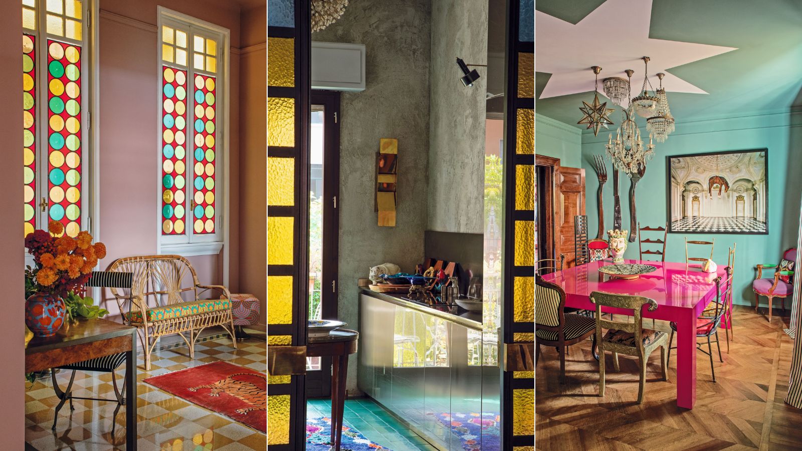

Feeling like bold decor choices for your apartment might just give it the edge it's currently lacking?
When looking for apartment decor ideas, we often tend towards the muted, the safe, the space-enhancing. But let us reframe your small space decorating preconceptions for a moment, with the help of interior designer Nicolò Castellini Baldissera and fashion and interiors photographer Guido Taroni.
The pair teamed up to create Inside Milan, an extraordinary book that goes behind the closed doors of Milan’s foremost creative residents, including Veronica and Jacopo Etro, Martina Mondadori, JJ Martin, and Barnaba Fornasetti.
The rooms they showcase demonstrate just how art, pattern and color, can suit small spaces, and tiny homes. These are our top eight, with commentary from Nicolò.
1. Color drench from floor to ceiling
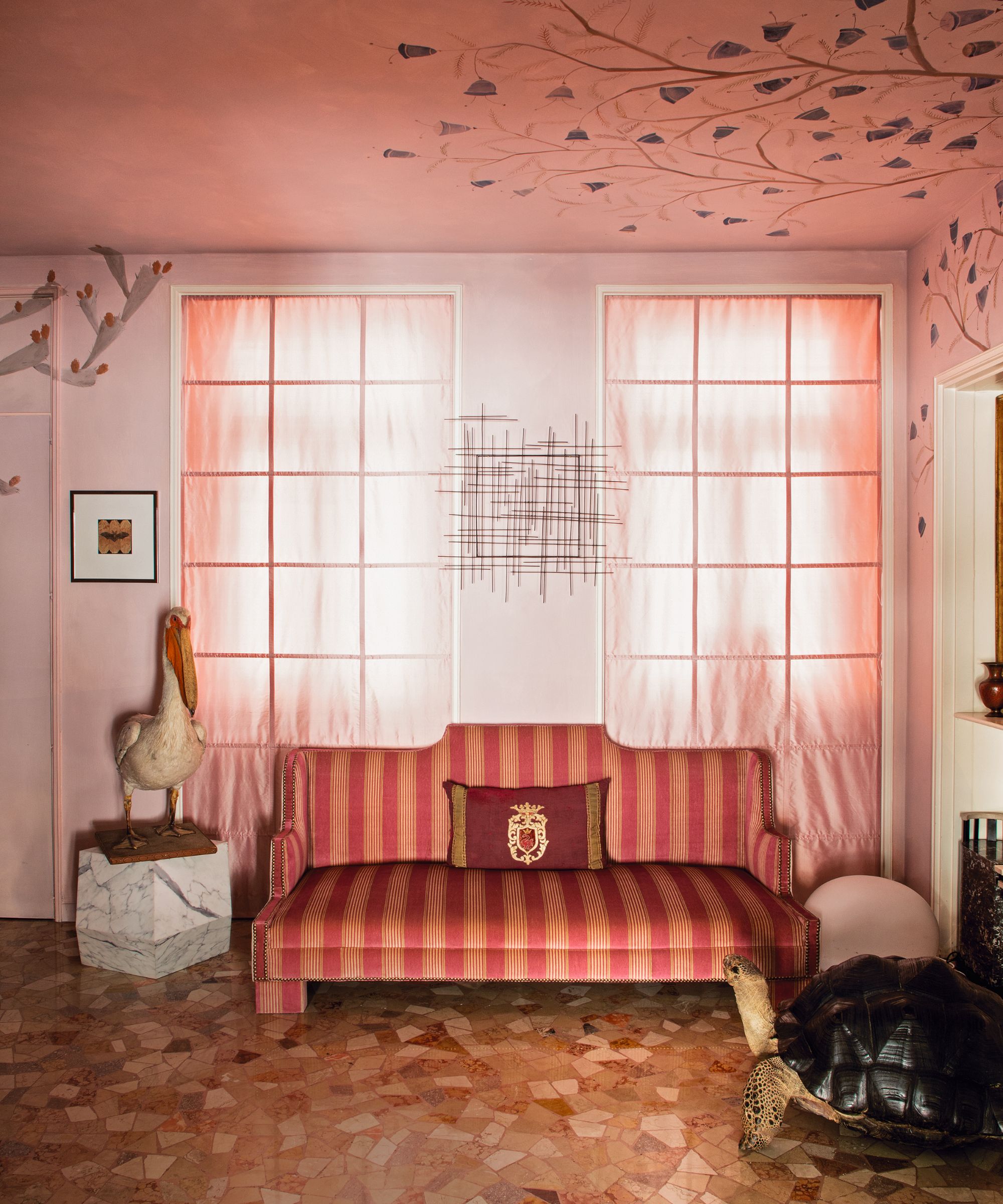
This color-drenched space by interior designer Nicolò Castellini Baldissera has a stunning ceiling, floor and sofa – the patterns and details are pulled together by the soft colors.
‘One of the benefits of living in Milan is the number of industrious people who can help you realize just about anything,' he says.
'On Via della Moscova, I found an antiques shop with a set of silverware, an electrician to rewire my lamps and a fabric shop where I unearthed some silk stripes and blue velvet.’
2. Small space? Use high-impact surfaces
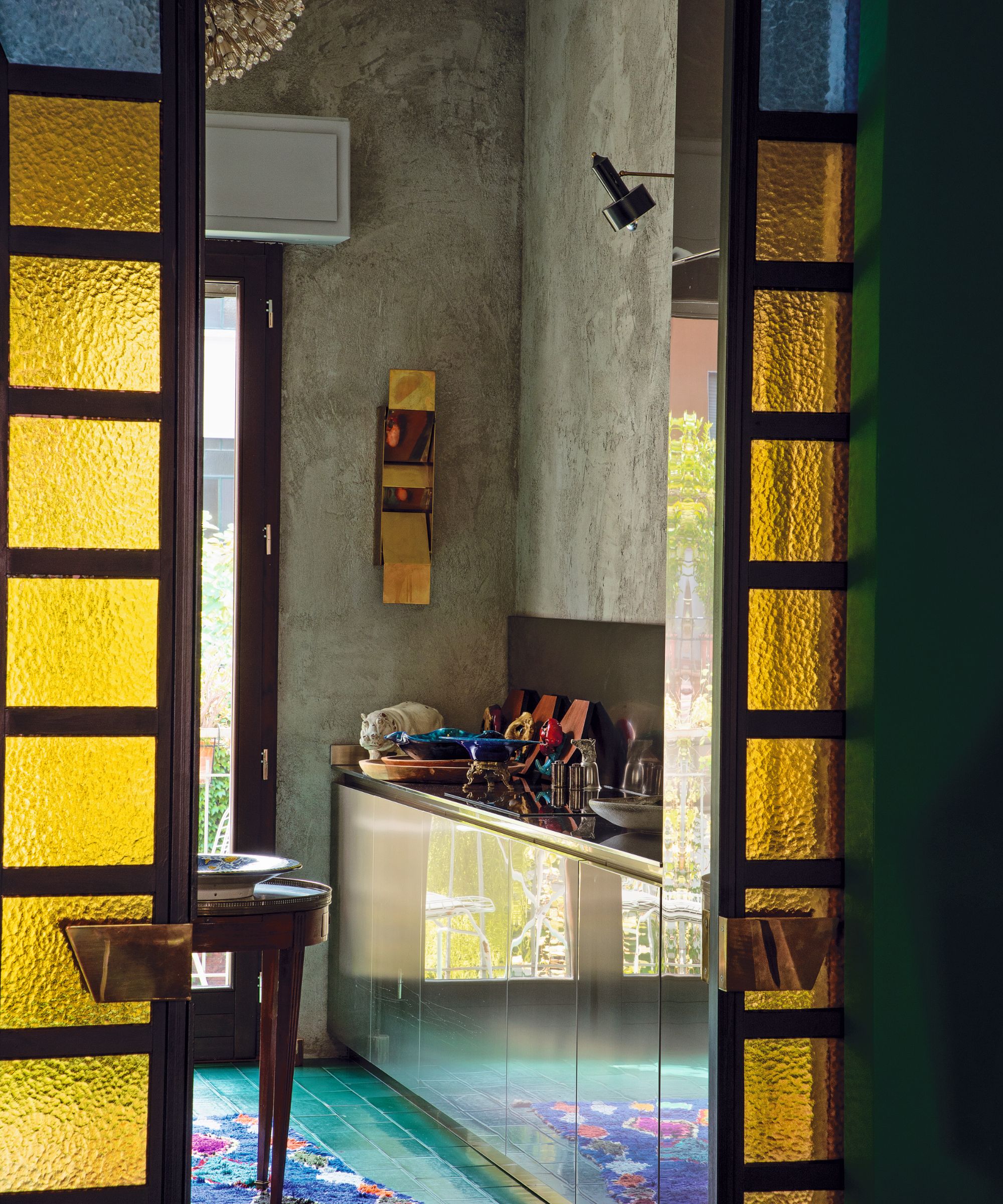
This sweet space by architect Hannes Peer and Philippe Rinaudo is bursting with small-space ideas, including reflective surfaces, textured wallcoverings and decorative ceilings.
The stained-glass sliding doors between the kitchen and dining room were created to imitate a garage door typical in Milanese entryways.
3. Don't shy away from bold color clashes
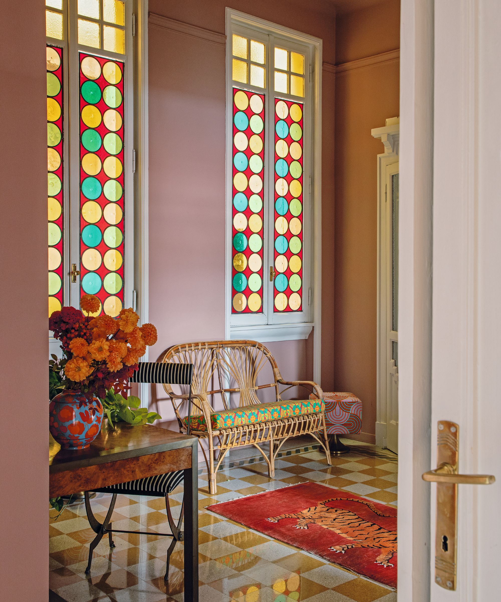
Fashion designer J.J. Martin lives here. ‘I began peeking in the doorways of buildings and interviewing doormen; eventually one of them gave me a tip about this place,’ she explained.
It was kismet. Entering the 1910 building, there is a palpable sense of grandeur, thanks to its generous proportions and mosaic details.
4. Over-accessorize in social spaces
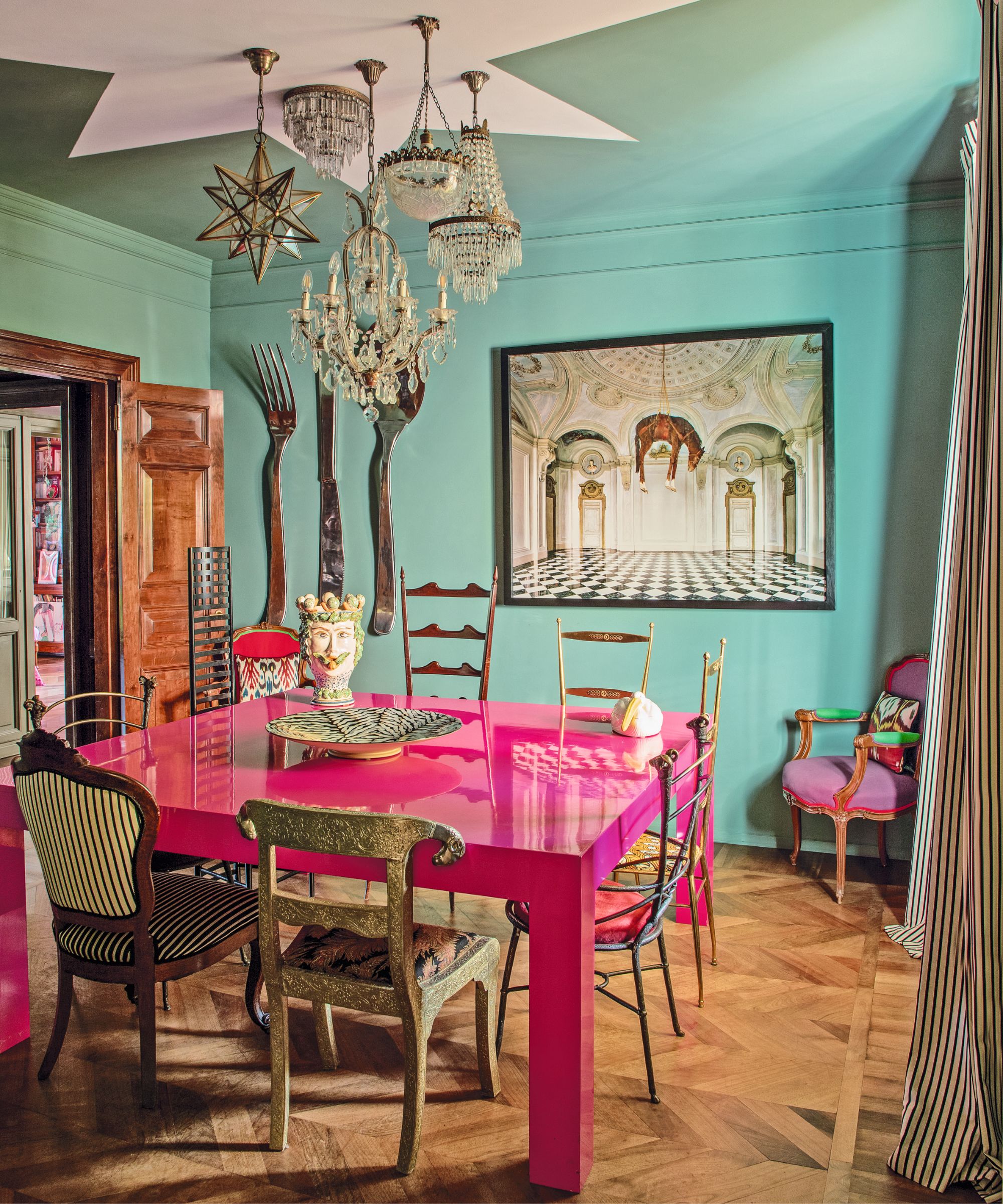
Veronica Etro needed something to suit her effervescent personality:
‘My father always told me I could never make up my mind,’ Veronica revealed, when she began work on the dining room, ‘and so I loved not having to make my mind up with the chairs and the chandeliers! That room is my favorite – like Alice in Wonderland.’
5. Use bold geometrics to exaggerate space
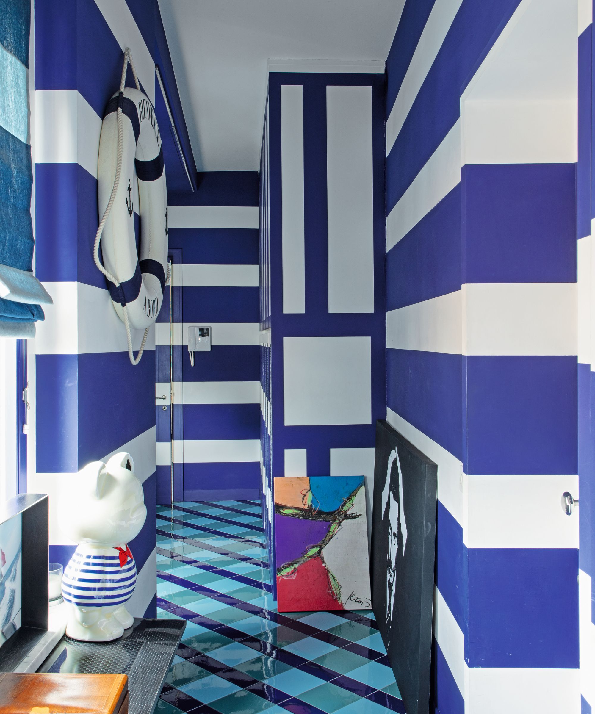
Lapo Elkann immediately recognised the potential this space had to offer. It has the quality of a sailboat: long and narrow, with a terrace that wraps around its entire length. The apartment reflects his unique collecting style, eclectically mixing art, design and a love of objects: ‘I love to find things that are not new.’
6. Enhance small spaces with characterful layering
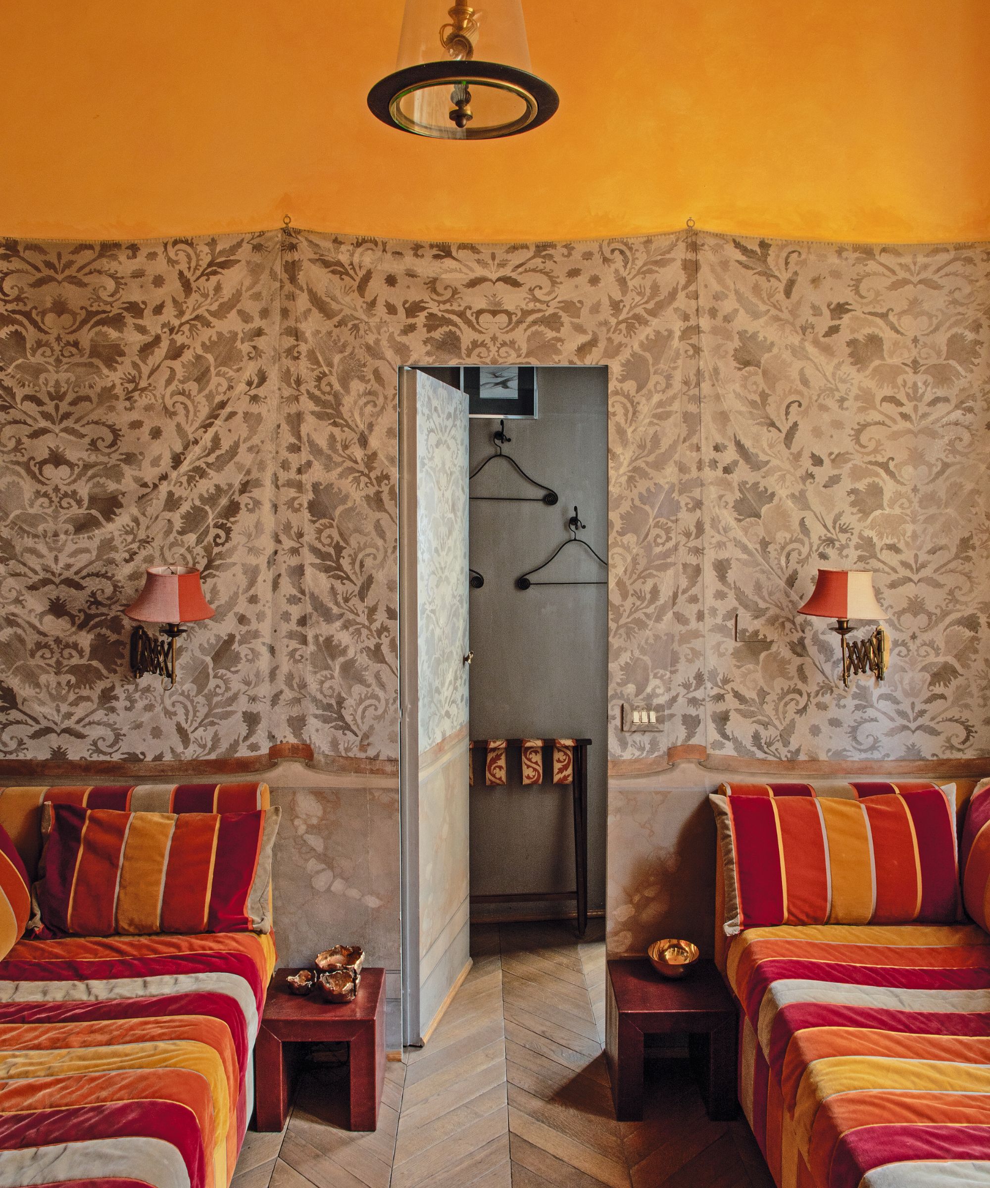
Osanna Visconti has embraced the decorative history of the building. Grand rooms with frescoed ceilings boast walls with layers of plaster and accumulated patina.
There is a mix of objects, from contemporary paintings to collections of antique blue ceramic plates and warm 19th-century armchairs covered in rich velvet fabric.
7. Switch paint colors to the unexpected
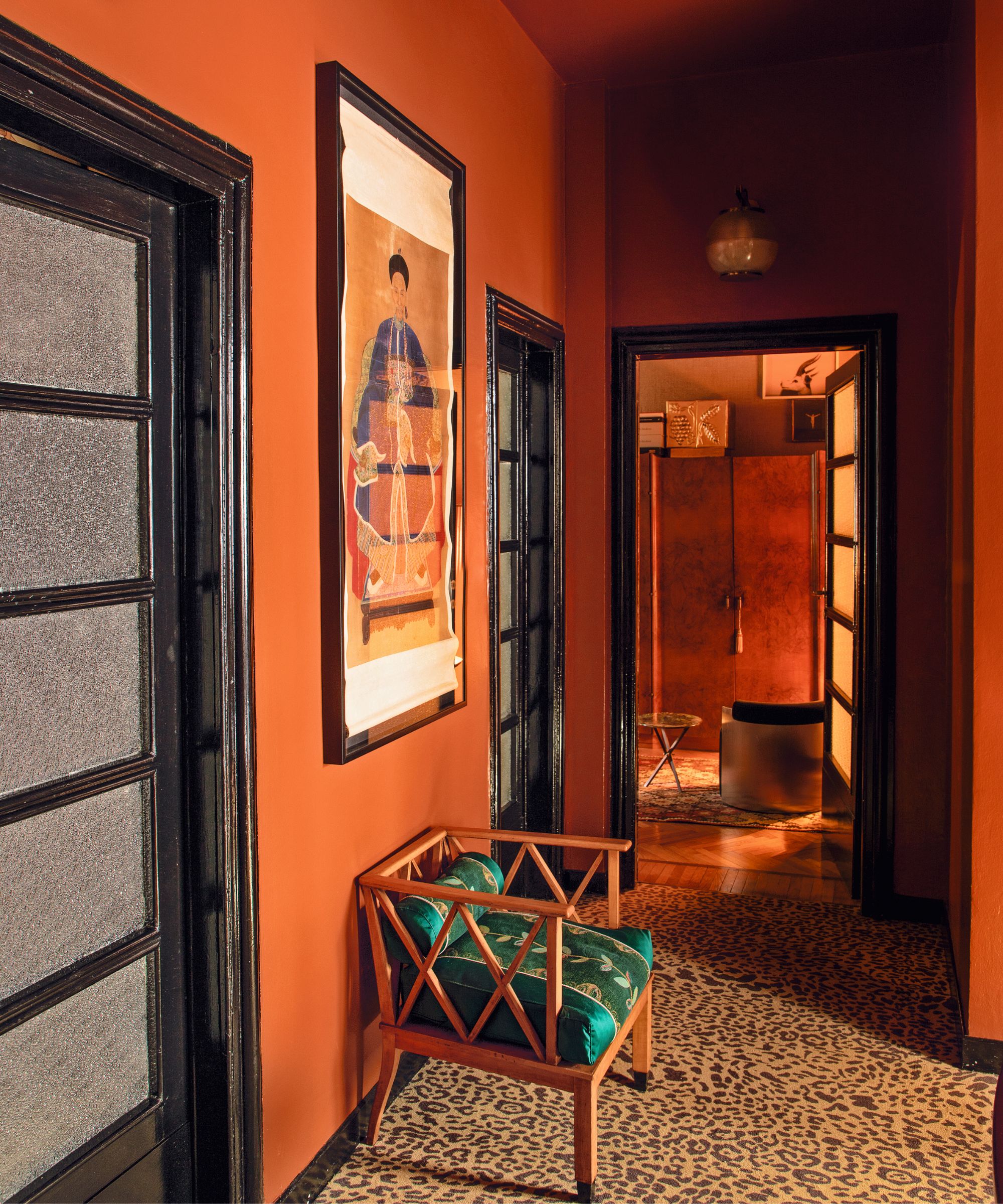
‘I have fallen in love with the unusual orange used in this space,’ says Emiliano Salci, co-founder of Dimorestudio. He has decorated his home with some of his most favorite pieces: a pair of white closets by Alvar Aalto; shelves by Jean Prouvé; a painting by Enrico Castellani and armchairs by Piero Portaluppi.
8. Use paint tricks to create depth of detail
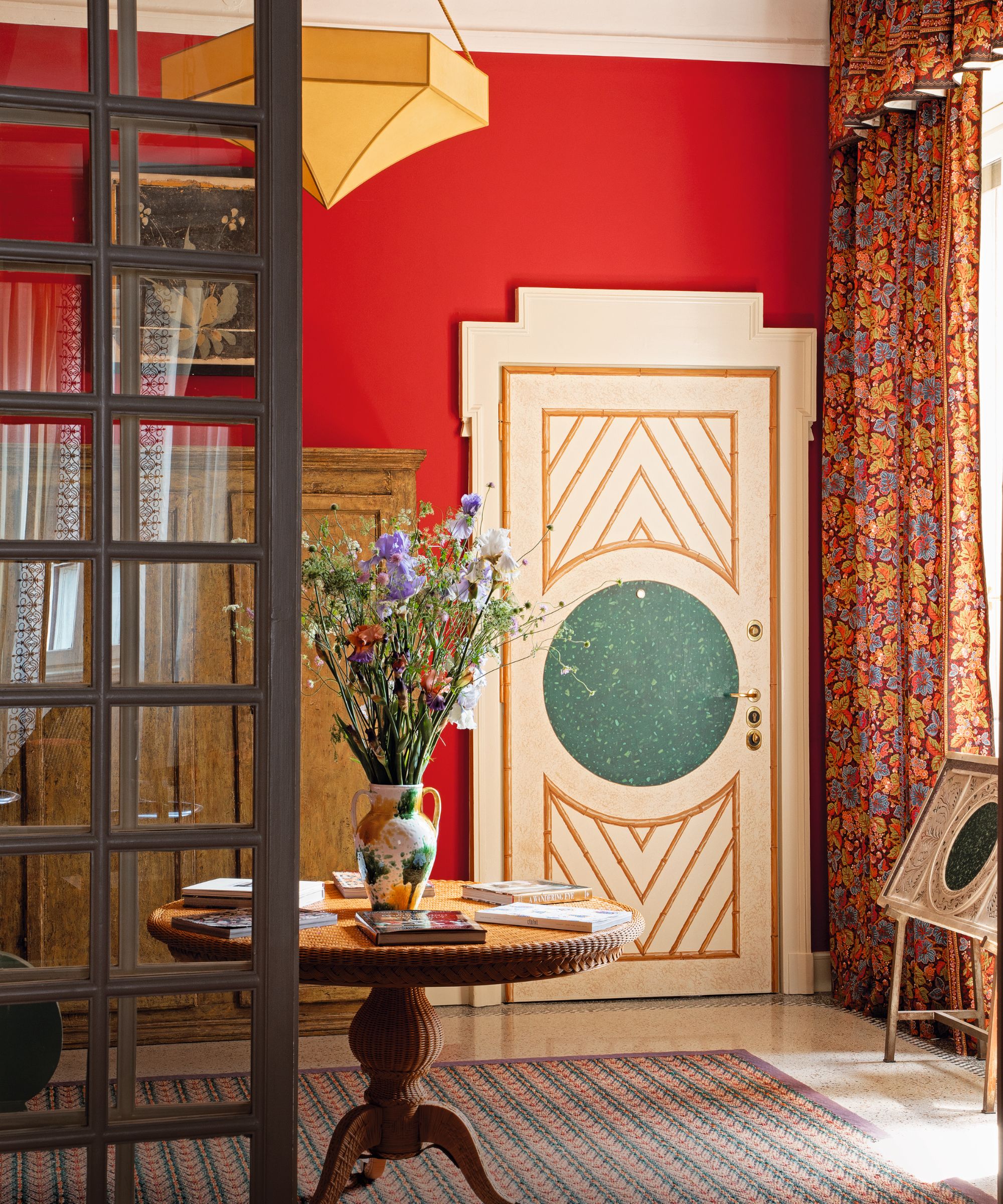
It is one thing to be born into good taste, as Martina Mondadori and Ashley Hicks certainly were, but their relentless efforts have cemented them as foremost authorities of what it means to be tasteful.
This apartment is a testament to their undaunted creative energy. Ashley set to work on trompe l’oeil marble and stonework on various columns and doors and paisley stencils for walls in other rooms.
Inside Milan: Colorfully Creative Italian Interiors,
$63.16 (Hardcover), Amazon
Available in hardcover, Inside Milan showcases the best of Milanese interior design.
Sign up to the Homes & Gardens newsletter
Design expertise in your inbox – from inspiring decorating ideas and beautiful celebrity homes to practical gardening advice and shopping round-ups.

Lucy Searle has written about interiors, property and gardens since 1990, working her way around the interiors departments of women's magazines before switching to interiors-only titles in the mid-nineties. She was Associate Editor on Ideal Home, and Launch Editor of 4Homes magazine, before moving into digital in 2007, launching Channel 4's flagship website, Channel4.com/4homes. In 2018, Lucy took on the role of Global Editor in Chief for Realhomes.com, taking the site from a small magazine add-on to a global success. She was asked to repeat that success at Homes & Gardens, where she has also taken on the editorship of the magazine.
-
 5 surprising but brilliant ways to clean with old socks – from perfectly buffing stainless steel to deterring pests naturally and more
Tackle dust in tricky corners, clean your mirrors and even banish bad odors with those rogue single socks
By Andy van Terheyden Published
-
 How to grow astilbe – expert advice on cultivating this shade-tolerant flowering perennial
Shade-tolerant and pest-resistant - astilbe are hardy and tough perennials that can thrive in many settings
By Ellen Wells Published
