Gossip Girl's Alice Callahan's home makes mid-century modern family-friendly
The modern farmhouse-style new build is super stylish yet practical for her young family
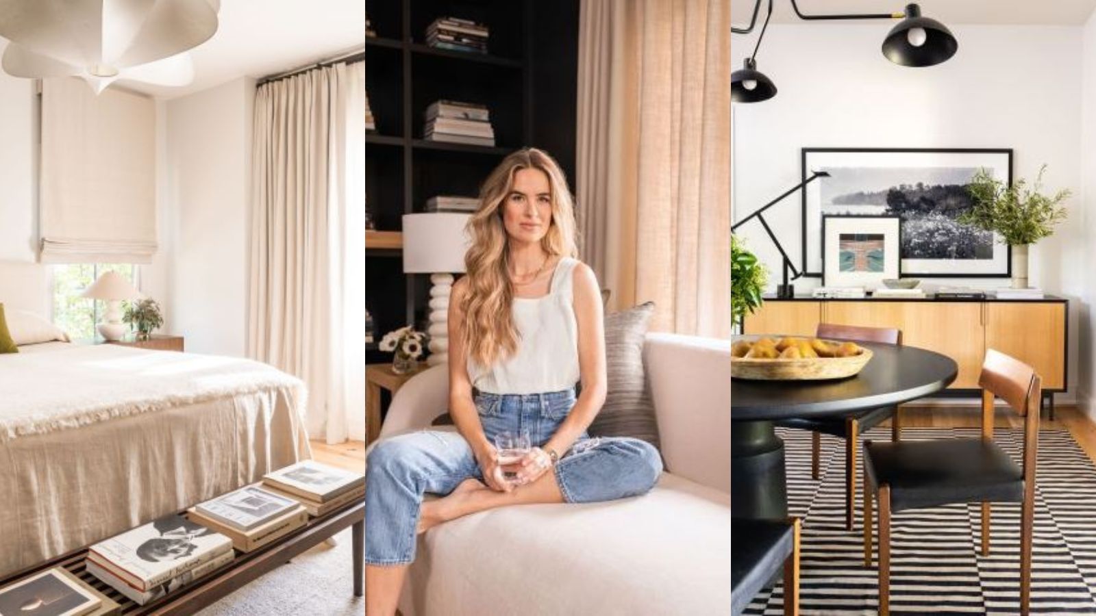
Alice Callahan Thompson, actor, model and advocate, and husband Kyser Thompson met in New York. Alice played the recurring roles of Jessica on Gossip Girl, and Stephanie on Odd Mom Out; and had guest starring roles on shows such as Law & Order, Orange is the New Black and One Life to Live. She also appeared in feature films including Morning Glory and Teenage Mutant Ninja Turtles, working with award winning directors Steven Soderbergh and Bertha Bay-Sa Pan.
Alice's biggest passion is adoption and foster care advocacy both domestically and internationally, and she has worked with a sustainable orphanage/school in Kenya called Many Hopes since 2011. Alice and Kyser have a grown godson named Tashem (originally through fostering), a young son through adoption (Timothy), a young biological daughter (Rosemary) and a new biological baby boy (Billy).
Although both from the South, Alice and Kyser's first apartment was in the Lower East Side. But once covid happened, they considered moving back to Alice's native Birmingham. Shortly after engaging a real estate agent in Birmingham, they were emailed a few pictures of an off-market house. They were immediately drawn to its modern shapes and dark colors. Since one of the main reasons for moving was for the kids to have more wiggle room inside and out, they loved the open playroom connecting their rooms and the sizable backyard (even for Birmingham standards). But it wasn’t until Alice flew down that the deal was sealed. She stepped into the screened porch and imagined the entire family hanging out together in the space. She called Kyser right away and said, 'Let’s do it'.
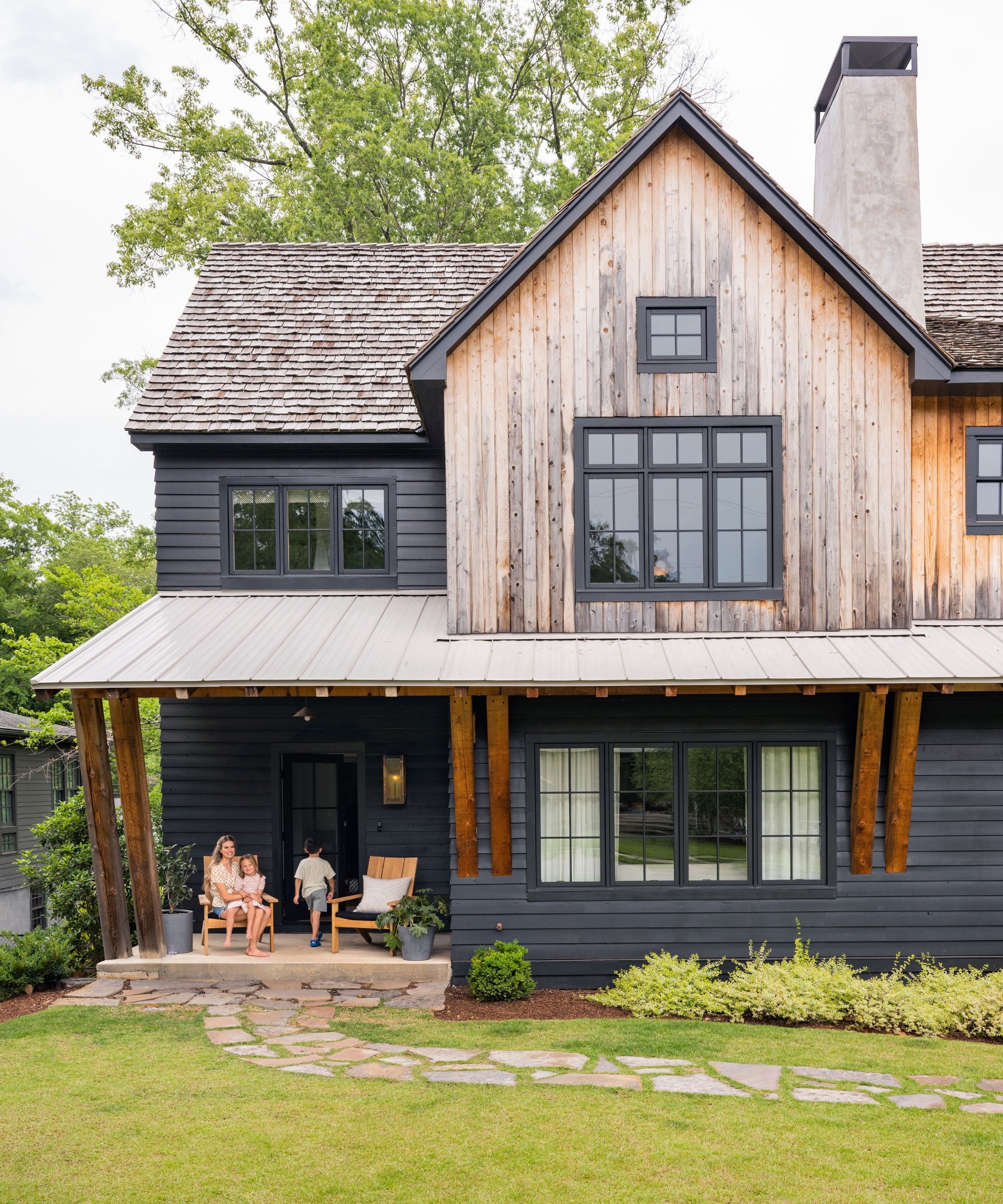
Teak chairs by Summer Classics; Custom pillows in C&C Milano outdoor fabric
Built in 2020, the modern farmhouse style home is located in a charming neighborhood in Birmingham, Alabama. The Thompson’s neighborhood is bustling with lots of young families. There is a small, quaint downtown area with shops and dining, and the local elementary school and several tree-filled parks are in walking distance. There is a constant flow of strollers, runners, kids running from home to home and lemonade stands. Alice and Kyser loved the walkability of Brooklyn so they were attracted to this particular neighborhood with almost all amenities in walking distance.
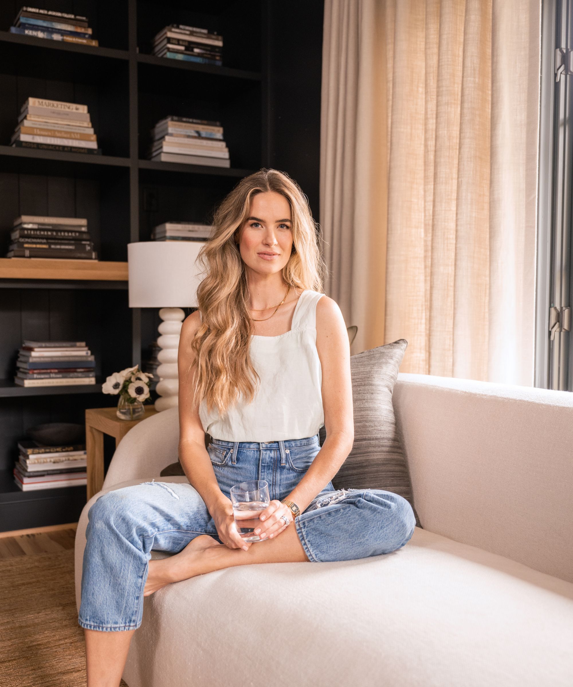
'The home originally felt confused. It had jewel-toned walls, lots of faux brass fixtures and trendy farmhouse elements,' say the team at Still Johnson, who remodelled the house for the Thompsons. 'We knew immediately that we needed to come up with a more unified palette for the house. We established our colors from the existing exterior of the house (charcoal), existing walls (white) and existing wide-planked oak floors (camel). The base palette for the house became charcoal, white and camel.
'From there, we began to strip out the faux brass and replace it with more gutsy dark metals or metals with a living finish. The new architectural palette immediately made the house feel cohesive and set the tone for a timeless but modern design.'
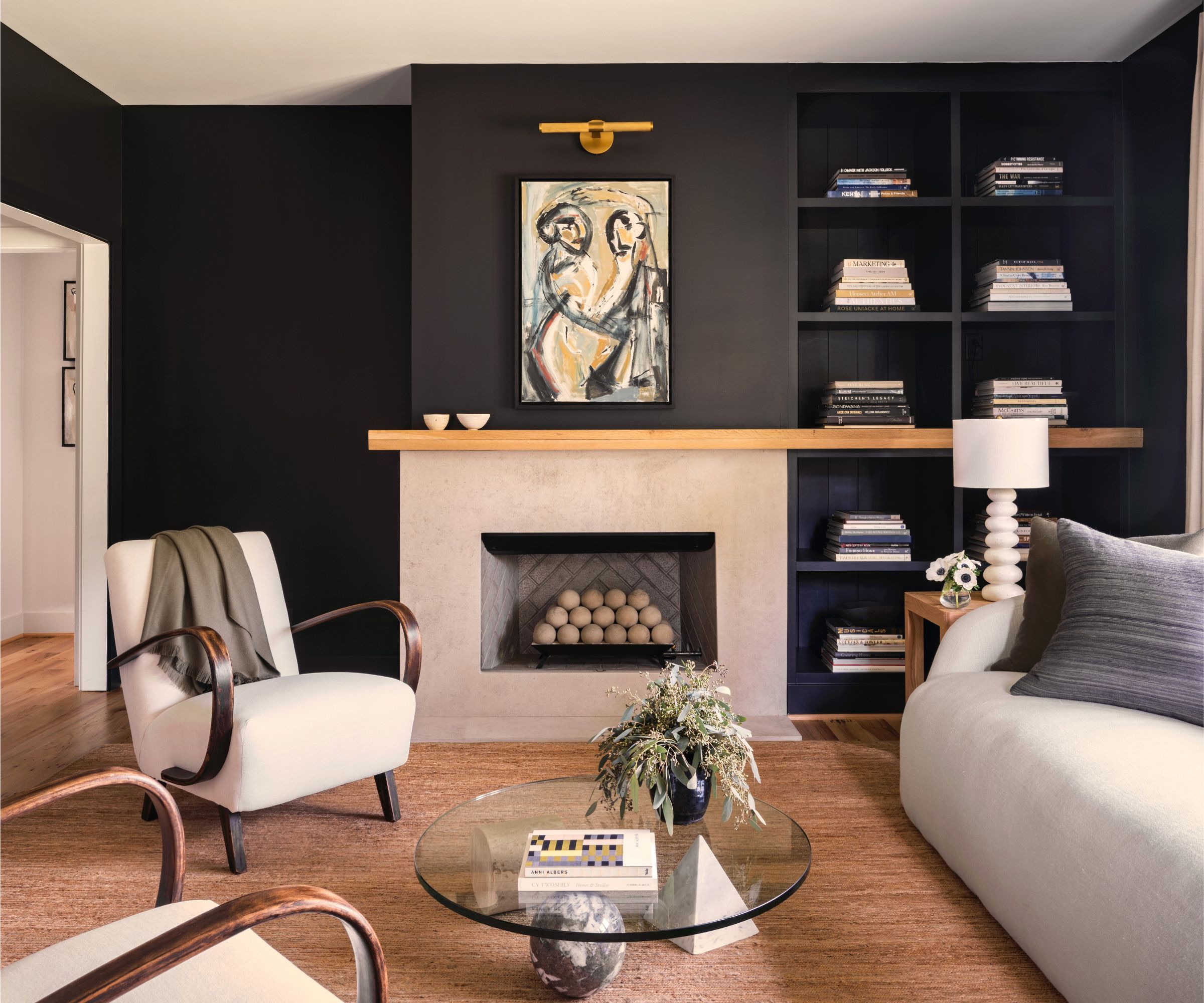
Sofa by Verellen; Custom pillows in Holland & Sherry silk and Yoma wool; Custom drapery in natural Belgian linen; Painting by Anne Darby Parker; Custom oak sides tables by MDM Design Studio
'Alice indicated from the beginning that she liked dusty colors (dusty rose, dusty blue, dusty olive) so we sprinkled those colors throughout the house as pillows or artwork which made for a really nice accent to the moody pallet we had established.
'We tried to use as many natural materials as possible to infuse some weighty timelessness in this newly built house. We used oak or walnut for almost every piece of hard furniture, and we used lots of natural linen in the drapery and upholstery. We weren’t after a look per se, we just wanted to use as many textured, natural materials as possible to soften the “newness” of the house.'
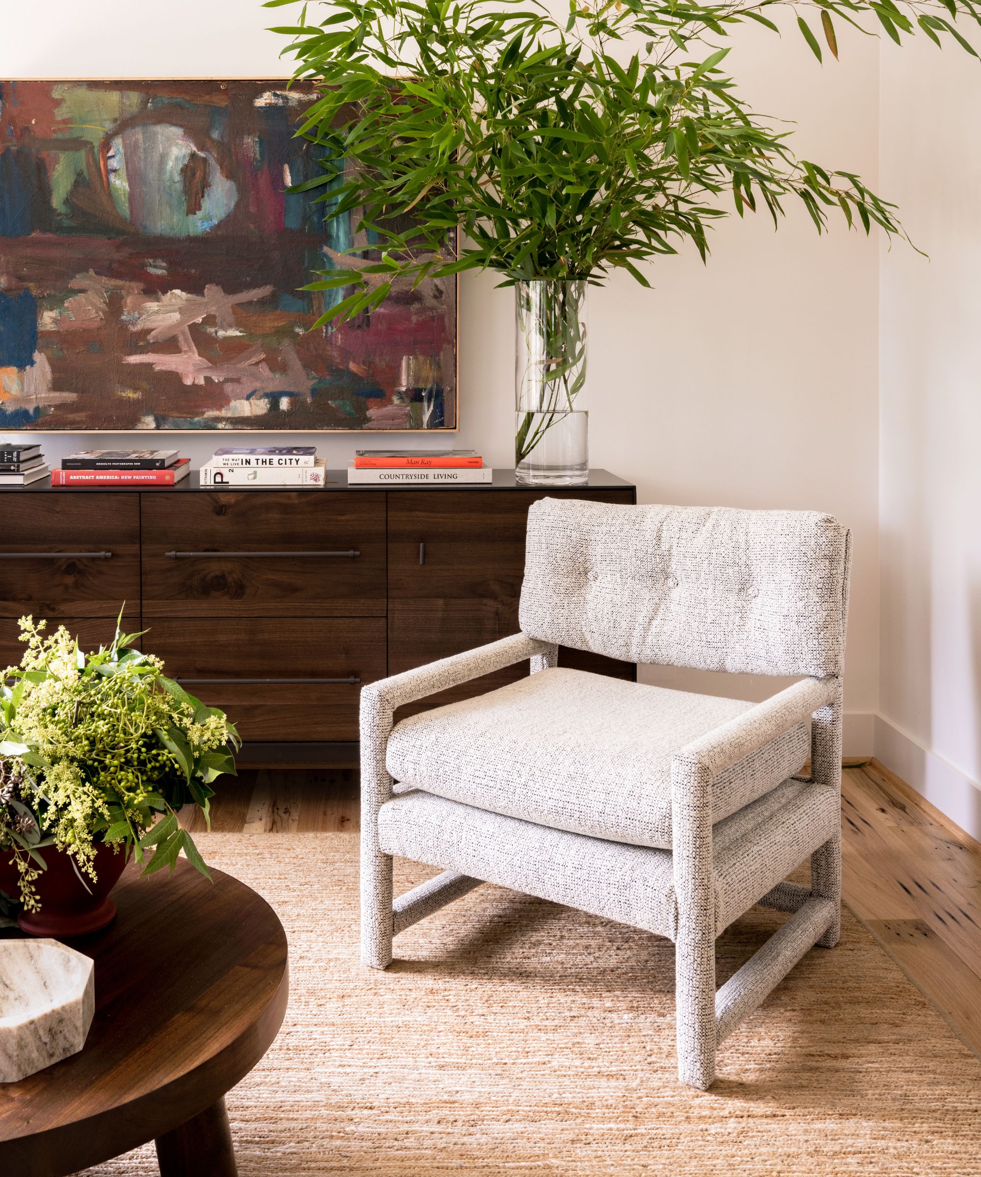
'The architecture of the home is very dramatic with steep roof lines and a tight, upright facade. The exterior facade of charcoal stained siding with aging cedar accents is very powerful. We wanted the interior of the house to carry that same drama but in a more approachable and inviting way. We pulled the charcoal into the house by painting the formal living room, kitchen millwork and all interior doors the exact same charcoal color as the exterior.
'The strong charcoal helped connect the exterior to the interior and gave the interior a sense of power that was lost in the original jewel toned paint colors. We followed the thread of light oak that was already running through the house by designing lots of custom oak furniture with our local workroom, MDM Design Studio.
'We then added several walnut pieces as an accent material so that the hard furniture began to take on a collected look that the homeowner could add to over time.'
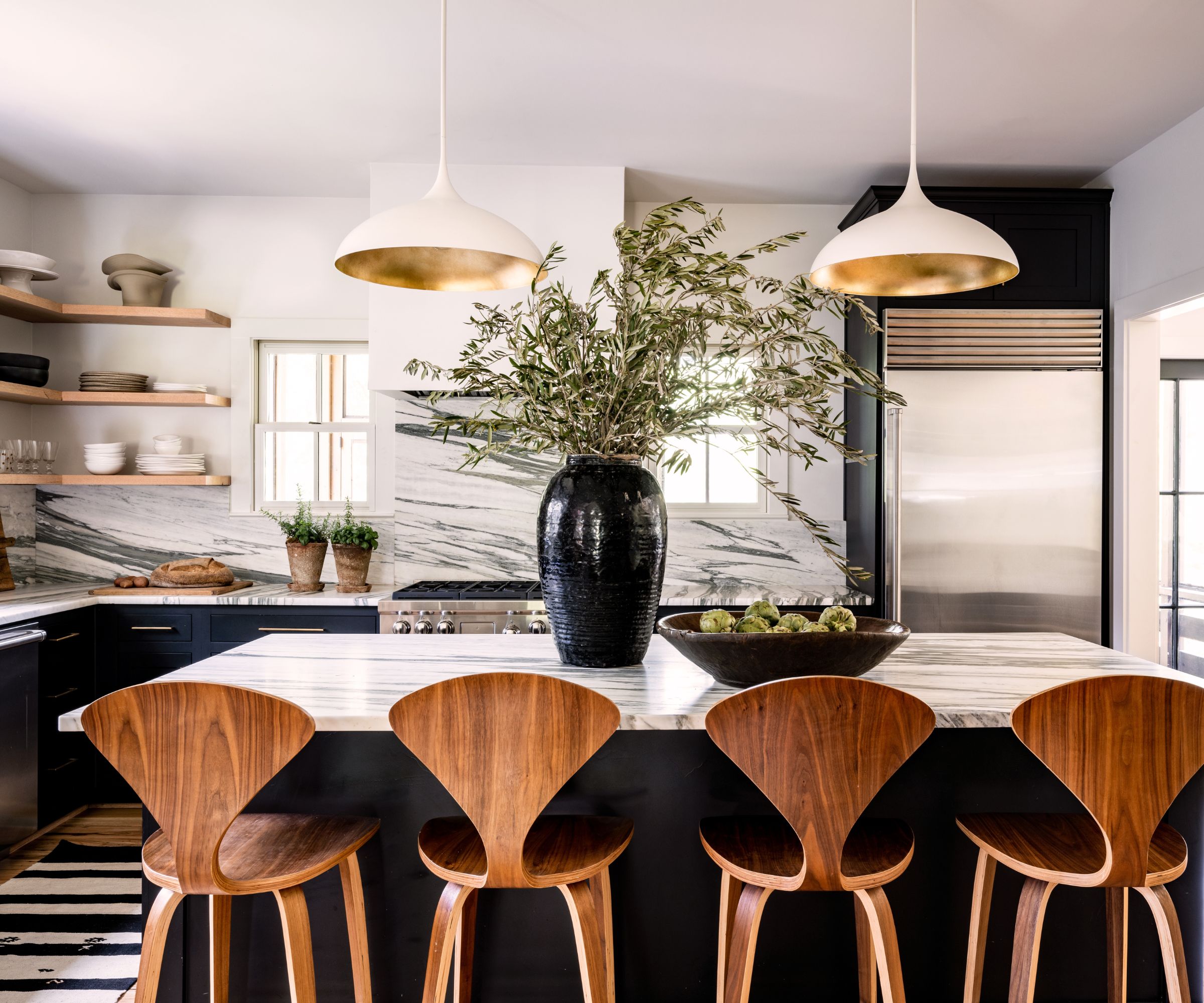
Cherner counterstools; Vintage kilim runner; Vintage Alexander Calder lithograph
'Once we added the furnishings, it began to make the exterior architecture of the house make sense and more appropriate for the family. Everything works so well together now that it is hard to imagine it any other way.
'We also were very inspired by an existing collection of mid-century furniture and art from their parents and grandparents. We love mid-century forms so the existing key pieces we got from the Alice and Kyser inspired the newly made pieces. This added a special sentimental aspect to the family’s collection as well as making the home feel more collected.'
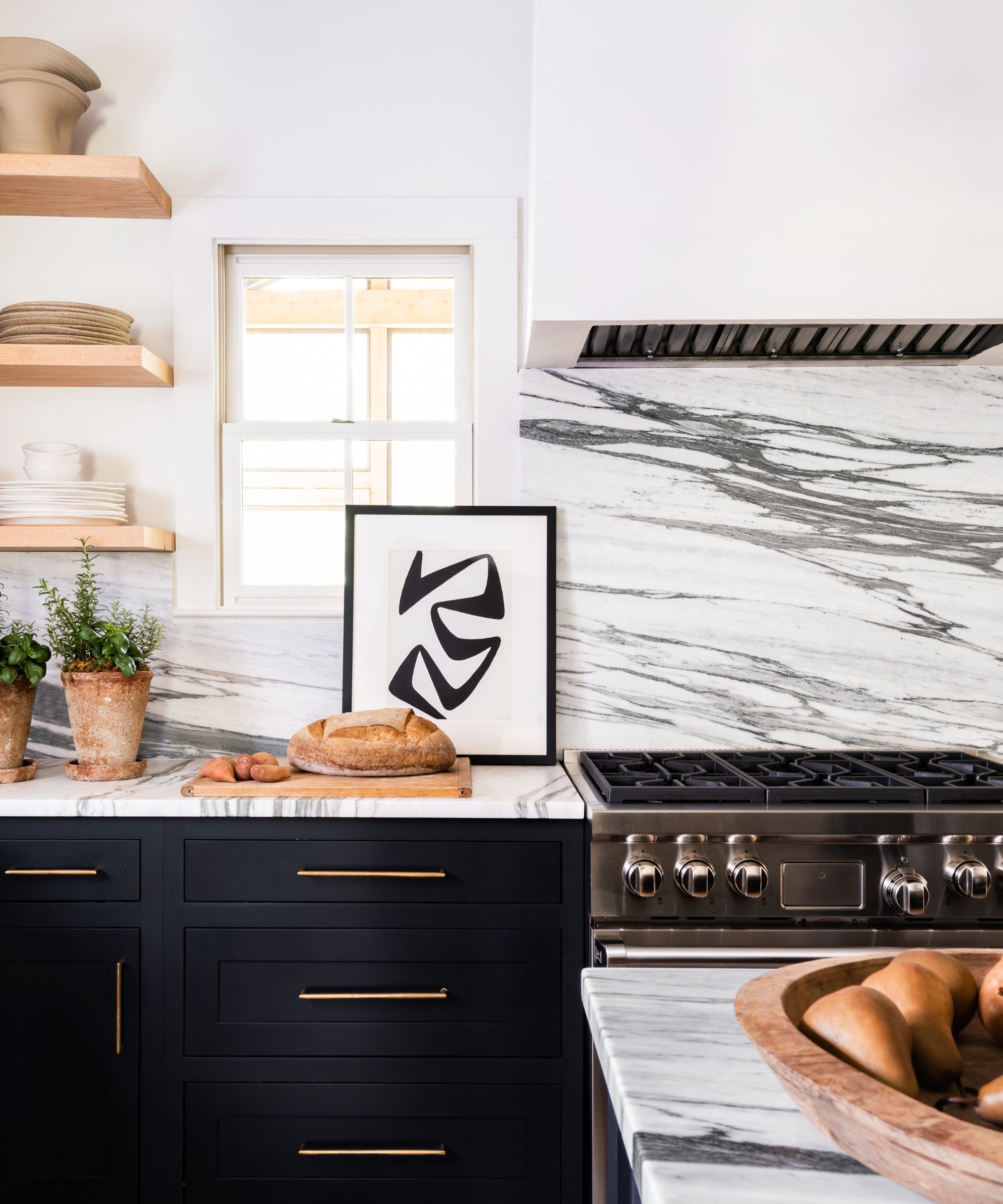
'Alice and Kyser wanted the house to be family friendly. We used a lot of durable materials and fabrics. We made sure all the new wood furniture, rugs and sofas were impervious to spills and stains. We selected natural materials such as hemp rugs that were inherently durable. We asked our custom furniture workroom to make sure each wood piece was “child proof” sealed so we got the beauty of wood furniture with the durability we needed.
'Alice and Kyser also wanted to make sure we understood and appreciated their existing art and mid-century furniture. In our first call to discuss the potential project, Alice mentioned her love for art and her existing collection of mid-century furnishings from her family. Interesting art and vintage furniture is a central part of our design ethos so we were thrilled. Sometimes we have to educate clients on the importance of interesting art and using some old, especially mid-century, pieces. Alice and Kyser understood that from the beginning.
'We had so much fun integrating their existing pieces, especially the living room coffee table, into their new home. In the end, they received not only a well-designed house in terms of aesthetics but a house that functions for their lifestyle.'
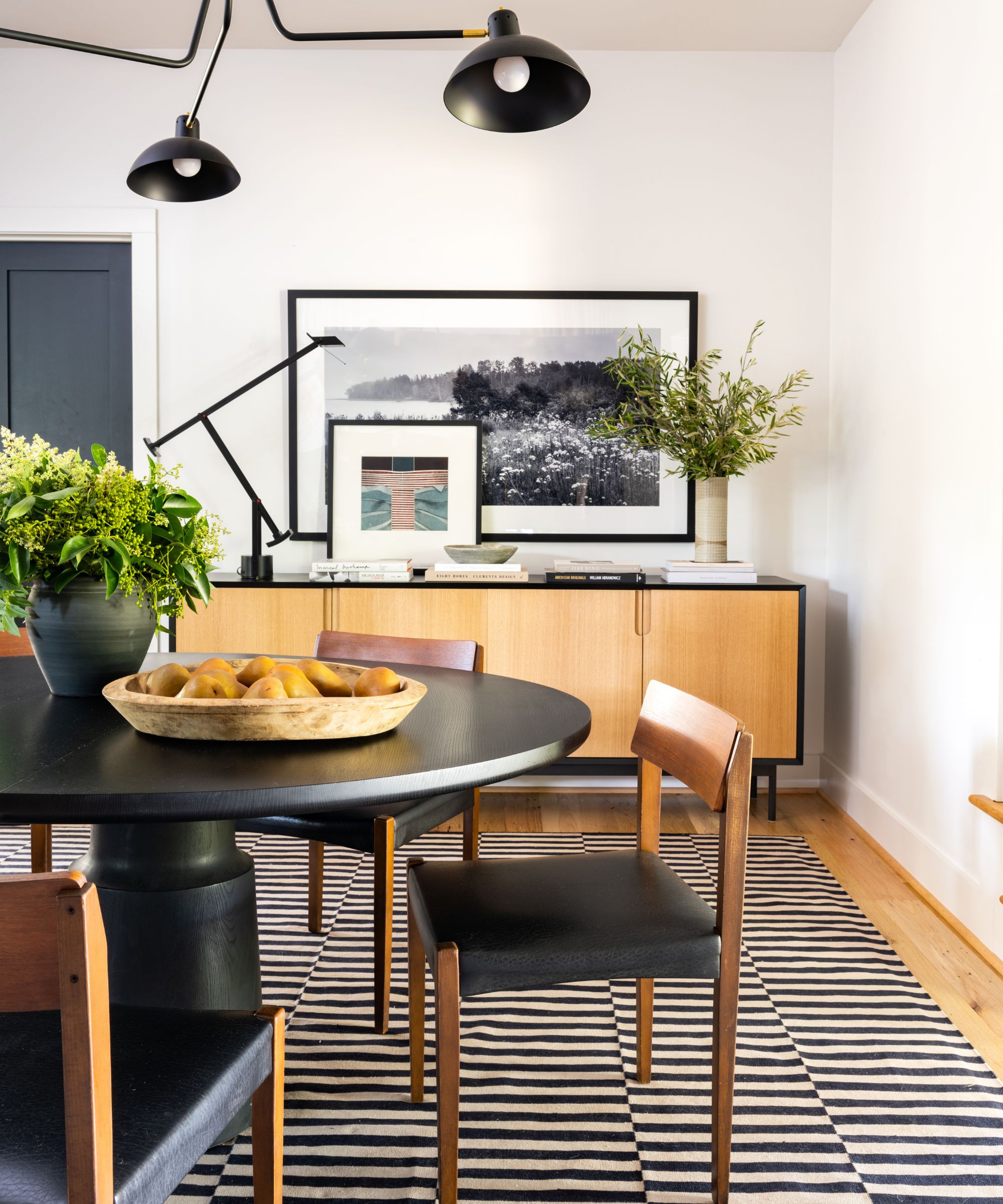
'We were very inspired by an existing collection of mid-century furniture and art from Alice’s parents and grandparents. We love mid-century forms so the existing key pieces we got from the Alice’s family inspired the newly made pieces. Some of the pieces from Alice’s existing collection such as the living room coffee table were mid-century pieces we have been coveting so it was fun to use those iconic items in our design plan.'
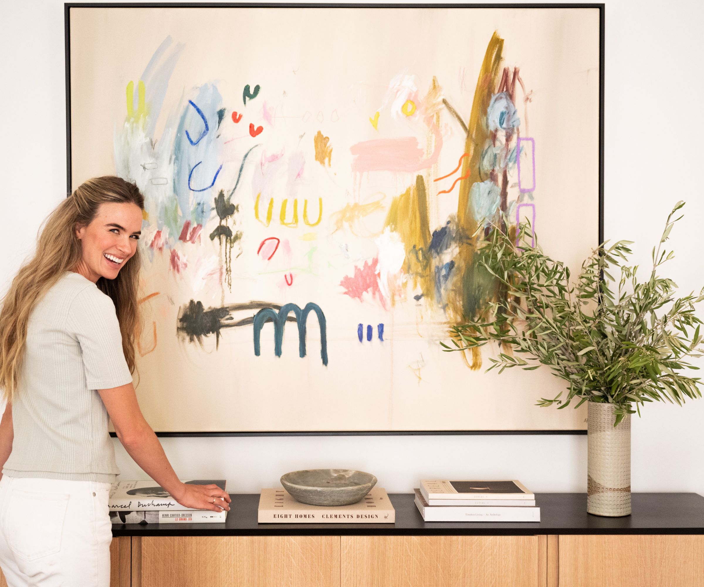
This home is about 3800 sq.ft., and it’s organized really nicely for a family of five. The main level includes the dining room, kitchen, den, living room and primary bedroom. The dining room, kitchen and den are an open concept. The living room is more compartmentalized at the front of the house which gives the family a more formal area that tends to stay clean since the kids don’t hang out in that area as much as the den/kitchen/dining room area.
'The living room serves as a retreat for a conversation with guest or to enjoy a fire. Alice and Kyser host both of their extended families and friends from around the country so it’s nice to have the option of a true living room for more entertaining possibilities.'
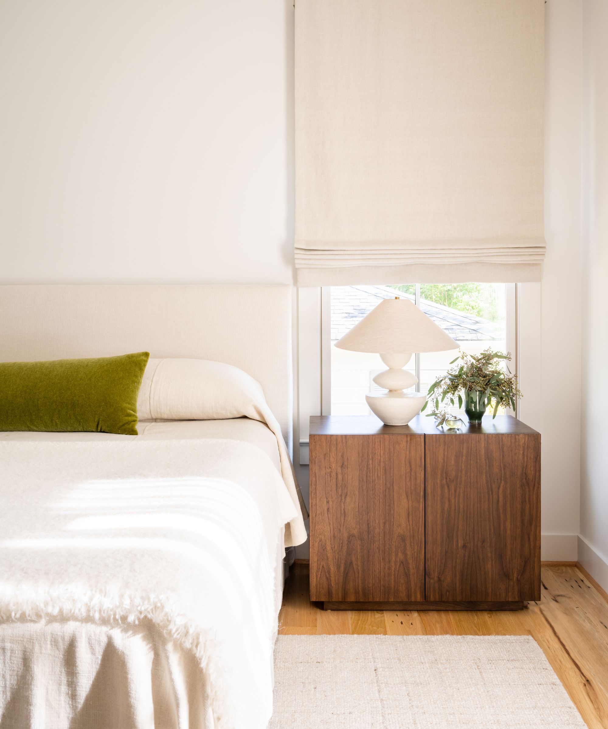
Custom bed by Design Industry by Grant Trick in natural Belgian linen; Custom coverlet in natural Belgian linen; Custom lumbar pillow in Yoma mohair; CB2 alpaca throw at foot of bed; Custom walnut bedside tables by MDM Design Studio; Danny Kaplan table lamps; Roman shade and drapery in Belgian linen
'The primary bedroom (above and below) is on the main level with a generous bathroom and closet.'
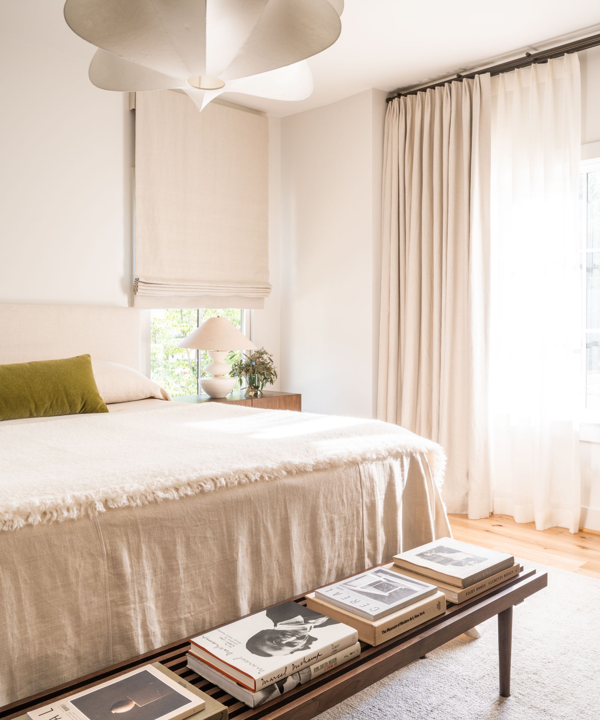
Custom walnut bench by MDM Design Studio; West Elm light fixture
'Our favorite rooms are probably the children’s rooms. We really worked hard to select the perfect pink and blue paint colors. We wanted to use pink and blue, but we didn’t want them to be childish in any way. The dusty colors we selected in the end were some of our favorite paint colors we’ve used.'
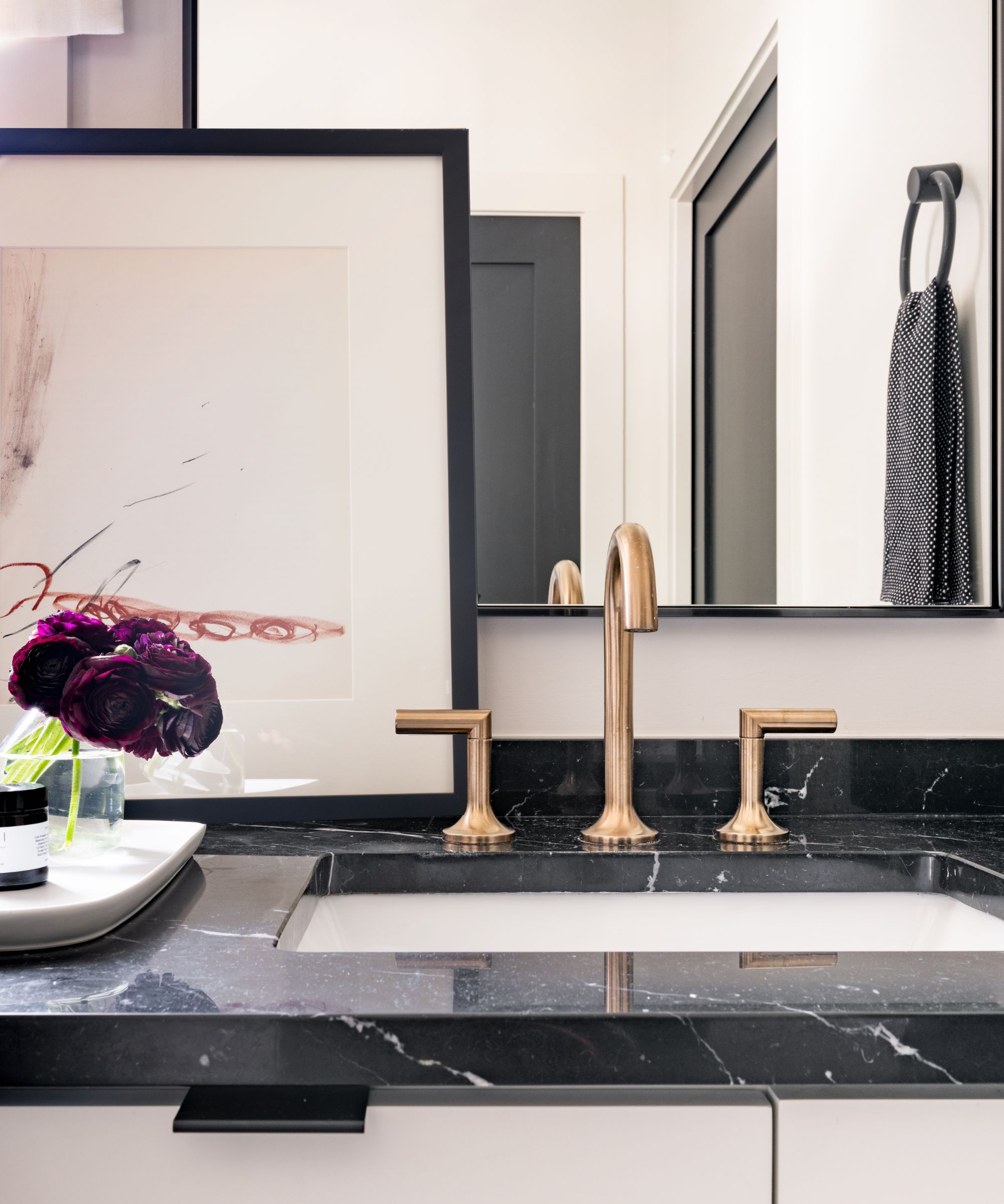
Lithograph by Antoni Tapies
'They are the perfect colors for young children’s rooms, but they are serious enough to work as the children grow. Alice really got involved in selecting fabrics and art for the kids’ rooms so it’s fun that these spaces were a totally collaborative effort between client and designer.'
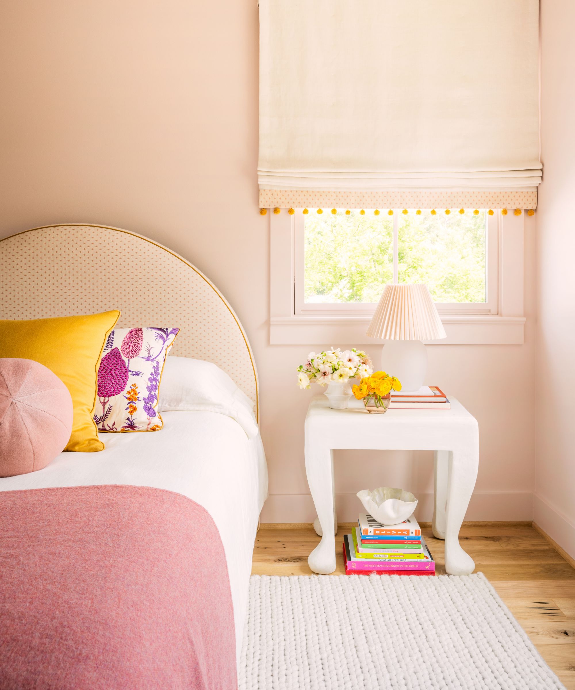
Custom headboard by Design Industry by Grant Trick in Schumacher fabric; Custom window treatment in Schumacher fabric; Custom pillows in Schumacher print, Zak+Fox solid; Customer sphere pillow in Yoma mohair; Vintage bedside table; Pink lamp from CB2
'There are three bedrooms off the playroom. It’s a great layout for a family – each child has his or her own retreat (decorated in monotone colors to match each personality) with a very colorful communal playroom.'
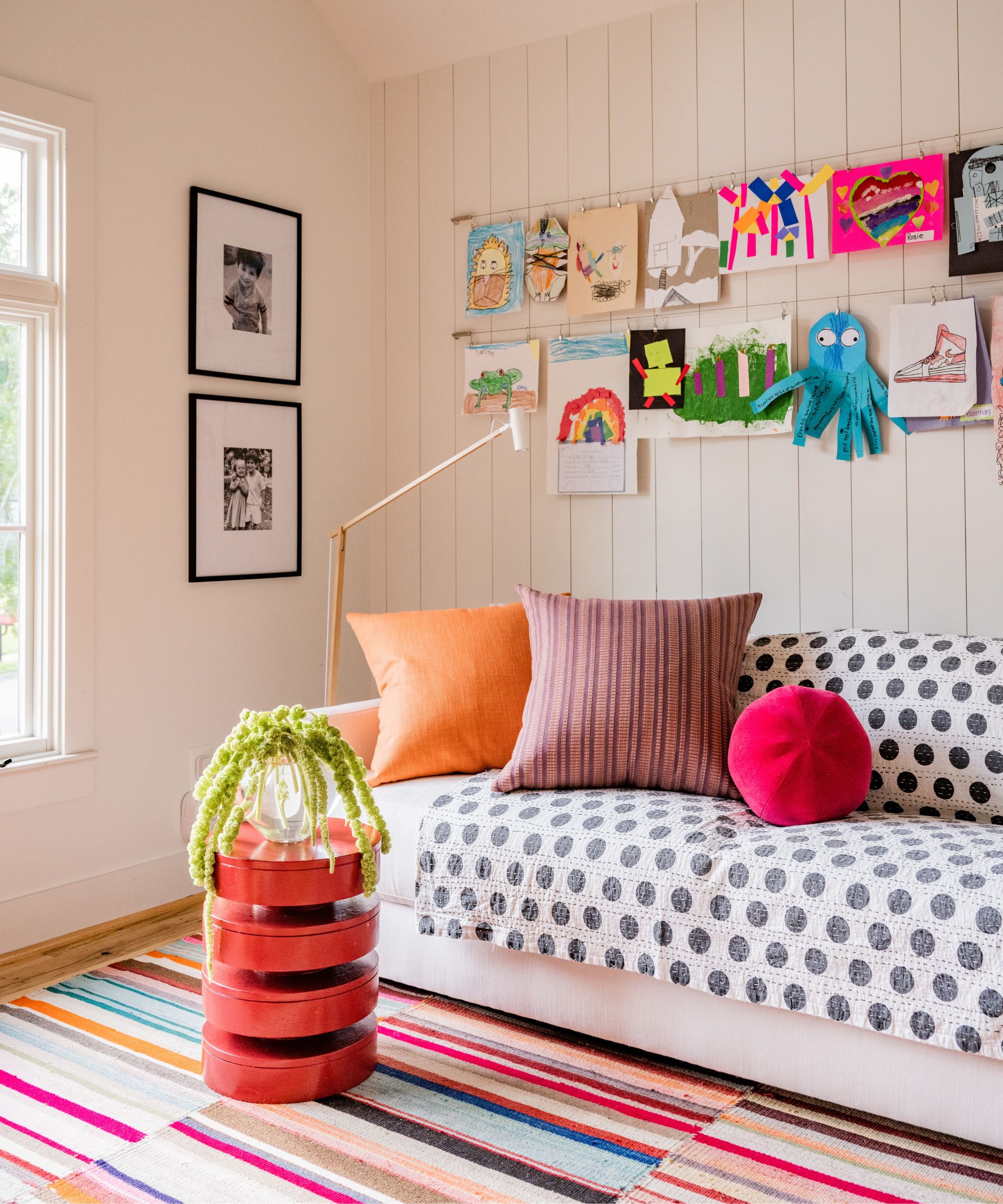
Vintage striped kilim rug; Pottery barn sofa in outdoor white fabric; Pillows in Zak+Fox fabrics; Sphere pillow in Jane Churchill; Art by Alice’s children
'The screened porch off the main level den serves as a bonus living space for the family. The stairs to the second level open into a large, sunny, colorful playroom (above). The playroom is a great space for the children; it keeps the mess of playtime confined to the third floor.'
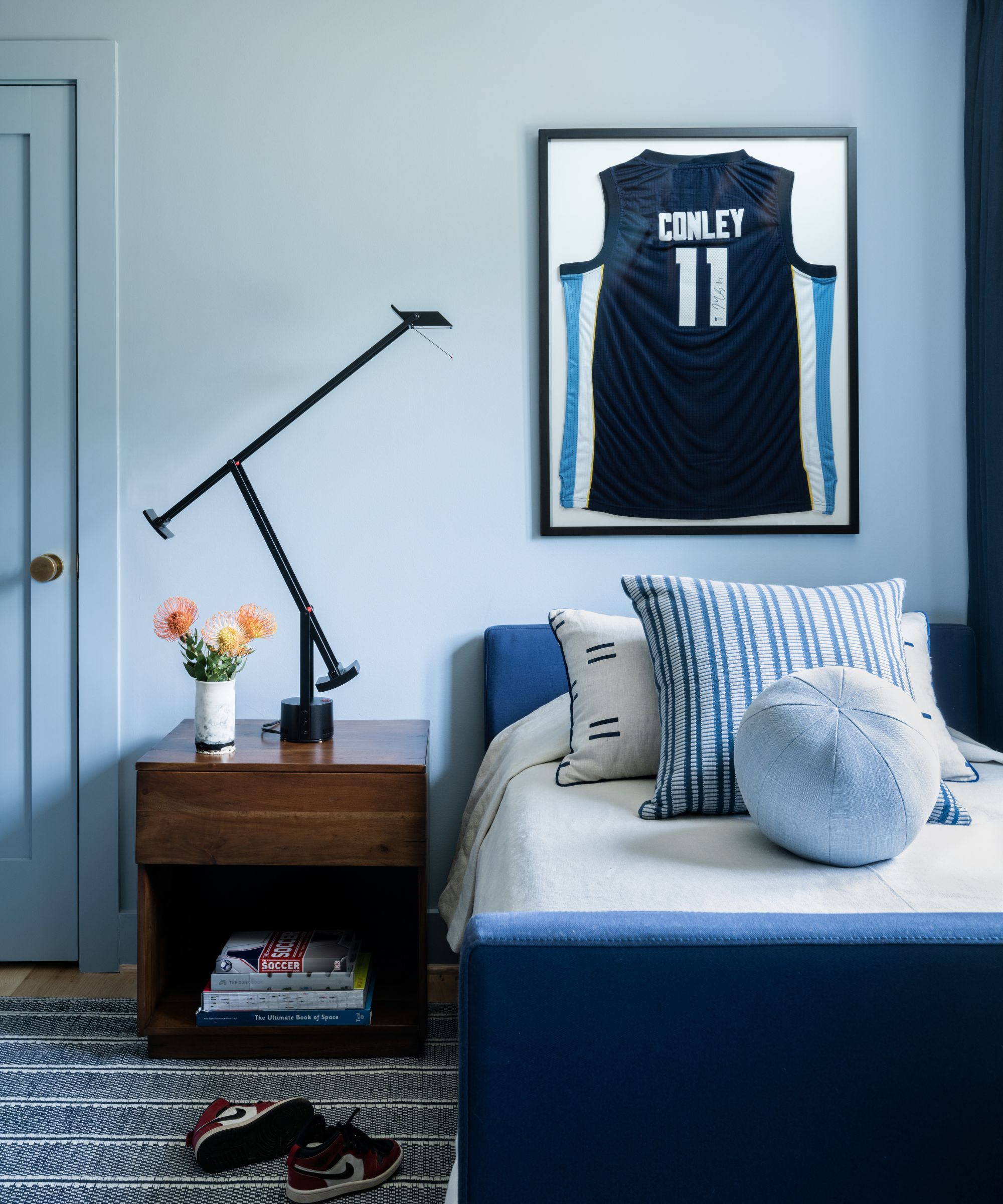
Pottery Barn daybed in navy canvas; Custom coverlet in natural Belgian linen; Custom pillows in Caroline Z Hurley and Zak+Fox fabrics; Dash and Albert rug; Pottery Barn walnut bedside table; Artemide Tizio lamp
'We think this house is a modern mix. The home leans modern which works for Alice and Kyser’s inherent edgy/cool vibe, but we tried to include a mix of furniture materials, styles and forms. We hope that one particular style is not evident. This allows Alice and Kyser to continue collecting art and furniture through their life without the boundaries of a particular style.'
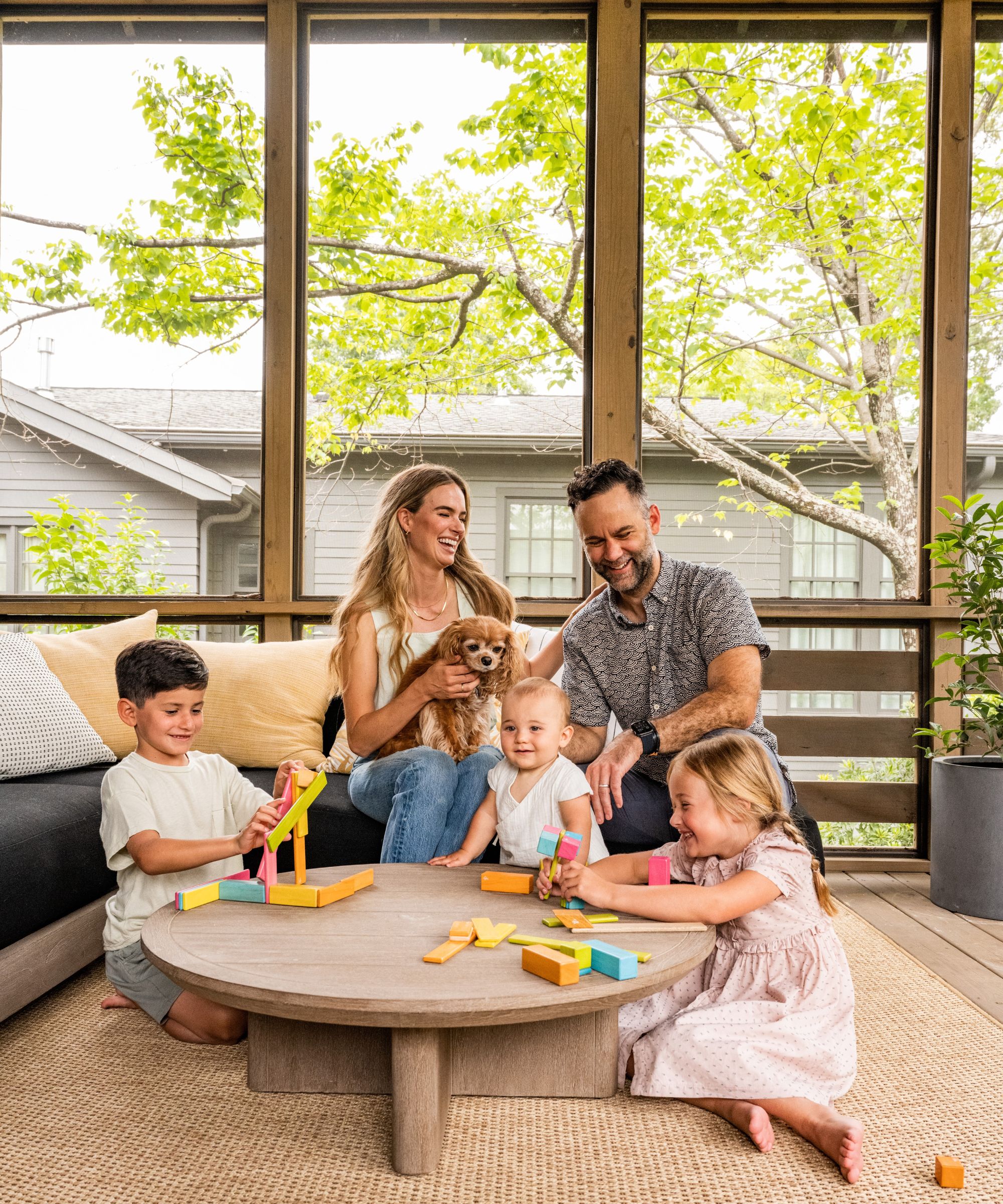
'We are happy with the result. There are two points that make us happy: the interior/exterior now complement one another and the family truly seems to be happy in the new space.
'When we first saw the house, we were worried about how “new” the house looked. We feel like the end-result is a house with soul and less newness. Some visitors even think it is an authentic mid-century house.
'Furthermore, when we visit the house, we see the family playing, enjoying each room/piece, entertaining, etc., and nothing makes us happier than seeing the family enjoy the spaces we have created.
'Also, the materials we painstakingly selected to work for this family really do seem to be holding up to the daily wear-and-tear. We would not change anything, but we hope Alice and Kyser can continue to layer art and furniture as they find piece that speak to them. The design of the interiors was meant to allow for a lifetime of collecting.'
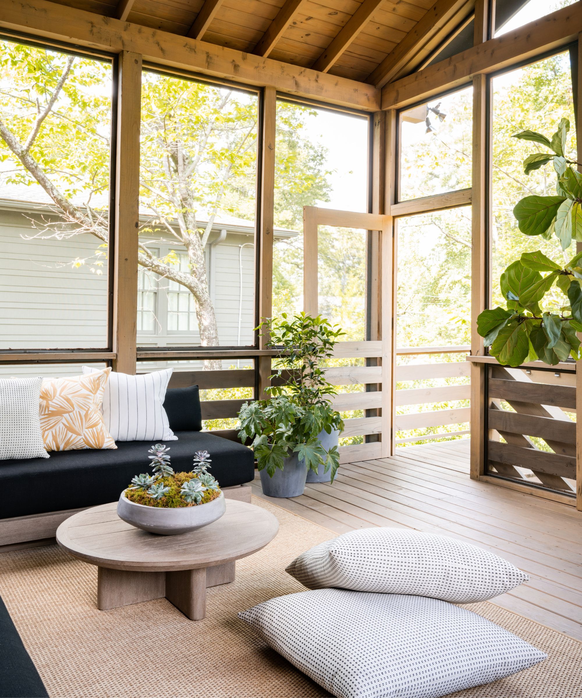
Sectional and coffee table by Restoration Hardware; Custom pillows in Perennials fabrics; Custom floor cushions in C&C Milano outdoor fabric
'The front porch and back porch are not only extensions of the home. They truly are additional living spaces. The back screened porch off the main level den serves as a private, bonus living room for the family with a dining table, sectional and low coffee table that can serve as child-level dining.
'The screened porch overlooks a HUGE backyard with a tree swing and basketball goal so it’s a great place to relax and also monitor the children. The front porch is also a living space as well as entry to the home. It is public facing so offers a different atmosphere than the more private back porch. This is a great space for Alice and Kyser to relax while also engaging with walkers/joggers and to receive the children returning from school or neighbor’s homes.'
'We request clients not be present during the installation. We love to have a “reveal” where we set up wine/cheese on the kitchen island, turn on the music, get the lighting just right. We did this process for Alice and Kyser, and it was the best experience for everyone.
'Alice and Kyser left the house for about a week, and we were able to totally install the house while they were out. When they returned, they loved everything. They called us crying as they walked room-by-room. Kyser texted us later in the day after they were at home, and he said, “Alice is beside herself. It really is magical. You went above and beyond.” Hearing from happy clients keep us going; it’s why we do this. Of course we loved the design, but a happy client is the best result we can hope for.
Photography: C.W. Newell
Designer: Still Johnson
Sign up to the Homes & Gardens newsletter
Design expertise in your inbox – from inspiring decorating ideas and beautiful celebrity homes to practical gardening advice and shopping round-ups.

Lucy Searle has written about interiors, property and gardens since 1990, working her way around the interiors departments of women's magazines before switching to interiors-only titles in the mid-nineties. She was Associate Editor on Ideal Home, and Launch Editor of 4Homes magazine, before moving into digital in 2007, launching Channel 4's flagship website, Channel4.com/4homes. In 2018, Lucy took on the role of Global Editor in Chief for Realhomes.com, taking the site from a small magazine add-on to a global success. She was asked to repeat that success at Homes & Gardens, where she has also taken on the editorship of the magazine.
-
 Zooey Deschanel and Jonathan Scott's breakfast nook is an innovative, effective use of kitchen space – it turns a 'dead area' into a cafe-style corner
Jonathan and Zooey have situated an eccentric yet elegant dining area in what may have been an otherwise underused corner
By Hannah Ziegler Published
-
 6 things you should never throw in the trash – and what to do for safe disposal instead
From batteries to space heaters, experts reveal what not to throw
By Andy van Terheyden Published
