This busy family home's clever storage keeps it neat, streamlined and elegant
Take the tour and you might discover ideas you want to use in your own home remodel
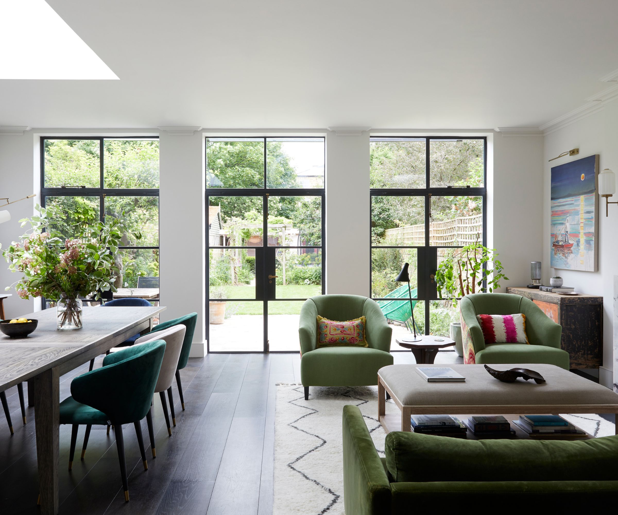

Masterfully conceived by interior designer Naomi Astley Clarke and Smith Brooke architects, this six bedroom west London townhouse was completely transformed to suit a busy family with three young children and a sweet poochon pup.
And it's an incredibly useful lesson in how to make the most of space in a tall, fairly narrow home. Packed with storage ideas that keep the family's possessions not just neat but organized, it is streamlined, smart, yet family-friendly.
'The brief was to create a warm, vibrant, fun family home which met all their practical needs, but which also captured their personalities,' says Naomi Astley Clarke. 'The new house had to work for children ranging from toddler age to teens and incorporate spaces for relaxed family living, as well as more formal entertaining.'
Take the tour with us to discover just some of the clever home decor ideas used.
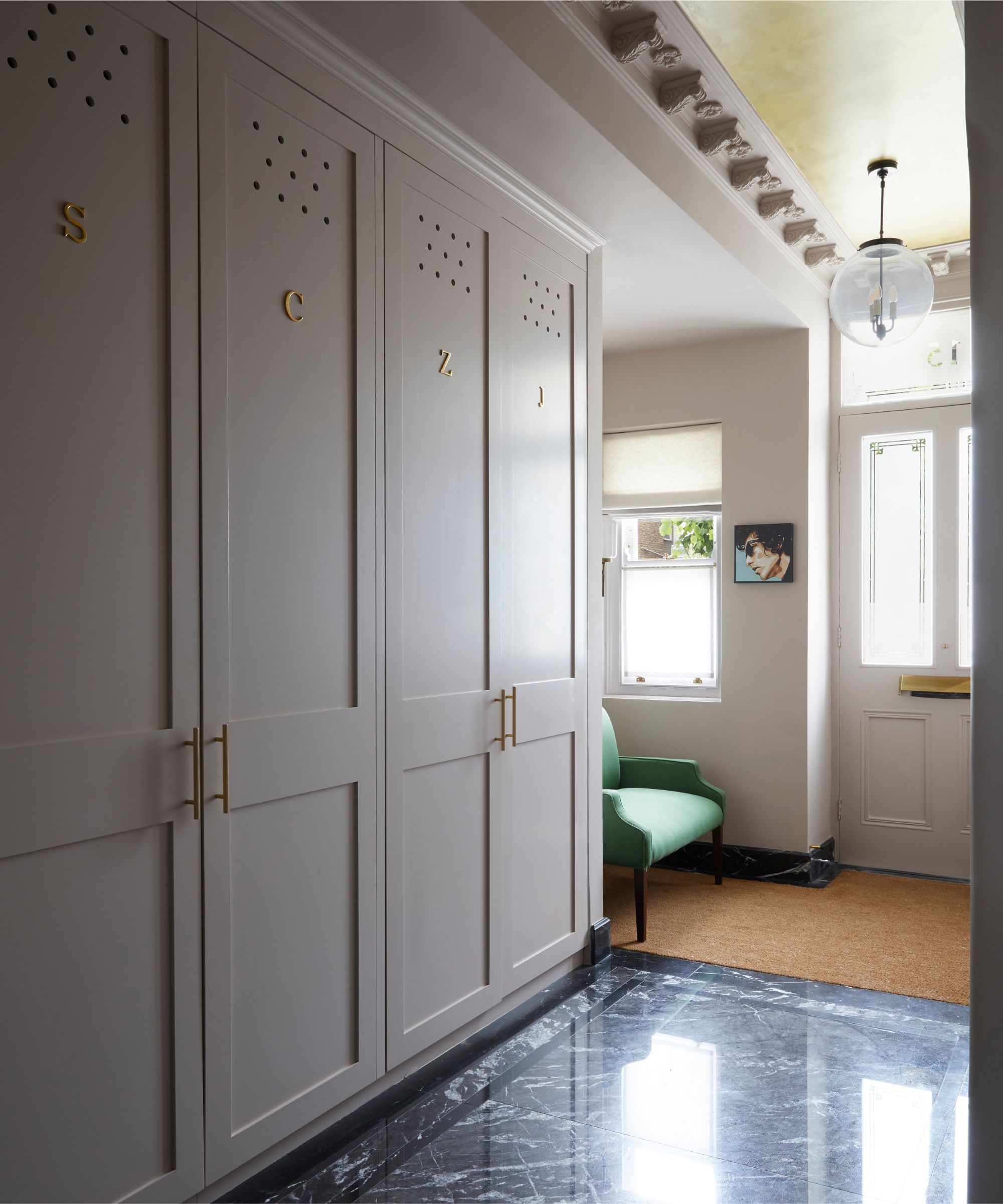
Entryway storage ideas are vital in a family home, and this series of entryway closets is ideal. Featuring a statement black marble floor from Lapicida, the entryway was enlarged to accommodate bespoke floor-to-ceiling storage, allowing mess and clutter to be easily hidden away.
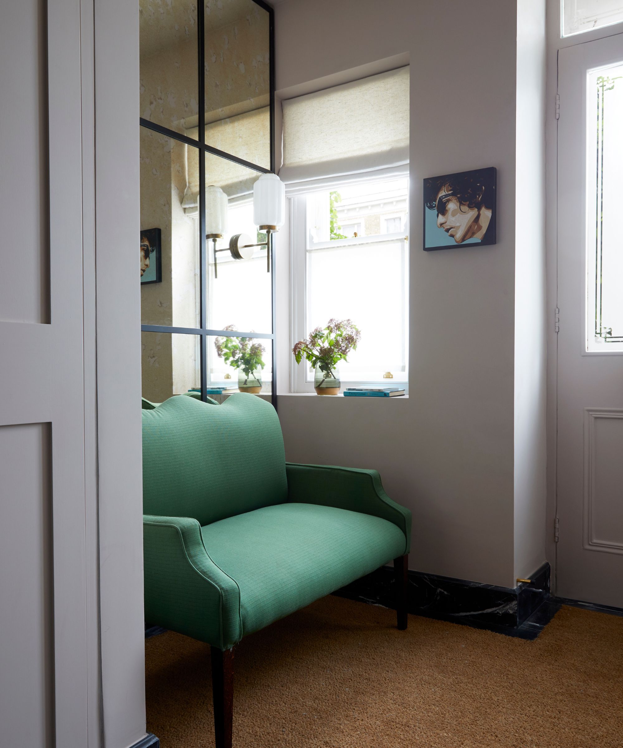
Decorating with mirrors is vital when designing a space that's naturally narrow and a little light-starved. The placement of mirrors adjacent to the front door enhances the space and reflects light back into the entryway.
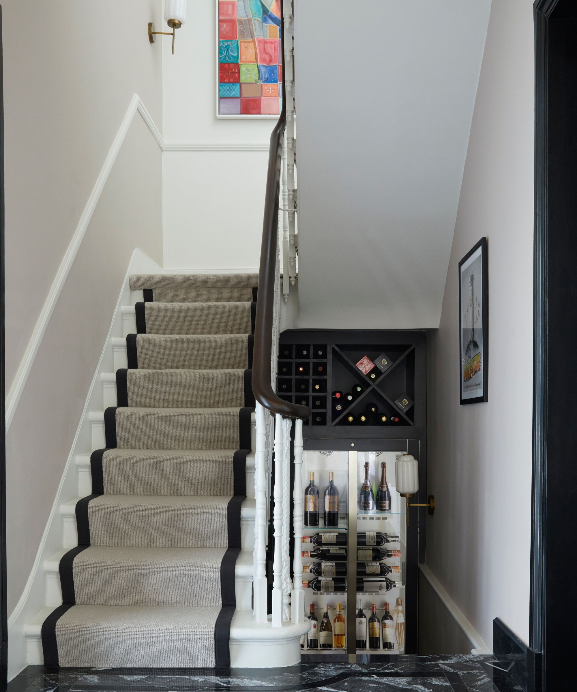
Looking for useful landing ideas? The turn in the stairs down from the entryway to the basement has been usefully employed for wine storage.
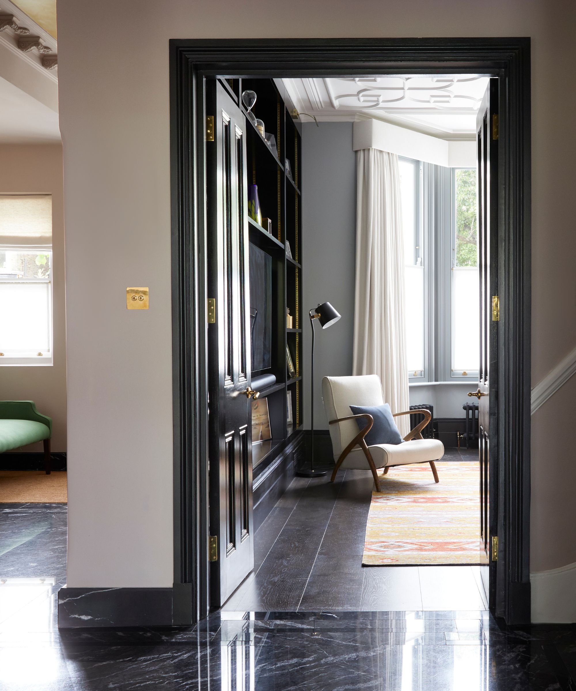
Structural changes were necessary; an extension was added to the side of the house, as well as the ground and first floor rear, and the owners decided to dig down to the basement. At the front of the house, is the living room (above).
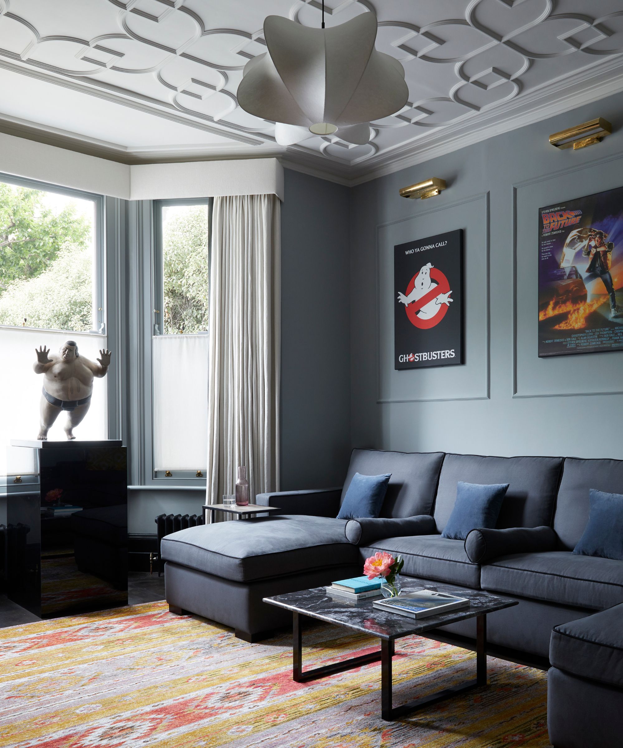
Original architectural detailing on the living room ceiling is the focal point of the space, while wall paneling adds interest to the walls, framing the artwork.
On the ground floor, the sitting room and kitchen doors were placed directly opposite one another, ensuring an easy, open flow throughout the entire space.
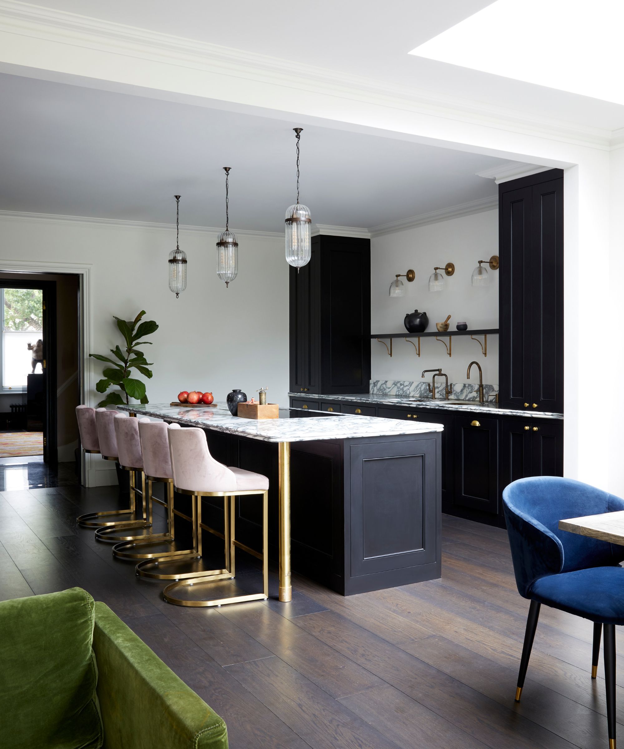
With fantastic, uninterrupted garden views, the open-plan kitchen features both a more formal dining area and a relaxed, soft, seating zone where family and friends can gather in a more casual way.
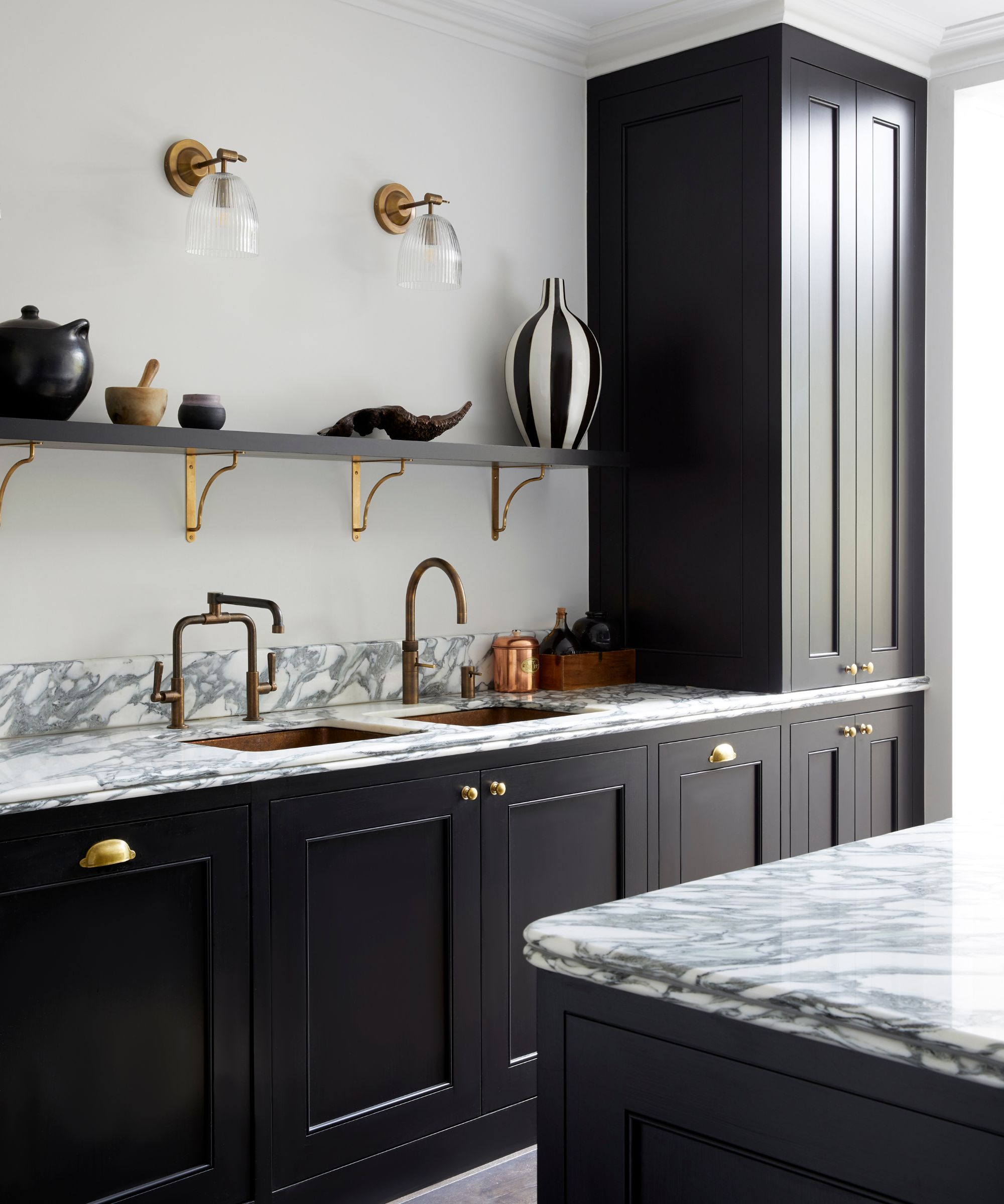
The kitchen itself showcases a mix of both classic and contemporary style; hand painted, traditional style cabinetry is contrasted with warm brass finishes and dramatically veined marble countertops, bringing a modern edge to the room.
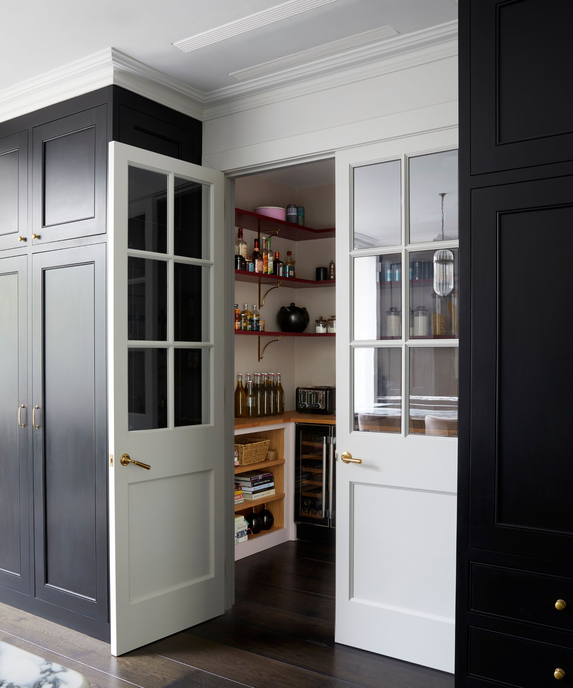
A beautifully arranged and organized walk-in pantry provides much needed storage space for dry ingredients, cookbooks, coffee, tea, oils and small appliances.
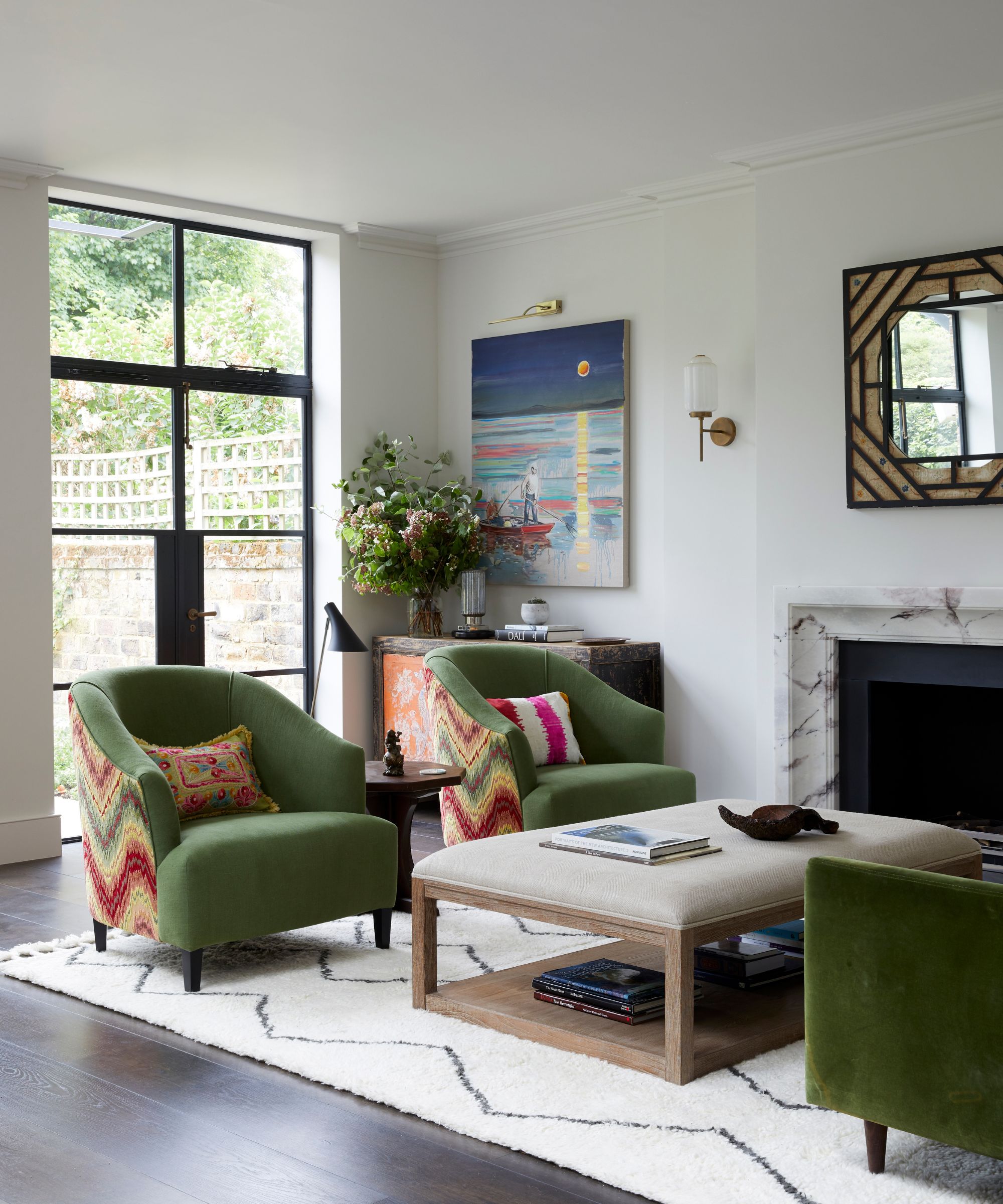
At the far end of the kitchen is an informal seating area that gives on to the garden.
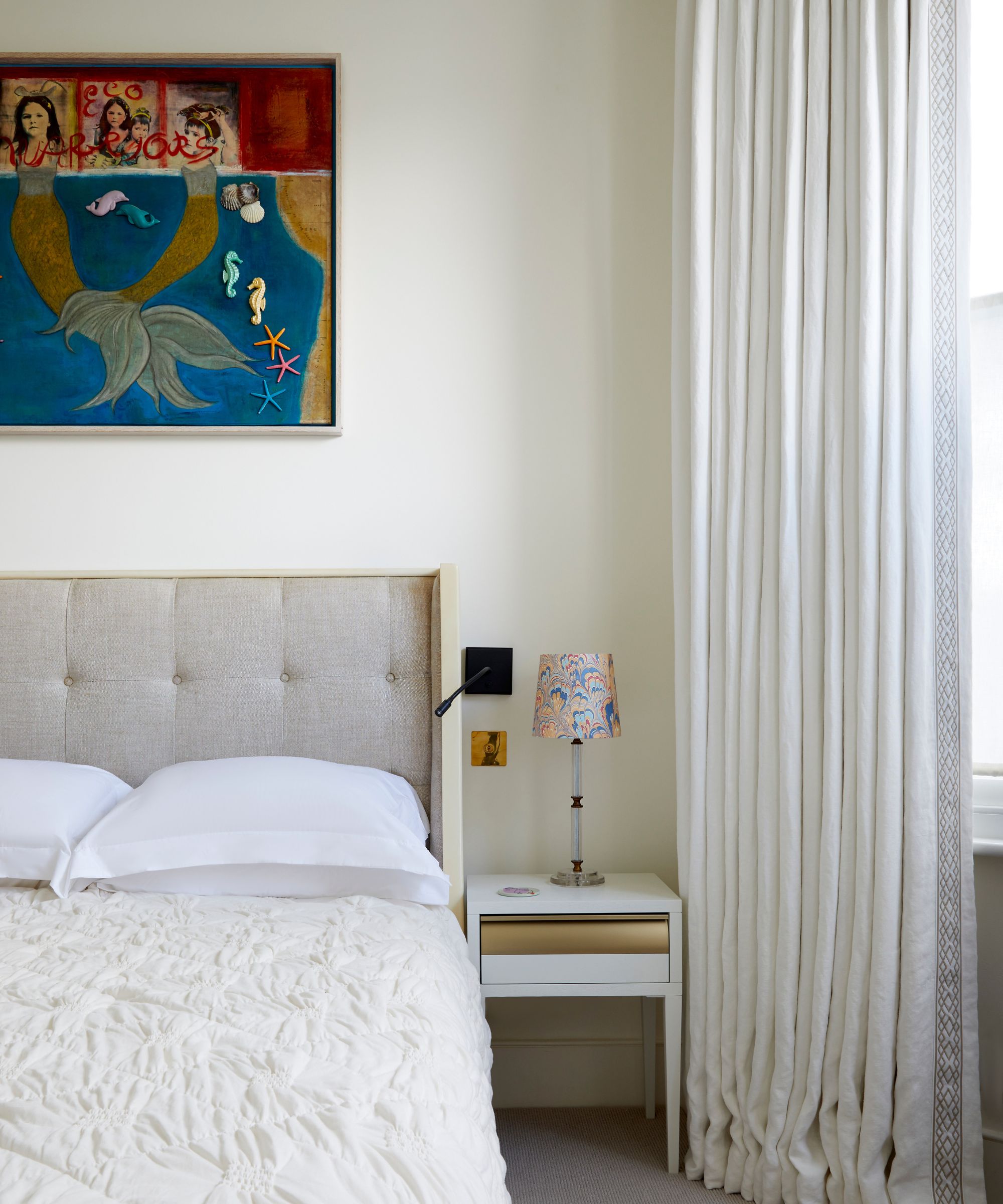
Whilst an inviting, convivial atmosphere was essential in the main living areas, the bedrooms were to be calm and restful. The color schemes of the main and guest bedroom were kept deliberately quiet, with various soft furnishings and the owners’ artwork collection providing lively pops of color and visual interest.
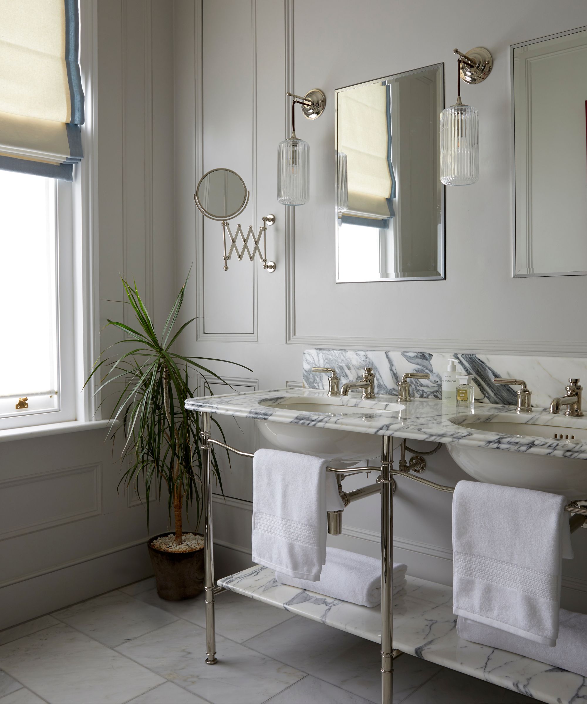
Chosen for their classic beauty and timeless feel, Drummonds' bathroomware was specified for each of the property’s four bathrooms, as well as the ground floor cloakroom.
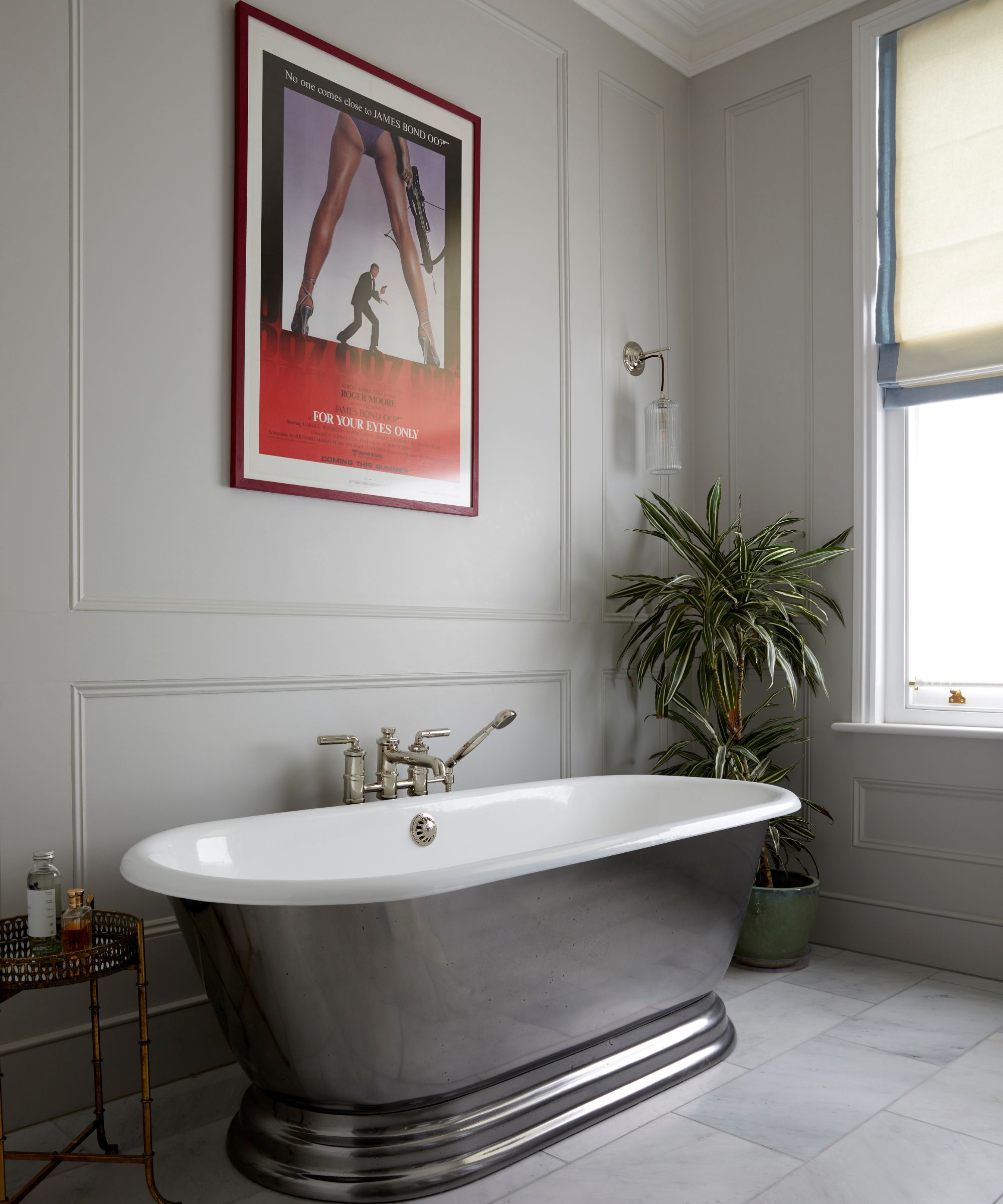
Subtly elegant and showcasing a cool, calm palette, the main ensuite places the Meon bath in a polished finish and the Double Ladybower Vanity with Calacatta marble, in center stage.
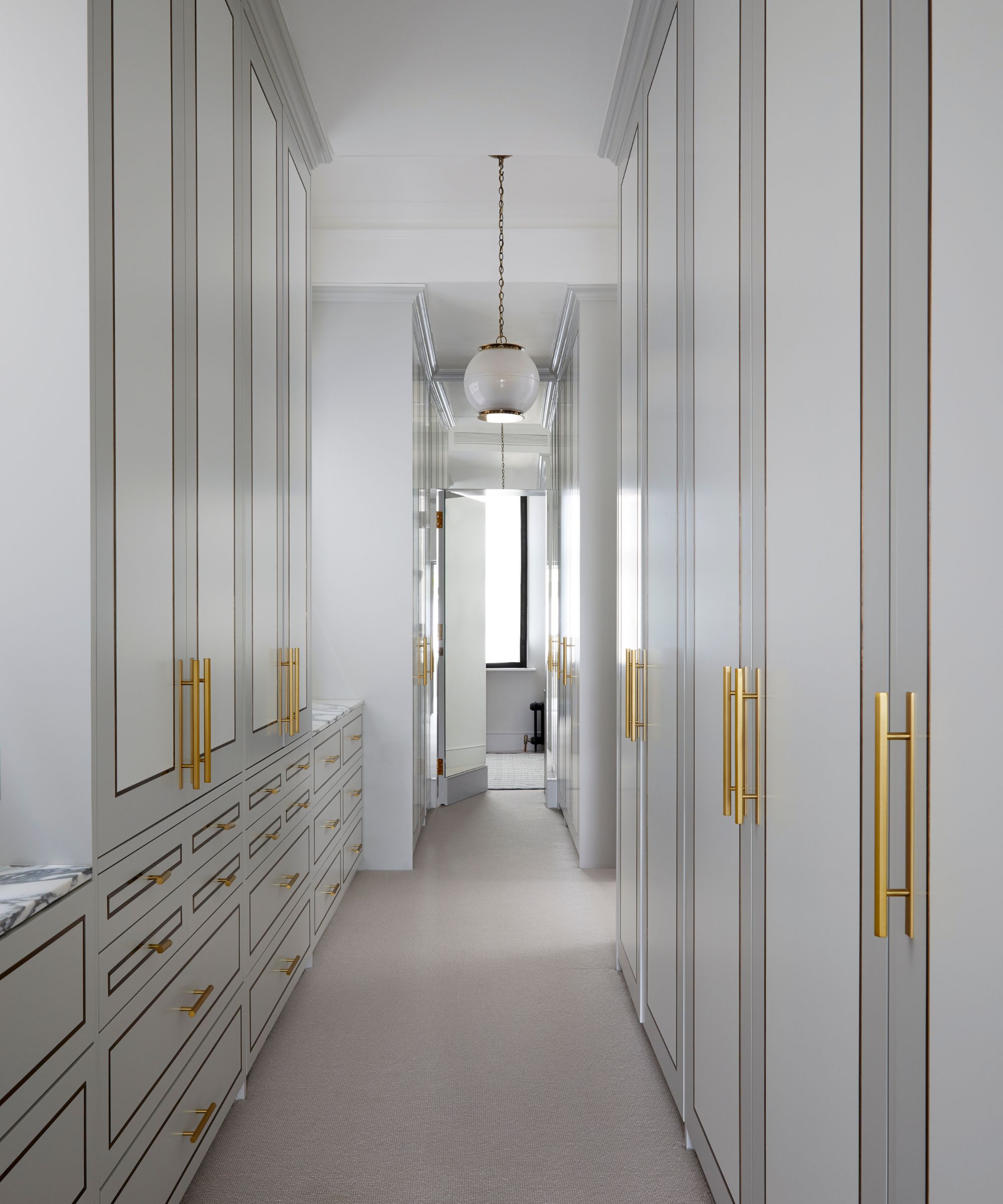
Fabulously positioned, the ensuite leads out to the bespoke dressing room which features spacious floor to ceiling closets, and a similar color scheme of dreamy neutrals, contrasted with warm, brass handles.
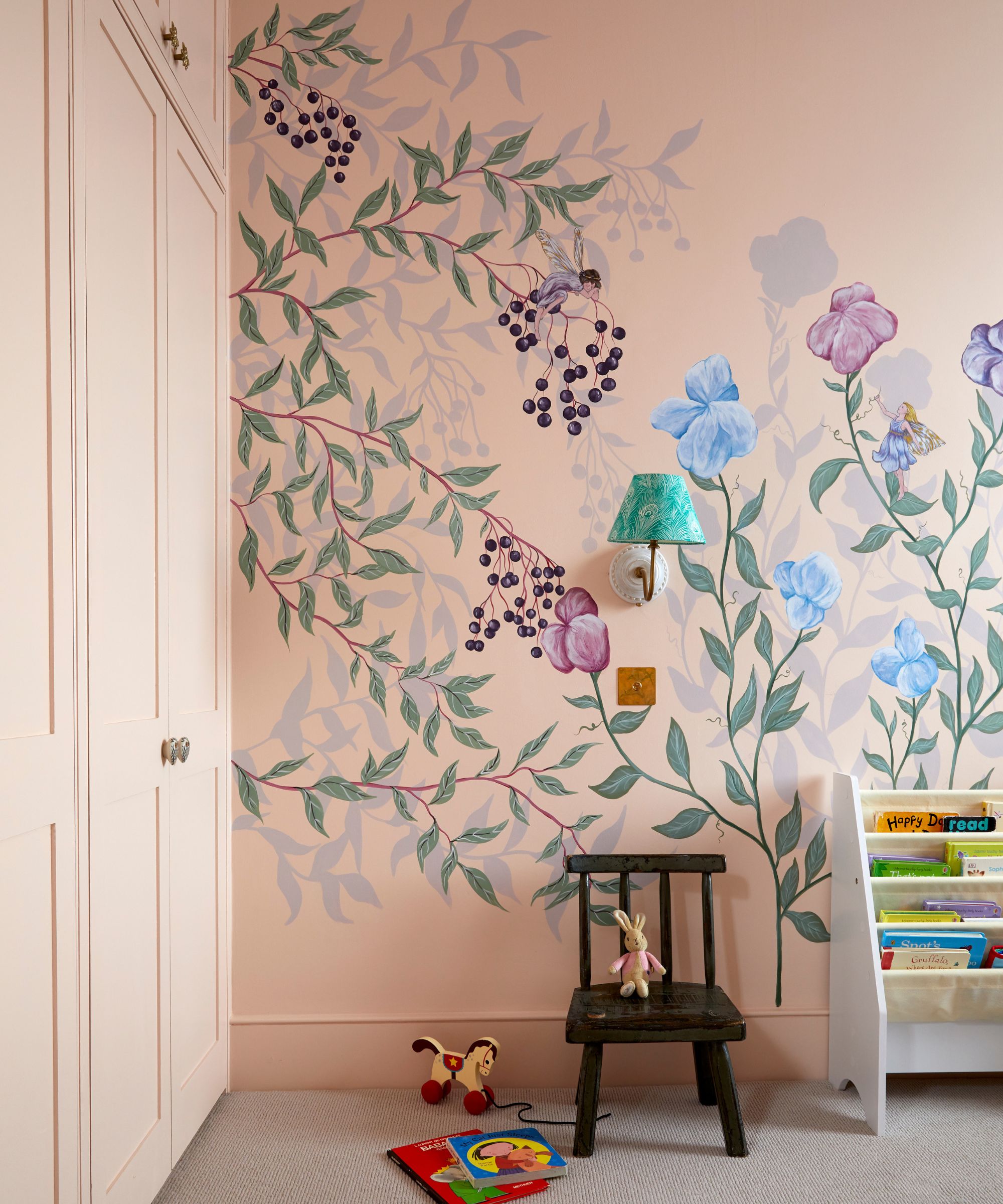
For the children’s bedrooms, pinks, blues and bold, hand painted murals bring a young, vibrant and personalized feel.
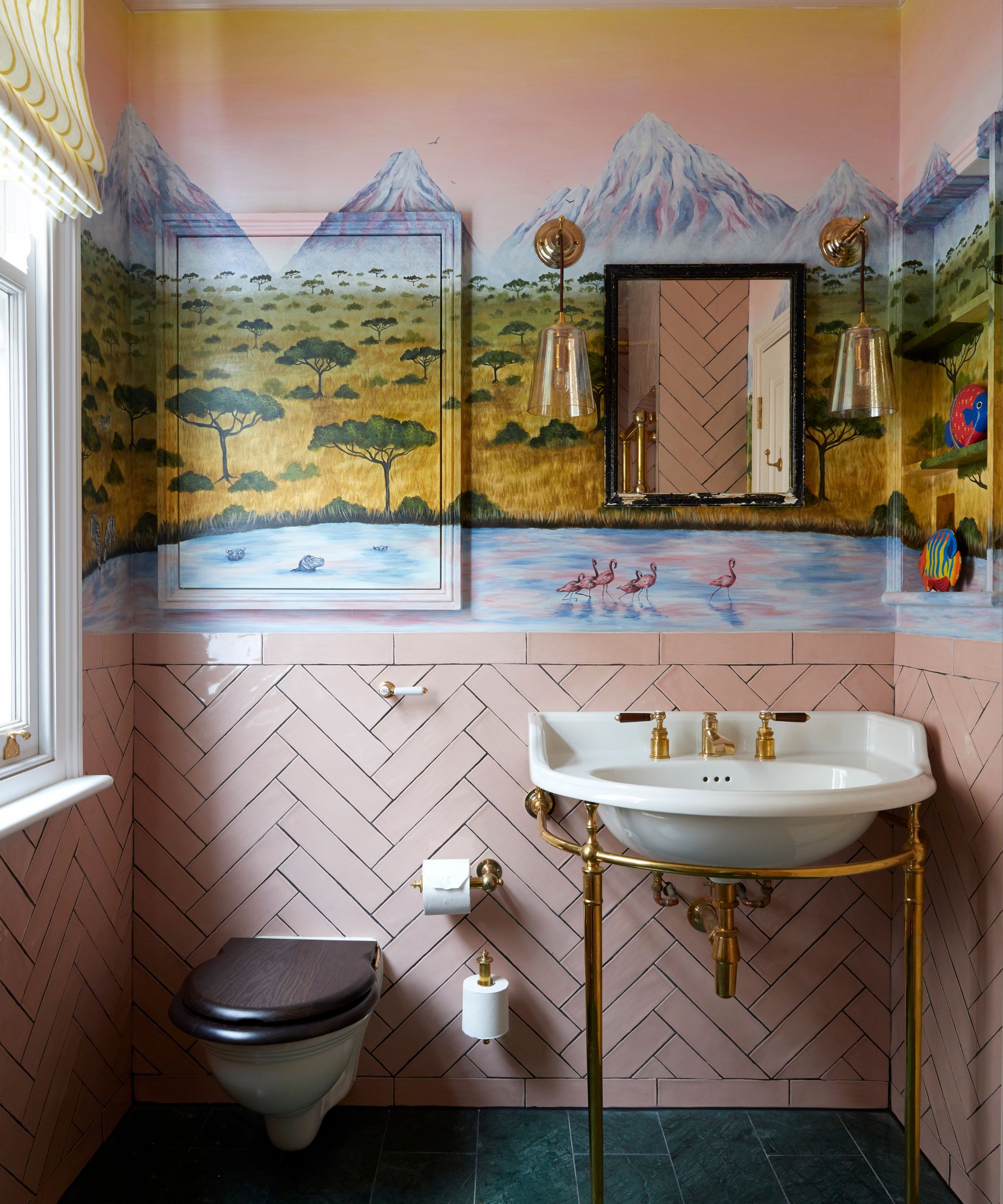
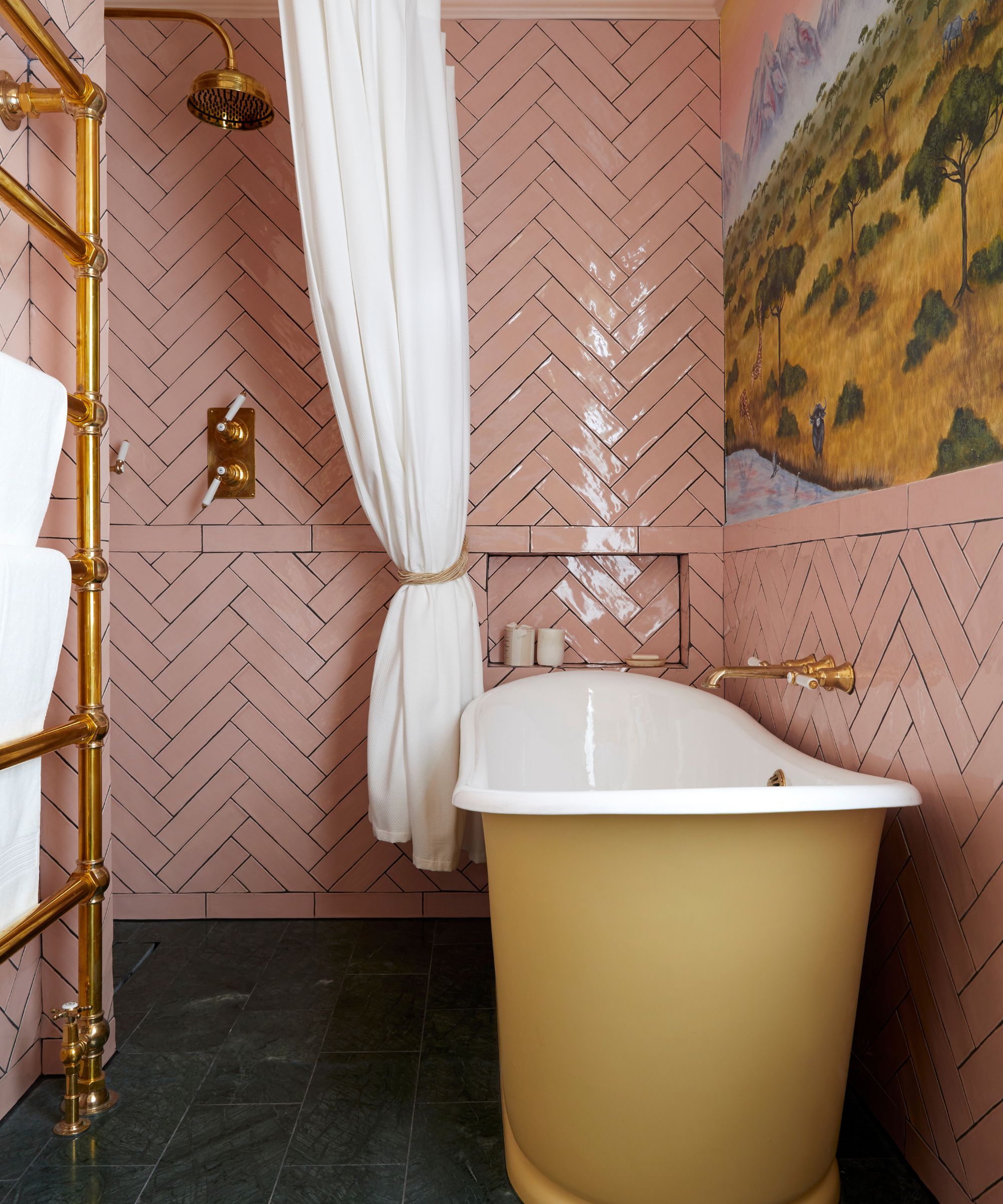
On the top floor, the girls’ bathroom combines candy pink tiles and bespoke mural art with classic brass fittings and a handpainted yellow Usk bath, achieving just the right blend of the playful, and the timeless.
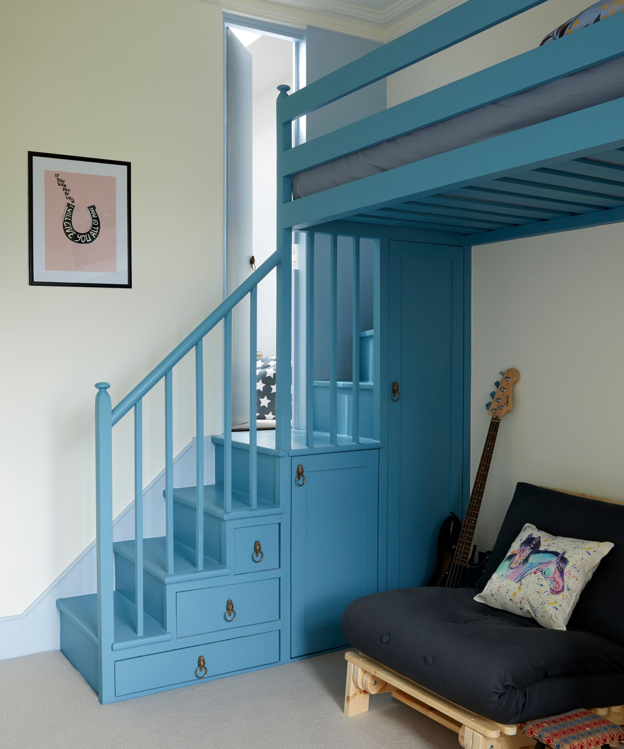
Clever bedroom storage ideas include these clever drawers and cabinets built into the steps up to the loft bed.
Interior design / Naomi Astley Clarke
Architecture / Smith Brooke Architects
Sign up to the Homes & Gardens newsletter
Design expertise in your inbox – from inspiring decorating ideas and beautiful celebrity homes to practical gardening advice and shopping round-ups.

Lucy Searle has written about interiors, property and gardens since 1990, working her way around the interiors departments of women's magazines before switching to interiors-only titles in the mid-nineties. She was Associate Editor on Ideal Home, and Launch Editor of 4Homes magazine, before moving into digital in 2007, launching Channel 4's flagship website, Channel4.com/4homes. In 2018, Lucy took on the role of Global Editor in Chief for Realhomes.com, taking the site from a small magazine add-on to a global success. She was asked to repeat that success at Homes & Gardens, where she has also taken on the editorship of the magazine.
-
 Thoughtful modernism – how one Dallas home makes bold contemporary design feel warm, welcoming, and comfortable
With its mix of textural finishes and carefully curated furnishings, this modernist home is a refreshing retreat
By Karen Darlow Published
-
 'Wick away the ick' – 6 things people with clean laundry rooms always do to make this hardworking space shine
These tips on how to clean your laundry room will banish grime
By Seraphina Di Mizzurati Published