Bold colors and pale wood cabinetry redefined this home – here the architect talks through the dramatic transformation
Expect the unexpected in this family home redesign, where cabinets double as walls and primary colors make a splash
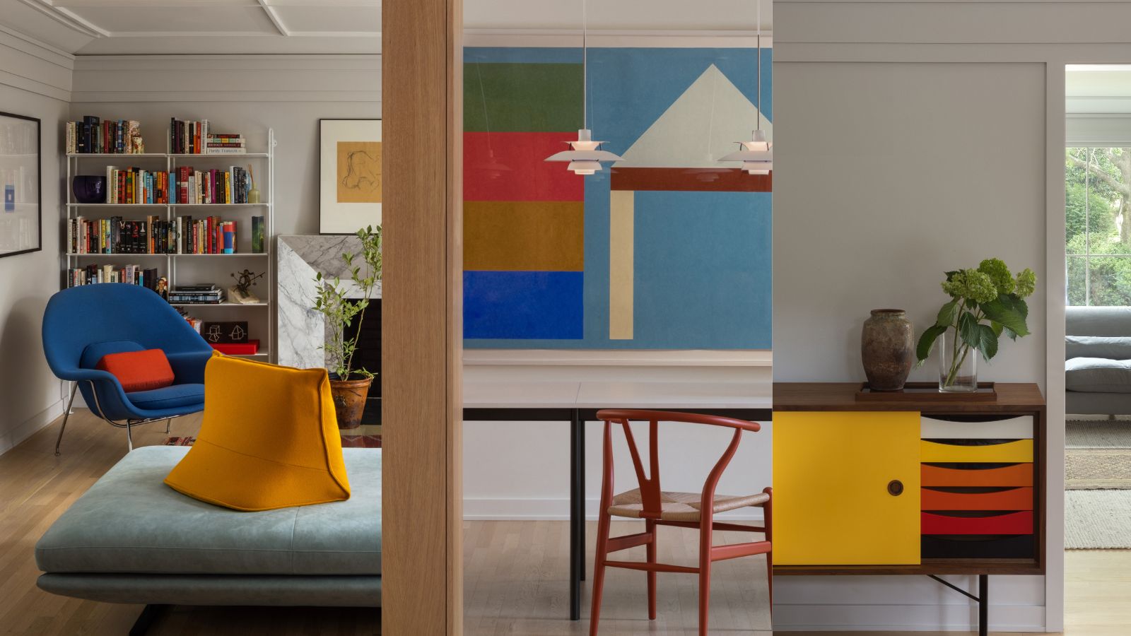
Call in an architect to rework the exterior and interior of your home and prepare for a dramatic transformation in the house design.
The new owners of this 1985-built, colonial-style home in Northwest, Washington D.C. were keen to give it a new look inside and out. Looking to commission an architect to rework the inside and outside of the home, the couple brought in the team from local firm Fowlkes Studio, whose principals VW and Catherine Fowlkes, together with colleague Brett Promisloff, set about redefining the space. Both homeowners are Italian and spend a lot of time in Europe so they wanted to bring some old-world sensibilities to the house along with some color and panache.
'The proportions of the rooms were pleasing but there was very little architectural personality,' says VW Fowlkes. 'But the result after the 10-month construction project is an eclectic and sophisticated mix of playful color layered over restrained bones. It serves the clients’ appetite for commingling historicist and modern detailing.'
Take the tour to get the architect's eye view of the home's stunning new look.
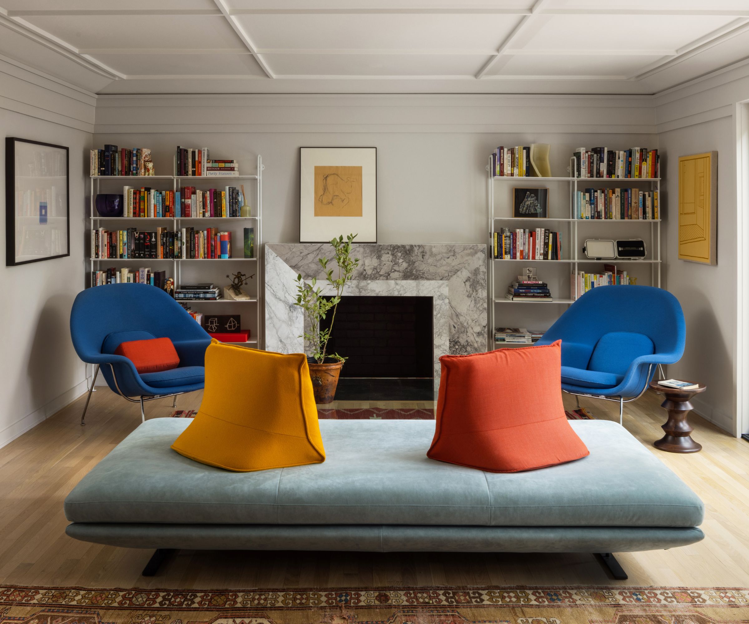
The house is a tale of two halves, with a central hall splitting the two. The left side has two living rooms and the right has a dining room/kitchen and butler's kitchen.
'The living room side is dignified and more formal,' says architect VW. 'The kitchen-dining side is a place to cook, eat and argue – where the aesthetic is more stripped down, more natural, and less partitioned.
'There was little in the way of hierarchy, however,' he adds. 'The rooms had an equivalency that made it feel repetitive.'
The Fowlkes Studio team remedied this with their family living room ideas adding 'sticking' to the family room ceiling (pictured above), creating shadow and texture, and playing with varied trim and molding throughout.
'The family room mantel was replaced with a new honed super white marble fireplace, flanked by metal bookshelves, amping up the scale and created a focal point in the otherwise plain room,' says VW.
The addition of standout pieces of contemporary furniture and furnishings in bold, primary colors creates the perfect setting for lively family fun.
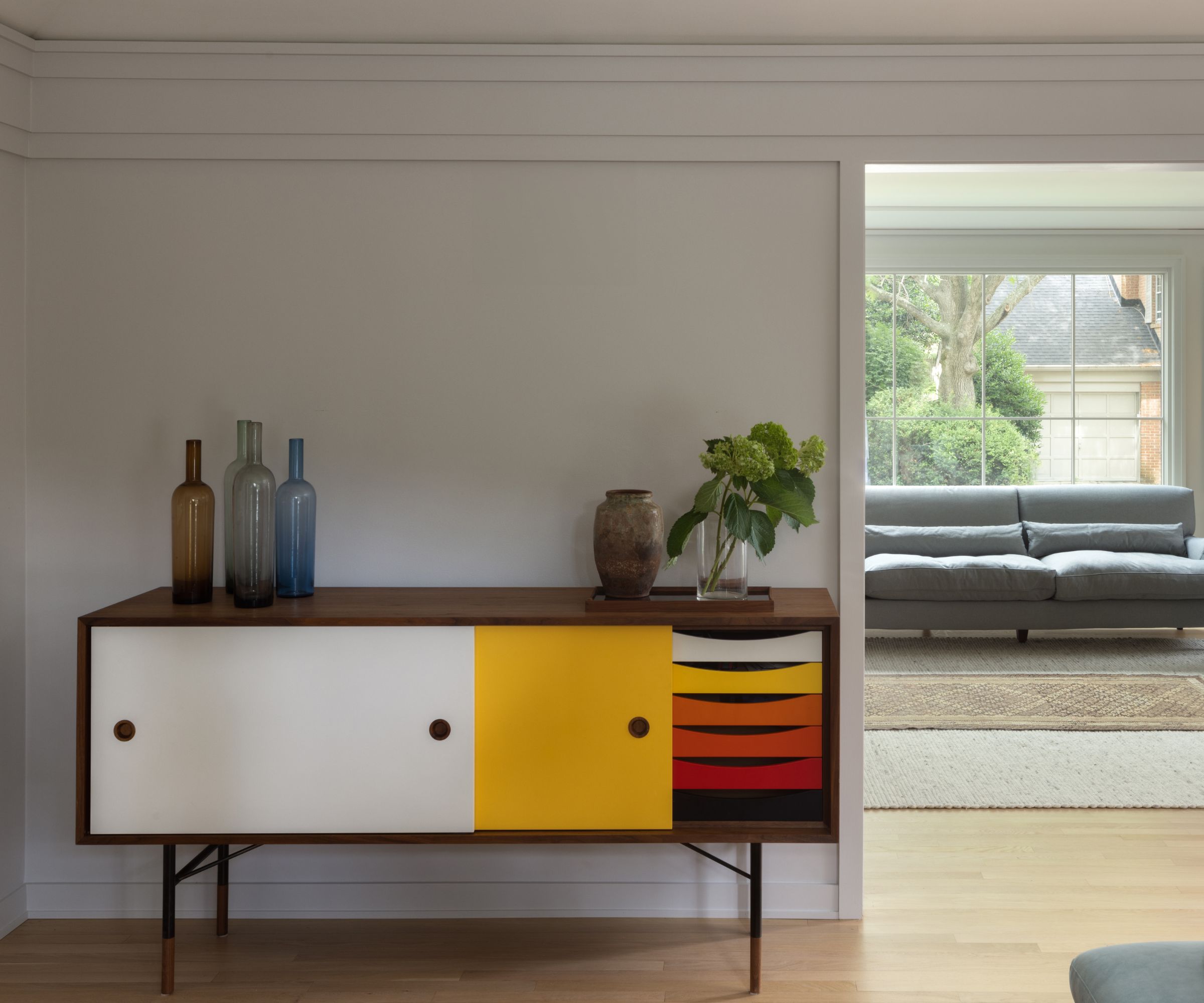
An open doorway from the playful family room looks towards the more formal living space and although different in design and treatment, the two spaces are now more sympathetically linked, particularly since they share the same flooring in pale wood, a theme which recurs throughout the home. The brightly colored cabinet is the perfect storage piece for the family room.
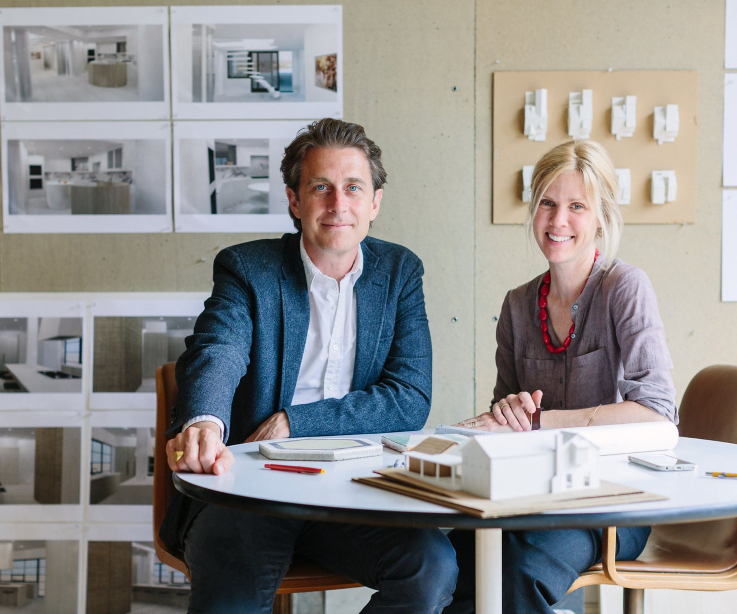
Founded in 2009 in Washington DC, Fowlkes Studio is an architecture and interior design studio committed to thoughtful design that celebrates craft and strives to represent the personalities of its clients with considered residential projects that are beautiful and unexpected. 'In this project we got to take some risks with the two-toned cabinets and the high-relief trim and it paid off,' says VW. 'I think the project benefited from the sophisticated creative direction from the clients who were great collaborators,' adds Catherine.
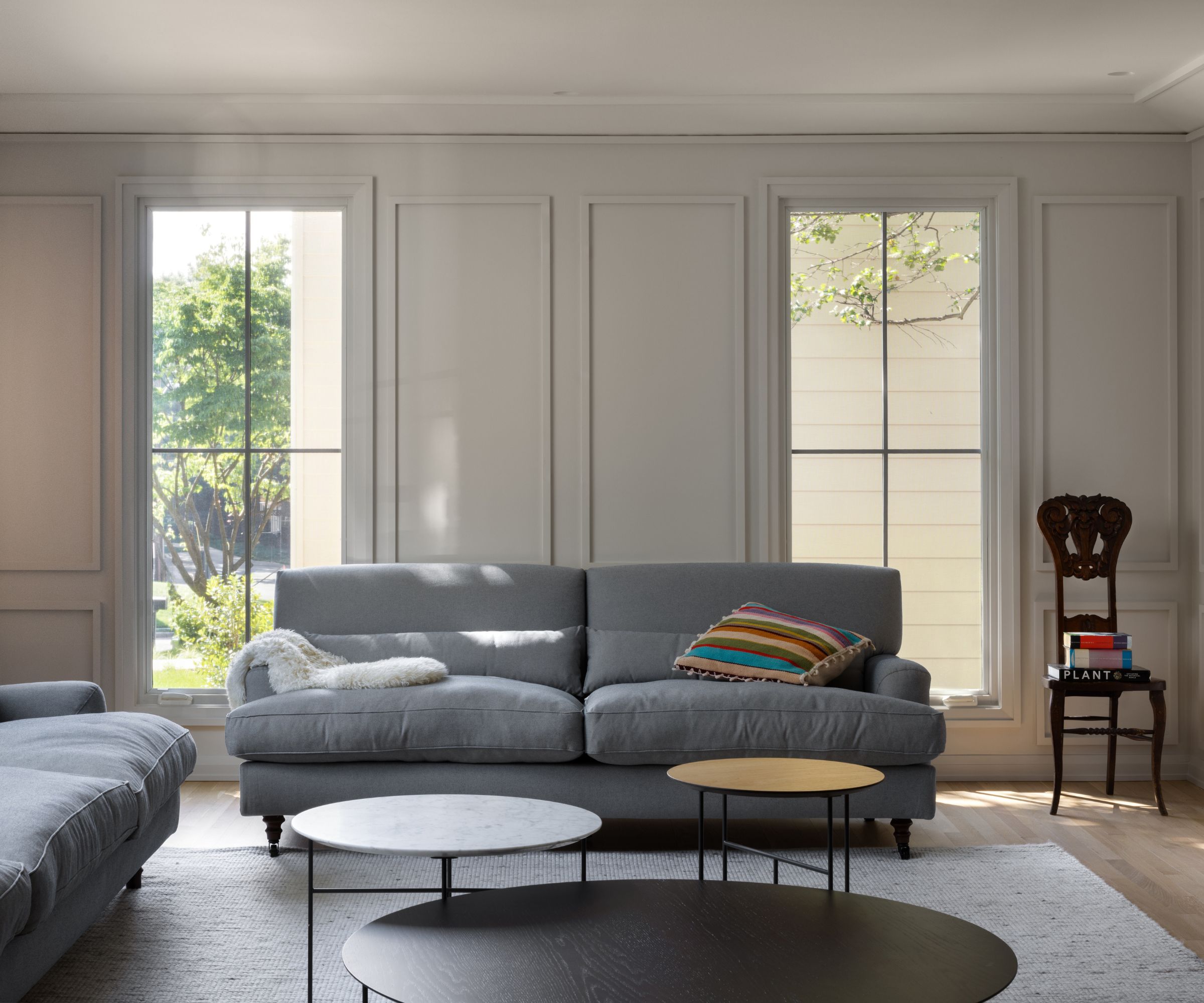
Living room ideas for the more formal of the two living rooms, included adding a custom-designed crown molding on the walls and ceiling. This addition was an experiment in layering, and is one of the architects' favorite elements of the whole project.
'The high-relief sticking, puffy furniture and elongated windows are an antidote to stuffy drawing room style, while staying within its vocabulary,' says VW. 'Topping the Farrow & Ball Ammonite walls is a subtly beveled crown molding that, instead of creating a tight fit between ceiling and walls, intentionally leaves a crack to let the steam out of the room.'
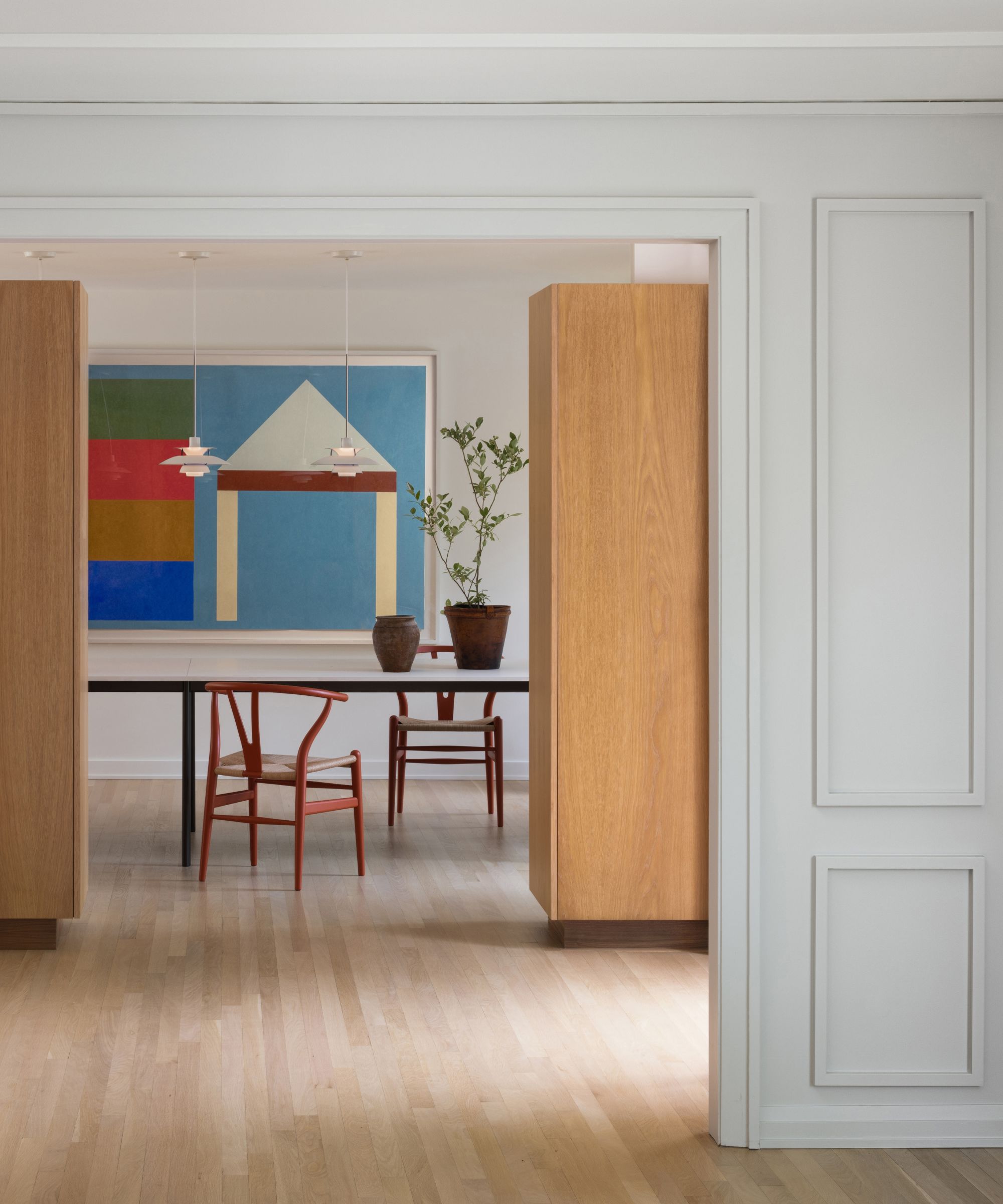
One of the homeowner's must-haves was a big, comfortable dining room, and the architects' dining room ideas were central to their reworking of the whole downstairs layout. The hallway wall that divides the front hall from the dining room was entirely demolished and replaced with a continuous run of freestanding millwork, which stands two feet short of the first-floor ceiling.
'These cabinets serve as a partition, but they also do a lot of work,' explains Fowlkes Studio's principal VW Fowlkes. 'The first stretch houses the coat closet and is accessed from the hall. The second run, adjacent to the dining room table, accommodates the family’s heirloom china and crystal. The cabinet then stretches into the kitchen where flipper doors expose a coffee station.'
Pops of primary colors bring the new dining space to life, with a bright artwork and tomato red wishbone chairs around a table from &Tradition. The pendant lights over the table are from Louis Poulsen.
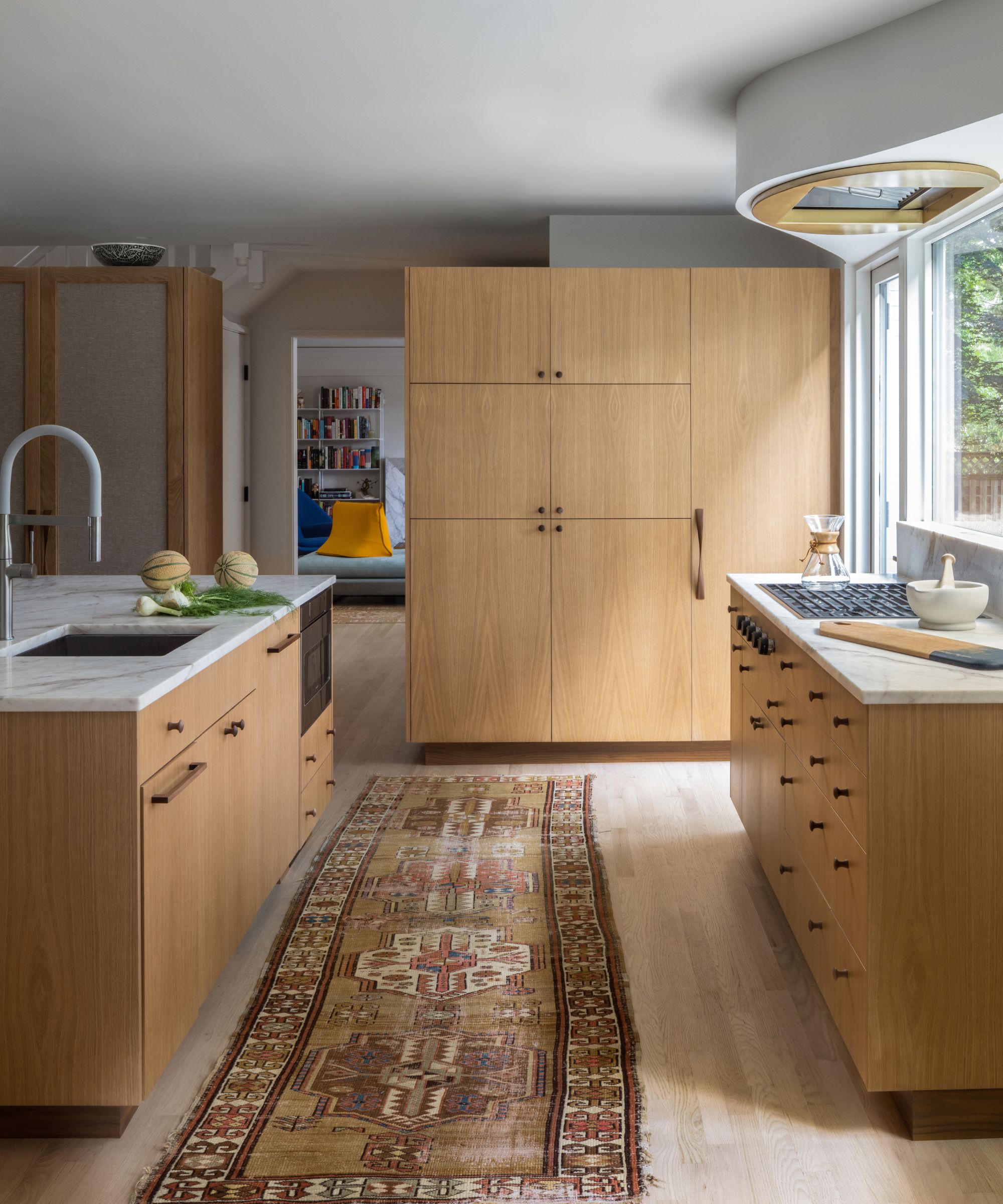
The new cabinetry is key to the kitchen ideas, gently defining the new spaces. The central island marks the only division between the dining space and the working part of the kitchen, while taller cabinets take the place of walls around the perimeter.
The cabinet door fronts are solid oak panels in the kitchen and switch to burlap fabric (to the left of the picture, above) in the dining room. The countertops are honed Saffron White Marble and both faucets are Grohe Essence, with appliances from Wolf and SubZero. A vintage runner contributes additional textural interest and warmth of color.
'The cabinetry is in wirebrushed white oak with walnut toe kicks, handles, and tops (which you can see when walking up the stairs),' says VW. 'The mixed-species (oak and walnut) vocabulary reoccurs throughout the project including the owner’s suite, front hall, kitchen, dining and prep kitchen.'
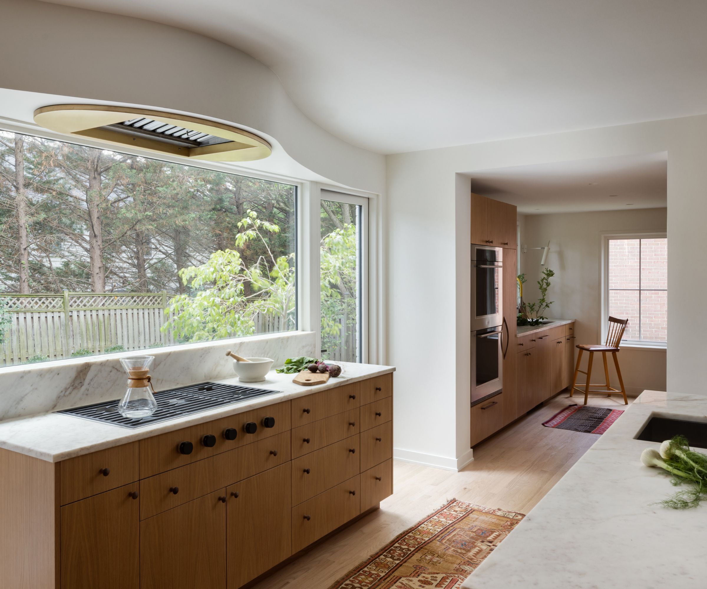
At the back of the primary kitchen space is a butler's pantry that doglegs into the area of what was previously a laundry room. This space is a useful addition as an out-of-the-way service kitchen where dirty dishes can be piled out of sight from the open-plan kitchen-dining room.
And what of the striking architectural feature above the window here? VW explains: 'Although most of the windows in the house have traditional four-part sticking, the windows in the kitchen, which face the back yard are single lite to maximize light and contribute to the more contemporary character of the space.
'The header over these windows bulges out into the room,' adds VW, 'creating an organic foil to the rectilinear cabinets. The bulge engulfs the built-in range hood over the stovetop and it mirrors the curvilinear form of the terrace outside on the other side of the window.'
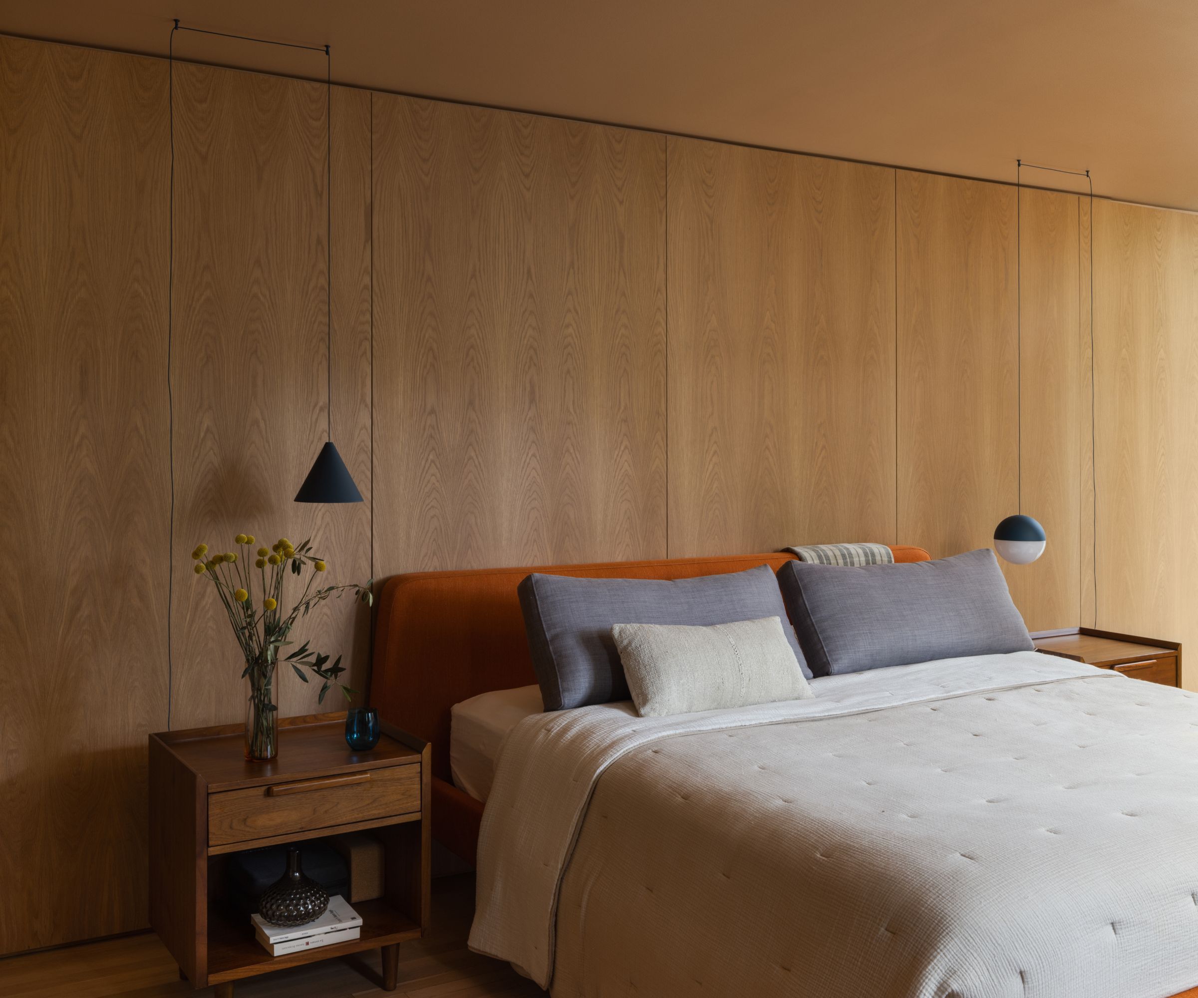
Upstairs, other than paint, floors, and bathroom updates, the work was confined to the primary suite where two bedrooms and a bathroom were combined. Explaining the bedroom ideas, architect VW says: 'The space is organized around an oak bed wall that recalls the form, material, and function of the downstairs millwork. This wall separates the bed chamber from the closets which, in turn, lead into the bathroom.
The reading lights are a cone and sphere string light by FLOS, their pleasing asymmetrical arrangement adding a playful touch, along with the russet headboard.
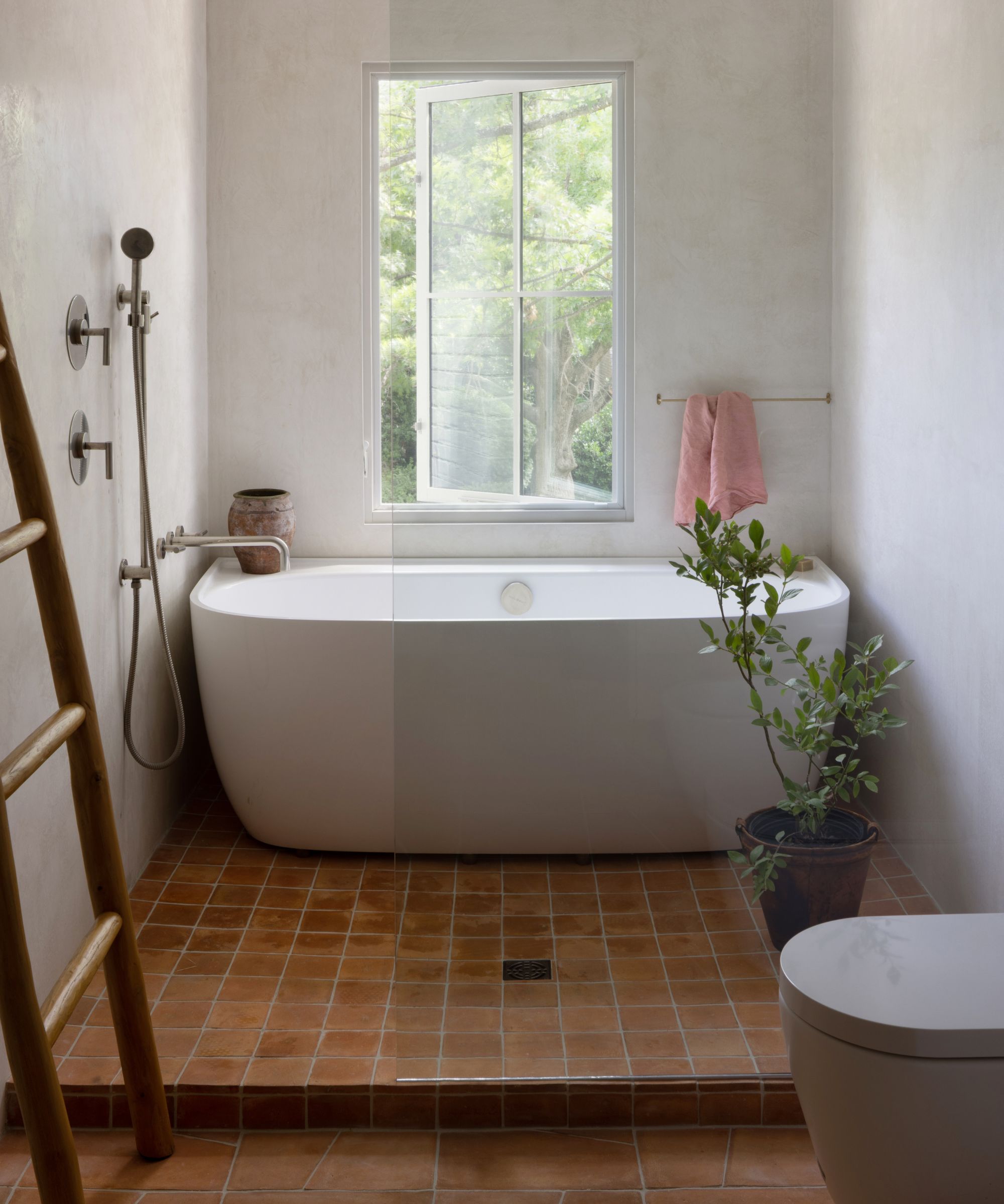
In the ensuite, geometric terracotta Zia tiles and Venetian plaster on the walls give the space a European edge. The plumbing fixtures are Phylrich Transition Line in Burnished Nickel and the soaking tub is by Victoria + Albert.
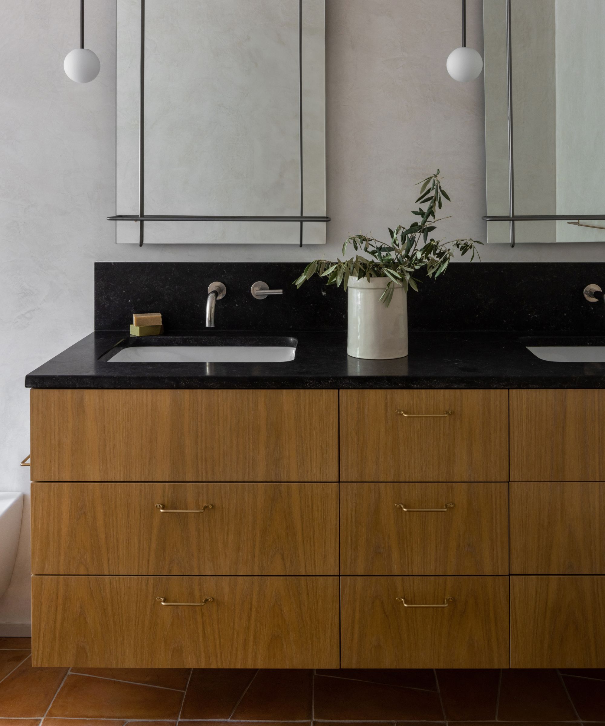
The vanity sink with its white oak millwork offers a fresh take on old-world charm. with a countertop in honed Petite Blue limestone
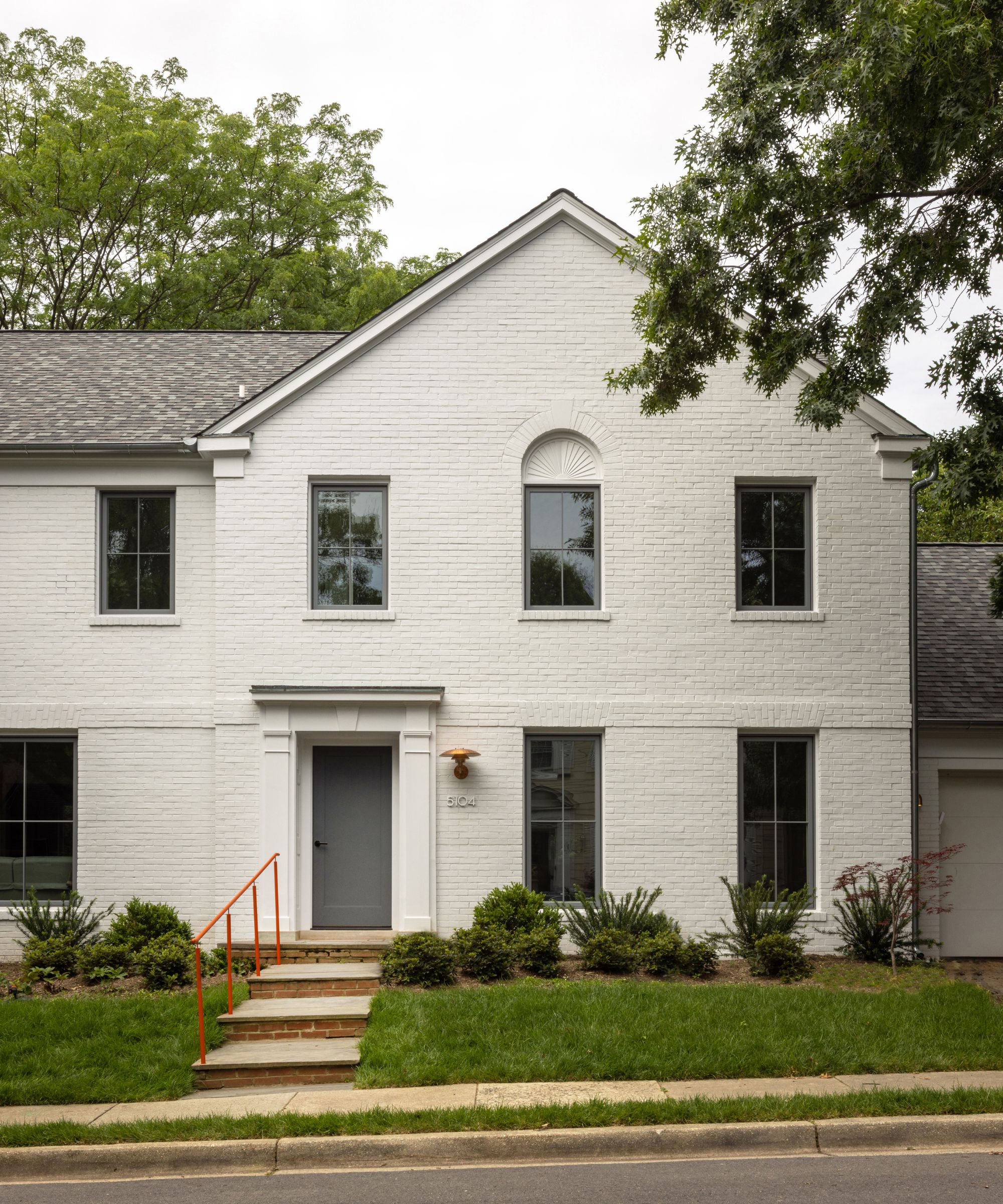
'We wanted to improve the curb appeal but given that we would not be changing the shape of the structure, we tried to make the front of the house more stylish and less fuddy-duddy,' says VW Fowlkes.
'We removed the shutters, painted the red brick and replaced the double-hung windows with gray casements. The six-panel front door was replaced with a single-panel leaf that matches the color of the widows. We placed a copper Poul Henningsen light next to the front door and we replaced the iron rail on the lead walk with a new bright-orange custom steel handrail, which, against the restrained exterior color palette and detailing, exemplifies the sensibilities of the project as a whole.'
Sign up to the Homes & Gardens newsletter
Design expertise in your inbox – from inspiring decorating ideas and beautiful celebrity homes to practical gardening advice and shopping round-ups.
Karen sources beautiful homes to feature on the Homes & Gardens website. She loves visiting historic houses in particular and working with photographers to capture all shapes and sizes of properties. Karen began her career as a sub-editor at Hi-Fi News and Record Review magazine. Her move to women’s magazines came soon after, in the shape of Living magazine, which covered cookery, fashion, beauty, homes and gardening. From Living Karen moved to Ideal Home magazine, where as deputy chief sub, then chief sub, she started to really take an interest in properties, architecture, interior design and gardening.
-
 How to get rid of bean seed flies – a pest control expert reveals how to keep crops safe from these seed munchers
As their name implies, these insects primarily feed on bean crops
By Tenielle Jordison
-
 Sarah Michelle Gellar's kitchen cabinets are moody yet elevated – I've always used dark paint with caution, but they make bolder tones accessible
The actress's black kitchen cabinets are bold yet palatable, proving that this dark shade is a trendy yet timeless color pick
By Hannah Ziegler