Designer Elizabeth Hay uses endless layers of color and pattern to elevate the modest proportions of this new-build apartment
The British interior designer is a master at reviving ordinary spaces with her distinct layered and charming look. Here's how she achieves it
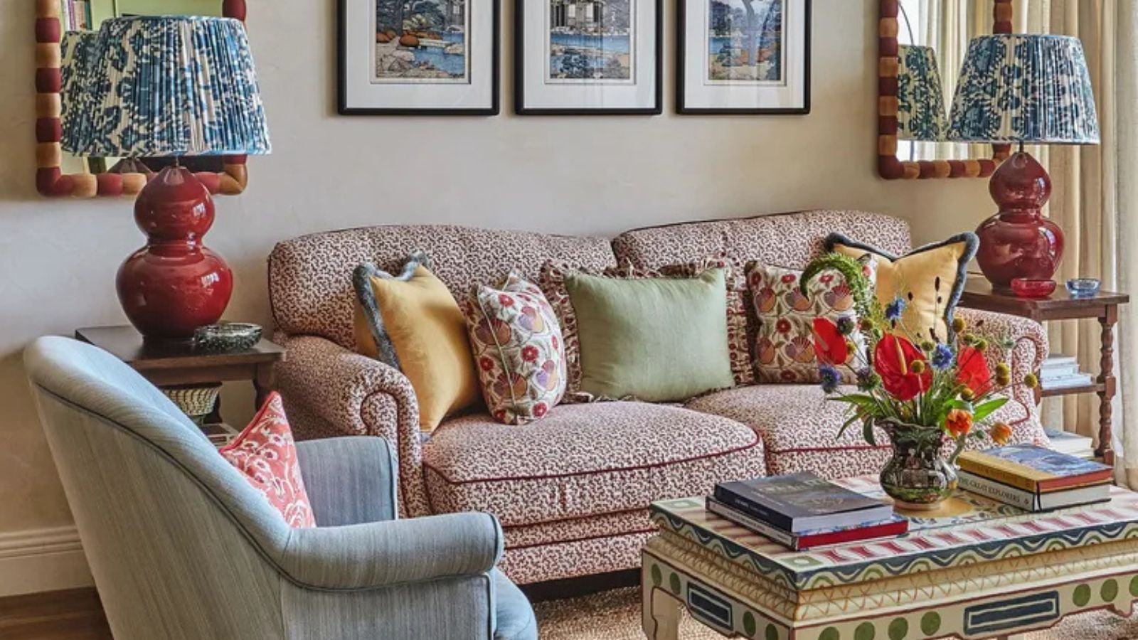

Down to the clever skills of one designer, this property that started life as a bland and sterile new build is now unrecognizable. It's a lesson in how to decorate with pattern in a way that doesn't overwhelm a space, but elevates it.
'When you're in this apartment, it feels like you’re in a cozy cottage,’ says Elizabeth Hay of this duplex in a modern apartment block in Singapore – her most recent project. The interior designer has worked her magic to transform what was once a soulless new build into a homely haven that showcases her signature style of layers, patterns, and color.
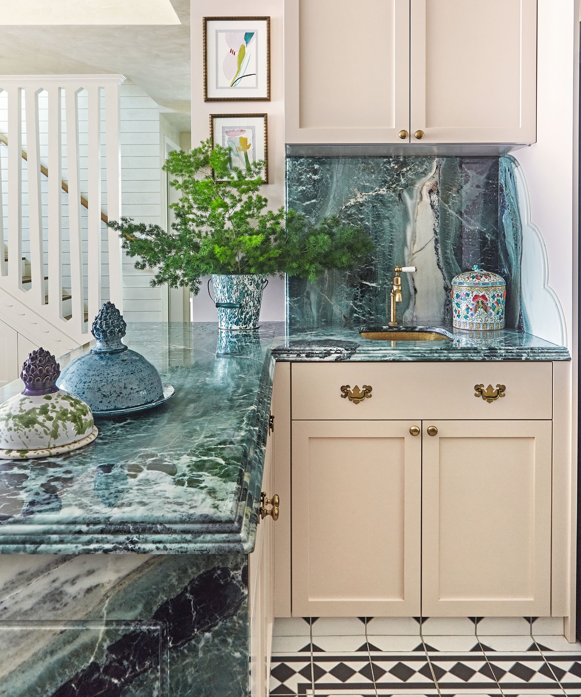
Cabinetry in Tippy Taupe, Dulux. Floor tiles, CE.SI. Ceramica.
Having worked with the clients previously, Elizabeth was naturally the go-to when they bought a larger property. ‘The client is a big supporter of my work and has always loved the style that I bring. She wanted the apartment to be very cozy with lots of layers and color, but practical too as they have a young child.’
The compact space presented certain challenges, particularly due to the profession of the husband of the homeowner couple as a professional chef. ‘Originally, when you first walked into the apartment, there was a much smaller galley kitchen. The husband very much wanted two separate kitchens, which is quite common in Asia, so we had to open the space up,’ says Elizabeth.
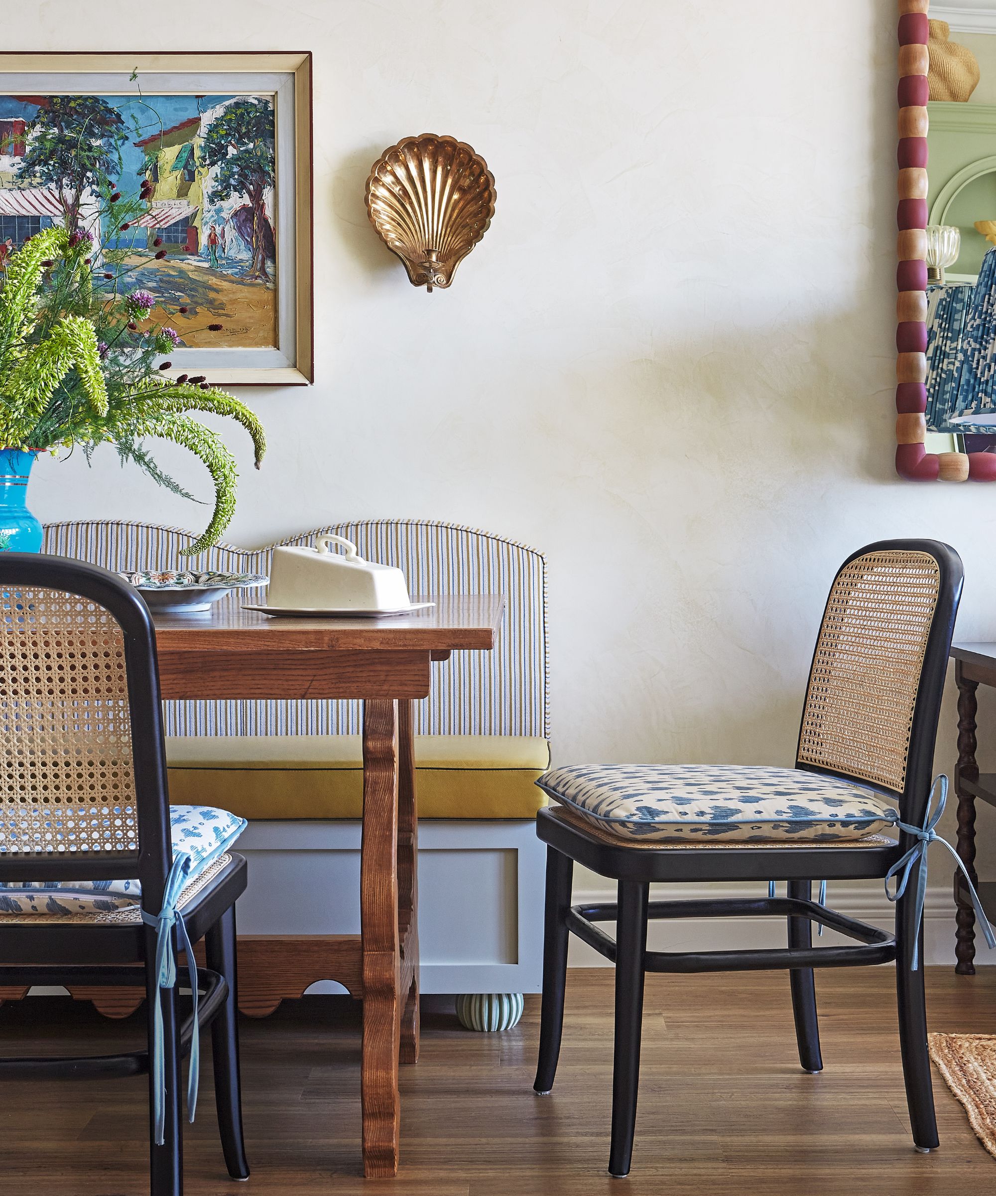
Chairs, Ton with seats in Darta fabric, Peter Fasano. Custom bench in Golden Ground, Dulux, with shaped back in Elise fabric, Howe.
A 'wet kitchen' at the back of the apartment is now the venue for heavy-duty cooking and is separated from the open-plan living space by a custom-made brass and reeded glass door. A 'dry kitchen', meanwhile, was created in the open-plan living and dining area.
In the dry kitchen, plaster pink cabinetry is teamed with a green marble worktop that provides the perfect surface for making pastry and pasta. The pretty pinks and soft greens are a cohesive thread that weaves throughout the apartment, along with pastel colors like light blue and sunny yellow, to a joyful effect.
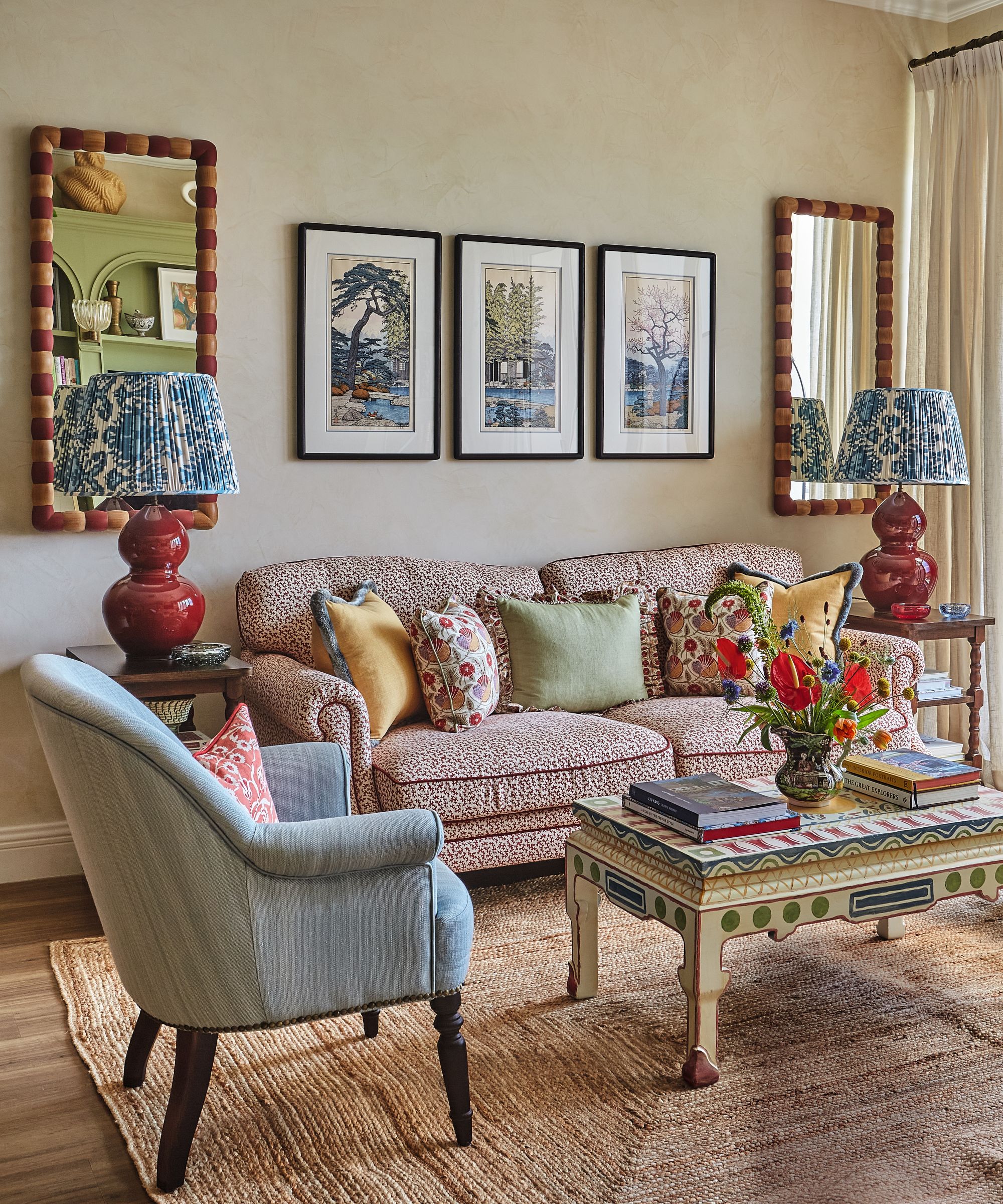
Coffee table, vintage find. Custom sofa in Red Seaweed, Sibyl Colefax & John Fowler. Avebury table lamps in Sang de Boeuf, Vaughan. Artwork sourced from the Japanese Gallery.
In the open-plan living space, different ceiling heights posed a problem. Elizabeth decided on a polished Venetian plaster finish on the walls and ceiling to soften the scheme. ‘I always like to do textures in an open-plan space. It adds interest but still feels very light and fresh and not too overwhelming.’
The sitting room decor was a careful balancing act between the wife, who was very keen on a layered and patterned look, and the husband, who preferred a slightly more subdued scheme. The solution was the Venetian plaster backdrop with pattern and color woven in with hero furniture and accessories.
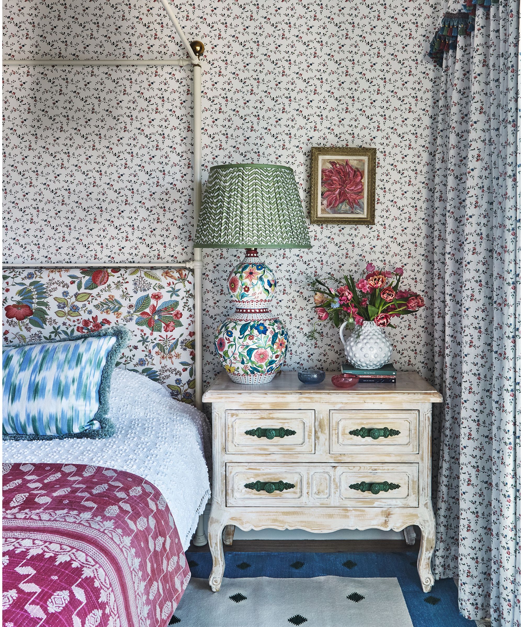
Gabriella lamp and Green Chevron shade, both Elizabeth Hay Design. Headboard in Pomegranate Botanical, Schumacher. Cushion in Ikat 110, Teixits Vicens; with Marabout Rasé fringe, Les Passementeries de l’île de France. Billy bed, Cornish Bed Company.
The coffee table is a vintage piece bought at auction. Bespoke pale green joinery is both beautiful and practical, housing the clients’ TV while providing additional living room storage. The size of the apartment dictated the need for bespoke furniture.
‘We had to work out carefully all the sizes of the furniture. We masking taped it all out on site because the space was so tight,’ says Elizabeth. As a chef, the husband wanted a dining area that could seat up to ten people, so an extending table was introduced. A bench has storage underneath for napkins and tablecloths.
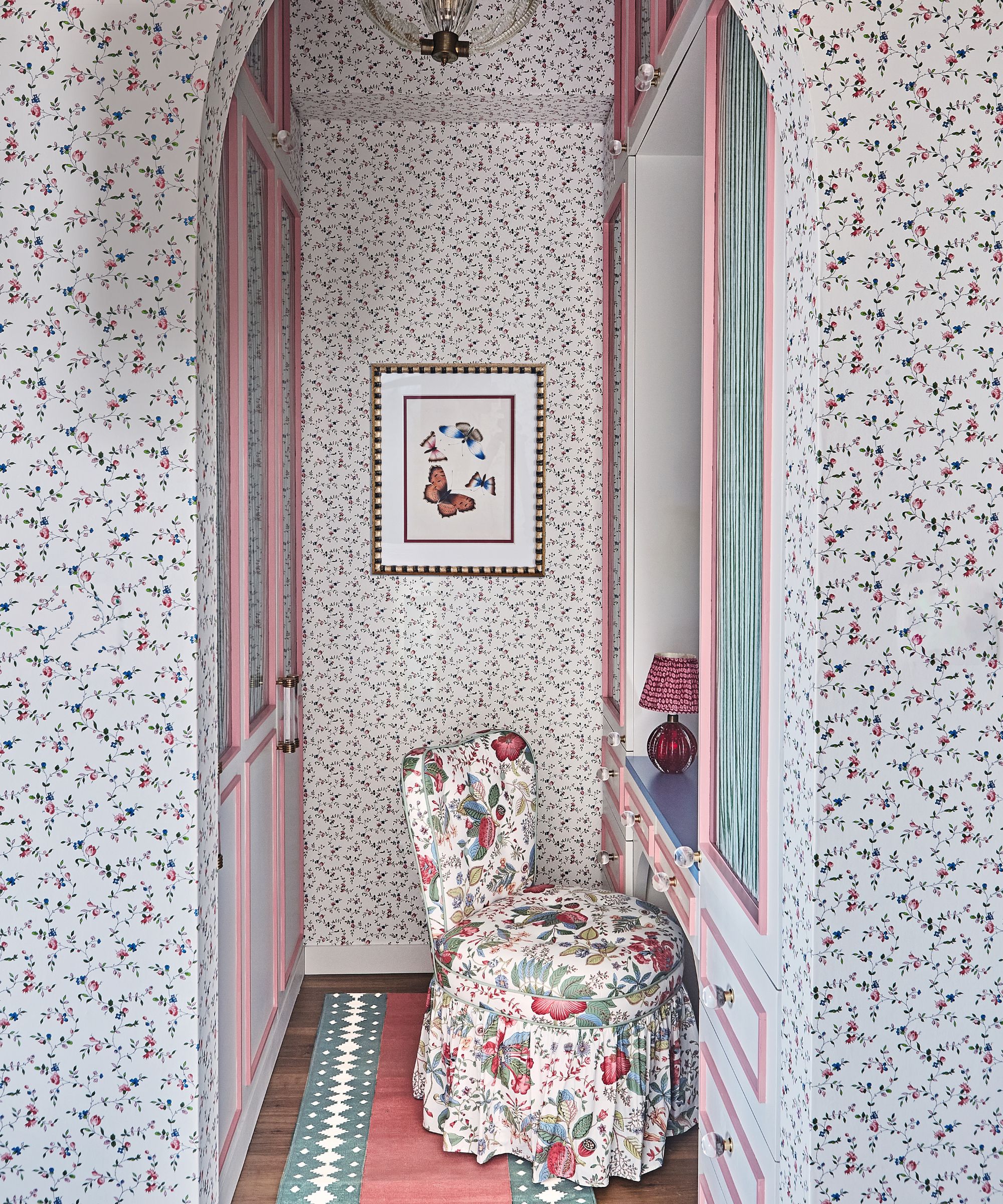
Croquis Collection No. 142 wallpaper, Christopher Moore. Custom-made cotton dhurrie runner.
In Elizabeth’s quest to make everything beautiful, the modern black metal staircase was given a comprehensive facelift. ‘We were quite clever with it,’ she says. ‘We kept the original structure so we didn’t have to replace it, but we clad the treads in wood and painted the risers to completely transform it.’
Extra storage was incorporated beneath and Venetian plaster extended to swathe the staircase walls, designed to resemble wooden cladding.
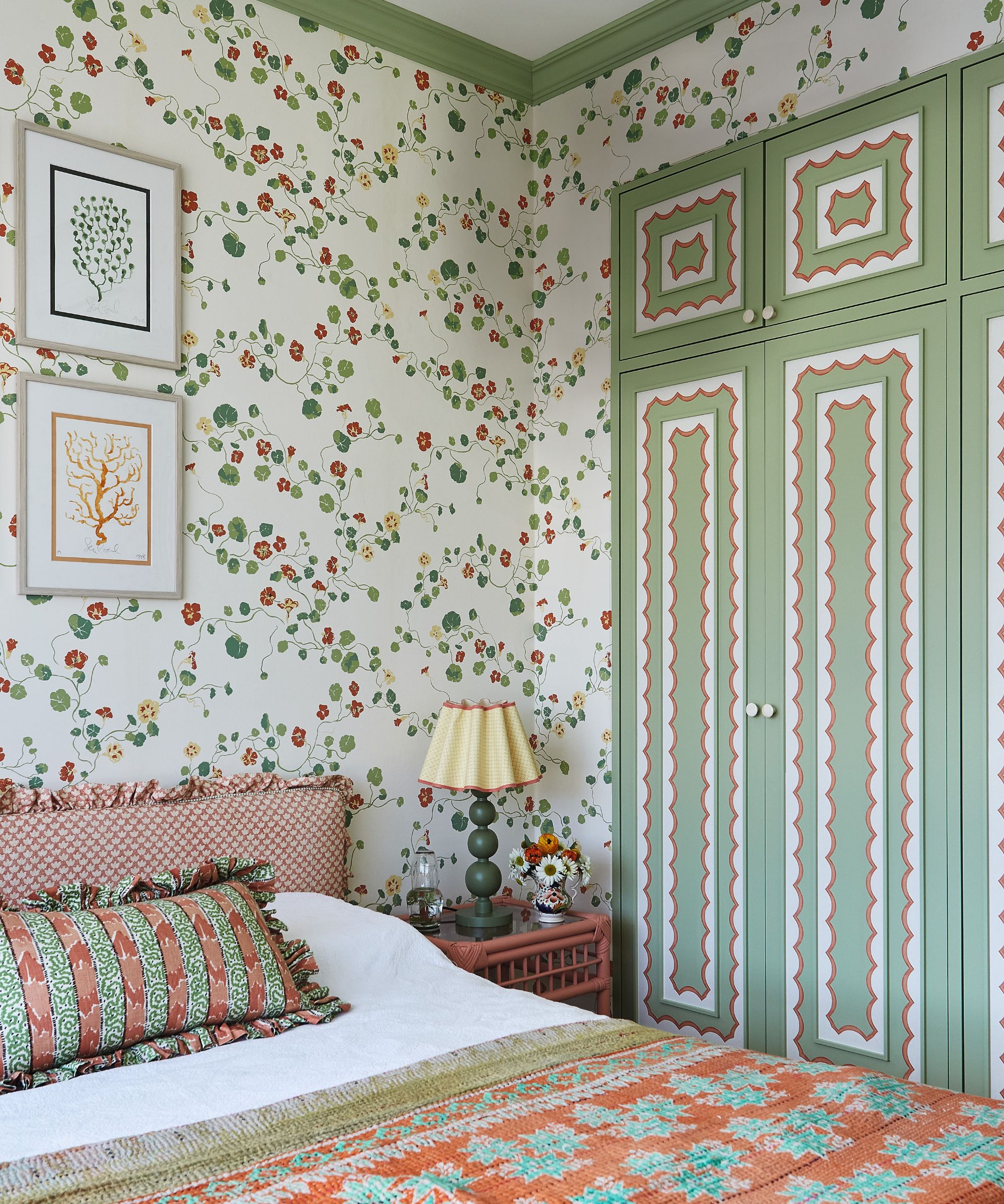
Nasturtium wallpaper in Bigleaf, Lake August. Scalloped border in Orange, Ottoline.
Elizabeth was able to indulge in color and pattern in the bedrooms and bathrooms. The main bedroom exudes wow factor with a beautiful triple-height vaulted ceiling that was uncovered during the renovation. A four-poster bed was chosen to draw the eye upwards.
A classic scheme was the intention here, with the starting point being the Schumacher fabric on the headboard, which incorporates red, pink, green, blue, and yellow. It was the perfect setting for it, as Elizabeth explains: ‘It feels very fitting and lovely for Singapore because it features ginger flowers and pomegranates and all the things that grow locally.’
Meet the designer
Elizabeth Hay shares her style inspiration
What part of the project was the biggest indulgence?
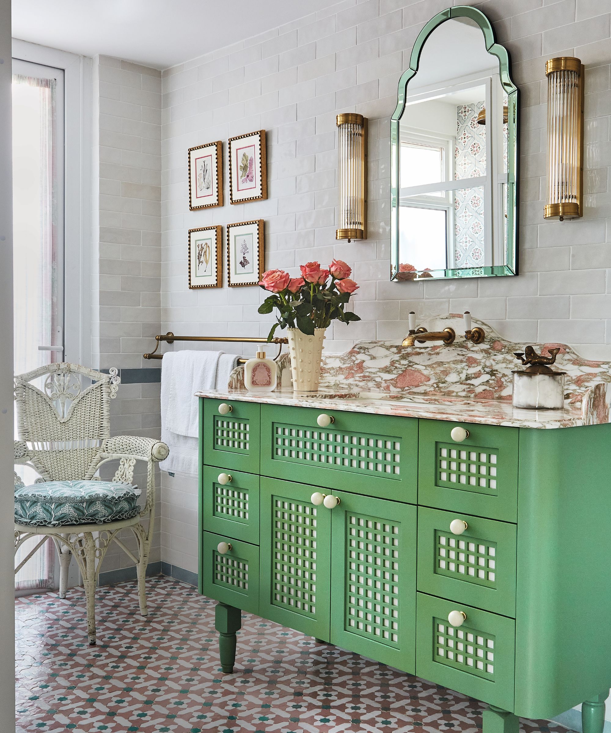
The marble in the kitchen and the hand-painted tiles in the main bathroom.
What do you consider its greatest success?
How we updated the stairs. We didn’t do anything structural but they were transformed.
What small change has a huge impact?
Adding cornice and skirting throughout the apartment.
Do you have a go-to color?
Green.
Any tips for making a small space appear bigger?
It is a fine balance to not fill it too much but at the same time not to be afraid of using larger rugs and pieces of furniture. I think sometimes it is tempting to put a small rug in a small space for example, but this makes it feel smaller.
Can you reveal an lesser-known homewares shop worth a visit?
Light Stylist for fun lampshades.
Sign up to the Homes & Gardens newsletter
Design expertise in your inbox – from inspiring decorating ideas and beautiful celebrity homes to practical gardening advice and shopping round-ups.

Interiors have always been Vivienne's passion – from bold and bright to Scandi white. After studying at Leeds University, she worked at the Financial Times, before moving to Radio Times. She did an interior design course and then worked for Homes & Gardens, Country Living and House Beautiful. Vivienne’s always enjoyed reader homes and loves to spot a house she knows is perfect for a magazine (she has even knocked on the doors of houses with curb appeal!), so she became a houses editor, commissioning reader homes, writing features and styling and art directing photo shoots. She worked on Country Homes & Interiors for 15 years, before returning to Homes & Gardens as houses editor four years ago.
You must confirm your public display name before commenting
Please logout and then login again, you will then be prompted to enter your display name.
-
 Gwyneth Paltrow's quiet luxury kitchen is so beautiful, we almost overlooked her ultra-smart cabinets – they make the use of 'every inch' of storage space
The Goop founder makes use of dead space in her kitchen with customized cabinetry that reaches to the ceiling, providing ample storage
By Hannah Ziegler
-
 Martha Stewart's intelligent cabinets 'take every inch into consideration' – their 'visually light' style will solve your small kitchen storage problems
'Every kitchen can be beautiful and functional, no matter what the size': 9 years since sharing her clever storage, Martha's cabinets are just as beautiful
By Megan Slack