10 lessons about designing a home for family living from this elegant Maryland home
This family home balances practicalities with sophisticated design choices – the designer shows us how it's done
- 1. Create flexible spaces in multi-function rooms
- 2. Use a scenic wallcovering to bring a storied element
- 3. Mix traditional and contemporary furnishings
- 4. Add a few new accessories to transform a room
- 5. Make family-friendly choices for the main living space
- 6. Design a playroom that works for adults and kids
- 7. Invest in good storage for toys and games
- 8. Double up the office as an occasional guest room
- 9. Challenge existing room layouts for a better fit
- 10. Open up a narrow entryway
It's so easy to lose yourself in the everyday practicalities of designing a family home. Functionality, organization, and easy-to-use spaces are key in a busy household but add some great interior design ideas into the equation and things become both useful and beautiful.
The new owners of this colonial-style home in Chevy Chase, Maryland, were looking to update the house design to make it practical for their young family but also wanted it to feel welcoming, beautiful, and elegant.
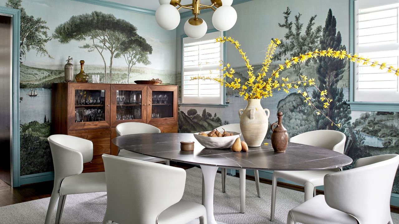
That's where interior designer Kate Ballou of Hendrick Interiors comes in. She lifted the property to a whole new level of sophisticated family home with her enlightened design solutions for every room. The home's smart new color palette was inspired by the mural wallcovering above – more on that later, as Kate shows us around, sharing family-friendly design tips as she goes.
1. Create flexible spaces in multi-function rooms
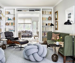
'The formal living room is designed to be a flex space embracing its multiple functions as a gathering place but also as a pass-through space,' says designer Kate Ballou. 'By specifying a bench-like sofa and removing the expectation of a coffee table, the family has full control over circulation within this room.'
To soften the formality of the space, Kate selected Design House Stockholm’s Knot floor pillows which quickly became the favorite pieces of her clients' two young daughters.
'We planned the furniture layout to allow for flexible and unobtrusive seating. The custom-size Stark carpet has soft blue and green tones that relate back to the colors of the scenic wallpaper (below). The knot floor poufs add an element of play, keeping the space relaxed and welcoming for the youngest in the family.'
2. Use a scenic wallcovering to bring a storied element
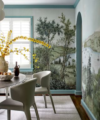
'I have recently fallen in love with the concept of scenic wallpapers because of the stories that they tell and the richness that they provide to a space,' says designer Kate. 'Scenic wallpapers provide an unexpected backdrop and allow the eye to wander throughout its scenes, keeping the occupant engaged with the design.'
The homeowners loved the serene, historical look of Iksel’s Romantic Bosphorus, which the designer suggested as one of her dining room ideas. In fact, once that was agreed, the wallcovering became the inspiration for style and color updates elsewhere in the home, too.
Focusing on the tranquility of the wallpaper, Kate Ballou's concept for the home was a 'breath of fresh air'. Pulling soft neutrals with subtle hue variations, she accented each room with muted blues and greens.
3. Mix traditional and contemporary furnishings
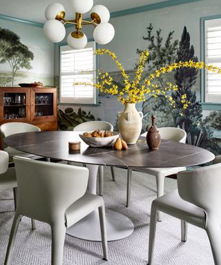
The dining room demonstrates how a blend of old and new furnishings will update a space with transitional design. The scenic wallcovering and wooden cabinet lean into an antique style, while the Knoll Saarinen table, Cassina Hola 367 chairs and chandelier bring a refined Scandinavian modern edge.
Referencing the role the wallpaper plays in the new look, designer Kate says: 'While most scenic wallcoverings have strong traditional undertones and origins, I enjoy pairing them with modern furnishings to create a unique aesthetic experience.'
4. Add a few new accessories to transform a room
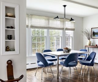
You don't have to replace all the furniture or accessories to get a new look.
Even in a whole-house redesign, there will be some items that should be kept. This shouldn't compromise the design refresh, as by placing new pieces of furniture or accessories alongside the older pieces the overall look will be updated.
'The homeowners kept their existing breakfast table,' says designer Kate, 'but we updated the space with custom window treatments from Hartman & Forbes, a sculptural light fixture by Serge Mouille, and extra comfortable everyday Saarinen Executive chairs upgraded with a beautiful blue mohair.'
5. Make family-friendly choices for the main living space
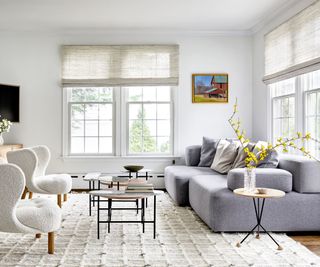
This bright family room is the main living space for the young family and although the color choices might seem daringly pale with sticky fingers around, interior designer Kate ensured that the fabrics are all resilient natural fibers.
'The Alphabet sofa from Fritz Hansen is upholstered in hard-wearing wool fabrics by Kvadrat,' says Kate. 'It becomes the ultimate family-friendly seating element. The space is kept bright with a wool shag area rug by Stark.
'The Petra armchairs are sophisticated in their form but offer a comfortable seat for both adults and children, given their scale and proportion. Another playful family-friendly element is the multi-level side tables paired to serve as the coffee table,' she adds. 'They can be easily moved around the space as needed for large games on the floor.'
6. Design a playroom that works for adults and kids
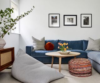
Looking for playroom ideas? Take note of Kate's advice: make sure the space will appeal to the adults in the house, as well as to the kids. Including an inviting sofa (the Reid from DWR), means there's a relaxed place to watch movies as a family.
7. Invest in good storage for toys and games
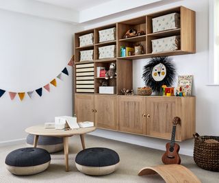
This is the business end of the playroom, where the serious fun takes place. Kate ensures that the space is organized and presentable, giving the kids more space to play and more chance of finding their toys.
'Wall-hung cabinets made of oak are perfect for displaying books and toys, while hiding away office supplies and clutter,' says the designer. They also give a neat finish to the room and more floor space.
8. Double up the office as an occasional guest room
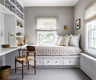
When coming up with a new look for this space, the designer had to include guest room ideas as well as home office ideas, and there's inspiration here for anyone wondering how to host guests without a guest room.
'The office underwent a huge transformation,' says designer Kate Ballou. 'The space was being used as both a home office and guest room, and the redesign needed to retain those functions.
'I swapped the location of the bed and desk, so that the bed became a built-in daybed with storage below, and the office work and storage space tripled in size. The custom cabinetry, built by Dinger Design, was the perfect solution. We also installed wall-to-wall carpet from Stark to ground the room and provide better acoustics for work-from-home meetings.'
9. Challenge existing room layouts for a better fit
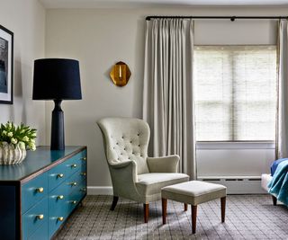
In the primary bedroom, the bed was originally positioned on the shorter of the two walls, resulting in a very cramped space on one side.
'I suggested rotating the bed to the adjacent wall so that the end of the bed felt more open, and the access to each side of the bed would be more balanced,' explains designer Kate.
'By installing wall-to-wall carpet, we made better use of the floor space, calmed the room down by limiting the materials on the floor, and created a quieter space. We installed custom black-out drapery over Hartman & Forbes shades to provide light control and continued the color story, inspired by the dining room's scenic wallpaper, with the blue-green finish on the De la Espada chest of drawers.'
10. Open up a narrow entryway
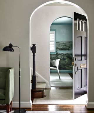
Where space is tight, as in this home's original entry hall, it's important to increase the sense of light, which in turn will create the impression of more space. 'We used a reflective wallpaper (Cartography in Pearl, from Holly Hunt) to brighten and reflect light,' says designer Kate. 'The wallpaper also makes the space feel more luxurious, upgrading the finish from paint. We replaced the carpet runner on the stairs with a sophisticated and subtle herringbone design to create a more tailored look.'
Thanks for the tips and inspiration, Kate. We'll see ourselves out!
Interior design: Kate Ballou at Hendrick Interiors
Photography: Stacy Zarin Goldberg
Sign up to the Homes & Gardens newsletter
Design expertise in your inbox – from inspiring decorating ideas and beautiful celebrity homes to practical gardening advice and shopping round-ups.
Karen is the houses editor for homesandgardens.com and homes editor for the brand’s sister title, Period Living, and an experienced writer on interiors and gardens. She loves visiting historic houses for Period Living and working with photographers to capture all shapes and sizes of properties. Karen began her career as a sub editor at Hi-Fi News and Record Review magazine. Her move to women’s magazines came soon after, in the shape of Living magazine, which covered cookery, fashion, beauty, homes and gardening. From Living Karen moved to Ideal Home magazine, where as deputy chief sub, then chief sub, she started to really take an interest in properties, architecture, interior design and gardening.
-
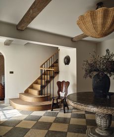 'Earthy, organic, and imbued with a sense of calm materiality' was the brief for this restored 19th century stone farmhouse in the English countryside
A historical Wiltshire farmhouse has been sensitively refreshed by Blank State Studio using materials that pay homage to the beauty of the surrounding countryside
By Emma J Page Published
-
 How to clean a bird feeder – an ornithologist shares 5 key steps for clean feeding during avian flu
Expert cleaning advice to help keep native bird populations healthy and thriving
By Alex David Published