If you like Nancy Meyers movies, you'll love this cozy, refined home in Vermont
It's Complicated – how the classic Nancy Meyers rom-com inspired the aesthetic for this elegant Vermont home
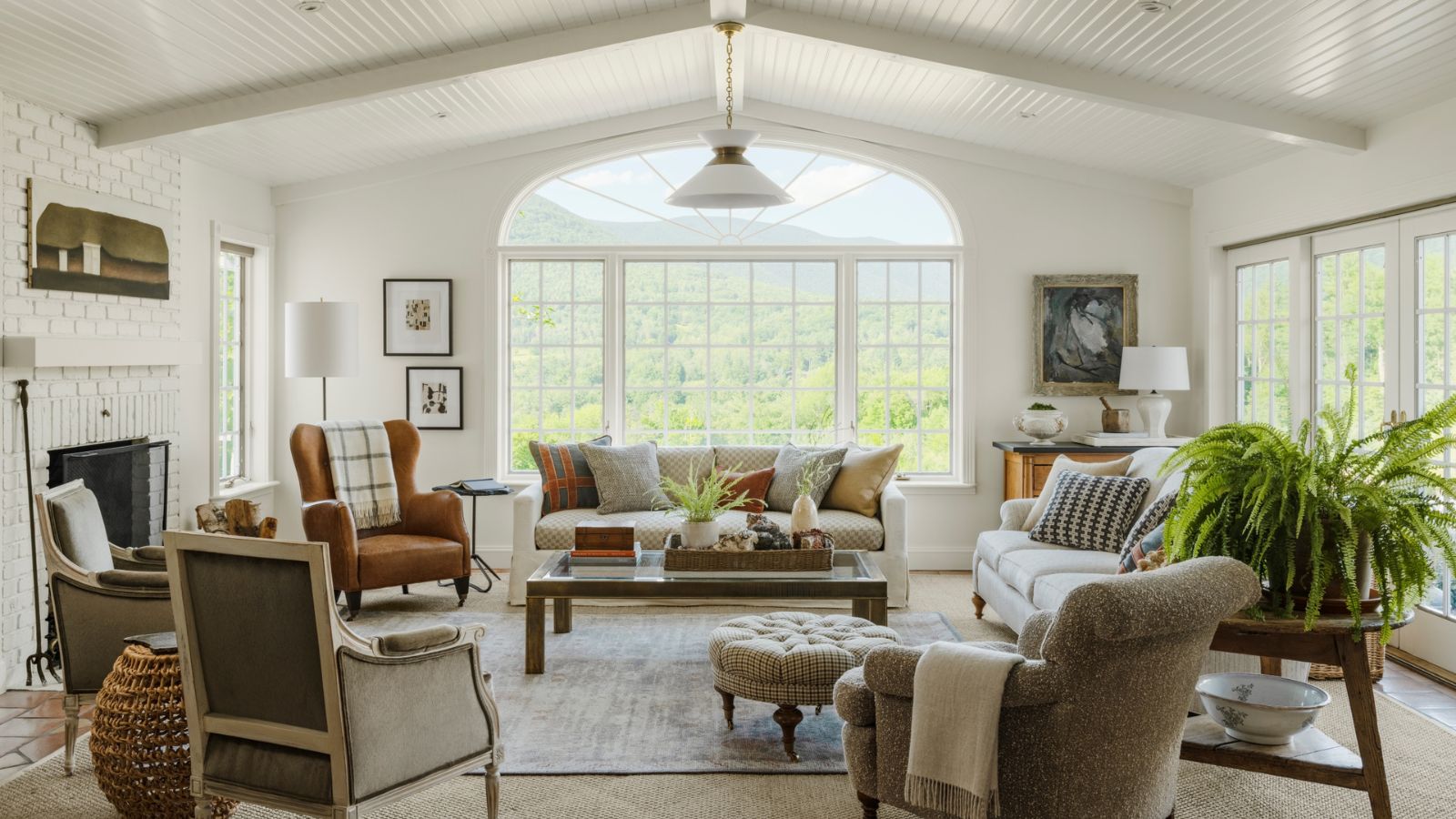
Its owner describes this home as a 'rambling ranch', all 5,045-square-foot of it, perched on an expansive bluff over a wildflower field and with a forested backdrop, and 72 acres of land with stunning mountain views.
The tired 1990s house design was ripe for renovation as nothing had been updated for 30 years but since the new owners are interior designer Joshua Smith and his husband David Gerbitz, the chance to breathe new life into this stunning Vermont setting was an exciting opportunity.
'I'd call it a cosmetic facelift rather than a total gut,' says Joshua. 'We updated it by adding new wood floors and added millwork and beams to ceilings for more architectural interest. We updated the lighting throughout the home and outfitted the walls in wallcoverings to add warmth and texture, as well as to break up the rooms that are connected.'
What's even more exciting about this renovation, is that in creating the new look and feel, designer Joshua says he was inspired by an iconic movie. 'It's Very Nancy Meyers – think the Vermont Version of the house from It’s Complicated,' he says. Take the tour, to see how he combines inspiration from nature, vintage finds and the Nancy Meyers aesthetic to give his country home a charming look that stays just the right side of cozy!
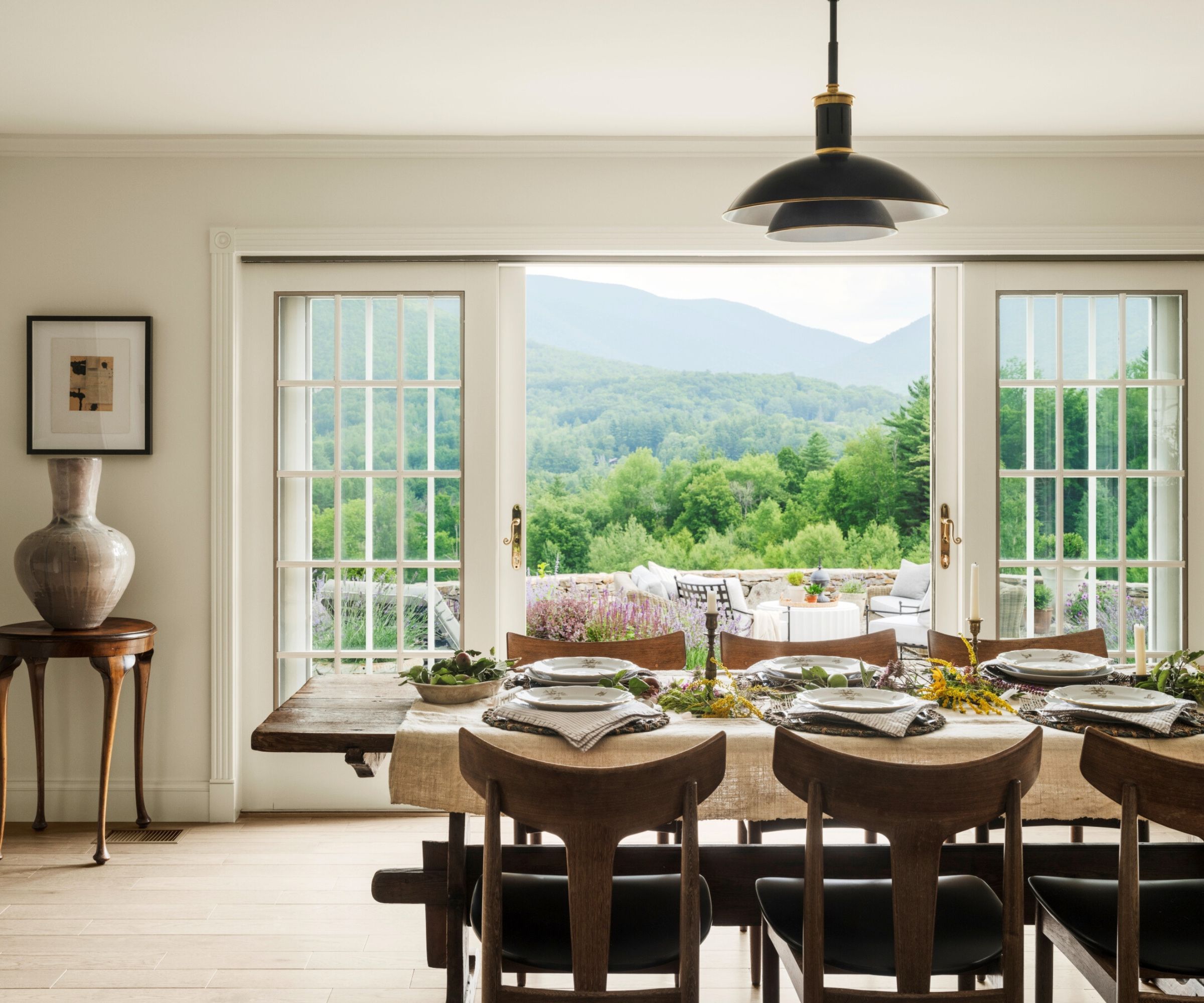
Joshua set about creating that special Nancy Meyers blend of comfort and elegance, or 'livable beauty' as the designer likes to call it, nothing too ornate and precious but still refined. 'I always look to Mother Nature for inspiration. We took into consideration a year-round ambiance, with a focus on feeling light and airy in the summer and cozy during snowy seasons.'
It was views like these that convinced Joshua he could turn this home into something special and his dining room ideas need little embellishment with a landscape like this through the arched windows. The table is an 18th century French trestle table found at Galerie Half in LA, paired with mid-century chairs upholstered in vegan black leather. Other vintage furnishings and accessories complete this very storied look. 'We looked to transform our 90s home into a modern French country vibe with influences from Provence,' the designer adds.
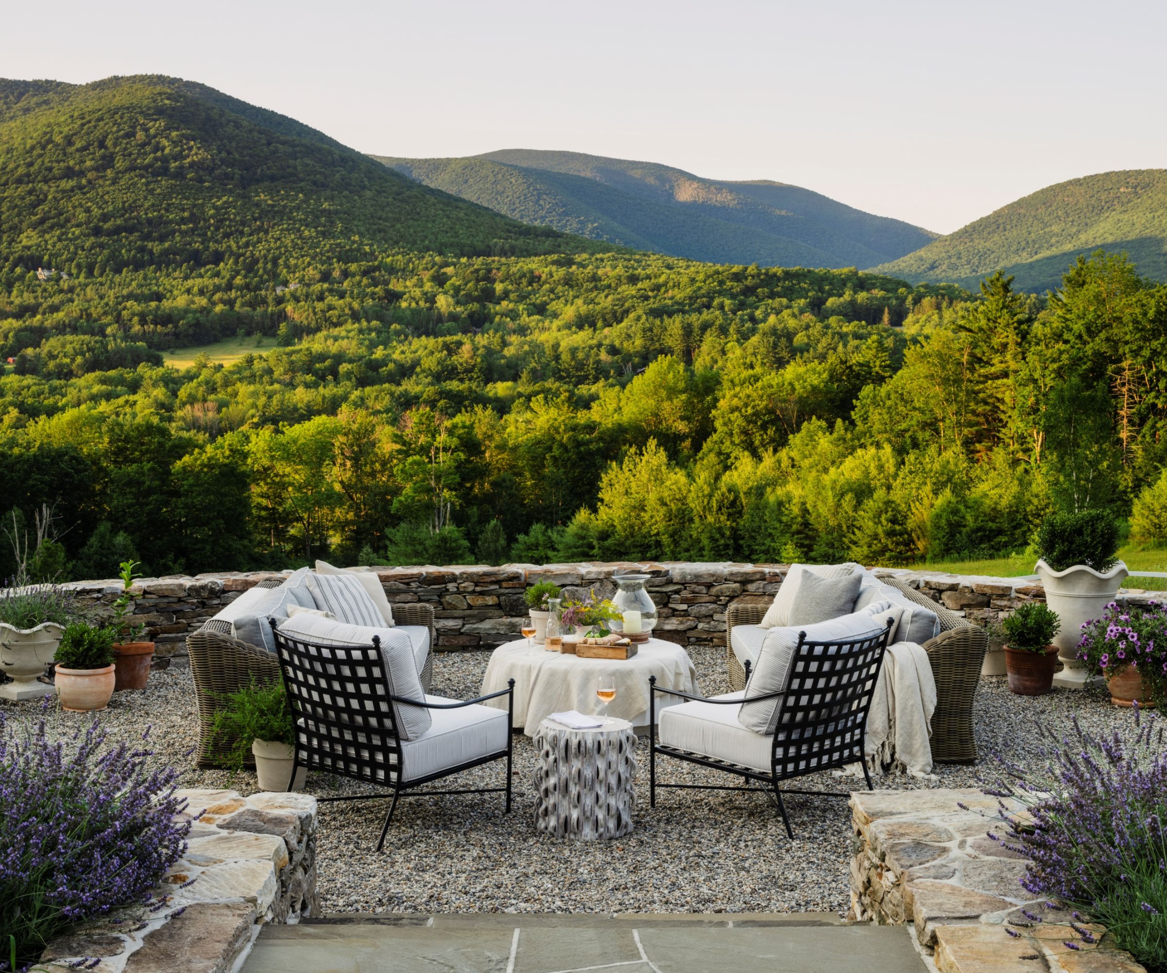
The creation of a new stone-walled and pea gravel terrace that arches out to capture those incredible views is a brilliant touch. Joshua's backyard ideas could be adapted to suit any setting, although the impact here owes a lot to the borrowed landscape over the wall.
'The new terrace not only enhances the aesthetic appeal but also serves as a functional space for enjoying the outdoors,' says Joshua. 'Our home is a haven where the beauty of nature seamlessly integrates with my thoughtful design choices, resulting in a space that is both visually stunning and practical for everyday living.'
The designer decided to use indoor-outdoor upholstery, even for the inside furniture. 'It was a good decision considering our two boxer dogs, and reflects a practical and mindful approach to living,' he says. 'It allows us to enjoy our space without constantly worrying about potential damage, promoting a relaxed and stress-free environment.'

With projects across the country, Joshua Smith and his eponymous firm offer full-service residential interior design and life-changing spaces. His firm is known for transforming functional spaces into inspiring environments that engage the senses and nourish the soul. Joshua continuously advocates for the importance of wellness and sustainability intertwining with design and takes pride in implementing this approach in his work.
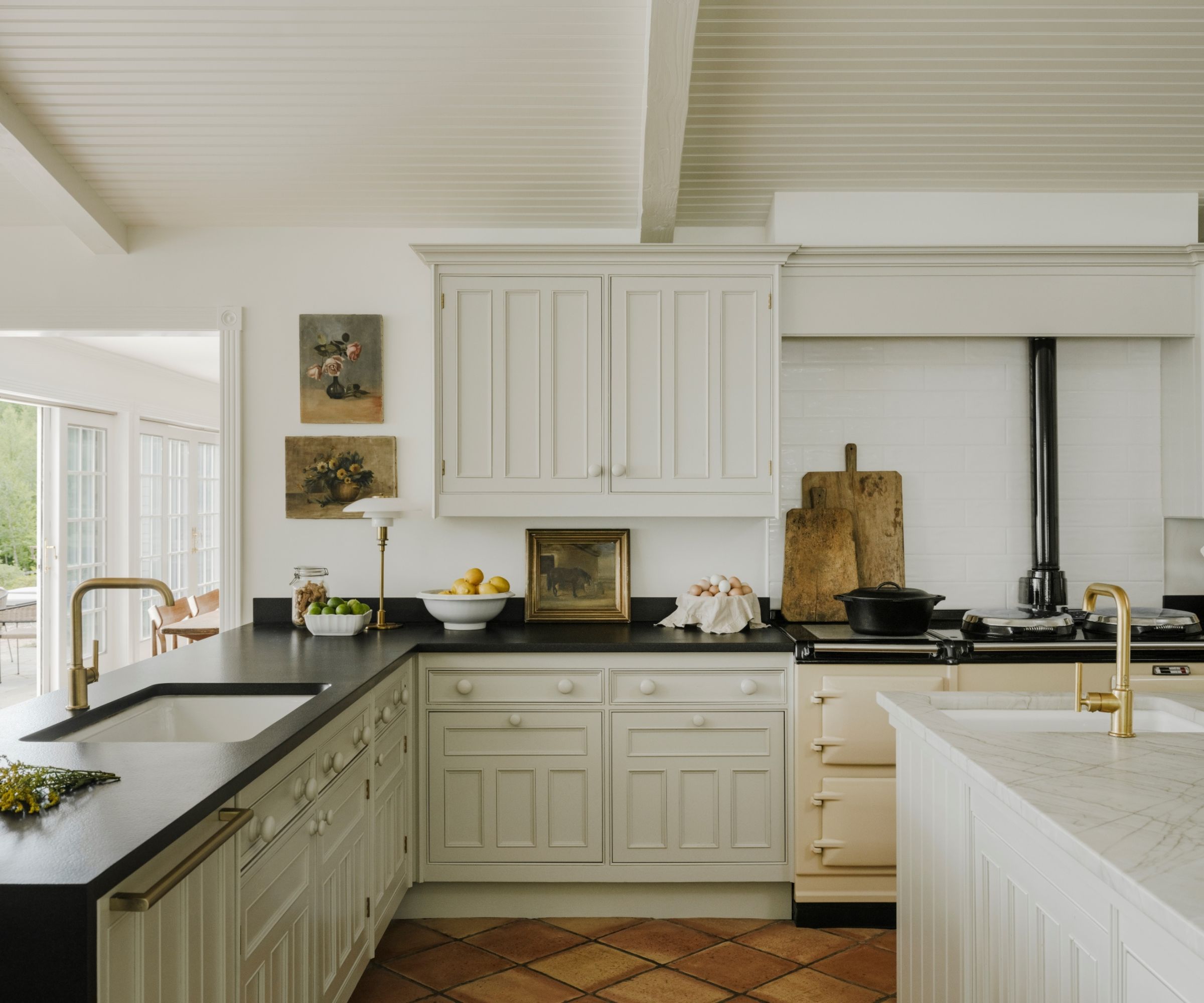
The designer chose to keep the existing kitchen cabinetry which was still in good condition. As a result, his kitchen ideas were all about how to update and refresh the look, rather than demolishing and starting again.
'This island was originally on four levels of height,' says Joshua. 'I searched high and low to find a stone that would work for this and now it’s all seamless, one big giant slab of Taj Mahal quartzite in a leather finish.' He added beams and tongue and groove to the ceiling, and painted the cabinets in Benjamin Moore's Revere Pewter. The other countertops were replaced with granite in a leather finish. The classic cream Aga, and a curated selection of vintage cutting boards and paintings add to the characterful, lived-in look.
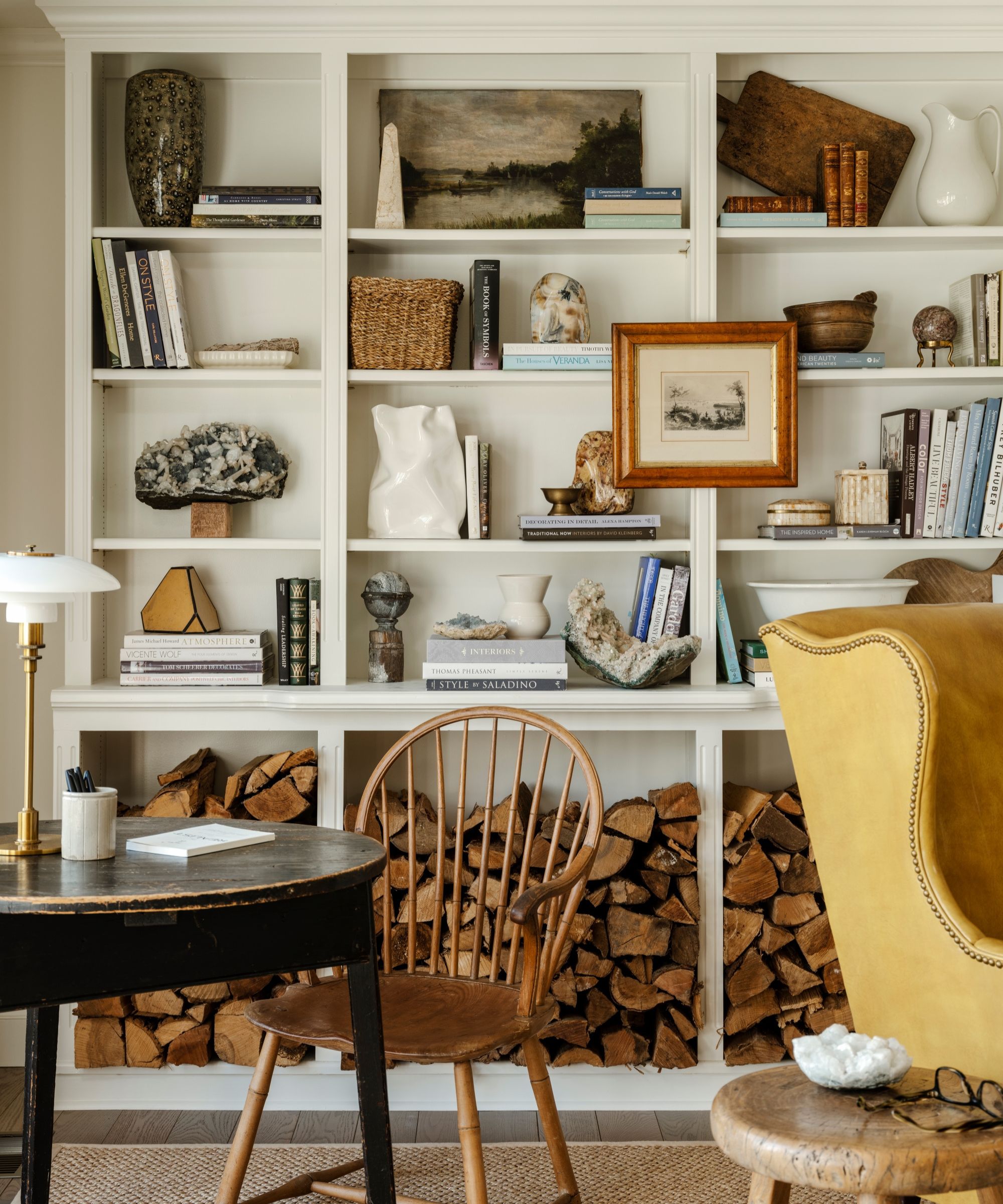
This cozy home library is one of Joshua's favorite spaces in the home. The Goldenrod leather wingback chair was sourced from Montage Antiques in Millerton, New York, and actually inspired the color palette across the project. The black cricket table to the left was sourced at Brimfield Antiques Fair.
'We opted for no doors on the lower built-ins and chose to stack firewood, as it keeps us from having to run to the garage every time we want to start a fire. The home has two fireplaces and we have them going year-round,' he adds.
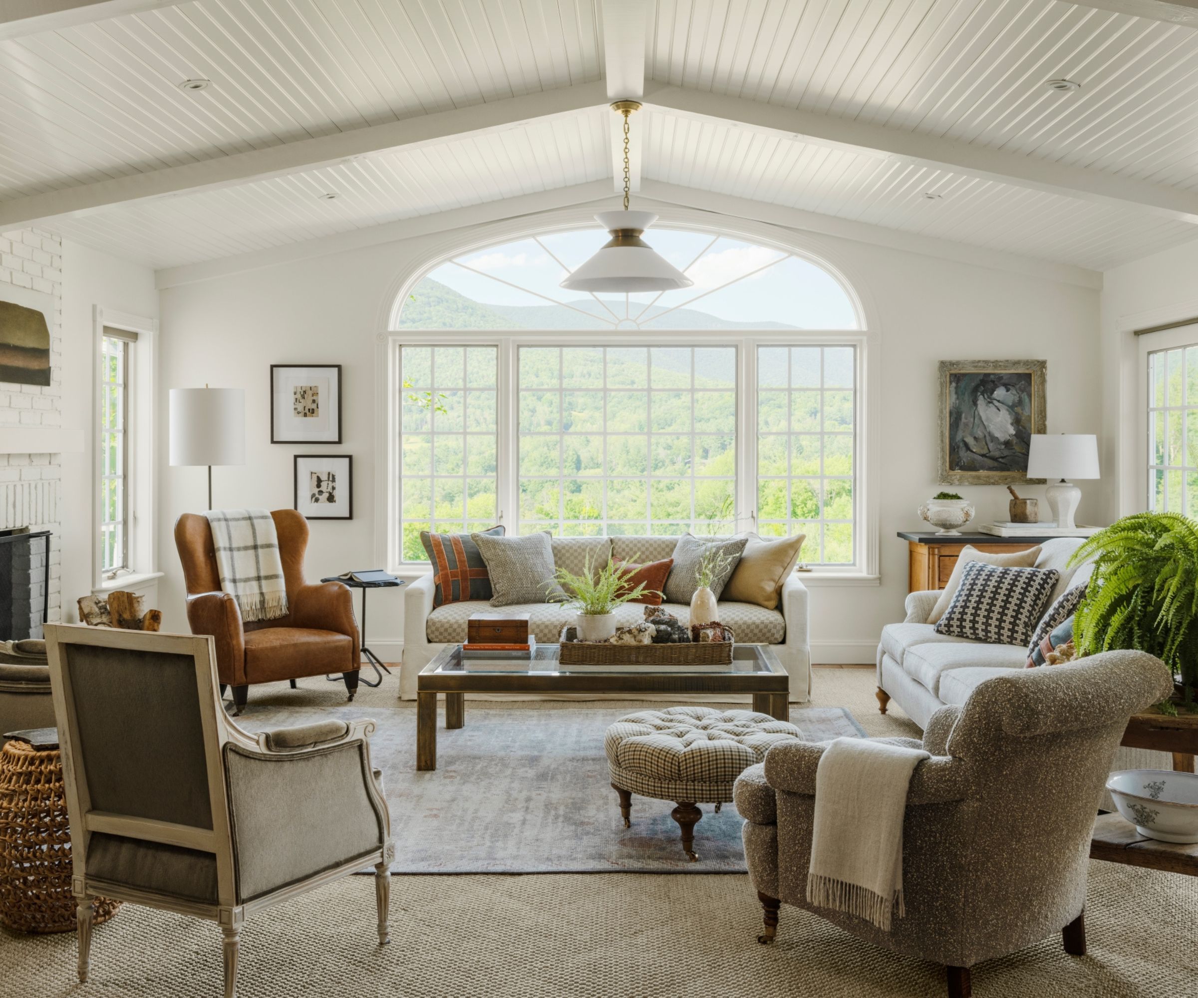
If I were to pick a room that truly reflects the Nancy Meyers look, I'd say this living room comes close. Describing his living room ideas, Joshua says: 'The goal was to create a space that perfectly embodies my vision of 'livable Beauty'. I emphasized comfort, carefree living, and a retreat-like atmosphere for both myself, David, and our guests, which is evident in the thoughtful choices we’ve made in our home.'
And where did the inspiration for the designer's living room color ideas originate, apart from the movie It's Complicated? The answer, as with much of Joshua Smith's designs, can be found in nature. 'Adapting the color palette and textiles to evoke the essence of autumn leaves in the family room created a beautiful and thematic choice,' he says. 'It not only adds visual warmth, but also connects the interior with the changing seasons, creating a dynamic and inviting atmosphere throughout the year.'
The renovation involved some architectural changes, alongside the decorative elements. 'The addition of beamed ceilings and tongue-and-groove details not only brings character but also adds to the charm of a country sanctuary,' says Joshua. 'Opening doorways and expanding views further contribute to the overall sense of spaciousness and connection with nature.'
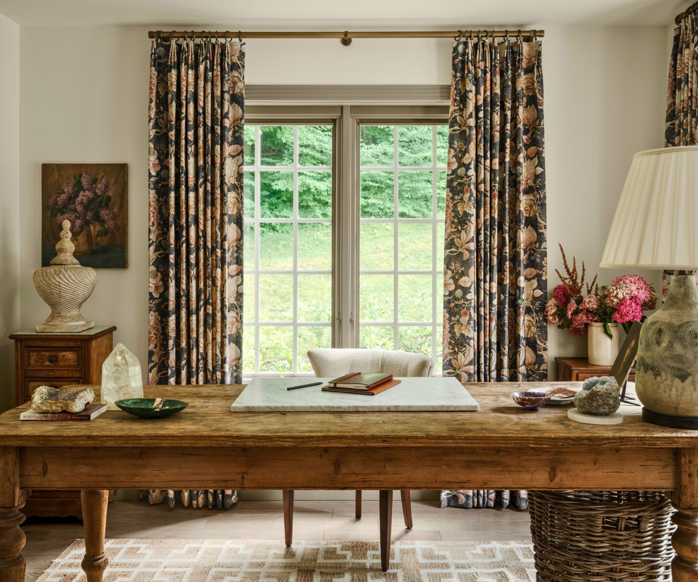
For his home office ideas Joshua again turned to rural France for inspiration, using a French farm table as the desk with a leftover remnant of marble for the writing space, and turning a piece of antique pottery into a lamp. Other vintage pieces were sourced from Brimfield and Round Top Antique Market, giving the refined but comfortable look the designer was looking for.
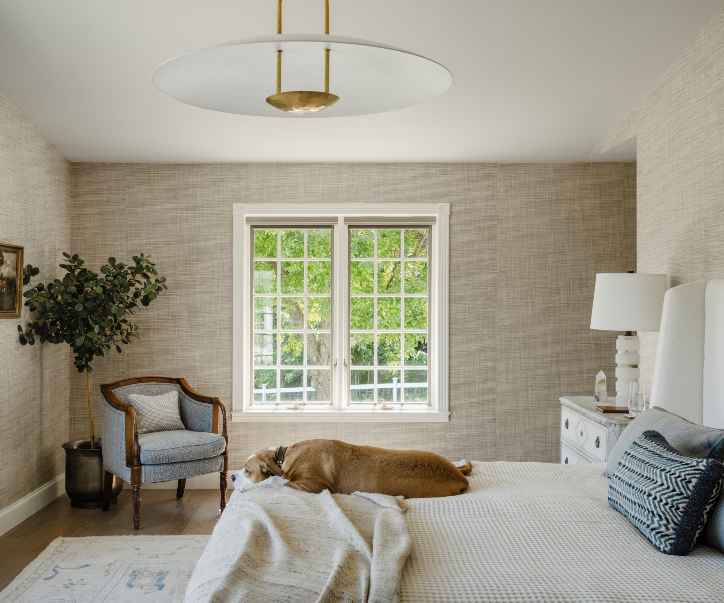
There's a more elevated look in the bedroom but of course comfort is paramount for the designer's bedroom ideas too.
Phillip Jeffries' Driftwood wallcovering adds texture and interest to the walls, the bedside chest is an original Swedish dresser from Covers & Roses in Massachusetts, and the rug is a handwoven design from Nepal. The statement light fitting is by Visual Comfort.
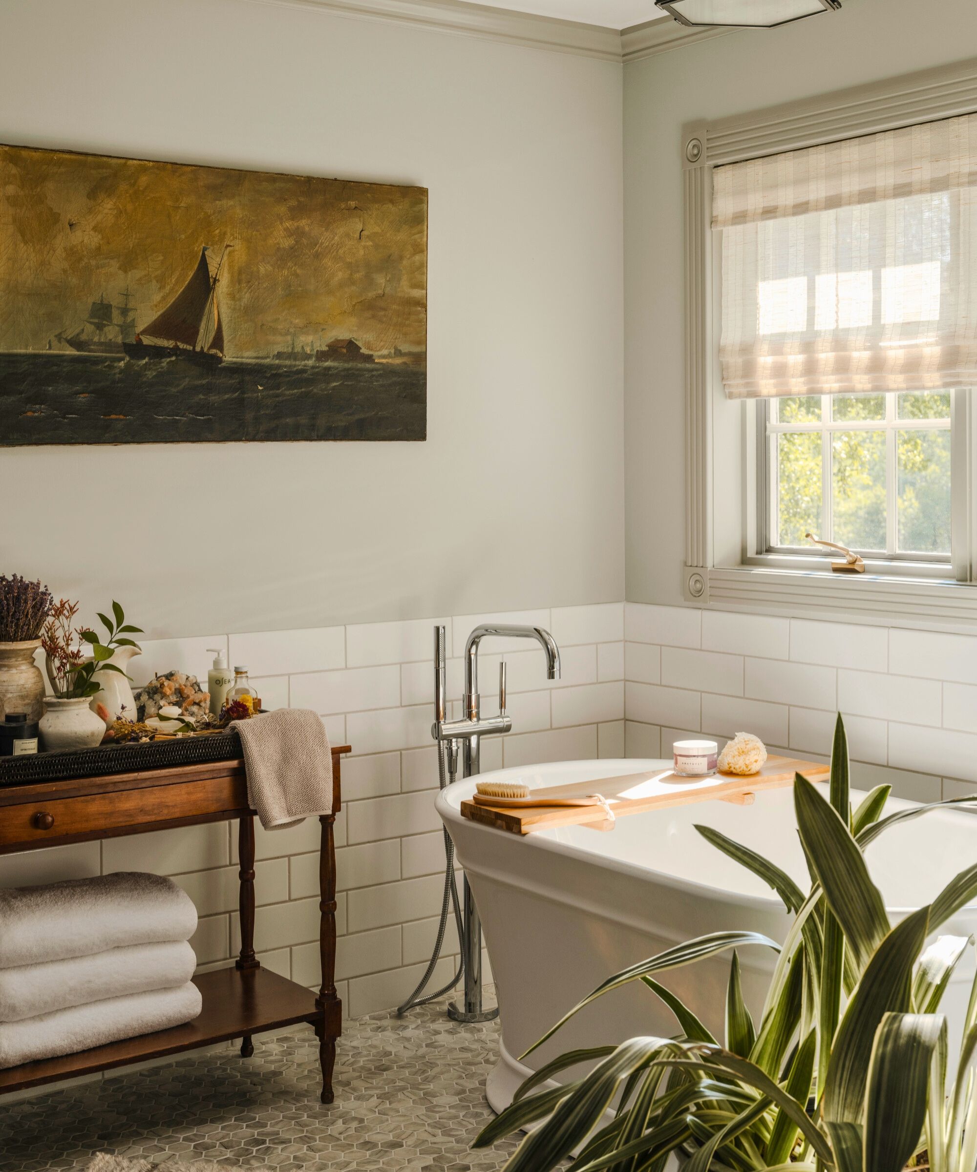
Bathroom ideas for the primary bathroom required a total remodel. Although this is all new, the results are classic and timeless, with traditional fixtures and accessories that add to the layers and stories Joshua was seeking to create. 'The ship painting is from Brimfield Antique Market. The art has a little tear in it and I think it's a livable imperfection. I embrace imperfections in my antiques and encourage people to do the same,' he says. 'I used an antique table to make my own home apothecary.'
The floor tile is recycled glass to look like marble from Village Tile, in Manchester, Vermont, with Kohler plumbing fixtures.
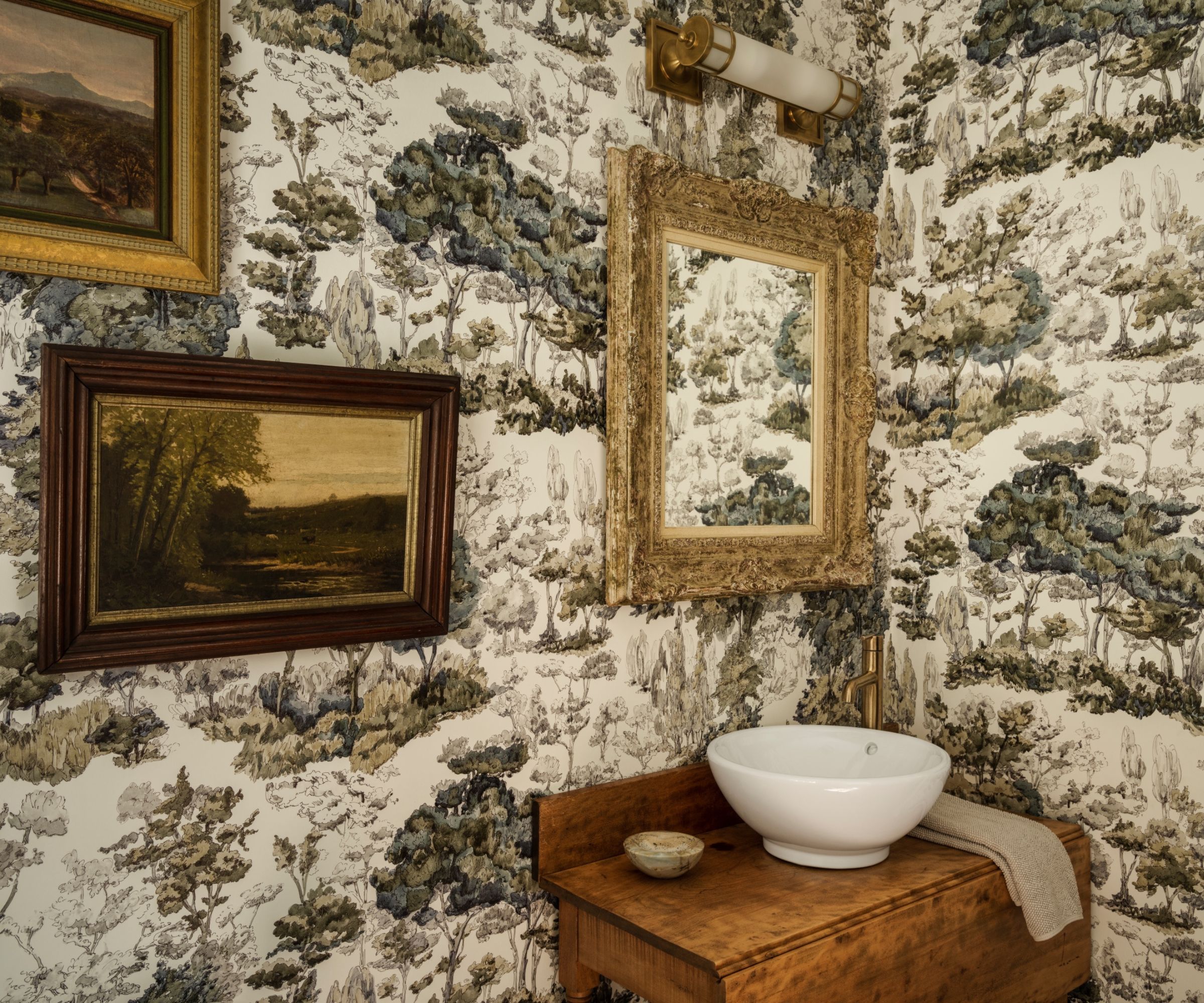
Joshua went all-out vintage with his powder room ideas, creating a cohesive look in sepia tones to complement the Pierre Frey toile de Jouy wallcovering. He repurposed an old hall console, left by the home's previous owners, as a vanity, and added antique paintings and a new piece of mirrored glass to an old gilded frame - a great way of reusing an ornate frame.
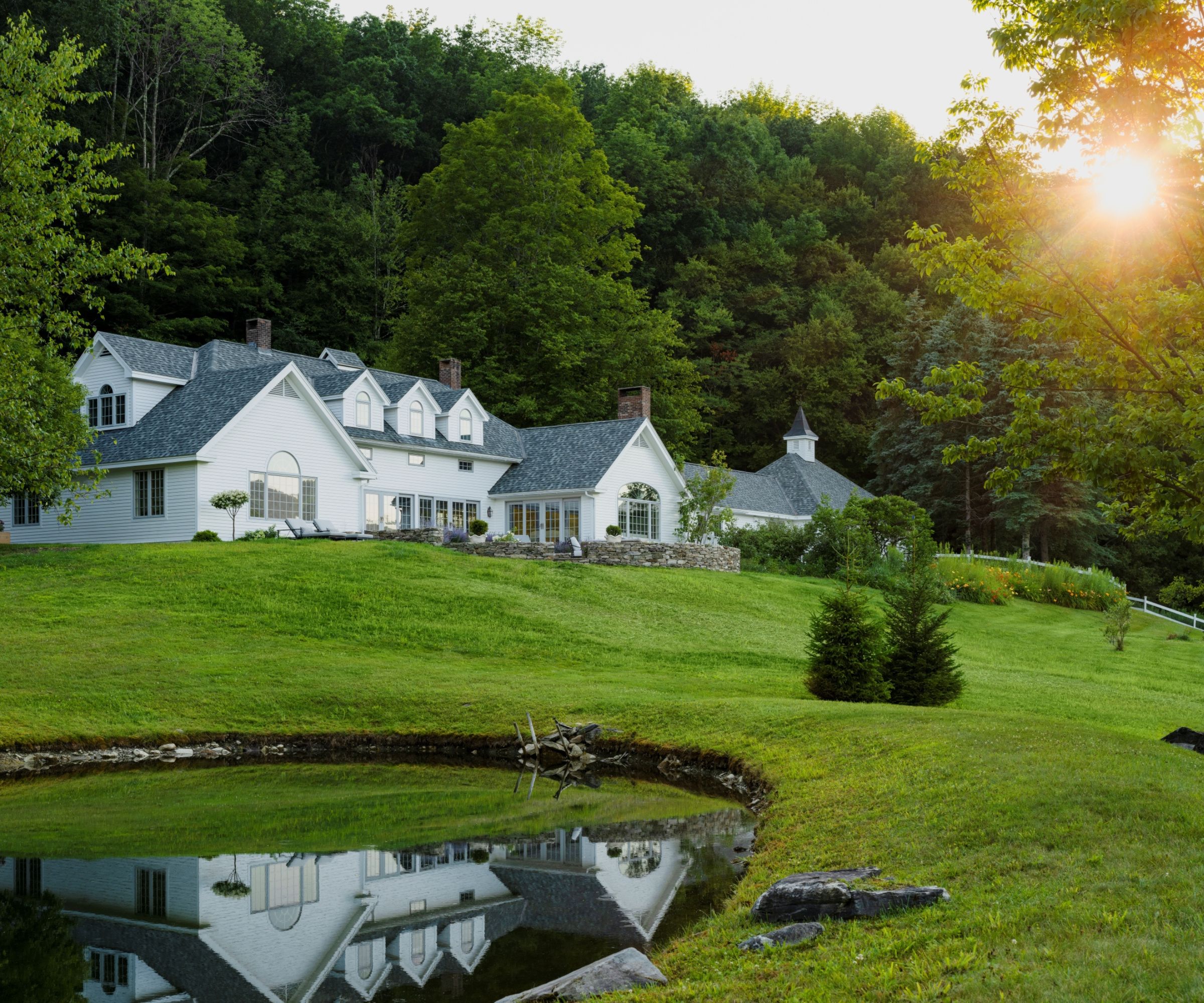
Looking at the renovated property now, it's so easy to see the appeal. For Joshua, however, this country home represents so much more than easy-on-the-eye décor and practical updates. 'When I am in the country,' he says, 'my nervous system settles, and I fully relax. Now we know what is actually happening in the brain when we perceive beauty.'
Interior design: Joshua Smith
Photography: Lance Gerber
Sign up to the Homes & Gardens newsletter
Design expertise in your inbox – from inspiring decorating ideas and beautiful celebrity homes to practical gardening advice and shopping round-ups.
Karen sources beautiful homes to feature on the Homes & Gardens website. She loves visiting historic houses in particular and working with photographers to capture all shapes and sizes of properties. Karen began her career as a sub-editor at Hi-Fi News and Record Review magazine. Her move to women’s magazines came soon after, in the shape of Living magazine, which covered cookery, fashion, beauty, homes and gardening. From Living Karen moved to Ideal Home magazine, where as deputy chief sub, then chief sub, she started to really take an interest in properties, architecture, interior design and gardening.
-
 How to grow lupine – expert advice on growing this dramatic and vibrant cottage garden flower
Vibrantly colored flower stalks make swathes of lupines a sight to see in meadows and cut flower gardens alike
By Ellen Wells
-
 I’m a professional cleaner, and I swear by these quick and easy tips to clean pet hair from wooden floors
Staying on top of the mess makes it 10 times easier
By Carolina Kazimierski