Contemporary luxury meets West Coast informality in this historic Craftsman cottage
Interior designer Jonathan Rachman creates relaxed yet elegant interiors in this sophisticated family home filled with art

This enticing period home is one of a row of the four historically important Filbert Cottages in Russian Hill, San Francisco. Built in 1907, in a modest, rustic style, the cottages had fallen into disrepair by 2000 but were rescued, restored and became protected with landmark status in 2003. Today they offer one of the most sought after addresses in the city.
Arranged over three storeys, the property comprises 3005 square foot. Outside, the shiplap exterior was restored to its vernacular Craftsman house style charm, while inside the contemporary design resonates with modern comfort. This seemingly effortless atmosphere of informal elegance was created by interior designer Jonathan Rachman. As his fifth project for the current owners, his sensitive awareness of his clients’ needs has ensured both the perfect look and functionality for their lifestyle as a busy family.
Jonathan worked with his clients to redesign and refurbish the property throughout over a period of 14 months. He focused carefully on the needs of a sophisticated family with three children in their teens and early twenties but also on tailoring the home to support their personal passions as keen hosts and discerning art lovers.
'This is our fifth project with the clients, so we know them extremely well in their style, lifestyle and their needs,' says Jonathan. 'For me, every project revolves around the human factor and I wanted to make this home truly their nest, honoring all their requirements. Their priority is always their children: making sure they have the proper space and room for each of them, even if they are not living at home full time.'
He goes on to explain that 'comfort and practicality are vital: while casual in their lifestyle, the couple love to entertain so it was important to include a large, fun dining table, lots of non-traditional seating and big, comfy sofas to lounge on.'
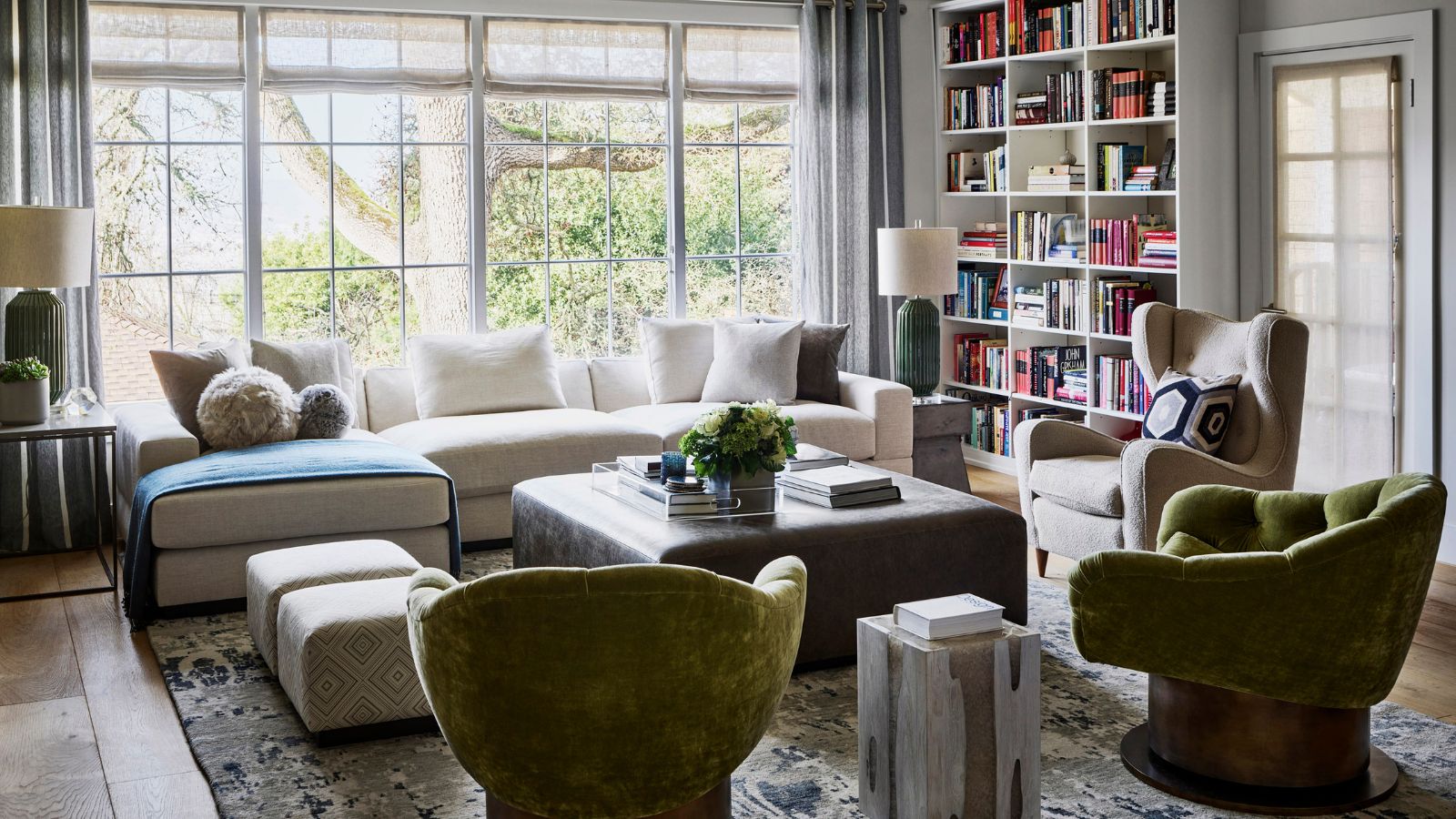
In the sitting area at one end of an open-plan sitting/dining room, Jonathan composed this chic arrangement of different styles of seating for relaxed gatherings yet with an elegant ambience.
The modular sofa was custom made for JRD and upholstered in fabric from Ellis Dunn, the unusual green upholstered Turn Around Swivel Club Chairs were sourced from Coup d’états in San Francisco. The rug from Stark anchors the grouping.
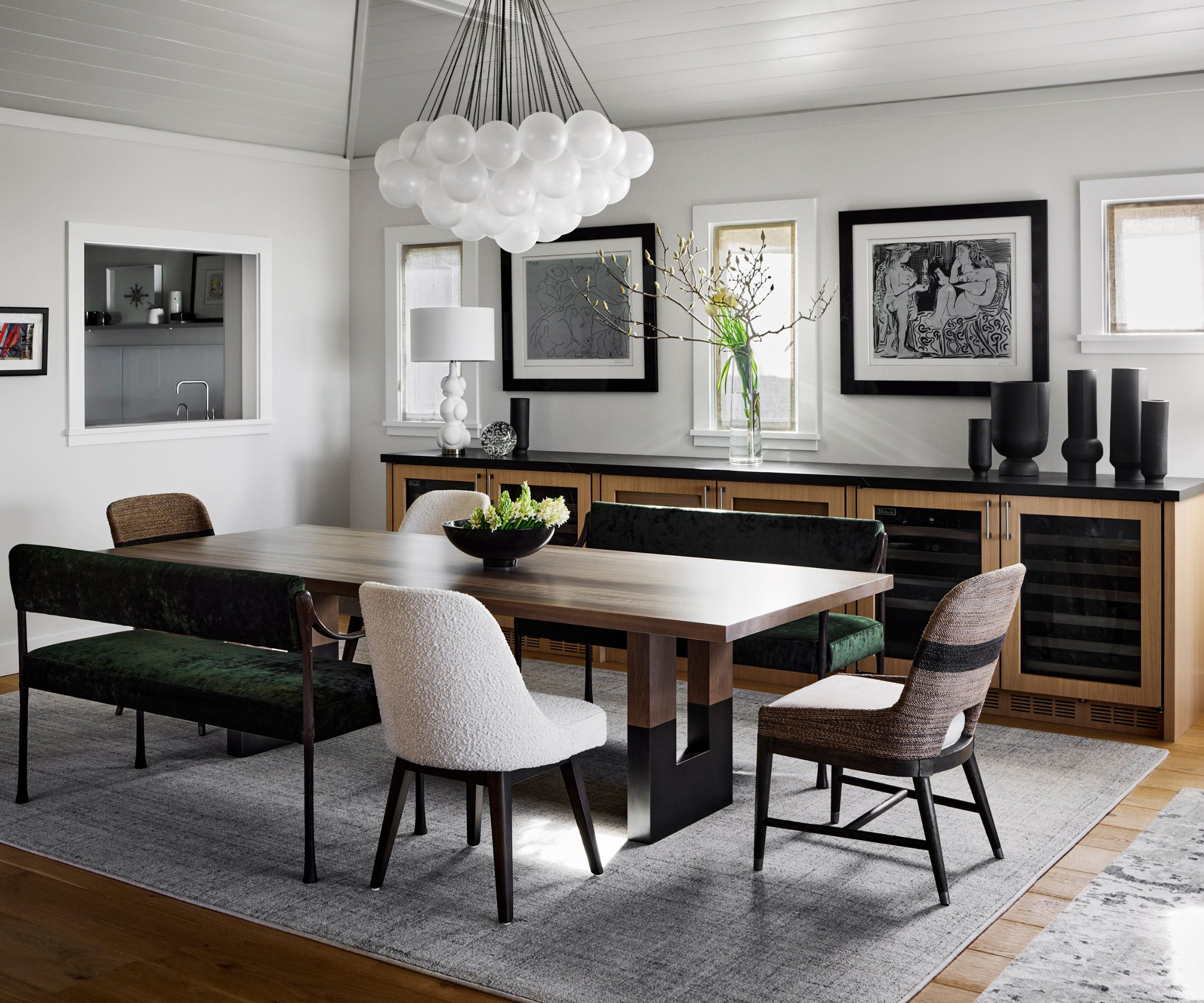
Clever dining room ideas abound at the other end of the open-plan space. A generously sized dining table is teamed with an ingenious and considered combination of upholstered Giac settees by De La Vega designs, purchased at Coup d’état in San Francisco and dining chairs from Palacek and Arden Home SF.
This highly unusual approach works beautifully because the asymmetric positioning of a pair of benches as well as pairs of chairs gives a sense of rhythm and cohesion. The long buffet was custom designed for JRD and grounds the room by thoughtfully balancing the scale of this table arrangement.
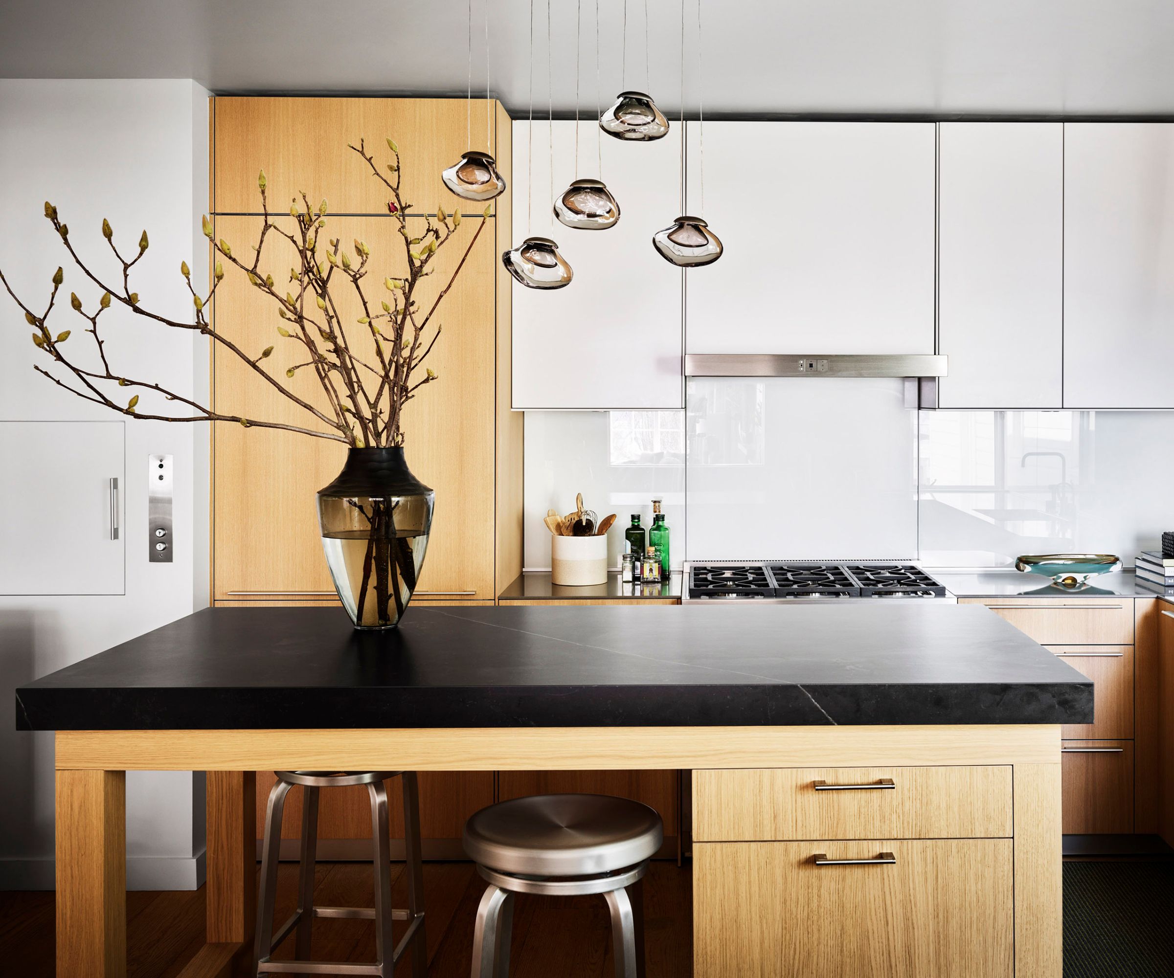
Throughout the home, lighting features add striking focal points. Jonathan goes on to reveal: 'The husband has a discerning eye for decorative light fixtures and we know what he prefers so we made sure that the light fixtures become functioning sculptures within each setting.'
The multi pendant light above the kitchen island is the Medusa Bloom design by Ochre. The dining room pendant light which features a group of frosted glass spheres is the Cloud chandelier by Apparatus.
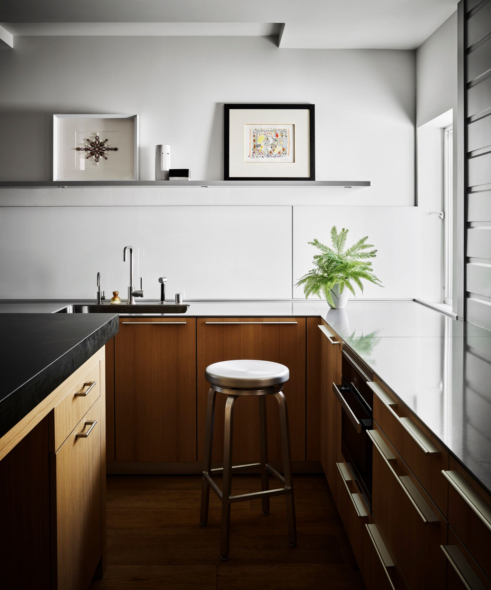
Minimal use of wall cabinetry in the kitchen allowed for a long display shelf to showcase some of the couple’s art collection. At night spotlights in the ceiling above, as well as task spots undermounted in the shelf, add to the gallery wall feel. The kitchen island was custom designed by JRD was fit to meet the family’s lifestyle.
From kitchen to bedrooms, Rachman’s interiors were designed to incorporate the family’s extensive art collection. 'We were eager to take into consideration the fact that they are art lovers with a growing curation and we wanted to honor that,' Jonathan explains.
He continues: 'We had to think ahead with regards to art placement and plan the layouts based on the sizes of the works of art and the colors and themes. Our clients don’t request this, but we know it’s expected, and they fully trust us with placement and layout.'
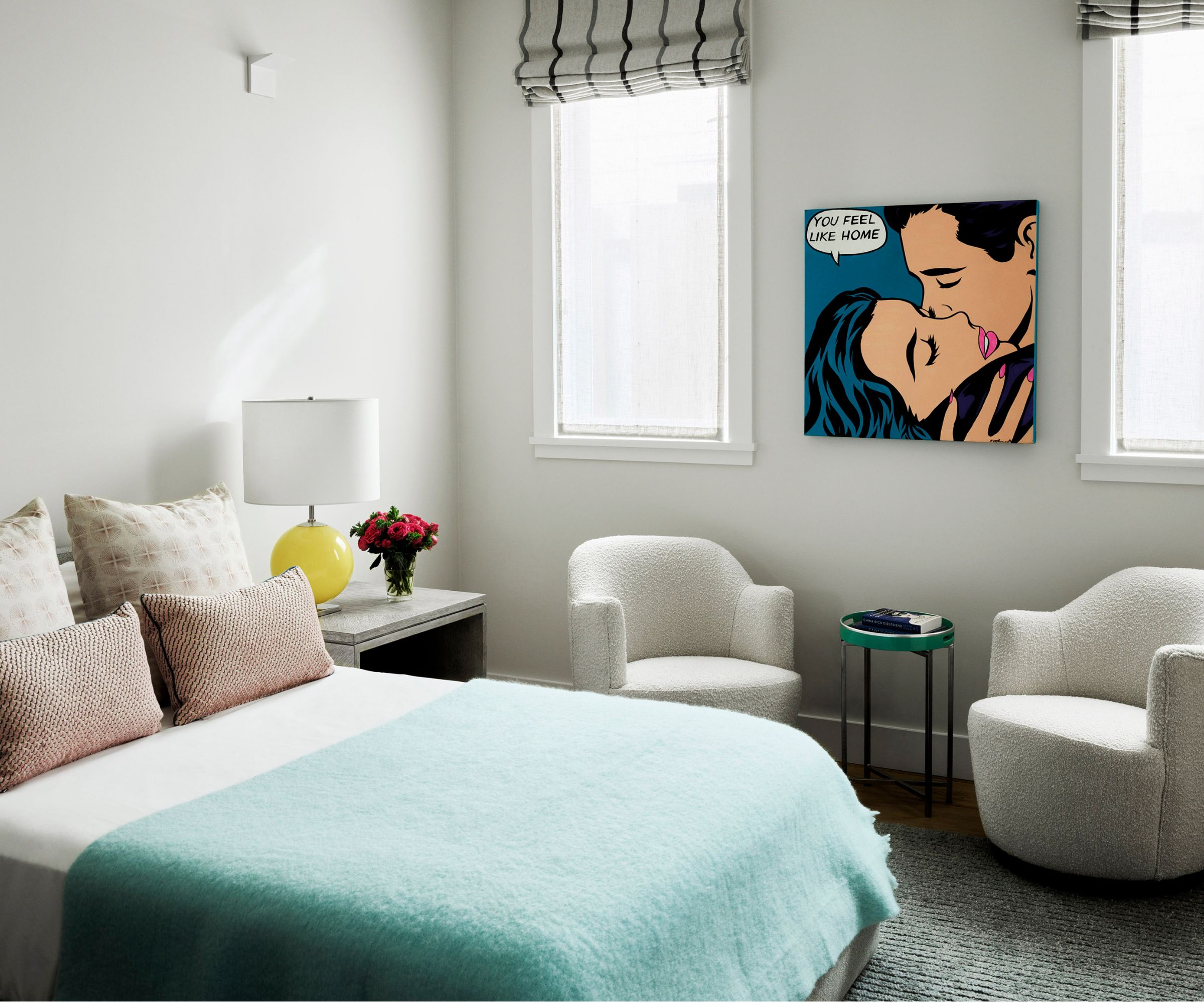
The daughter’s bedroom gives pride of place to a singular piece of impactful pop art inspired by Roy Lichtenstein , thoughtfully placed to view on entry to the room but also on waking. It is framed by the symmetrical layout of the windows and occasional chairs.
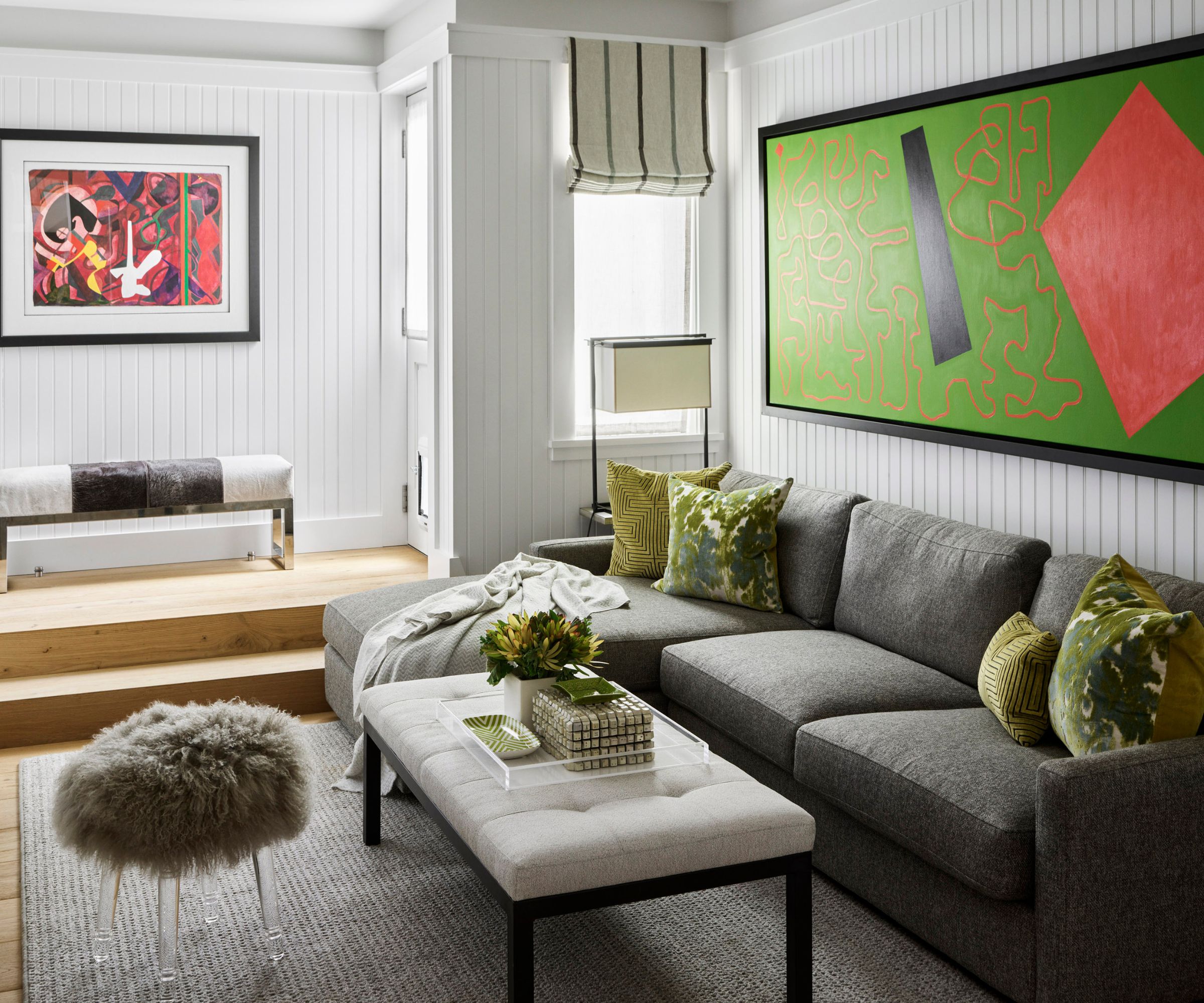
In this family TV room, bold contemporary artworks were sensitively complemented by the choice of accessories. The neat linear effect of walls – which are paneled with beat board – and the striped blind in fabric from Designers Guild make effective foils to the graphic forms and fluid strokes within the art.
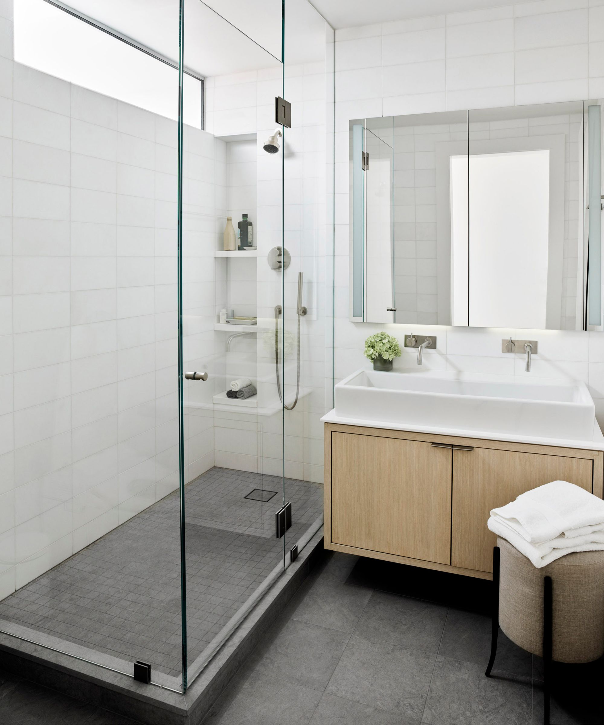
Prior to Jonathan Rachman working on this property, the shower room serviced the master bedroom but it was not practical for the couple. So, he and his team reconfigured the layout so that the closet and bathroom connect to the son’s room. The bathroom now has a barndoor.
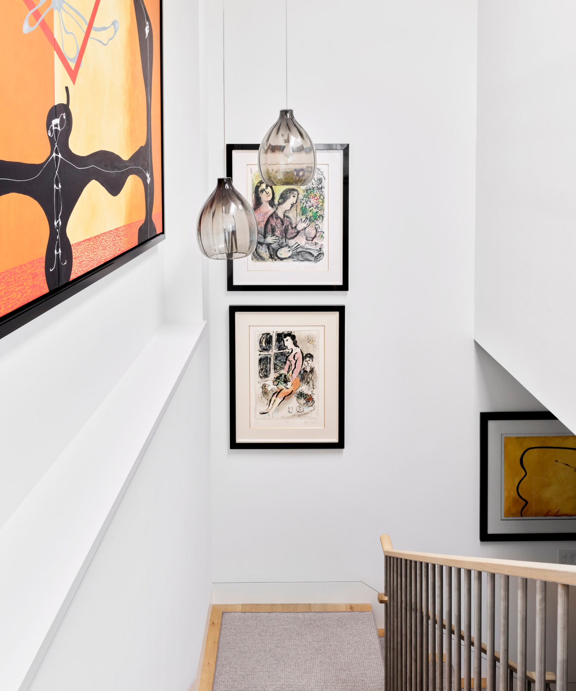
When asked how this house sits within the West coast style aesthetic Jonathan Rachman says, 'It defines Californian style in various ways! First architecturally, this used to be a cottage but then it was literally ‘lifted up’ to accommodate a sub terrain garage (cars can only go in and out with a disguised elevator – the roof of the elevator doubles as a lawn/flower bed). It is a modern cottage, very casual yet chic and with its historical façade and style preserved, as dictated by the city. It is also a fun ‘stackable’ cottage on a steep hills of San Francisco.
'I think the most satisfying thing was accomplishing everything my clients needed to accommodate their three children, and to include their wine and art collections in a way that works in this ‘stacked’ style modern cottage. It challenged my creativity in a positive and fun manner. It was like solving a giant puzzle! Very rewarding.'
This project is featured in full in Jonathan Rachman’s interiors tome: Currently Classic: Jonathan Rachman Design, published by Flammarion and distributed by Rizzoli.
Sign up to the Homes & Gardens newsletter
Design expertise in your inbox – from inspiring decorating ideas and beautiful celebrity homes to practical gardening advice and shopping round-ups.

Interiors editor and brand consultant, Kerryn Harper-Cuss has worked on four interior magazines and edited three of these, most recently The English Home, where she was Editor-in-Chief of both its UK and US editions for almost 12 years. She now writes for a number of high caliber publications, moderates design seminars and is particularly delighted to pen profile features on world-class interior designers for a regular slot on the Homes & Gardens website.
-
 Bissell CleanView XR Pet 300W Stick cordless vacuum review – it's a great budget vacuum, but by no means perfect
Low price point, but with the cleaning performance to match it
By Camryn Rabideau
-
 Kevin Costner uses the 'ultimate color choice for interiors' in his kitchen – it masters a top 2025 trend that's 'guided by the calm of nature'
The Yellowstone actor embraces a subtle yet soothing trend that's influencing how we decorate this year, but it will look just as perfect in 100 years
By Megan Slack