How to inject a plain property with color and character – a masterclass from an English country home
This home in the British countryside looked like a 'white box' – now it’s a joyful place with fresh hues and uplifting pattern, thanks to Olivine Design
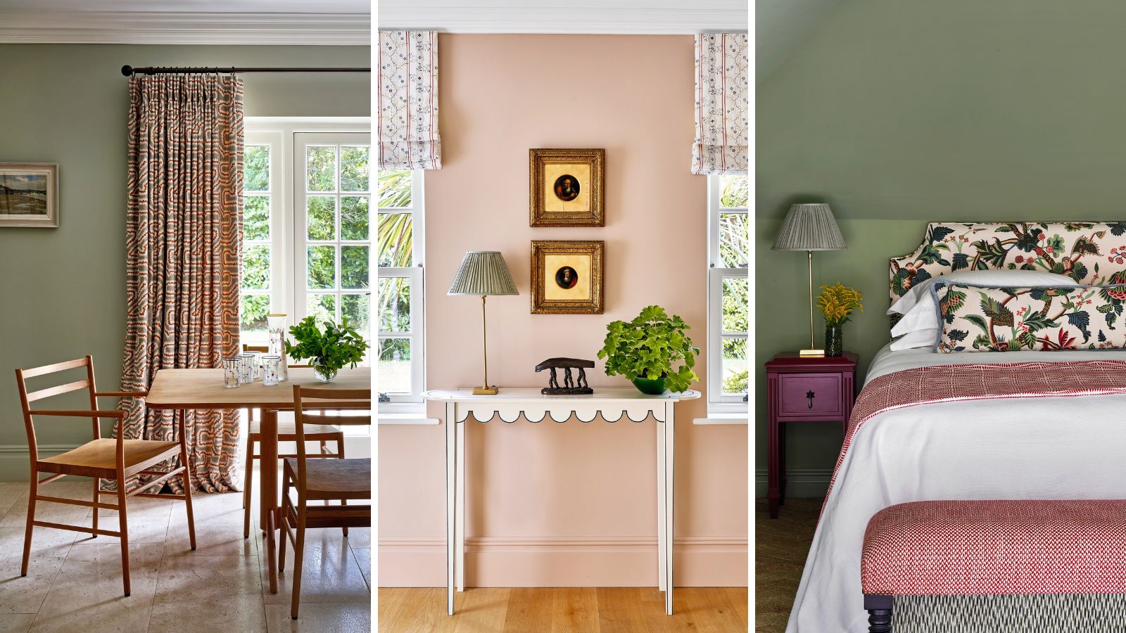

Country interiors are often defined by muted palettes, but this Surrey home is imbued with a joyful interior full of kaleidoscopic color, thanks to interior design studio Olivine Design.
The clients, a family with three young children, had moved out of London looking for a property with more space. They found this seven-bedroom house, which is around 30 years old but needed updating.
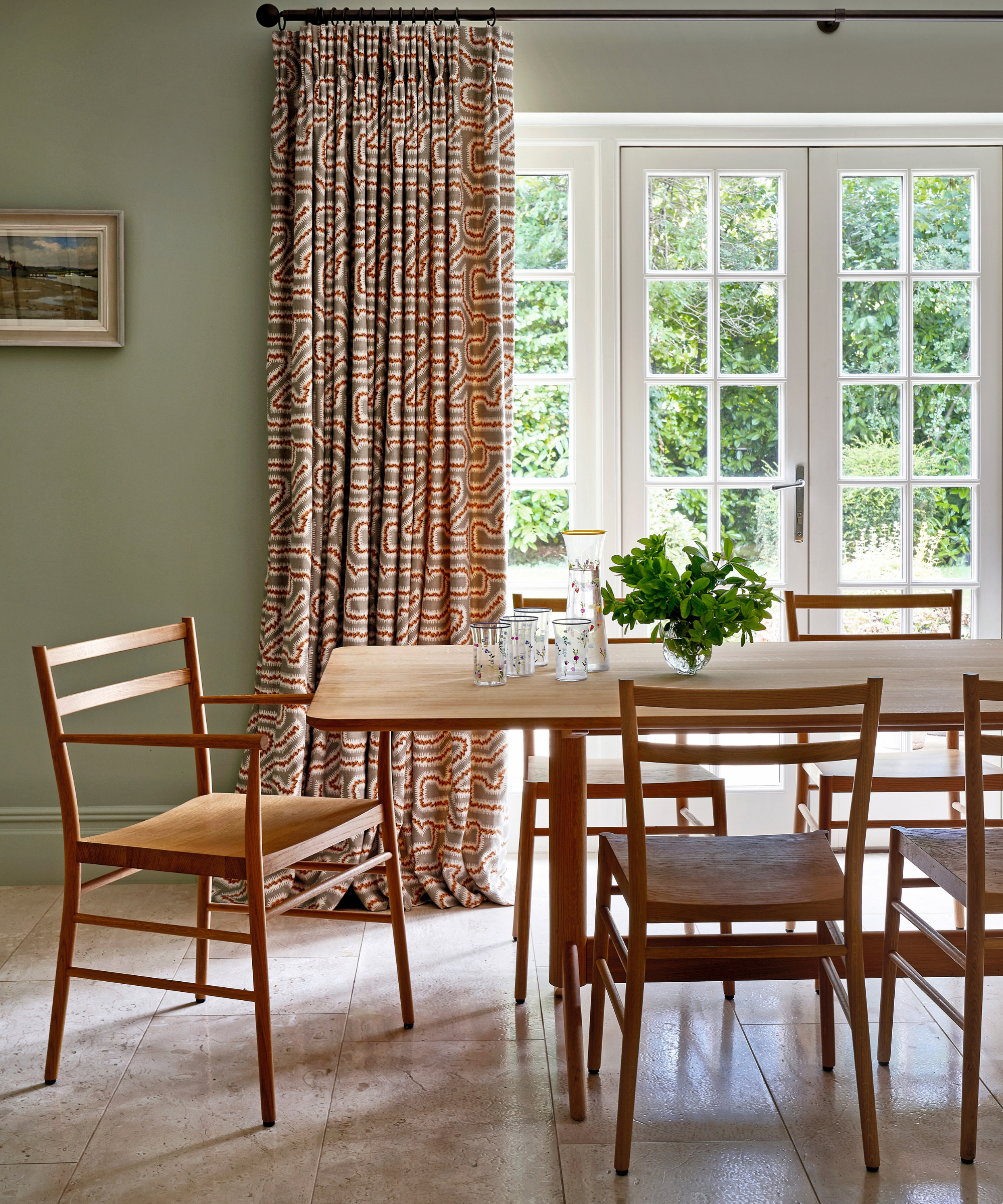
Dining table and chairs, Pinch. Walls in Mizzle, Farrow & Ball. Curtains, Rapture & Wright.
‘They were attracted to it because is it spacious and filled with light’, says Victoria Gray, co-founder of Olivine Design with Taline Findlater, who was tasked with renovating the interior.
‘The architecture and proportions of the rooms are wonderful, but it was a bit of a white box – there was nothing quirky or interesting.’ With a brief to inject character and personality into the interior and reflect the family, it fell to Olivine Design to introduce life with colorful paint ideas and carefully curated detail.
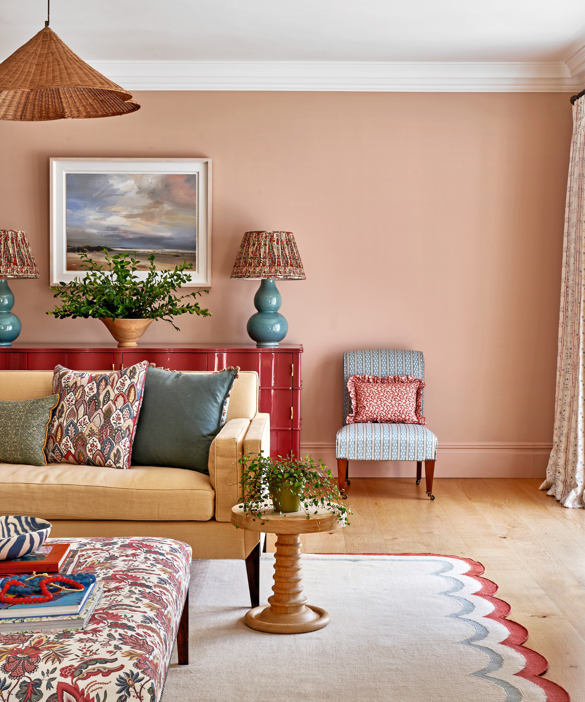
Cabinet, Julian Chichester. Table lamps, Vaughan. Side table, Howe London. Slipper chair, Vaughan; covered in fabric by Fleurons d’Hélène. Rug, Jennifer Manners. Ottoman, David Seyfried; covered in Christopher Moore fabric from The Toile Man.
‘At Olivine we do love colour!’ adds Victoria. New bathrooms were installed and a large dining room off the kitchen, which the family knew they wouldn’t use, was transformed into a generous playroom.
‘It was built for a reason but it needed to adjust with time,’ explains Victoria. The color palette was dictated by the layout of the property.
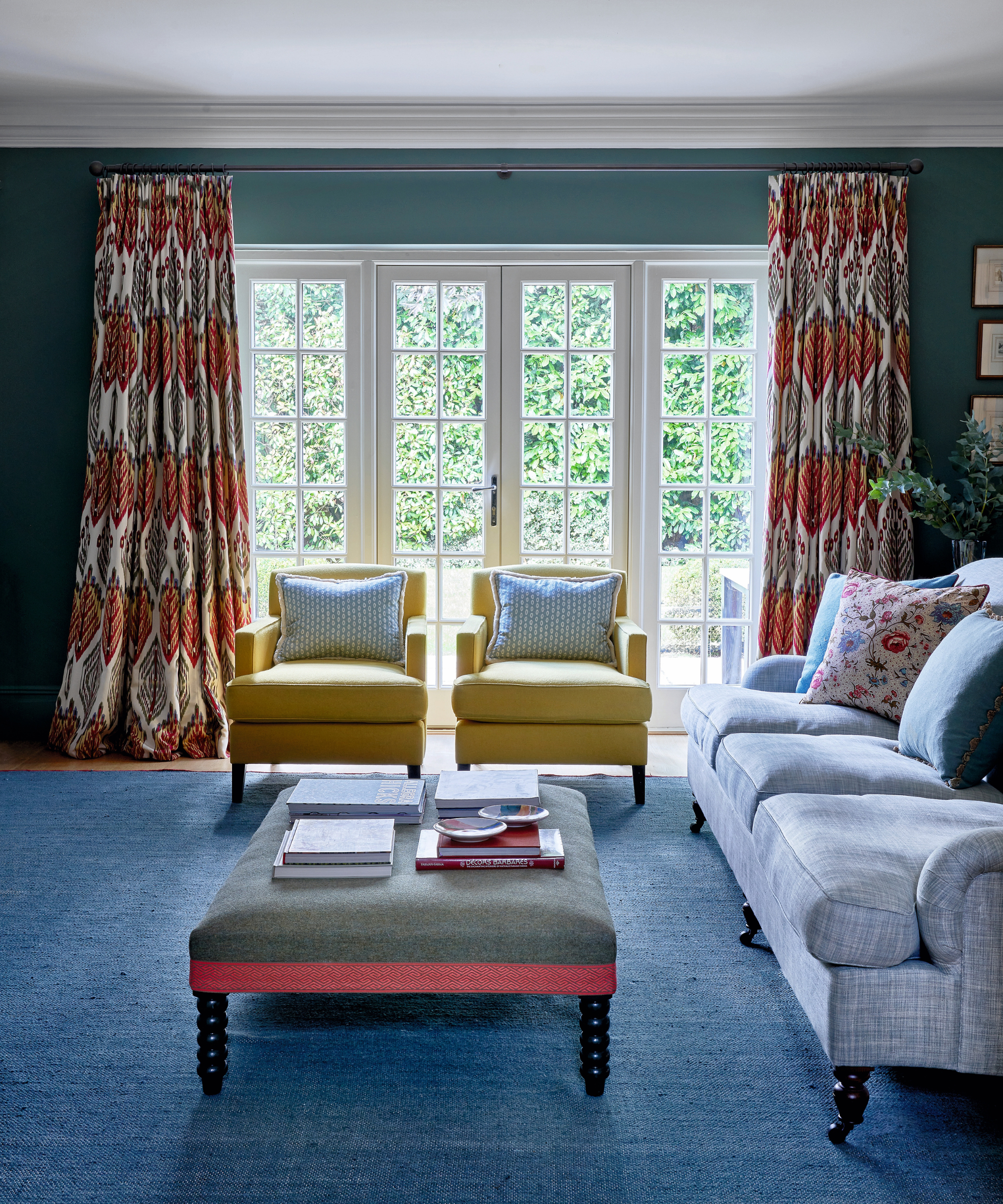
Walls in Green Smoke, Farrow & Ball. Curtains, Pierre Frey. Bobbin leg stool, David Seyfried. Stratford sofa; Jansen chairs, all Kingcome.
‘Downstairs, most of the rooms interconnect and, if they don’t interconnect, they have French doors into the garden and the hallway so we couldn’t really design any of the rooms in isolation to the others,’ says Victoria.
‘They had to all work with each other, which was crucial to the design downstairs.’ Clean, calm and fresh hues were selected, focusing on pinks, blues and reds, with pops of yellow and green, for a cohesive feel.
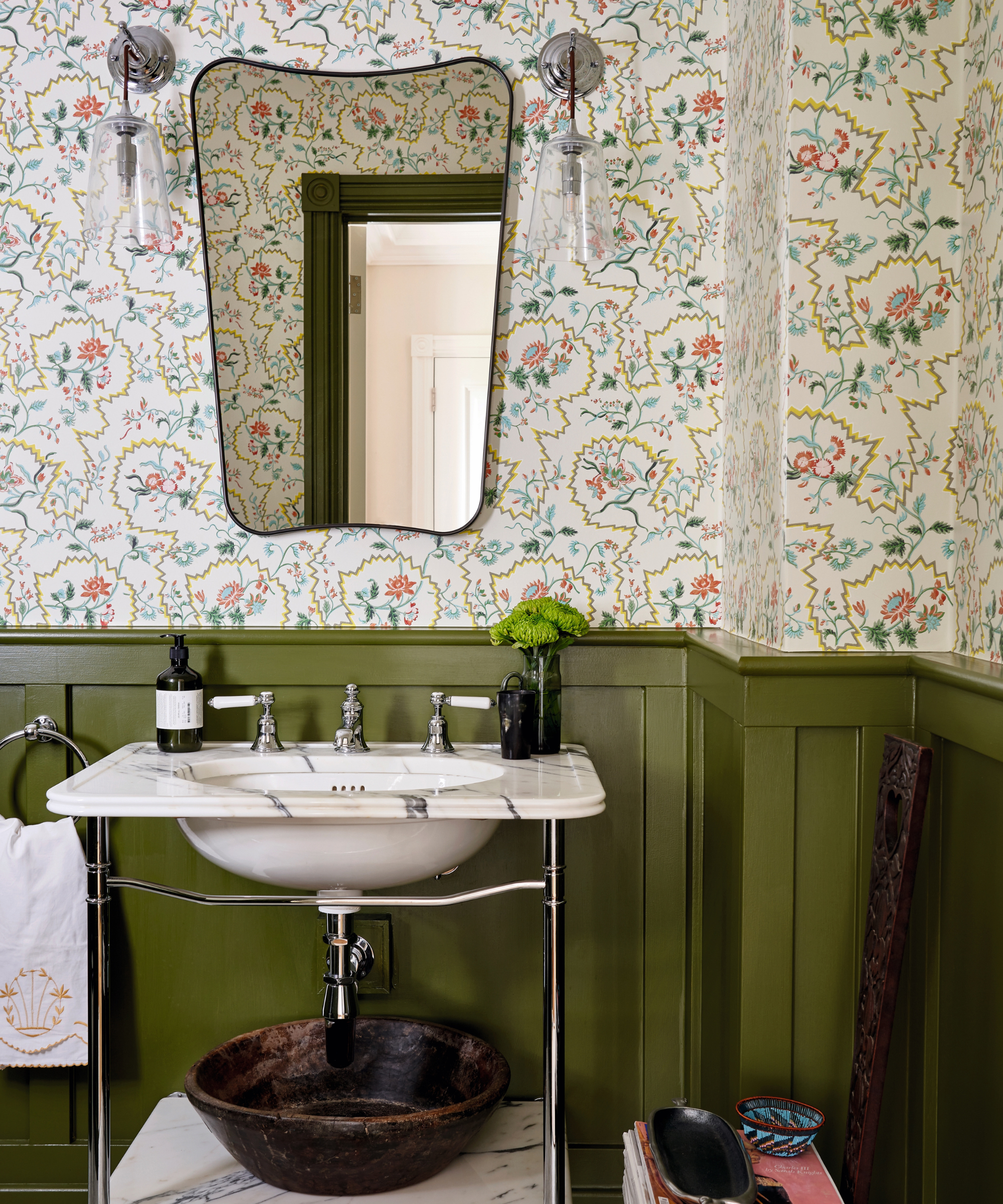
La Pannonie wallpaper, Pierre Frey. Panelling in Bancha, Farrow & Ball. The Single Ladybower basin; wall lights, all Drummonds .
‘The rooms are very light and we didn’t want to overwhelm them with anything too dark,’ says Victoria. ‘The punches of color came through on the furniture and the fabrics. The fabrics are what shine through in the rooms and, although they’re not dramatic, they work beautifully together.’
The capacious sitting room, for instance, showcases soft pink walls with bursts of yellow, blue and red and those colors are picked up in the exquisite florals. ‘It’s rare to have a room that size that you can break up with furniture,’ says Victoria.
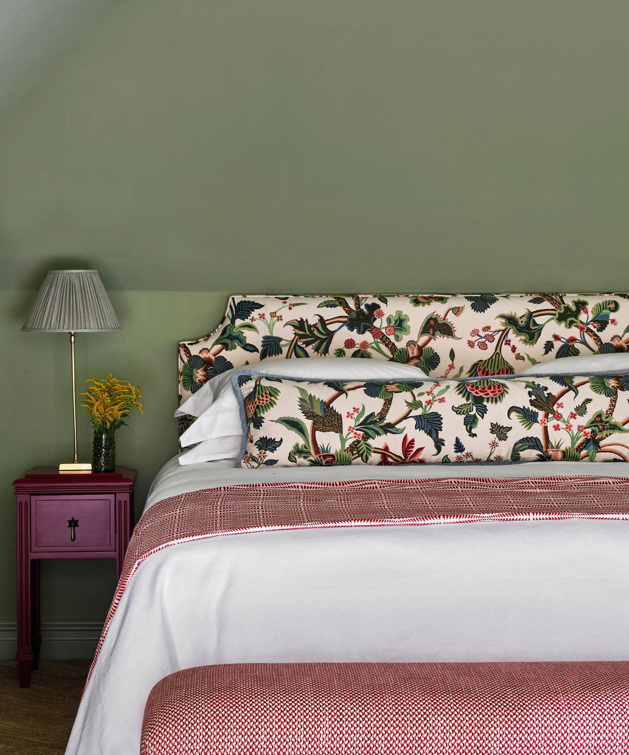
Walls in Light Olive Green, Edward Bulmer Natural Paint. Headboard, Bennison Fabrics.
Playful touches, a nod to the young family, include a bold red lacquered cabinet and a scallop-edged rug that echoes the detail on the scalloped console. The blue in the sitting room is picked up and intensified in the snug – the clients’ favorite room – but Olivine Design selected a deeper shade for it.
‘The snug was the only room where we went darker and we made it work,’ says Victoria. ‘It is not a color the clients would naturally have chosen, but we punched through with pops of yellow on the chairs and bright orange on the curtains.’
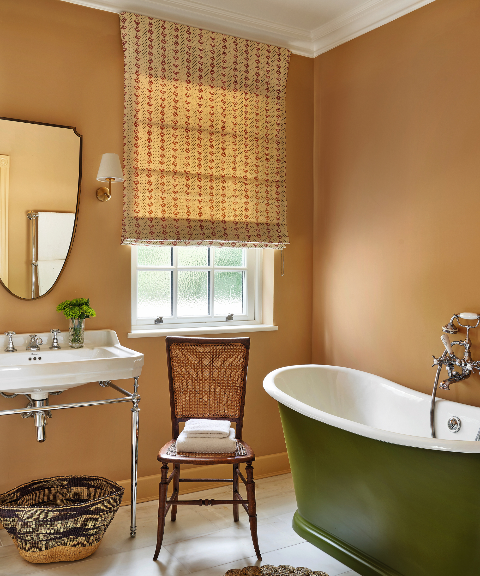
Walls in Cinnamon, Edward Bulmer Natural Paint. Light, Corston. Basket, Olivine Design.
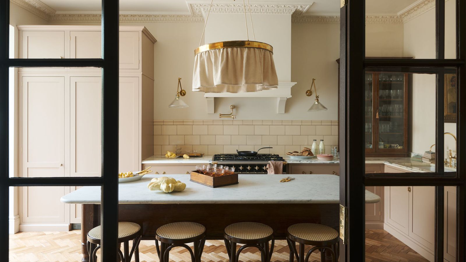
Modern pieces ensure the style is transitional. In the kitchen, for instance, against a soft green backdrop, a monastic-style pale oak table rubs shoulders with clean-lined chairs. ‘The client didn’t want anything too modern nor too precious or antique,’ says Victoria.
Upstairs, fluted bedside cabinets inject a contemporary feel into the bedrooms. That eye for carefully considered detail spans the interior, from the oversized floral headboards in the bedrooms and the scalloped curtains in the nursery to the wavy-edged cabinetry that hugs the wall in the playroom, all of which ensure that this family home is now bursting with character.
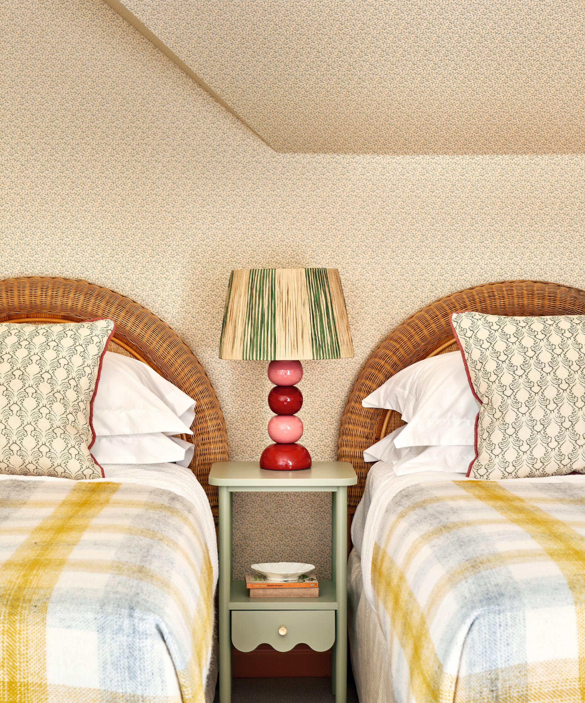
Lizzie wallpaper, Jean Monro. Bobble ceramic lamp, Wicklewood. Table, Jelks London. Cushions, Olivine Design.
Meet the designers
Victoria Gray and Taline Findlater share their style inspiration
What part of the project do you think is the biggest success?
Adding built-in joinery in the playroom – it showcases the wonderful collection
of books the children have.
What's your go-to color?
For this project, pale pinks in all shades.
What's your favorite small change that has a huge impact?
Oversizing the headboards in the larger bedrooms of the house to make an impact.
Favorite design detail?
Trims - on cushions, curtains, and furniture.
How do you find inspiration?
We love a trip to a museum or gallery, like the V&A in London – we can spend hours
here finding detailing inspiration.
Can you reveal a secret address we should have on our radar?
Painswick Fabrics in the Cotswolds.
How does this house epitomize the country idyll?
There is a lovely inside-outside feel to the house, especially on the ground floor.
Sign up to the Homes & Gardens newsletter
Design expertise in your inbox – from inspiring decorating ideas and beautiful celebrity homes to practical gardening advice and shopping round-ups.

Interiors have always been Vivienne's passion – from bold and bright to Scandi white. After studying at Leeds University, she worked at the Financial Times, before moving to Radio Times. She did an interior design course and then worked for Homes & Gardens, Country Living and House Beautiful. Vivienne’s always enjoyed reader homes and loves to spot a house she knows is perfect for a magazine (she has even knocked on the doors of houses with curb appeal!), so she became a houses editor, commissioning reader homes, writing features and styling and art directing photo shoots. She worked on Country Homes & Interiors for 15 years, before returning to Homes & Gardens as houses editor four years ago.
-
 I tried this one easy dishwasher trick and made the annoying need for manual drying a thing of the past
If you hate those little pools of water left on your cups and crockery, this towel trick is for you
By Punteha van Terheyden
-
 Renovation Aloha's Tristyn and Kamohai Kalama share the front color you need to sell your home – they explain, 'it's one of the areas you can go a little bolder'
In Homes & Gardens' exclusive interview with the Kalamas, they explain the renovations to make to the front of your home for property value
By Sophie Edwards