These chic coastal interiors were inspired by the elegance of America's beloved former first lady, Jackie Kennedy
Taking inspiration from a true American icon – this Vancouver home's interiors have all the timeless elegance of Jackie O

It's not unusual to see elements of inspiration sashaying their way from the runways of haute couture into our house design, but a whole look inspired by one of America's most beloved style icons? That's got to be worth a second glance.
The muse for this glamorous oceanfront home in Vancouver is Jackie Kennedy Onassis, America's first lady at the time of President John F Kennedy's assassination in 1963. The home is an elegant and timeless combination of both modern and traditional style, rather like Jackie O's outfits, and specifically took inspiration from her elegance on sailing trips, along with design trips to The Hamptons and close observation of vintage sailing craft. How does that all translate to the interior design of a family home? We asked designer Kelly Deck to explain the intriguing connection as she gives us the tour.
Designer Kelly Deck's involvement with this extended Vancouver home began when the owners asked her to come up with some coastal decor ideas for a scheme that would seamlessly bring together their original home with an addition built on the recently acquired neighboring lot. The extension was built to accommodate the changing needs of the owners' growing family, and there are now 7 bedrooms and 8 bathrooms. The timely purchase of the plot next door meant the owners could stay in this most idyllic of locations, one block away from the Royal Vancouver Yacht Club.
The home's prestigious location plays a big part in its design. 'We referenced the timeless and practical details, and materials of wood sailboats – the sun-kissed wood, the fastened details, the colors of rope, sail and sea,' says interior designer Kelly Deck. 'All these elements inspired our color scheme and the relaxed coastal feel.' And for the Jackie O connection, the design team looked at historical images of the American style icon on sailing trips or at the seaside. 'We wanted the home to have the same chic and restrained style,' says Kelly Deck.
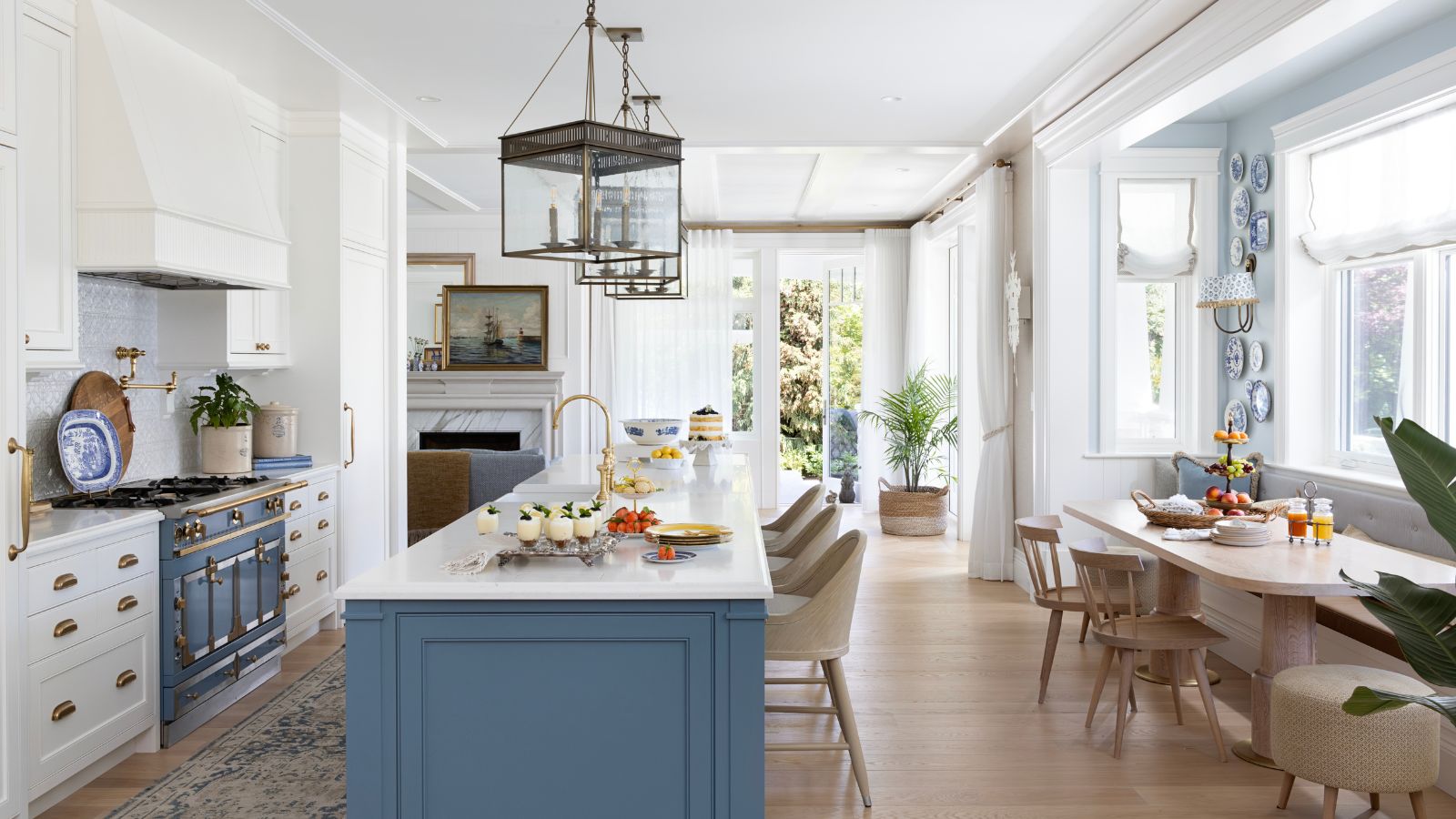
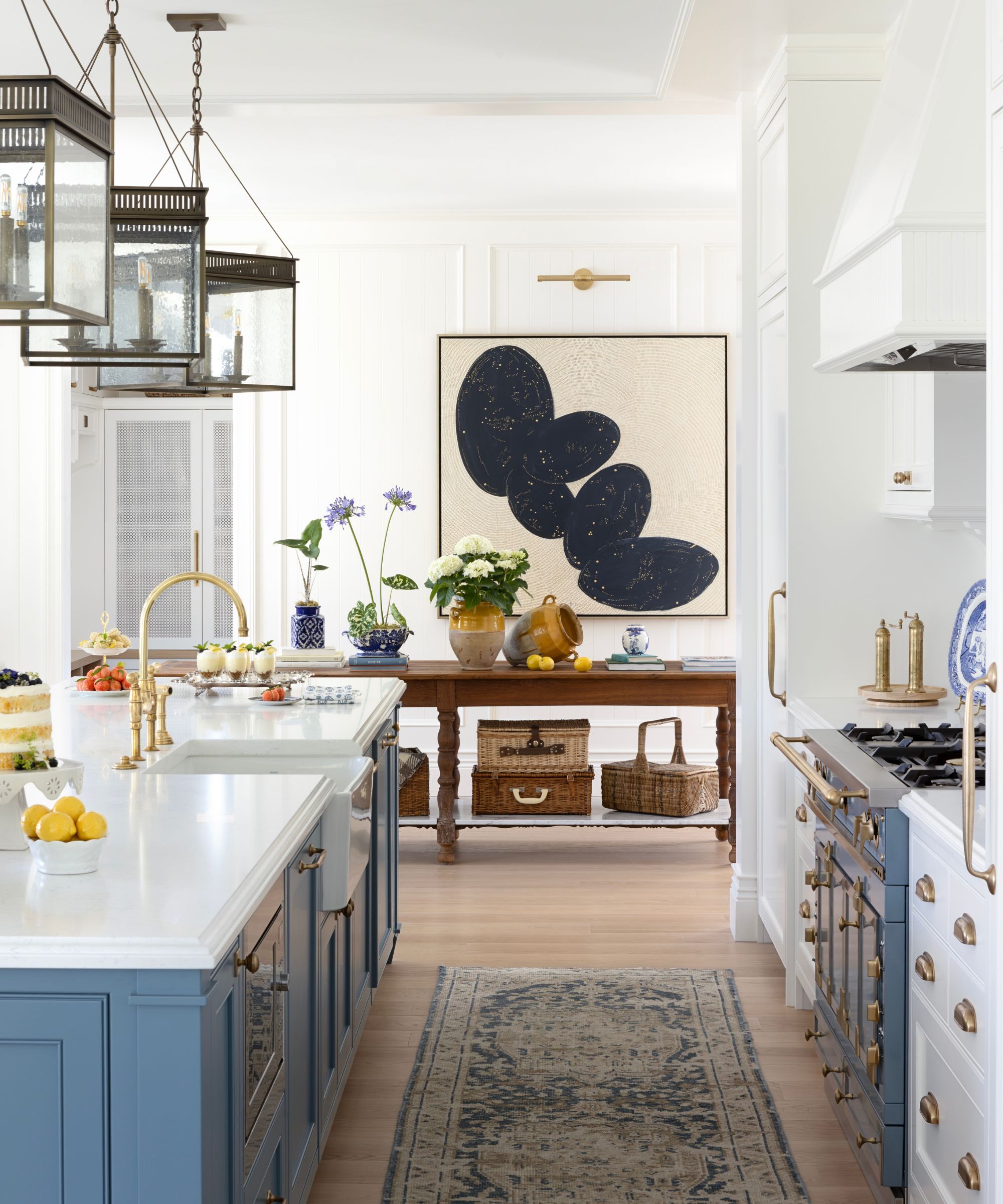
Kitchen ideas feature a classic coastal color scheme inspired by the property's ocean views. Blue, white, navy, gold, and natural wood all feature in the kitchen's palette, with the central island matching the exact shade of blue of the Le Cornue range.
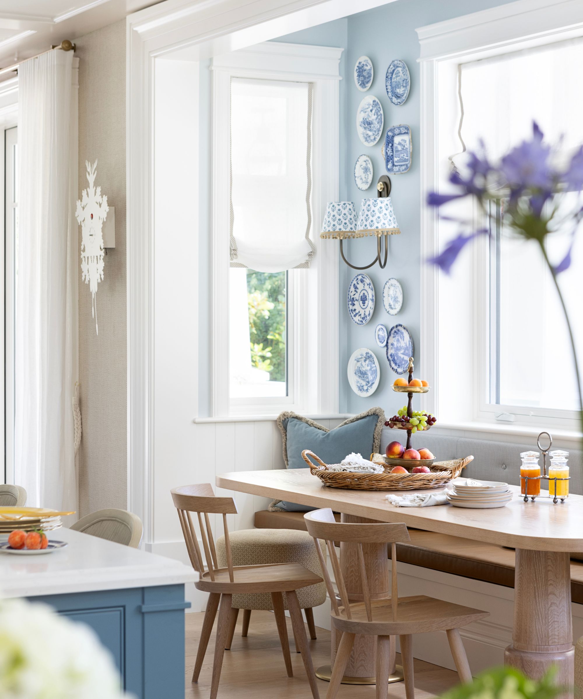
Meanwhile, in the eat-in kitchen, the soft blue shades continue into a gallery wall display of vintage china, which adds another layer of character to the traditional meets modern blend. The baker's table is from Arcadia Antiques, with chairs by Coolican & Company and the sconces are from Visual Comfort.
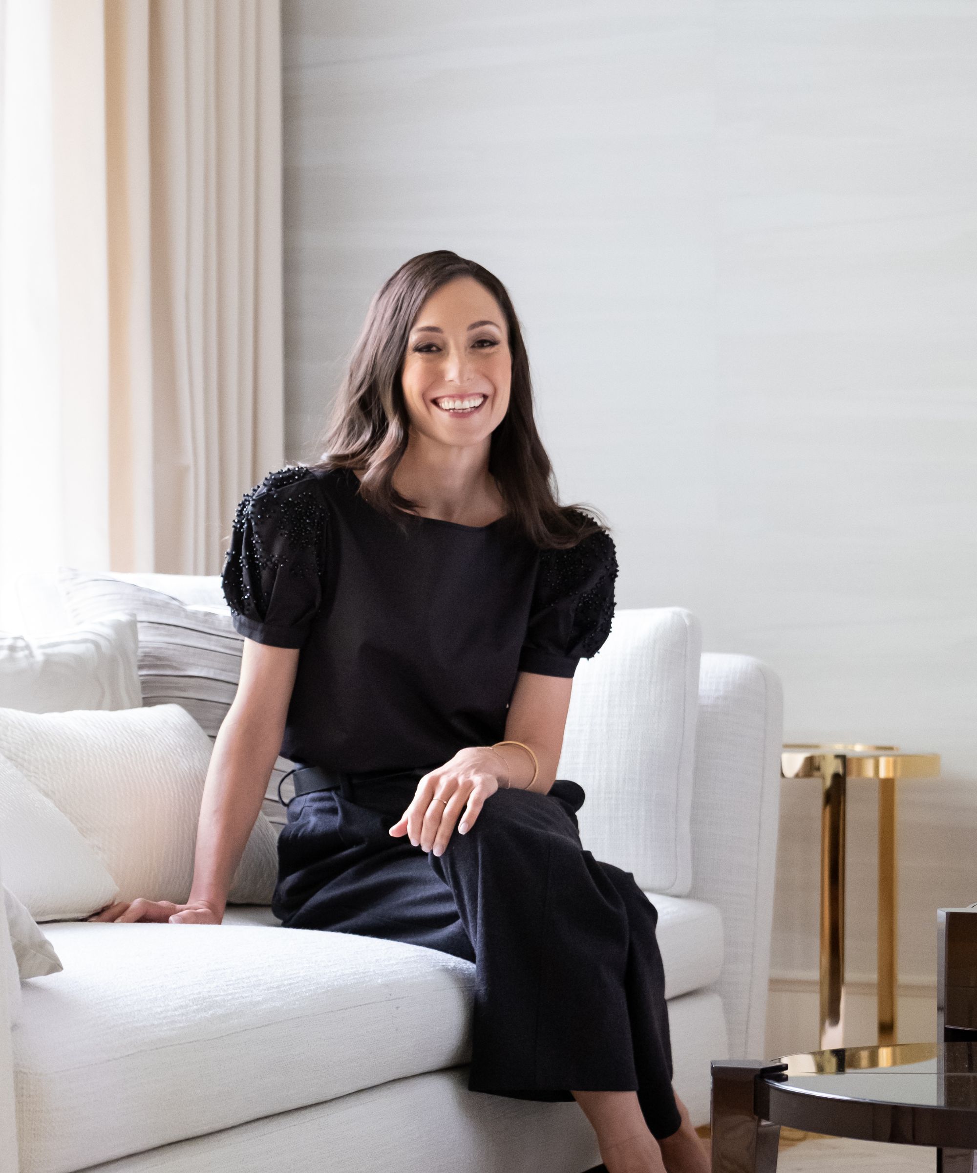
For over two decades, Kelly Deck and her team have artfully designed estate homes in the Pacific Northwest and beyond, earning international acclaim for their detailed and exquisite approach to creating interiors.
'Adapting this home to the evolving needs and tastes of the family over four years was a challenge and an opportunity,' says Kelly Deck. 'Room configurations changed and older teens moved to the lower floor (to be close to the hangout rooms), requiring flexibility in our role.'
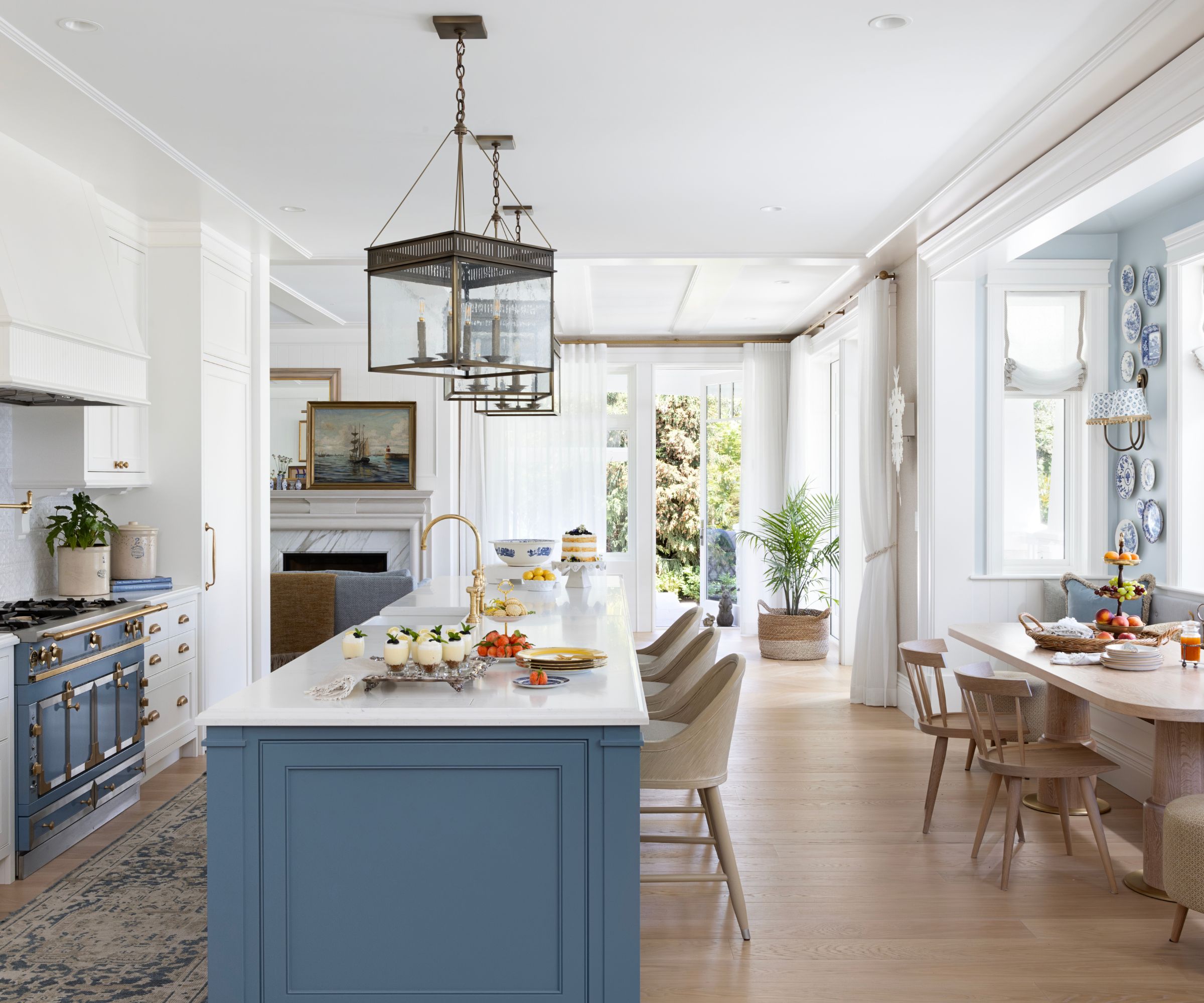
'We used a broad selection of finishes in this home. It has so many contained spaces – through archways and glazed oak doors that there were beautiful opportunities to create unique experiences from room to room,' says designer Kelly.
Design expertise in your inbox – from inspiring decorating ideas and beautiful celebrity homes to practical gardening advice and shopping round-ups.
The kitchen's transitional style is a perfect example of using a variety of different pieces and finishes, that all come together to give a relaxed, timeless look. From the historically inspired Urban Electric light fixtures and Vicostone countertop to the vintage-style rug from Tibetano and Walker Zanger backsplash, the kitchen has a beautifully curated look.
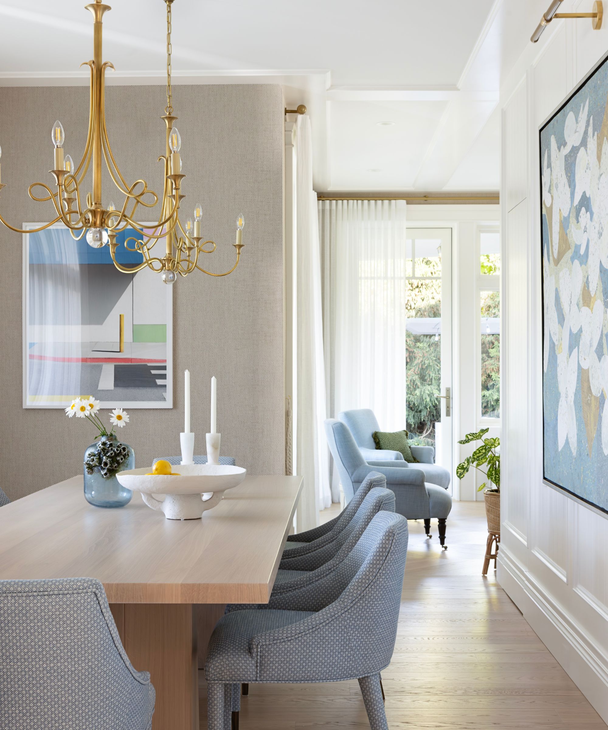
Kelly's dining room ideas play on more contemporary design influences, with just the Visual Comfort chandeliers hinting at the more traditional areas of the home. The table is from Avenue Road, with dining chairs from Villa & House. The contemporary painting is by David Guenter, with neutral textured wallpaper by Holly Hunt.
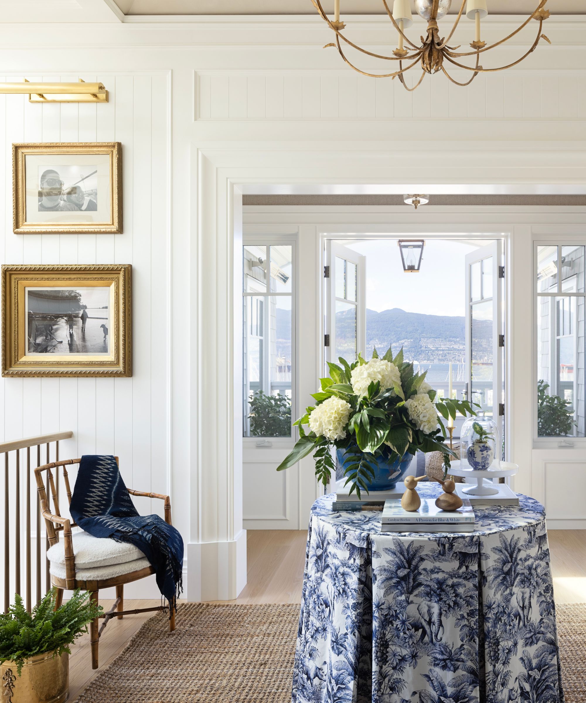
You're never far away from the home's deep verandas, which wrap around three sides of the property, giving it a stately and Southern sensibility. The hallway ideas invite the eye to appreciate the exteriors, with look-throughs onto the veranda. Walls with raised panels and ship lap detailing enhance the nautical narrative.
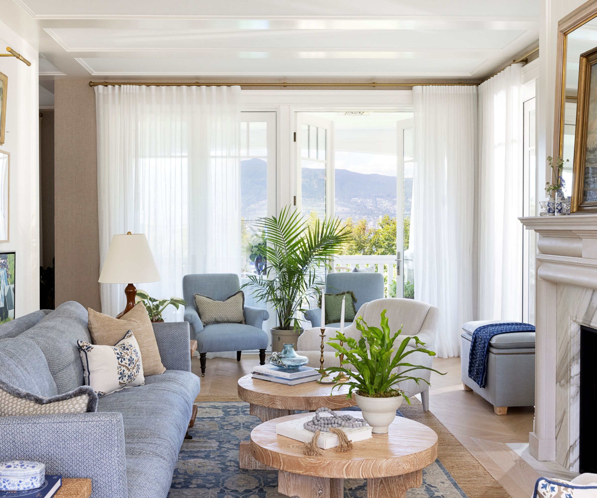
Living room ideas here are quietly elegant, with gauze drapery to allow light to easily pass through into the home. The flooring throughout the main rooms is a wide plank, whitewashed white oak, which also helps to keep the space feeling light and bright. The chandeliers are by Urban Electric; fireplace by Jamb; lamp by Visual Comfort. The custom sofa is by Kelly Deck Design, teamed with a blue armchair by Lee Industries and a white one by Baker furniture.
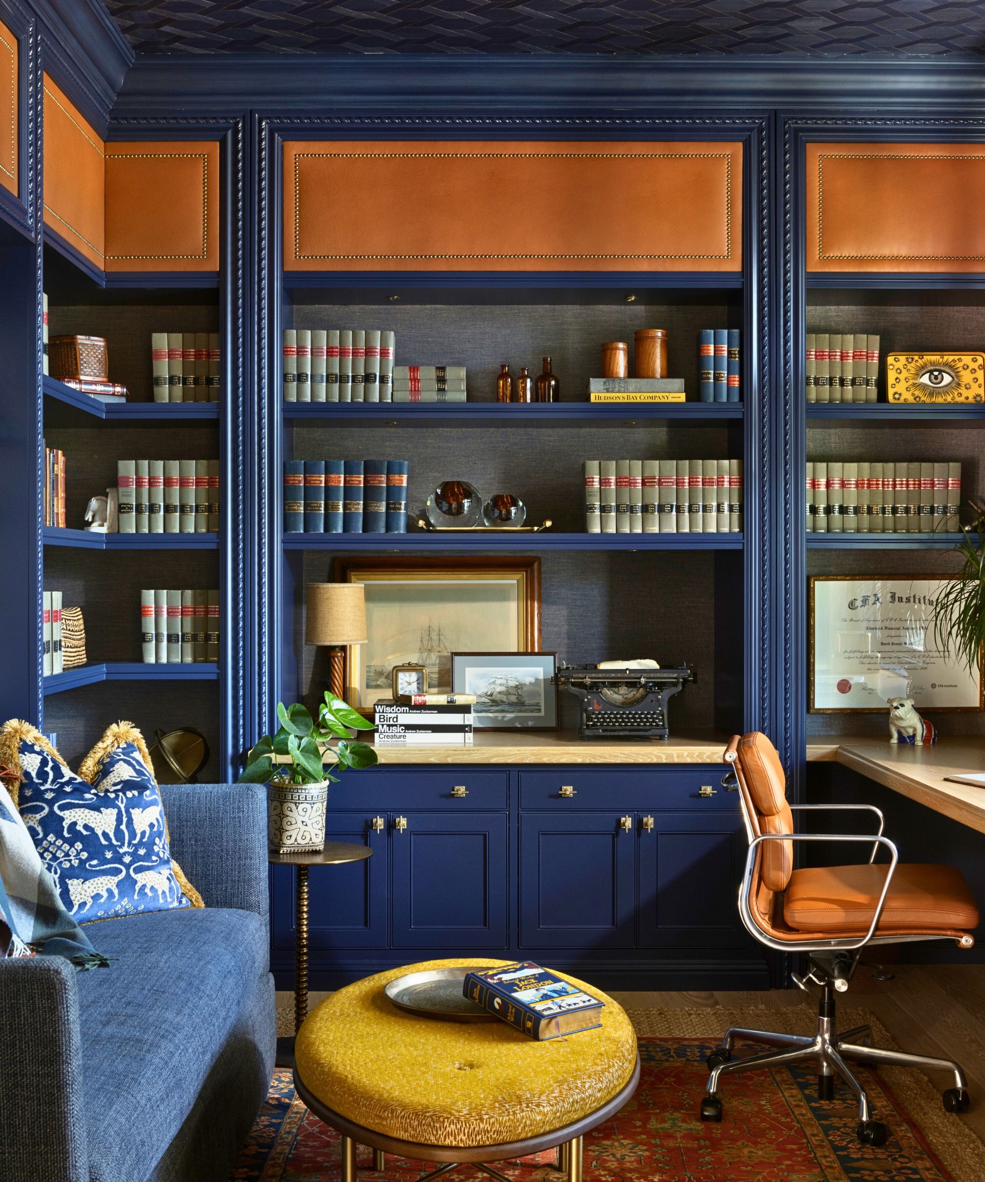
Home office ideas for the man of the house include smart navy millwork, with a carved rope motif molding, navy grasscloth walls and cognac leather accents, the whole creating a nautical look. The desk chair is by Herman Miller; custom sofa and ottoman by Kelly Deck Design; rug by East India Carpets; ceiling wallpaper by Phillip Jeffries; light by Hector Finch; and hardware by Myoh.
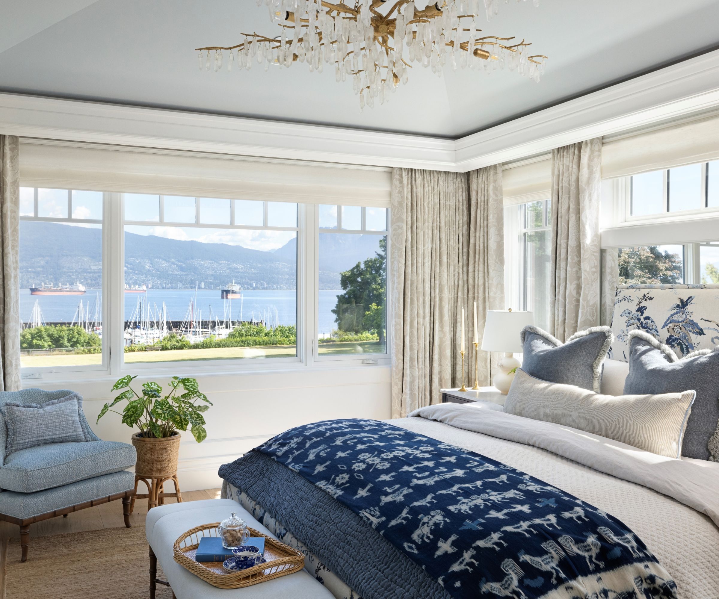
The exquisite principal bedroom is light, bright, and very layered, with bedroom ideas furnished in white, linen, and different hues of blue.
You could argue that with windows on two sides and stunning views of the ocean and passing yachts, a room like this has little need for coastal bedroom ideas, yet Kelly's scheme enhances the setting in with the darker blue furnishings reflecting the ocean shades, and the very pale blue ceiling detail (Sherwin Williams' Misty) making a gentle reference to the sky-blue outside. The chandelier is from Currey & Company.
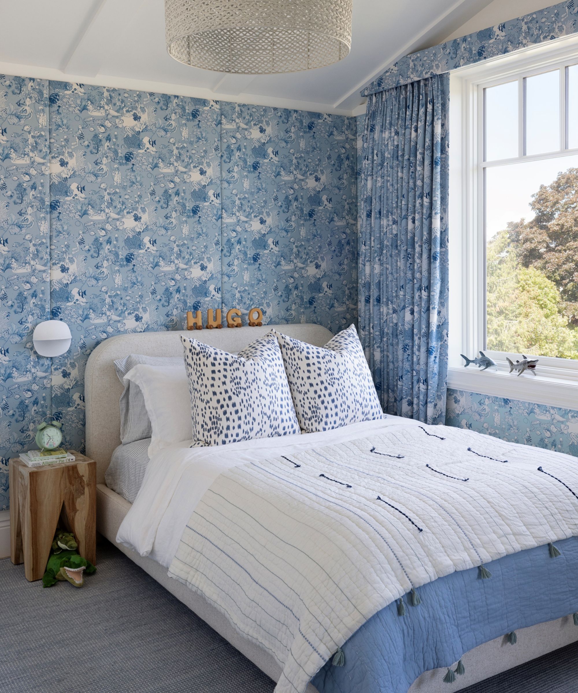
The design team particularly loves the kids' room ideas they created for the family's youngest members. This one features an under-ocean theme with matching wallpaper and draperies that designer Kelly found in Paris. The soft blue shades are in keeping with the color themes elsewhere in the house, so there's a harmonious look while still adding a touch of individuality to the space.
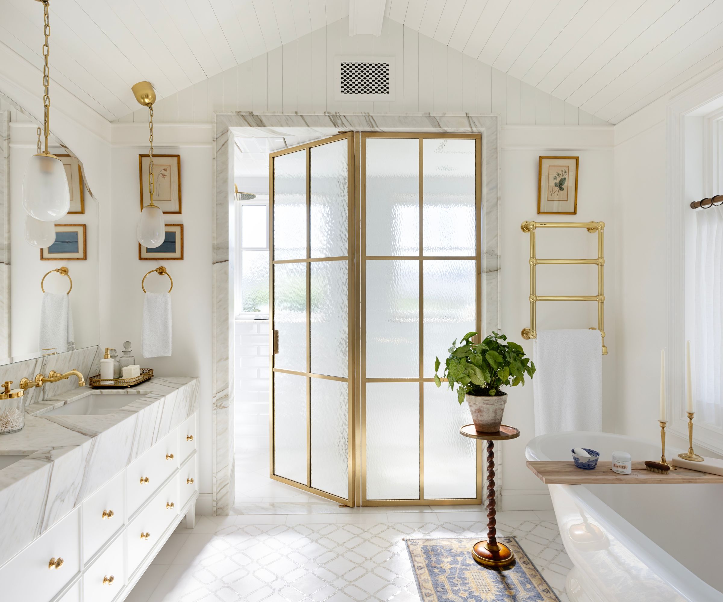
There are 8 bathrooms to choose from in this property, but this ensuite to the primary bedroom really is something else. On the face of it, it's a very neutral scheme: all white with gold highlights, but look closer to appreciate the textures and layers created within that very limited palette. It's the kind of space that has Jackie O written all over it! Key details include pendant lights by Hudson Valley Lighting, faucets by House of Rohl, tiles by Ann Sacks and tub by Victoria & Albert.
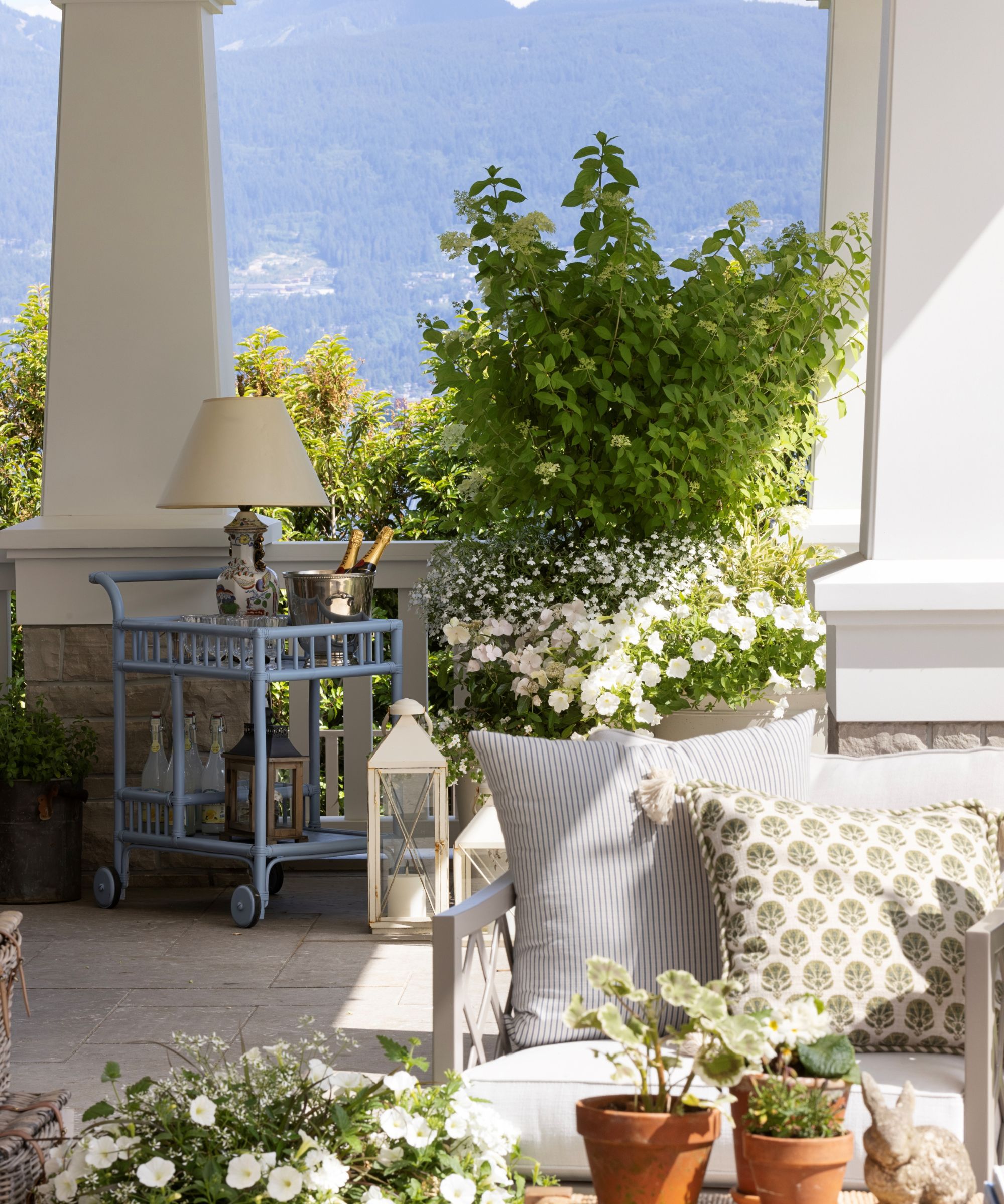
The outside space and patio ideas were an important part of the home's design, since this veranda surrounds the home on three sides and gives access to those ocean views.
'Our team worked closely with architect Eric Stine and landscape architect Paul Sangha on the exterior color scheme, endeavoring to keep it light and romantic,' says designer Kelly. 'Our final selections were: parchment colored cedar shake, white trim, cedar shake roof, beautiful copper pipes as well as buff-colored natural stone in large format for all patio areas.' Good quality outdoor furniture and frothy container plantings in the same soft palette are the perfect complements to finish the look.
Thinking back over the project as a whole, inside and out, designer Kelly says: 'We wanted the home to feel lighthearted, youthful and airy. We also wanted to create the presence and substance of a historical home that had been standing for generations.'
We think that's mission accomplished.
Interior design: Kelly Deck Design
Architecture: Eric Stine
Landscape architecture: Paul Sangha
Photography: Ema Peter
Karen sources beautiful homes to feature on the Homes & Gardens website. She loves visiting historic houses in particular and working with photographers to capture all shapes and sizes of properties. Karen began her career as a sub-editor at Hi-Fi News and Record Review magazine. Her move to women’s magazines came soon after, in the shape of Living magazine, which covered cookery, fashion, beauty, homes and gardening. From Living Karen moved to Ideal Home magazine, where as deputy chief sub, then chief sub, she started to really take an interest in properties, architecture, interior design and gardening.
