7 ways to add character to a newly extended kitchen
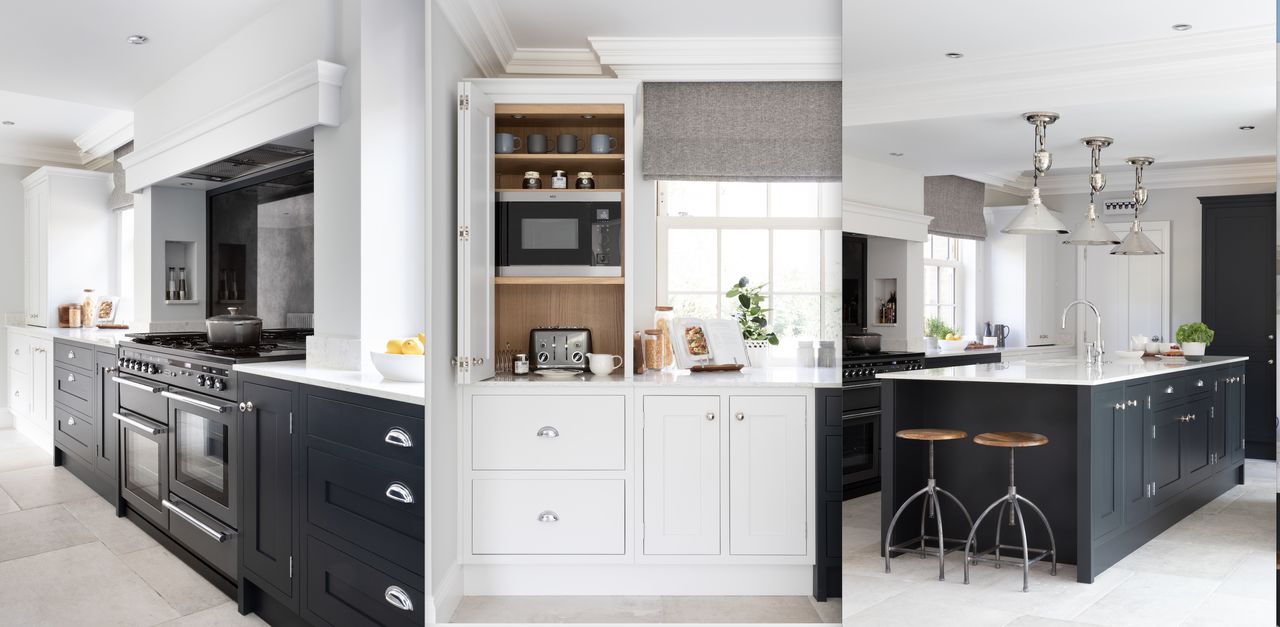
Bold color and elegantly proportioned furniture create impact in this kitchen extension

Older properties can be full of charm and character but the layout and size of the rooms don't always suit the way we live today. Kitchens in an older home may be tucked away from the main living space, and often they are too small for the open-concept cooking, eating, entertaining rooms we prefer today.
When considering kitchen ideas and new layouts for your home, you can choose to reconfigure your existing space – or add on to create the dimensions and functionality you desire. This family chose the latter option, realizing that the initial disruption would be worth it and the end result would add value to their home.
The family home in Nottinghamshire, part of the UK's East Midlands, has five bedrooms and is set in two acres. But while the house is large but the kitchen wasn't. They combined a new extension with a kitchen remodel to create their ideal space.
Planning a kitchen extension
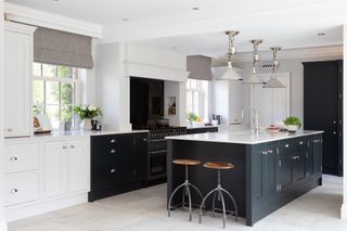
Once you've decided on a bump-out, you'll need to pin down your kitchen extension ideas and how you make it work with your existing space.
'In this property, the existing kitchen was relatively small and cut off from the dining room, as was typical of the time the house was built,’ explains Jamie Krantz of Krantz Designs, which completed the project. ‘Our clients wanted to create a more spacious room with an open-plan design, suitable for cooking, dining, relaxing as a family and socializing with friends.’
Their solution was to remove the internal wall between the old kitchen and dining room, and to extend across the rear of the property to create a much larger and light-filled L-shaped space. Zoned into new soft seating and dining areas with the kitchen at its heart, a central log burner is built into a structural supporting pillar to radiate warmth throughout the room.
The result is a contemporary country kitchen that combines charm and functionality. ‘It is a room designed for modern family life,’ agrees Jamie, ‘with a timeless feel that should last for years.’
Here, he shares how to get brilliant results with your own project.
1. Choose Shaker cabinets for a classic look
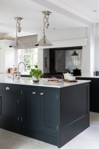
‘Our goal was to design a kitchen with character that sat comfortably in the large space,’ says Jamie. Choosing in-frame Shaker-style cabinetry with a clean-lined design was key to success – the unfussy look of Shaker kitchens creates a contemporary twist on classic furniture, while the deep Black Blue painted finish adds plenty of impact.
‘We introduced a two-toned color scheme to highlight the range cooker, island and tall cabinetry as focal points, balancing them with sections painted in a soft white with a hint of grey,’ Jamie explains. ‘In a large kitchen like this, it’s important to add some variation for interest – too much black would be heavy, too much white would be bland.’
2. Make the island the focal point
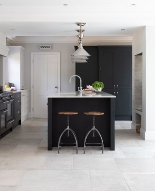
When you're considering your kitchen island ideas, decide whether you want it to be a cook space with a hob, to have a sink, or if you'd prefer the surface to be free for prepping, dining and gathering around.
Here, the kitchen is focussed on a large island including sinks, dishwasher and plenty of work surface, with an area for two bar stools at one end.
The island is the heart of the room – its 2.8m long size designed to be in proportion to the generous dimensions of the room, and to provide ample prep surface and a hub for morning coffee or an evening glass of wine.
But it's the nickel pendants that really make it stand out – statement pieces like this are key when designers are developing kitchen island lighting ideas and are worth investing in to elevate your kitchen.
3. Create distinct work zones
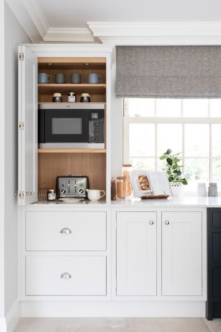
Behind the kitchen island, the wall run contains a breakfast cupboard, cooking zone and storage, while, at right angles, a section of tall cabinetry includes an integrated fridge, freezer and wine cooler flanking a coffee station.
The room is carefully designed to create areas dedicated to specific tasks, from making breakfast to preparing drinks, so that the family can use the space together with ease.
4. Add a faux chimney breast
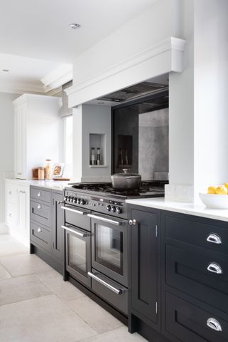
A faux chimney breast adds character to the room, frames the range cooker and conceals the built-in extractor hood. Topped with a clean-lined overmantel, painted to match the wall to lighten its look, the side supports include wall niches, used to keep condiments for cooking close at hand.
Painting the base units in Black Blue distinguishes the zone from the remaining sections of the wall run and creates a more ‘unfitted’ look, while the antiqued mirror splash back reflects light and enhances the spacious feel of the room.
5. Turn structural elements into showstoppers
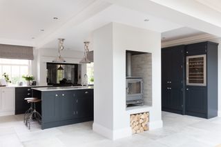
The structural pillar in the centre of the room houses the wood-burning stove, its warmth enjoyed in both the kitchen and the adjacent dining area.
The kitchen flooring has been carefully considered. Stone-effect porcelain floor tiles are waterproof, stain and scratch resistant, making them easy to maintain, while their three size mix of formats adds to their traditional flagstone look.
6. Mix-up materials for a distinctive look
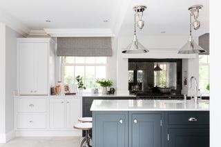
While the dark furniture contrasts against the light for simple yet effective modern impact, the design is united by consistent use of polished chrome and nickel detailing, from the pendant lights to the cup handles and knobs, the tap and the trim of the range cooker.
Natural textures are introduced with wooden-topped bar stools and heavy linen blinds, designed to create a smart combination that still sits comfortably in a house in the country.
Made of engineered quartz, the marble-effect kitchen countertops are designed to create the look of natural marble with the durability, stain and scratch resistance of a man-made material
7. Create a drinks zone
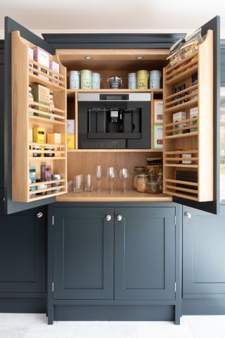
It makes sense to house all the kit for making drinks in one zone, so the family can make coffee or reach for a chilled bottle of wine for the adjacent dining table, without getting in the way of the cook.
The section of tall cabinetry includes a central built-in coffee machine, next to a built-in wine cooler and freezer for ice, creating a smart home bar.
Built-in shelves and racks and a lower cupboard provide storage for coffees, glassware and mugs, while the integrated fridge is in easy reach for milk.
Sign up to the Homes & Gardens newsletter
Design expertise in your inbox – from inspiring decorating ideas and beautiful celebrity homes to practical gardening advice and shopping round-ups.

Amelia Thorpe is a specialist interiors and design journalist, covering every topic to do with homes from fabrics, furniture and lighting to surfaces, kitchens and bathrooms.
As the daughter of an antique dealer and a lifelong collector of old cookery books and vintage graphics herself, she also has a particular expertise in antiques, mid-century and decorative arts of all kinds.
Drawn to homes because of their importance in the happiness of our lives and the enjoyment they can bring, Amelia has been writing about the topic for more than fifteen years. She has interviewed some of the most influential designers of our time, from Piero Lissoni, Antonio Citterio, Jaime Hayon and Arik Levy to Nina Campbell and Robert Kime.
-
 Martha Stewart's multi-functional basement proves this room shouldn't be an afterthought – it's one of the most important spaces in her home
Martha's Bedford farmhouse features the most unconventional basement I've ever seen – it's stylish enough to reshape what I knew about this space
By Megan Slack Published
-
 You can't deny it any longer, retro bathrooms have made a comeback – and these 7 chic yet characterful ideas are a lesson in how to get the look right
Add a dose of vintage nostalgia to your space with these retro bathroom ideas
By Molly Malsom Published