This Boston Brownstone condo reinvents open-plan family living – we love it
Interior designer Kristen Rivoli has created a beautiful family home that's deceptively practical
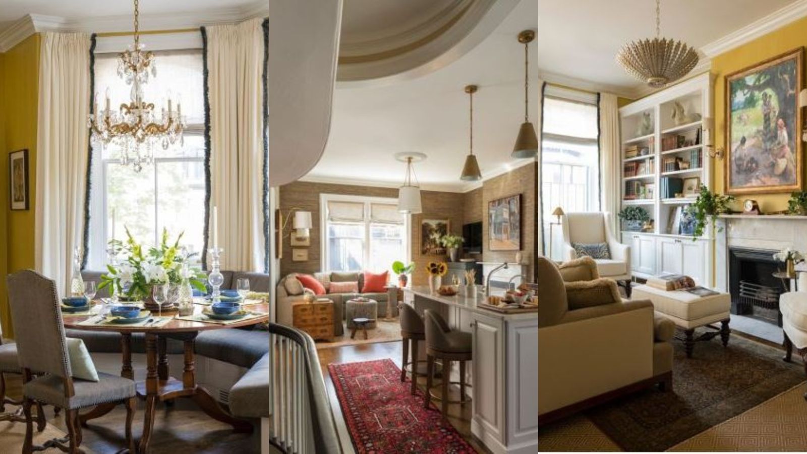

The reimagining of this condo by Kristen Rivoli demonstrates a perfect combination of contemporary and traditional interior design. Situated in the Back Bay neighborhood of Boston, the classic brownstone house was built in the late 1800s, and the condo, which sits over two floors, hadn't been updated since the late 1980s.
It was in need of skilful old house decorating ideas.
'Our clients wanted a family friendly home that was open and had a more modern style within the classic brownstone envelope. With two young children, they needed space for them so we focused on creating an open floor plan,' says Kristen.
'I wanted to keep the classic details intact and where we opened up the kitchen and family room area, we recreated the mouldings and trim work consistent with what was there. We also followed the curve of the stair opening with the new opening to the kitchen area. I wanted to give the condo an updated, more modern look while paying homage to the history of the building.
'We were able to reuse many beautiful antiques throughout the home, many of which are family heirlooms and weave them with the new pieces we created especially for our clients.'
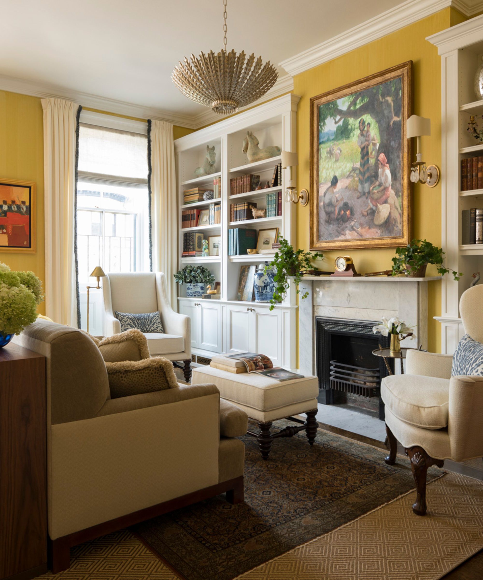
You enter the unit into a small entry area and immediately go up the stairs to the main living floor. There are also two fireplaces in the room, and the owners wanted to engage with both.
'When you arrive at the top of the stairs, you are facing the living area which spans the entire width of the building, making it an extra-large space,' says Kristen. 'My clients wanted to open up the downstairs floor plan making the kitchen larger and creating a family room separate from the formal living room. The current living room was so large that we were able to make it a living/dining room.'
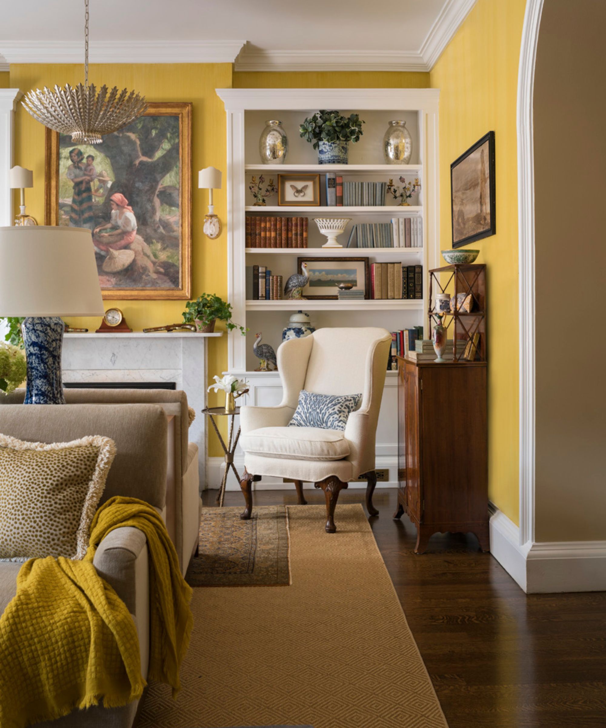
Wondering how to make a large living room feel cozier?
'We created two sides to the room using back-to-back sofas; one side has a sitting area and dining table beautifully tucked into the bay window,' says Kristen.
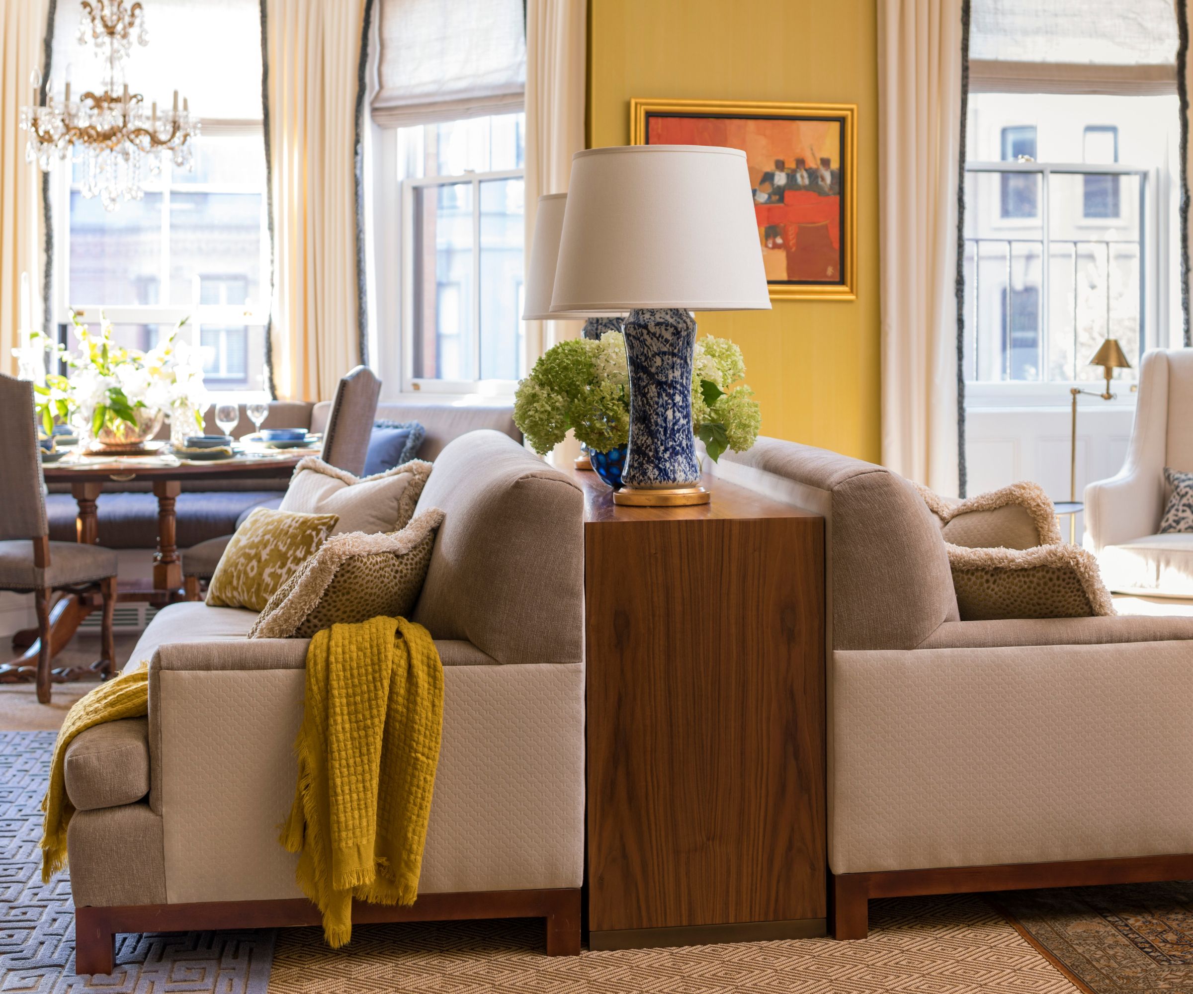
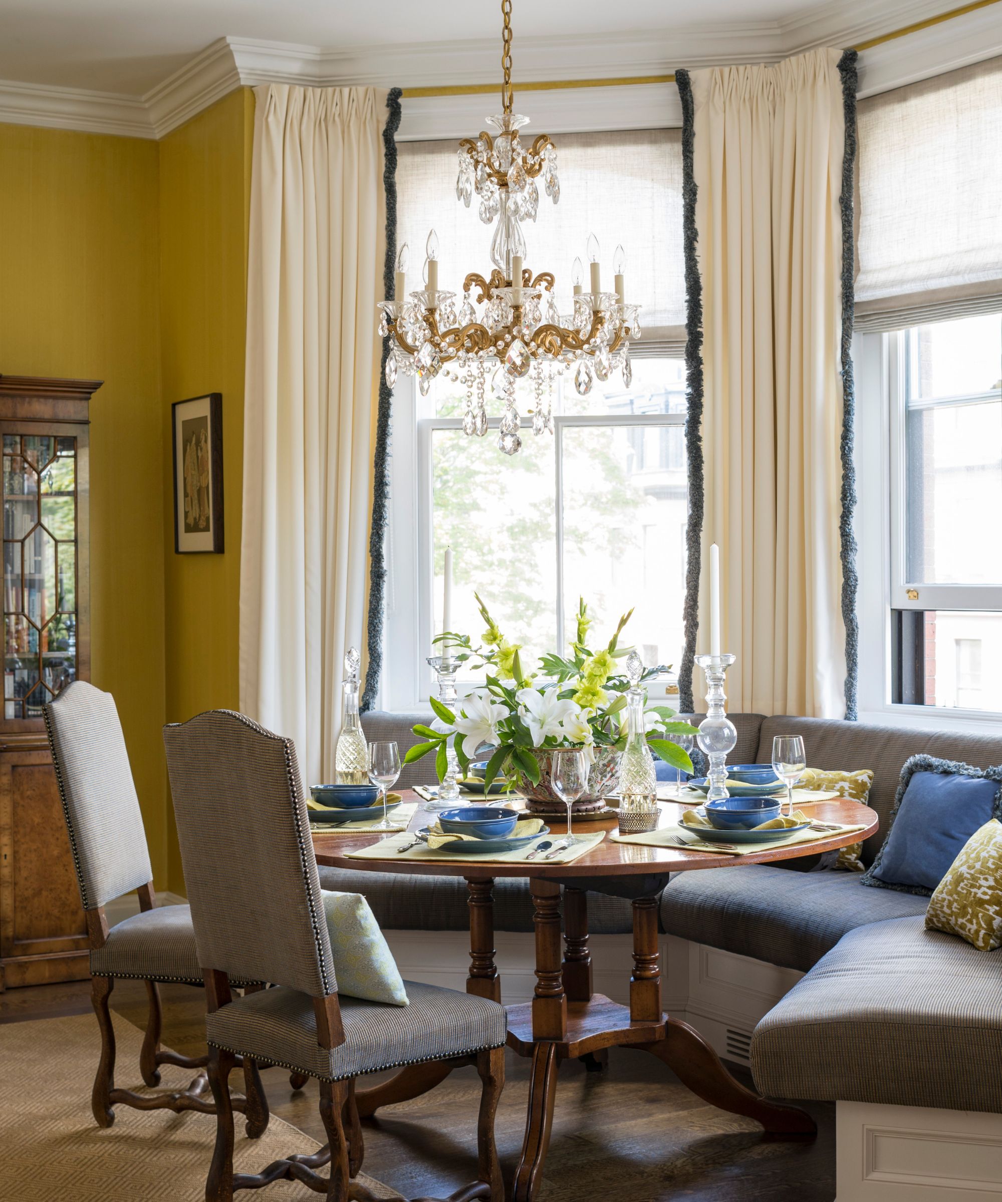
'We designed a custom banquette to create comfortable seating that can double as extra seating if there’s a large crowd. The other side we created a cozy reading area. We wanted to take advantage of the existing fireplaces in the room by creating living spaces with that as the focal point.'
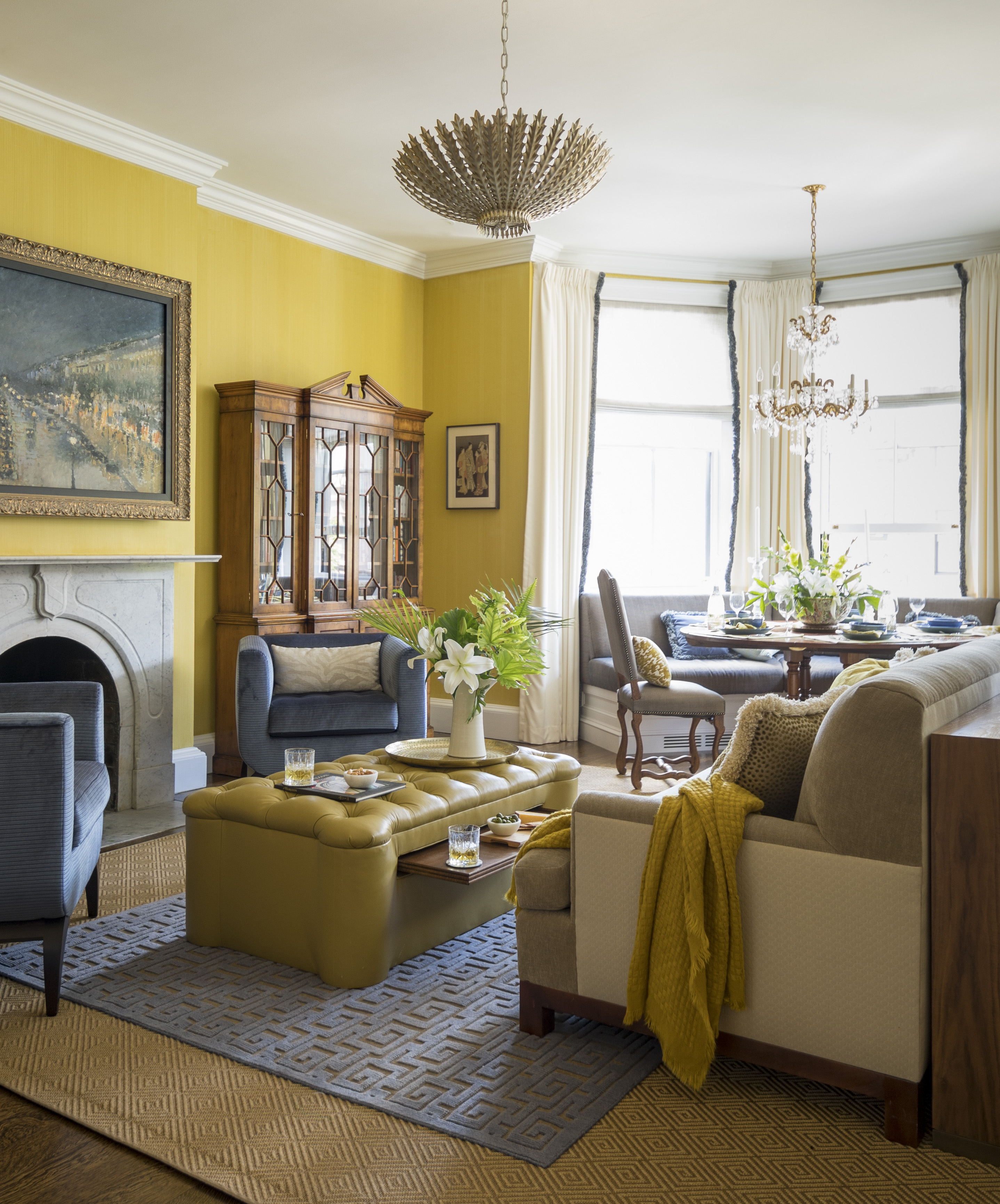
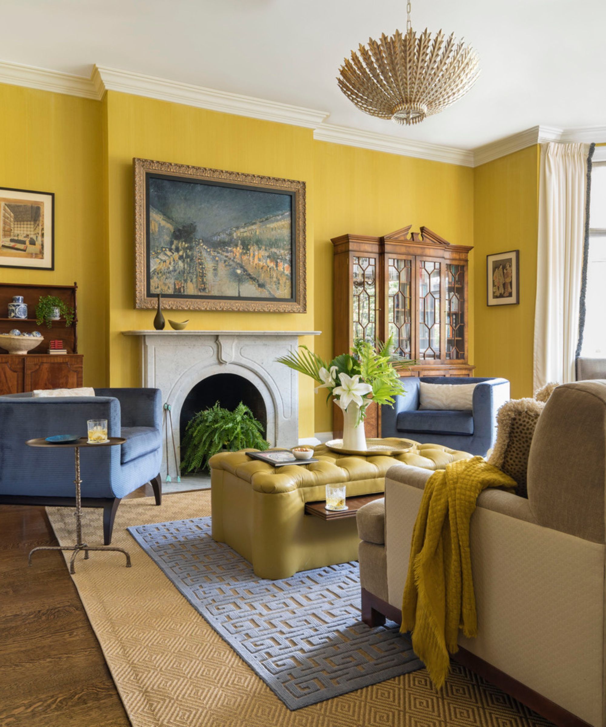
'One side of the room was set as the more spacious living room for entertaining and TV watching while the other side was set as a cozy reading room facing an original painting of the cover art for the book Treasure Island, (a gift from his grandmother) using custom back to back sofas, separated by a custom console.'
Banquette seating ideas make a huge impact on the room.
'The dining table was set into the bay window fitted with a custom banquette so my clients could read the paper at the dining table and look up the block into the Public Garden.'
'The walls were custom painted in a chartreuse strié that creates a cozy feeling in the entire room. All of the furniture was covered in stain resistant fabrics that have the look of a luxury fabric so that my clients didn’t have to give up on having a formal living room with two toddlers living in the house,' continues Kristen.
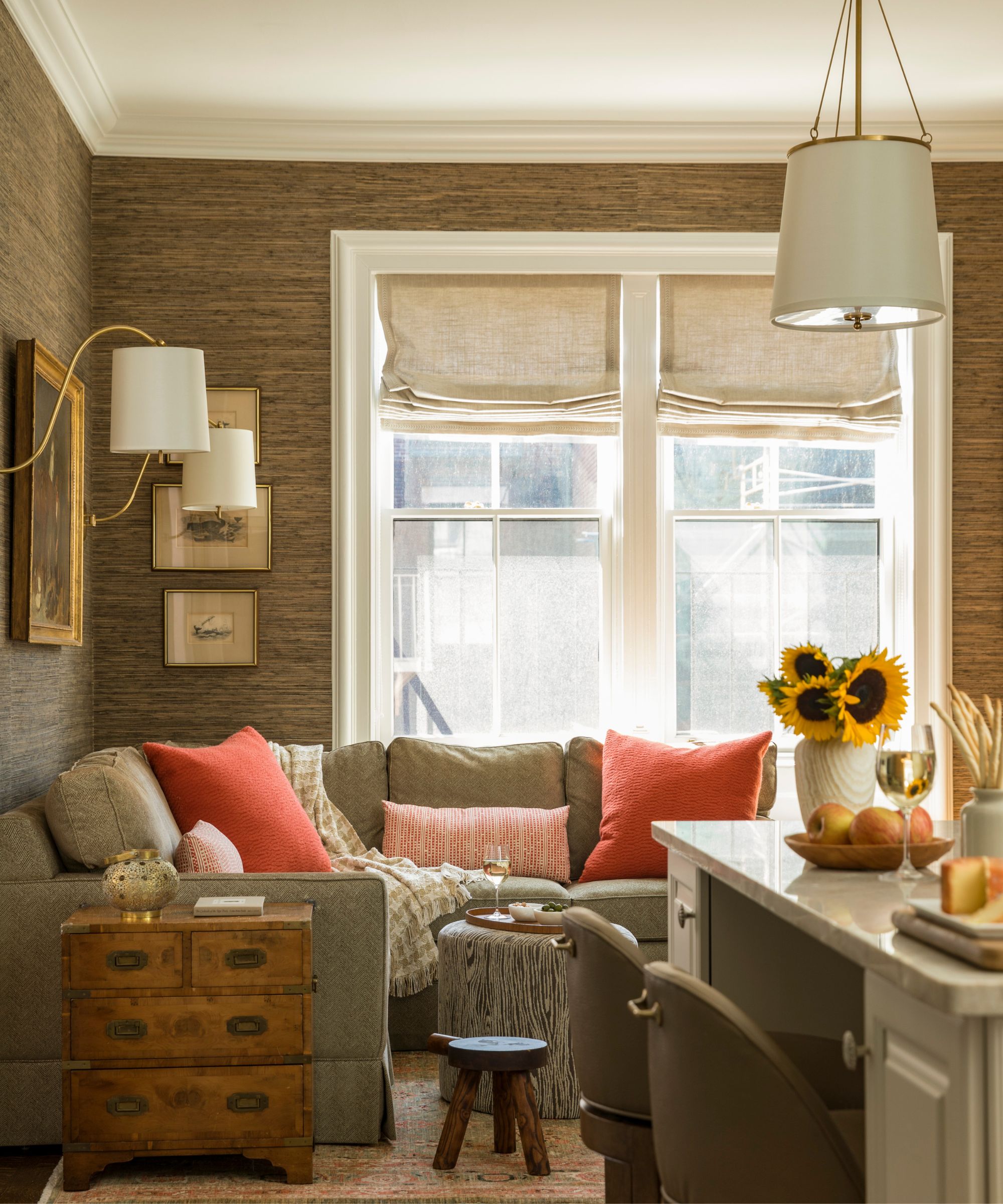
Family room ideas are super practical, but nonetheless beautiful. The kitchen was opened up from a small, cramped room to an open island kitchen that is part of the new family room (the old dining room).
'The family room was created to accommodate their two young children and their more casual lifestyle,' says Kristen. 'We designed a custom cabinet under the TV to store the kids’ toys and a lovely sectional that creates a cozy area to relax and hang out as a family. Having the kitchen open to the family room creates a large room where the entire family can congregate and be all together.'
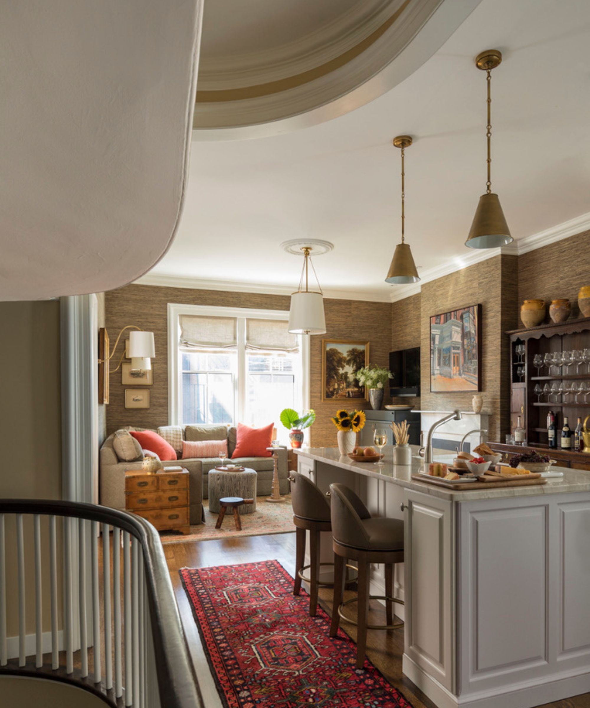
We covered the walls in dark (Phillip Jeffries) grass cloth to create a cozy, comfortable vibe. The family room has a cabinet beneath the TV that was custom made to house the children’s toys to keep the room organized. Our contractor, Payne/Bouchier, had the difficult task of keeping the cased opening and crown moulding curved where it once was a wall with a door. We wanted the opening to follow the curve of the stairs instead of keeping it squared off to add more interest. Off of the Kitchen/Family Room is an office where my client can work from home, exisiting antique chairs were recovered in beautiful De la cuona fabric.
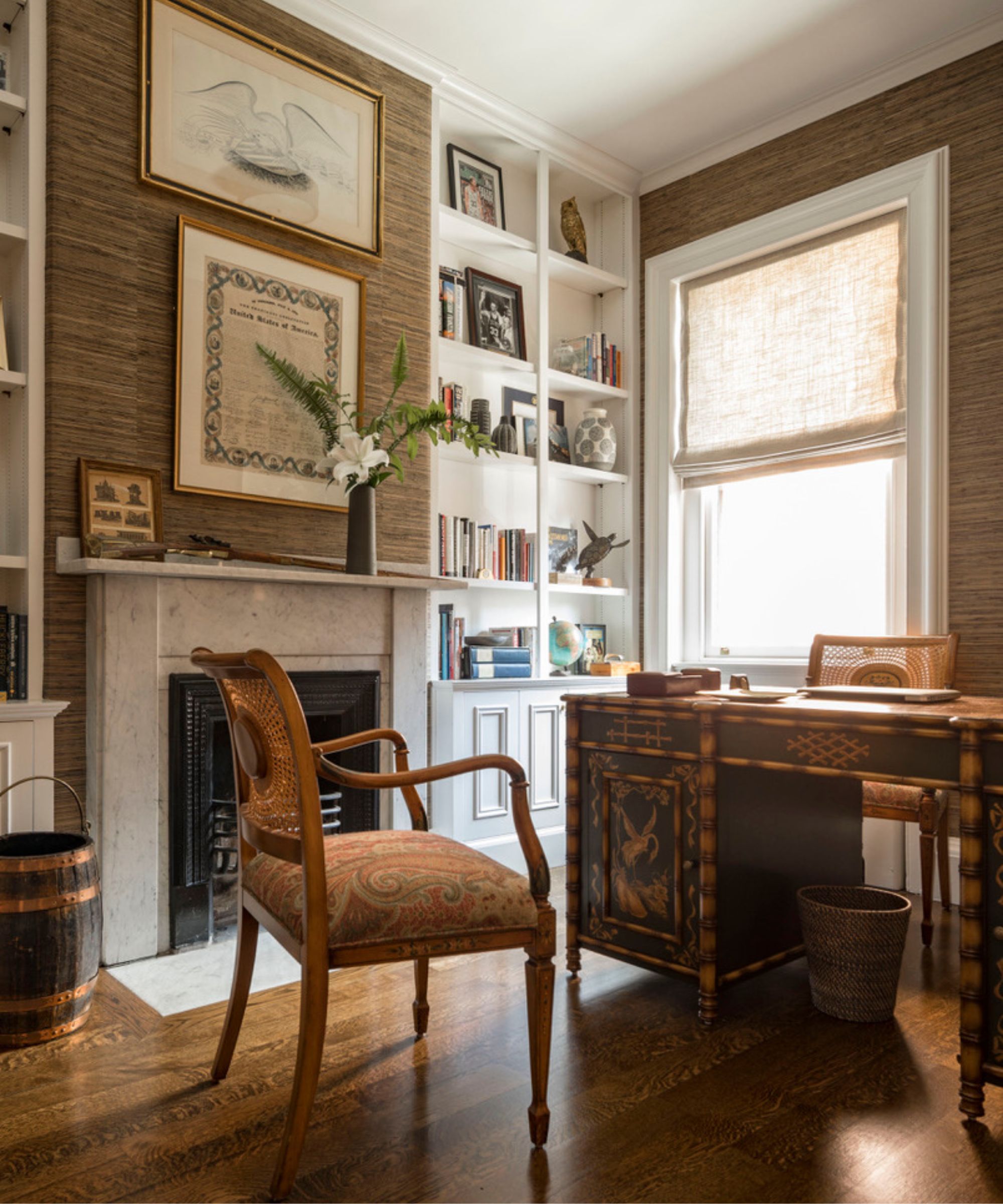
Off of the Kitchen/Family Room is an office where my client can work from home, exisiting antique chairs were recovered in beautiful De la cuona fabric.Off the Family Room is the husband’s office, that has an antique desk and chairs. The chairs have a unique cane back and plaque that needed some repair and reupholstered the seats. We added the same grass cloth from the family room into the office for a connected feeling between the two rooms.
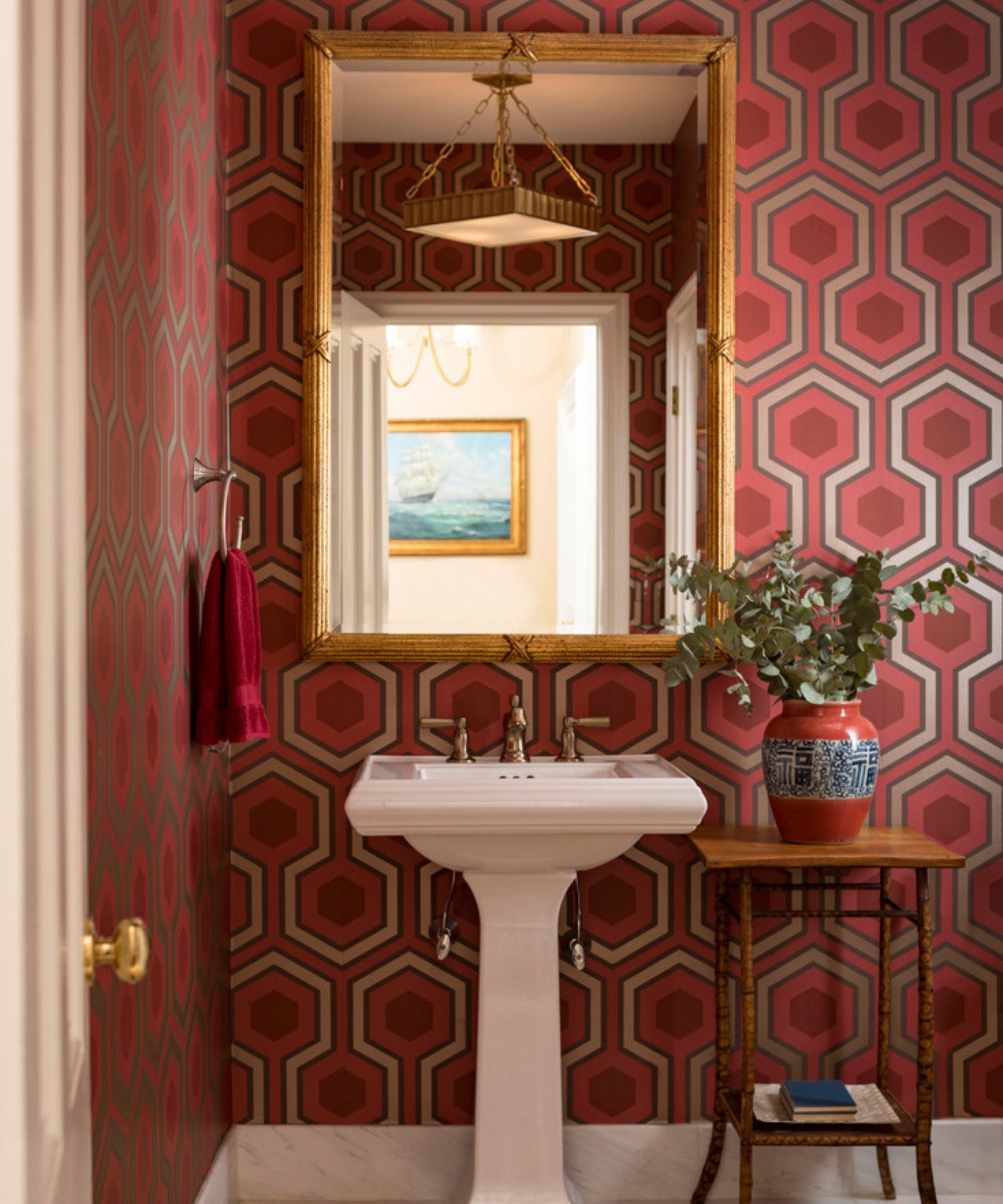
Want some bold powder room ideas? Look no further.
'There’s a wonderful powder room between the living room and kitchen, we continued the same design in here with a wonderful bold David Hicks inspired wallpaper in red.'
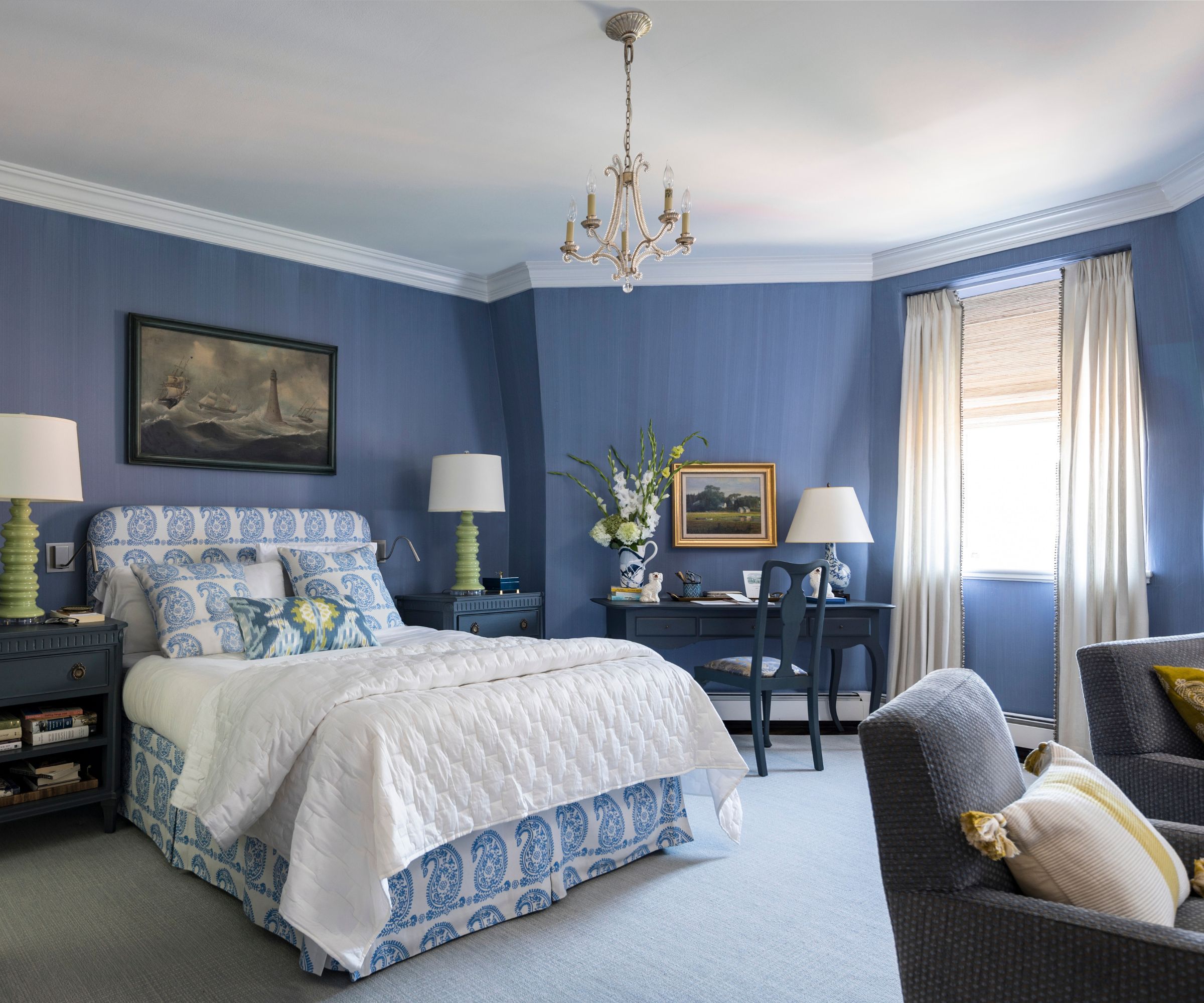
'In the primary bedroom, we used our clients' favorite color throughout that reflects her favorite hydrangea purple/blue color. There’s a beautiful sitting area near an old fireplace and a lovely desk from Chelsea House in a deeper blue of the walls.'
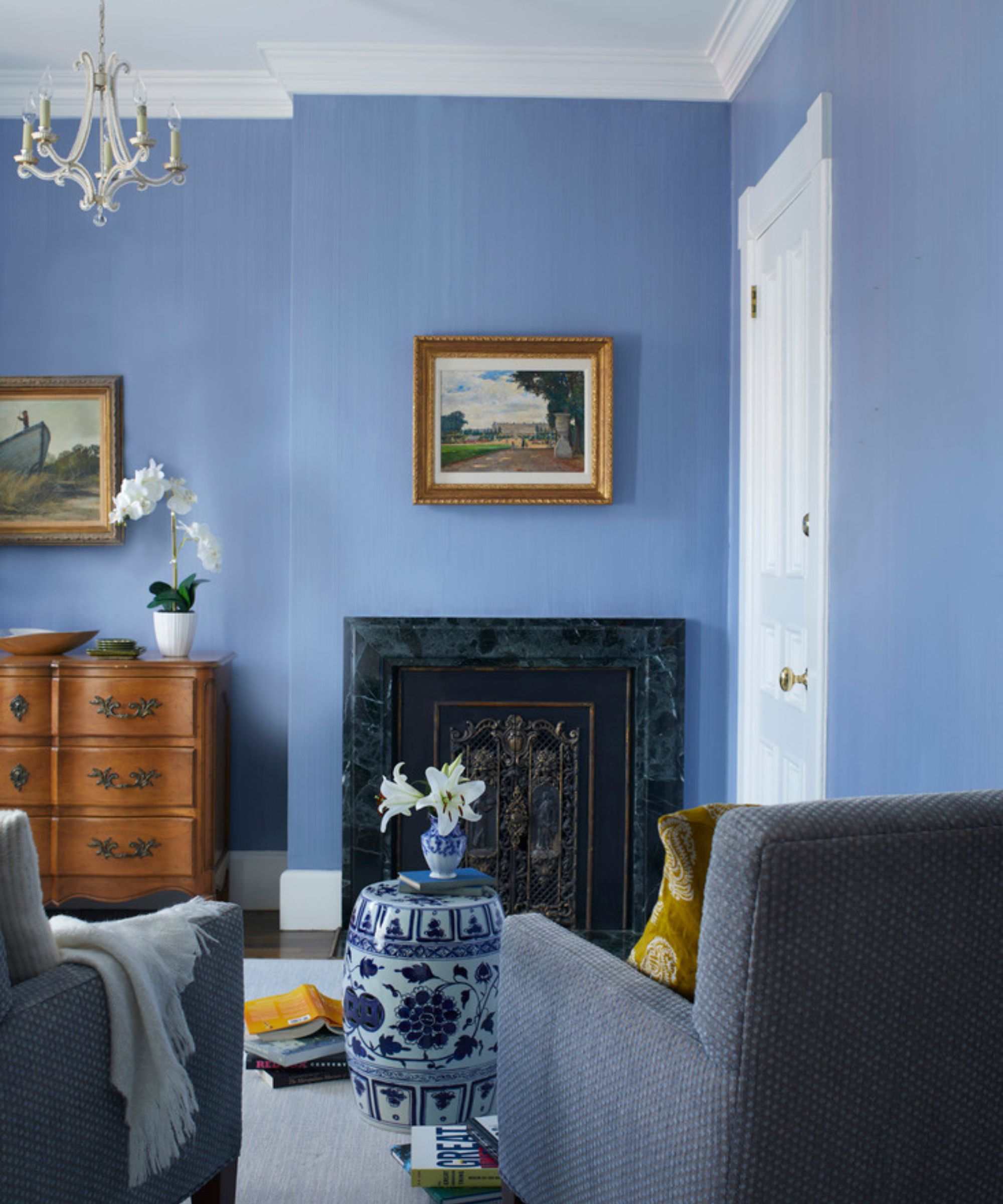
'In the children’s rooms, we used a beautiful coastal blue color and a fun wallpaper in the bathroom that reflects their love of water and boating. The children’s’ rooms were large enough to accommodate a loveseat for story time and plenty of floor space for play time.'
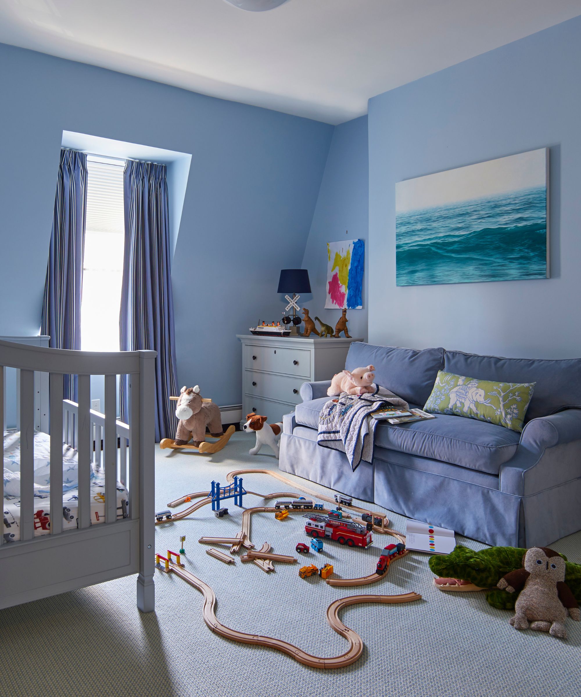
'I’m so happy with the finished result, especially on the main living floor,' says Kristen. 'My favorite part is the new open kitchen and family room that we created from two smaller cramped rooms. It really was a game changer in making the home feel so much bigger than it is.
'My clients really love the banquette in the bay window, it’s a favorite spot in the morning having coffee on the weekends and getting an amazing view up and down their pretty tree lined street. I don’t think I’d change a thing about the end result, it really all came together as we envisioned.'
Photography: John Bessler
Stylist: Karin Lidbeck
https://kristenrivoli.com
Sign up to the Homes & Gardens newsletter
Design expertise in your inbox – from inspiring decorating ideas and beautiful celebrity homes to practical gardening advice and shopping round-ups.

Lola Houlton is a news writer for Homes & Gardens. She has been writing content for Future PLC for the past six years, in particular Homes & Gardens, Real Homes and GardeningEtc. She writes on a broad range of subjects, including practical household advice, recipe articles, and product reviews, working closely with experts in their fields to cover everything from heating to home organization through to house plants. Lola is a graduate, who completed her degree in Psychology at the University of Sussex. She has also spent some time working at the BBC.
-
 Bathroom colors going out of style in 2025 – and the designer-approved shades to decorate with instead
These are the colors to swerve in your bathroom decor if you want to create a stylish and design-led space, according to experts
By Emily Moorman
-
 I swear by the ‘ETC’ method to prevent clutter and save money – my expert-backed checklist is transformative
Now I Edit The Cart and save time, money, and energy
By Chiana Dickson