Inspired by Slim Aarons, this glamorous apartment is a lesson in basement decorating
Shimmering materials and space-clever furnishings make this colorful space feel bright and characterful
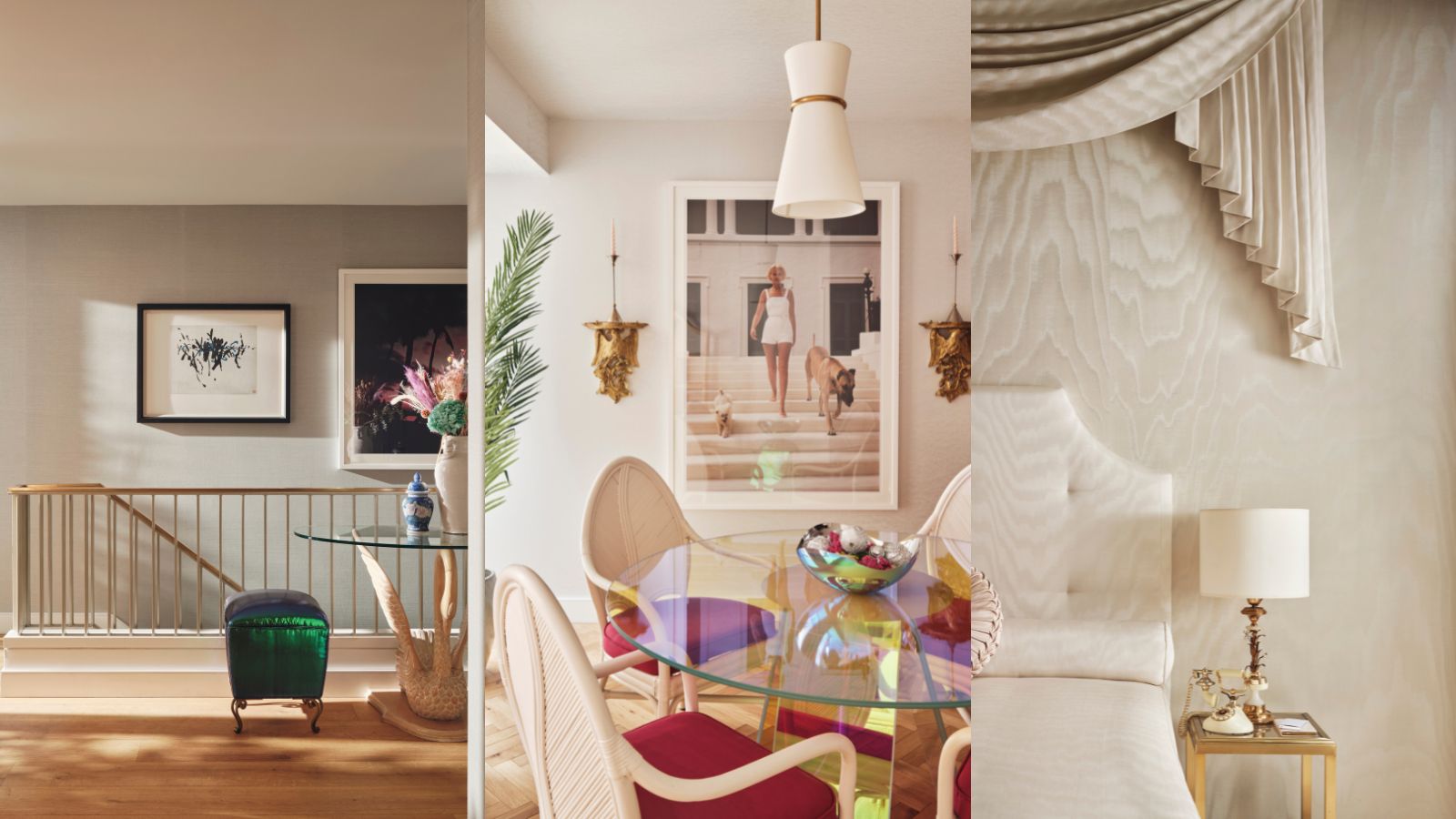

Whatever the size of your apartment, if it's largely within a basement, it can suffer from a lack of light. Laura Marino, Creative Director of Studio L interior design agency shows, in this duplex, how a clever use of materials and furniture can make basement ideas feel glamorous, bright and charming.
'I wanted to draw out a sense of luxury for this apartment and make the decor surprising and exciting so that people want to journey through to see the entire home,' says Laura. 'So we graduated the décor's impact along the way. Initially, I wanted to infuse a sense of '80s nostalgia and pull from my childhood with references to Memphis Design, color blocking, pastels and neon with ditsy florals, oriental decor, and stylized graphics.
'Then came the incorporation of another favourite era of mine: Hollywood Regency of the 50s and 60s. I was drawn to Slim Aarons’ photo of Joan Collins lounging in her monochromatic pastel pink bedroom from the late '50s and was determined to recreate a version of that photo for today. We used a stunning moiré fabric in a similar powder pink in one of the duplex bedrooms, evoking the sense of luxury seen in the original photo.'
Below, Laura gives us a tour.
The entryway
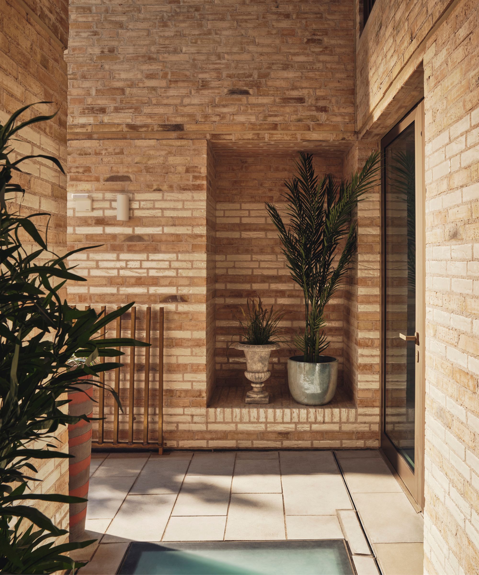
'I wanted the entrance to indicate the concept, color and style flavors that you are going to find inside. That iridescent pot was a find! I use a lot of iridescence inside. I love the glazed bricks of horizontal banding the architects designed. It’s a beautiful building,' says Laura.
The living room
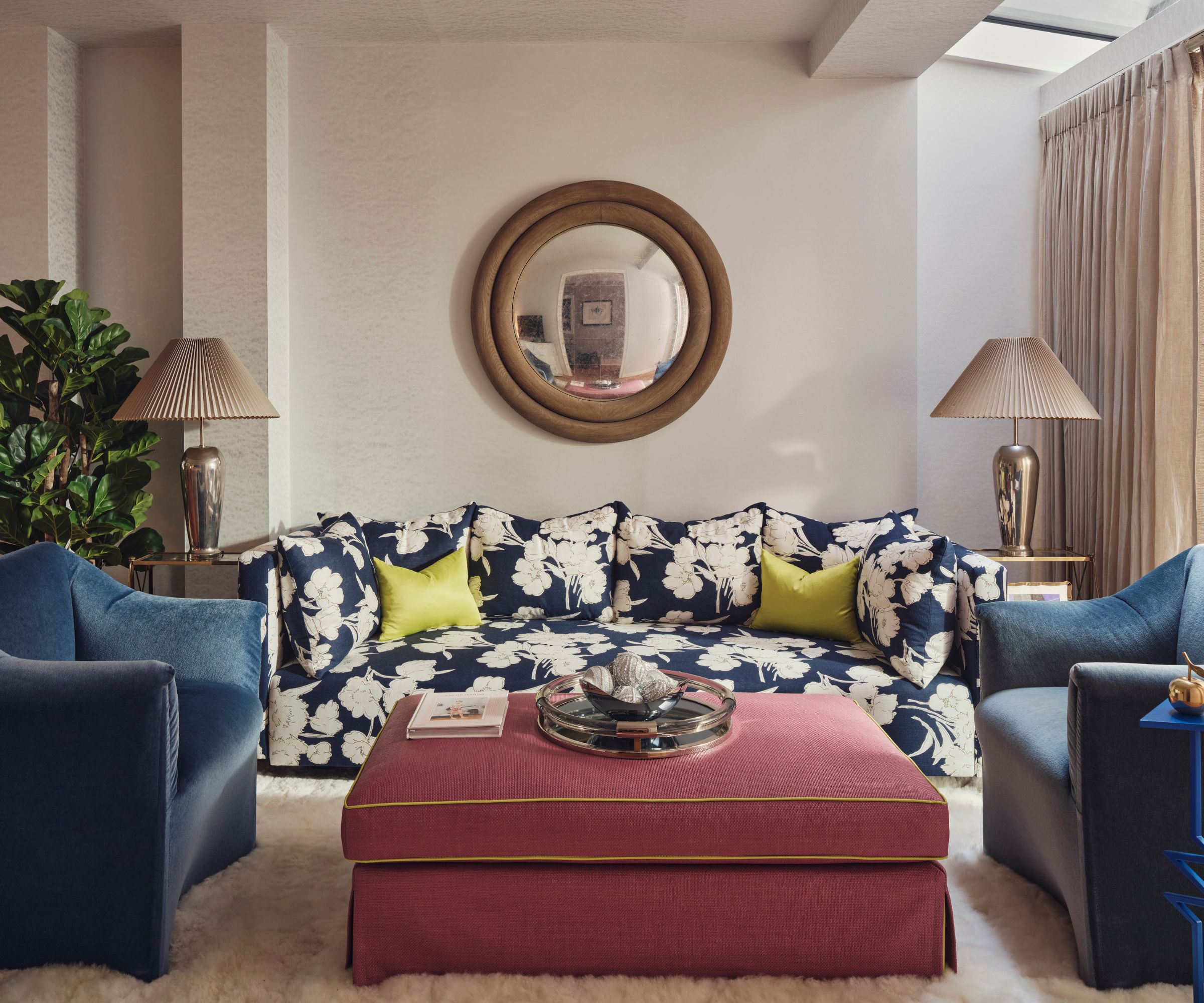
'The Ilse sofa by George Smith in the is one of my favorites I’ve ever designed. When I paired that Ralph Lauren fabric and the neon fabric from Metaphores, it became clear I was going for a full Palm Beach 80s homage!
'The hyper chrome lamps Ground One Six with those knife pleat shades and the mohair “Little Temptations” Mario Bellini vintage armchairs are also standout pieces.
'I think the alpaca rug is the element that best communicates what the room is about: it’s sumptuous, fun and inviting.'
The dining room
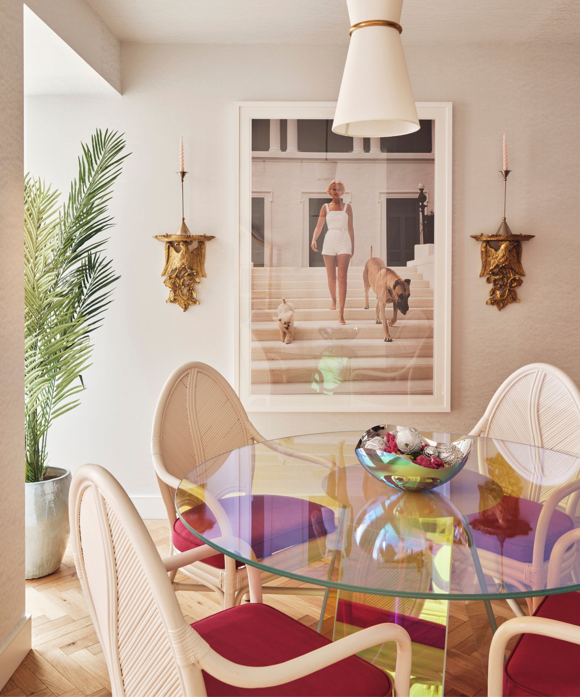
'The photo of C.Z. Guest by Slim Aarons acted as the inspiration behind the dining area and for the wider concept for the apartment as a whole,' says Laura.
'The Shimmer dining table by Patricia Urquiola from Glas Italia is a genius product design that adds so much intrigue and vibrancy to the space.
'And the vintage rattan banana leaf dining chairs with seat cushions covered in a fuchsia Rubelli moiré are fabulous.
'Aside from the dining table I love the little detail of those gilded, Hollywood Regency American Eagle wall shelves. It’s just so appropriate with the photo and the era.'
The kitchen
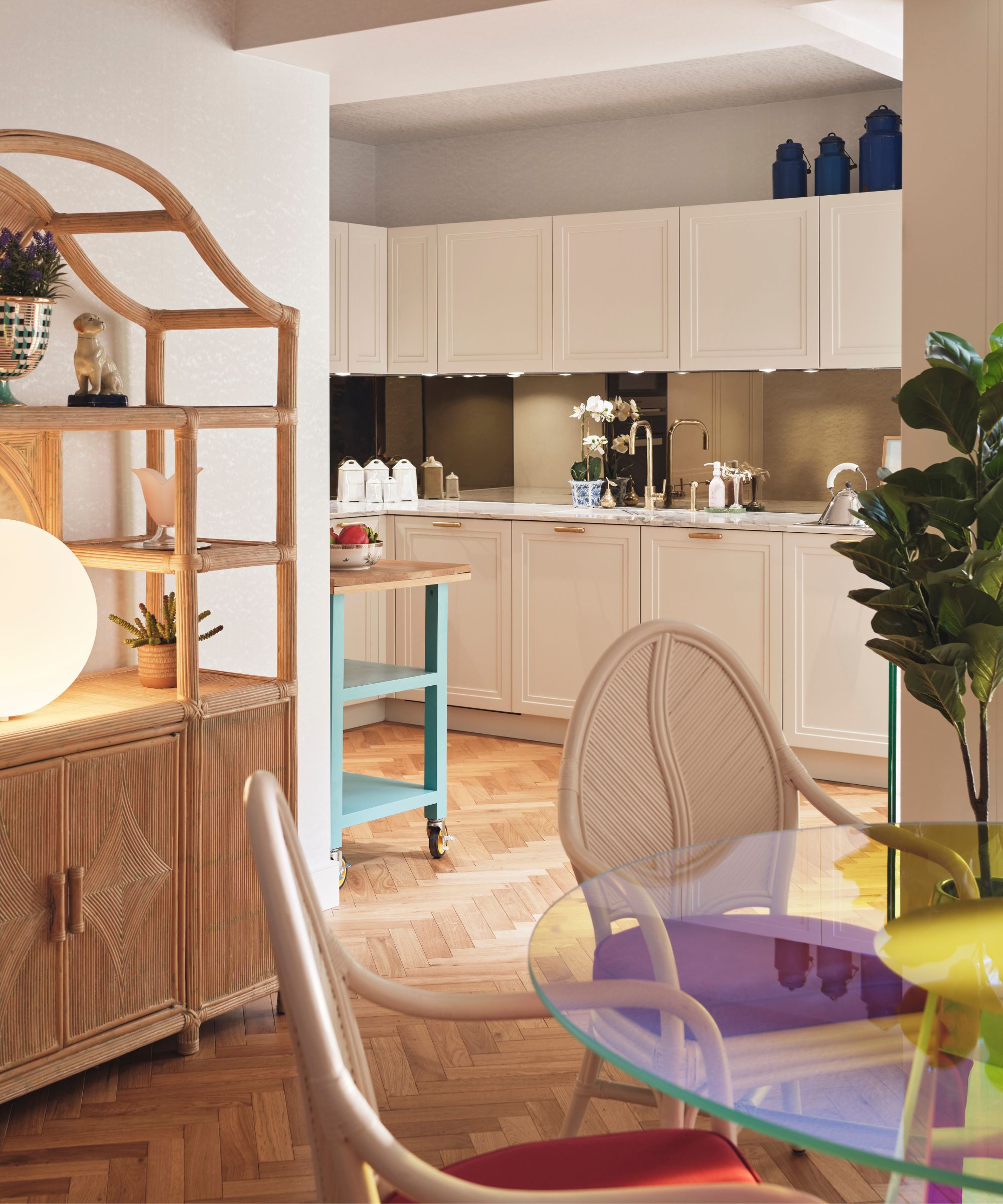
'For the kitchen inspiration, I wanted to elevate a traditional Shaker door to something more refined, so I added a wide double bead soft edge.
'The bookcase is from Anemone Interiors
'I enjoy subversion in interiors, so I like the glo ball as the feature piece on the bookcase as a source of ambient lighting for the dining area.'
The powder room
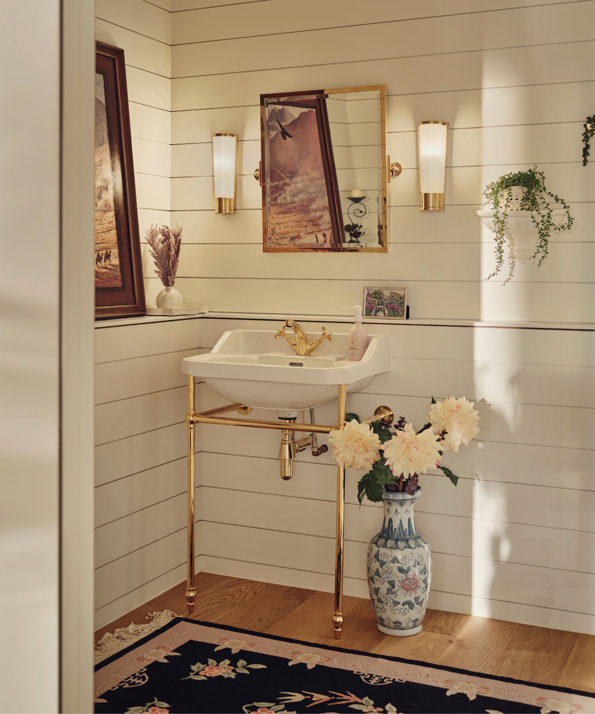
'A beachy, bohemian eclectic 80’s vibe was my inspiration for the washroom
'All the art here is standout because I designed the room to emulate a nostalgic, kitsch gallery but I also fell in love with the black and pink oriental carved rug.
'The sanitaryware is from Lefroy Brooks'
The hallway
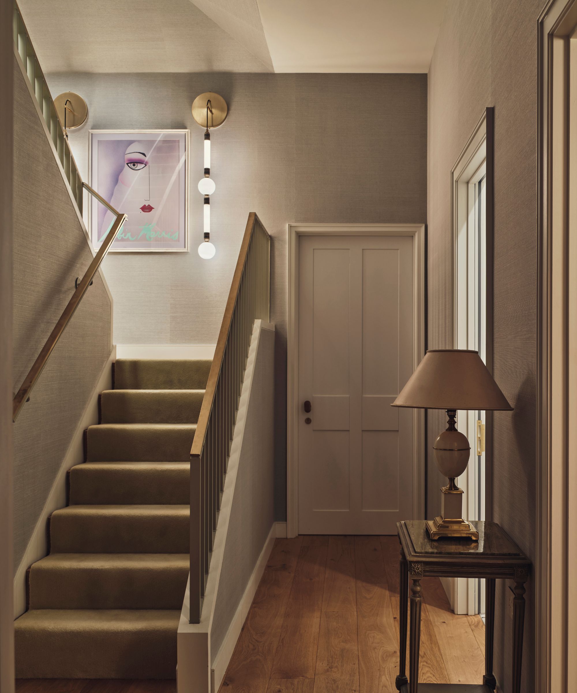
'I wanted to draw a person’s interest to physically move down and be intrigued to discover what’s going on downstairs, so I designed a custom ombré stair runner that is a darker citrine green at the top and gets lighter as you go to the lower ground floor.
'The runner came out so well. I designed it so it arcs on the half landing instead of being straight corners. The little detail again really helps draw you downstairs.
'The vintage art is from Ground One Six.'
The main bedroom
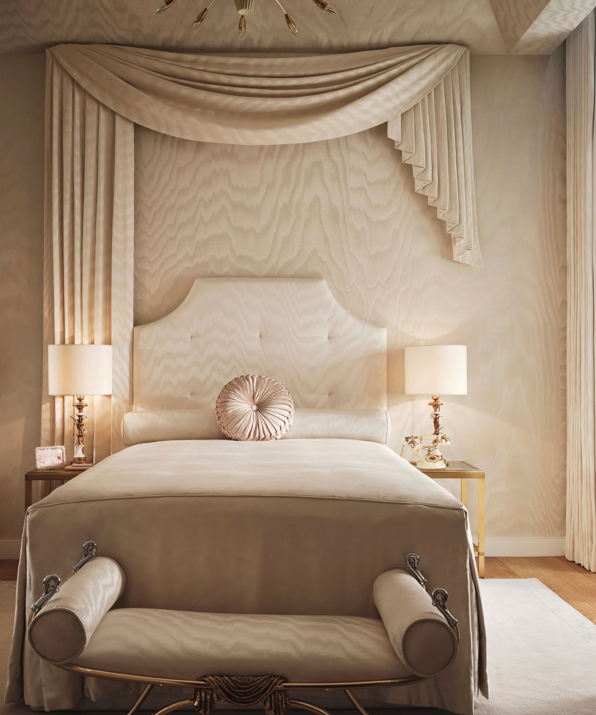
'For the primary bedroom, the Slim Aarons Photo: “Joan Collins Relaxes” and Hollywood Regency aesthetic is the inspiration,' says Laura.
'The moiré fabric from Dedar is the star. I designed the swag, headboard, and bedspread. The lamps are vintage Maison Jansen, the Italian mid-century chandelier is from Morentz, and bench from Ground One Six. The wool and silk band rug is from The Rug Company.'
The shower room
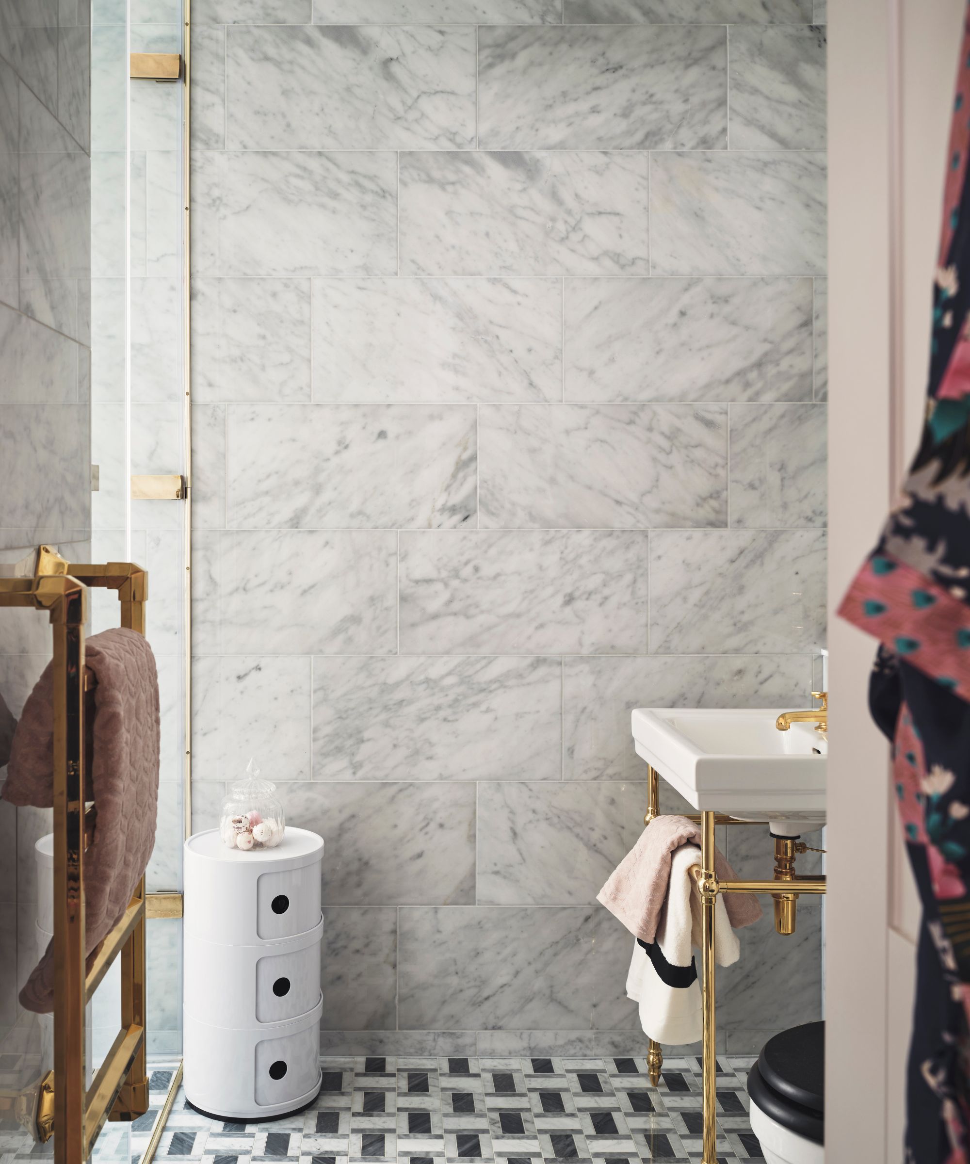
'I was inspired by the ceiling of Chiltern Firehouse which was made by Studio KO, cleverly basket weaving old fire hoses. I applied that idea to the floor and designed that mosaic.
'The sanitaryware is from Lefroy Brooks. The storage is Kartell's Componibili.'
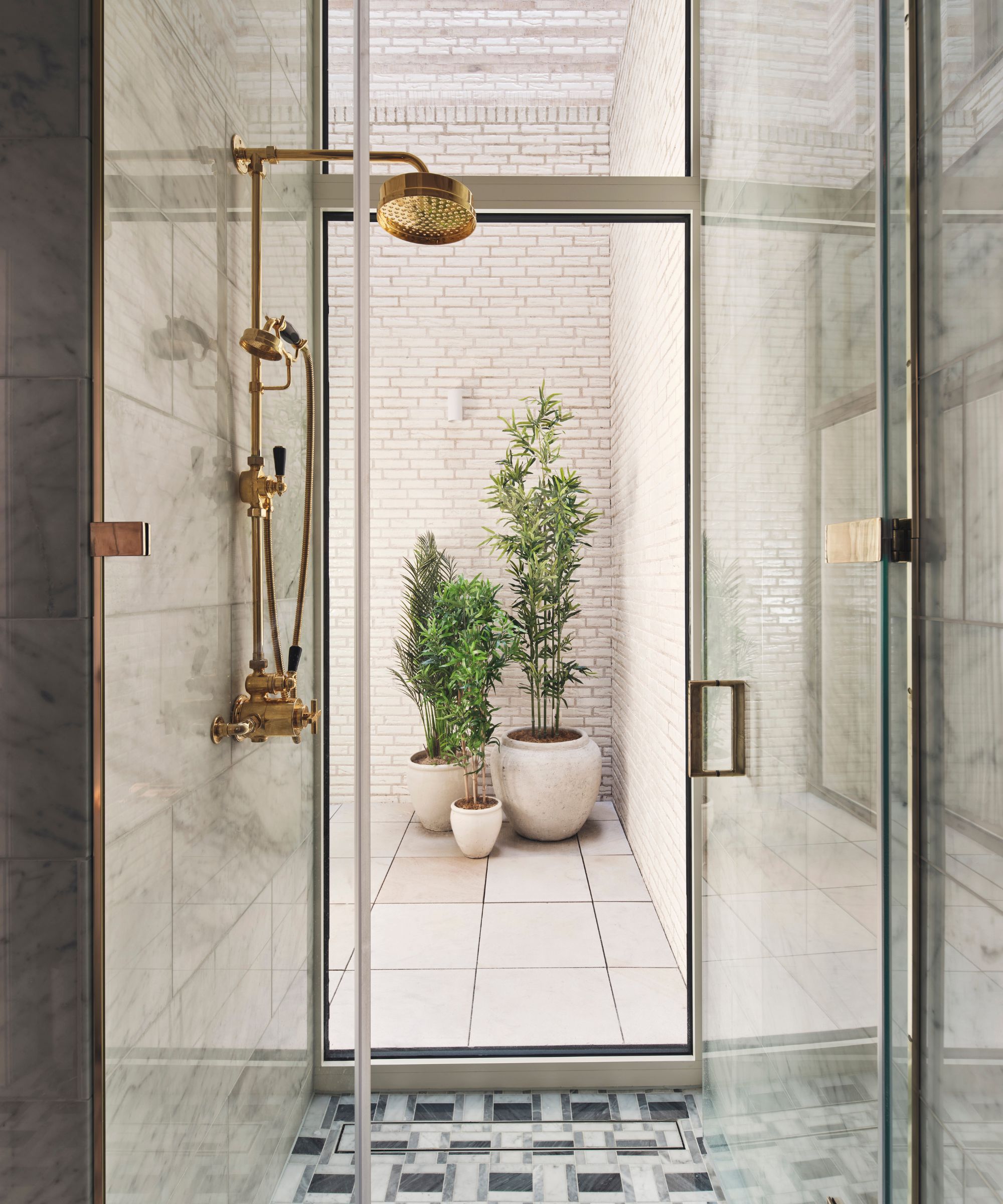
'Because the architecture and finishes have a bit of a beach vibe going on, what better way to bring the outdoors in than create the feeling of an outdoor shower? The shower with that 4m tall glass pane looking out into the private lightwell is an exceptional surprise.'
1. What was the inspiration behind the room scheme?
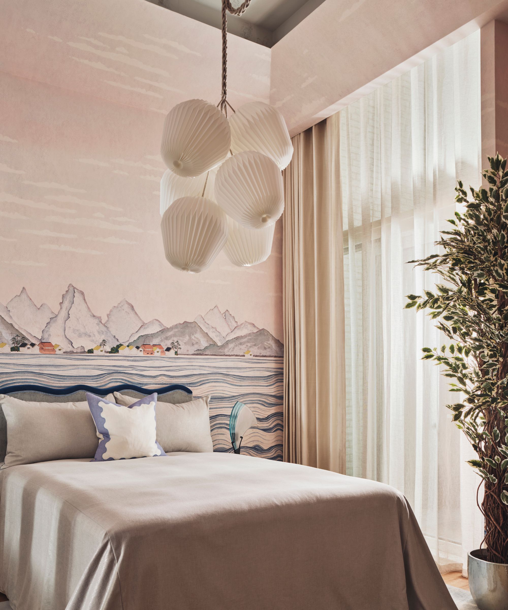
'The “A Journey Through Japan” mural paper by Jennifer Shorto inspired me for this room. Because of the ceiling height, I wanted to evoke an ethereal, floaty feeling so I really went bold with the mural design.
'The glittery celestial paper on the ceiling by Custholm perfectly sets off The Le Klint bouquet pendant.
'You can see how the wallpaper was the inspiration for the bed. I designed the custom headboard to emulate the lines of the irregular waves. Even going so far as to double pipe its waves in between the two main fabrics to mimic the drawing of the waves on the paper. And the bedspread and its cushions were inspired by the celestial paper on the ceiling. I found a fabric with a subtle shimmer in the same color as the ceiling paper and had the bedding made.
'The Murano lamps are from Anemone Interiors.'
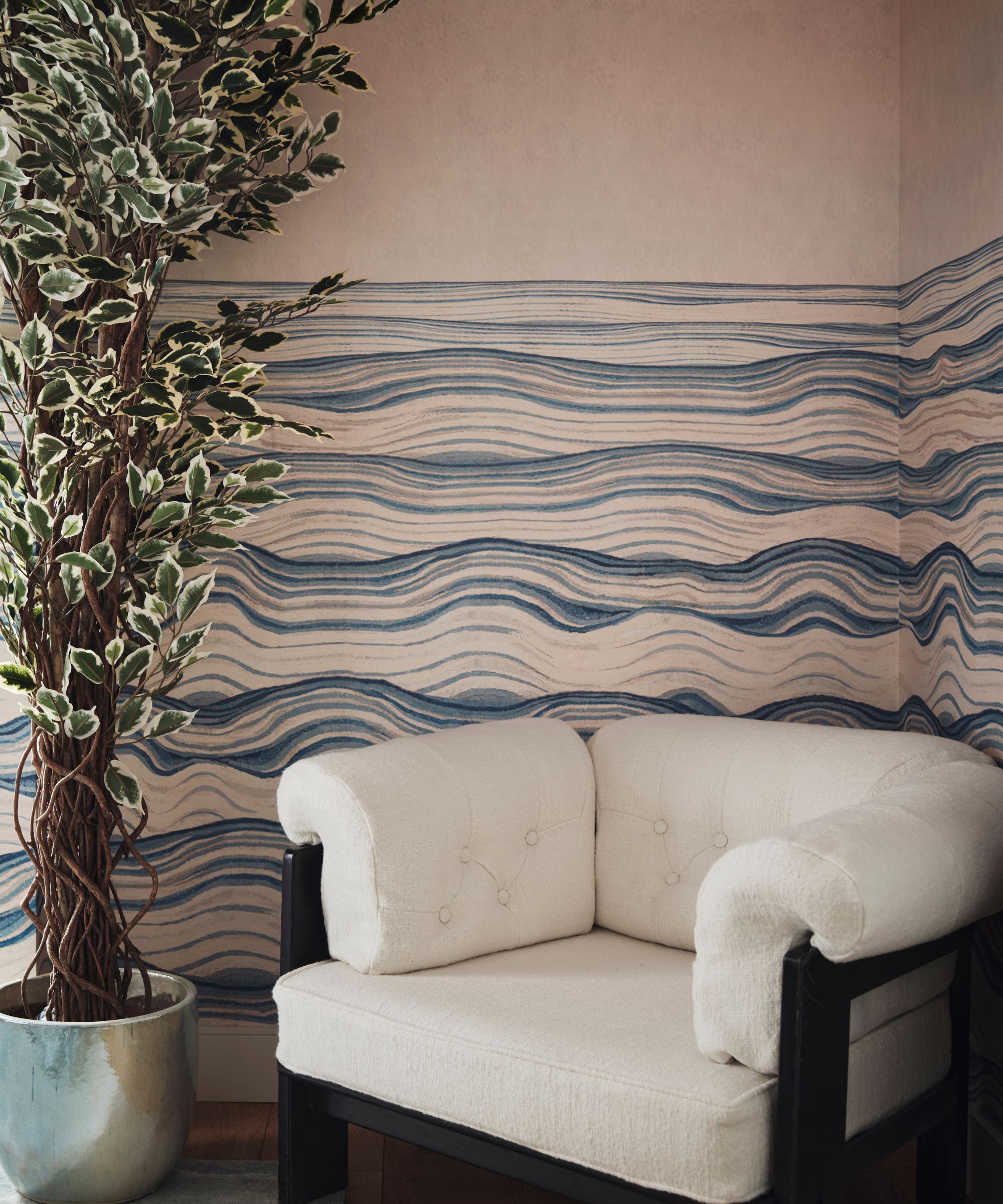
'This is a lovely, peaceful moment,' says Laura. 'I have always been a huge fan of the Scarpa’s (Tobias and Afra) furniture. This chair of theirs I recovered in a nubby Pierre Frey textile which I think works beautifully in the room.
Interior design: Laura Marino, Founder, Studio L, London
Architecture: Openstudio Architects
Building: Westminster Fire Station
Sign up to the Homes & Gardens newsletter
Design expertise in your inbox – from inspiring decorating ideas and beautiful celebrity homes to practical gardening advice and shopping round-ups.

Lola Houlton is a news writer for Homes & Gardens. She has been writing content for Future PLC for the past six years, in particular Homes & Gardens, Real Homes and GardeningEtc. She writes on a broad range of subjects, including practical household advice, recipe articles, and product reviews, working closely with experts in their fields to cover everything from heating to home organization through to house plants. Lola is a graduate, who completed her degree in Psychology at the University of Sussex. She has also spent some time working at the BBC.
-
 7 underrated kitchen features that are sure to make your life easier, according to interior designers
From game-changing storage to functional decor
By Molly Malsom
-
 These 5 plant species will help to attract and nurture an underrated nighttime pollinator that's crucial to every yard
Discover the best plants for attracting moths to your yard
By Ciéra Cree