Downsizing? Here's how to create a stylish and cohesive look with eclectic belongings
Finding harmony in a curated look – how one designer refreshed a home full of memories and treasures
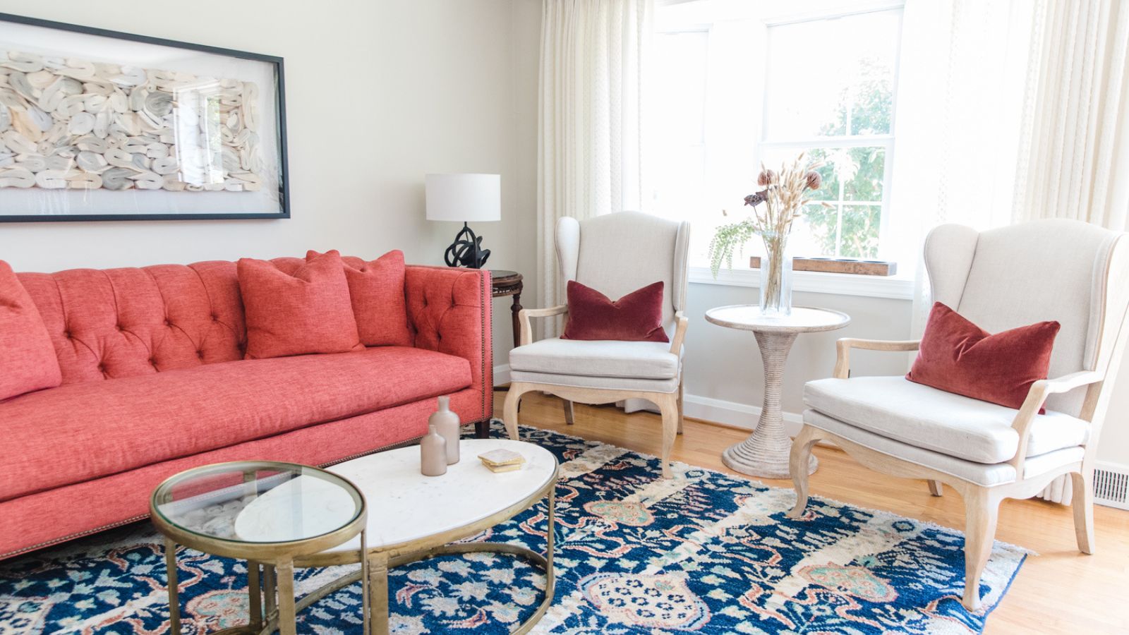
This traditional Baltimore rowhouse had been a second home for 25 years. Now living there full time, its owner found herself in a property that hadn't been updated for 12 years, surrounded by extra furniture gathered from the New York home she'd vacated. A serious interior design rethink was required.
Thankfully, designer Jennifer Walter of Folding Chair Design Co was on hand to do the rethinking. The solutions she came up with are a lesson in downsizing, repurposing and finding a thread of design harmony between eclectic pieces. She talks us through her ideas and gives us the guided tour of the refreshed forever home.
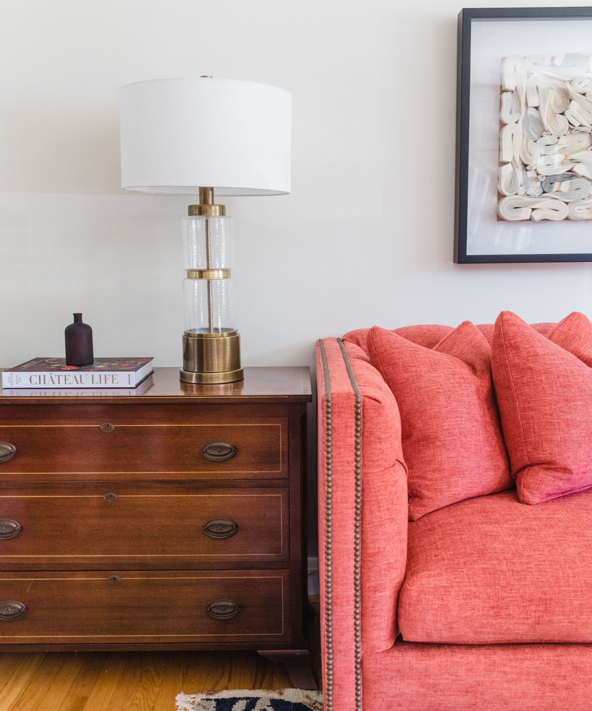
The house was built in the 1950s, in a small, quaint suburb just north of Baltimore called Rogers Forge. Although the kitchen had been remodeled 12 years ago, everywhere was ready for a refresh, says designer Jennifer Walter, 'The client brought many heirlooms from her family home in upstate New York to the home, and we had to fit them all! Some worked better than others, but through a combination of re-upholstery, strategic placement, and repurposing, we managed to make most of them work even within our new design.'
It soon became clear that the owner loved blue and pink shades and would prefer a feminine, traditional aesthetic in her living room ideas, and indeed throughout the house. 'We knew exactly how to execute that for her,' says Jennifer. 'Rather than approach the living room with an obvious navy, we decided to add lighter blues and amber tones. The Rowe Furniture sofa in a rich salmony velvet gave a nice jolt of color in her living room.'
The art piece over the sofa is from Scout Design. 'We needed a long and strong piece over the sofa but didn’t want to add more color because it felt very saturated over there. This added a neutral yet very textural pop to the room,' adds Jennifer.
Benjamin Moore Wind’s Breath is used for the walls here in the living room, and also in the kitchen, halls, and stairwells. 'While I feel like it usually takes us months to find the right colors, this house seemed easier,' says Jennifer. 'Wind’s Breath was a perfect, slightly darker neutral and it felt compatible with our selections for furniture.'
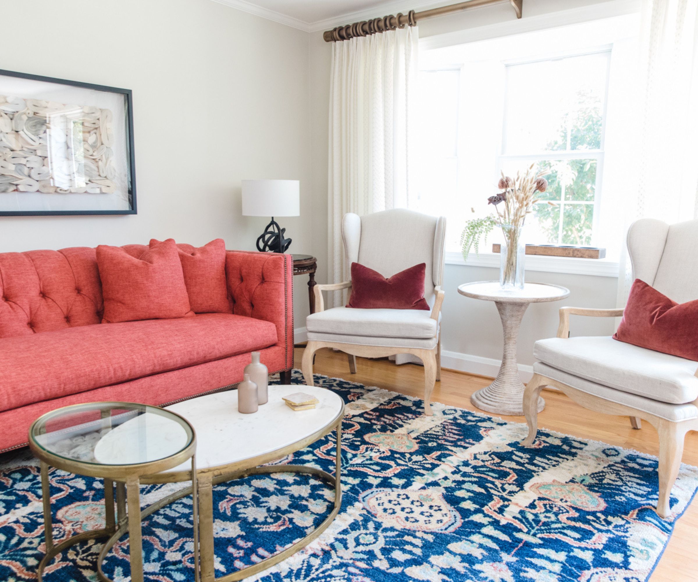
Talking about how to choose a rug for the updated living room, designer Jennifer Walter says the look evolved, 'We really wanted to do a really neutral rug beneath the sofa since we were re-upholstering the backs of the wing chairs in the same room in a very simple linen block print,' says designer Jennifer Walter. 'At the last minute, we tossed in the bold rug that ended up being the owner's true love, and we just went with it and decided this room would now be flooded with color!'
Both of the end tables in this room already belonged to the owner. 'We had about 20 tables to work with, so we really had our pick of what to use,' says Jennifer. 'However, not everything fit, so we did play with the scale of the lighting and accessories to make everything play well together.' It seems with this home, it was all about editing and adapting accessories and furniture to suit the refreshed aesthetic.

In a Baltimore rowhouse in 2010, Jennifer Walter founded Folding Chair Design Co. with a baby on her hip and one on the way. Her mission from the start has been to enhance the lives of her clients by realizing the greatest potential in their homes. 'We are listeners first. No matter what, we hear our clients. We may encourage clients to branch out in different directions, but we always want to know how people want to feel and live in their homes,' Jennifer says. 'It’s part the client and their likes, it’s part us and our influences, and it’s part everything else around that just moves us.'
'This house feels the most at home of all the homes we've decorated, and that’s my style coming through. The client happened to also be a wonderful, kind, and appreciative person who we loved working with throughout,' Jennifer says.
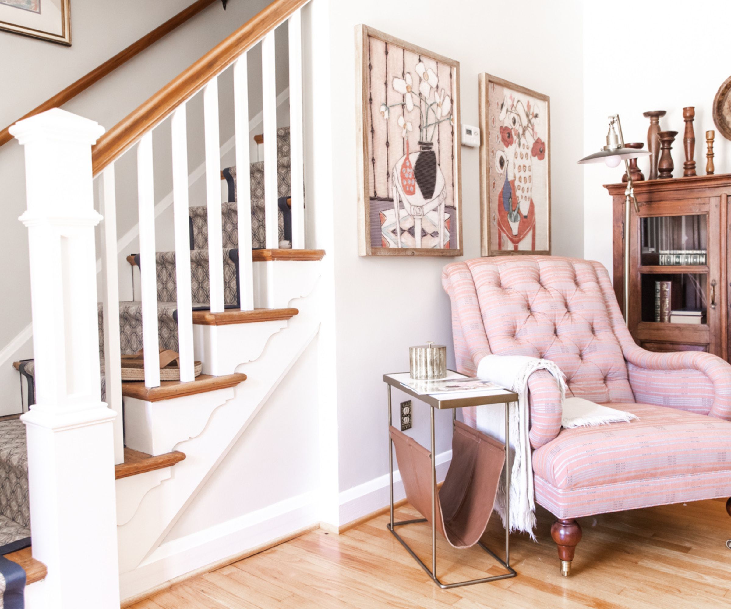
Among the hallway ideas is this inviting armchair, creating a quiet moment by the stairs with the soft pink tones in upholstery and artwork bringing a warmth to the space. A patterned runner on the stairs continues the owner's favorite gray blue shade up to the next level of the home.
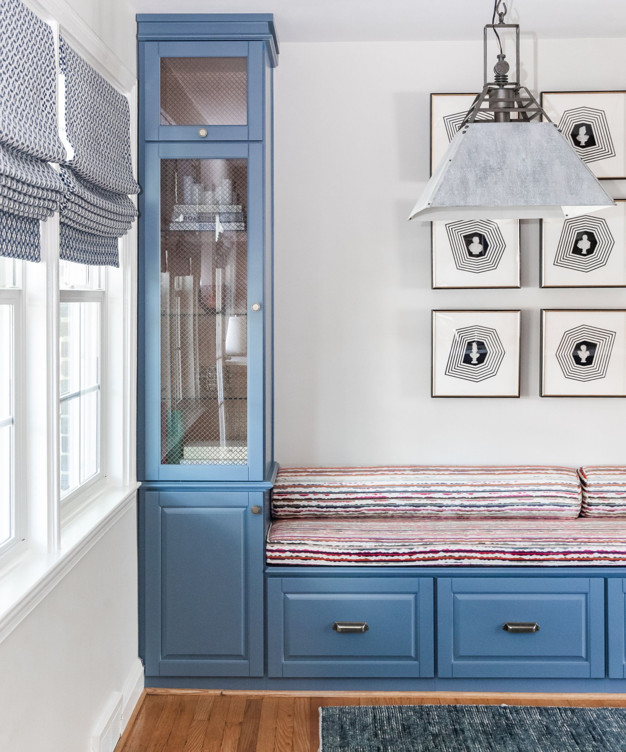
Jennifer Walter decided to introduce this eye-catching banquette seating to update the kitchen's look. Keeping the blue tones introduced in the living room she added built-ins to the dining space. 'The mesh inserts for the cupboards were sourced by me and my carpenter from Van Dykes Hardware in sheet and placed behind the glass for easier cleaning. I love to add detail to a glass front, and this really spoke to me,' she says.
The Kravet fabric used on the banquette is full of color with a strong pattern, and is a favorite with both the designer and her client. 'We weren’t going to do bolsters on the seat but because the fabric looked so stunning, we added them!' adds Jennifer.
The distressed metal lighting fixture, by Circa Lighting, maintains the slightly vintage vibe, while the artworks over the banquette are from Scout Design. Describing her decision-making, the designer says: 'Most people will opt for a large piece of art in a space like this but my thought is to keep the eye looking at the art over and over again. Each time you see this installation, you see something new. It also feels uniform and a bit eclectic at the same time.'
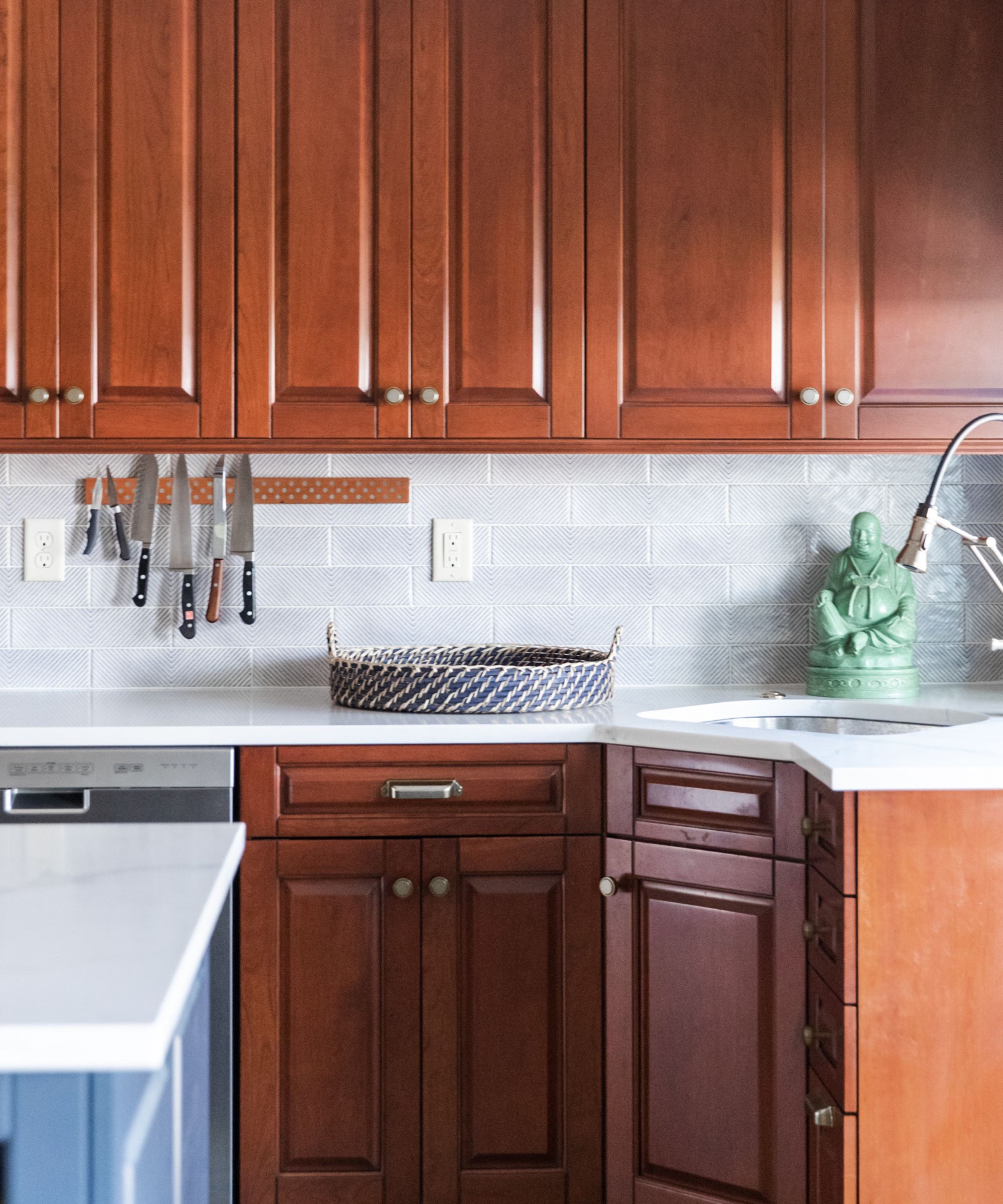
Kitchen ideas had to bring harmony to the existing traditional wooden cabinetry and blue island, alongside the new elements that were being introduced.
'A new backsplash, new countertops, lighting and seating all rounded out the space,' says designer Jennifer Walter. 'Our goal was to lighten and freshen the overall look. We selected subway tile from Annie Selke for the Tile Shop that had a touch of blue dotting in it. The light cream ground of the tile immediately breathed life into the kitchen! The calacatta gold quartz countertop also added warmth without being too starkly white.'
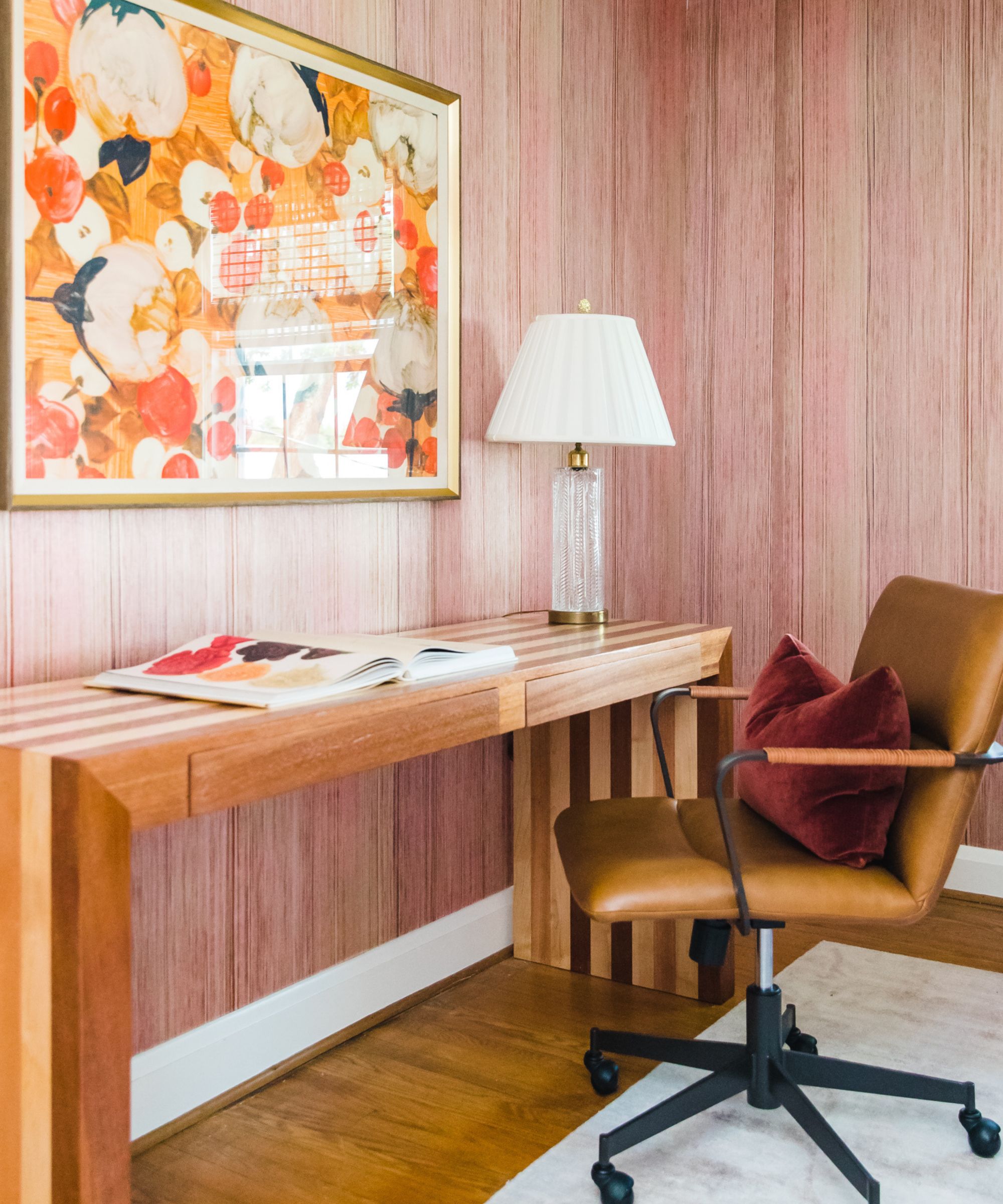
Home office ideas came together with the Elitis ‘POP’ wallpaper. 'We loved the texture of it so much,' says designer Jennifer Walter. 'It has a tissue paper meets tree bark feel to it. The irregular strie pattern hit all the notes for us with a blush rose, deeper browns and even a bit of green. The paper felt perfectly in line with the greater palette we were working with and accentuated pink in a subtler way.
'When sourcing for office furniture we often find it hard to get what we want. Even though this is an office, we didn’t let it fall into that look. We always advise clients not to follow rules or specific pieces for their needs and we ended up putting the printer in the closet which was both close and hidden away. We designed the desk ourselves in alternate strips of mahogany and maple and a carpenter custom made it, all as a tongue and groove fitment. There is no glue, no nails. Nothing but nature holds it together! In the end, the room was both beautiful and functional.
'The framed art is a print from Soicher Marin called Orange Blossoms. It was all things feminine, floral, and colorful. Just what the client needed to accent the walls and wood.'
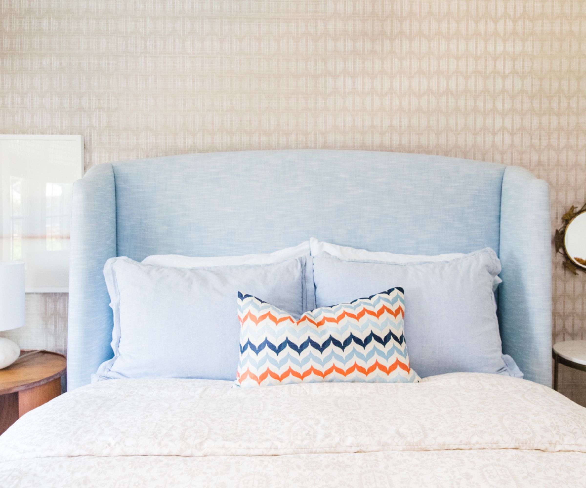
Bedroom ideas for the guest room include a lot of custom elements. 'We designed the bed ourselves and had it built by Buildlane out in CA,' says Jennifer Walters. 'They were wonderful to work with and took our napkin sketch and really brought it to life. We wanted the bed to be a light (almost denim) looking linen. Twice, our fabric selections got discontinued, but I guess, the third time’s the charm!'
The wallpaper and custom duvet cover are both from Schumacher.
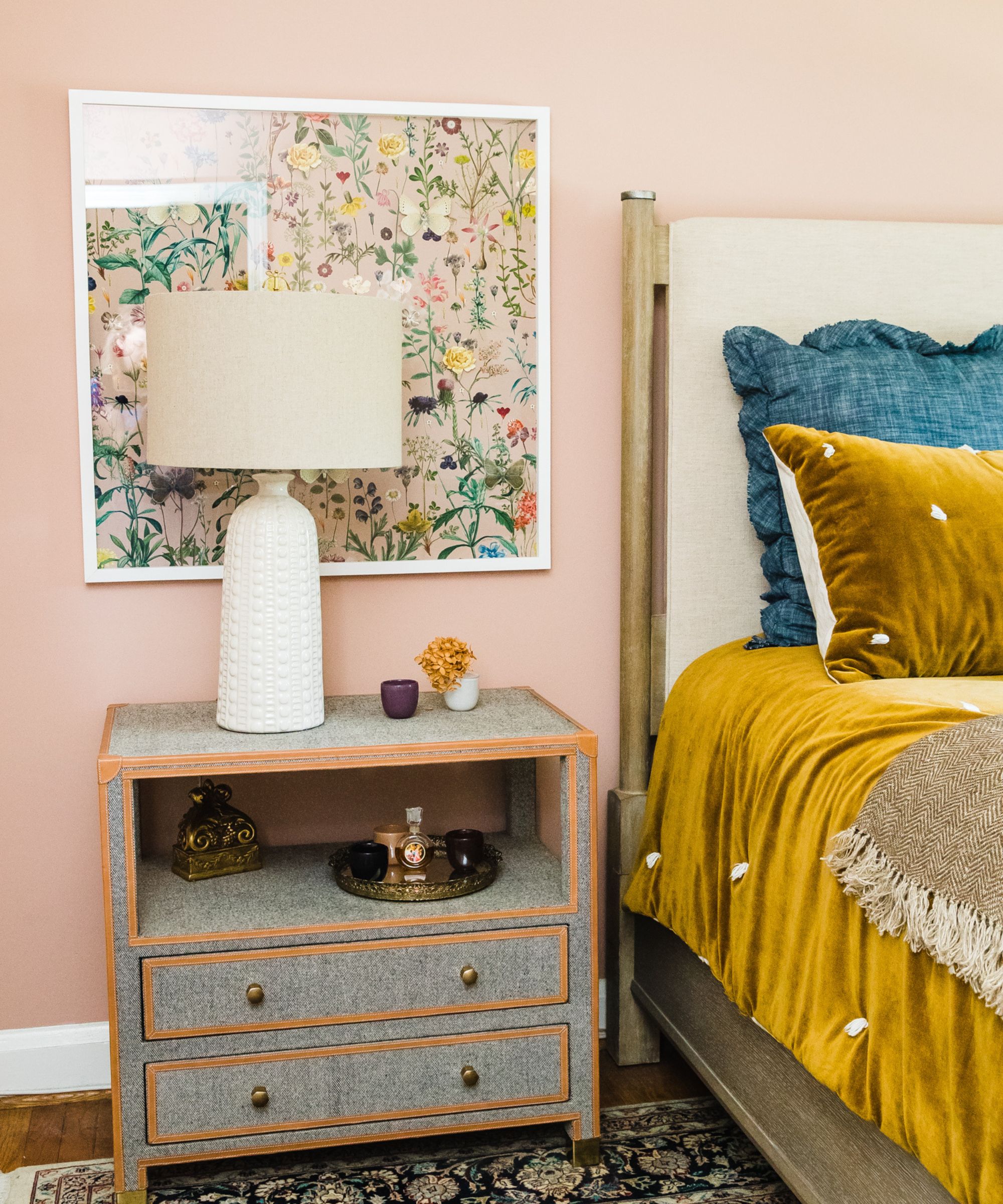
The guiding aesthetic for the main bedroom was chic yet comfortable. Designer Jennifer Walter says they tried nearly 50 shades of pink, 'Benjamin Moore's Vintage was a clear winner. It feels moody and dusty hazed all at once.'
Her general tip for rooms where there's a lot of color on the walls and upholstery, would be to gravitate to more neutral, monochromatic colors for the bedding. However, she approached this room differently. 'We were creating a cave of sorts and wanted the bedding to feel luxe, soft, and layered.' says Jennifer. 'The amber velvet quilt from Amity was the starting point, then we continued pulling ideas from the the vintage rug from her parent’s home.
'We love to source from the client’s own collections. When we start a job, we always ask the client to gather and save every little thing they might have for us to select from. This client happened to have many objects to use within. Her lovely glass trays, vases, lamps, and perfume bottles were all arranged in her bedroom.'
The nightstands are from MadeGoods. 'We loved the leather details and striping so much. They felt just a bit masculine in this otherwise feminine room,' adds Jennifer.
The butterfly artwork is a custom piece commissioned from Dawn Wolfe, who created the artwork to match the colors and scale of the room. Dawn’s art can also be sourced at One King’s Lane and Anthropologie.
Designer Jennifer Walter and the homeowner are both more than happy with the result. 'We feel like we did the historic house justice, kept it very in line with the client’s requests, and were able to refresh without renovating. The client is delighted with her colorful, cozy, new-look home.
Designer: Jennifer Walter, Folding Chair Design Co.
Photographer: Katie Merkle
Sign up to the Homes & Gardens newsletter
Design expertise in your inbox – from inspiring decorating ideas and beautiful celebrity homes to practical gardening advice and shopping round-ups.
Karen sources beautiful homes to feature on the Homes & Gardens website. She loves visiting historic houses in particular and working with photographers to capture all shapes and sizes of properties. Karen began her career as a sub-editor at Hi-Fi News and Record Review magazine. Her move to women’s magazines came soon after, in the shape of Living magazine, which covered cookery, fashion, beauty, homes and gardening. From Living Karen moved to Ideal Home magazine, where as deputy chief sub, then chief sub, she started to really take an interest in properties, architecture, interior design and gardening.
-
 ‘It leads to more headaches than it's worth’ – 4 reasons you should never store things in your oven, including fire risks and serious illness
Your oven is for cooking, and cooking only, experts urge
By Chiana Dickson
-
 Urban gardening ideas – 7 creative ways to grow in small spaces, balconies, containers, indoors, and more
Make the most of your space with these innovative ways to garden
By Tenielle Jordison