This cabin home turns 1970s style and pared-back minimalism into a winning combo
Tour this dreamy mountain cabin - and get ready for retro cool and chilled-out neutrals in this perfect treetop hideaway
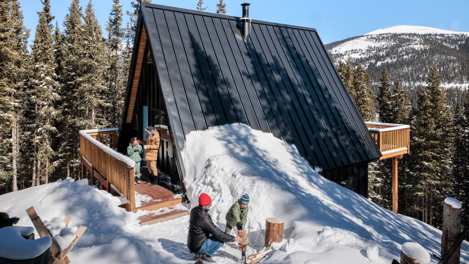
This compact winter sports chalet up in the treeline is something of a design hotspot, packing cool, colorful 1970s-style high notes into the smallest of spaces, while still leaving room for some contrasting calm, minimalist zen vibes. It sounds an unusual mix, but this cabin near Breckenridge, Colorado, is not your everyday holiday home. And its diminutive good looks may just give you some fresh ideas for decorating small spaces.
Interior designer Amy Pigliacampo is based in Boulder, CO and was looking for a cozy cabin in the mountains for herself and her family. They wanted somewhere they could enjoy the fresh air and open spaces, and eventually share with other holidaymakers when they're not using it themselves.
Breathe in the fresh mountain air, then take the tour as designer Amy explains how she came to own and restore this high-altitude holiday home, giving it a most distinctive style.
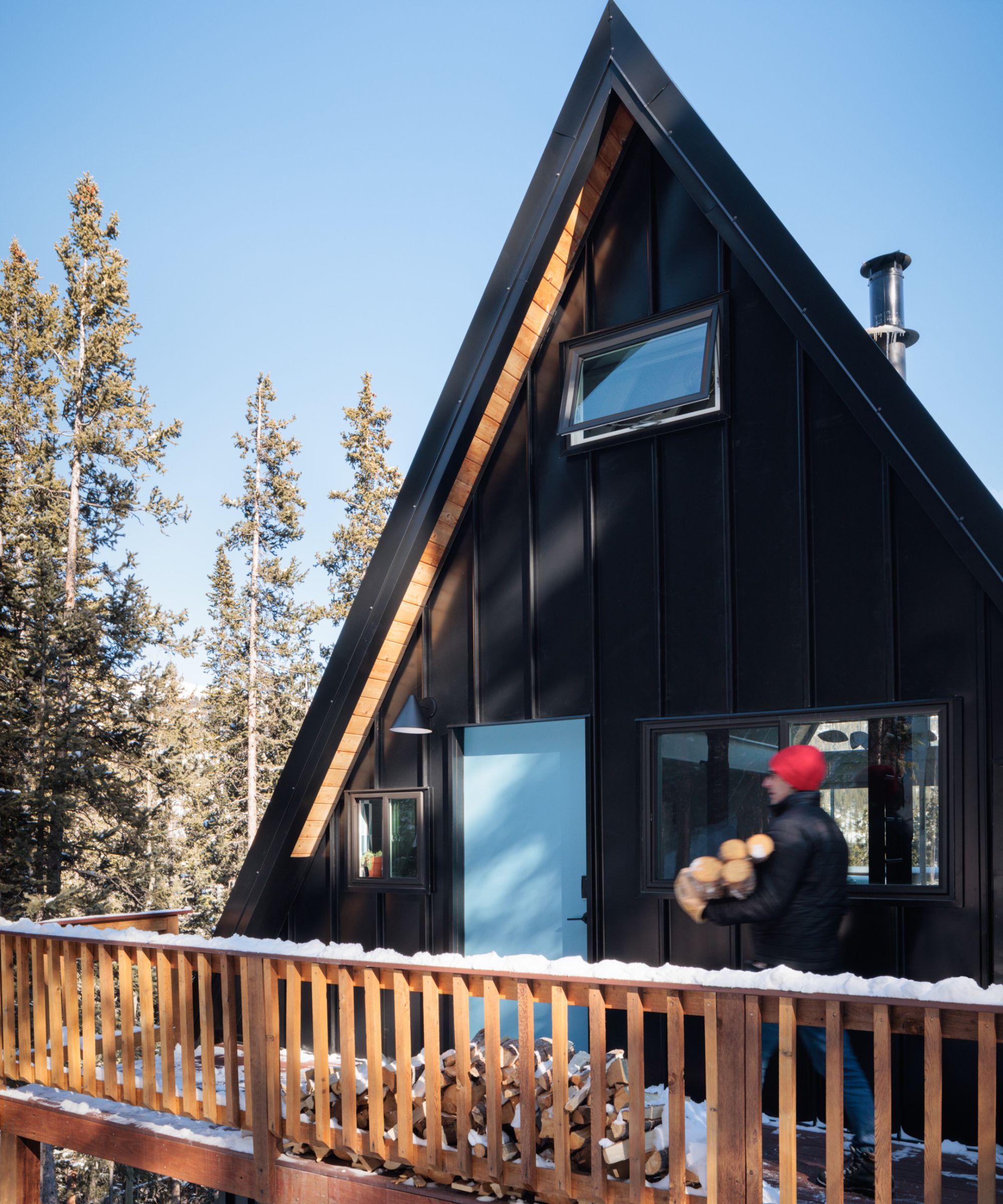
'We were on the way home from a few unsuccessful showings,' says Amy. 'When I spotted the MLS photos of this A-frame cabin. I called the realtor and asked if she would turn around and meet us again! I was ready to buy it sight unseen but luckily we got in that day and the potential I saw in real life was even better than in the photos.'
The cabin was essentially in its original 1976 state. 'However, it had fallen victim to some sad builder-grade updates in the early ‘90s,' adds Amy. 'Clearly, it had been used largely as a crash pad and very little thought had gone into function, design or even comfort.
Thinking of decorating a home on a budget? Amy's renovation is a lesson in keeping a handle on costs. 'My goal was to create the most beautiful experience possible on a shoestring budget. Nothing in the cabin was worth saving other than its classic bones; we had to peel back the layers of bad decisions to expose the good while conserving enough funds to replace everything,' adds Amy. Not an easy feat under the best of circumstances but at this remote location it was still more problematic.
'Finding any help that would actually show up and do the work was almost impossible,' says Amy. 'And like any renovation, once you touch one part you inevitably have to touch 10 more… We had issues with cowboy electrical work, poor insulation, mice and even getting to the front door.'
It's hard to imagine this small but perfectly formed cabin home throwing up so many problems but, as Amy wisely advises: 'It’s really not worth spending any money on the pretty stuff if you’re not willing to fix what that all sits on top of; you have to protect your investment by making it right from the inside out.
'Renovating in that way is challenging because a lot of your budget goes to the “guts” of the place leaving very little left over for the finishes and furnishings; it’s a balancing act but we pulled it off, with much drama along the way.'
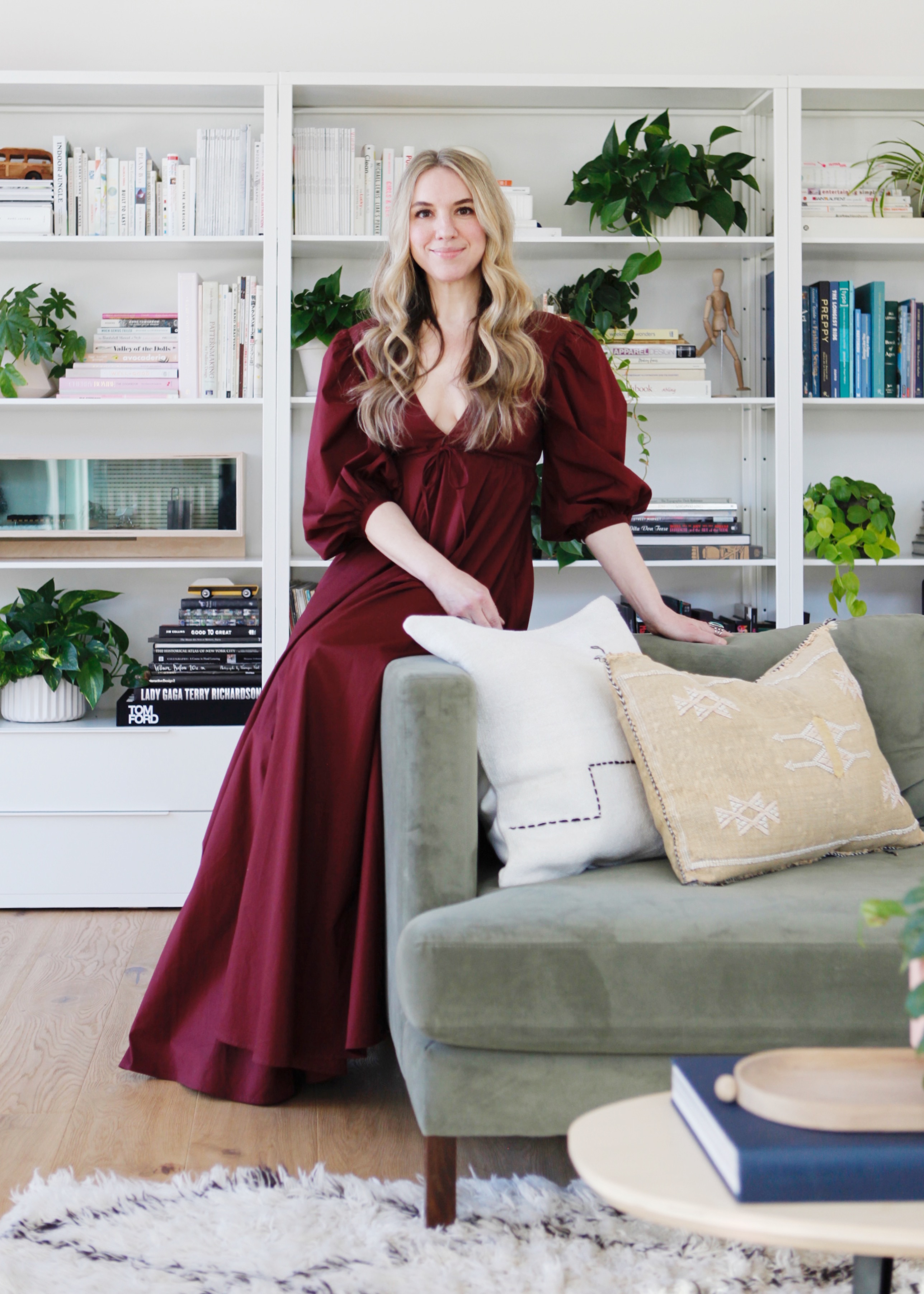
Amy creates modern, warm and inviting spaces with an emphasis on playful colors, contrast, muted tones, and organic shapes. Amy has been designing incredible projects from Denver to Aspen while also working remotely with clients from Brooklyn to Los Angeles. As a mother herself, Amy also focuses on beautiful yet functional design for growing families and everyday life.
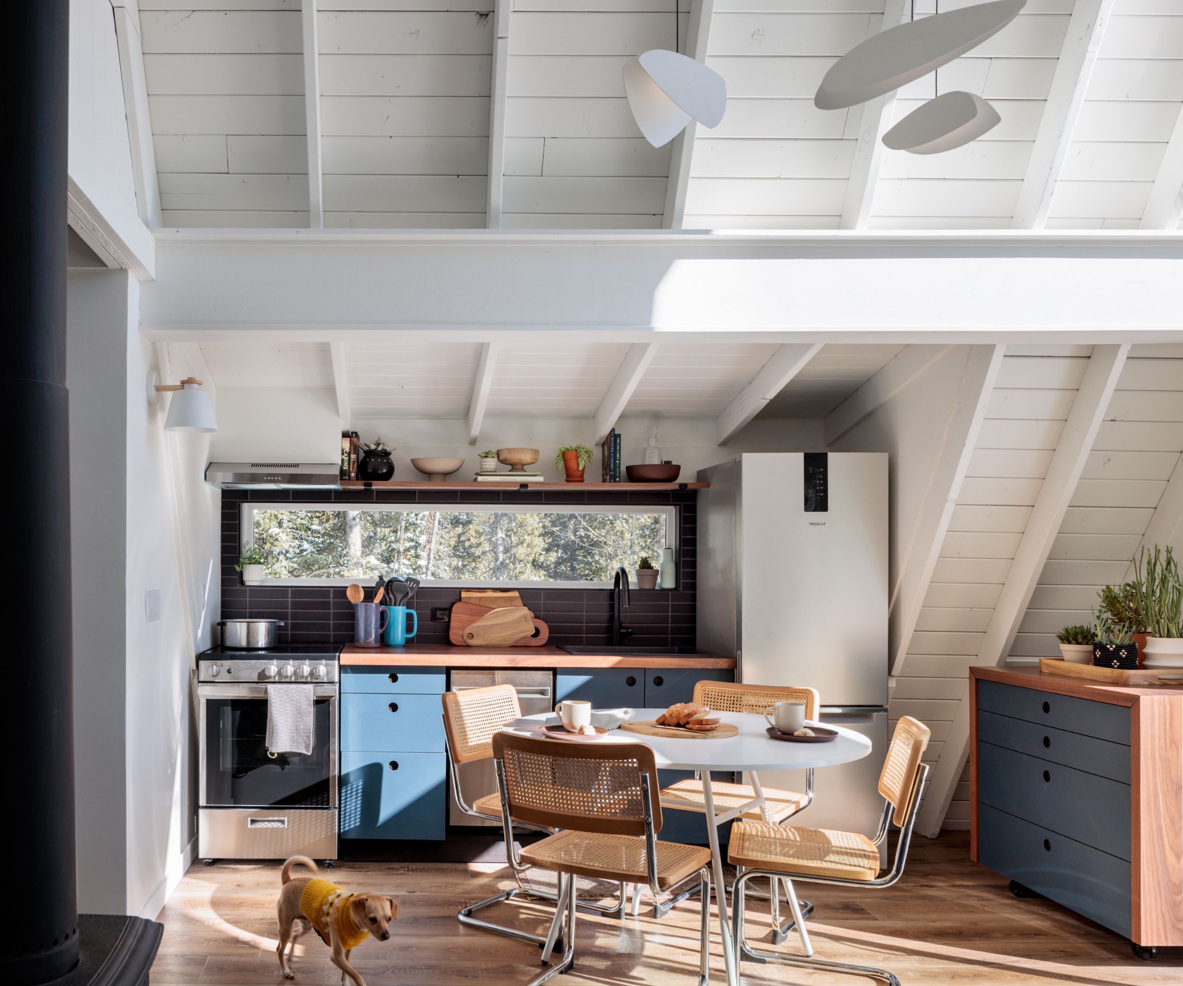
Amy called her vision for the space, a '1970s Modern Alpine Chalet', and gave herself the challenge of designing something warm and cozy yet different than anything else on the mountain.
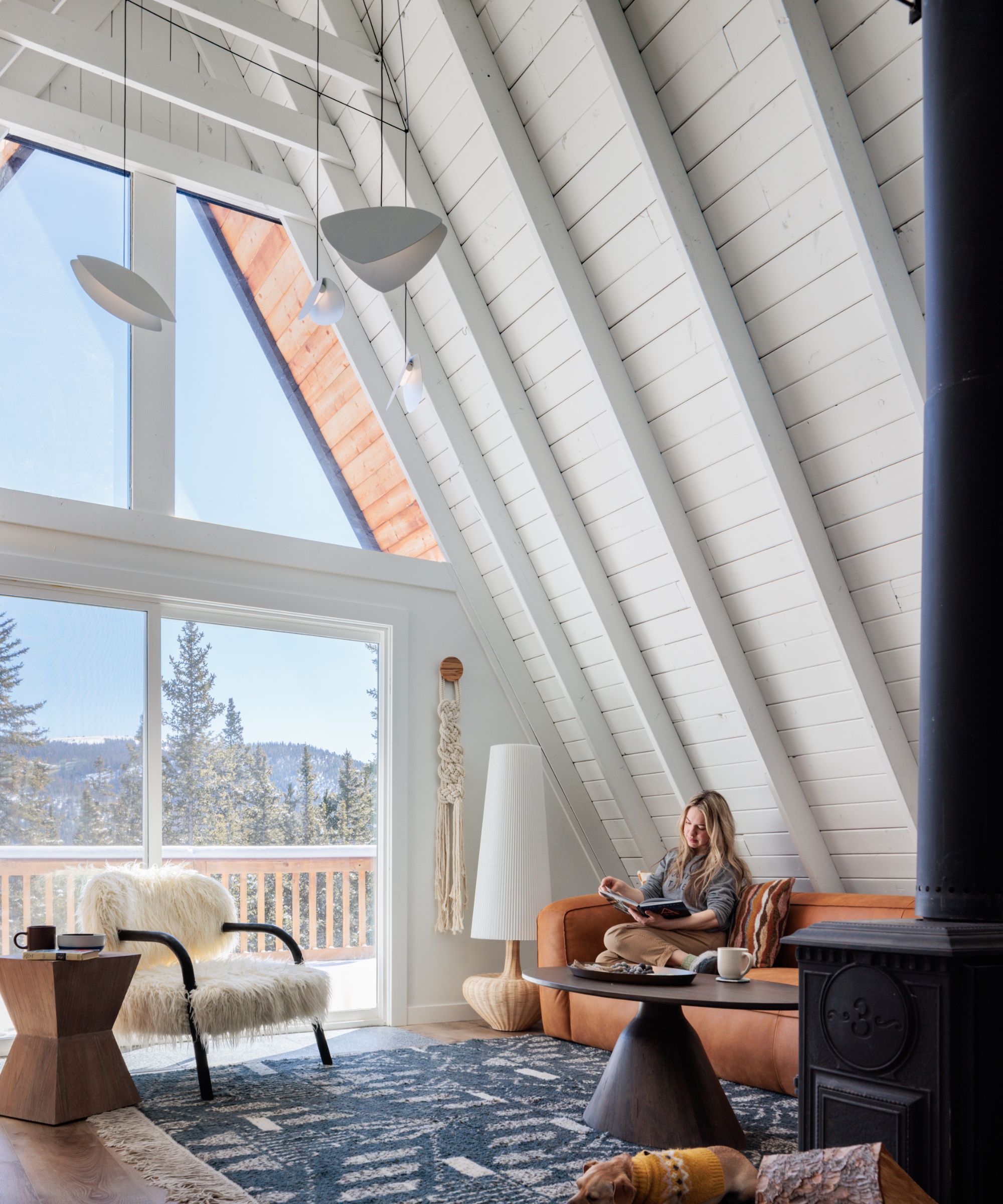
The entire main level was pine that had yellowed over time and, recalls Amy, 'It made the space feel small and tired. Painting it white was controversial,' she says, 'and I knew the furnishings would need to add back some of the warmth we took away by painting.'
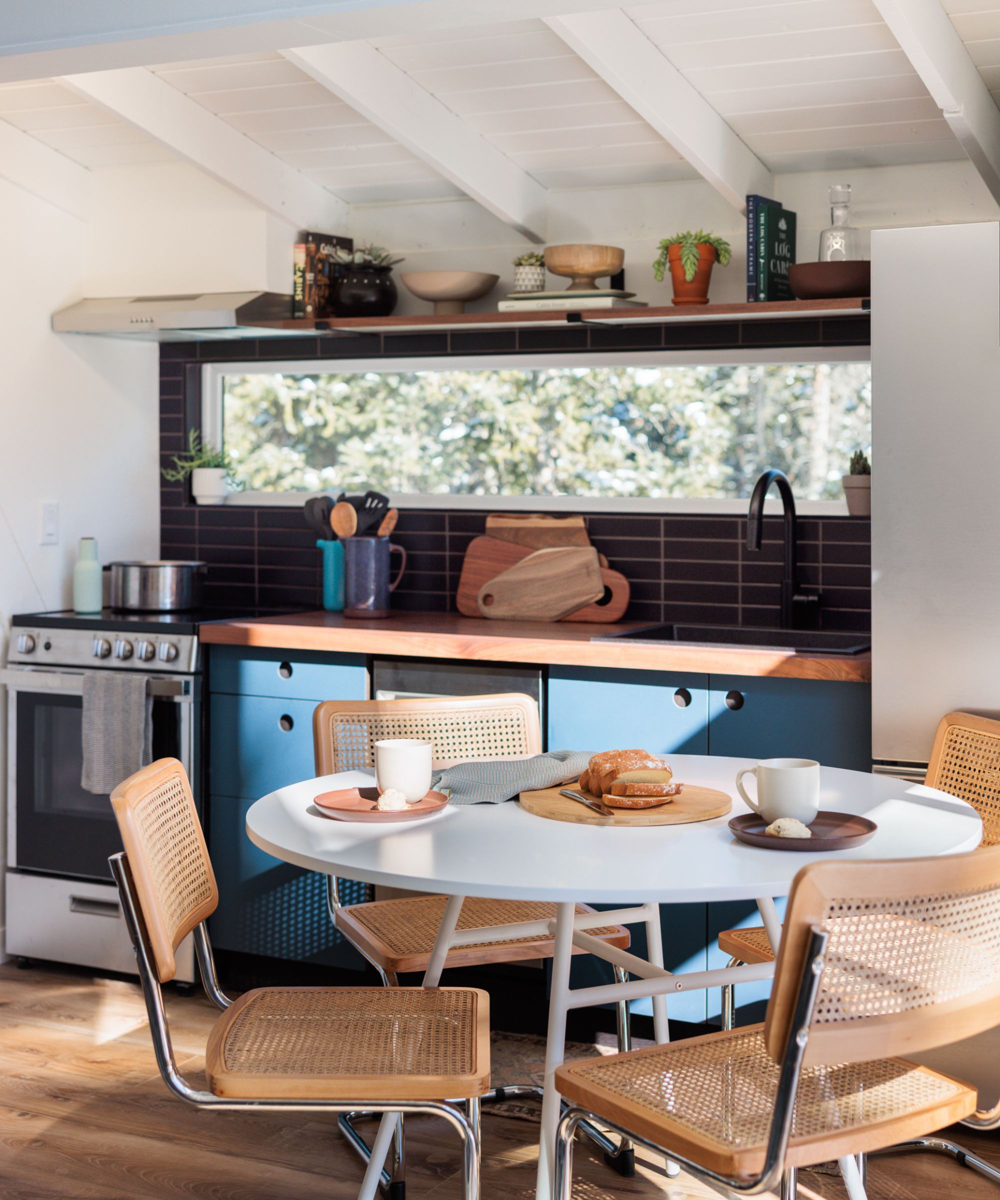
'I started with the kitchen, which is pretty typical for my process as this space informs so many other decisions in the home.'
Amy's kitchen ideas include cabinetry from Reform CPH, 'a deep smoked oak front with an almost navy linoleum face - that was my starting point in terms of a palette, navy and black. We also added a fixed pane window where the kitchen backsplash had formerly been located and tiled inside and around it with matte black subway bricks from Fireclay.'
Once the kitchen design was complete, Amy wanted to contrast those cooler dark tones with warm natural colors; adding a variety of wood, caramel leather, creamy wool, and a few cane touches.
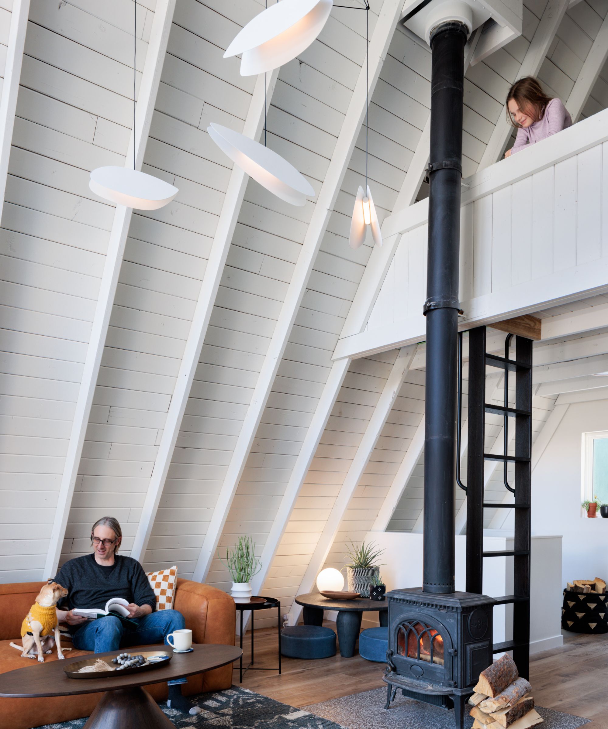
The imposting vaulted roof in the main space, allows plenty of scope for imaginative living room ideas, and Amy's choices don't disappoint. 'I spent hours and hours sourcing the right sofa (caramel leather from Article), dining table (Urban Outfitters), chairs (Scandinavian Designs), coffee table (Burke Decor), faux fur chair (Urban Outfitters again!), rattan lamp (Justina Blakeney) and vintage Moroccan rug that would complement the furnishings and fit the odd space it needed to live in. In addition to those challenges, we knew that we planned on renting the place so nothing could be too precious or fragile.
'The original wooden spiral staircase and loft ladder were heavy, unattractive and taking up way too much precious space on the main level. We removed both and replaced them with the most affordable custom options we could source. The loft ladder requires a bit of upper body dexterity but the space we reclaimed in the main room was so worth it.'
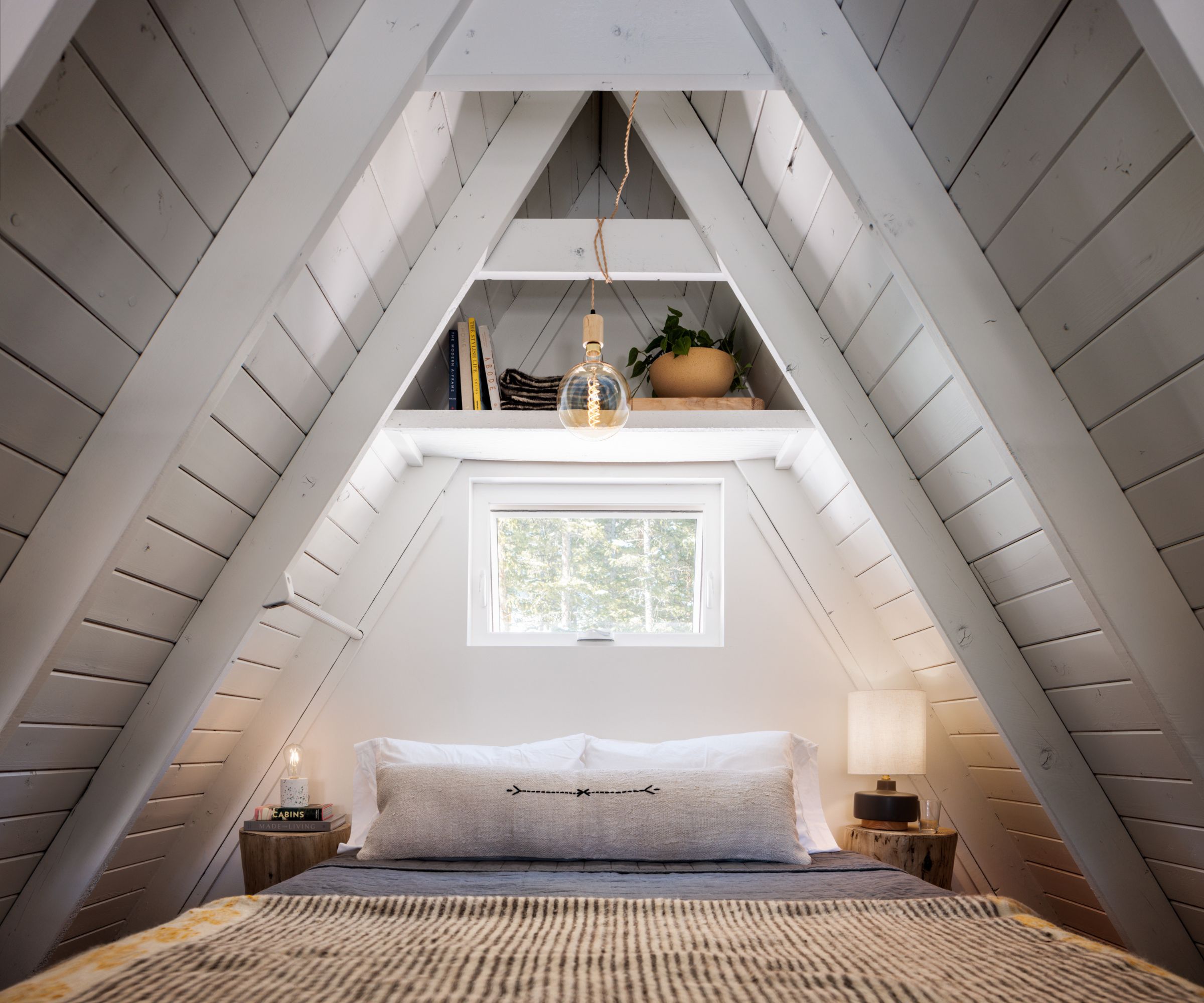
'Since the loft bedroom is the peak of the “A” it was super challenging to furnish it (imagine handing up bed components piece by piece and building a queen bed then realizing that you liked that frame better in the room two floors below and convincing your husband it would be worth changing!) but in the end I created a base for the mattress by using a powder coated box spring frame. This gave the bed just enough of a lift that was visually pleasing while allowing more clearance around the bed.'
Other ingenious and relaxing bedroom ideas include two 'stump' stools as nightstands, a cute mid-century lamp, linen and wool bedding, plus one of Amy's favorite rugs from a past Justina Blakeny collaboration.
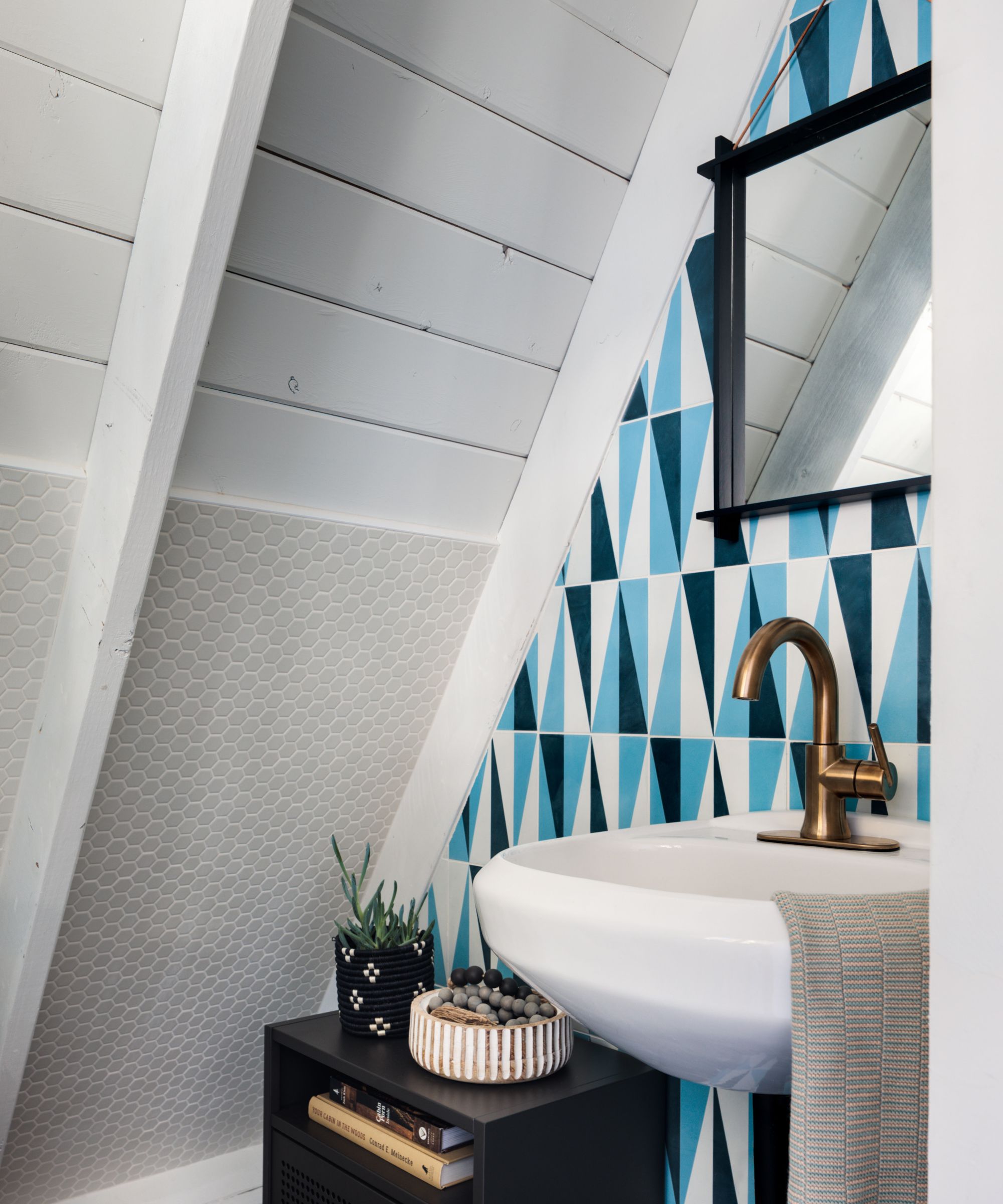
'The powder room was quite possibly the worst space in the whole cabin and after a lot of drama, it’s now really special. I fell in love with a specific concrete tile from Cle´ - the blue felt like the same color as the Alma sky, the triangles felt representative of the steep mountains and the A-frame lines. Getting this tile installed was a nightmare (our second tile guy quit midway through the install and we had to find a third!) .
Somehow, in the end, Amy's powder room ideas came together ('we even kept the existing toilet and sink, just swapped out the faucet!').
'Finding a mirror to fit the vibe and the tiny little triangular space above the sink was tricky too but Oyoy, one of my favorite brands from our friends Jones+Co made just the right one. A perforated powder coated metal nightstand made the perfect storage cabinet in the oddly shaped room.'
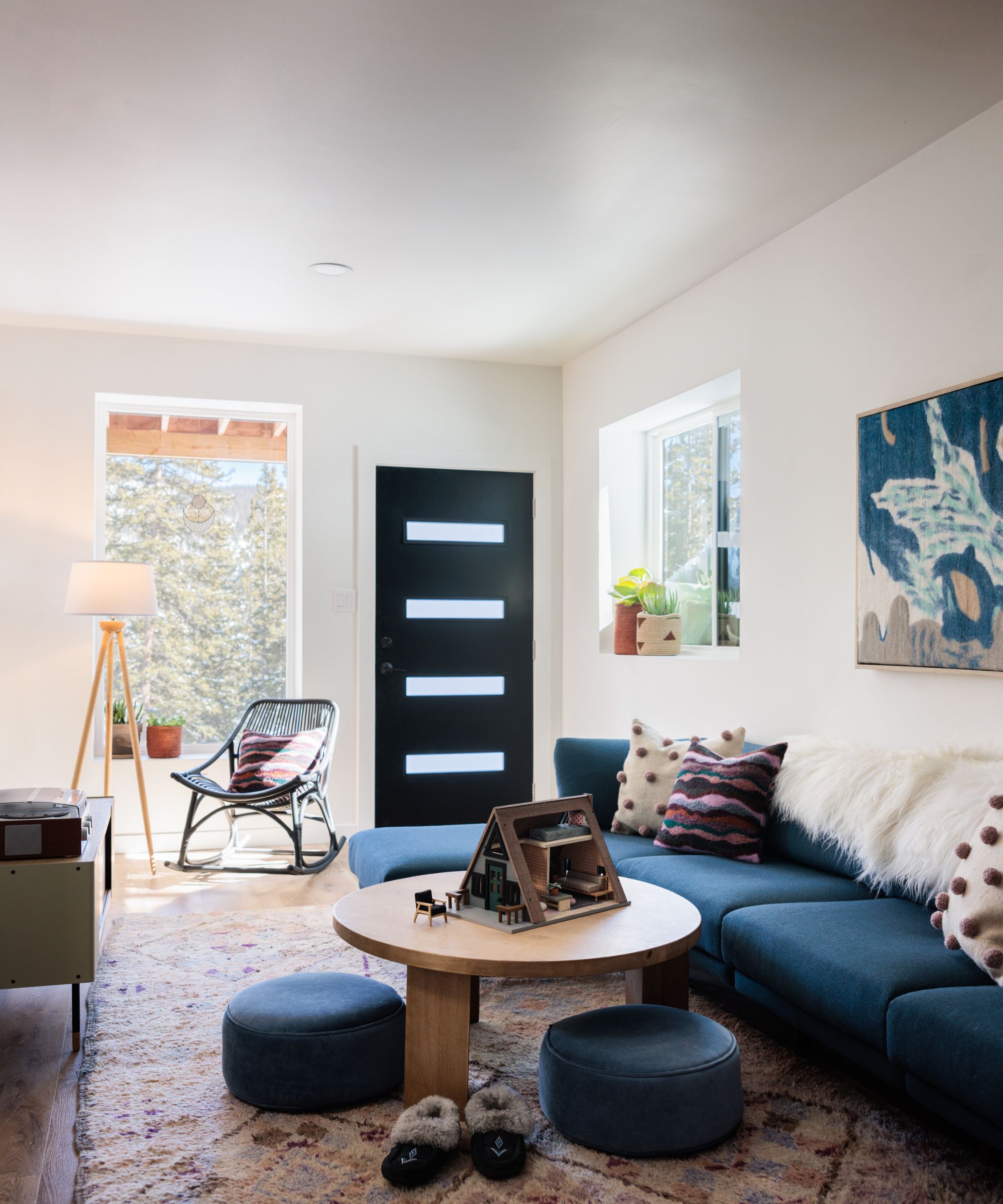
If you're looking for media room ideas, then this space is worth a careful look. 'Unlike the upper levels, the downstairs level has actual walls, so furnishing it was slightly easier but still really challenging because the rooms were very oddly sized. I designed the lower level as a media space with a TV, extra long Burrow sofa (important that this came in boxes and not one piece because there was no way to get it inside!), Burke coffee table, vintage Moroccan rug that was over budget but the only piece that fit the space and the vibe.'
A Selamat gray rattan rocking chair, Camino sideboard, Candice Luter woven wall art, with blankets, planters and accessories from Jones+Co in Boulder complete the look. This area also serves as a play space with toys under the staircase and in a charming touch, an A-frame dollhouse.
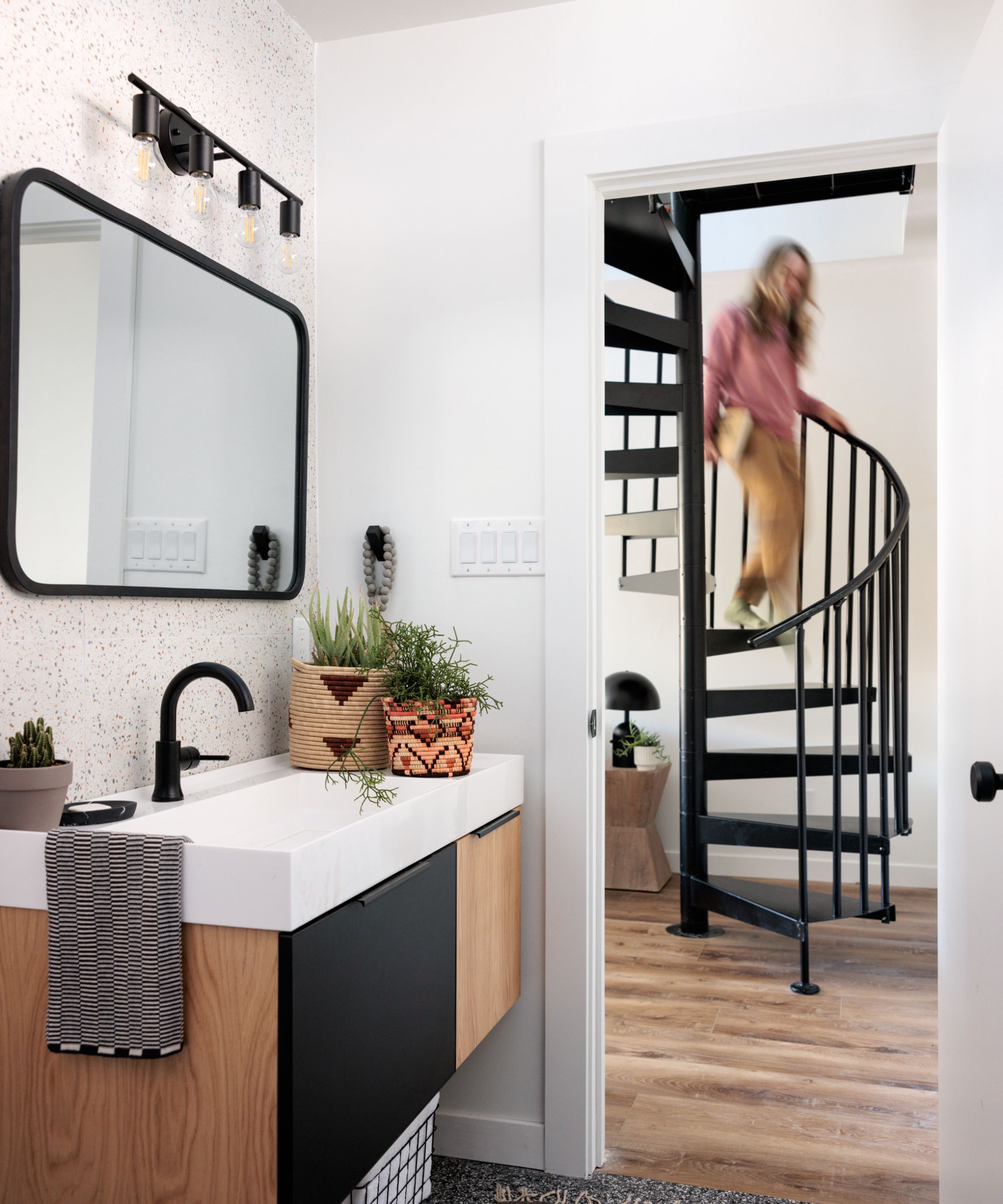
Amy's bathroom ideas for the downstairs bathroom were also fraught with tile drama. She chose two terrazzo tile designs, a black/gray from Daltile on the floor and another (now discontinued) creamy version with green, blue and terracotta bits on three walls.
'We sourced the hanging vanity from Karton Republic (our first general contractor mounted it too close to the wall and the drawer wouldn’t open because of door trim!) and mirror from Umbra home.
'There were so many design constraints in this renovation; budget, angled walls, very little space, everything having to be carried down a 30 foot outdoor staircase, no actual people that wanted to do the work, crazy high altitude, 3-4 feet of snow, mice, literally all the things,' says Amy.
But was it worth it? We think so. And anyone lucky enough to enjoy those cozy interiors and spectacular mountain views is sure to agree.
Interior design: Amy Pigliacampo
Photography: David Lauer
Sign up to the Homes & Gardens newsletter
Design expertise in your inbox – from inspiring decorating ideas and beautiful celebrity homes to practical gardening advice and shopping round-ups.
Karen sources beautiful homes to feature on the Homes & Gardens website. She loves visiting historic houses in particular and working with photographers to capture all shapes and sizes of properties. Karen began her career as a sub-editor at Hi-Fi News and Record Review magazine. Her move to women’s magazines came soon after, in the shape of Living magazine, which covered cookery, fashion, beauty, homes and gardening. From Living Karen moved to Ideal Home magazine, where as deputy chief sub, then chief sub, she started to really take an interest in properties, architecture, interior design and gardening.
-
 I'm an expert vacuum tester, and no, you really don't need a mattress vacuum – here's what to use instead
Before investing in a new gadget, the tried-and-true methods still work
By Dan Fauzi
-
 Charli XCX's front door color 'feels deliberate, and almost calculated' – estate experts say it carries authority (but it comes with a warning)
The singer's sophisticated front door color gives a 'psychological head start' to sellers, but it has a potentially unlucky downside
By Megan Slack