A sympathetic restoration has transformed this 17th-century Grade II listed converted barn into a rural masterpiece
Removing the orange wood and worn carpets left over from its 1980s conversion has transformed this barn and put the focus back on its glorious original features
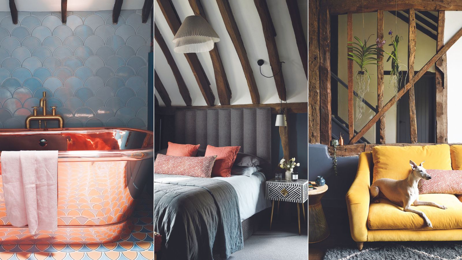
Bachelor pad meets weekend family home? It might not be the most conventional-sounding barn conversion, but then its owner Simon Lue-Fong would never wish to be described as conventional. He was looking for a country escapes for himself and his two young daughters who spend most weekends with him. So when best friend Vic spotted this Beaconsfield barn for sale, Simon’s dreams of moving out of London quickly became a reality. ‘Almost as soon as I walked in I knew this was where I wanted to live. I put an offer in that same day,’ Simon recalls.
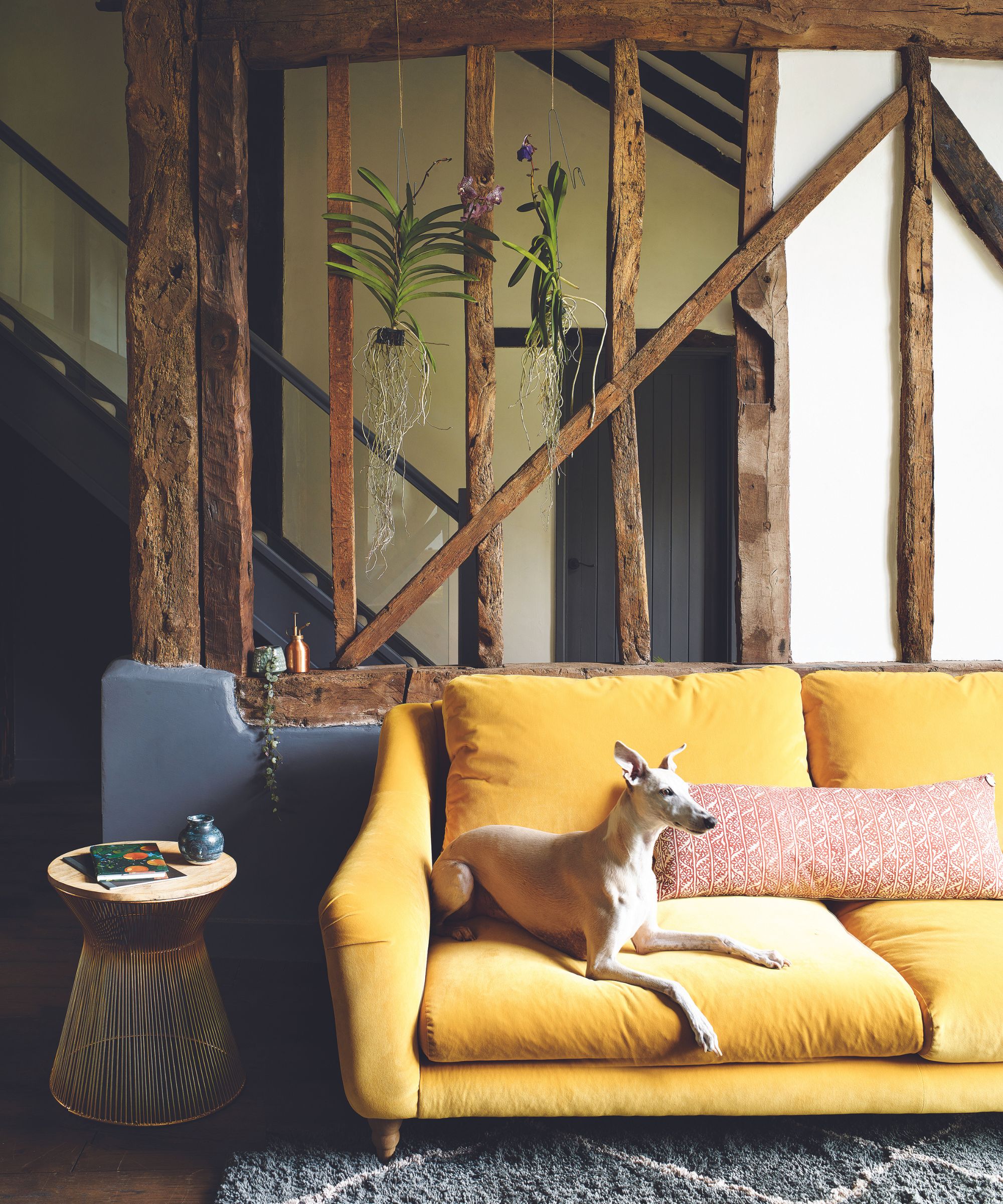
The framework of beams has been exposed to allow extra light into the hall behind, creating additional architectural interest
Although the barn conversion was in excellent structural condition it had not been changed since its conversion in the 1980s. ‘But I could see how updating the house design by fusing a modern twist with the vintage structure could create the dream home I was looking for,’ he says. Simon turned to interior designer Pia Pelkonen of Pia Design to come up with a plan, explaining that he wanted the interiors to be inspired by Annabel’s nightclub. ‘It was to push her not to make the house too conservative in its styling,’ he explains. The barn also had to be a fun place for Simon’s daughters, and he wanted them to have an input in their rooms.
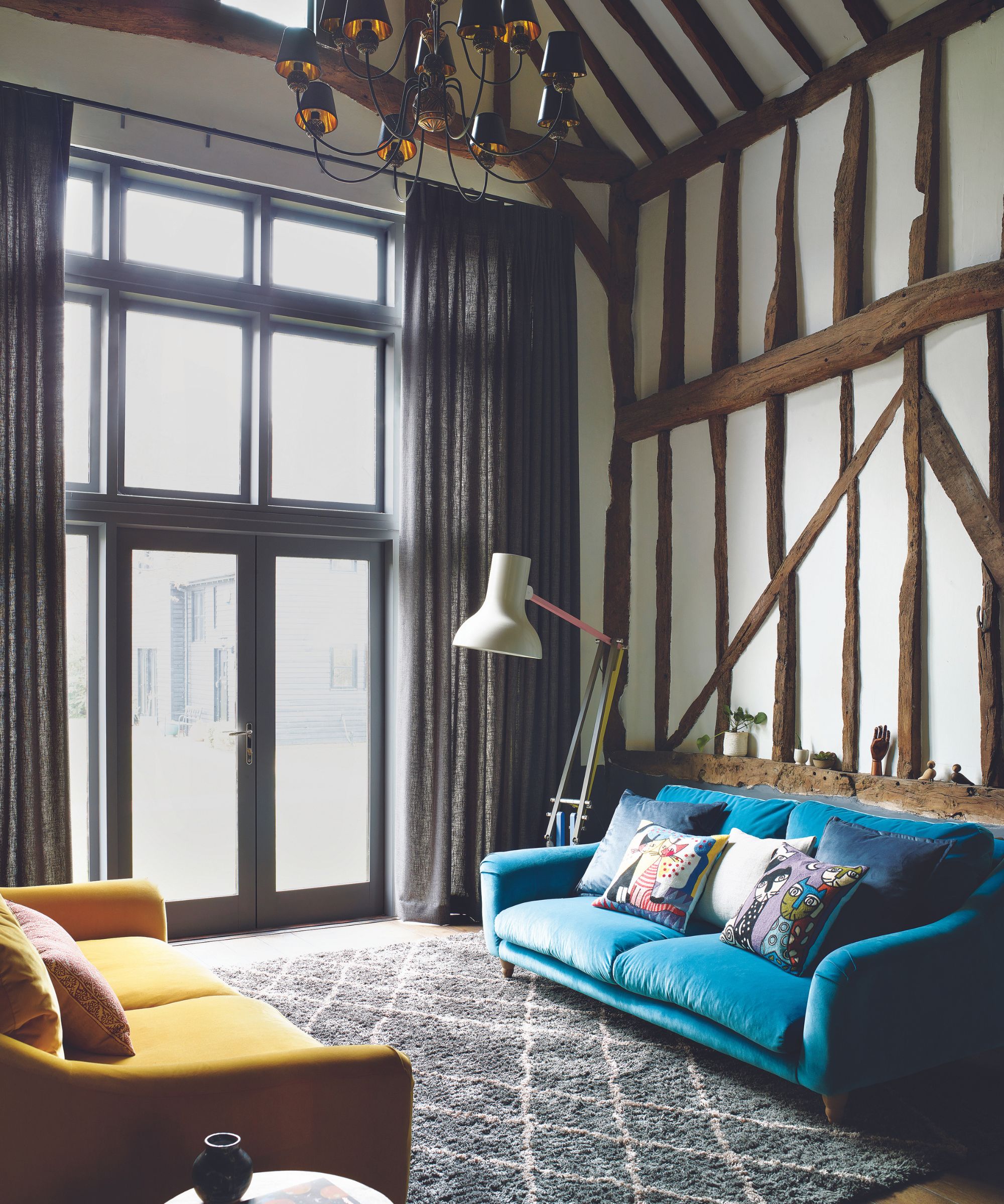
Simple furnishings allow the beauty of the original beams to do the talking
Sustainability is important to Pia so instead of focusing on what to remove from the barn, she looked at what she could adapt. ‘My initial impression was of lots of orange wood and worn carpets,’ says Pia. ‘But they were good-sized rooms and there was no need to knock down walls or extend the existing building.’ That proved to be a blessing as the barn is Grade II listed, with parts of the building dating back to the 17th century, so avoiding structural changes was the easiest option.
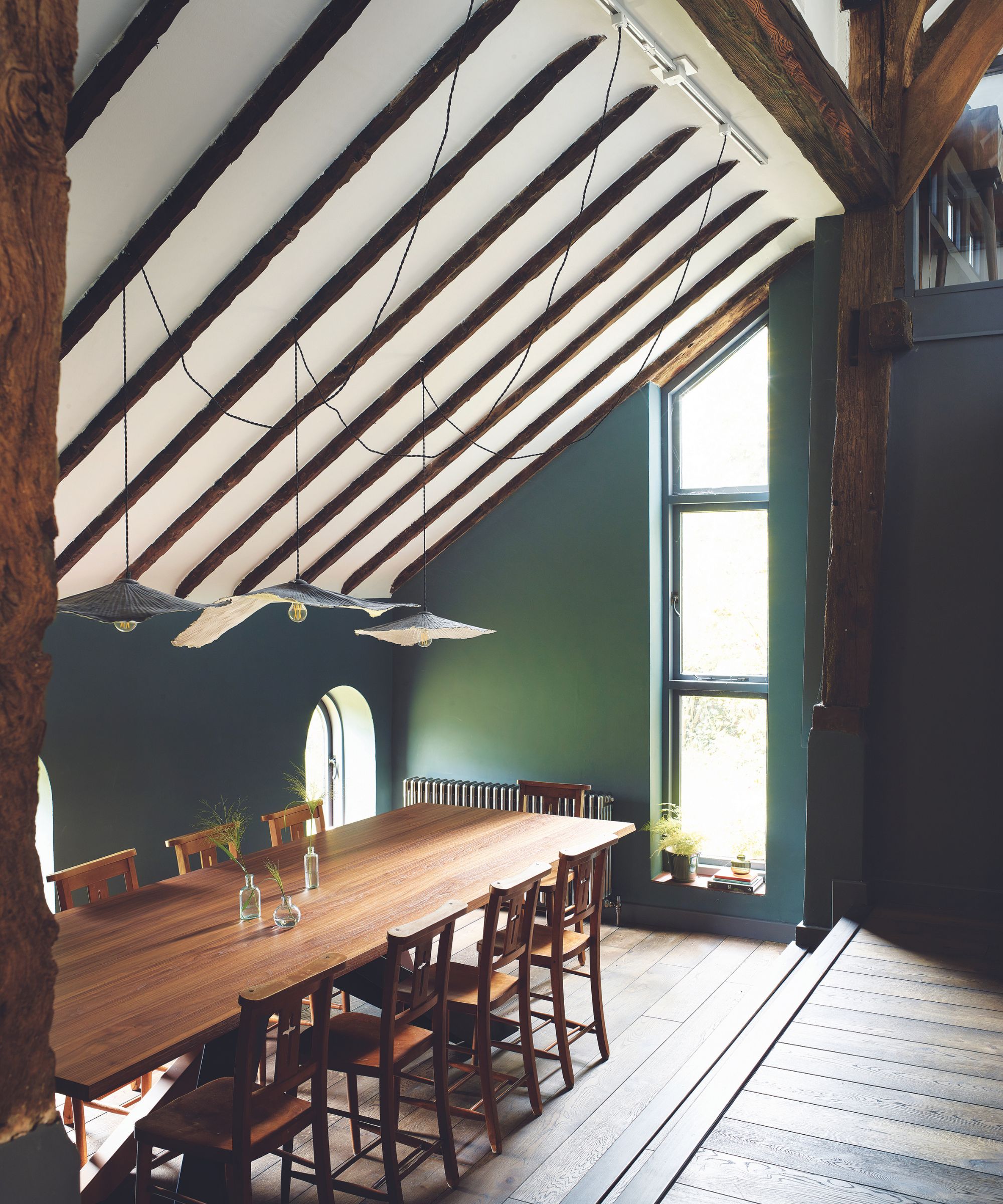
Pia overcame the room’s challenging proportions by making a feature of them
‘Of all the additions, the one that jarred the most was the balustrade around the upper floor, a mezzanine level that had been added to house the bedrooms and bathrooms,’ says Pia. ‘The orange wood clashed with the barn’s original beams, and we decided to replace the balustrade with simple glass panels that allowed the ancient woodwork of the beams to take the spotlight once again.’
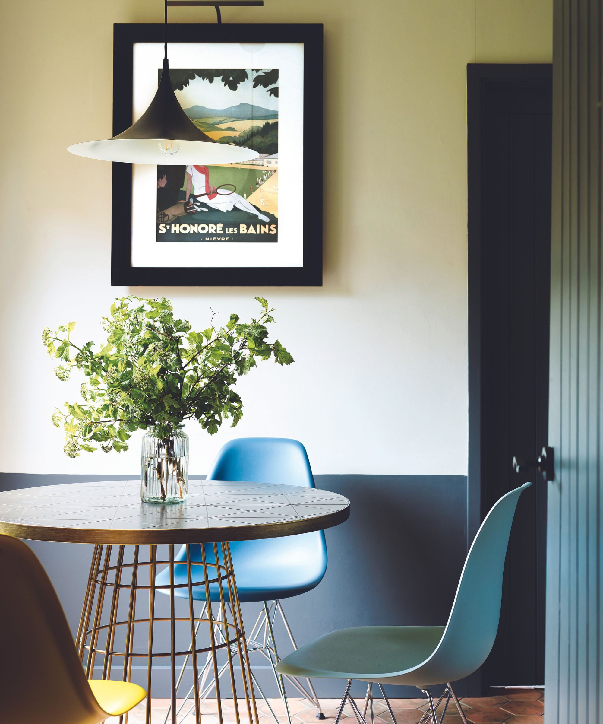
This brightly lit corner is perfect for family meals. Floor tiles, Porcelain Superstore
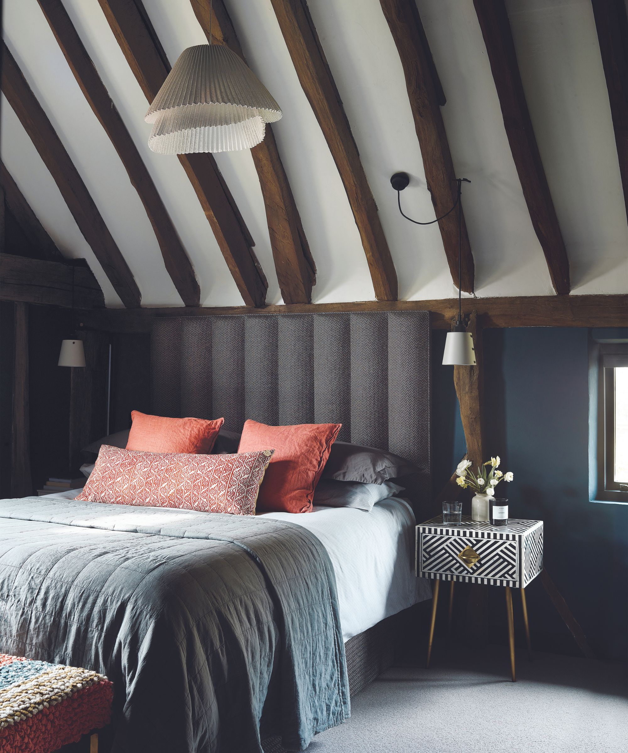
Many shades of grey combine with coral accents to create a smart and restful scheme
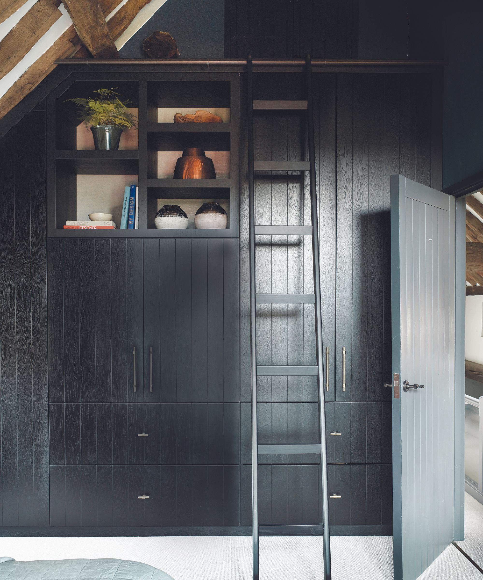
Pia replaced a bank of pine cupboards with these bespoke wardrobes
Pia knew that a subtle approach would be best, particularly when designing the girls’ rooms to grow with them. ‘We used paint and panels of wallpaper on cupboard doors to create a fresh look,’ Pia explains. ‘These add so much character but can easily be changed in the future.’ She opted for simple solutions elsewhere in the house too. An extra-long and narrow table suits the dining room’s challenging proportions and cabinets from Howdens were good choices for the kitchen where Simon didn’t want to invest too much.
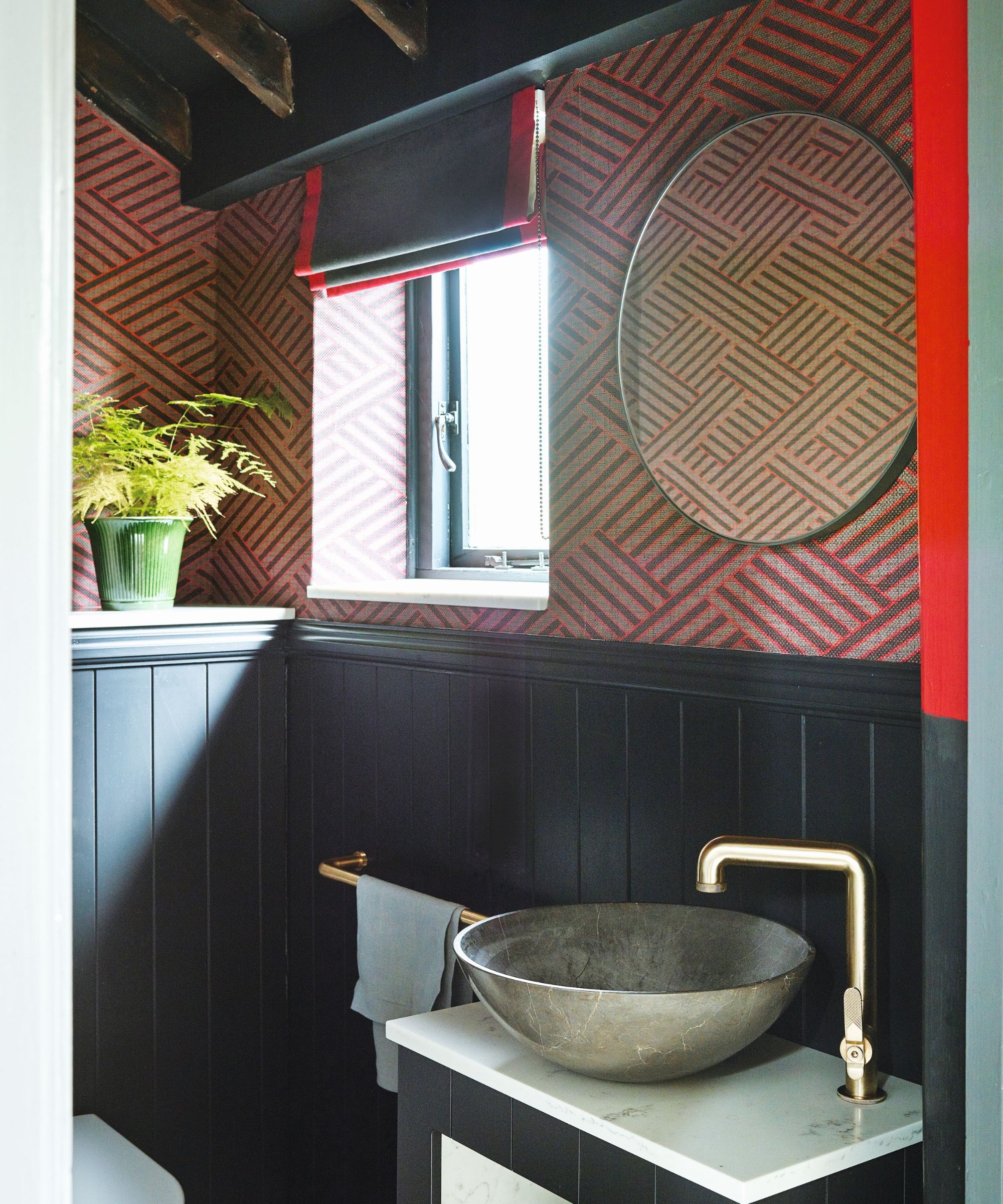
The downstairs bathroom has a dramatic scheme
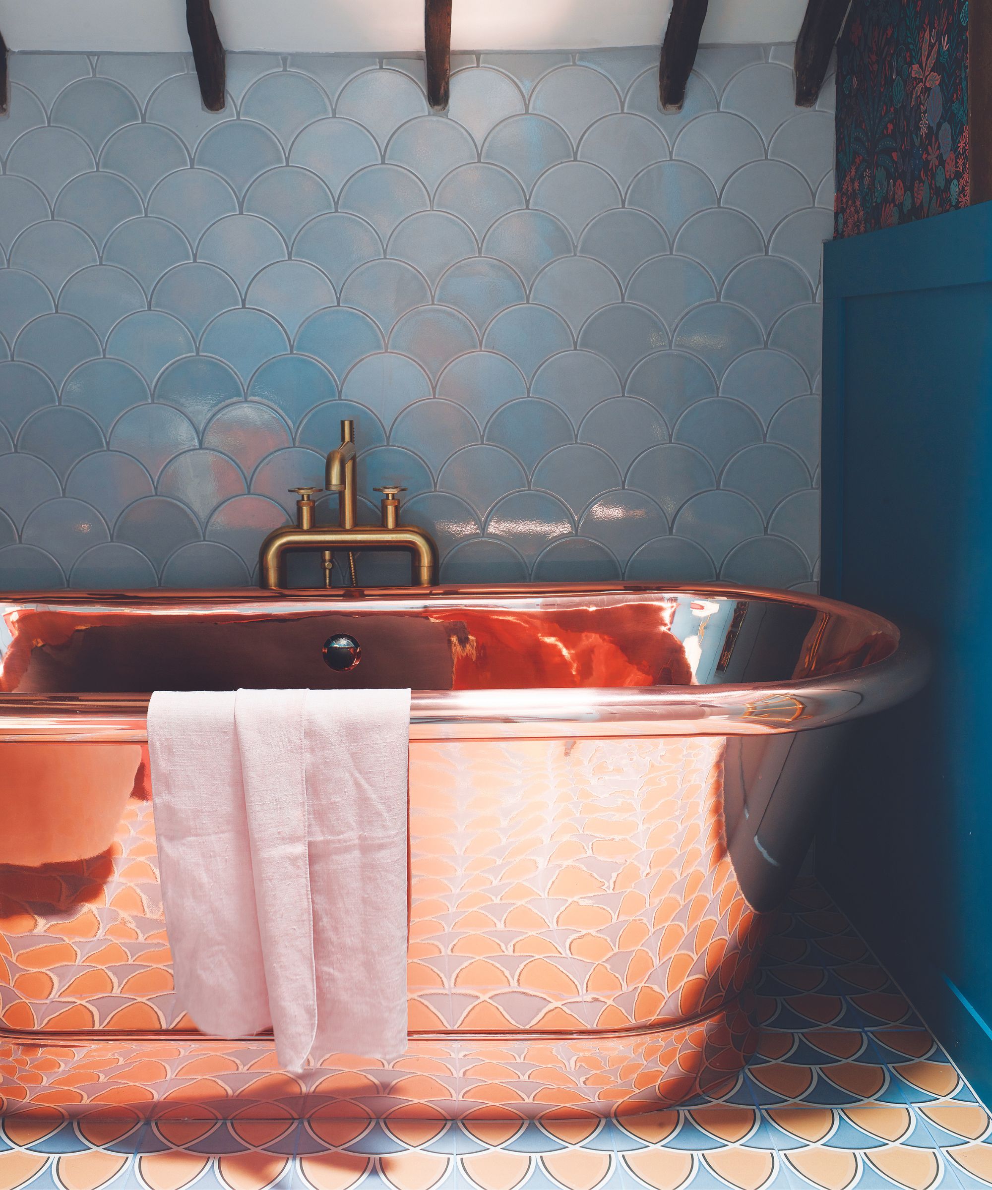
The freestanding copper tub adds distinctive glamour
Although Pia kept the original layout and room sizes the same, the result is a dramatic transformation and the barn is hardly recognizable from that first meeting. Moody interiors and Simon’s favorite grey color are the backbones of the new schemes. ‘The dark grey really adds to the bachelor vibe and brings the beams to life,’ says Pia.
Simon’s brief to Pia was that ‘when anyone walks through the door, it must be obvious I had nothing to do with the design!’ Pia has a different take on this. Simon feels he handed all the design decisions over to Pia, while she says she interpreted the exact look he wanted for the barn. Two different sides of the same story – surely the sign of a successful designer-client collaboration.
Sign up to the Homes & Gardens newsletter
Design expertise in your inbox – from inspiring decorating ideas and beautiful celebrity homes to practical gardening advice and shopping round-ups.
Karen sources beautiful homes to feature on the Homes & Gardens website. She loves visiting historic houses in particular and working with photographers to capture all shapes and sizes of properties. Karen began her career as a sub-editor at Hi-Fi News and Record Review magazine. Her move to women’s magazines came soon after, in the shape of Living magazine, which covered cookery, fashion, beauty, homes and gardening. From Living Karen moved to Ideal Home magazine, where as deputy chief sub, then chief sub, she started to really take an interest in properties, architecture, interior design and gardening.
-
 Kevin Bacon and Kyra Sedgwick's rustic kitchen island is stunning, but controversial – designers say you can get the look without the hassle
A popular material finds an unorthodox home in the couple's kitchen, but experts disagree on whether it should be used – here's how to do it instead
By Sophie Edwards
-
 How to grow grapefruit for homegrown sweet and tangy, highly nutritious harvests – a fruit tree expert shares their planting and care tips
From planting to harvesting, this is all you need to know about grapefruit trees
By Drew Swainston