Explore this Yorkshire Dales village home filled with William Morris wallpapers
Stunning Arts and Crafts patterns and antique furniture add to the charm of this period home in the English countryside

Design expertise in your inbox – from inspiring decorating ideas and beautiful celebrity homes to practical gardening advice and shopping round-ups.
You are now subscribed
Your newsletter sign-up was successful
Want to add more newsletters?
Moving to the picturesque Yorkshire Dales, Jo Lloyd and her husband John swapped their small cottage for a more sizeable, listed farmhouse, which they lovingly renovated over two years.
But when a For Sale sign appeared on a particularly special local property, the couple could not turn a blind eye…
Scroll down to enjoy the couple's property, then visit the world's best homes to see more beautiful houses.
Article continues below 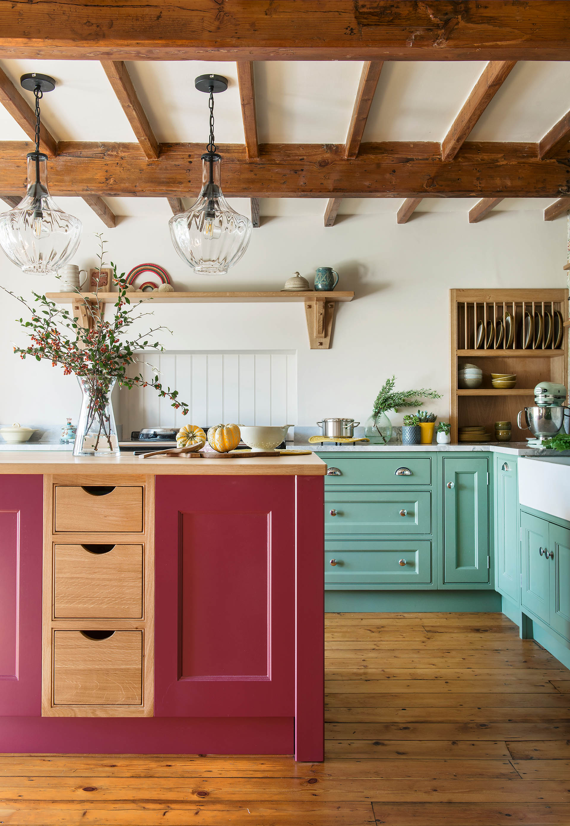
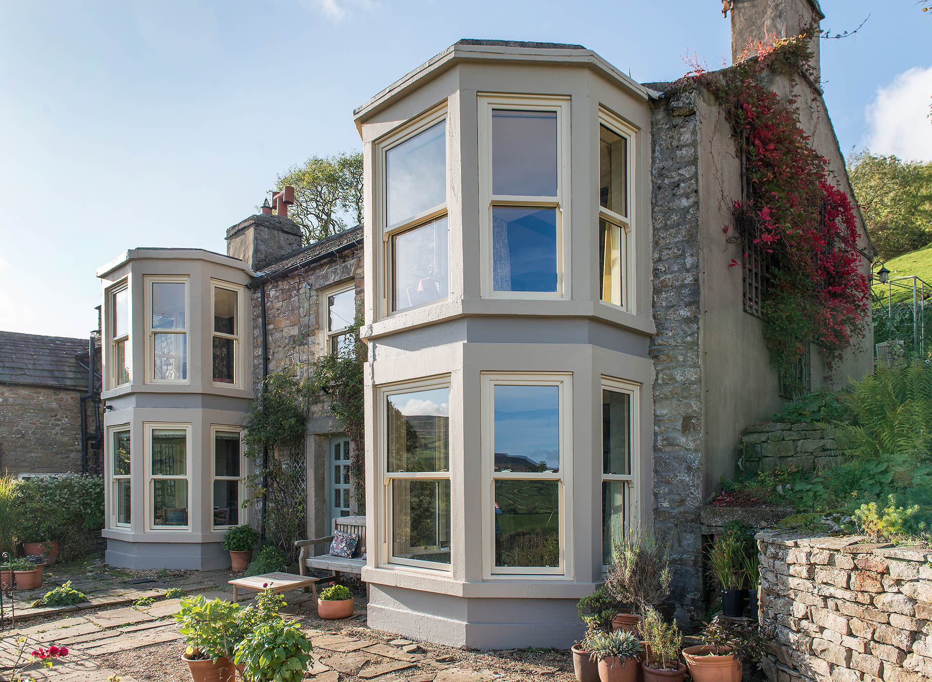
‘I was nervous, but excited too, because we’d long been aware of this house,’ Jo says. ‘It’s quite a landmark in the area, due to its high position and the huge bay windows, which are unusual for the Dales.
'Whenever we drove past, we’d look up at it and imagine the amazing views it must have across the Dales. We had to go and take a look.’
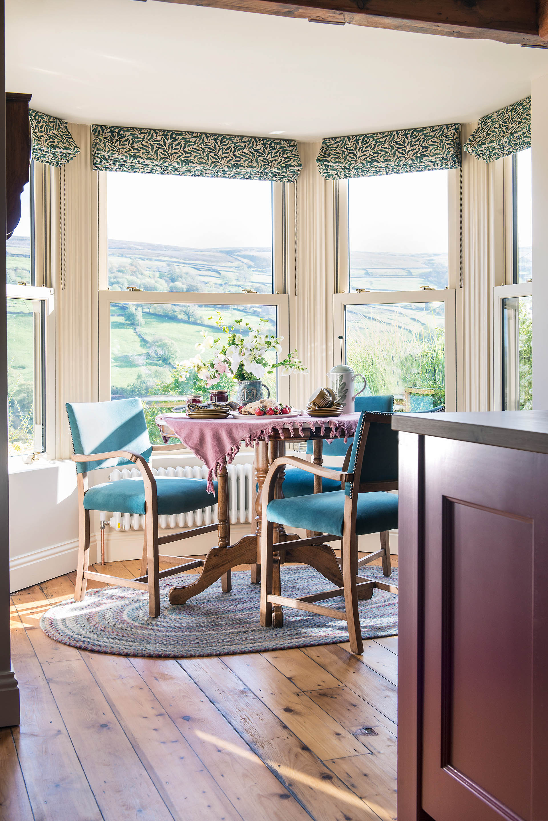
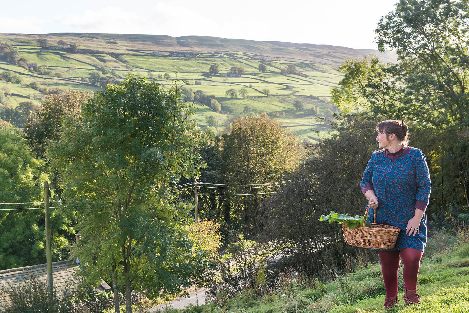
Perched on a steep bank above the village, the house looks out across a vast, green landscape and is attached at one end to a cottage.
The buildings have 17th-century origins and have been blended and split up in various ways over time. The eye-catching bay windows were a Victorian addition, and in the 1950s the property became two separate dwellings.
Design expertise in your inbox – from inspiring decorating ideas and beautiful celebrity homes to practical gardening advice and shopping round-ups.
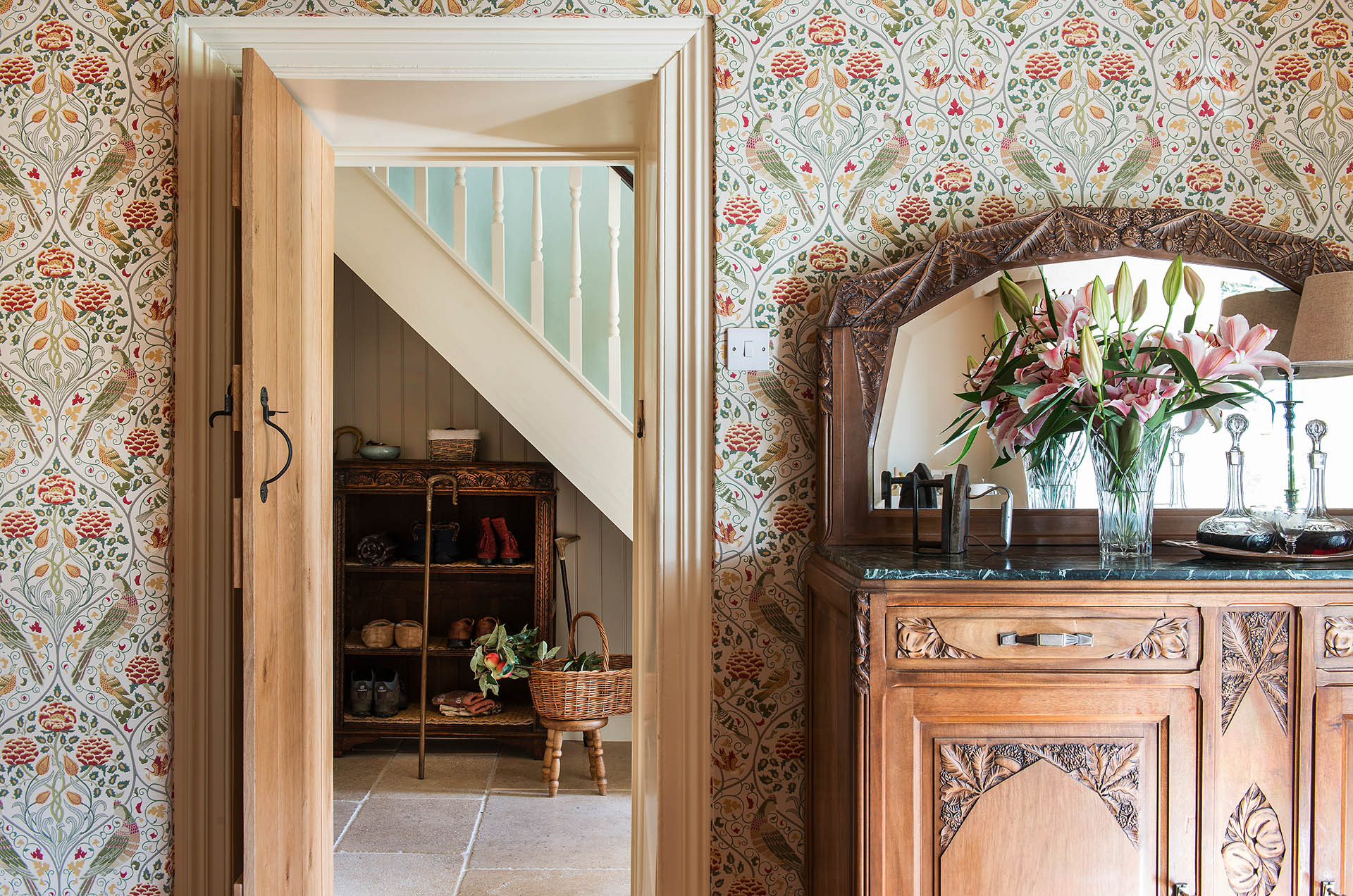
The house had been renovated some 20 years ago, but inside, the rooms had become dated and tired. Even so, as Jo and John walked around it, Jo found herself growing ever more enthusiastic.
‘I knew that this would be our home,’ she says, ‘The light is wonderful and the views over Swaledale are breathtaking. I could see our furniture working here, and I had an idea of how to rearrange the rooms to suit us a little better.’
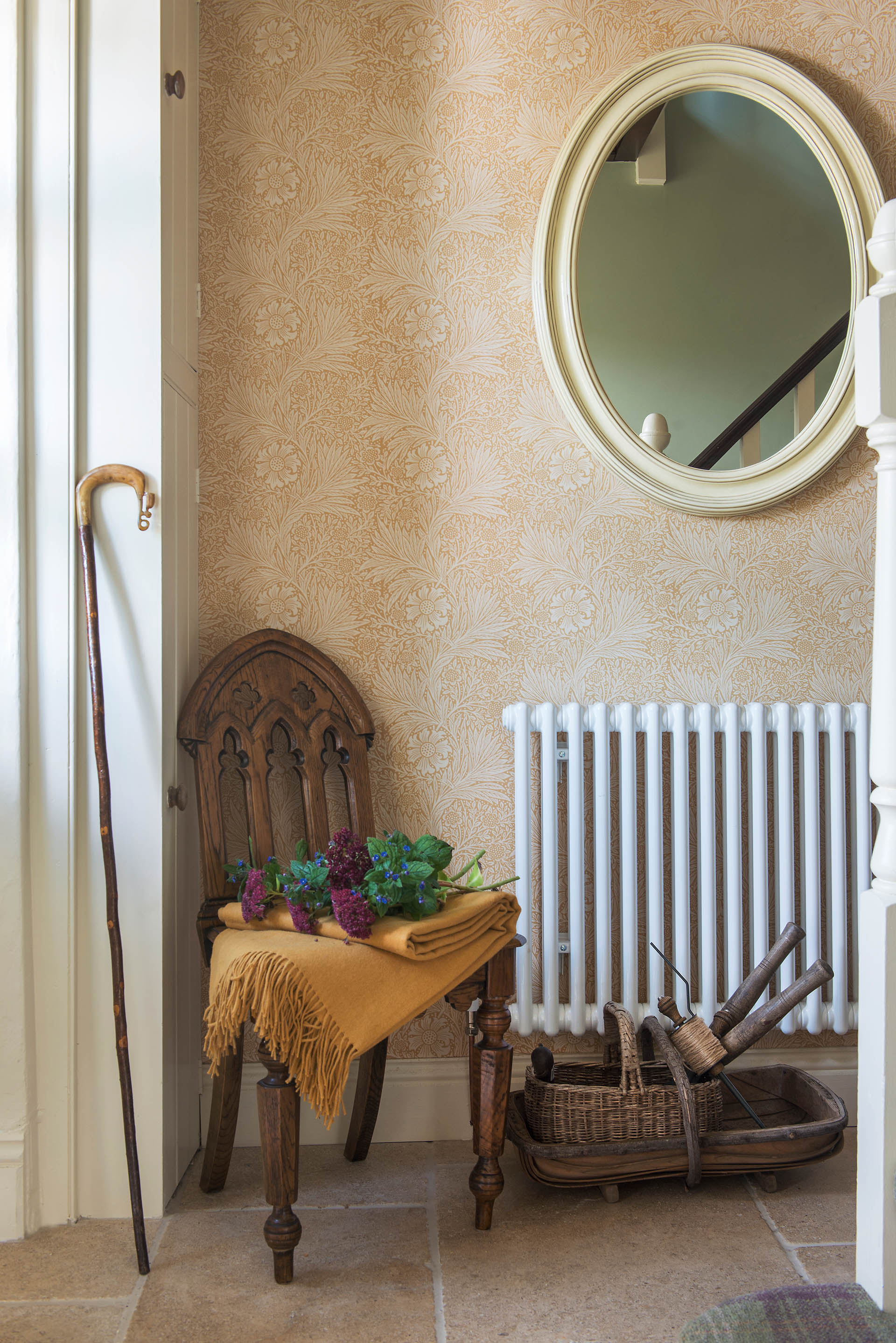
Once the couple had agreed to buy the house, Jo started planning her changes. The ground-floor layout was to remain largely unaltered but the modern white uPVC frames on the bays would be replaced with traditional, painted sashes.
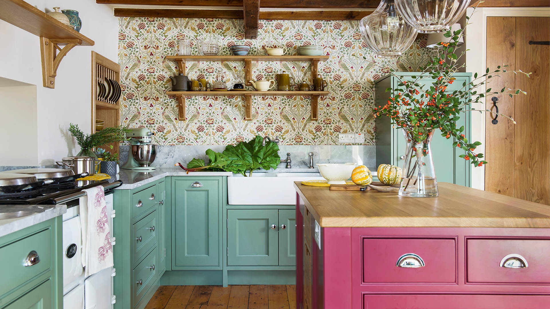
The old carpets would be removed and the wooden floors restored, and there would be a new hand-built kitchen.
- See: Living room ideas – inspiring ways to decorate and furnish your space
This house is taken from H&G's sister brand, Period Living magazine
Subscribe to Period Living for more inspiration
Period Living is the UK's best-selling period homes magazine. A subscription provides you with all you need to know about caring for and improving a traditional house and garden.
Read moreRead less▼
Upstairs, Jo wanted to turn the three bedrooms and small bathroom into a spacious master suite for herself and John, and a second en-suite bedroom for occasional visitors.
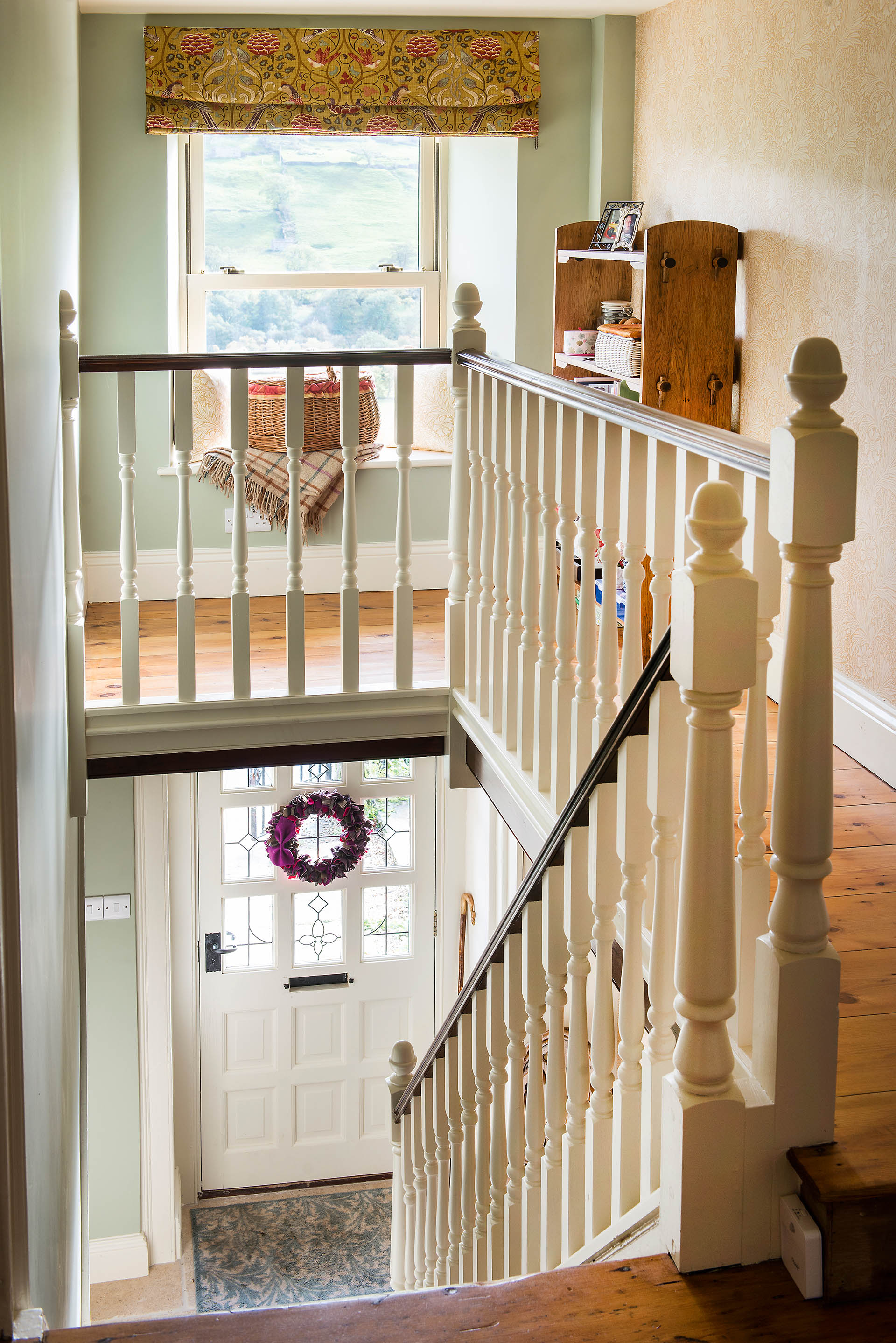
However, remodelling the upper floor was not going to be straightforward and the couple struggled with various permutations, before hitting on a neat solution. ‘There was a little flight of steps up from the kitchen onto a half-landing with a utility room,’ says Jo.
- See: Clever utility room ideas for a well-planned space
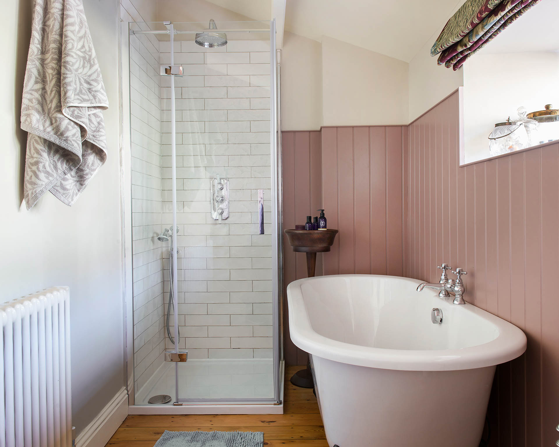
‘John realised that space could be accessed with a few steps down from the master bedroom instead, and it could become my en suite bathroom, which made all the difference.’
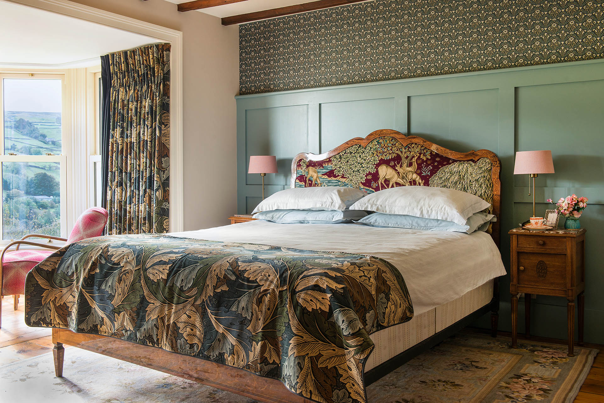
Having renovated before, Jo and John already knew skilled local builder Tony Sunter, and asked him to work on an intensive five-month programme of renovation, remodelling and redecoration.
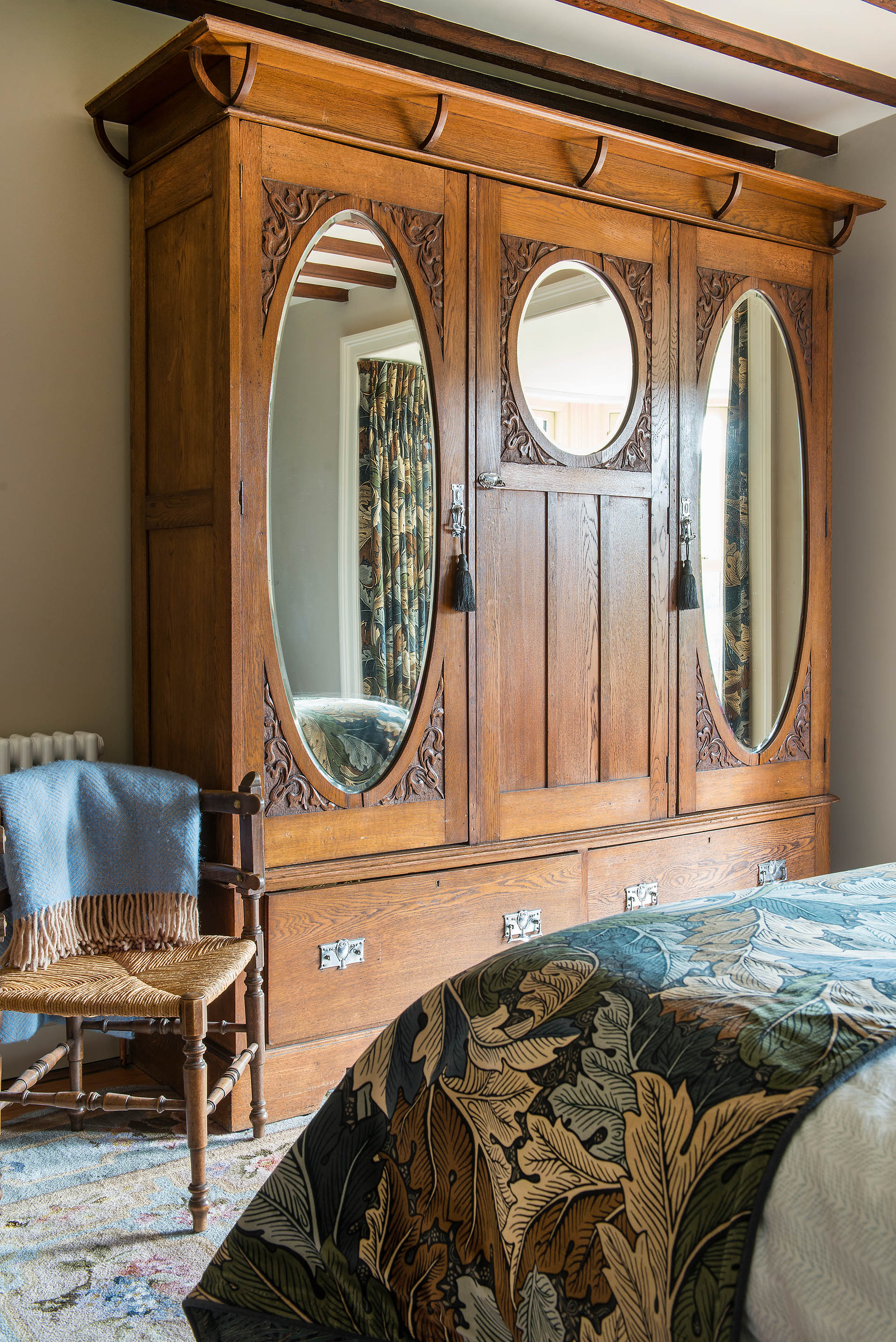
False ceilings were taken down and replaced, raising the room heights and exposing beams in the living room and master bedroom. Victorian panelled doors were changed for traditional ledged oak doors with cast-iron latches.
The wooden floor in the kitchen was painstakingly restored but when the living room carpets were lifted, the boards underneath were too worn to be saved. ‘We needed a new floor there, but we salvaged as much as we could of the old one, and reused it in the en-suite bathroom,’ says Jo.
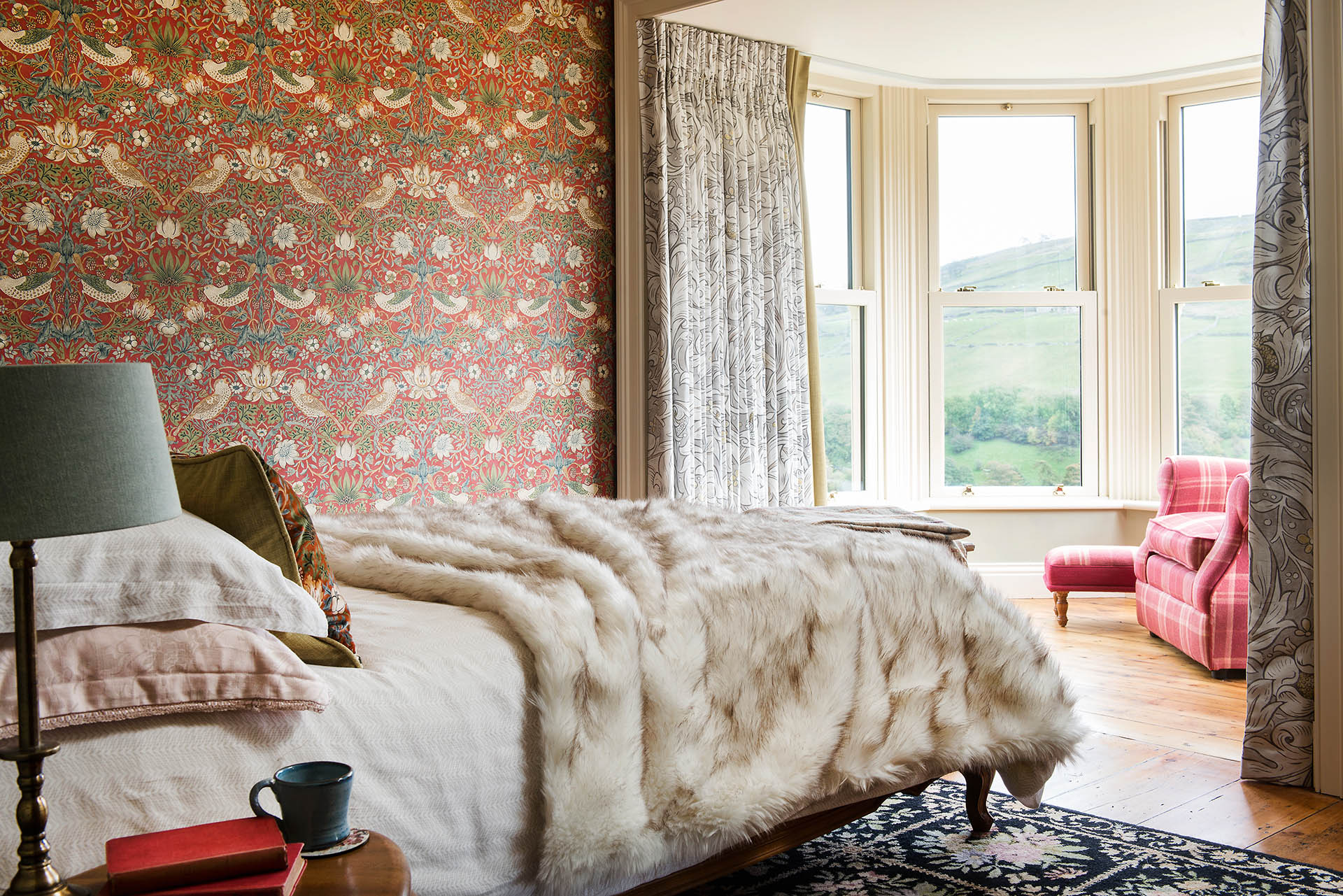
Jo’s guiding principle in redesigning the interior was to complement the property’s spectacular location and outlook.
As well as maximising light and focusing on the panoramic views from each bay window, she grasped the opportunity to use a much-loved classic style.
- See: Small bathroom ideas – 17 gorgeous decor solutions for compact washrooms
‘I wanted a natural, organic-feeling interior, to reflect the landscape,’ she says. ‘I’ve always adored the flowing lines of Arts and Crafts designs so it just had to be William Morris’ flowers, leaves and birds.’
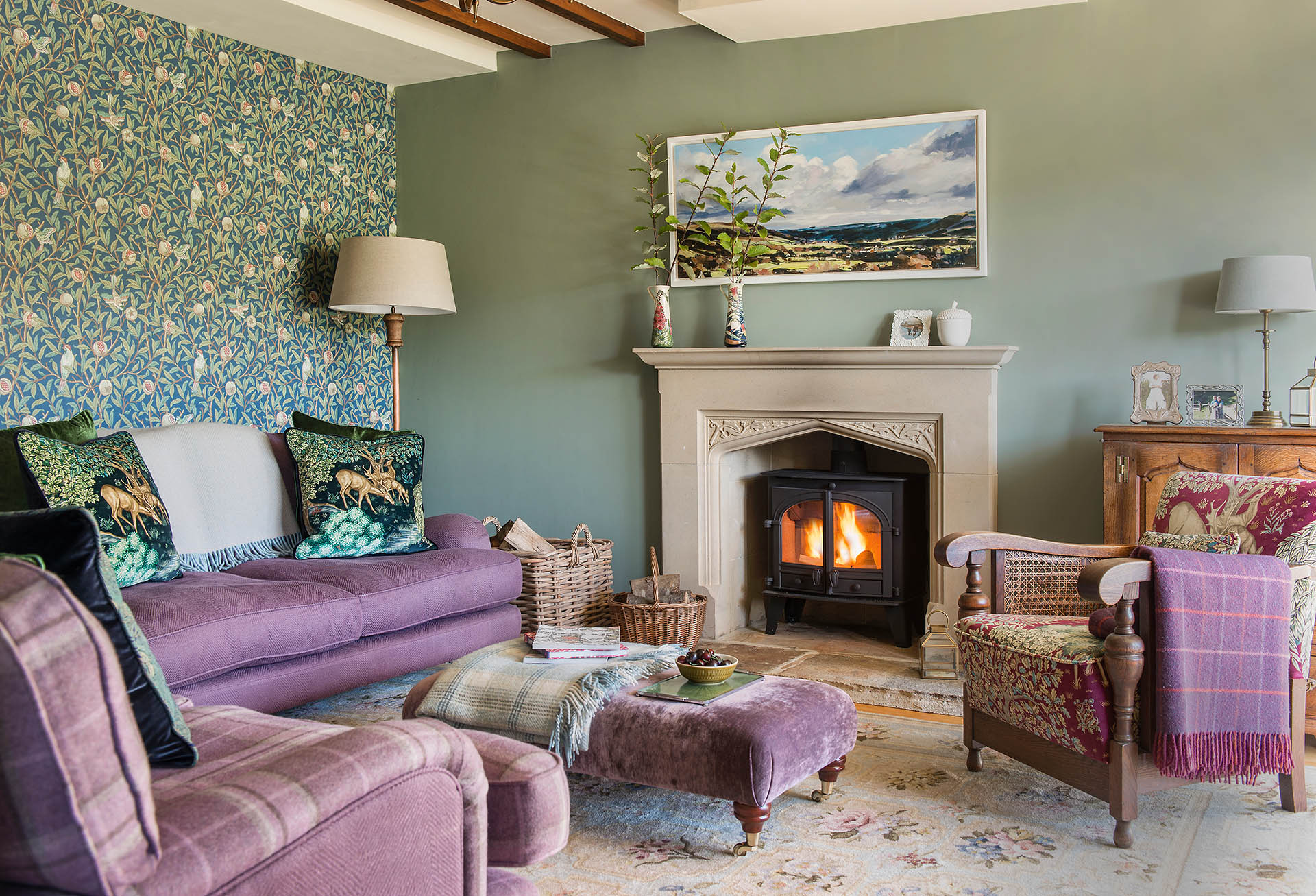
Morris’ colourful, intricate fabric and wallpaper designs form key features in all the main rooms, highlighting the kitchen’s soft reds and greens, and adding colour and detail to the living room and guest bedroom.
- See: Guest bedroom ideas for super-stylish sleepovers
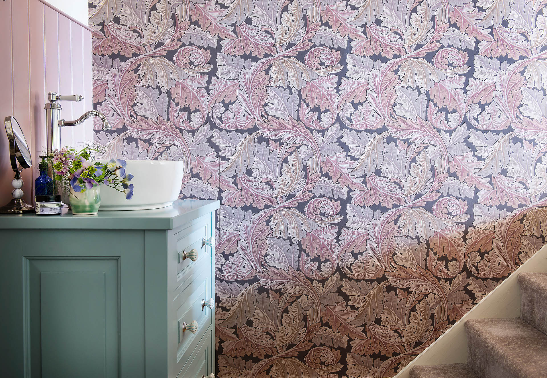
In several instances, including in the master bedroom, two or even three contrasting patterns come together, creating a bold and sumptuous effect. ‘I’m happy to have as much Morris as possible, and I think the patterns sit well with each other, because the beautiful colours and natural motifs connect them,’ says Jo.
The elaborate designs form the backdrop for the couple’s furniture, almost all of which was brought from their previous home.
Sourced over many years, from antiques fairs, secondhand shops, Ebay and the high street, their pieces sit as comfortably in their new surroundings as Jo anticipated.
‘This house has quickly become our home, and I’m so pleased with the way Morris has brought the inside and outside together,’ she says. ‘Everyone who comes here just says, “Wow!”’
Words / Annabelle Grundy

Interiors have always been Vivienne's passion – from bold and bright to Scandi white. After studying at Leeds University, she worked at the Financial Times, before moving to Radio Times. She did an interior design course and then worked for Homes & Gardens, Country Living and House Beautiful. Vivienne’s always enjoyed reader homes and loves to spot a house she knows is perfect for a magazine (she has even knocked on the doors of houses with curb appeal!), so she became a houses editor, commissioning reader homes, writing features and styling and art directing photo shoots. She worked on Country Homes & Interiors for 15 years, before returning to Homes & Gardens as houses editor four years ago.
