5 design tips to steal from this elegant yet kid-proof Vancouver family home
This modern-traditional decor scheme may look pristine, but it's ready for anything family life can throw at it
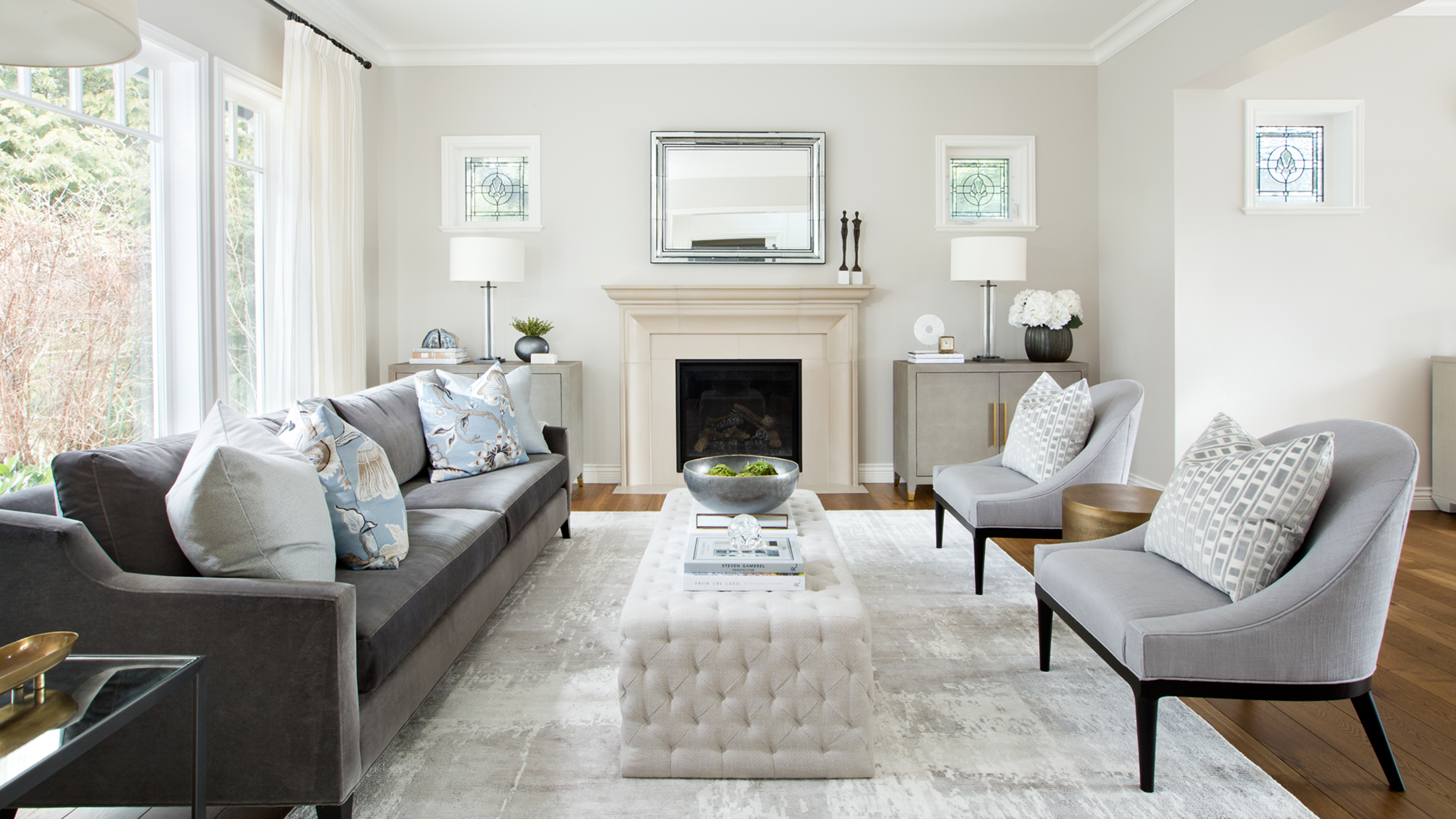

A full renovation of a three-storey house deserves final touches that aren’t just pleasant, but breathtaking – and that’s exactly what interior designer Amanda Evans provided for this West Vancouver family home.
‘We designed a new kitchen, bathrooms, fireplaces, and custom millwork throughout,’ explained Evans. The substantial project required Evans and her team to not only help redesign the entire house, but also reconcile potentially conflicting needs: a neutral color scheme had to work well for a life with children, while the traditional architecture needed decor that felt contemporary, but not out of place.
The result is an elegant, pristine but inviting design scheme that makes a reinvented house feel like one of the world's best homes. Evans gave us a tour of the redesign, and shared this secrets behind this radiant family abode.
1. Mix modern updates with traditional details
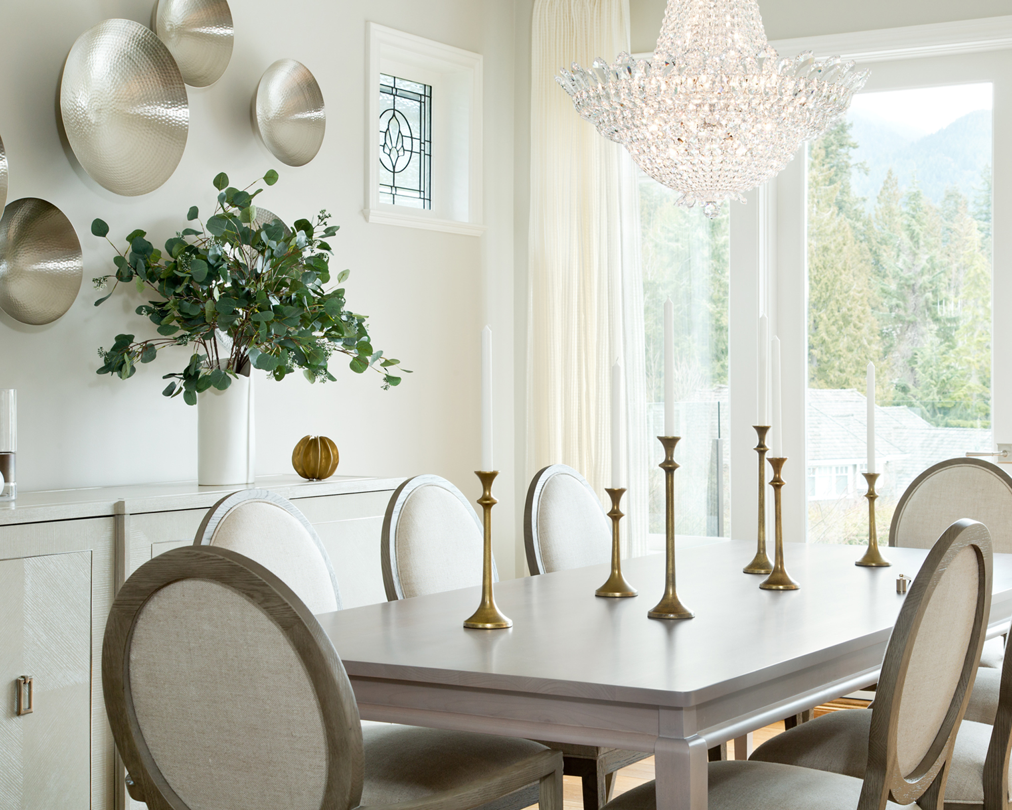
The home may have been entering a new era, but its owners were keen to ensure its history stayed present in the decor.
‘At our client’s request we maintained the home’s traditional feel by incorporating wainscoting, trim work, and repurposed the existing crystal chandelier,’ said Evans. While a largely clean aesthetic keeps the home feeling contemporary, traditional details are sprinkled throughout the woodwork and in select pieces of furniture and fittings.
‘We incorporated an angular turned leg on the island to reinforce the modern traditional feeling in the kitchen,’ Evans added. ‘The hood fan was a focal point, so we designed an oversized custom millwork hood fan that sat on its own to act as a statement element.’
2. Prioritize functionality in a kitchen layout
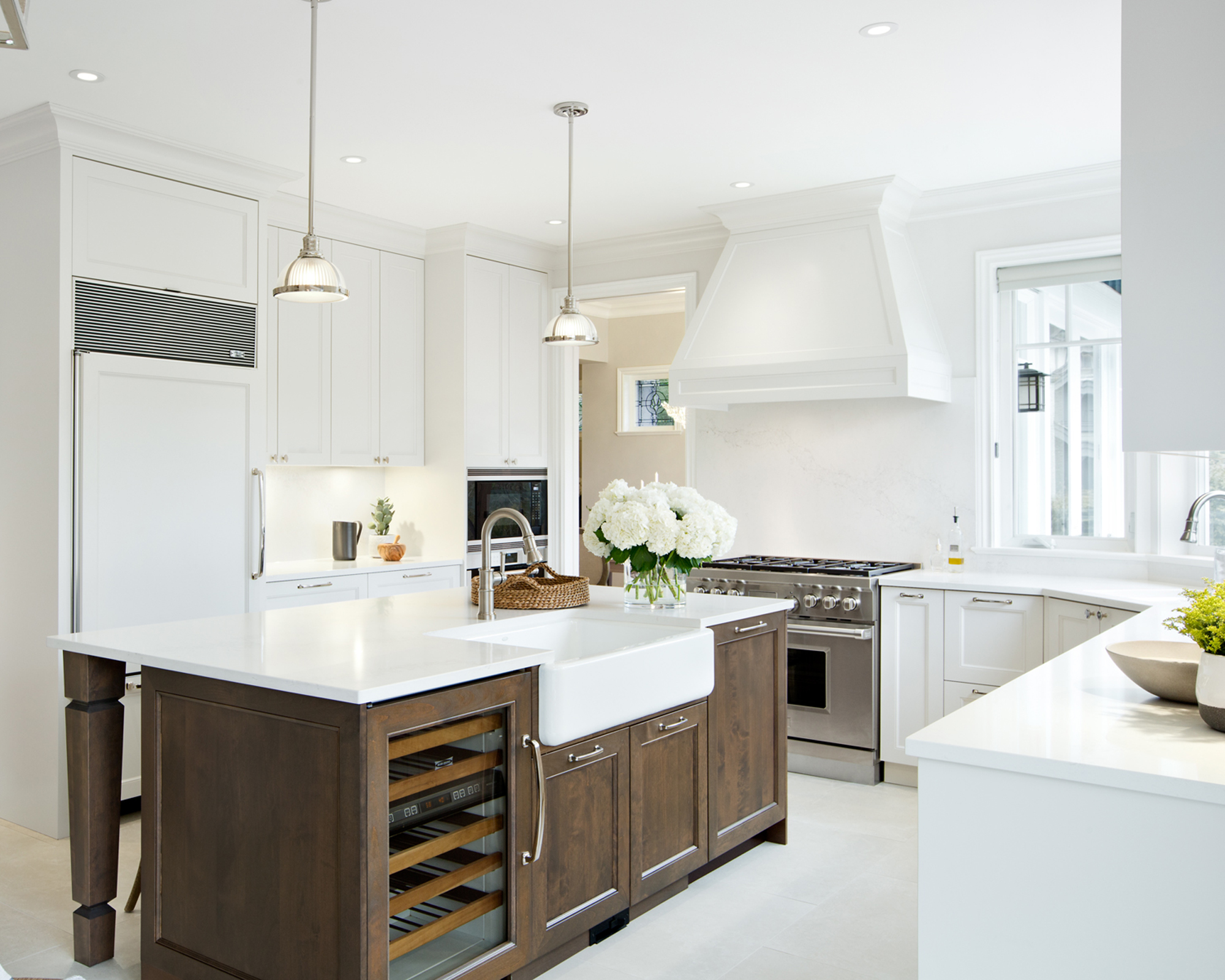
‘We were challenged by an awkward existing kitchen layout, which we made more functional by rearranging appliances and customizing the cabinetry to fit and maximize the space,’ explained Evans. ‘Our clients are avid cooks, so a well laid out kitchen was a very important element to them during the design process.’
An island is a great way to inject 360 degree functionality into your kitchen ideas. In this case, one side includes a drinks fridge, cabinets and a second Belfast sink, while the other can be used as a casual breakfast bar area. It’s positioning also boosts the available worktop area within reach of the range.
3. Make the most of a bathroom view
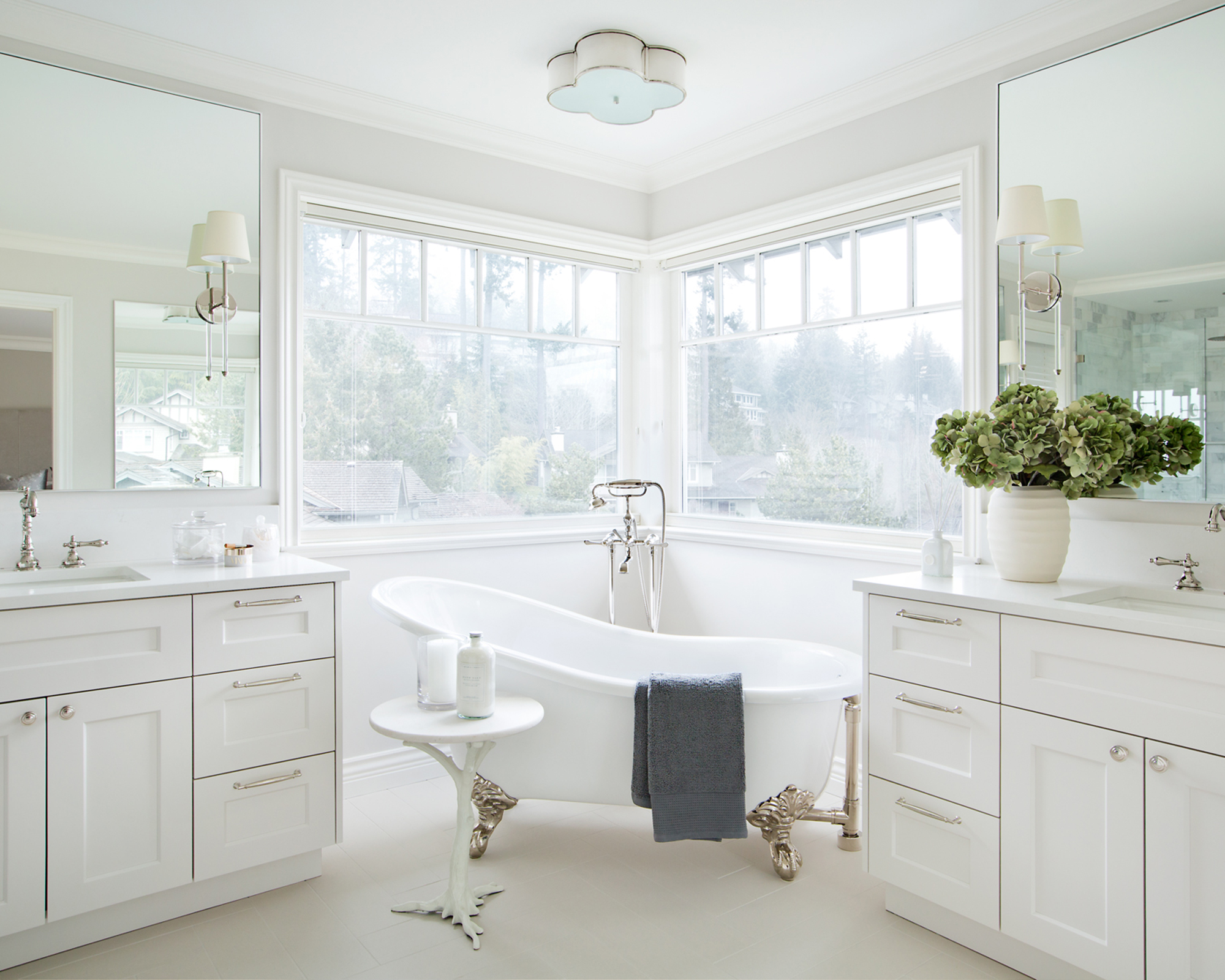
When a house is set in spectacular surroundings, it is essential that a design makes the most of it. ‘The principal ensuite was also an important space for our clients,’ said Evans. ‘It has an incredible view of the mountains, so we situated the tub right in front of the corner window on an angle.’
The bathtub placement makes for a stunning centrepiece for Evans's bathroom ideas, while the sense of open space imbued by the corner window is doubled with the use of large mirror panels either side.
‘We choose a claw foot tub as per our client’s request, but to also add some wow factor to the space. We kept the scheme bright and airy with white cabinetry and marble walls in the shower.’
4. Boost a neutral palette with blues and browns
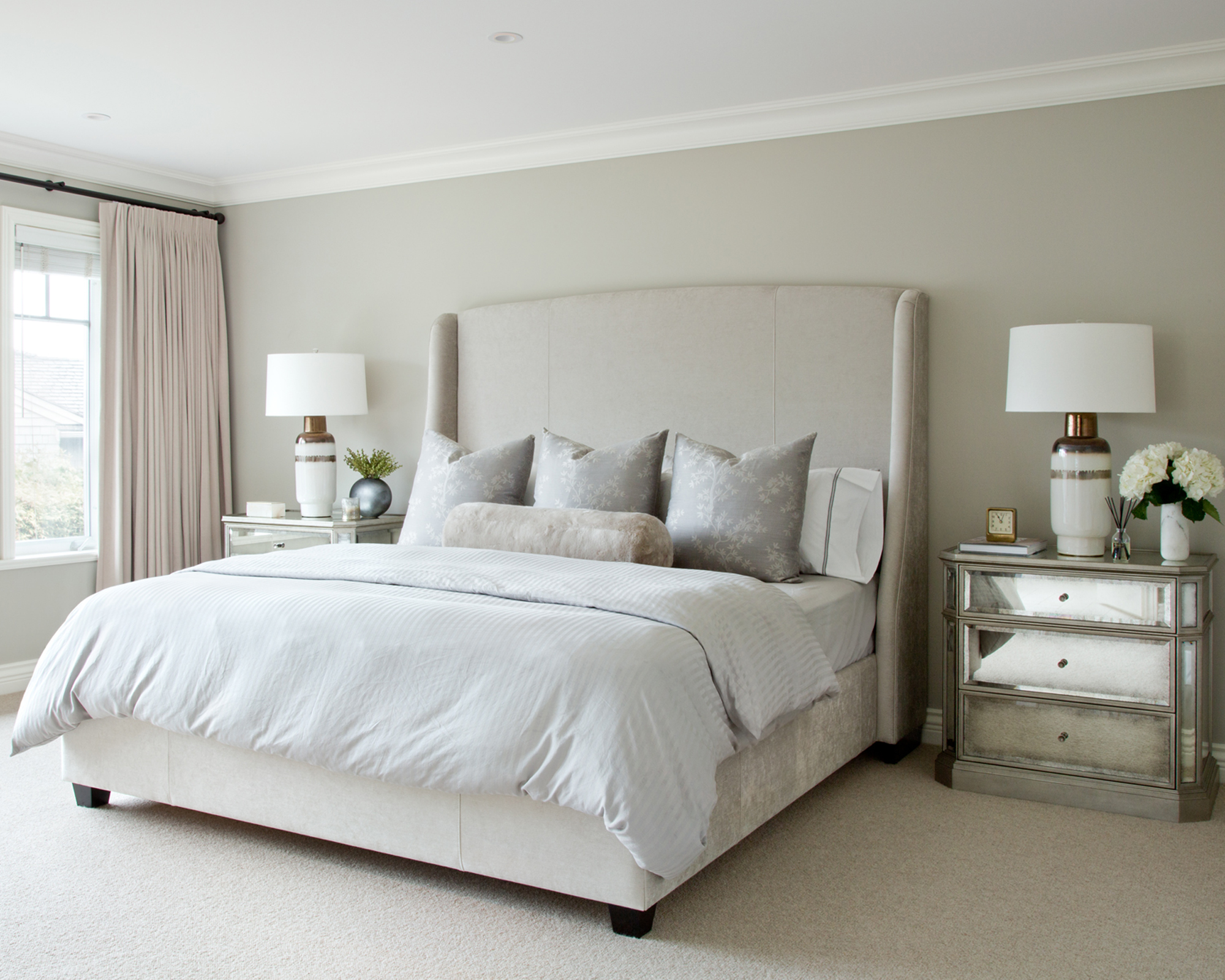
White underpins the scheme across all its rooms, but Evans’s subtle deviations from its purity are what makes it feel comfortable.
‘It was important to our client that the home felt warm and welcoming to themselves and their guests, so we chose a neutral colour palette of warm beiges, rich browns, soft blues, shimmery silvers and touches of gold,’ said Evans. Among the bedroom ideas are pale blues, warm greys and metallics that bring a touch of luxury.
Natural textures are also abundant, tying the home into its mountainous surroundings. ‘In the kitchen we used a creamy white on the cabinetry and contrasted the perimeter cabinets with a stained maple. The flooring is a natural stone looking porcelain that adds a textured, organic feeling to the space. We finished off the space with polished and brushed nickel accents.’
5. Ensure your finishes are kid-friendly
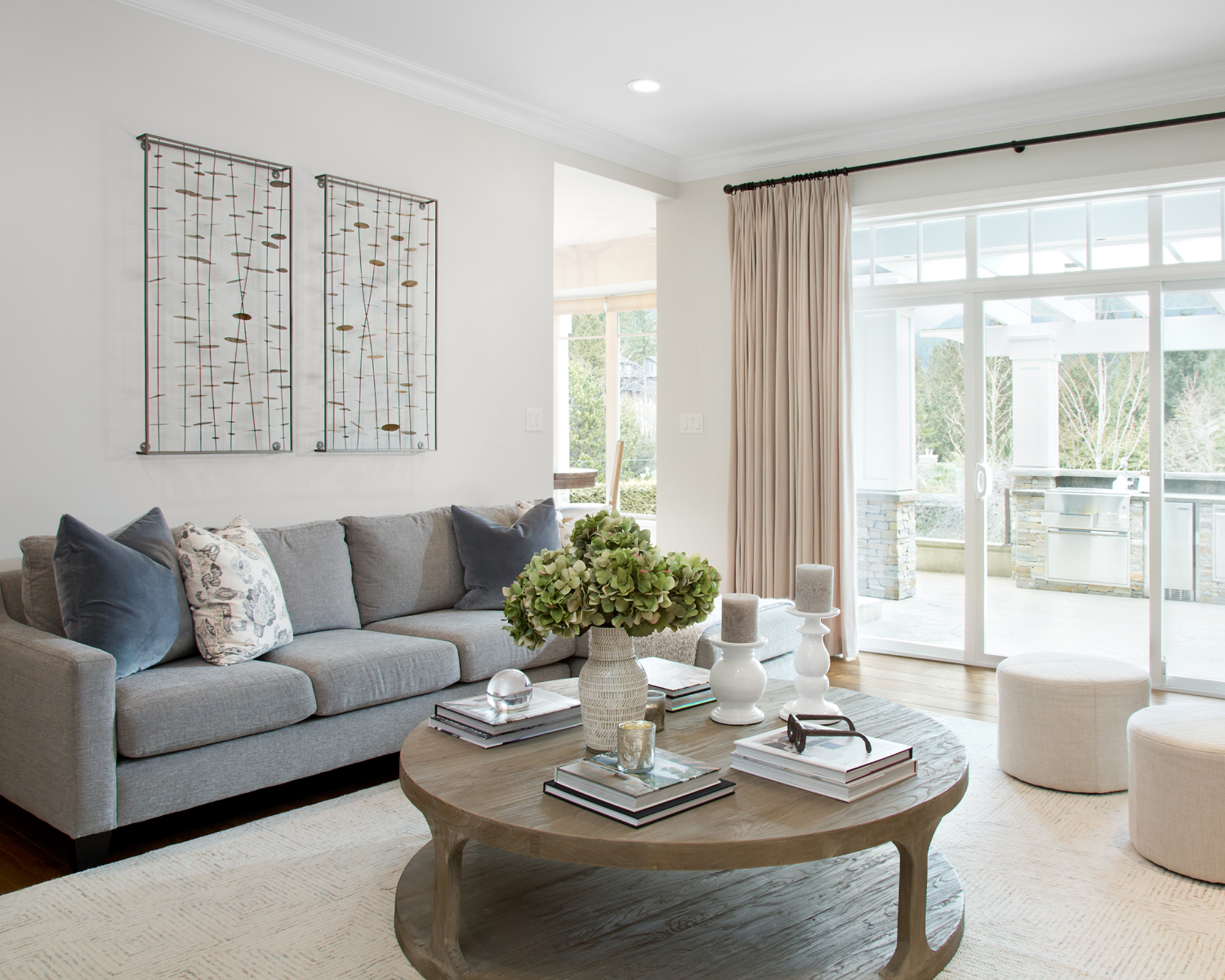
Focusing on a pale, neutral palette in a family home may feel all too daring for many parents – but Evans combatted any concerns by employing indestructible finishes.
‘The furnishings and décor were chosen to reflect our client’s formal, but family-oriented lifestyle. With young children in the house, we were conscious of choosing durable upholstery fabrics and hard woods that will withstand spills, crafts, and family game night.’
This means the living room ideas can encompass tactile finishes, from the rug to the long sofa, making it ripe for play as well as a bit of rest and relaxation.
Interior design / Amanda Evans Interiors
Sign up to the Homes & Gardens newsletter
Design expertise in your inbox – from inspiring decorating ideas and beautiful celebrity homes to practical gardening advice and shopping round-ups.

Ailis started out at British GQ, where a month of work experience turned into 18 months of working on all sorts of projects, writing about everything from motorsport to interiors, and helping to put together the GQ Food & Drink Awards. She then spent three years at the London Evening Standard, covering restaurants and bars. After a period of freelancing, writing about food, drink and homes for publications including Conde Nast Traveller, Luxury London and Departures, she started at Homes & Gardens as a Digital Writer, allowing her to fully indulge her love of good interior design. She is now a fully fledged food PR but still writes for Homes & Gardens as a contributing editor.
-
 April is the ideal time to prune beautyberry shrubs – for a stunning display of vibrant berries this fall
Whether you choose to trim gently or hard prune, cutting back in spring promotes healthy and productive growth
By Drew Swainston
-
 This kitchen has been transformed from cramped and outdated to warm and welcoming – and it's all thanks to a few thoughtful Japandi-style features
Warm wood tones, textural designs, and considered contrast are key to this beautiful transformation
By Molly Malsom