7 design tips to take from this calming, contemporary West Vancouver home
With views of both the ocean and rolling forests, designer Amanda Evans looked to make this home a place for relaxation
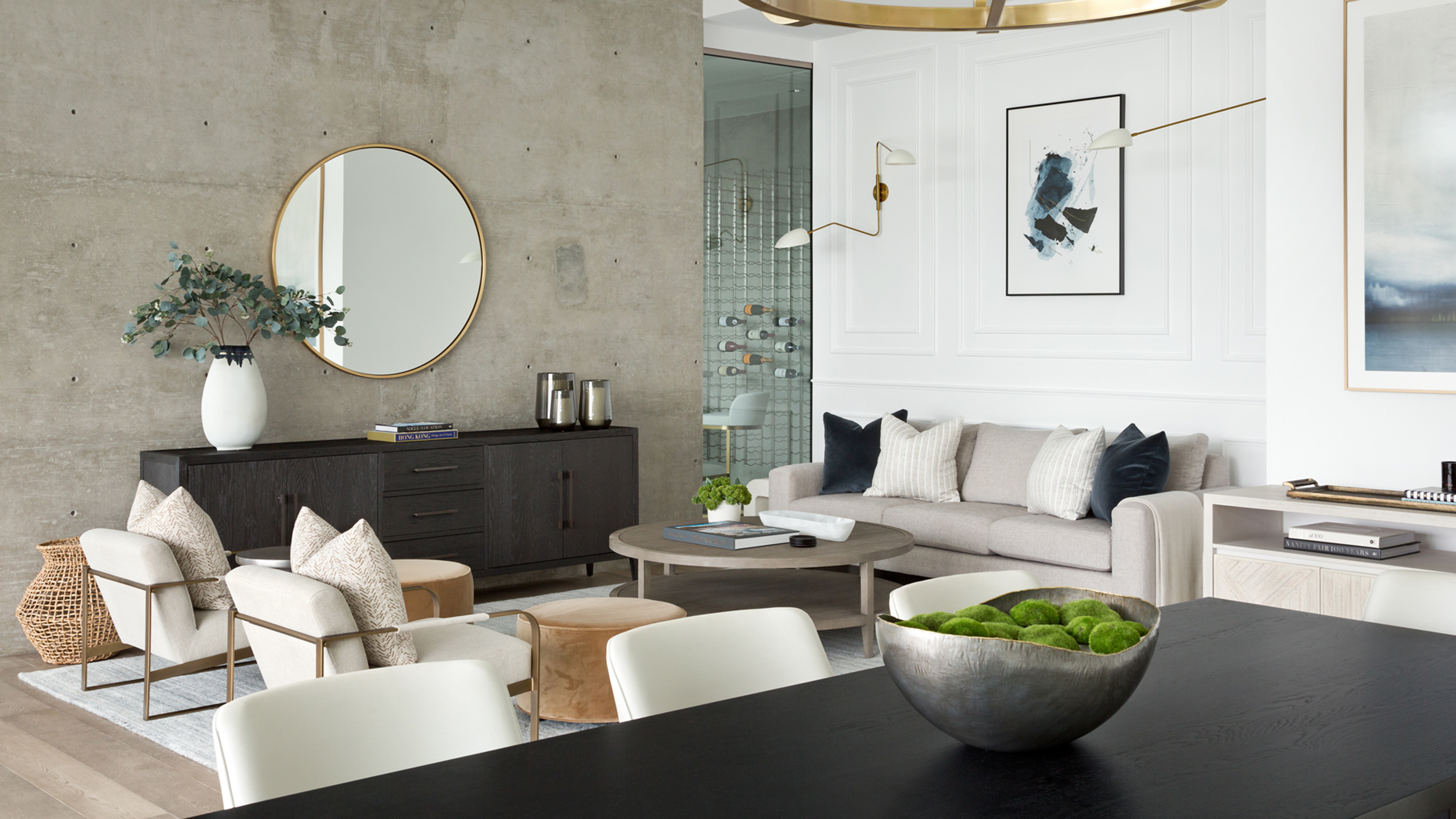

We often need our homes to be an oasis from the outside world – but when the views from your windows encompass both forested hills and the ocean, it can be just as relaxing to let a little of the outside in.
With a calming atmosphere to rival the world's best homes, this West Vancouver property was recently given an interior update by designer Amanda Evans.
‘We did a bit of renovation work to make the space feel more comfortable as it was very contemporary,’ said Evans. ‘The house itself was a blank slate designed by the previous owners. We added in things like paneling in the family room, marble in the principal bathroom and custom millwork in the living room to add interest to the rooms and create a more layered and comfortable space.’
While adding in homely details was key for Evans, the end result balances coziness with a contemporary sense of openness that extends into the property’s connection with its extraordinary surroundings.
Evans gave us a tour of the home and showed us both the big design decisions and little details that make this modern house a prime example of comfortable elegance.
1. Make the most of stunning views with oversized windows
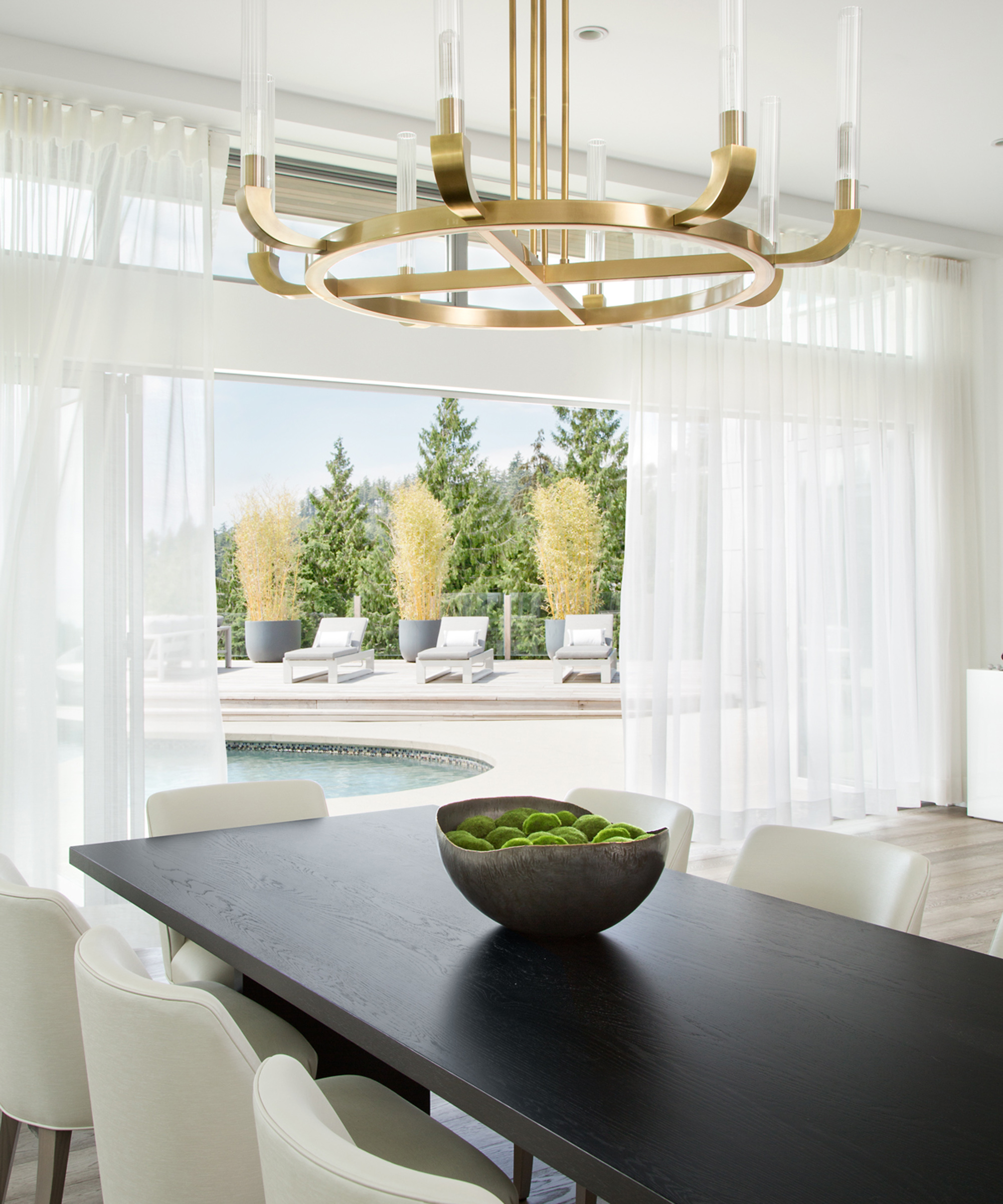
A bonus to the home’s contemporary structure is a healthy appreciation for glazing. Large windows and glass doors are recurrently present throughout the property, feasting on the spectacular West Vancouver countryside beyond. The dining room ideas give way to views of the pool through sliding glass doors, the view framed simply by sheer white curtains.
Putting the windows front and center of the design ethic is a principle Evans carries throughout her renovation. ‘On a clear day, the guest bedroom has a beautiful view of the ocean which we didn't want to compete with,’ she said. ‘Our clients wanted a relaxing space where they could welcome guests who were coming to stay with them.’
2. Choose art that mimics your surroundings
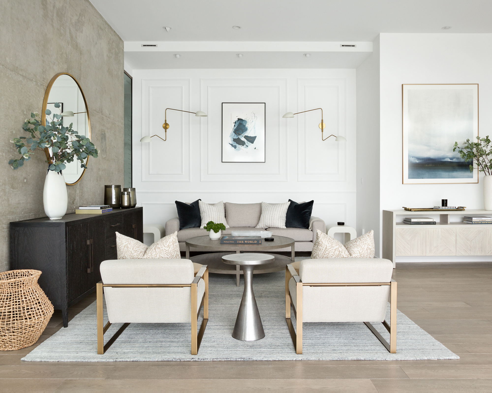
Allowing the vistas to shine meant choosing design details that would complement rather than detract from them. ‘We take a lot of influence from the area surrounding the home and since this house overlooks the water, we wanted to be mindful of that and chose a predominantly blue theme for the abstract art,’ said Evans. ‘We chose prints that would not compete with the view or space but would spark some interest and create a focal point.’
Among the family living room ideas are pieces of art that either directly mimic the scenes of forested hills on the water, or take a more abstract approach, both in shades of indigo. ‘The family room off the kitchen where our clients will hang out or entertain,’ said Evans. ‘I love the paneling and light fixtures we added to the far wall. It adds some architectural interest to the space and turns a large, blank wall into the perfect backdrop.’
3. Mix and match your furniture
‘There was a time when matching your dresser, nightstand, and bed frame/headboard was the ‘in’ thing to do – but I am here to tell you that that time is over,’ said Evans. ‘Try mixing up the furniture in a room to make the space feel unique. For example, black nightstands with a cream headboard and a black dresser. Or you can even add a colored dresser, like blue, for some fun.’
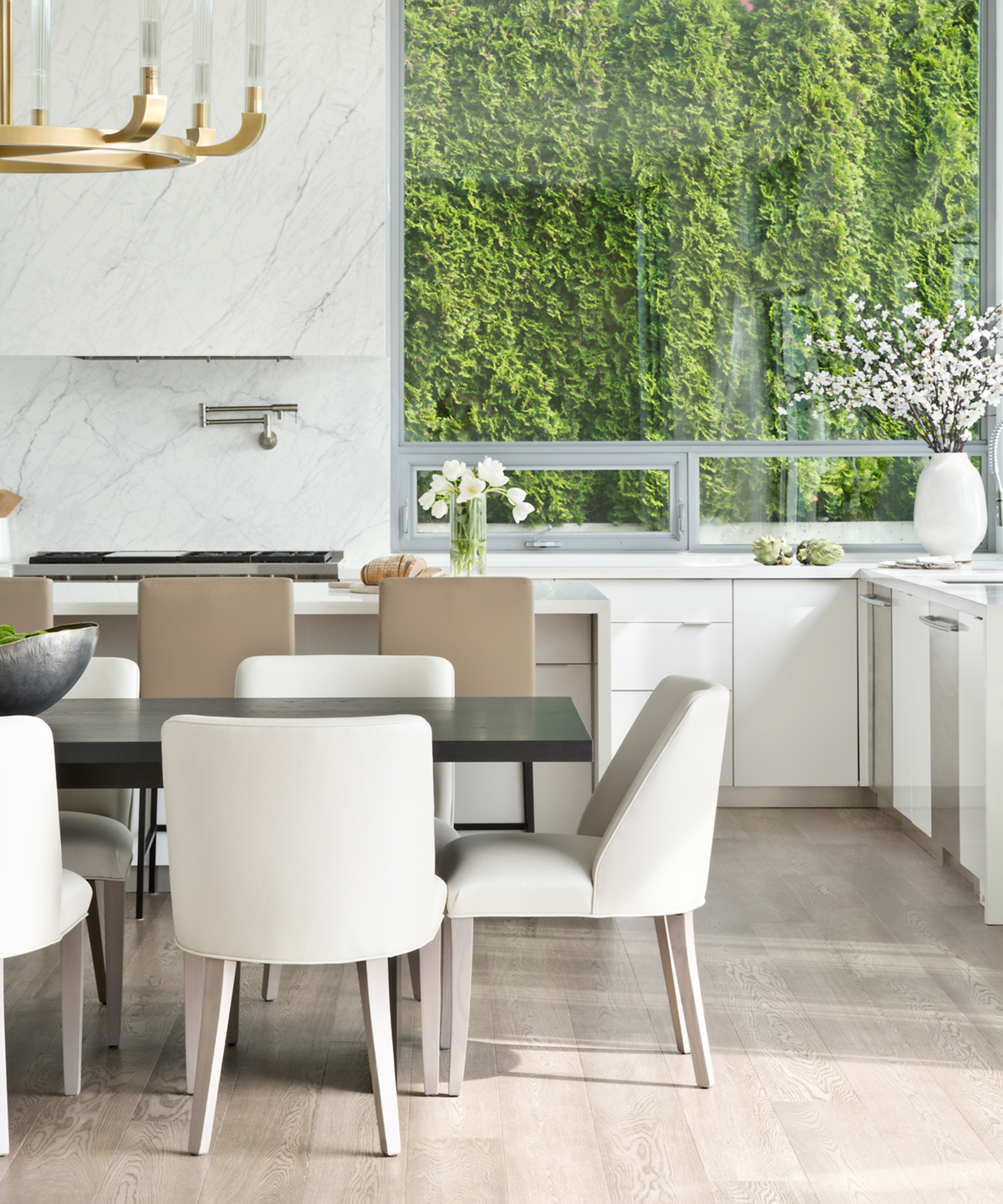
This approach to furniture choices is particularly noticeable among the kitchen ideas, where a dining table is flanked with white upholstered chairs with a curved back, while the breakfast bar right next to it is finished with high stools in a creamy, pale brown.
‘We sourced a lot of the furniture from Once A Tree in Vancouver, accessories from CB2 and some very special pieces from Da Vinci's in West Vancouver,’ added Evans.
4. Pile on the pillows
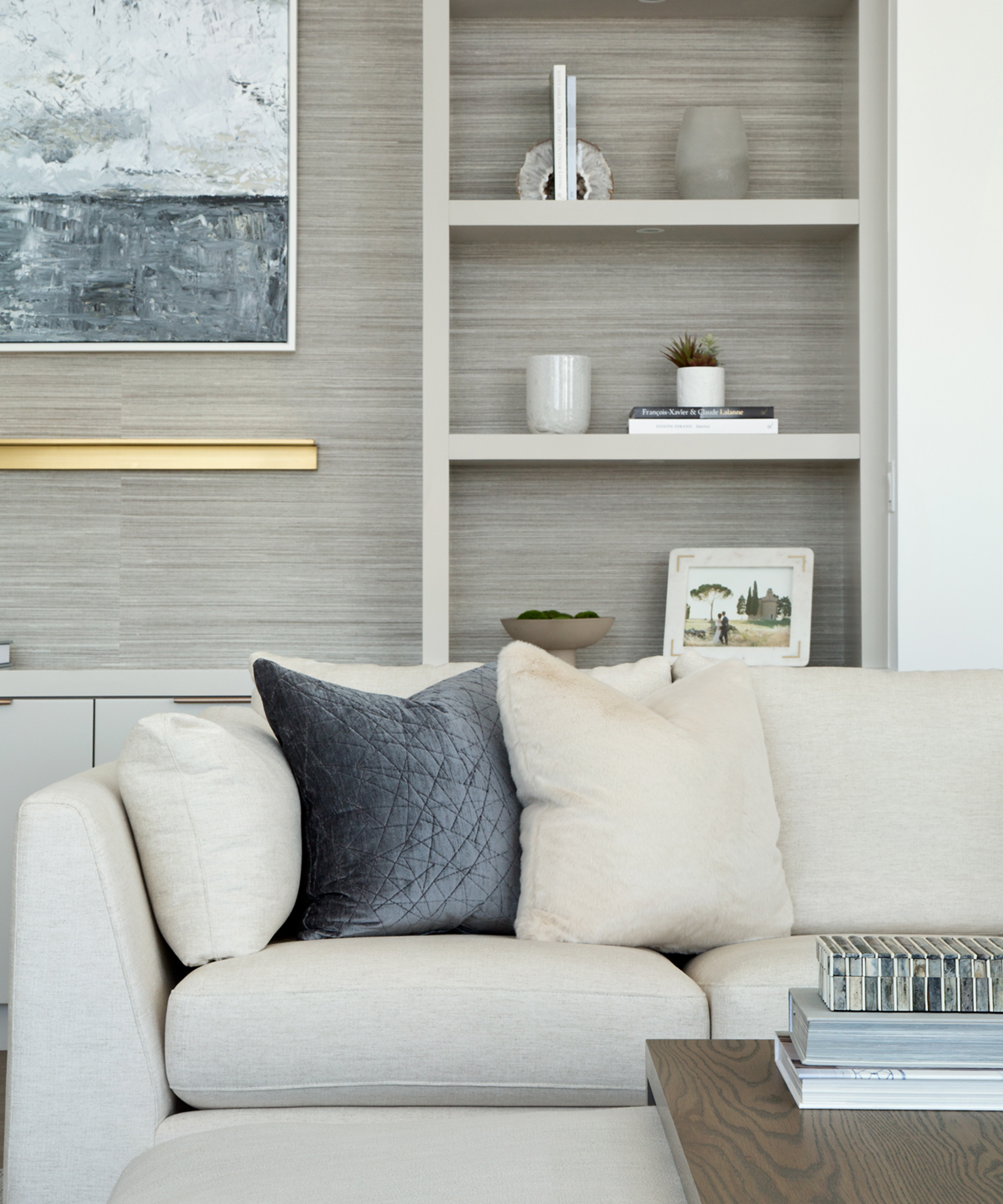
On a mission to soften the rigid lines of the home’s architecture, Evans put a significant focus on soft furnishings. In the living room, bouncy sofas and armchairs are paired with numerous plump cushions.
‘Pillows are the best – and easiest – way to add interest to a space,’ said Evans. ‘Play around with some fun patterns and designs and add pillows to sofas, beds, chairs, etc., to create inviting and cozier rooms in your home.’
5. Layer up your coffee table decor
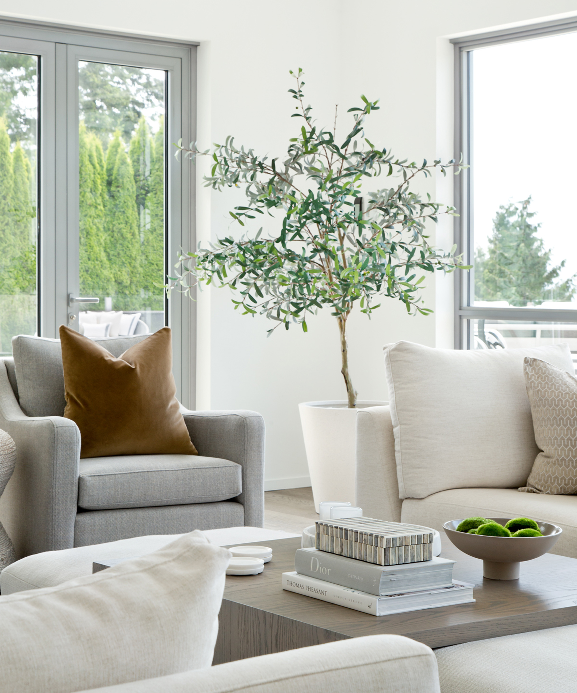
Elsewhere in the living room, Evans’s coffee table styling ideas bring a focal point to the intimate seating area.
‘On a large coffee table setting, I like to ensure there are different heights when working with accessories and the easiest way to achieve this is stacking books,’ explained Evans. ‘I also love to incorporate greenery to give an organic feel. We used this decorative box with bone inlay to add texture as it captures most of the colours in the room. Finally, adding in the round coasters adds another shape to the vignette.’
6. Add glamor to a neutral palette with gold accents
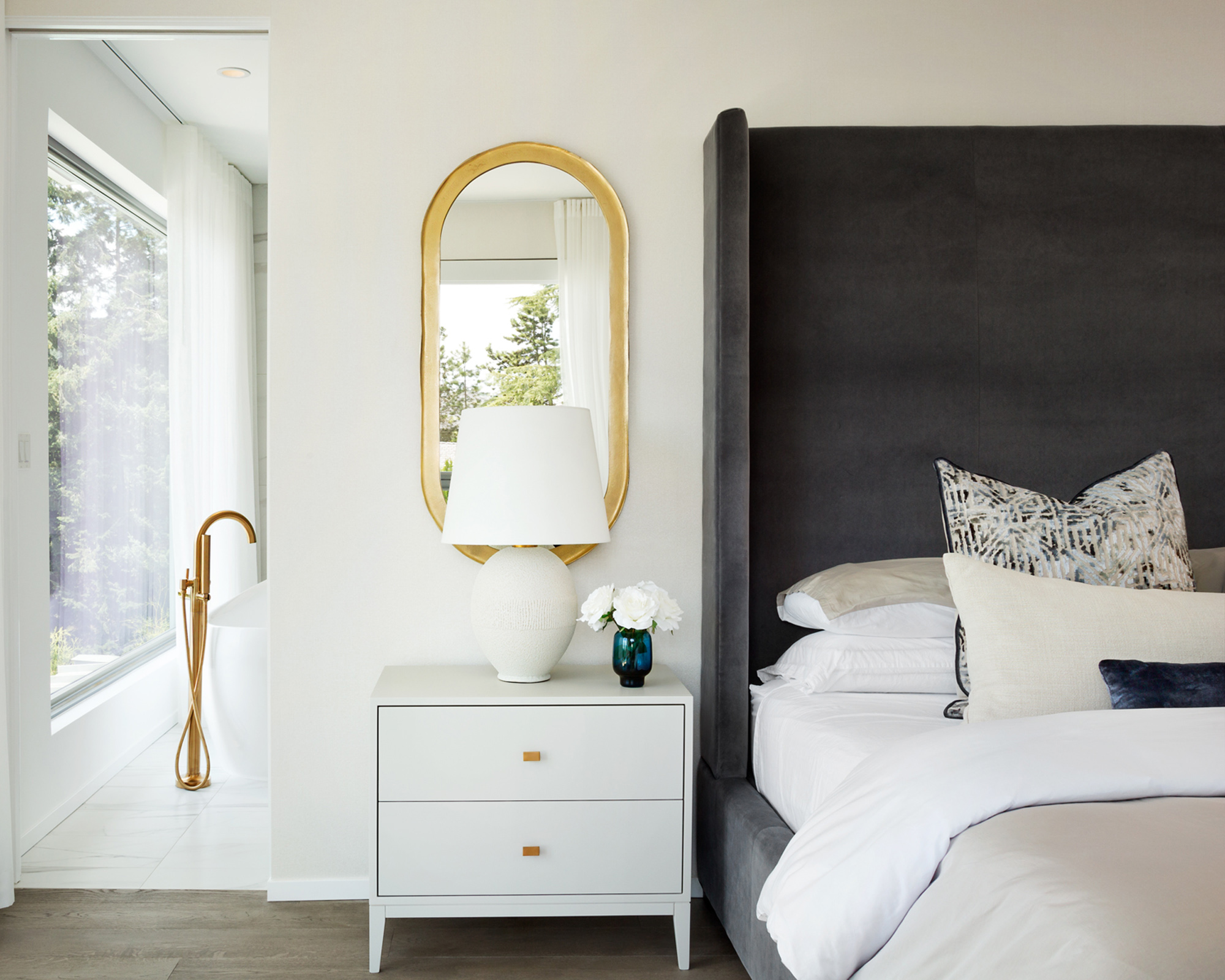
A neutral palette forms the fundamental basis of Evans’s design, but alongside the occasional ocean-inspired blue is a more glamorous addition.
‘Gold pieces thrown around a room really add a flair of elegance to the design,’ Evans continued. ‘You can add gold through almost anything too: cabinet hardware, gold-framed mirrors, light fixtures, faucets, desk lamps, and more.’
‘In the principal bedroom we wanted to up the drama a bit with a statement headboard and matching gold oval mirrors over the nightstands,’ said Evans of her Bedroom ideas. ‘We incorporated a light fixture made of linen to give off an ambient glow. The wallpaper is a white grasscloth which added texture to the space. The abstract yet neutral rug helps anchor the bed and is cozy to the touch when getting out of bed in the morning.’
7. Infuse whites with warmth for a relaxing bathroom
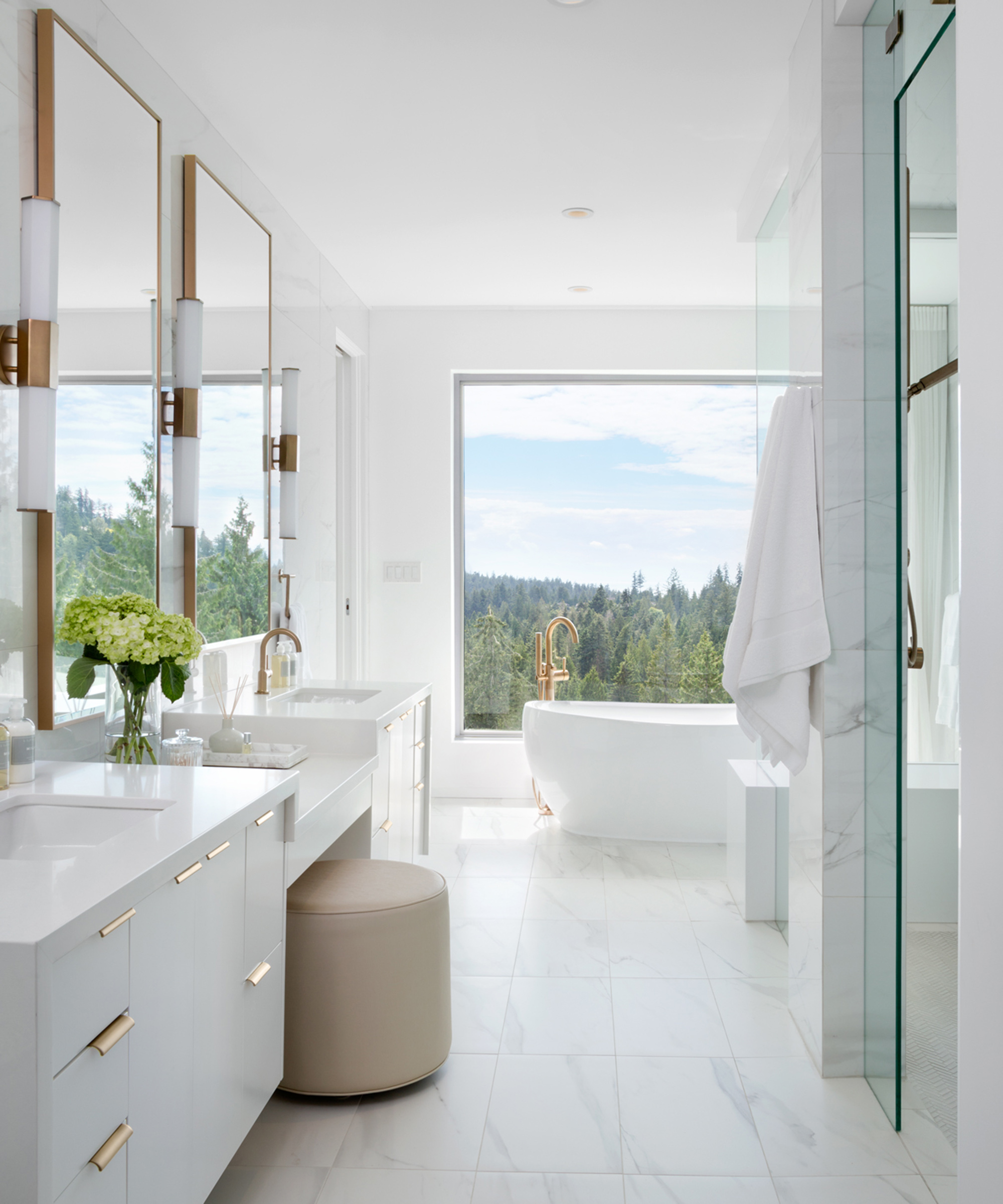
Metallics also play their part among the bathroom ideas, where Evans consciously added pools of warmth to the crisp white palette.
‘We did a cosmetic renovation in this space,’ Evans explained. ‘We kept the existing vanity and countertop but added in gold light and plumbing fixtures and mirrors to warm up the ultra contemporary bathroom. We also used a faux marble to add some texture to the floors and walls. The view is incredible so we kept the overall palette calm and relaxing.’
Interior Design / Amanda Evans Interiors
Photography / Christina Faminoff
Sign up to the Homes & Gardens newsletter
Design expertise in your inbox – from inspiring decorating ideas and beautiful celebrity homes to practical gardening advice and shopping round-ups.

Ailis started out at British GQ, where a month of work experience turned into 18 months of working on all sorts of projects, writing about everything from motorsport to interiors, and helping to put together the GQ Food & Drink Awards. She then spent three years at the London Evening Standard, covering restaurants and bars. After a period of freelancing, writing about food, drink and homes for publications including Conde Nast Traveller, Luxury London and Departures, she started at Homes & Gardens as a Digital Writer, allowing her to fully indulge her love of good interior design. She is now a fully fledged food PR but still writes for Homes & Gardens as a contributing editor.
-
 5 freezer cleaning mistakes you must avoid – or risk compromising your food quality and shortening the lifespan of your appliance
Avoid these blunders for a safer kitchen
By Seraphina Di Mizzurati
-
 What is an island bed? This clever garden design trick can add privacy and drama to any backyard
Create a long-lasting, low-maintenance and visually appealing island bed that also serves a purpose in the garden
By Sarah Wilson