An inspiring Victorian renovation has resulted in a bright and spacious home
Interior designer Kristen Peña’s San Francisco home was cleverly redesigned around an open plan layout and a soothing neutral colour scheme
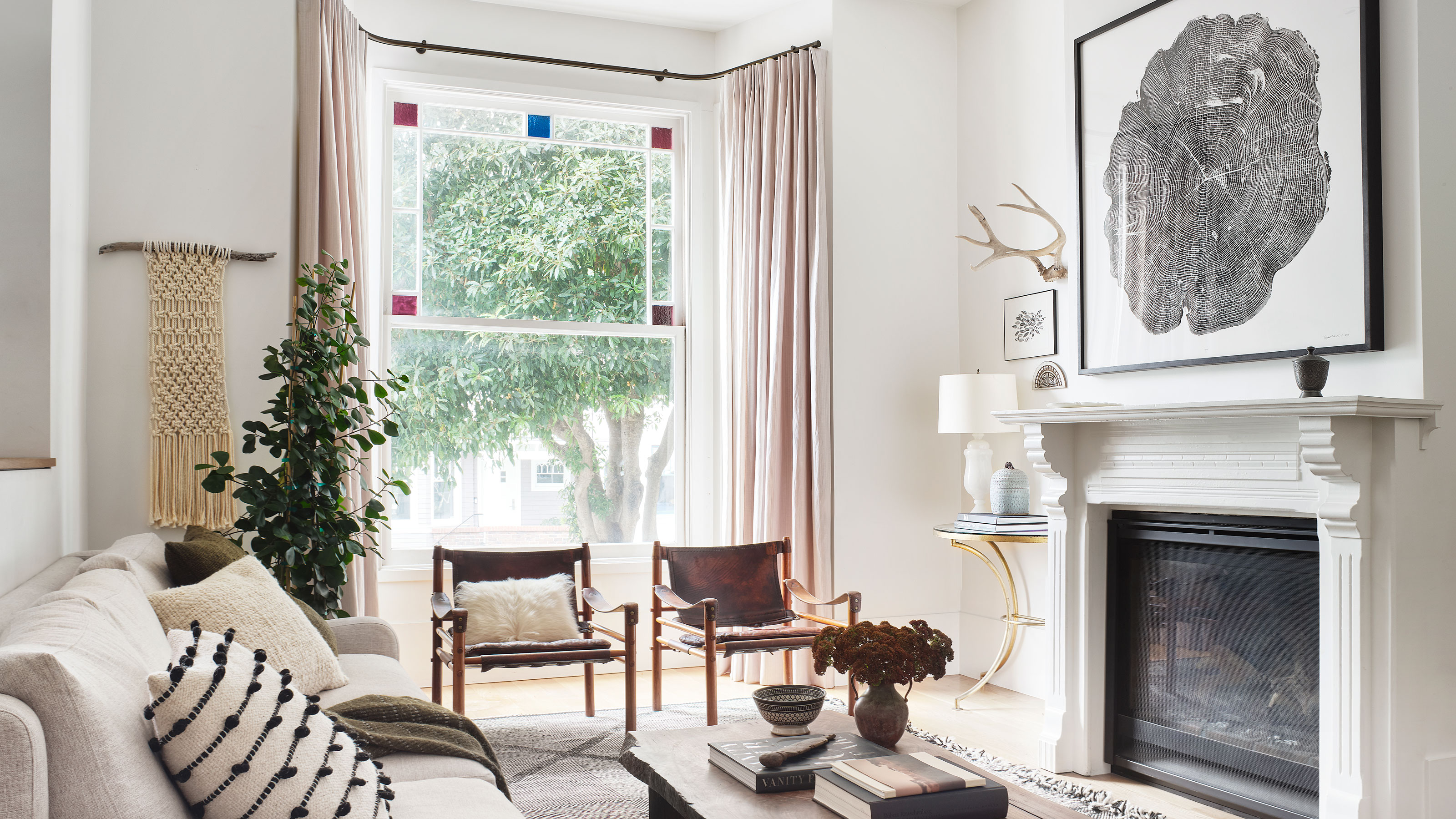

On the surface, the home of Kristen Peña is an oasis of tranquillity and calmness, where muted shades complement the natural tones of the many wood features.
But a closer look reveals an interior that also has substance, a reflection of Kristen’s philosophy. ‘A home should be a museum of memories,’ she says, referring to the many mementos sprinkled throughout the house.
See: World's best homes – tour the globes most beautiful houses
But perfection doesn’t come overnight – when Kristen, her husband Luis and their two daughters first moved in, the house was very different.
‘Oh it was a doozy,’ says Kristen. ‘It was a one-floor Victorian property with a worn-out kitchen and just one bathroom. We had to completely gut it, add new foundations and extend and reconfigure it.’
The result was a bright and spacious home that offered them four bedrooms and bathrooms, and for 10 years it served its purpose very well as a family home.
In 2015, it was time for a refresh and the house began to take on a new look. ‘I really wanted my home to be a space that was simple in its bones but filled with layers of texture, memory and warmth,’ explains Kristen.
Family room
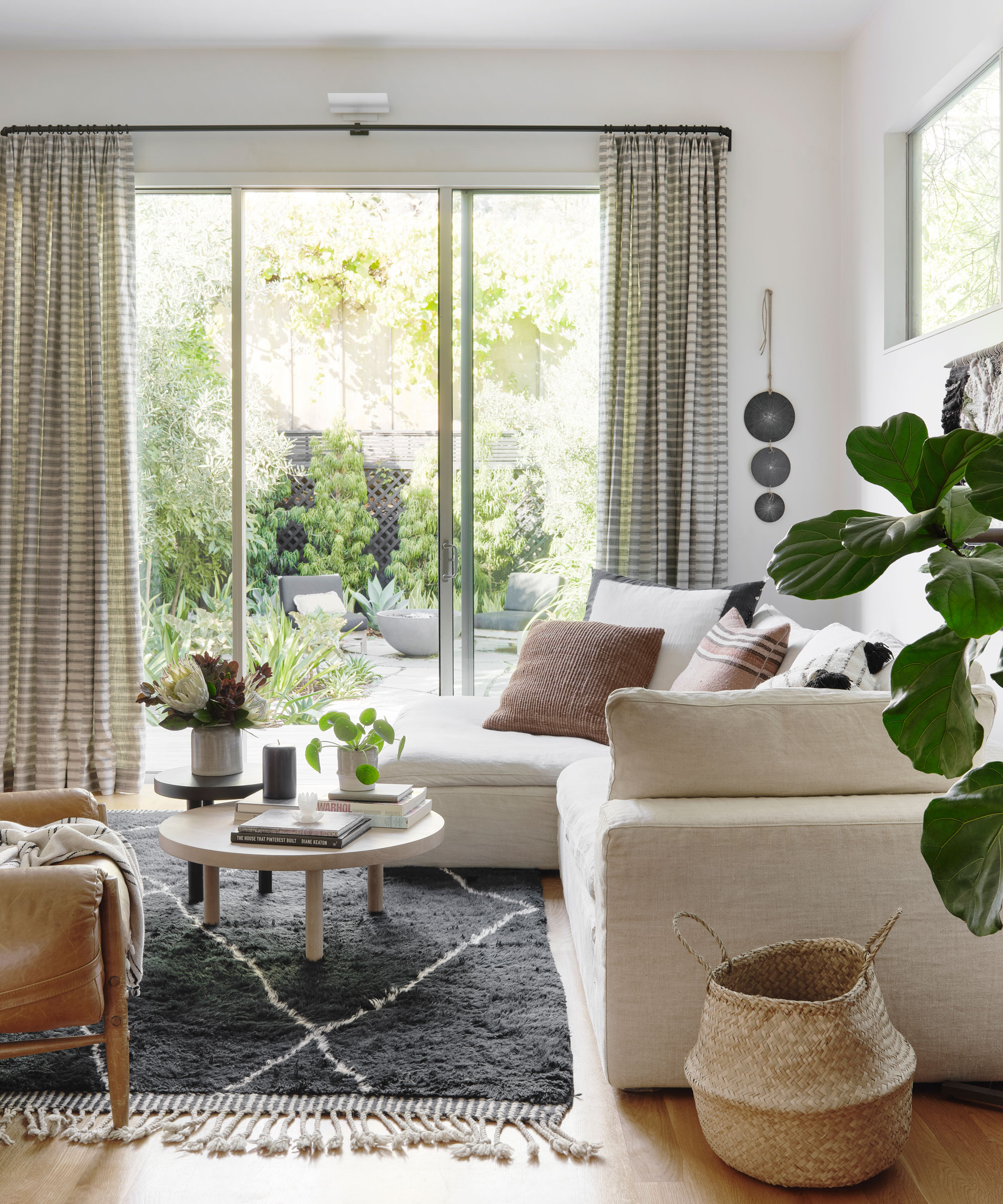
The most striking characteristic is the open-plan layout. ‘Light and space are incredibly important to me and this area has enough room for all the family to hang out,’ says Kristen. Everyone likes to relax in this informal space.
Dining room
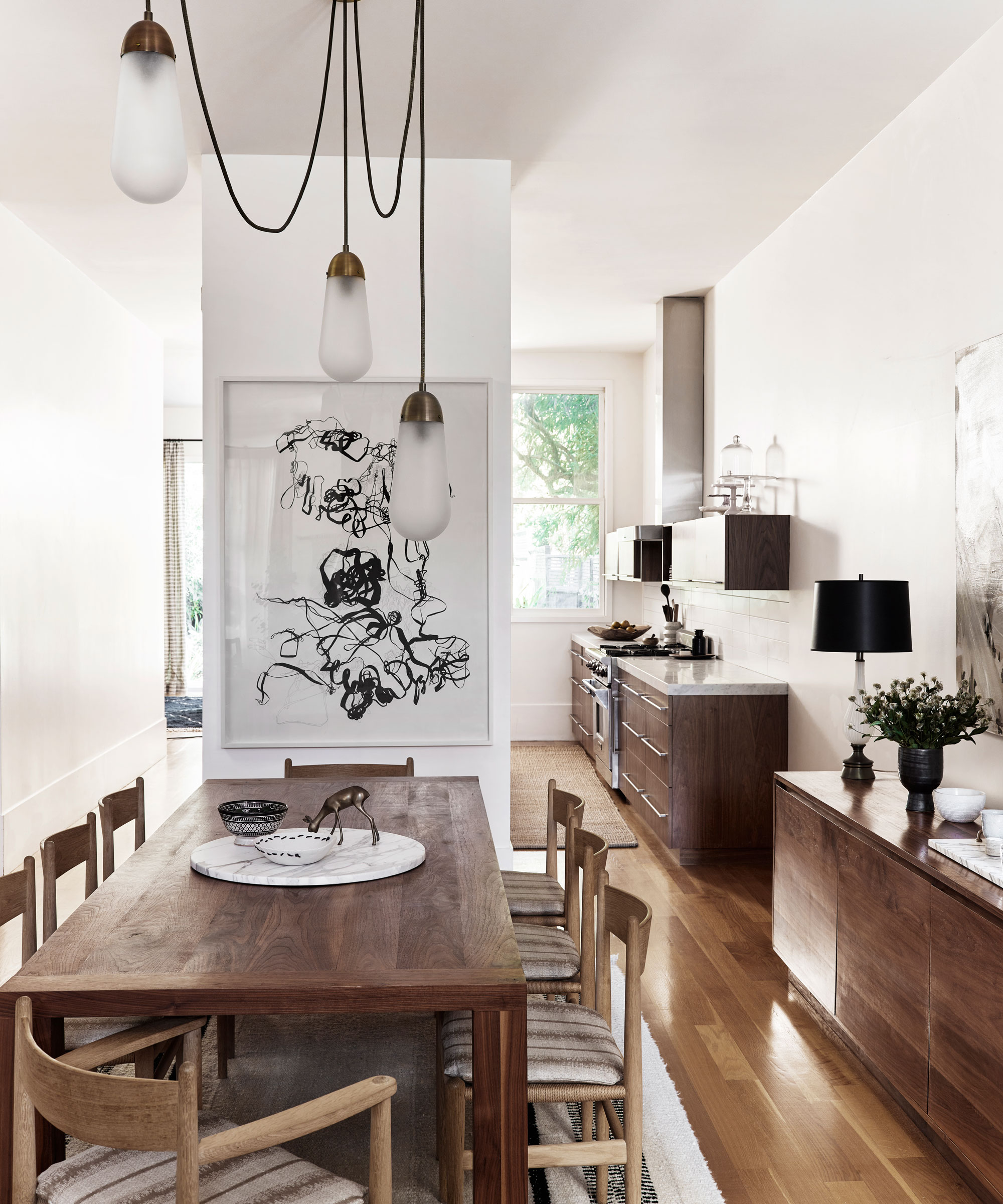
To inject a sense of character into the modern interior, Luis, a skilled woodworker, created handsome, custom wooden pieces designed by Kristen, like the dining room table and accompanying sideboard.
See: Dining room ideas – inspiration for decorating and furnishing your space
Kitchen
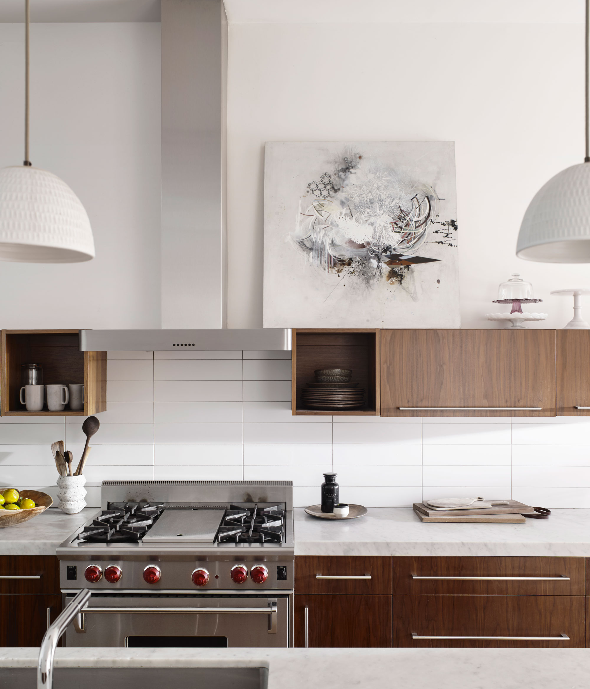
In the kitchen, natural timber cabinets were chosen to pop against the crisp white walls. Adding artwork on top of the upper units proves decorative accessories belong in this room, too. Warm wood and white concrete echo the tones and textures elsewhere in the house.
See: Kitchen ideas – decor and decorating ideas for all kitchens
Living room
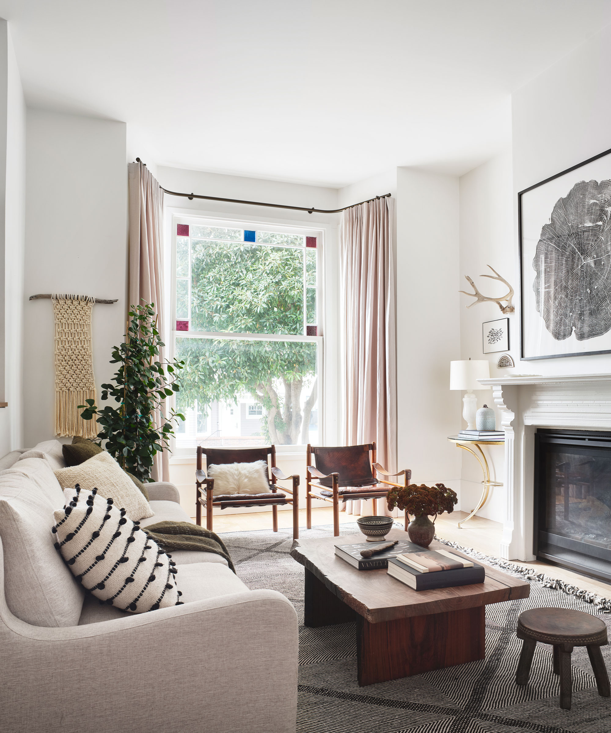
The original fire surround and stained-glass window in the living room add character.
Even more character was added by utilising the many personal items and treasures the couple had collected on their travels and allowing them to take centre stage.
‘Whether it’s a hand-carved stool from a trip to Tanzania or a ceramic vase made by a local artisan, accessories should be happy reminders of the past,’ Kristen says. ‘We love the lighting, art and treasures that we have collated from all over the world.’
See: Living room ideas – clever ways to decorate living spaces
Home office
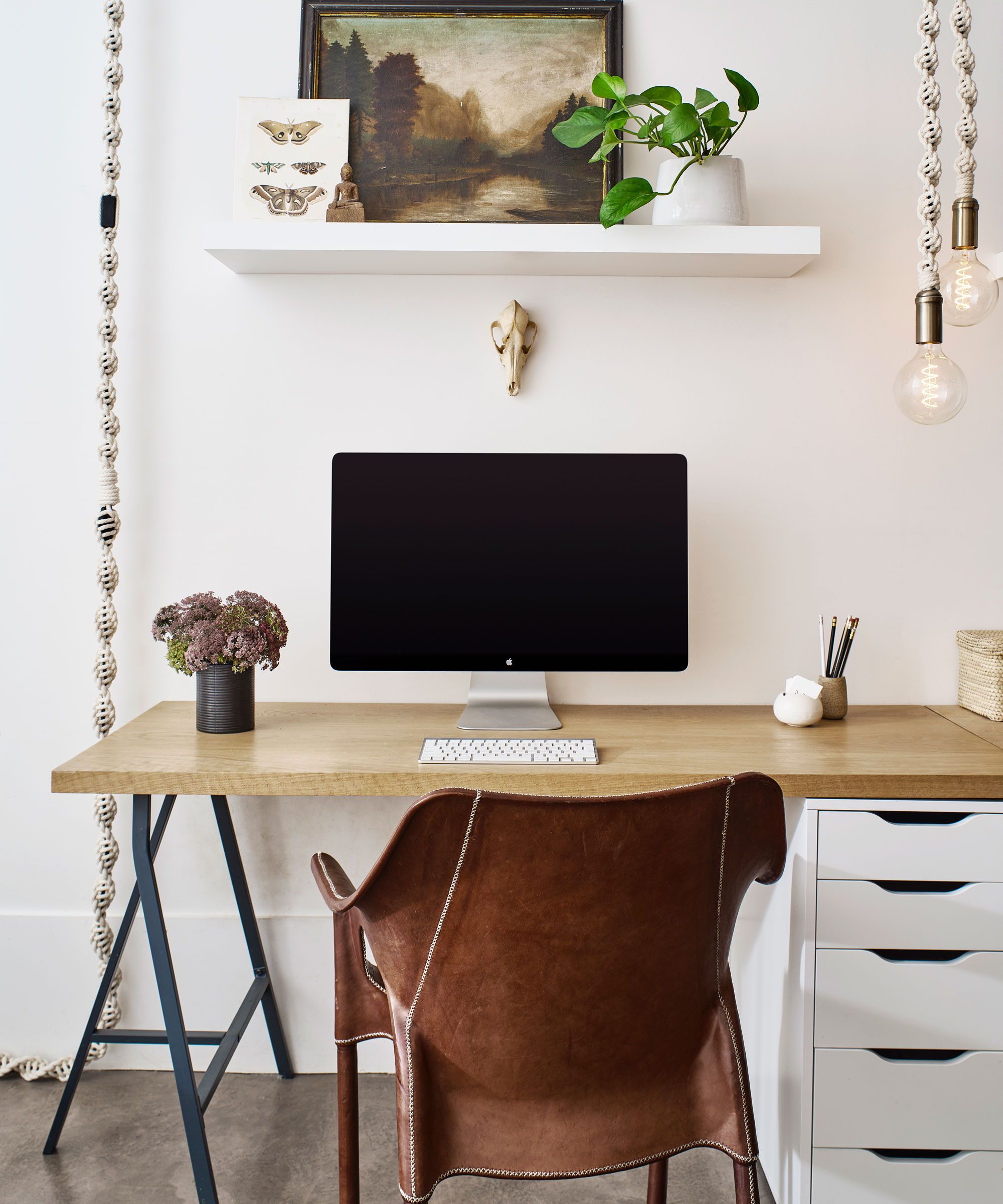
‘It’s always worth splurging on good lighting,’ says Kristen.
Main bedroom
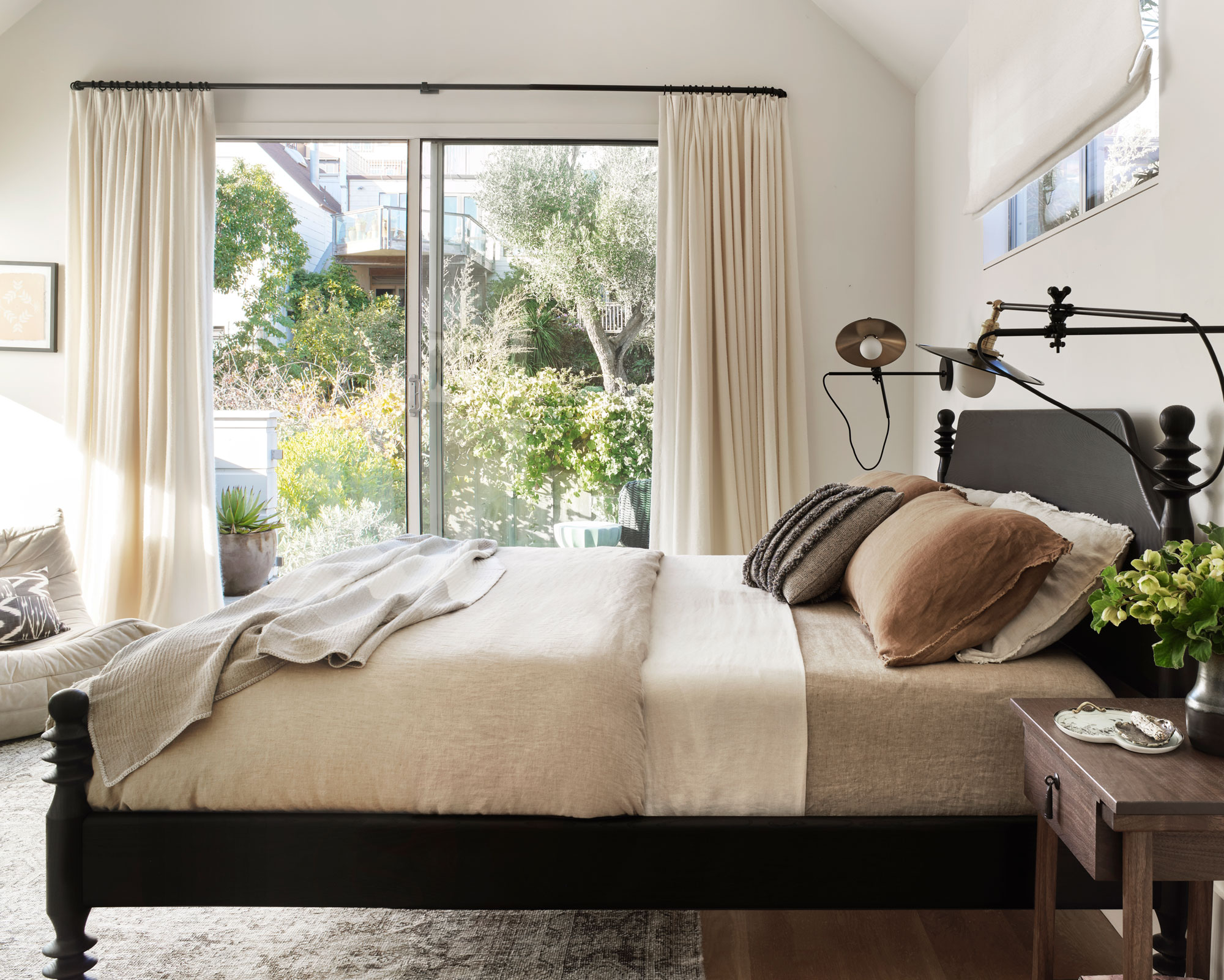
Rich, earthy tones and natural linens are timeless design choices.
See: Bedroom ideas – designs and inspiration for beautiful bedrooms
Main ensuite
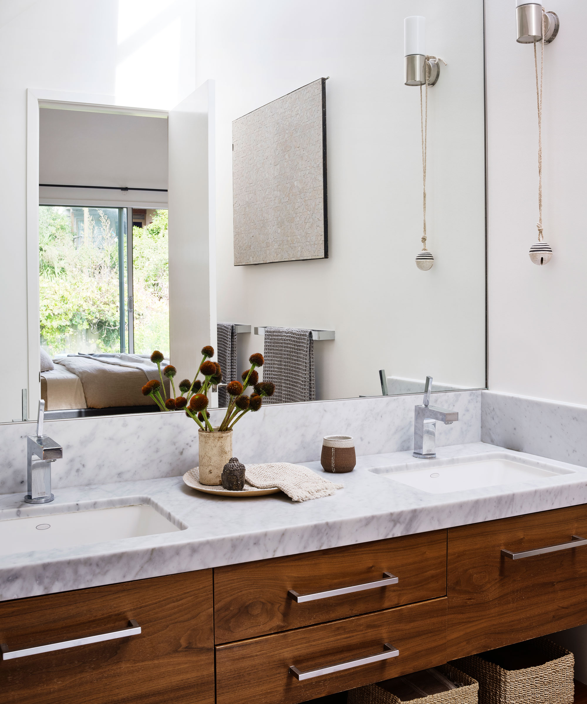
A large mirror maximises the sense of space.
Bedroom
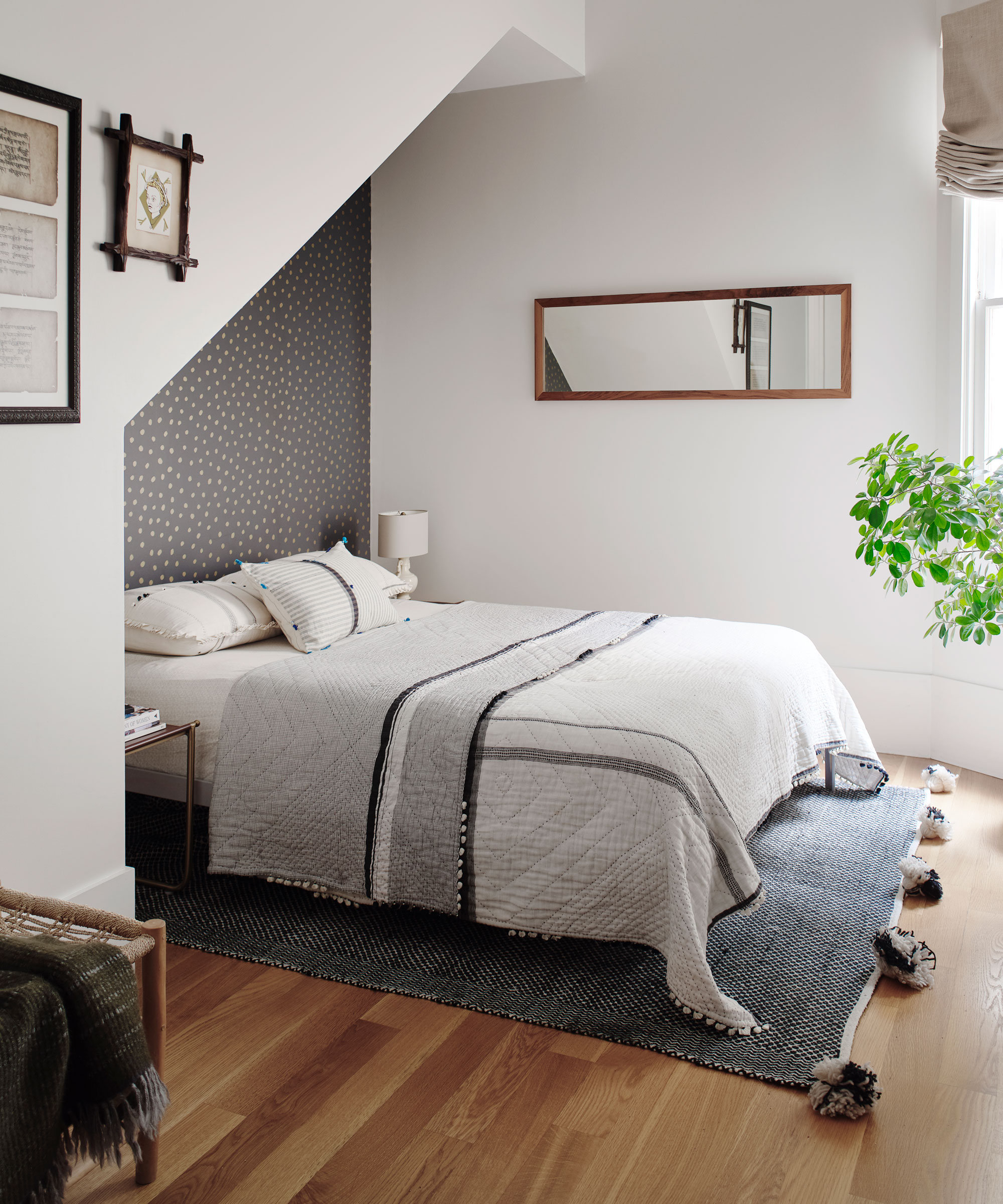
The hallmark of Kristen’s distinctive and very personal style is evident in the bedrooms with their bold patterned wallpaper designs and pale, sumptuous fabrics. A contrasting feature wall adds colour and depth to this co-ordinated scheme.
‘I’m a very down-to-earth designer, and I feel like every room has to have purpose and be inviting and welcoming.’ And so successful was this redesign that it proved the catalyst for Kristen to start up her own now-successful interior design studio K Interiors.
‘I don’t think a space needs to be very colourful to be deep, interesting or appealing,’ she says. ‘The most important thing is that it is not only beautiful, but comfortable, too.'
Interior design/ K Interiors
Photography/ R Brad Knipstein/Luis Peña/K Interiors
Text/ Seán O’Connell
Sign up to the Homes & Gardens newsletter
Design expertise in your inbox – from inspiring decorating ideas and beautiful celebrity homes to practical gardening advice and shopping round-ups.

Interiors have always been Vivienne's passion – from bold and bright to Scandi white. After studying at Leeds University, she worked at the Financial Times, before moving to Radio Times. She did an interior design course and then worked for Homes & Gardens, Country Living and House Beautiful. Vivienne’s always enjoyed reader homes and loves to spot a house she knows is perfect for a magazine (she has even knocked on the doors of houses with curb appeal!), so she became a houses editor, commissioning reader homes, writing features and styling and art directing photo shoots. She worked on Country Homes & Interiors for 15 years, before returning to Homes & Gardens as houses editor four years ago.
-
 'Big results before you know it' – Experts urge you to use the ‘Take Away 10’ method for simple decluttering with zero decision fatigue
It can cut hundreds of items from your home in just a few weeks
By Ottilie Blackhall
-
 Kevin Bacon and Kyra Sedgwick's rustic kitchen island is stunning, but controversial – designers say you can get the look without the hassle
A popular material finds an unorthodox home in the couple's kitchen, but experts disagree on whether it should be used – here's how to do it instead
By Sophie Edwards