A beautiful Victorian house design, inspired by the owner's antique collection
A move to a smaller home in London required expert advice to showcase the owner's antique collection in a new light

Prior to becoming an interior decorator at Sibyl Colefax & John Fowler, Daniel Slowik managed the company’s antiques division, and it was in this capacity that he first met the owner of this Victorian terraced townhouse in south London.
‘The owner of this house is a passionate collector and she would come into the Brook Street shop all the time,’ Daniel recalls. He continues, ‘Twenty years on, she got in touch with me via Instagram to say that she and her partner were downsizing to a house around the corner from their previous home, and she wondered if I could help.’
- See: World's best homes – gorgeous properties from around the globe
As owner and designer strolled from the larger house to the smaller one, a plan began to emerge as to how a lifetime’s collection could be curated and shown in a new light in this more petite property.
‘From the outset we knew that this wasn’t going to be a case of acquiring new pieces; rather, it would be about re-covering, re-polishing or repainting her most treasured finds,’ Daniel explains.
'We are entering an age of repurposing, which is something my company was doing when they were decorating country houses back in the 1950s. Our emphasis now, as it was back then, is on couture decorating – if you re-finish a piece beautifully, it will come back to life and last for many years to come.’
Living room
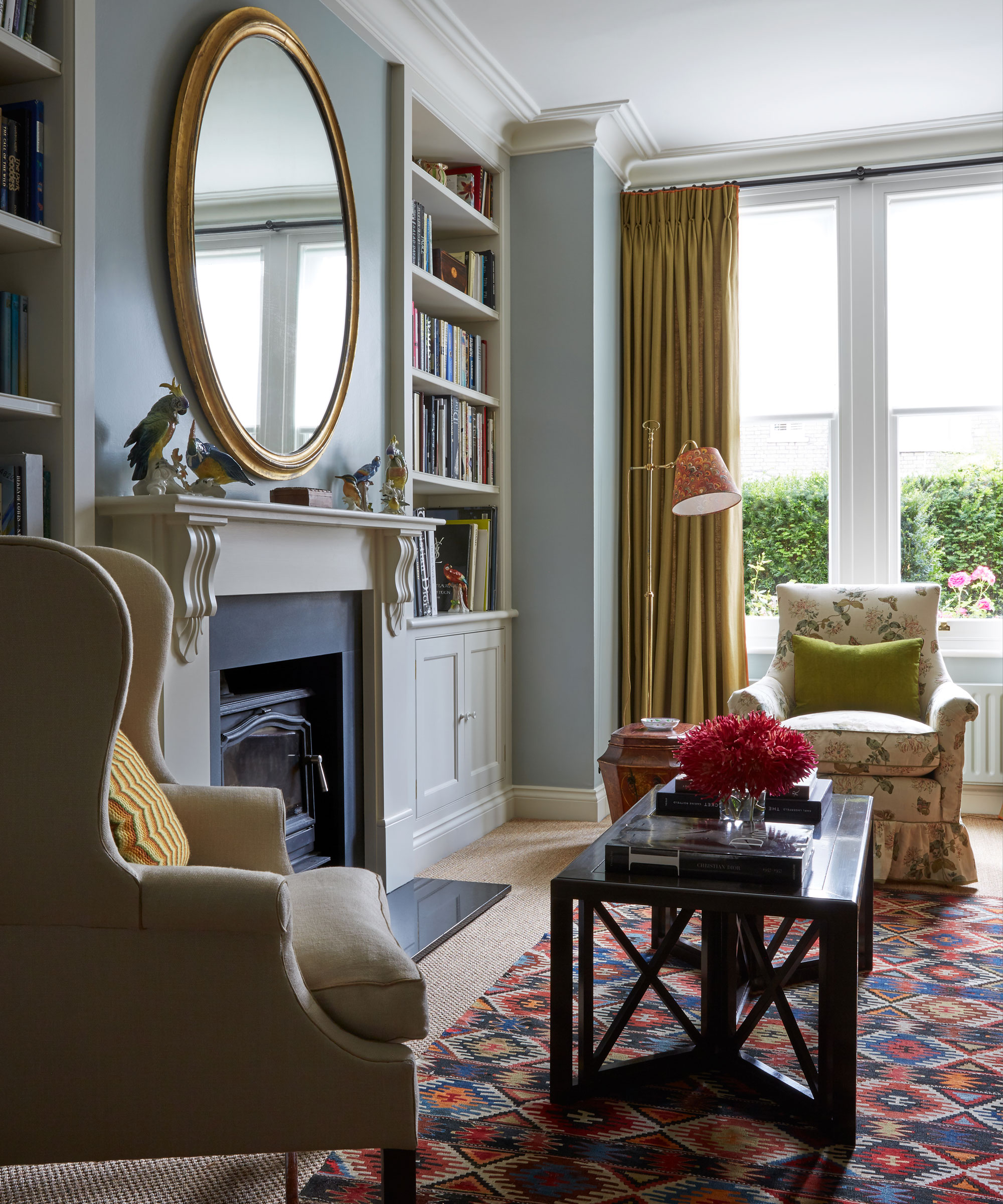
Designed to chime with the period of the house, the new joinery in the living room has been tailored to fit the owner's collection of books.
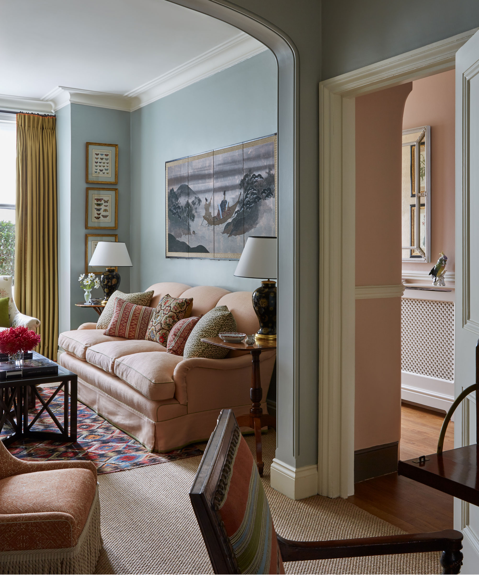
Detailing adds crisp definition to pieces, and includes contrast green piping on the pink sofa (which was originally covered in a chintz) and orange trim on the top, bottom and leading edge of the curtains. 'Curtain making and upholstery are not cheap but the fabrics don’t have to be wildly expensive. It’s all about the details,’ he posits.
The blue wall color was one of the first hues selected for the house. ‘It is incredibly versatile and works beautifully with greens, pinks and biscuit-y colors,’ observes Daniel.
Kitchen

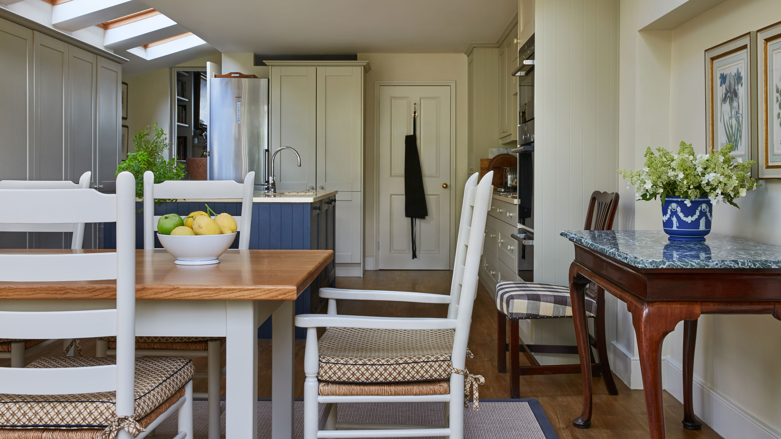
Daniel’s approach to upcycling also applied to the fittings within this house.
‘I’ve increasingly been trumpeting about sustainability and not throwing things away when they are perfectly good,’ he says, citing as an example the property’s existing kitchen cabinetry: ‘It had rather unattractive panelled units but we filled elements of the panels, and repainted everything; we then added beautiful reeded knobs, which put our stamp on the room.’
The wall of units was built to complement the existing kitchen cabinet idea, and the client’s informal dining furniture was repainted and treated to new seat pads. A fine marble-topped table adds a touch of grandeur.
Main bedroom
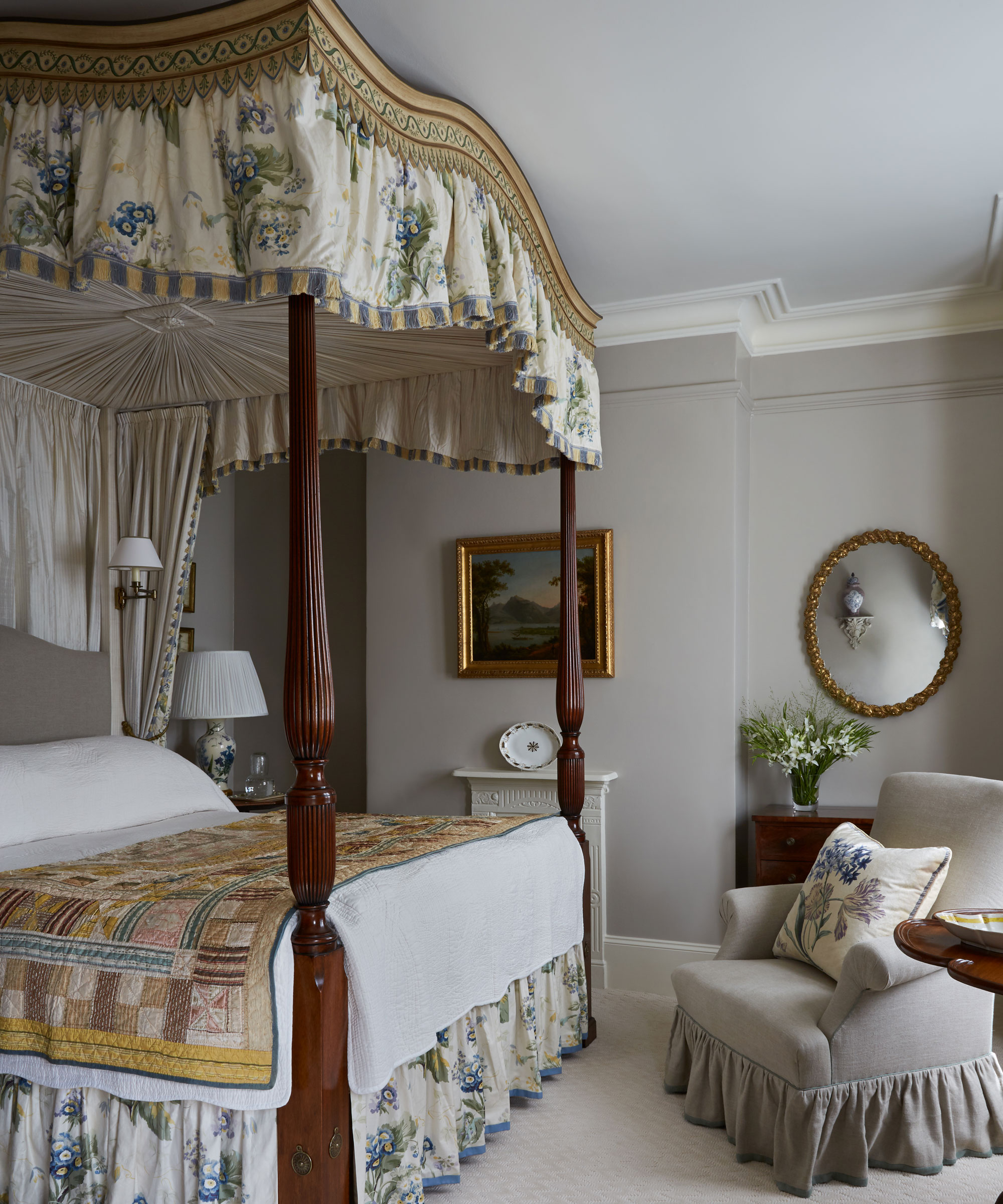
The floral drapes of the four poster bed were in perfectly good condition, so Daniel reused them as well as the matching curtains, which he had simplified to suit the more modest proportions of the space.
An English quilt dating to the 19th century adds another layer of richness to the scheme.
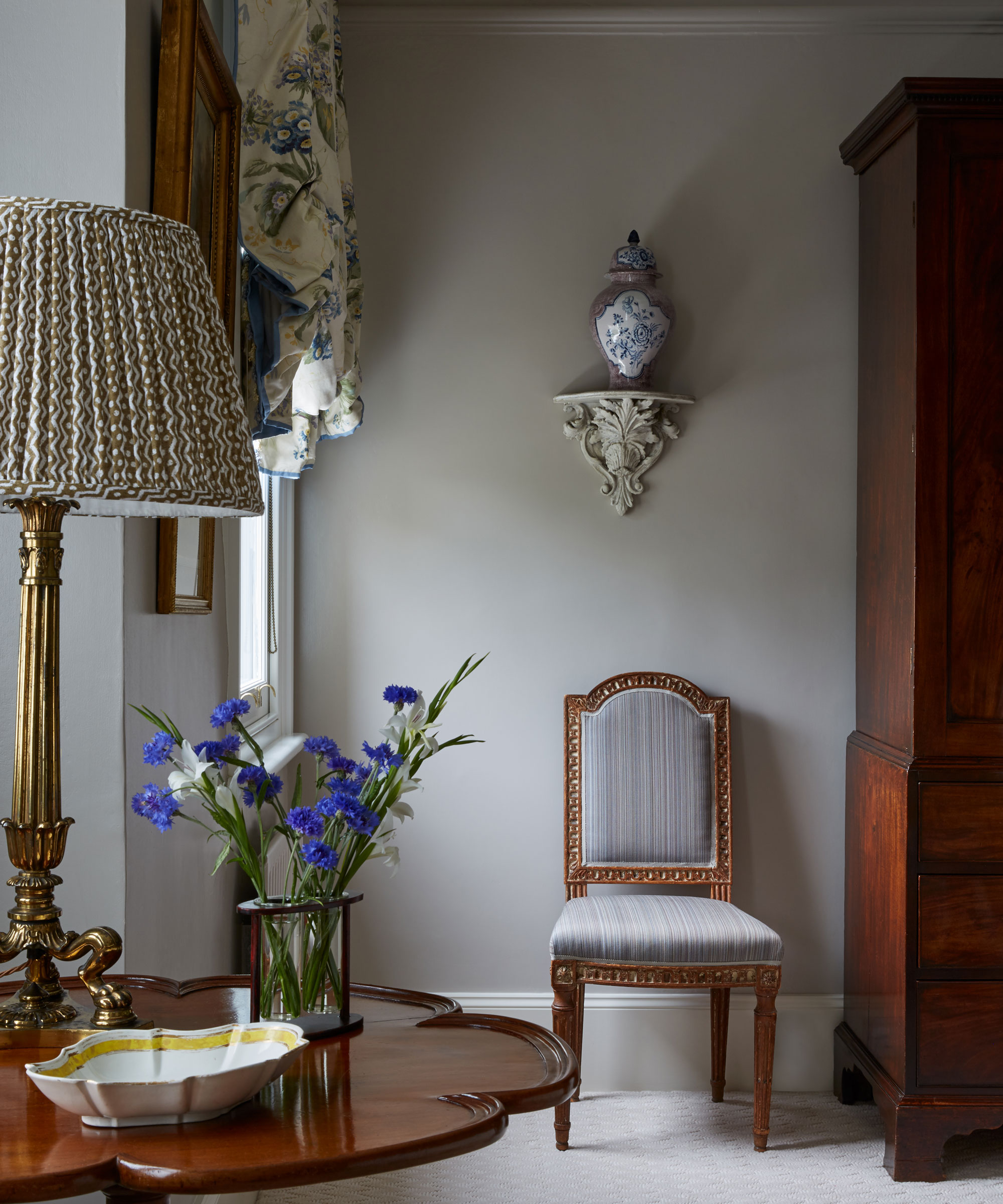
An 18th century French provincial chair in the main bedroom was reupholstered to suit the scheme.
On the bracket sits a 20th century faience vase featuring a manganese glaze.
Dressing room
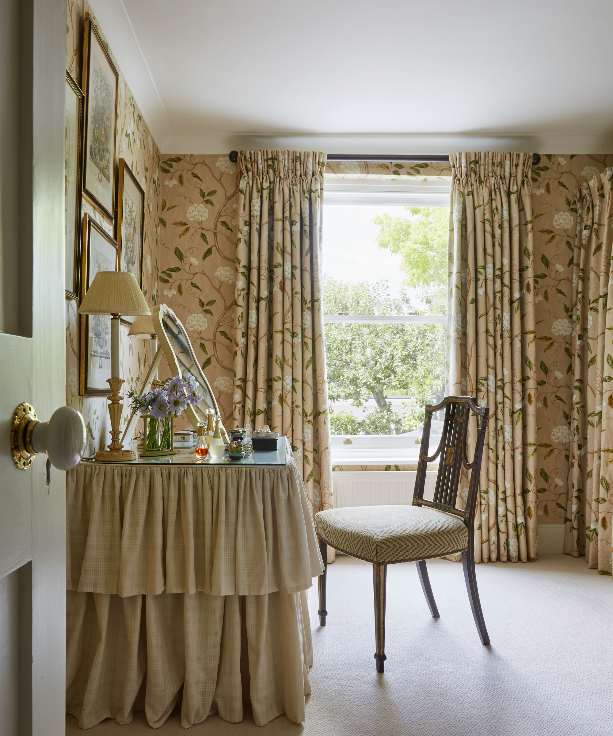
Inspired by a piece of wallpaper given to Nancy Lancaster by the King of Sweden, this painterly design has been used for the window treatment, walls and curtains which were favoured in lieu of cupboard doors.
For Daniel, the great joy of this project was that his personal tastes and those of the client converged.
'She loves florals and a palette of pinks, blues and greens – and so do I,’ he comments, adding that although the palette shifts from room to room, there is a sense of a connection between the spaces. ‘I always consider the view from one room into the next; it is important that it mustn’t jar.’
Daniel summarises this project as ‘a miniature country house in London’, and he believes that it exemplifies – albeit in a small-scale way – what he and his colleagues at Sibyl Colefax and John Fowler do best: ‘It’s about mastering color and pattern and focussing on every detail,’ he explains, adding, ‘Our company was born out of these principles.’
Interior designer/ Sibyl Colefax and John Fowler
Photography/ Boz Gagovski
Text/ Rachel Leedham
Sign up to the Homes & Gardens newsletter
Design expertise in your inbox – from inspiring decorating ideas and beautiful celebrity homes to practical gardening advice and shopping round-ups.

Interiors have always been Vivienne's passion – from bold and bright to Scandi white. After studying at Leeds University, she worked at the Financial Times, before moving to Radio Times. She did an interior design course and then worked for Homes & Gardens, Country Living and House Beautiful. Vivienne’s always enjoyed reader homes and loves to spot a house she knows is perfect for a magazine (she has even knocked on the doors of houses with curb appeal!), so she became a houses editor, commissioning reader homes, writing features and styling and art directing photo shoots. She worked on Country Homes & Interiors for 15 years, before returning to Homes & Gardens as houses editor four years ago.
-
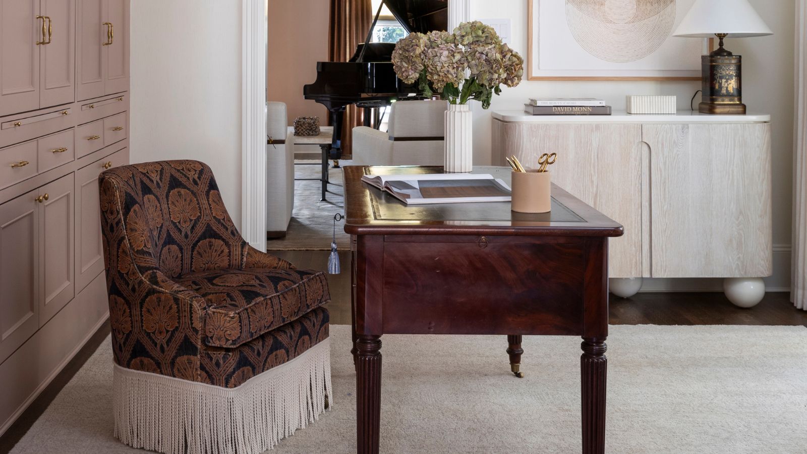 The rumours are true, the NYC trend for fringes and trimmings is actually happening – they are the secret weapon for making a room look expensive
A trim or a ruffle is the finishing touch that can take a scheme from ordinary to the extraordinary in an instant
By Jennifer Ebert Published
-
 How to grow impatiens – garden experts reveal the secrets to growing this shade-tolerant, sparkling summer plant
Both 'Busy Lizzie' and 'New Guinea' impatiens can thrive in shady yards
By Ellen Wells Published