Design house: Take a tour of this stylishly laid-back home in the New York suburbs
A focus on open-plan living and easy-going charm makes this home a place everyone wants to be in
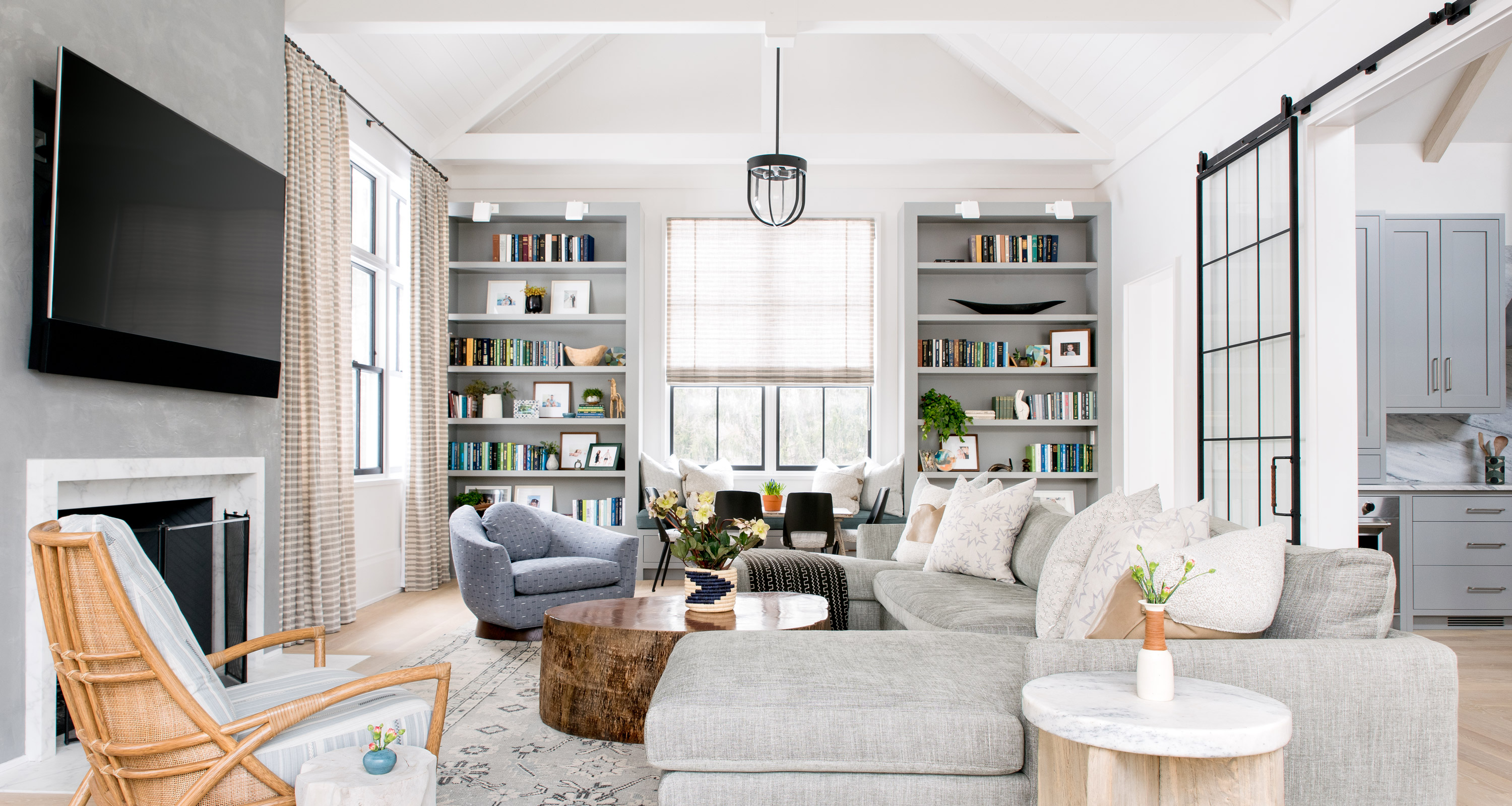

Creating a home from scratch was never high on the to-do list of Miranda Williams and her husband Evan. But when a plot of land came up for sale in a sought-after New York suburb, they jumped at the opportunity.
‘We found an empty piece of land two streets away from where I grew up, so it was a flip of a coin decision and we decided to go for it,’ Miranda reveals.
‘We had been living in Manhattan but always knew we would move to the suburbs as soon as our youngest child was old enough to start kindergarten.’
- Check out our page dedicated to the world's best homes for more a look inside some more beautiful spaces
The property
The couple, who have two children, very nearly ended up somewhere completely different due to Evan’s job. ‘We were previously living in Charleston, South Carolina, where he was posted, and we viewed some houses but then he was offered a fantastic position in New York City.’
But the viewings had made a lasting impression on Miranda and were to influence her future interior design choices. ‘We saw one house with an interior by the designer Cortney Bishop and I just fell in love. I became obsessed with her, following her on Instagram and studying every house she had ever done.’
Leaving the Charleston dream home behind and focusing on their own project, Miranda and Evan began the search for an architect.
‘We found Alisberg Parker through word-of-mouth recommendations and gave them a brief to create a contemporary farmhouse-style home that was open, laid-back and geared towards family entertaining,’ says Miranda.
With only one minor setback involving building permits, the house took 22 months to build from the original meeting with the architect to moving in.
Never having planned to hire an interior designer, when the challenge of decorating the house became too overwhelming for Miranda she contacted Cortney, yet had little expectation that she would be available.
‘We told her she would be jumping onto a moving train but she said yes. It was incredible. We sent her the plans and a month later she flew down to see the house.’
The kitchen
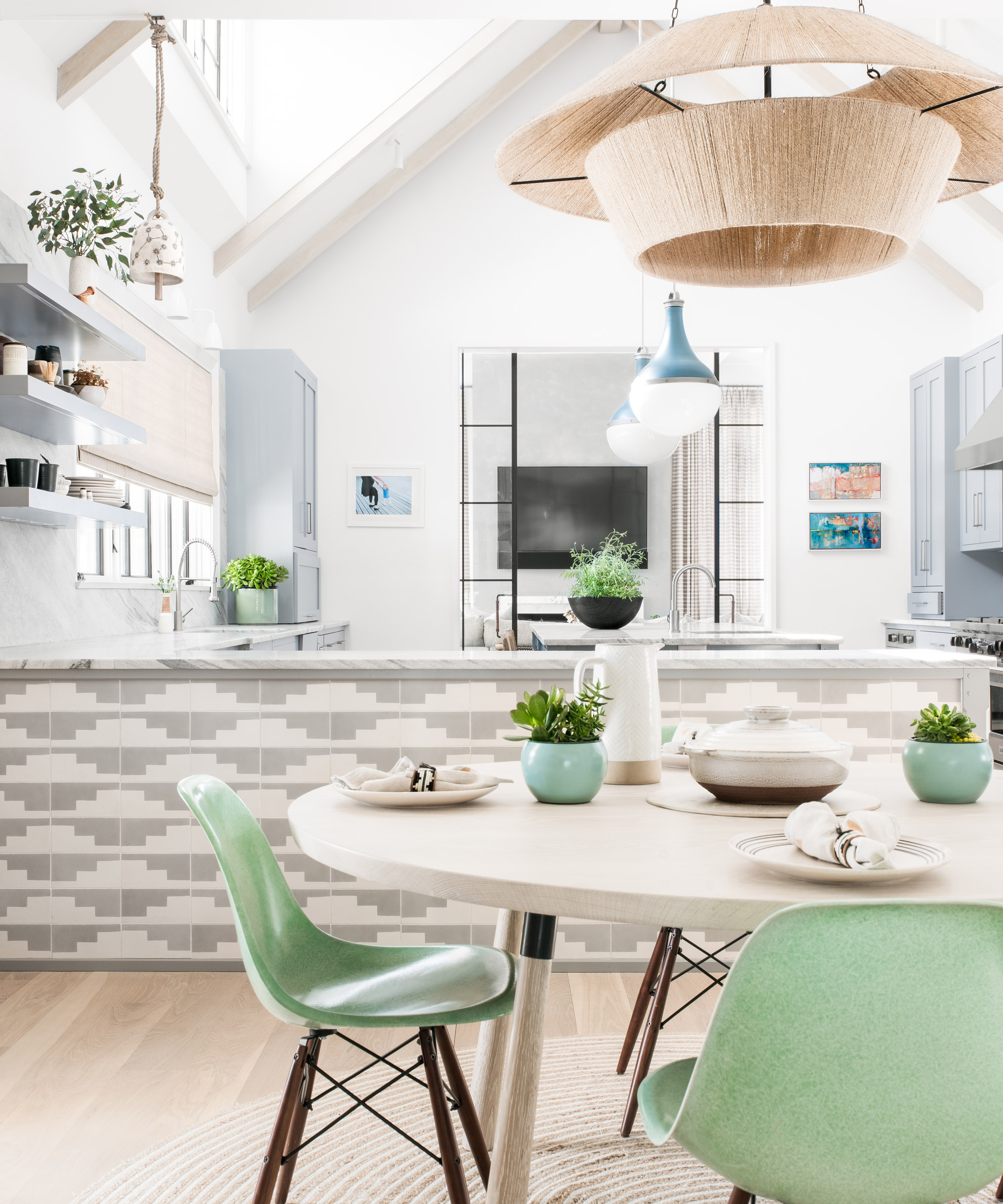
String lantern pendant, Nickey Kehoe. Braided Jute rug, iRugs, is similar. Malmo Zebra tiles, Exquisite Surfaces. Splay leg table, Black Creek Mercantile & Trading Co.
Joining the project late posed no problem for Cortney. ‘The architectural firm were very gracious and extremely open to collaboration,’ says Cortney. ‘When we came in, the direction was more contemporary but we wanted to layer in some organic textures and make it a bit more playful.’
Here in the kitchen, accent colours in the vintage runner from Etsy have been used in both the upholstery and the lights.
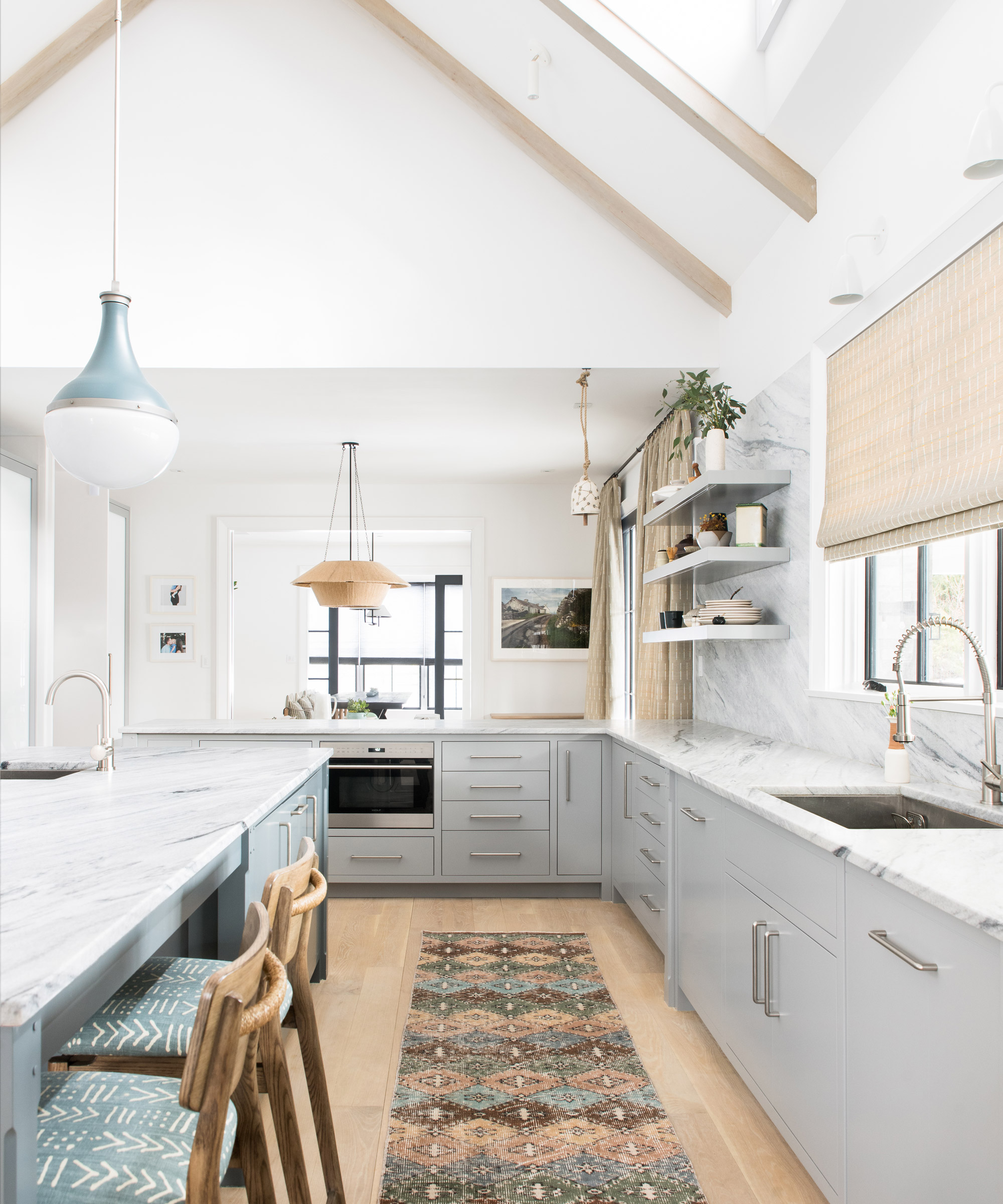
Vintage runner, Etsy. Maiden stools, McGuire; in Penny Morrison’s Luma fabric. Harford pendant light, The Urban Electric Co. Custom built units in Farrow & Ball’s Manor House Gray. Find Carrara honed marble worktops at MKW Surfaces
- Get some inspiration for your kitchen project with our stylish edit of open plan kitchen ideas
The kitchen leads through to a pantry with matching kitchen cabinetry and plenty of storage. This space in turn leads into the main hallway.
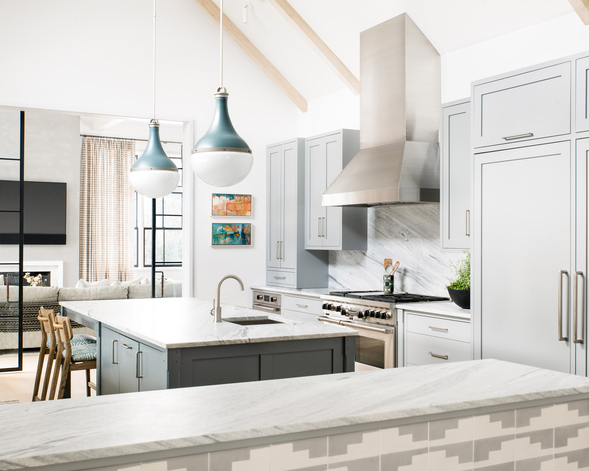
Taking inspiration from Miranda’s love of blue and the personality of her two children, Cortney set about creating an interior that also has touches of a breezy, sun-bleached coastal setting.
Cortney herself could be described as a ‘breath of fresh air’, and was a big influence in bringing a more colourful, relaxed, less fussy interior style to many homes in Charleston, which is known for its traditionality and formality.
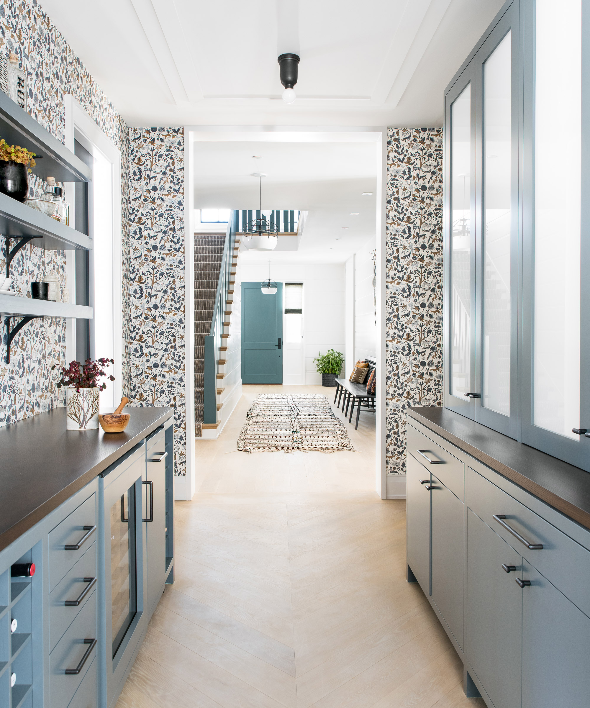
- For more kitchen pantry inspiration, take a look at our edit of the best pantry ideas here
‘I grew up around antiques and formal living where you couldn’t wear shoes in the house and had to shower if you’d been wearing suntan lotion, it drove me mad,’ Cortney laughs, remembering her original resistance to formality.
Here, she used the pantry's transitional space to create a useful bar area and storage spot. The blue-painted cabinetry responds to the tones in the wallpaper.
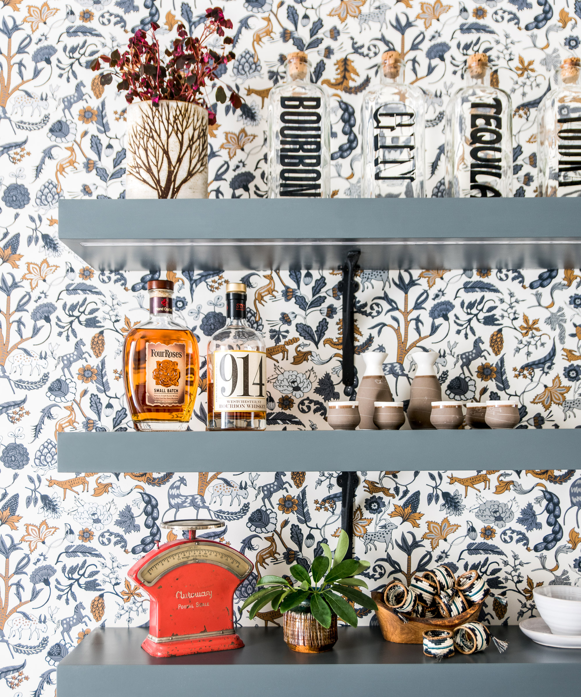
Foret wallpaper, Hygge & West. Shelves in Inchyra Blue, Farrow & Ball
Chunky open shelving brings a contemporary twist to contrast with the folksy wallpaper.
The sitting room
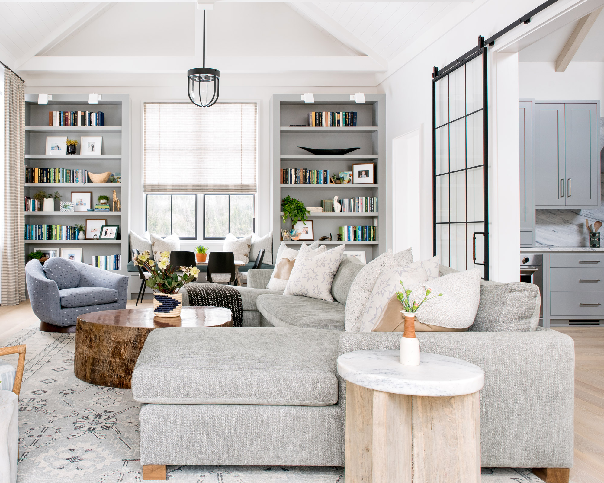
Nina sectional sofa, Verellen. Rug, Moattar. Petal lounge chair, McGuire
The result of this ambitious project is a lifelong home finely crafted to the family’s needs. Wide hallways beckon guests in, inviting them into the easy interconnected living spaces.
A huge U-shaped sofa in the open plan sitting room, separated by the kitchen with tall panelled glass sliding doors puts the emphasis on comfort. Floor-to-ceiling curtains and built-in shelves make this large space feel more intimate.
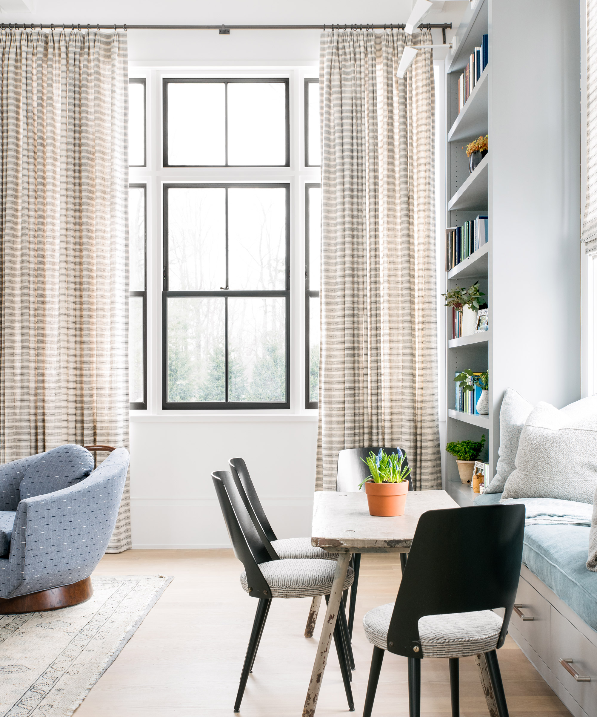
Good storage is an essential in an open plan home - too much visual clutter can feel overwhelming and messy. Flanked by two tall bookshelves, this cozy window seat features handy deep drawers underneath.
The dining room
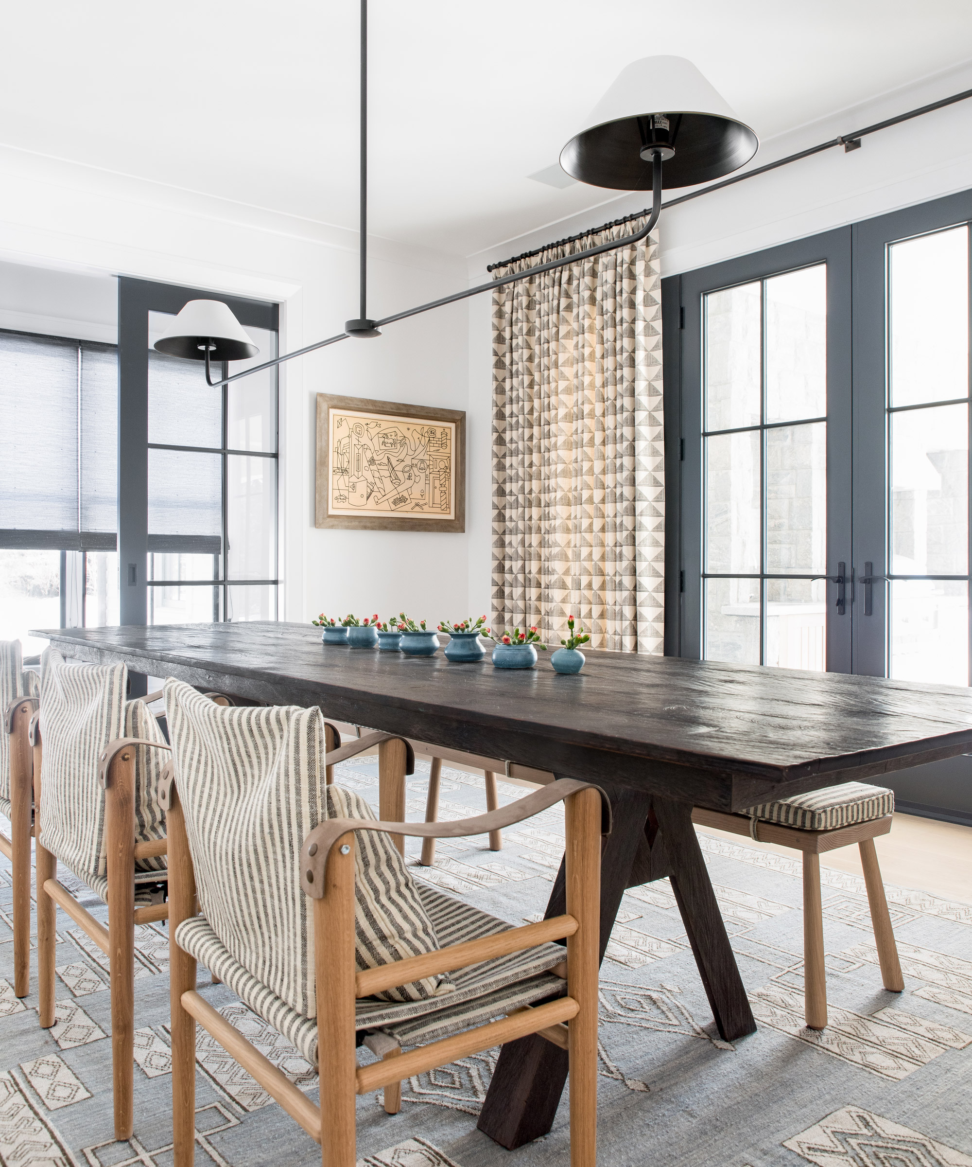
Montauk dining chair, Homenature. Double-arm pendant light, The Urban Electric Co. Curtains in Patra fabric, Susan Connor. Rug, Amadi Carpets
‘The glass doors ensure that rooms can be separated and the milky effect allows the light to be fluid but also brings a sense of privacy,’ notes Miranda. With tremendously tall ceilings, one of Cortney’s great skills was to imbue the interiors with a sense of cosiness despite their huge proportions.
Here in the dining room, director’s style chairs and a bench bring a sense of informality to this space, plus the lack of seat backs on the bench doubles down on the sense of openness.
The study
The welcoming, jovial atmosphere within the house has already been experienced by many of the family’s friends. ‘We are constantly entertaining,’ concludes Miranda. ‘It’s a house where people love to congregate.’
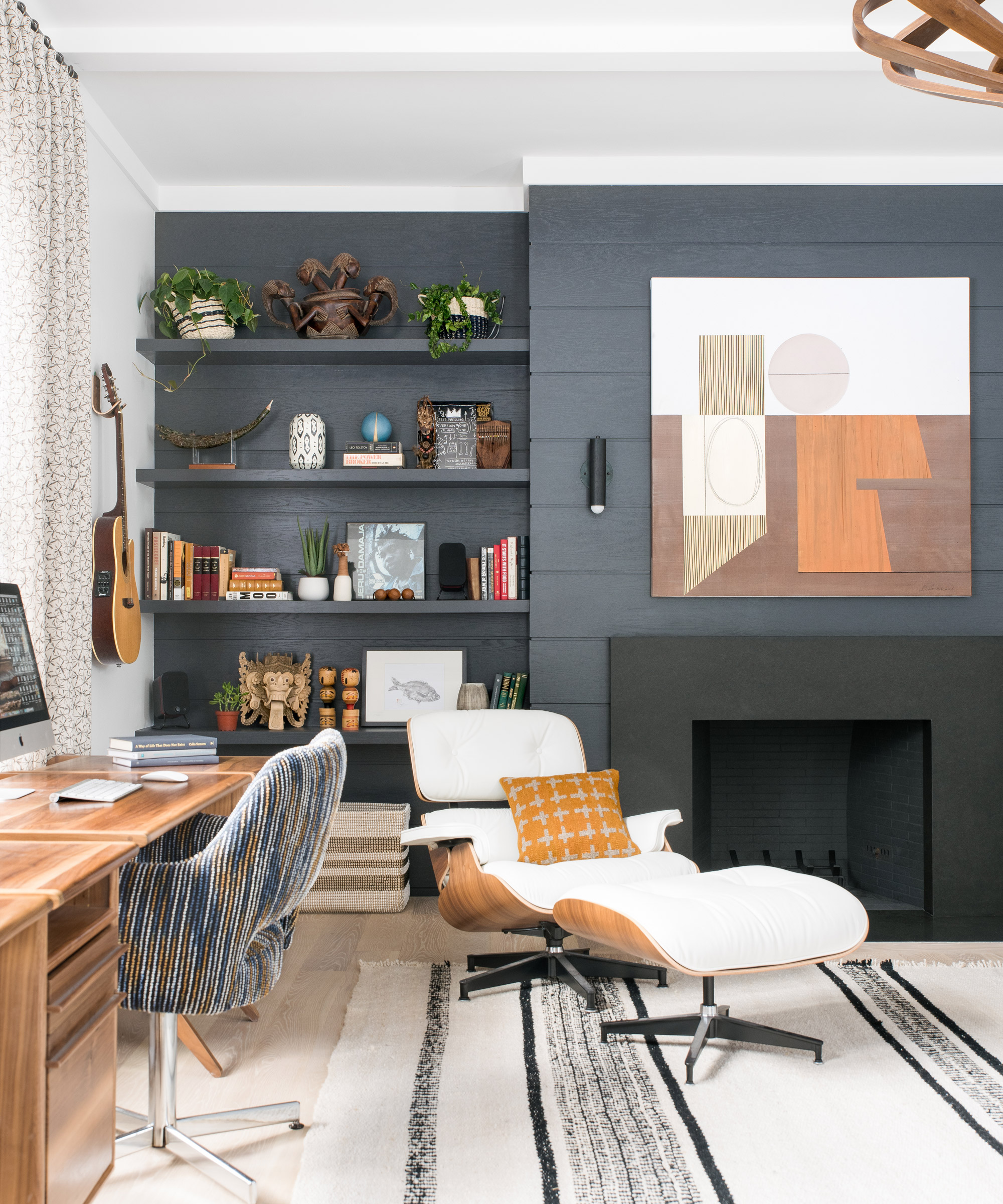
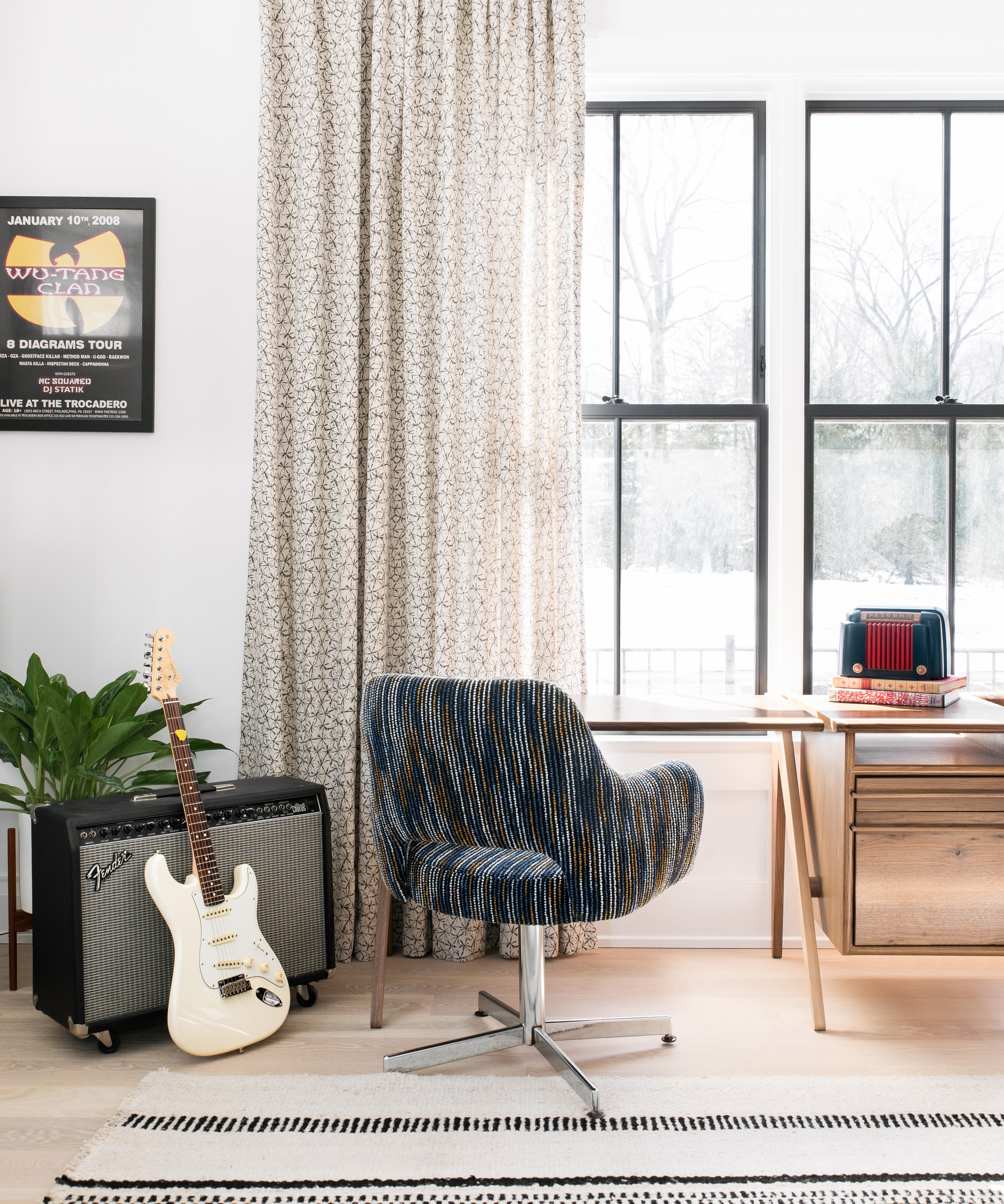
A fun and informal space, this room is packed with patterned textiles, artwork and the family's numerous guitars.
The master bedroom
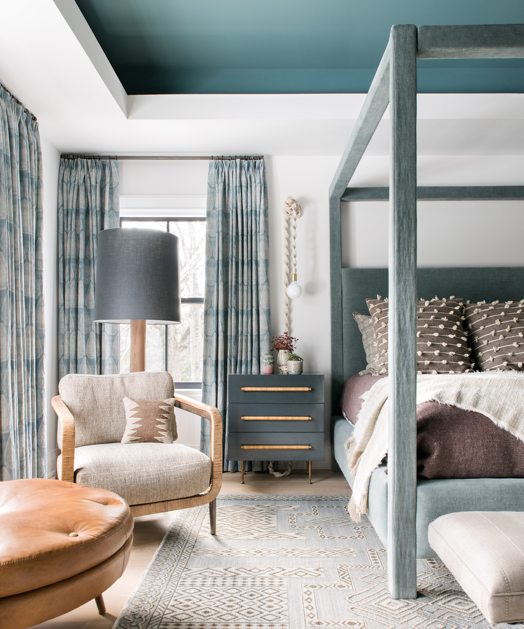
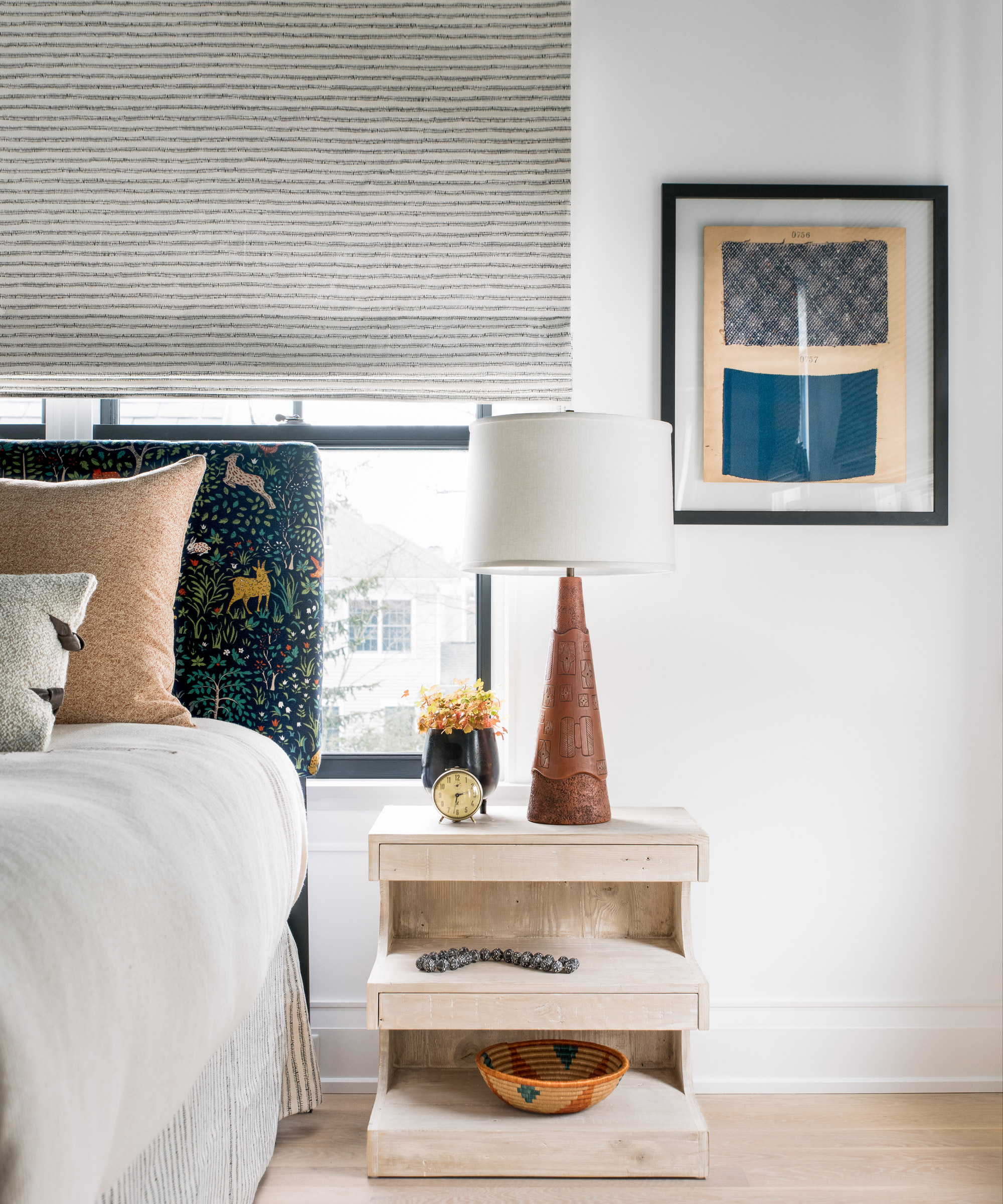
Custom-made bed, Verellen. Curtains in Artemis fabric, Susan Connor. Rug, Amadi Carpets. Duvall lounge chair, Palecek
LED lighting in the alcove makes a feature of the painted ceiling, the color of which echoes the furniture and drapes. The textures of leather, wool and rope create a relaxed, inviting character.
The daughter's room
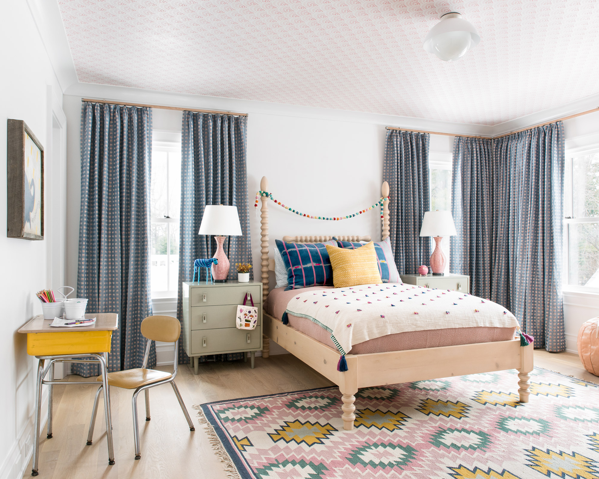
Fun prints on the upholstery and curtains will suit the taste of the couple’s daughter as she grows into a teen, helping to future-proof the scheme.
Here, the ceiling is wallpapered in contrast to the plain white painted walls, a similar effect used elsewhere in the house.
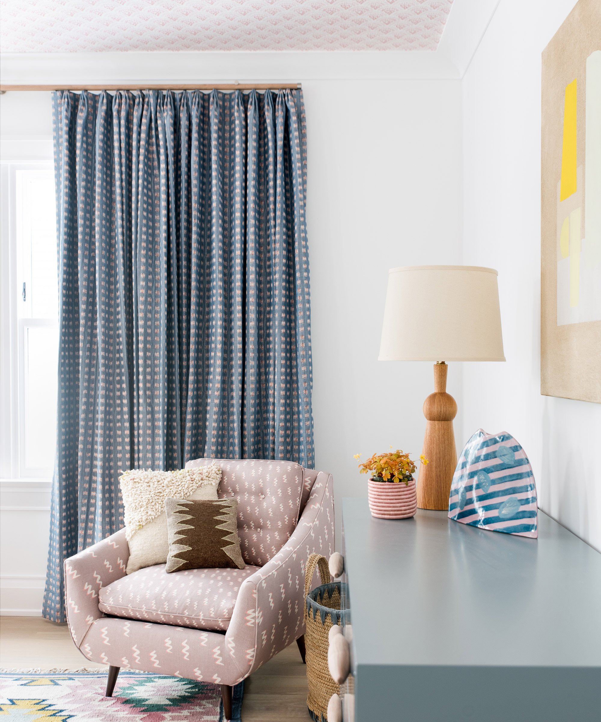
Vintage chair, Chairloom; reupholstered in The Little Zig fabric by KLS Textiles. Curtains in Gridded Ikat fabric, Rebecca Atwood
The landing
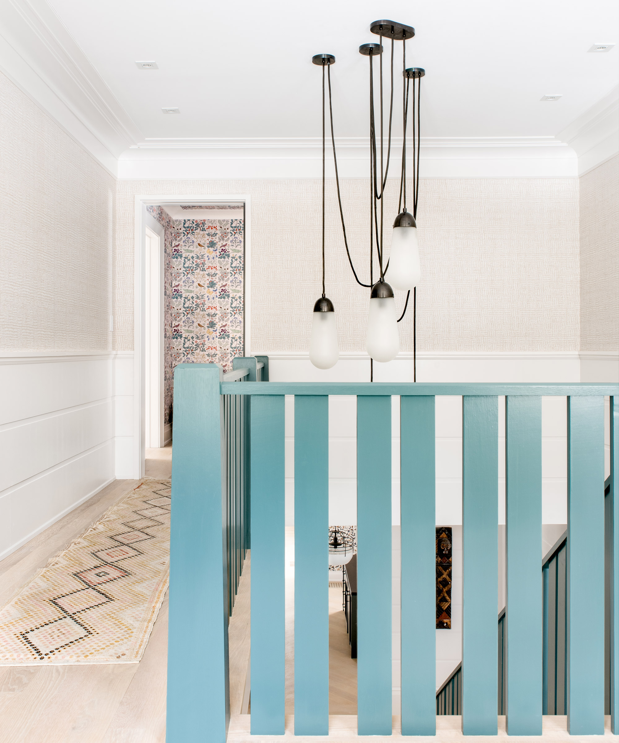
Lariat light fixture, Apparatus
Here on the landing, Cortney felt that a simple pendant light would be too small , so collaborated on designing this sculptural fitting that fills the space.
The runner lead into the reading room and its colorful wallpapered walls.
The reading room
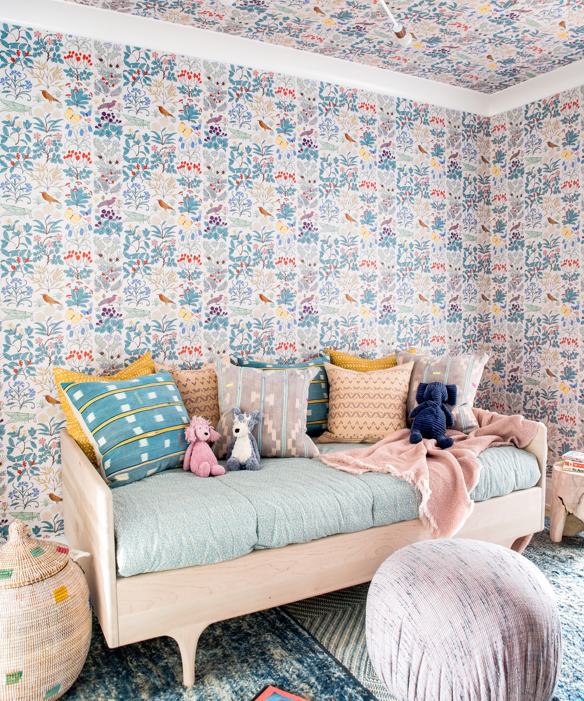
Apothecary’s Garden wallpaper, Trustworth Studios. Divan twin daybed, Kalon. Vintage rug hand-picked by Cortney in Morocco. Pendant light, One Forty Three
Papering the walls and ceiling in the same Trustworth Studios design brings an intense yet cozy vibe to this space.
Sign up to the Homes & Gardens newsletter
Design expertise in your inbox – from inspiring decorating ideas and beautiful celebrity homes to practical gardening advice and shopping round-ups.

Jennifer is the Digital Editor at Homes & Gardens. Having worked in the interiors industry for several years in both the US and UK, spanning many publications, she now hones her digital prowess on the 'best interiors website' in the world. Multi-skilled, Jennifer has worked in PR and marketing and occasionally dabbles in the social media, commercial, and the e-commerce space. Over the years, she has written about every area of the home, from compiling houses designed by some of the best interior designers in the world to sourcing celebrity homes, reviewing appliances, and even writing a few news stories or two.
-
 Pamela Anderson's kitchen seating arrangement is one of the most intelligent I've seen – it turns an awkward corner into a chic social space
The model's banquette seating perfects a smart seating trend that's shaping how we dine and socialize in 2025 – and it will fit in the smallest of kitchens
-
 8 of the biggest small bedroom layout mistakes designers see time and time again
These small bedroom layout mistakes are so easy to make, but so easy to avoid too