Design house: Take a festive tour of this elegant and colorful west London family home
The owners of this Victorian townhouse in Wimbledon renovated the entire property to create a fun and color rich family home
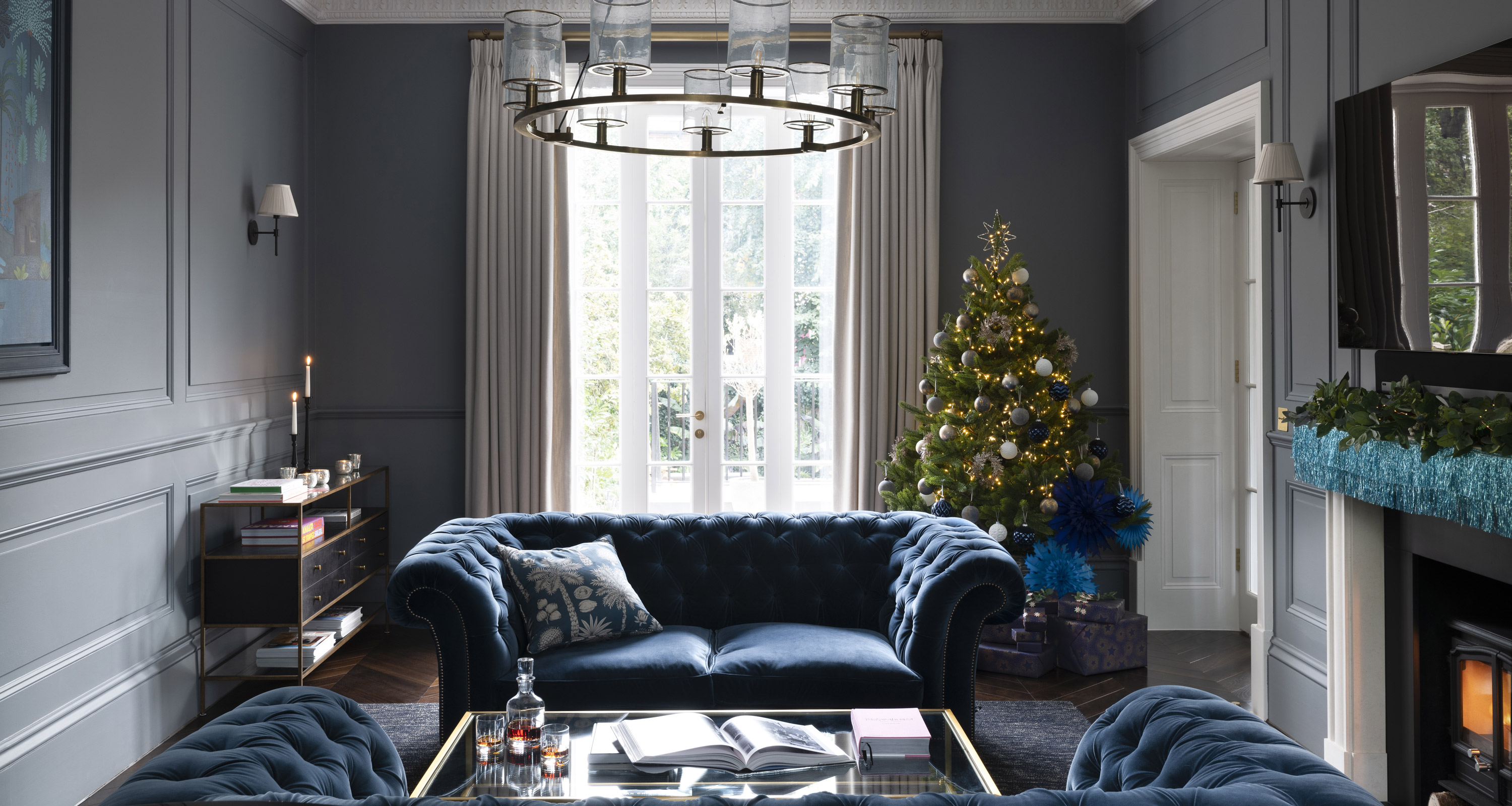

The phrases ‘lateral living’ and ‘Victorian townhouse’ aren’t ones that often appear in the same sentence, which probably explains why Viviane and Malte Heininger snapped up this 1850s house in Wimbledon within a week of viewing it.
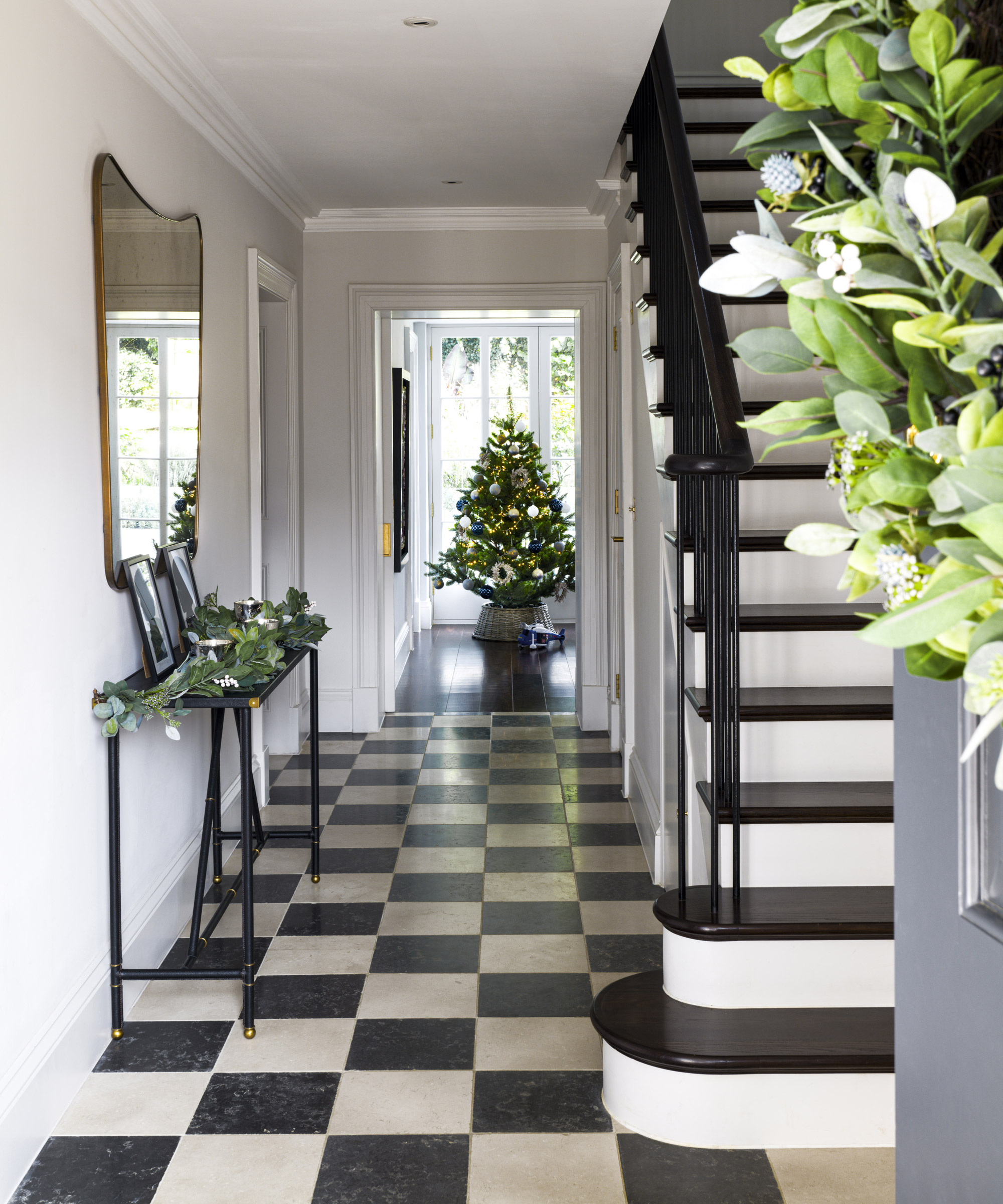
The pair, who are both German, had spent 12 years living in Chelsea and Kensington, but with two young boys and a third son on the way, they saw this move as an important lifestyle change.
‘We simply couldn’t get these proportions and a large garden in central London,’ says Viviane. ‘We recognised the potential in this house to create a really fun family home.’
- Check out more Homes & Gardens' world's best homes here
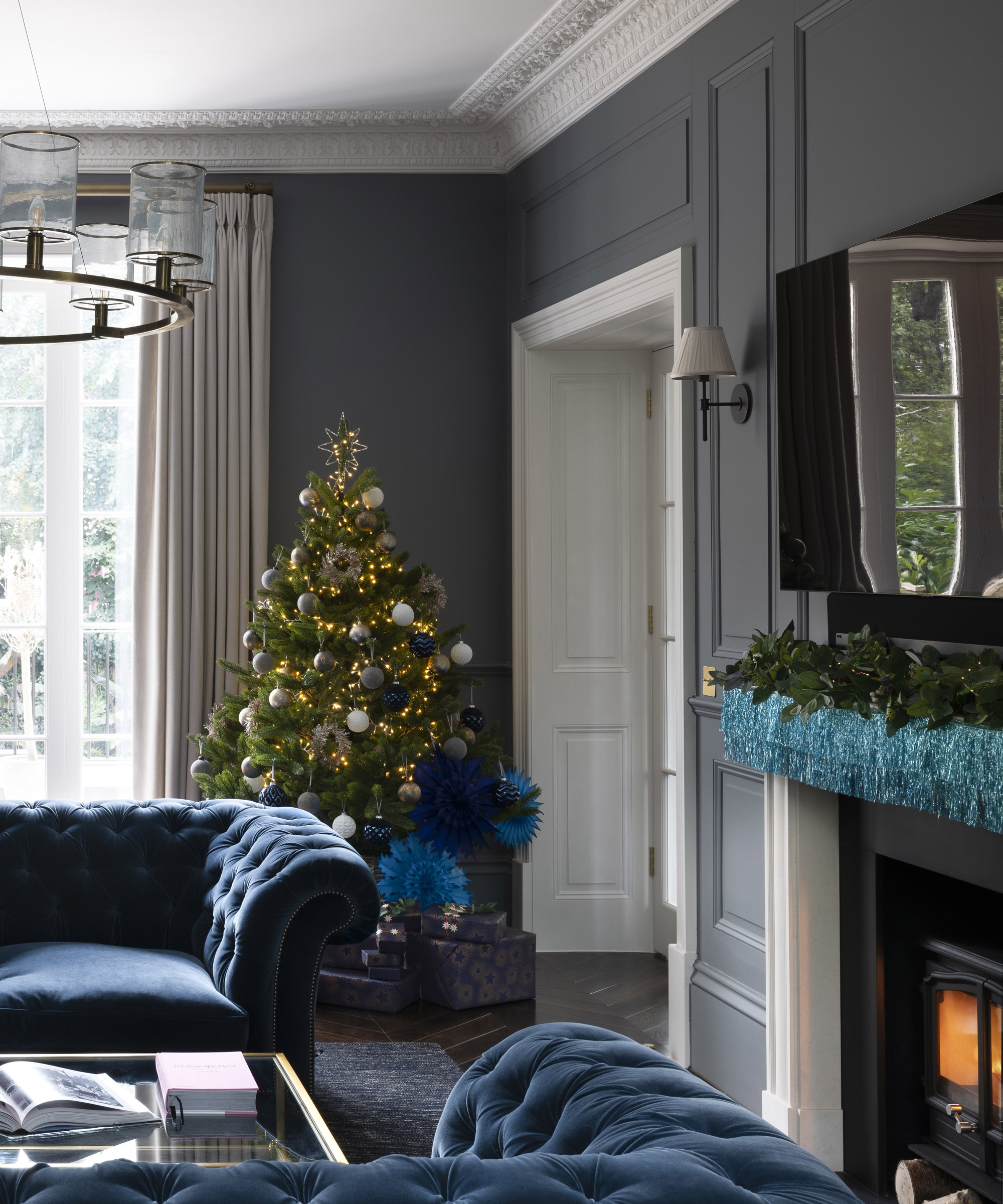
The sitting room
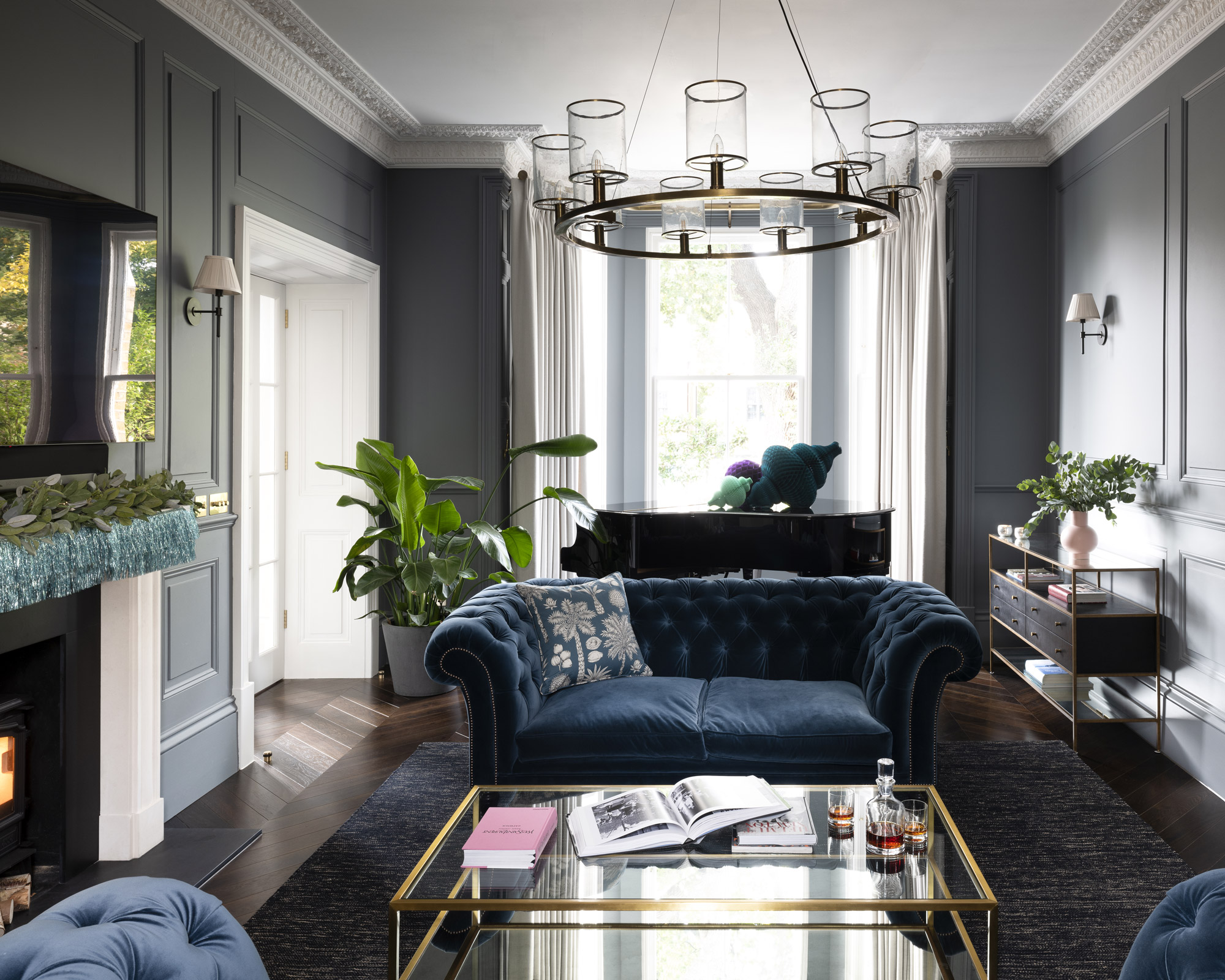
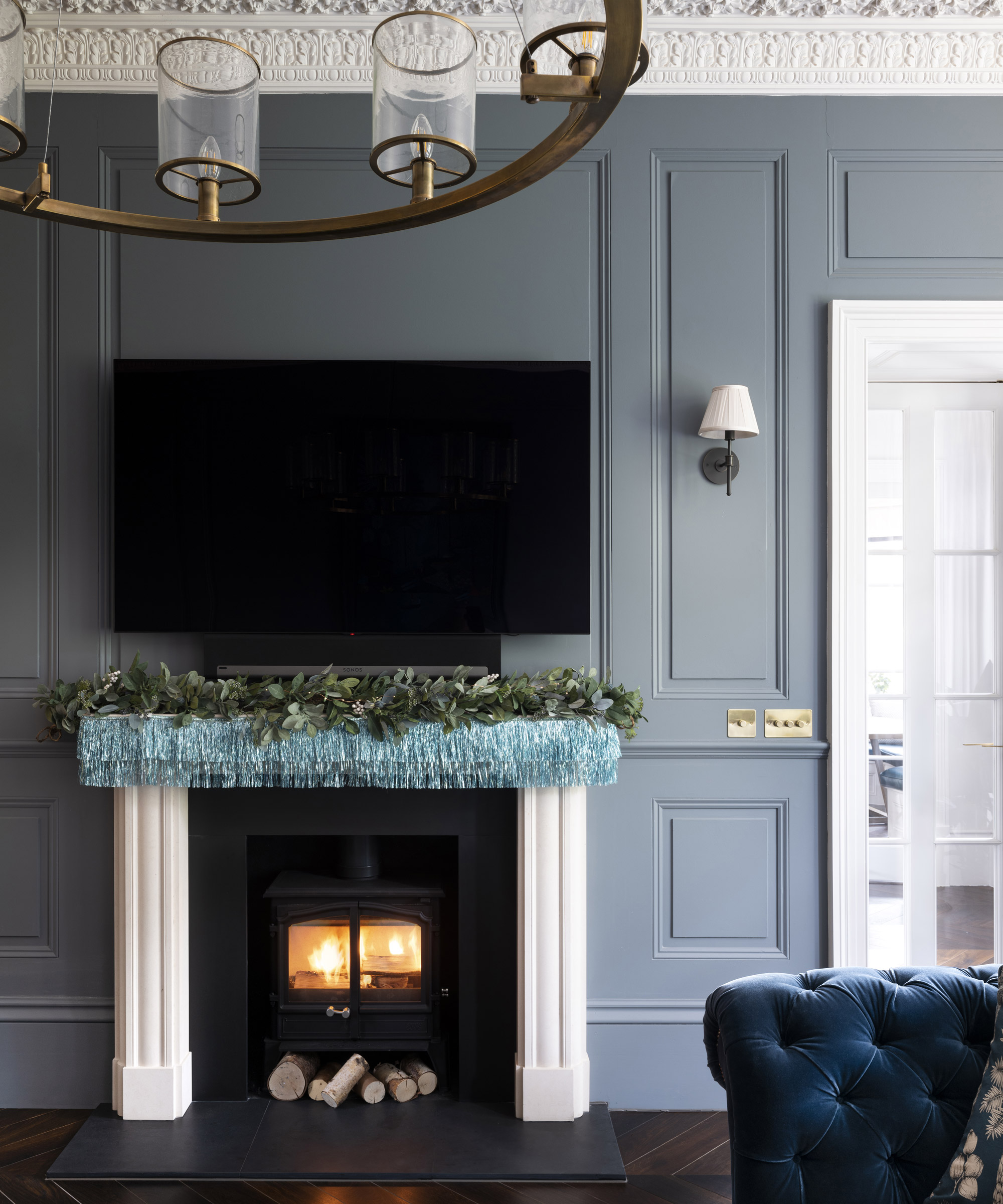
Christmas tree and garland on mantelpiece, The White Company. Blue Tassel garland, Meri Meri.
Viviane and Malte love frequenting London’s smart eateries, citing Cecconi’s and restaurants within the Soho House portfolio as favourites, and it was work for the latter by architectural firm Michaelis Boyd that first attracted the couple to the practice.
- See inside cookery writer Skye McAlpine's effortlessly elegant London home
The architects remodelled every inch of the four-storey building, moving all the sociable spaces to the grand first floor where an incongruous 1920s flat-roofed extension was replaced with a gracious sunroom that leads to a raised terrace overlooking the new swimming pool.
Panelling and sourced elaborate cornicing were reinstated to celebrate the grandeur of this sitting room.
The kitchen
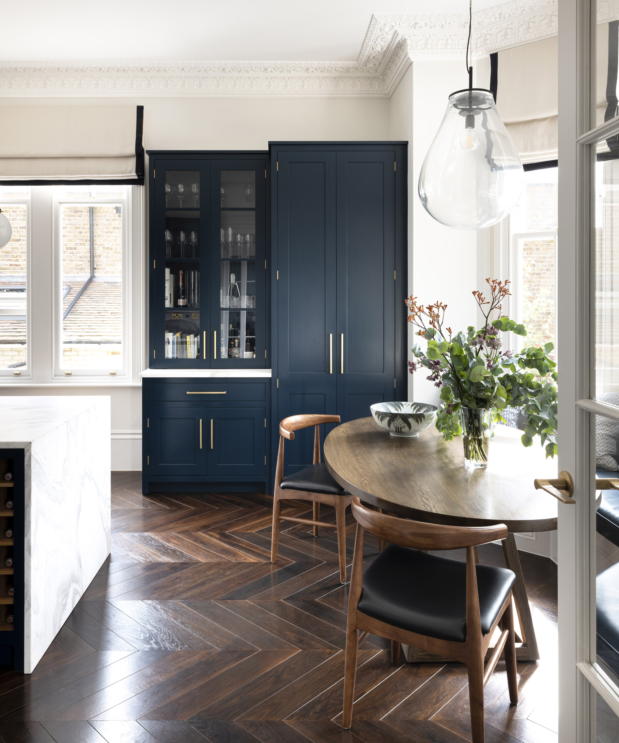
Beverly Hills Banana Leaf wallpaper, Designer Wallcoverings. Cabinetry, Blakes London; painted in Kigali, Paint & Paper Library. Michelangelo white marble worktops and splashback, Marble City
As the project progressed, Viviane enlisted the help of interior designer Anna Hewitson. ‘The scale of the rooms called for a lot of bespoke designs and Anna was fantastic at helping me source these pieces,’ Viviane explains, adding, ‘It was an amazing opportunity as I was able to bounce lots of ideas off her.’
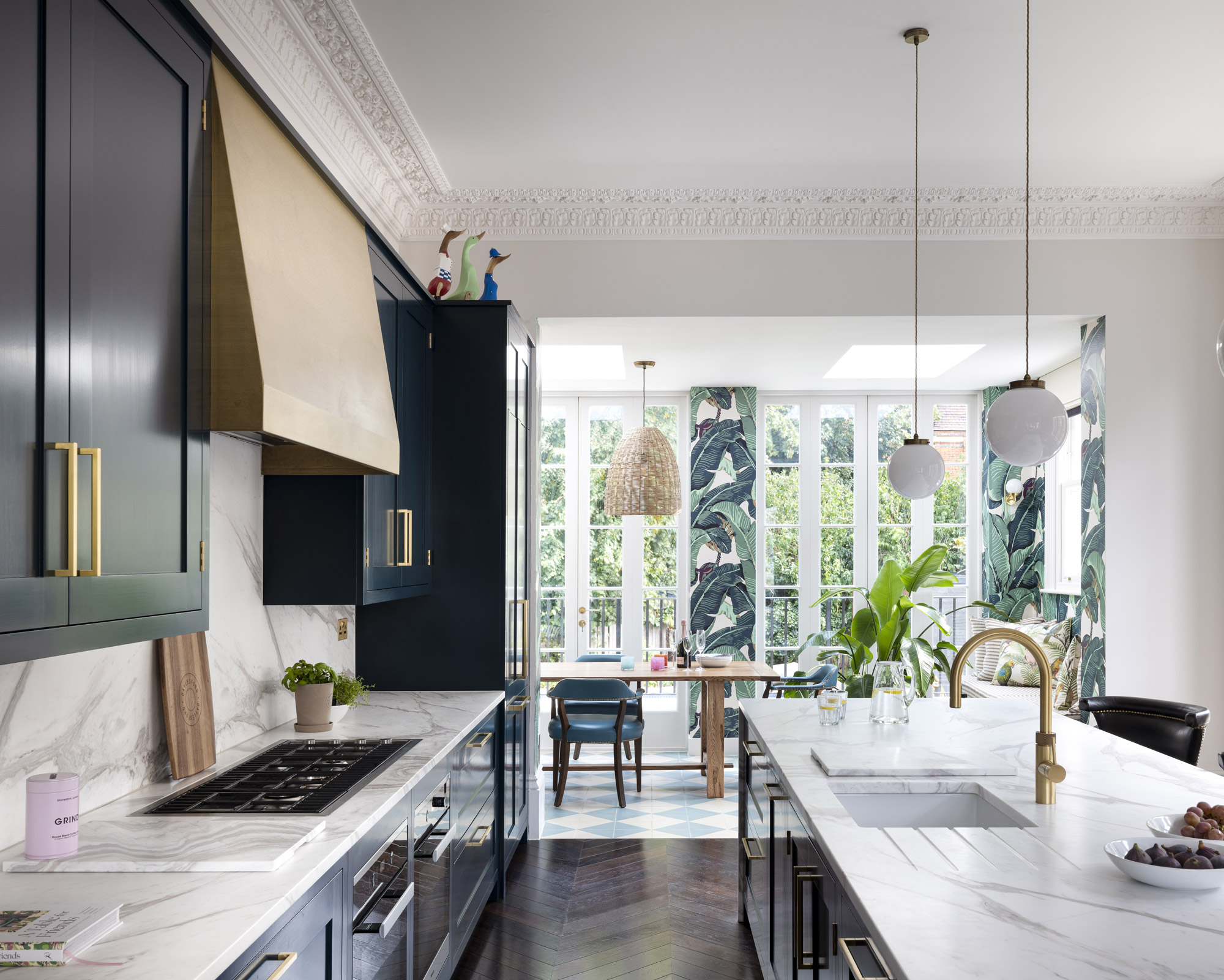
Anna helped to fine-tune the palette with hues that enhance the sense of flow, such as a blackened denim colour for the kitchen cabinetry and a French blue-grey for the walls of the formal sitting room.
‘There is a lot of blue in the house but we were careful to balance it with more soft, delicate tones such as turquoise or dusty pink,’ Viviane observes.
In the kitchen, tropical wallpaper and a rattan pendant in the dining area are a playful contrast to the classic styling in the cook space.
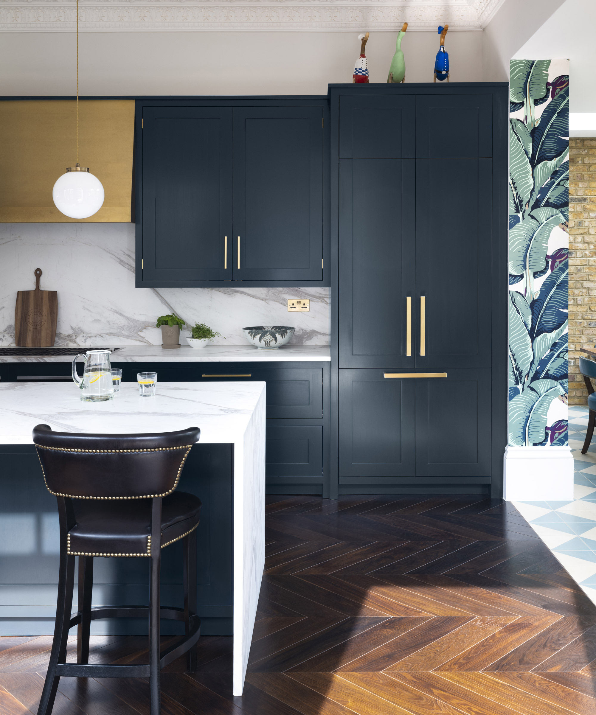
So, juxtaposed with features that evoke the feel of a club house – think panelled walls in rich hues, smart nailed or buttoned seating and dark oak herringbone floors – are elements that wouldn’t be out of place in the Hamptons or LA: bold cement tiles, a large-scale tropical print wallpaper and upbeat art.
The ground floor, which has lower ceilings, now has a huge L-shaped playroom as well as two guest rooms and utility spaces.
The study
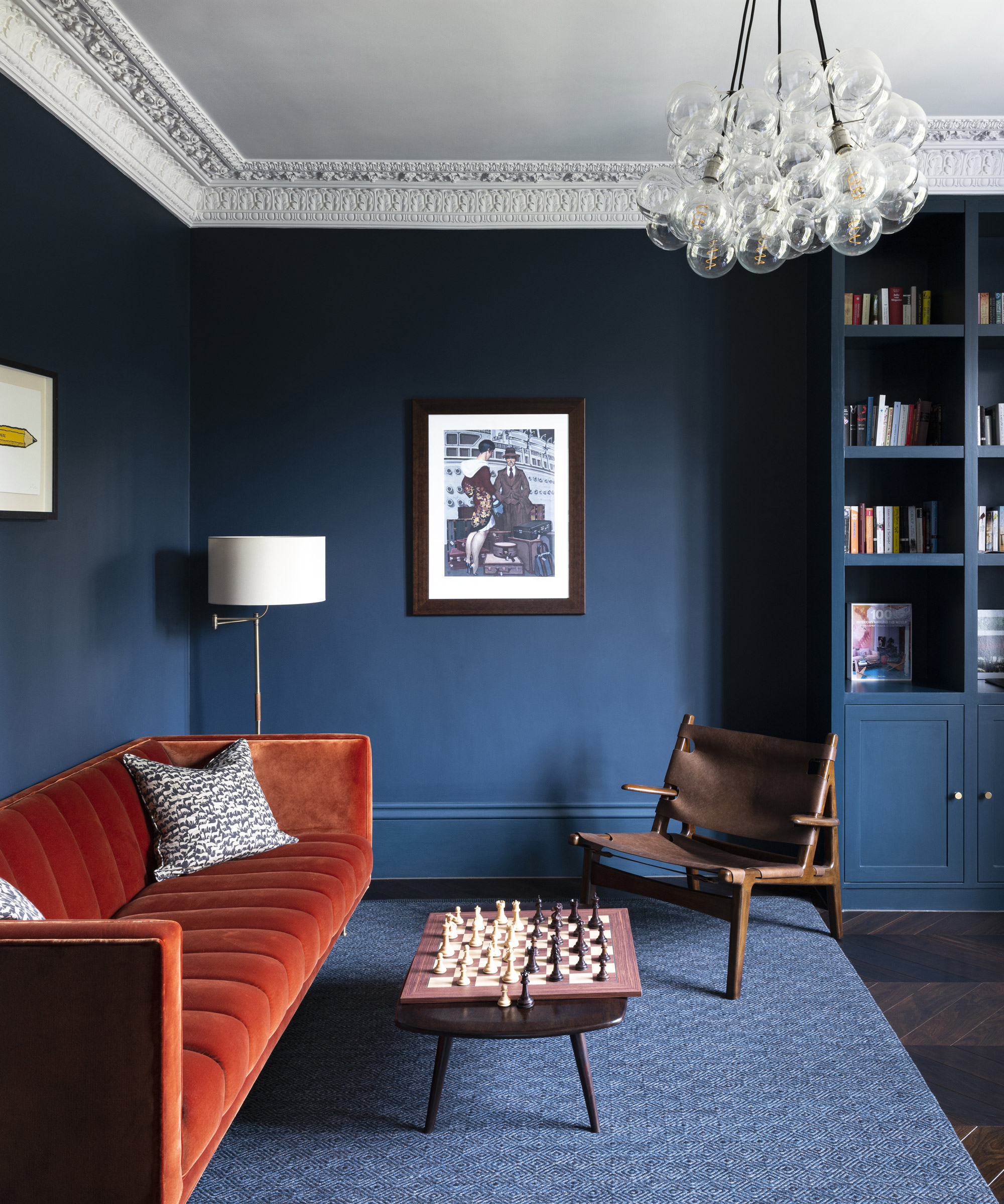
The Fleure sofa, Stuart Scott; covered in Aura 08, Lizzo. Walls in Hague Blue, Farrow & Ball
Before she had children, Viviane worked in fashion and she has a keen eye for design. ‘With this house, I was ready to be braver with colour,’ she says.
Here in the study, a sofa in orange velvet pops out against the deep blue walls. Joinery and skirting boards were painted the same hue for added impact.
‘Our years spent in the UK inspired us to give the schemes a very British feel, but we also wanted to introduce elements from southern climates – so that you might just think you were on holiday all year round.’
Master bedroom
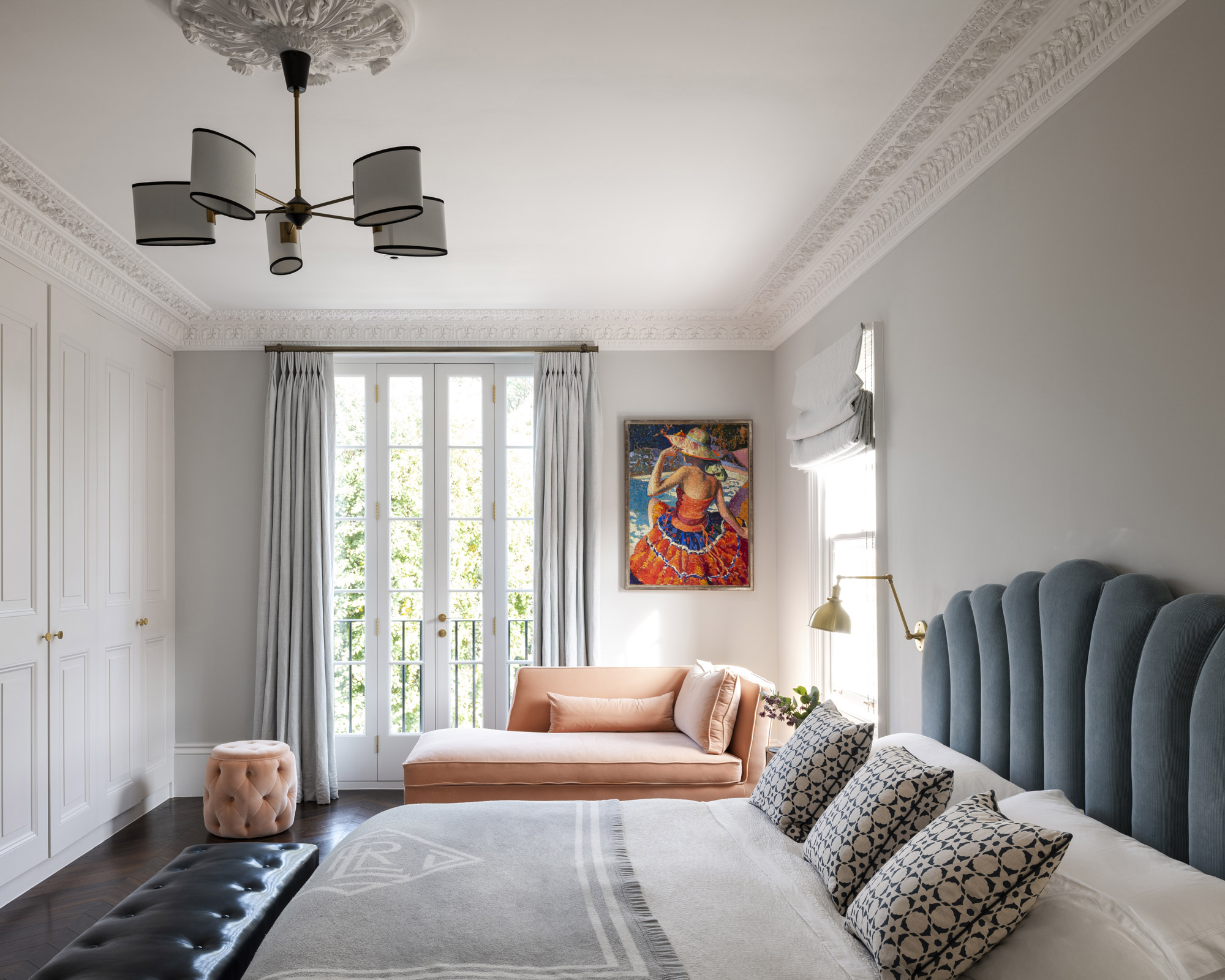
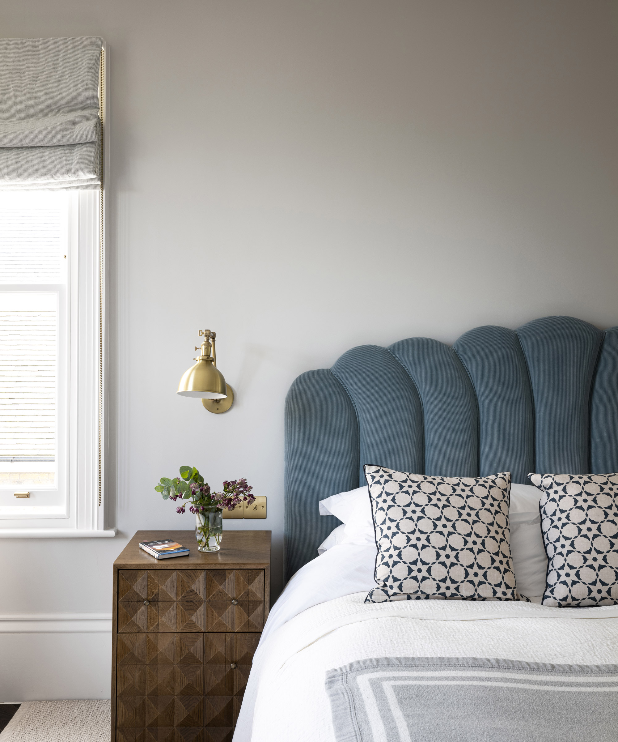
Manette bed; Dawbarn chandelier, both Soho Home. Headboard in Saranac Cord, Lee Jofa. Cushions in Flower Stencil in Midnight/ Champignon, Vanderhurd. Princeton sconces, Schoolhouse.
The second floor houses the couple’s master suite and study while the attic was developed to create sleeping quarters for the boys. ‘Effectively, the children got two levels and we got two – so that’s fair,’ says Viviane, laughing.
Of the master bedroom, Viviane says: ‘We wanted a Hamptons vibe.'
The master bathroom
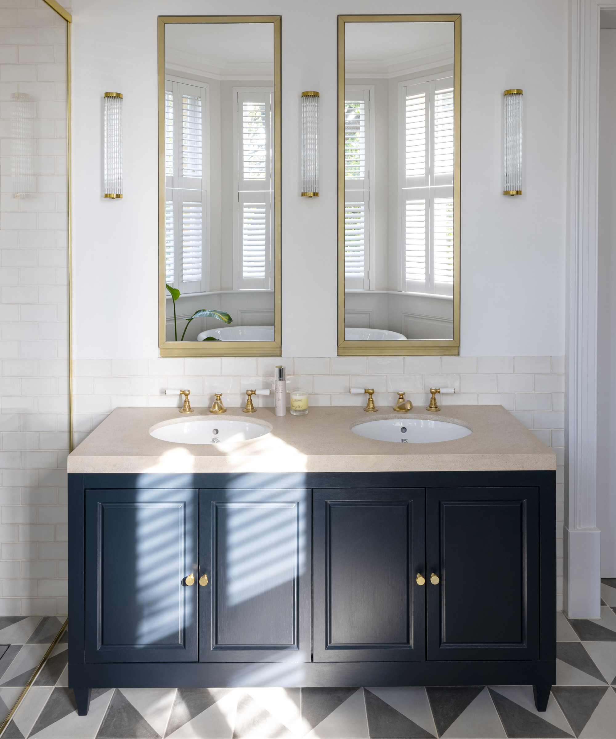
Bespoke cabinet in Railings, Farrow & Ball. Black Alalpardo tiles, Bert & May.
‘We were very much inspired by our travels,’ says Viviane, offering as an example the master bathroom floor, which takes its cue from Soho Beach House in Miami.
‘It’s great to start the day in a fun, cheerful space,' she adds.
The children's bedrooms
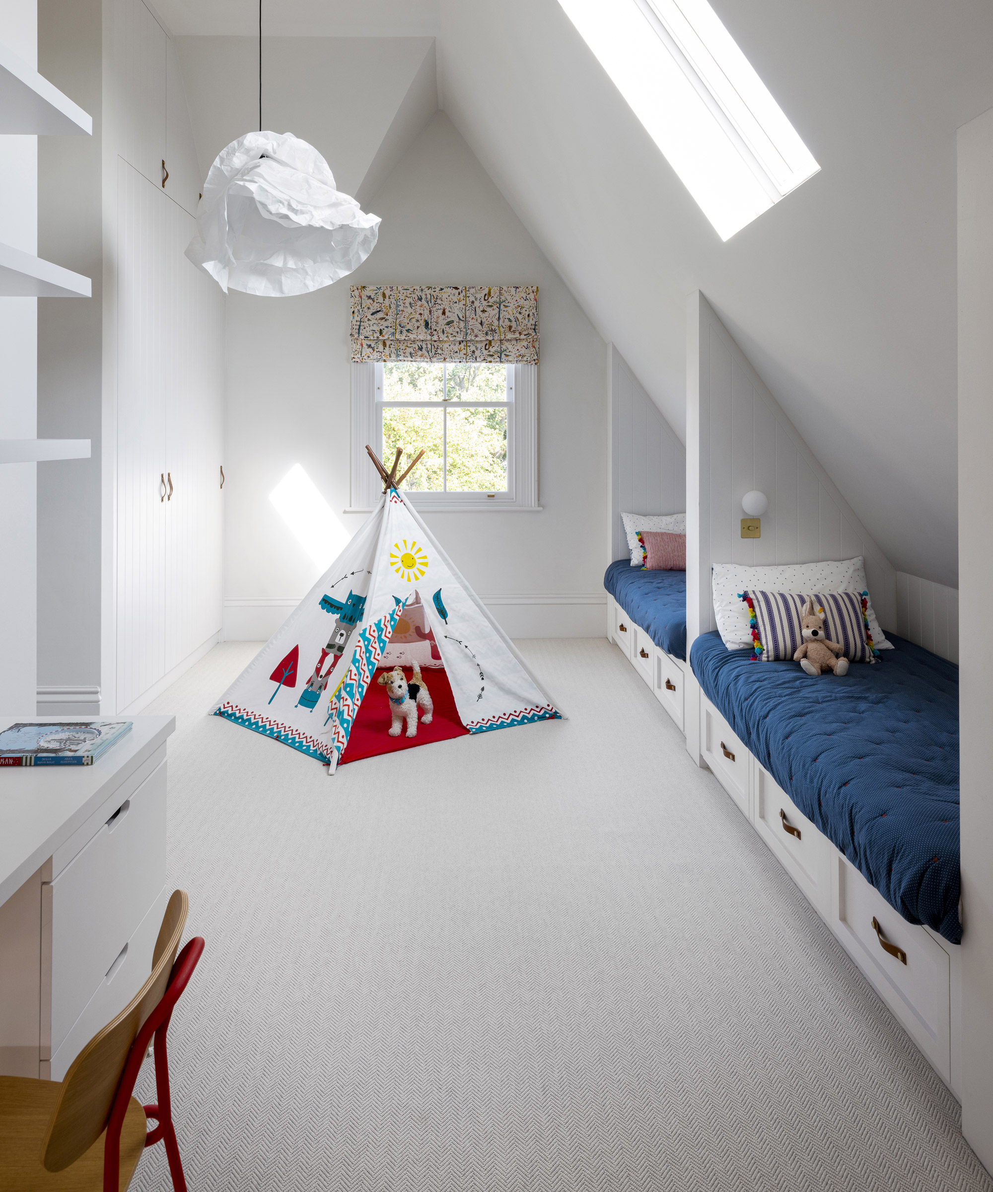
Blind in Forest in Spring, Virginia White. Cloud pendant light, Nedgis. Payson striped cushion, Wicklewood.
The largest of the children’s rooms has three beds built into niches so that the boys can sleep in the same room if they wish to.
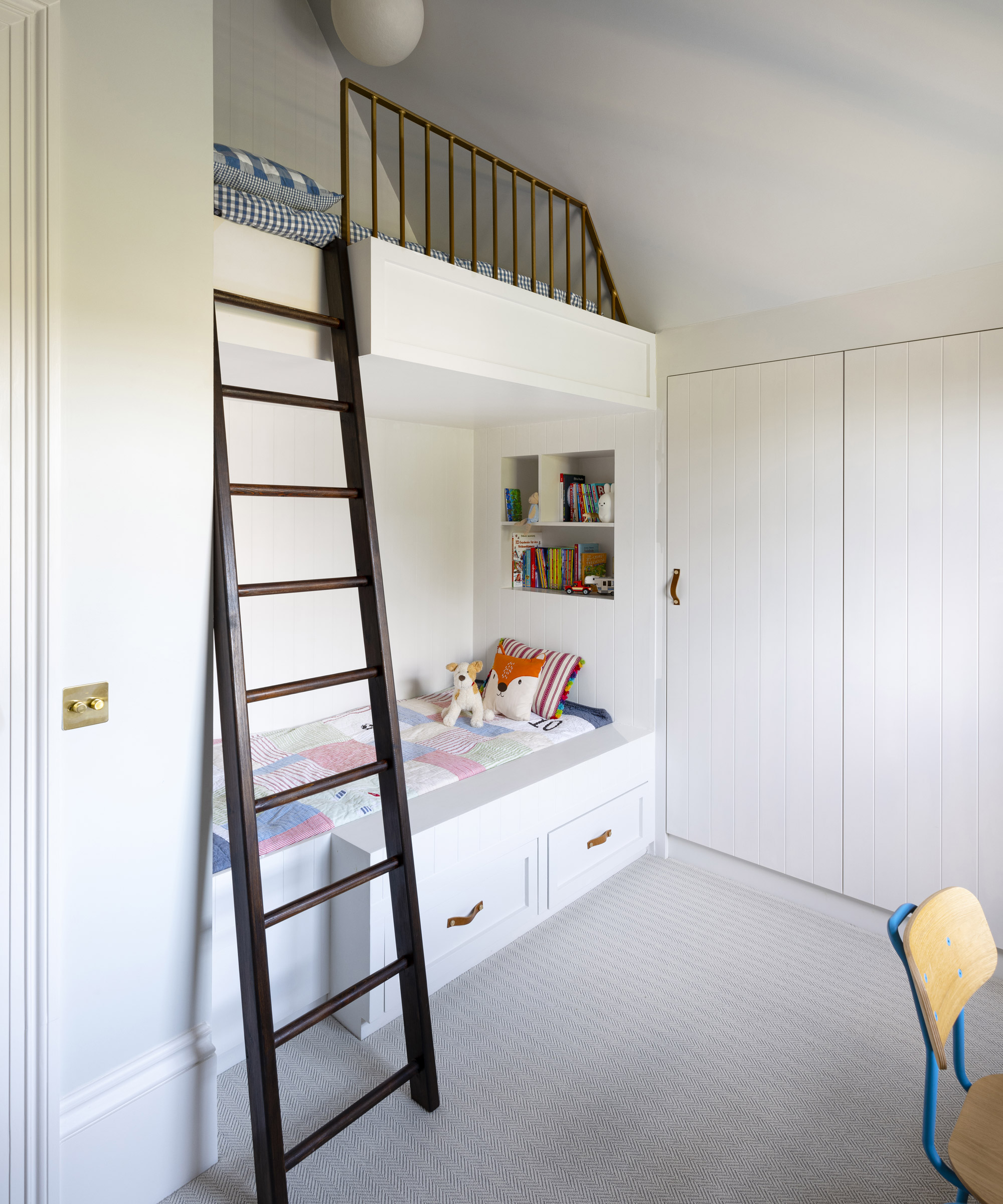
Thor leather handles, Dowsing & Reynolds. Hester chair, Habitat. Frosted Peaks wool carpet, Crucial Trading.
This streamlined space has a fresh Scandi aesthetic and features fun touches such as the built-in bunk bed tucked under the eaves.
The bathroom
In the bathroom, teal wall tiles were laid in a herringbone pattern to add a dynamic flourish.
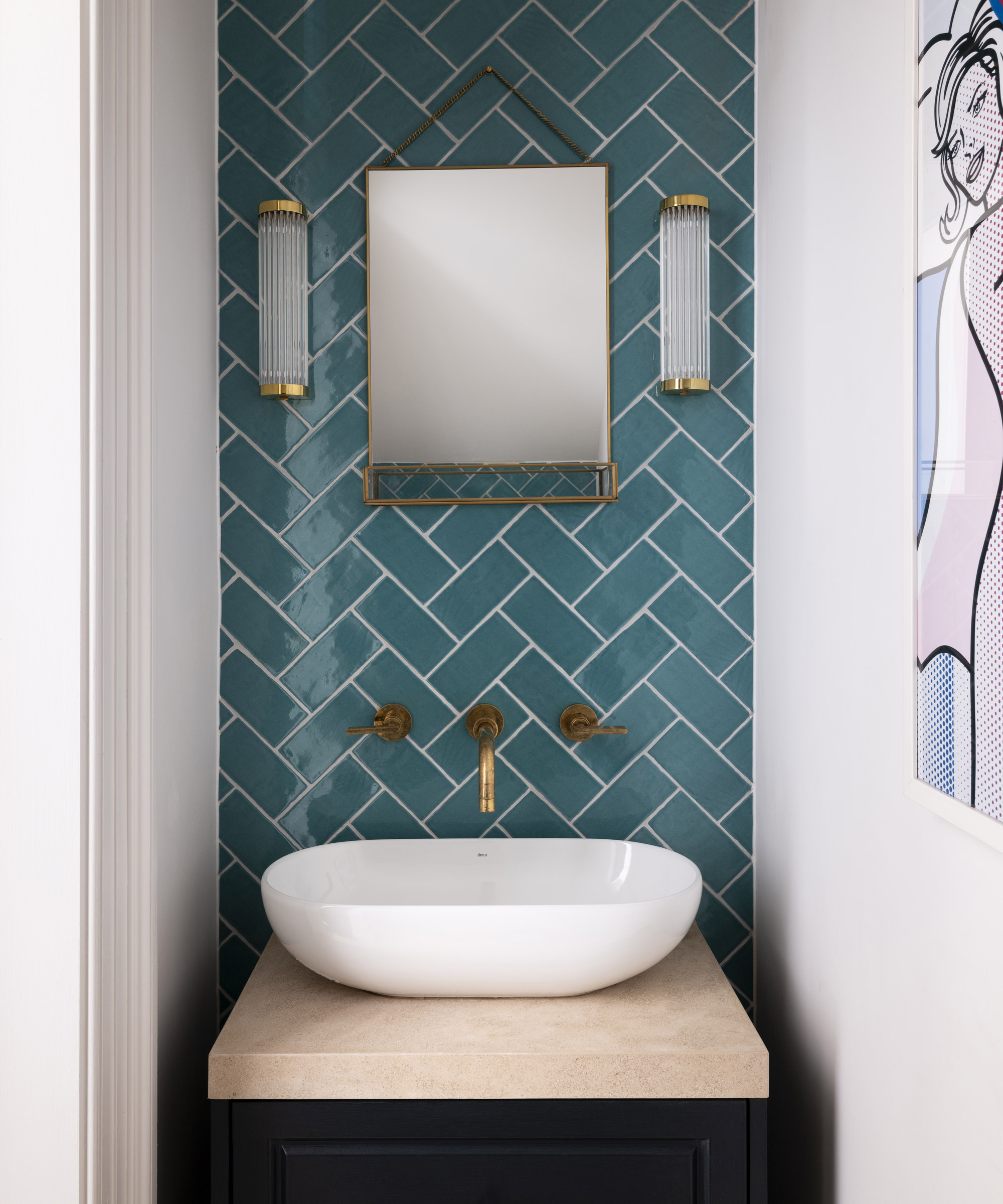
Carnival Laredo tiles, Fired Earth. Salvador basin, Aquaplus Solutions. Pillar wall lights in polished brass, Original BTC
The process of creating this home proved so enjoyable that it has heralded a career change for Viviane.
‘This project was a real eye-opener and I found it such fun that it inspired me to enrol on an interior design course,’ she reveals. ‘It’s always lovely to come across something new that really excites you. I feel ready to start a new chapter.'
Sign up to the Homes & Gardens newsletter
Design expertise in your inbox – from inspiring decorating ideas and beautiful celebrity homes to practical gardening advice and shopping round-ups.

Jennifer is the Digital Editor at Homes & Gardens. Having worked in the interiors industry for several years in both the US and UK, spanning many publications, she now hones her digital prowess on the 'best interiors website' in the world. Multi-skilled, Jennifer has worked in PR and marketing and occasionally dabbles in the social media, commercial, and the e-commerce space. Over the years, she has written about every area of the home, from compiling houses designed by some of the best interior designers in the world to sourcing celebrity homes, reviewing appliances, and even writing a few news stories or two.
-
 Gwyneth Paltrow's quiet luxury kitchen is so beautiful, we almost overlooked her ultra-smart cabinets – they make the use of 'every inch' of storage space
The Goop founder makes use of dead space in her kitchen with customized cabinetry that reaches to the ceiling, providing ample storage
By Hannah Ziegler
-
 Martha Stewart's intelligent cabinets 'take every inch into consideration' – their 'visually light' style will solve your small kitchen storage problems
'Every kitchen can be beautiful and functional, no matter what the size': 9 years since sharing her clever storage, Martha's cabinets are just as beautiful
By Megan Slack