Design house: a small, industrial-style condo has been lovingly updated with color and pattern
Statement wallpaper, wood finishes and touches of color sing out in this family home

This bijou property, located in the SOMA neighborhood right next to Oracle Park, home of the San Francisco Giants, comes in at a relatively tiny 1612 square foot. But what it lacks in floor space, it more than makes up for in style.
Built in 2012, this condo has an industrial feel, with concrete adorning the ceilings and walls throughout the home. This industrial-style interior remains an on-trend look: it adds depth to a scheme, complements period buildings such as lofts and warehouses as well as new-builds and adds an updated edge to a country style too. But it can create a cold look if used over-zealously, so it was up to interior designer Christine Lin at Form + Field to ensure that this family home remained calm and serene yet characterful.
Led by Christine, Form + Field creates original interiors that honor the identity, history, and surroundings of our clients. With an emphasis on art, architecture, and eclectic modernism, the firm cultivates every project as a partnership.
We speak to interior design Christine Lin about the design project.
- See some of the world's best homes – beautiful properties from around the globe
Our clients, a husband, wife, and their 10-month-old baby wanted a cohesive design and a finished home that they could be proud to show off.
The family had spent the past few years not living in a fully settled state, and wanted a bright and cozy home, despite living in new-build condo with a dark interior.
Living room
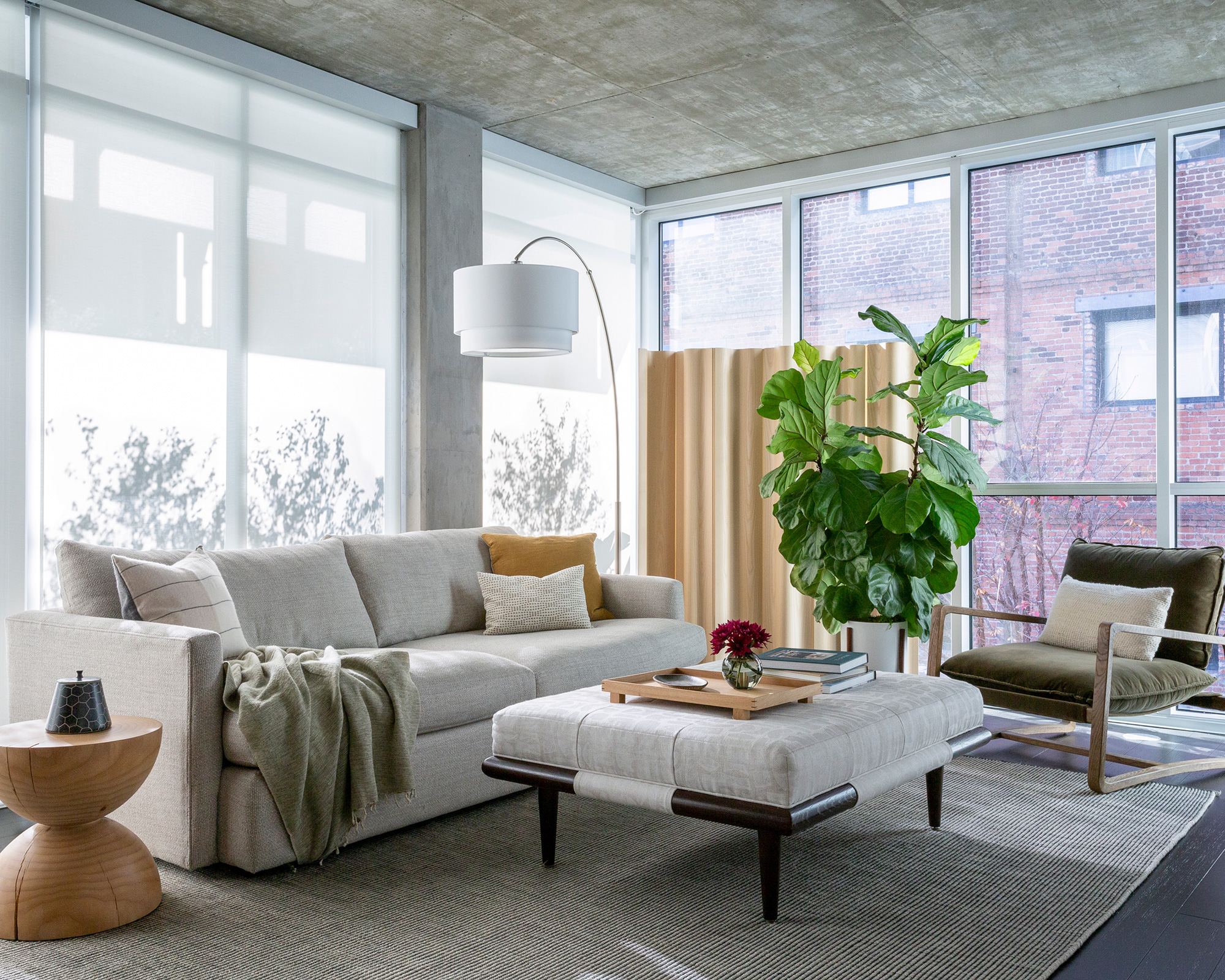
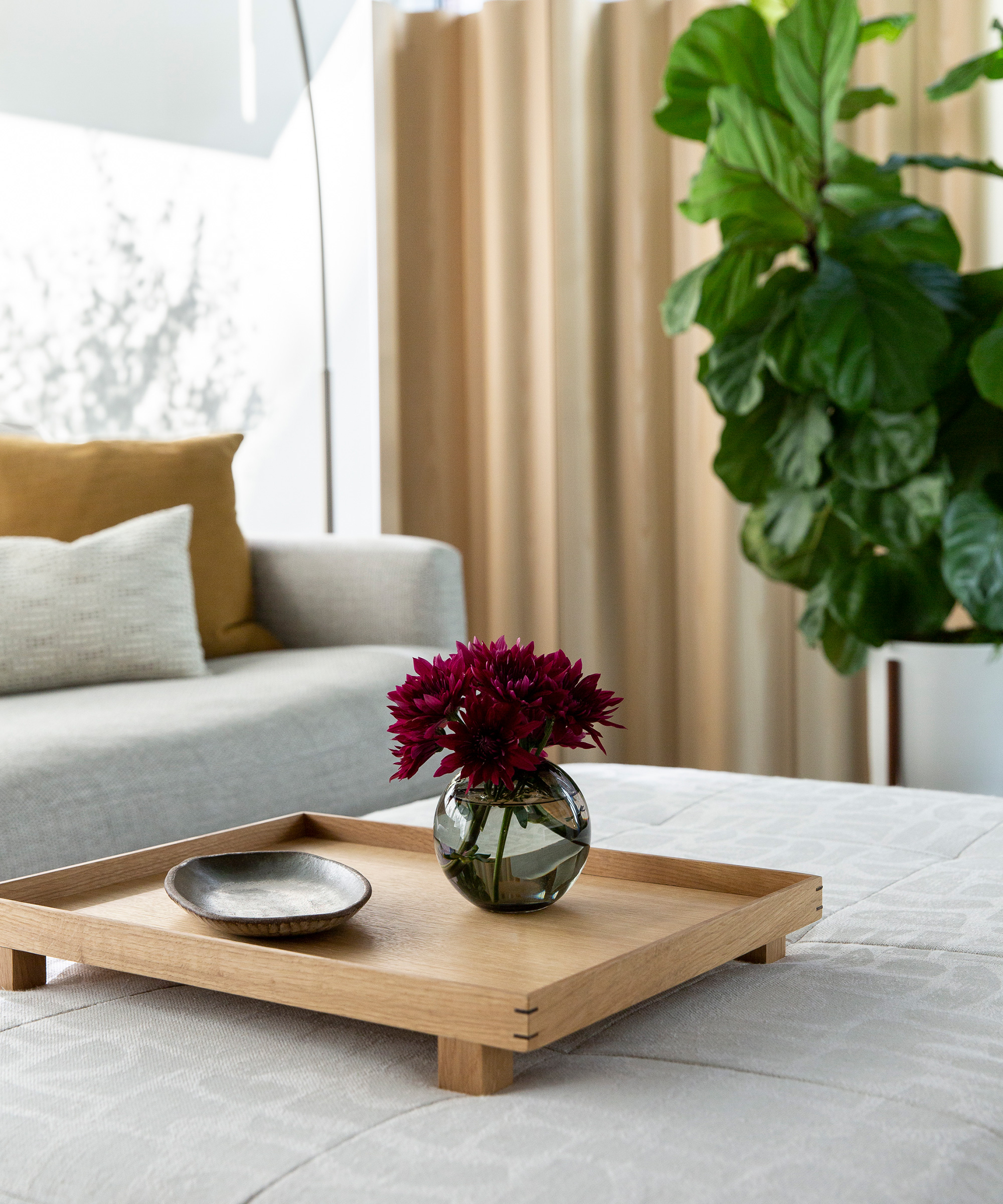
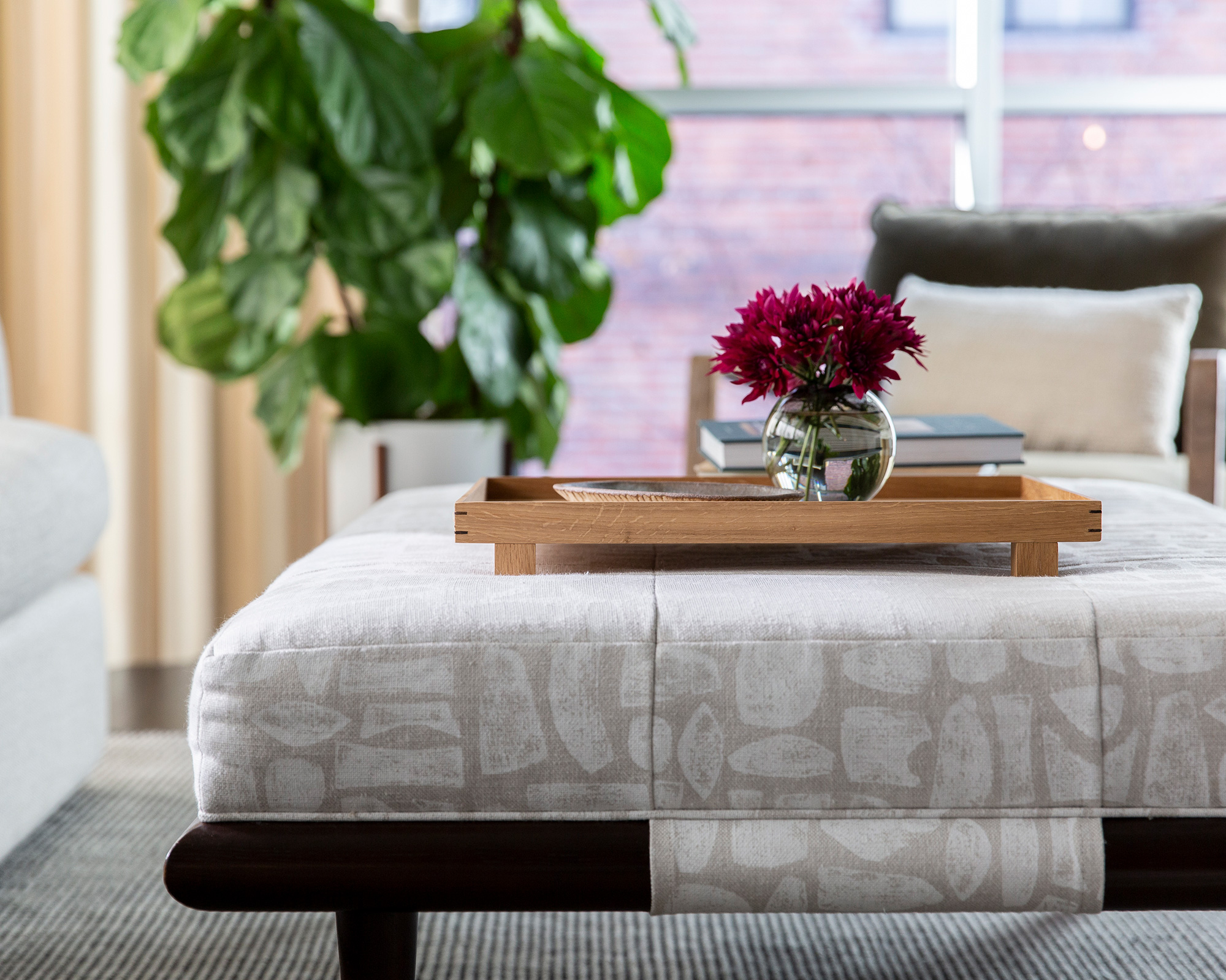
The fundamental aim in the living room was to create a cozy space within a glass and concrete box.
To warm up the space we introduced a mix of wood elements, upholstered surfaces and plenty of luxe layers, thus creating a juxtaposition that works wonderfully.
Dining room
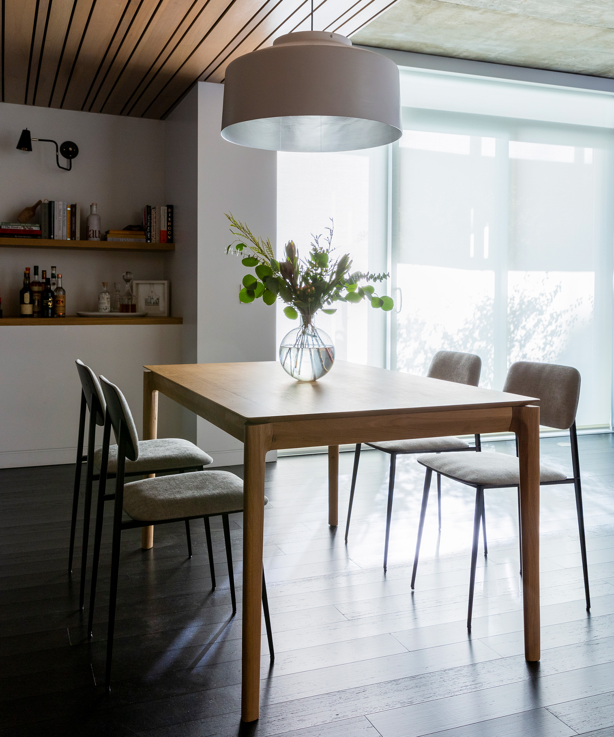
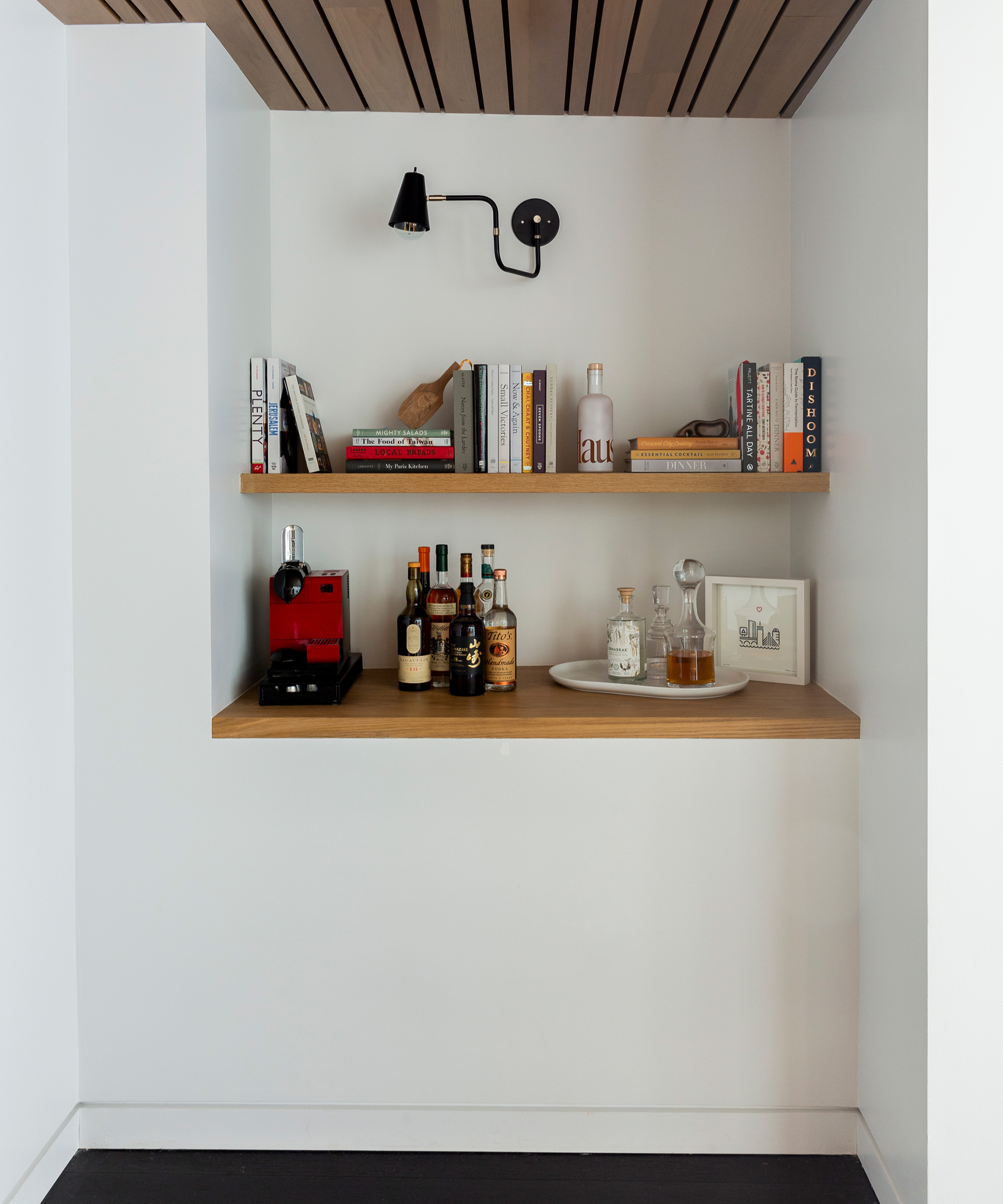
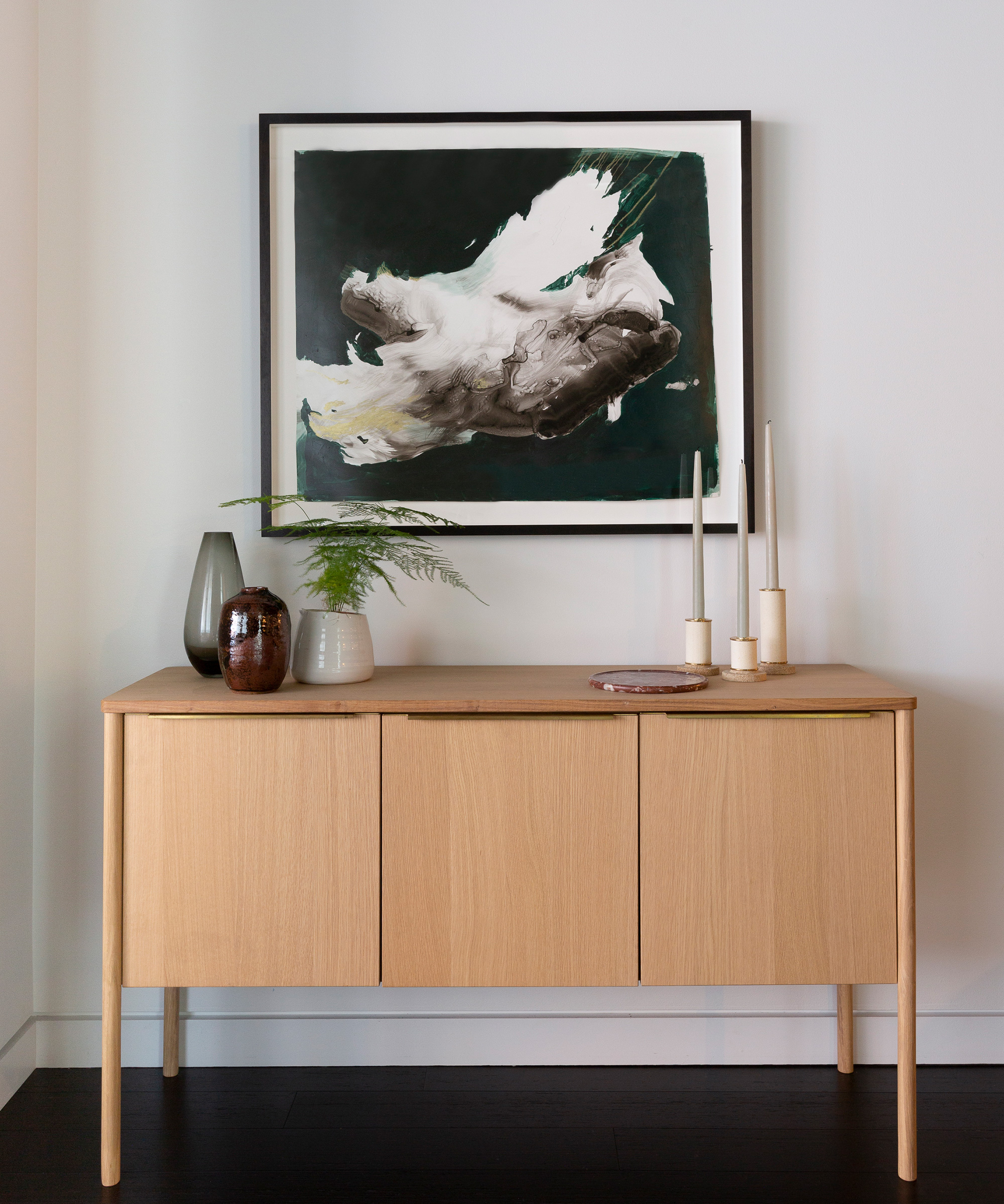
Here, we wanted to add natural beauty with wood finishes. Out of fashion for a while, wood is now enjoying a bit of a revival. Wood introduces a sense of warmth and character into a scheme and works equally well in modern and traditional homes.
For subtle drama, we replaced the light fixture with a simple oversized pendant. It is the perfect addition to a simple scheme.
Main bedroom
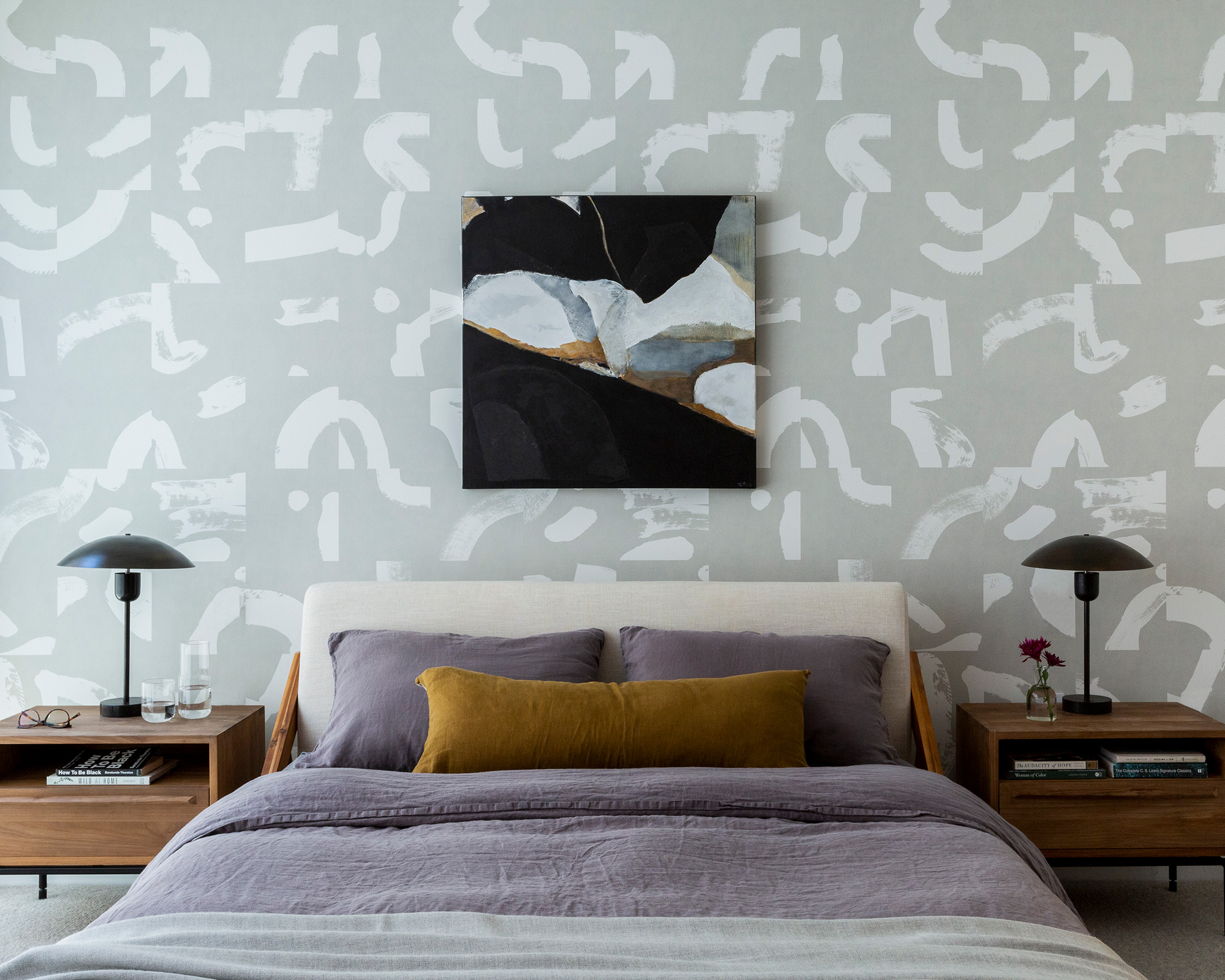
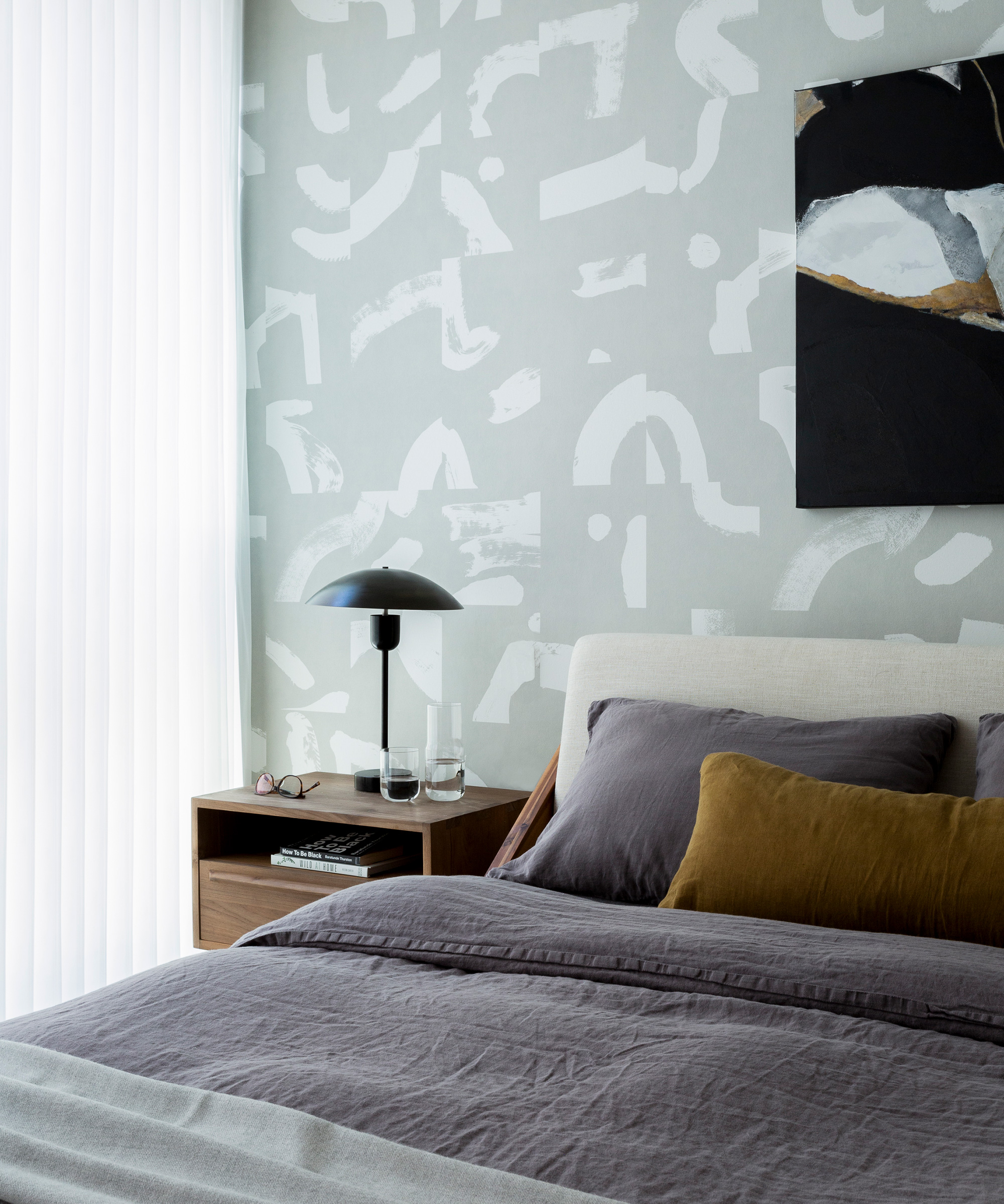
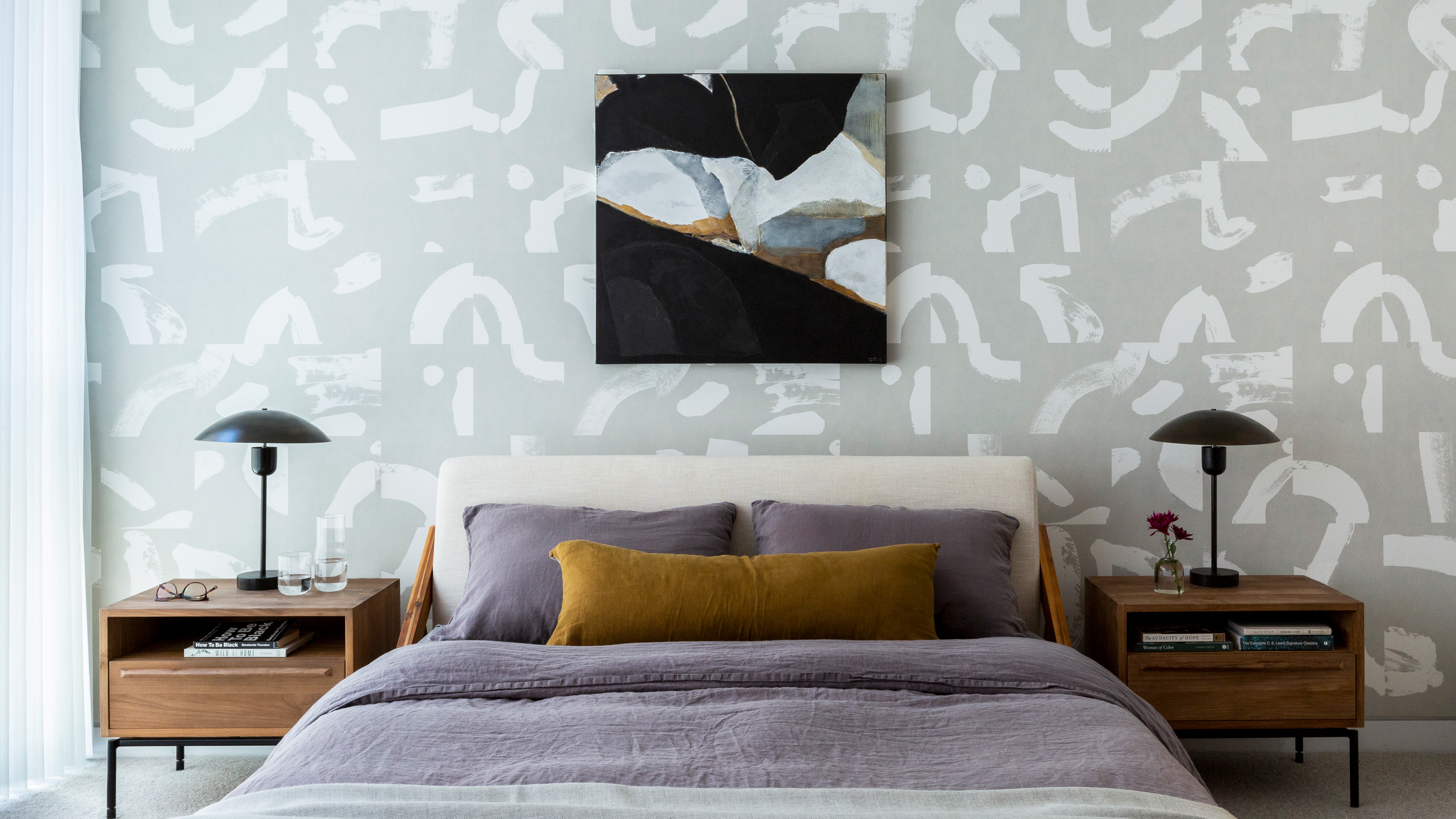
A wallpaper makeover was just what this bedroom needed for a simple yet striking transformation.
It’s important to decide on what look you want to achieve; whether it’s a chic hotel-inspired boudoir or a natural, peaceful retreat, picking the right pattern and color is key for a successful revamp.
Here, we used the homeowner's existing bed and chose clean lines for the bedside tables, while the wallpaper provides a calm canvas for bold artwork and bed linen.
Nursery
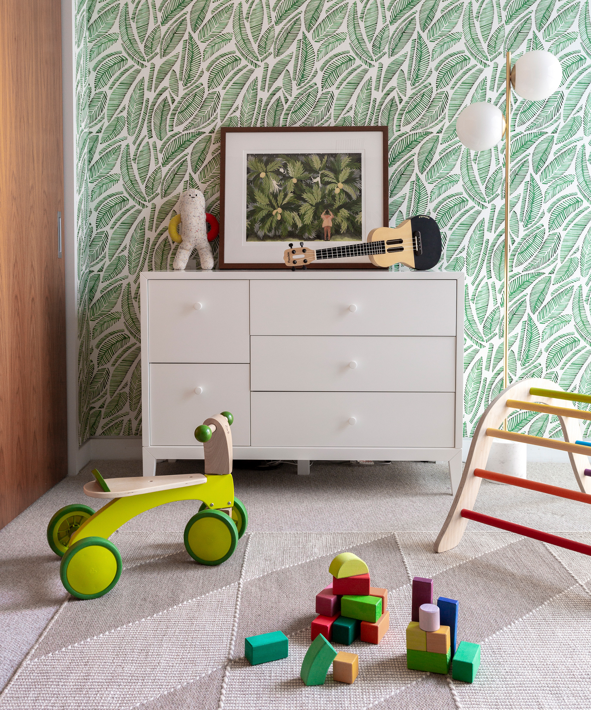
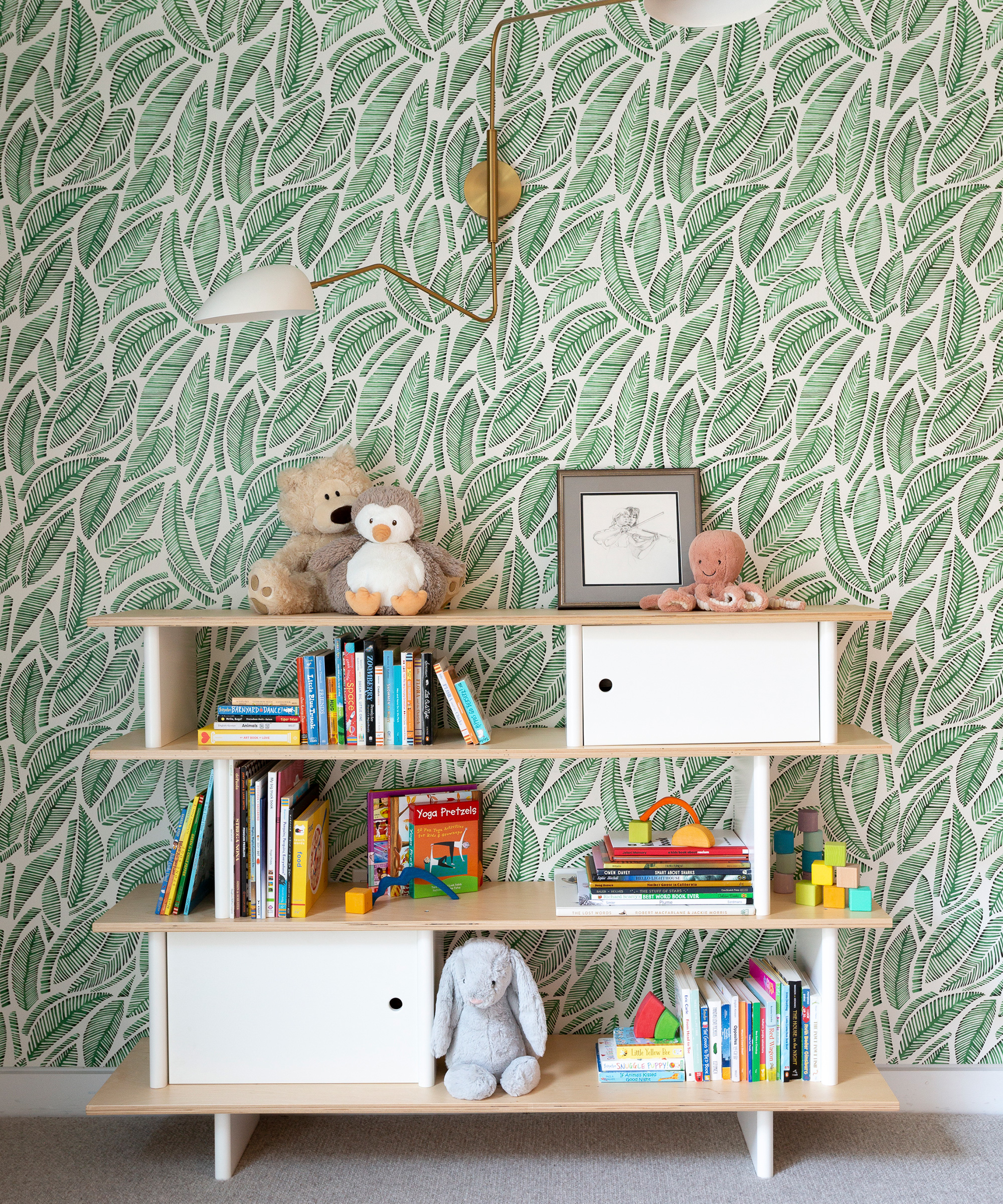
Designing a nursery that will suit your child as they grow, will save you both time and money in the long run, but that doesn't mean it shouldn't be fun, or spark creativity.
In this space, we wanted to evoke a bright and cheerful aesthetic, so it was essential for us to get this right.
Botanicals are back in a big way for this year, so we found an enduring style that we believe will be a timeless addition to this nursery.
Photography / Molly Haas
Interior design / Christine Lin / Form + Field
Sign up to the Homes & Gardens newsletter
Design expertise in your inbox – from inspiring decorating ideas and beautiful celebrity homes to practical gardening advice and shopping round-ups.

Jennifer is the Digital Editor at Homes & Gardens. Having worked in the interiors industry for several years in both the US and UK, spanning many publications, she now hones her digital prowess on the 'best interiors website' in the world. Multi-skilled, Jennifer has worked in PR and marketing and occasionally dabbles in the social media, commercial, and the e-commerce space. Over the years, she has written about every area of the home, from compiling houses designed by some of the best interior designers in the world to sourcing celebrity homes, reviewing appliances, and even writing a few news stories or two.
-
 Hailey Bieber's curvaceous toaster is an Italian design staple (with roots in the 1950s) – it blends retro style with modern capabilities
This toaster has stood on the countertops of 'It girls' since the '50s, and Hailey Bieber has just resurged the trend – you can follow suit for $250
By Megan Slack
-
 5 fast-growing tiny flowers – expert recommendations to fill your pots and borders with color in record time
These fast-growing tiny flowers prove that miniature can also be marvelous
By Thomas Rutter