Design house: A stylish, bright and modern home – in the heart of Silicon Valley
Tailored to perfectly fit its owner, this diminutive home offers a masterclass in sensitive spatial design

The glory of Tudor-style is reflected in this new-build home with its sleek and stylish monochrome scheme.
At first glance, this whitewashed, wood-clad house with its steep gable roof could be mistaken for one of the many original late 15th-century homes that this property draws its inspiration from.
In fact, it was built as recently as the 21st-century, by architects Hyland Design Group and builder Terry Babb – whom delighted in reinventing this period aesthetic in the heart of Silicon Valley.
To turn their new-build home into classically-styled yet contemporary marvel, the owners hired in interior design extraordinaire Emily of Emily Kates Design to carry out the renovation.
Emily Kates Design is a residential design studio focused on polished, yet approachable custom homes, with a nod to fresh, classic California style.
From expansive Hillsborough estates, and classic San Francisco homes, to chic bungalows dotting Silicon Valley, EKD’s end goal is to create spaces that are not only a visual treat for the eye, but also functional and uniquely stylish reflections of those who inhabit them.
We speak to Emily about the design project.
- See some of the world's best homes – beautiful properties from around the globe
The clients and their two teen-aged children are long-time residents of the home, and while they loved the town and location, they were ready for a fresh start on their existing property.
They are a family that exude warmth, and they have great appreciation for luxury goods, art and hints of color.
Over the past few years, I have seen a return to more classical language in interior design and architecture. People seem to enjoy the familiarity and longevity of traditional style, but are still seeking ways to put their own stamp on it, and keep it current.
The clients’ vision for the architecture of this home was a perfect example. The intent was to connote a light-touch Tudor feel, but in fresh and carefully edited way.
Architect Natalie Hyland of Hyland Design Group did an incredible job taking the classic architectural cues and articulating them in a contemporary manner.
We wanted to get the balance just right, so worked together to achieve this goal, all while being sympathetic to the surrounding area.
Entrance
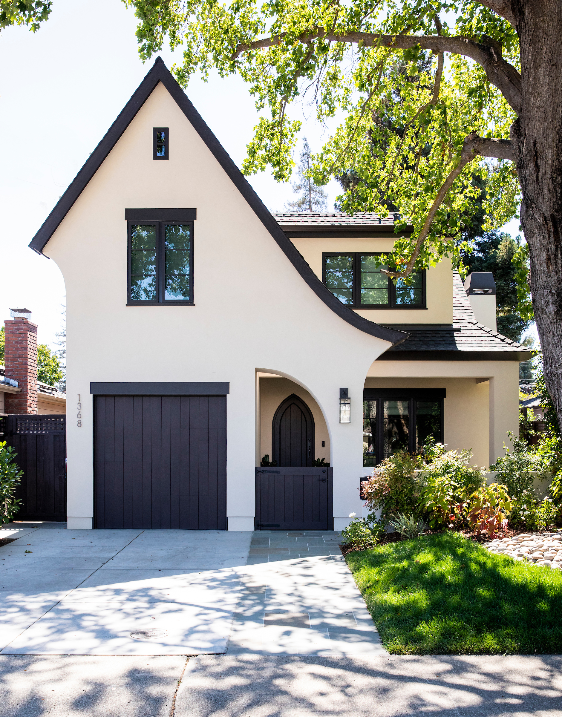
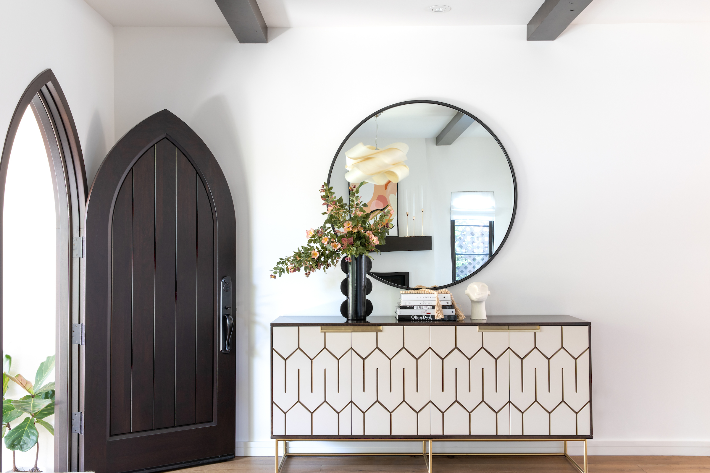
The coffee-bean colored Gothic door frame exudes curb appeal and character, while peek-a-boo windows in each roof peak adds an element of old-world charm. The idea was to suggest a classic style, without being too literal in the application.
Living room
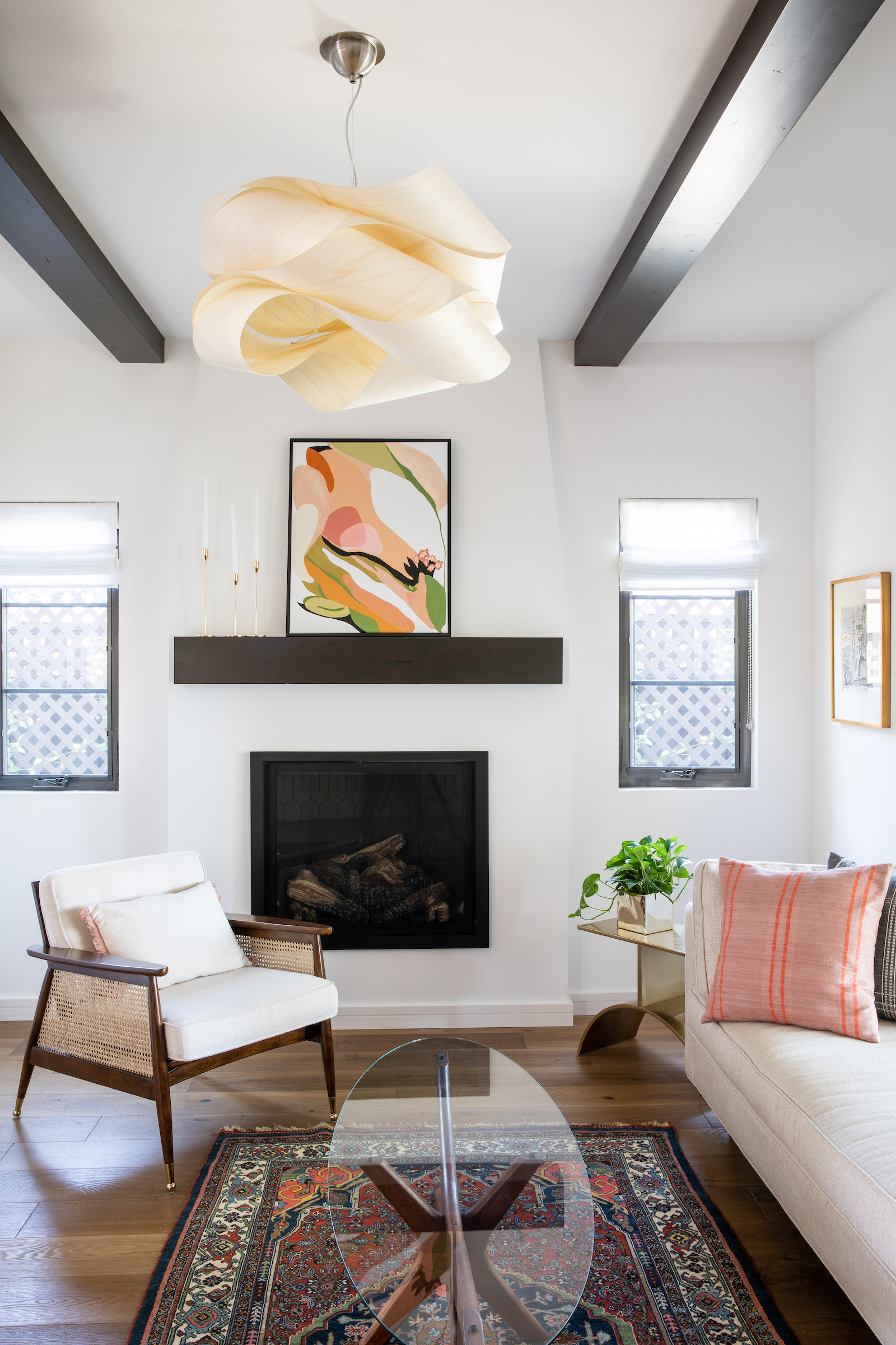
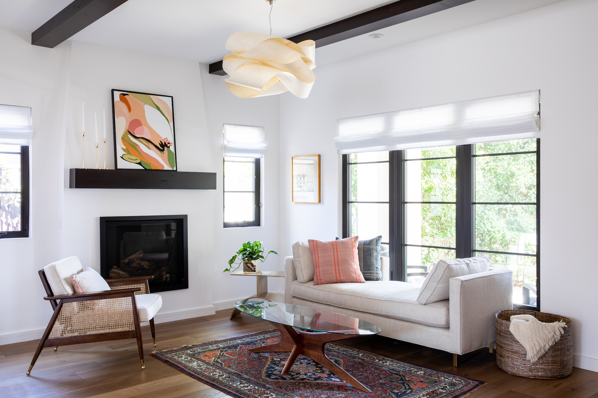
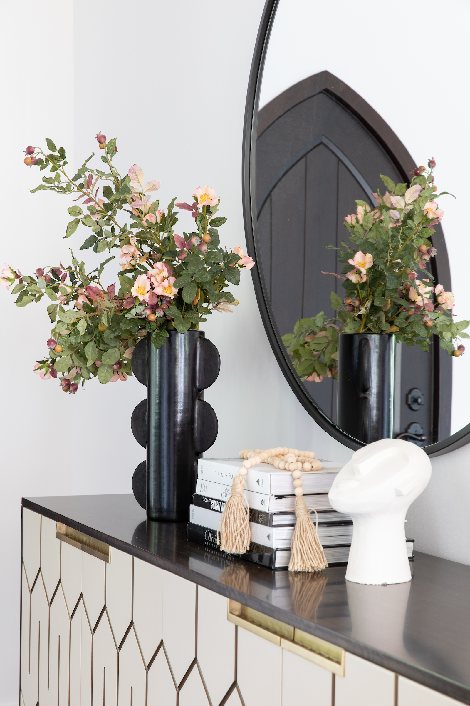
The front door opens into a stylish entry vignette with an oversized round dark bronze mirror above a brass and lacquered geometric credenza.
Directly opposite, is a bright and inviting sitting area which is grounded by a classic stucco fireplace and flanked by two wooden beams.
The space is fairly compact, so the idea was to keep it casual, clean and not too formal. For that reason, we opted for an open-back lounge versus a heavier traditional sofa.
Dining room
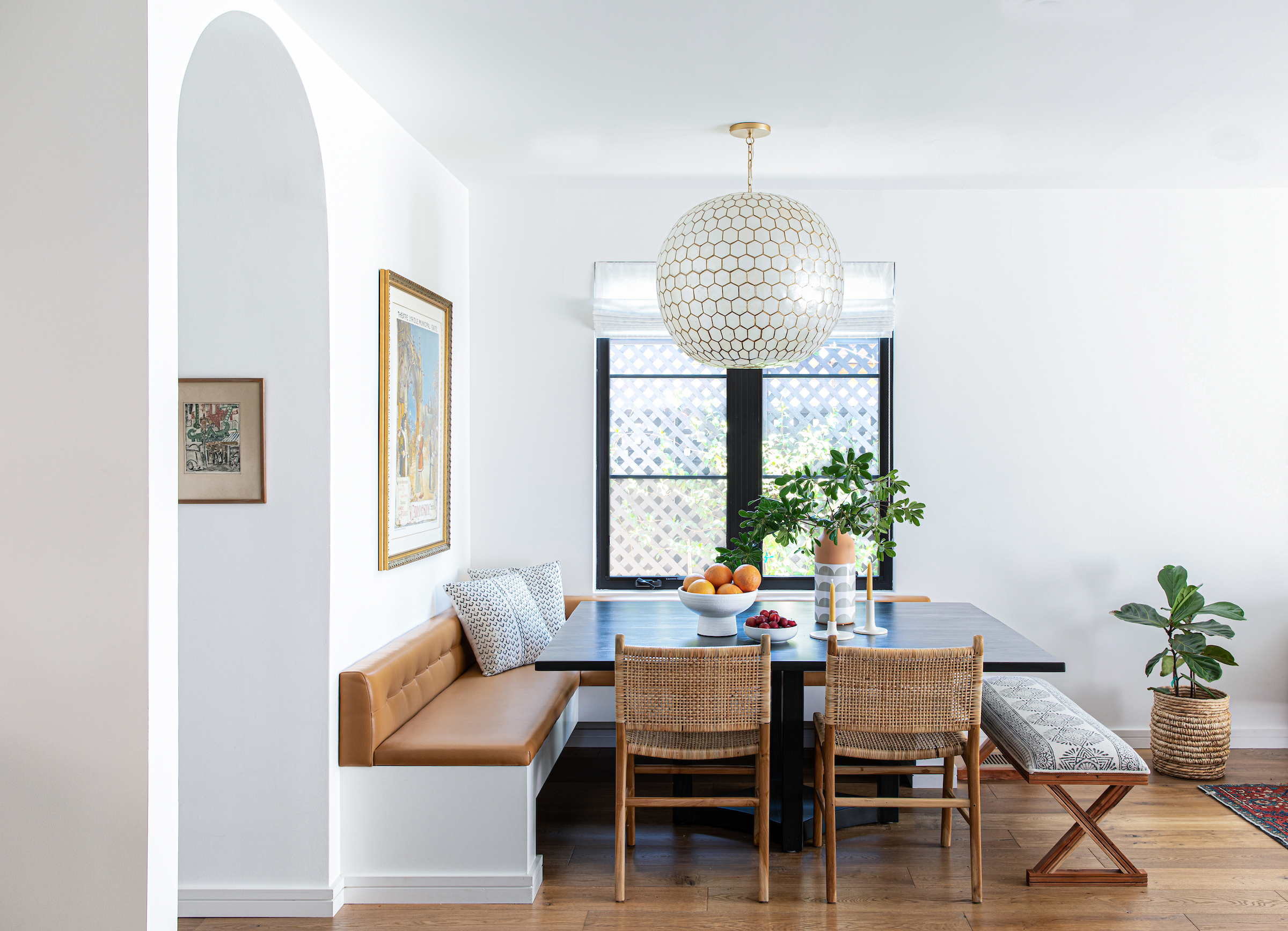
Given the more compact footprint of this home, I suggested that we forgo all walls between the living, family, dining area and kitchen in favor of something more open-plan and airy.
Our original plans included a traditional dining table set up, but it just didn't feel right to me in terms of design and functionality, both from a circulation and visual perspective.
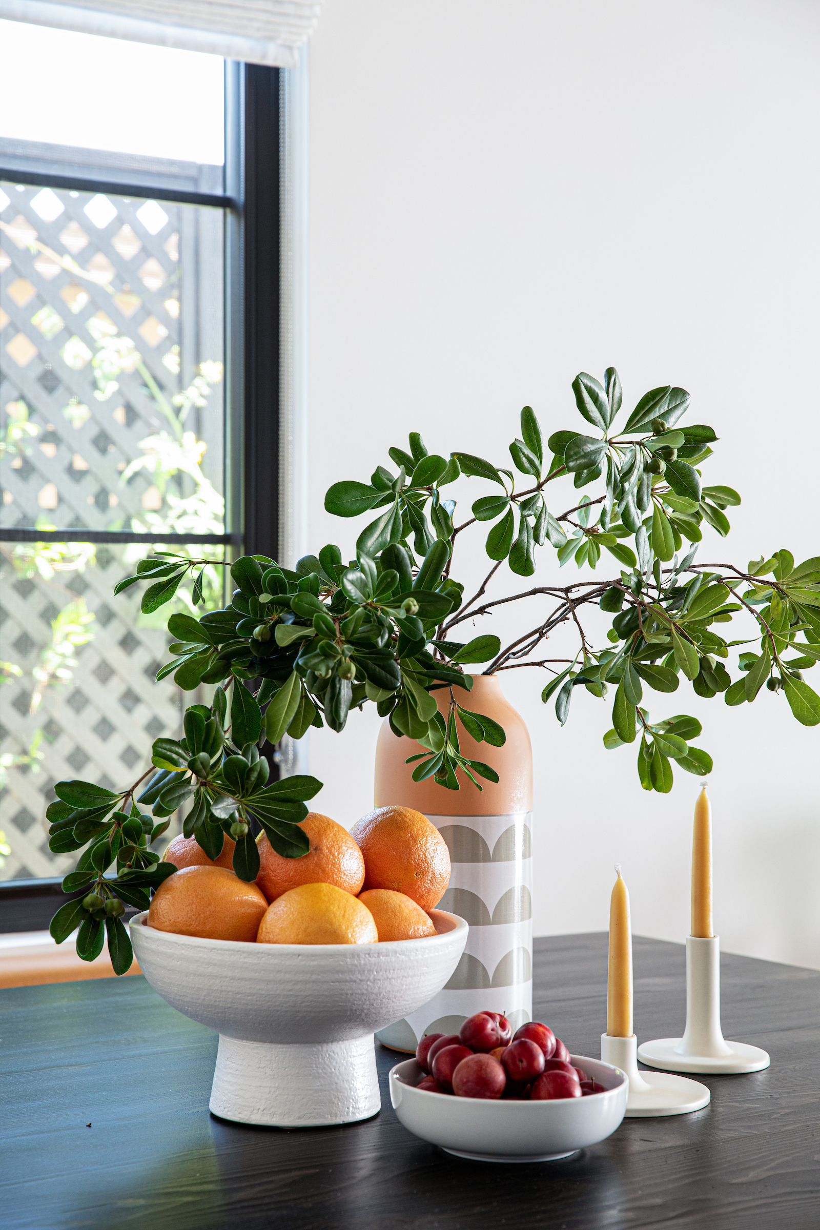
This home was heading towards more of a chic, relaxed vibe, and it seemed like a great opportunity to tuck it into a sunny corner with a tailored banquette.
Kitchen
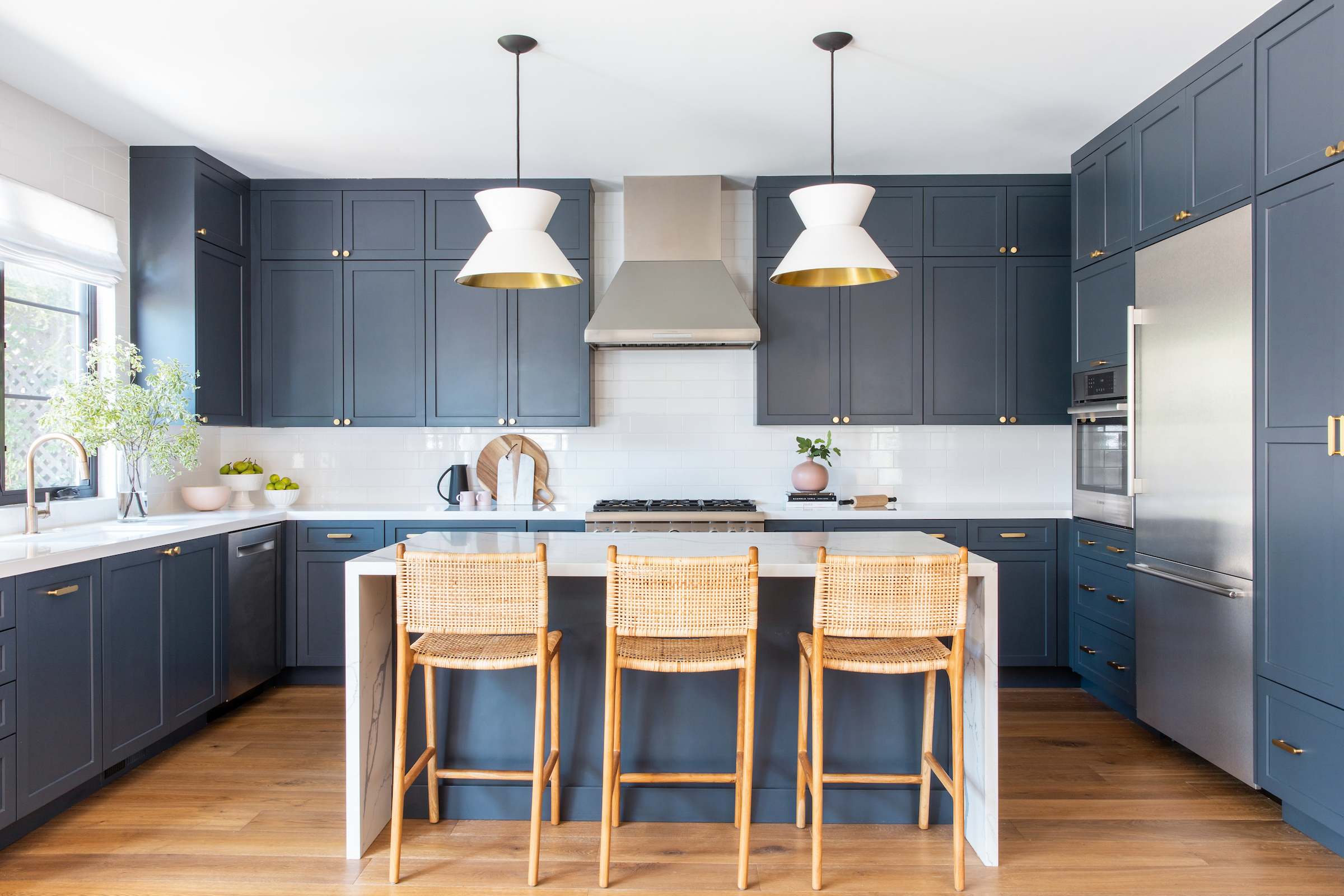
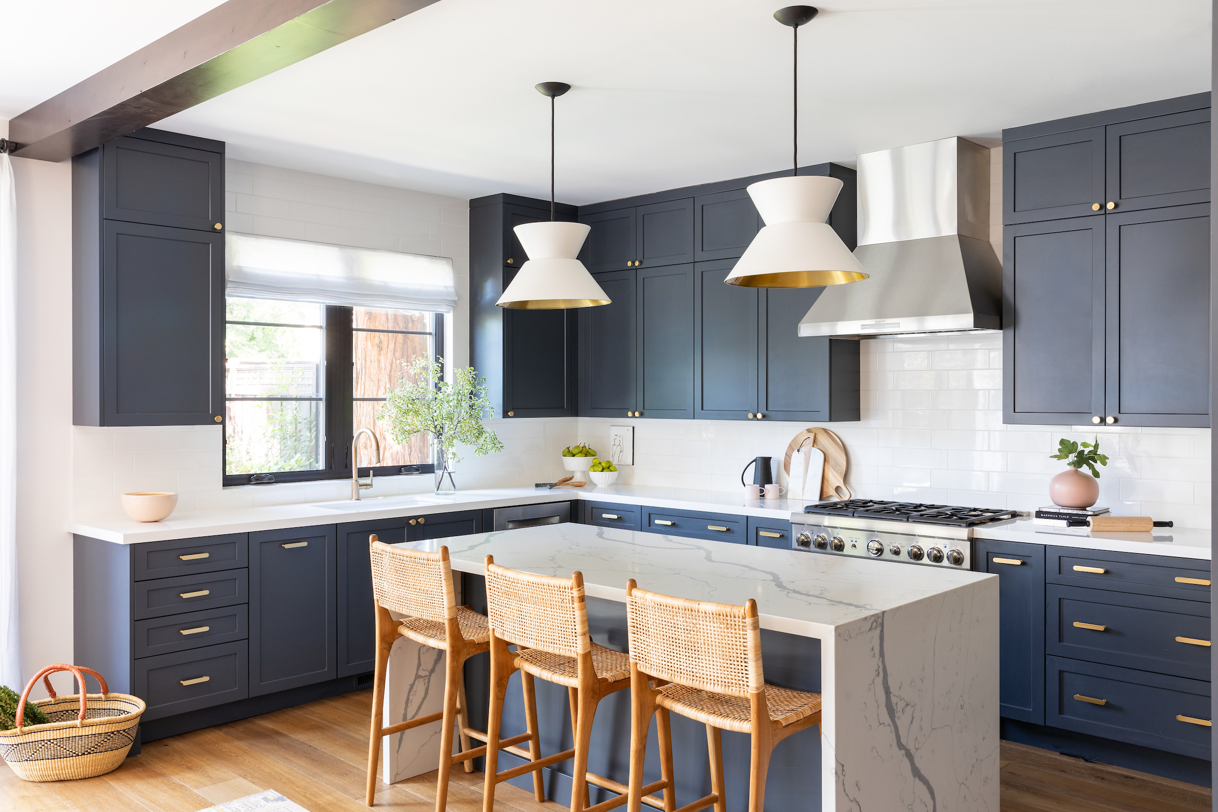
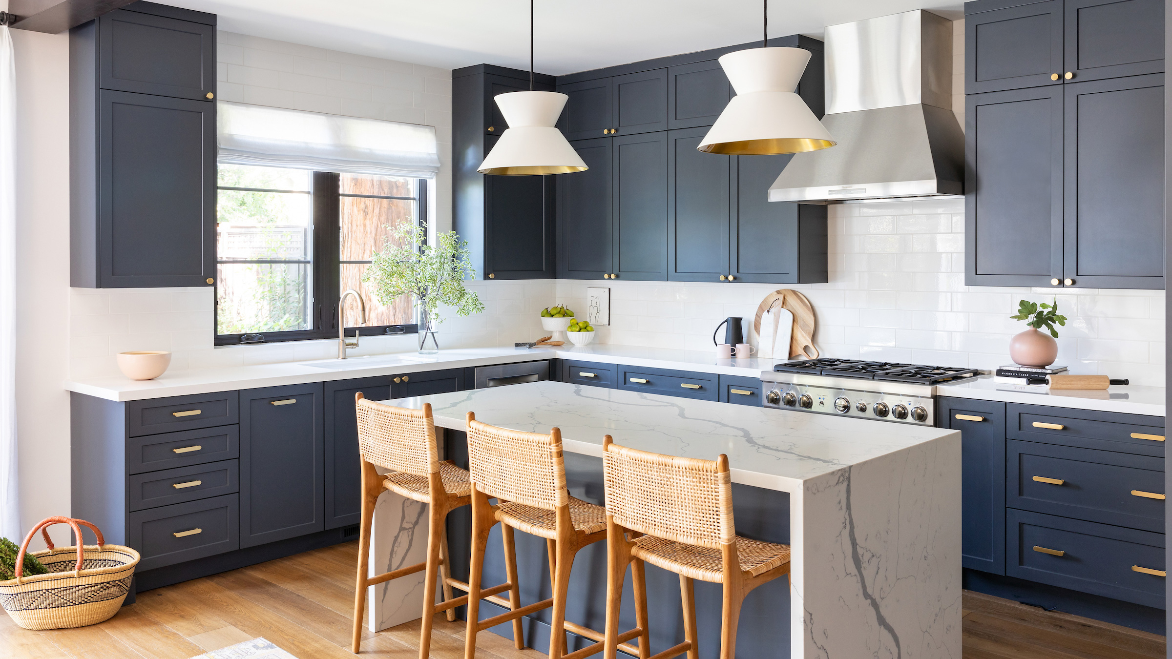
The kitchen sits diagonally from the dining space, so visual fluidity was key.
The rattan counter stools and light countertops helped to bridge the spaces seamlessly.
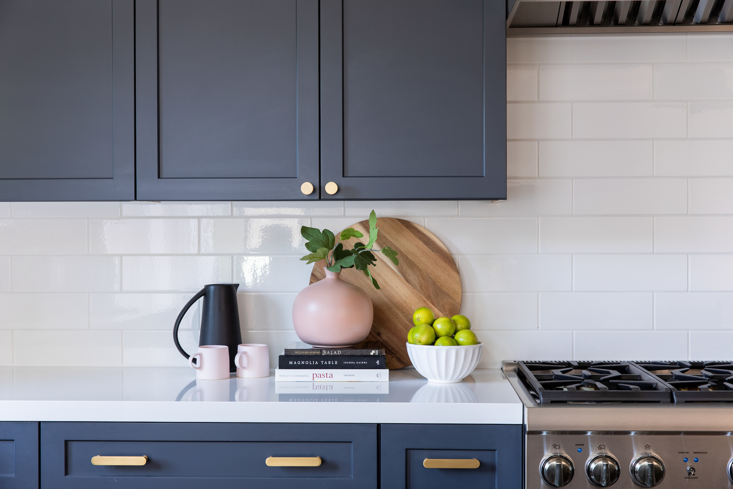
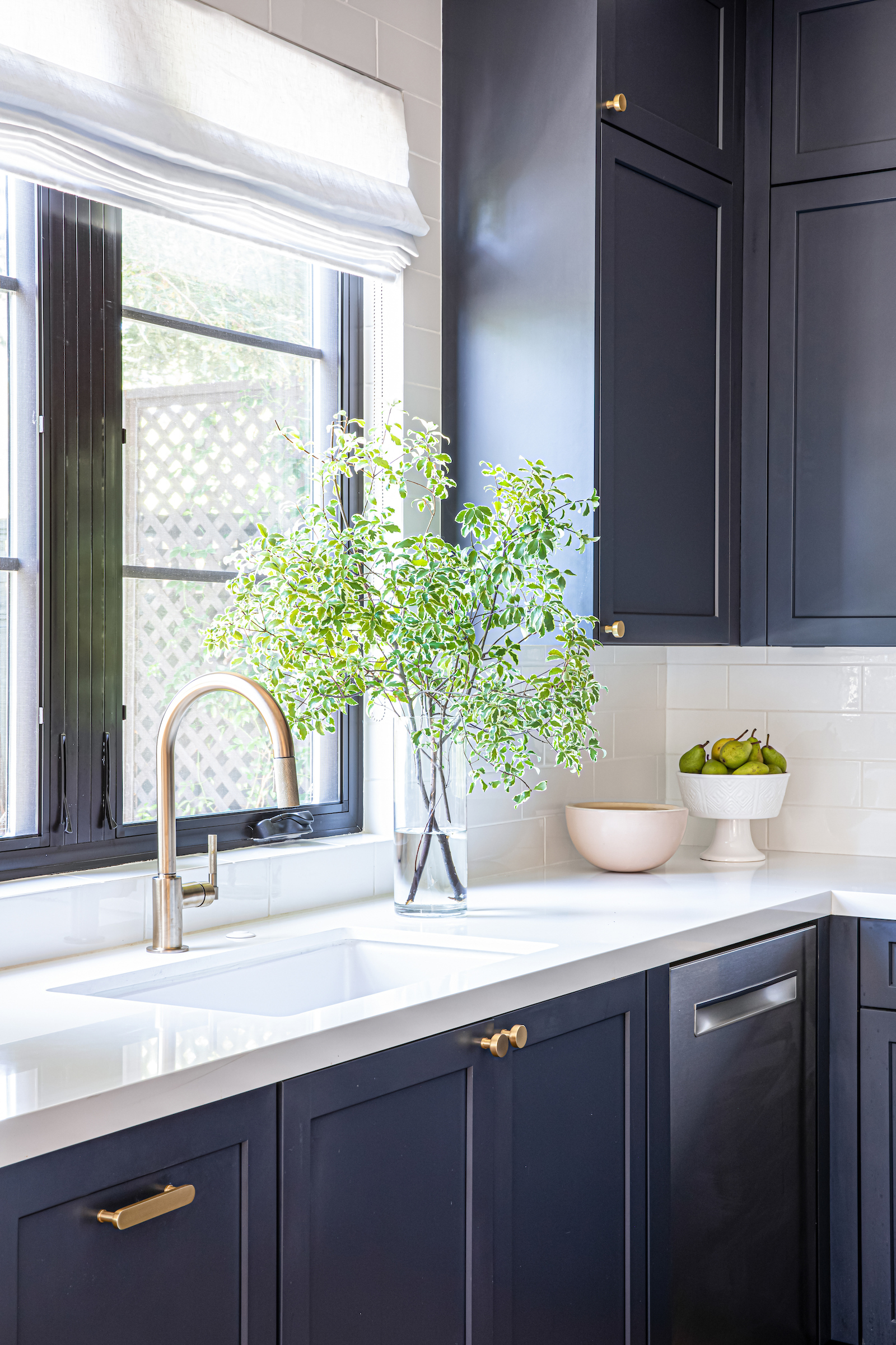
And, in my pursuit to balance aesthetics, the tile and cabinet profiles were kept clean and simple, but the rich slate cabinets and infusions of brass and shades of rose, made it feel so cozy and defined.
Bedroom
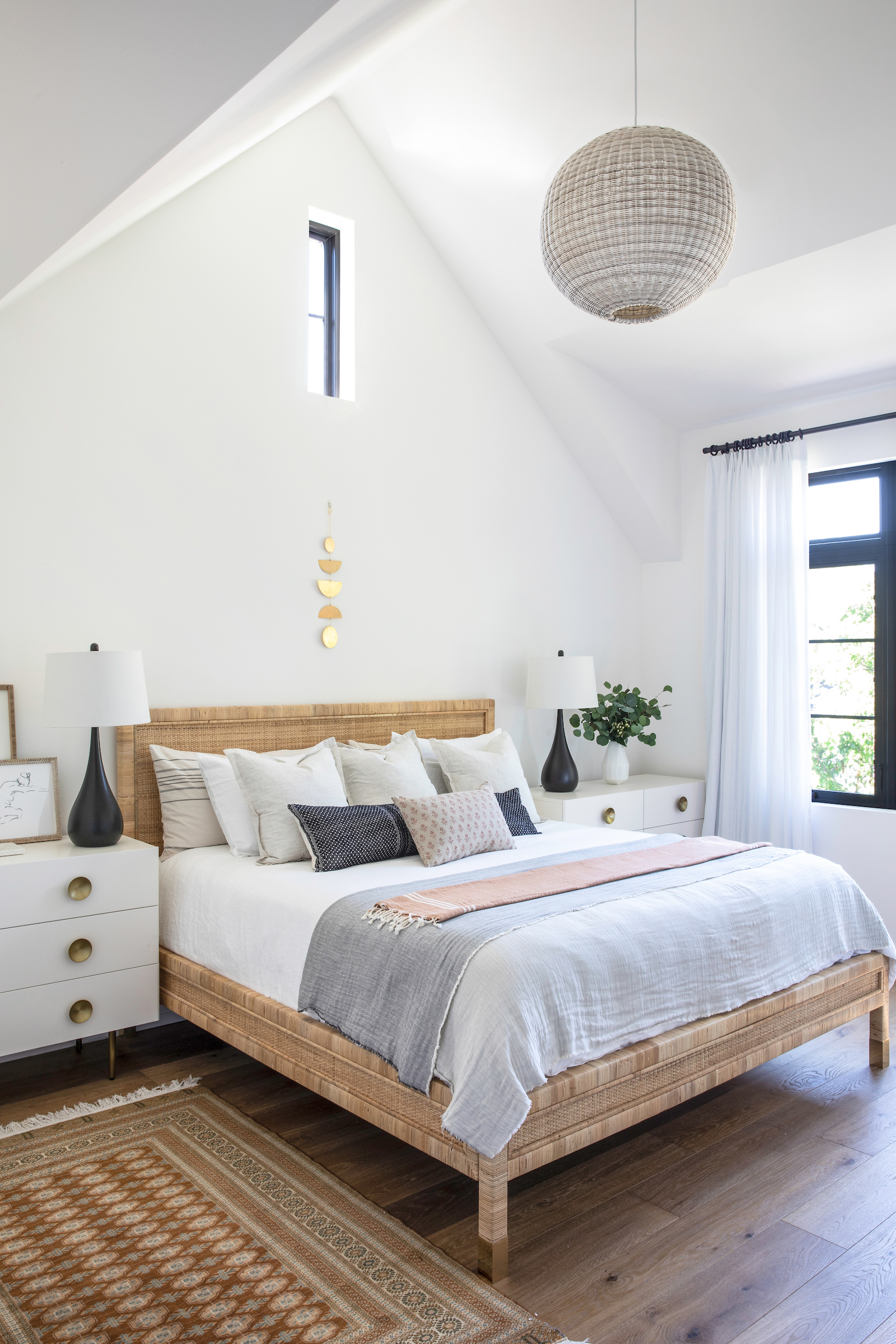
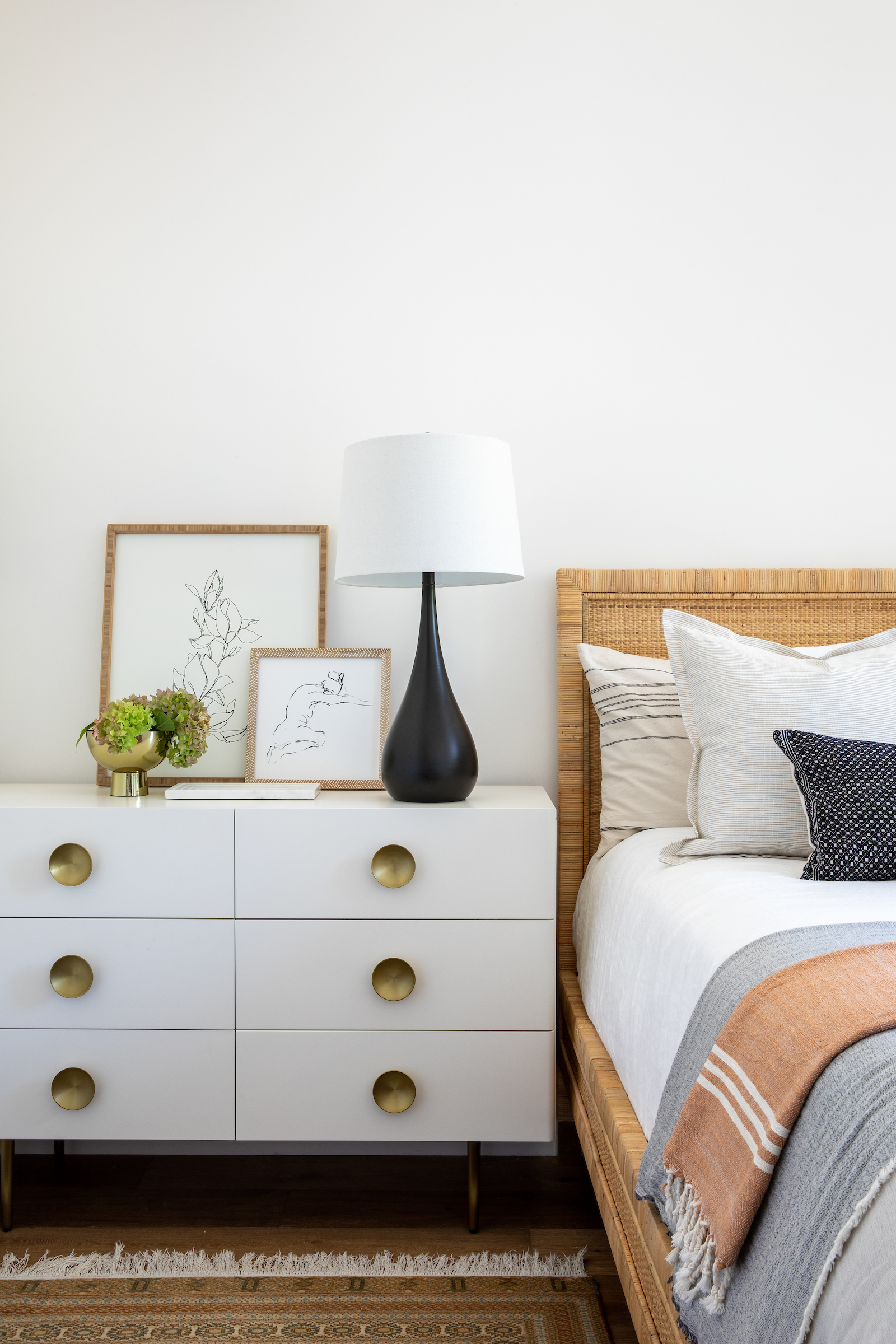
The bedroom is one of my favorite rooms in the home, both for its airy proportions – and also for the layers of tone and texture.
The space feels clean and uncomplicated, and yet enjoys so much warmth from the peach and russet textiles, the antique silk Persian carpet, and the woven bed.
The oversized brass hardware and simple art create visual interest and scale, without demanding too much attention.
Powder room
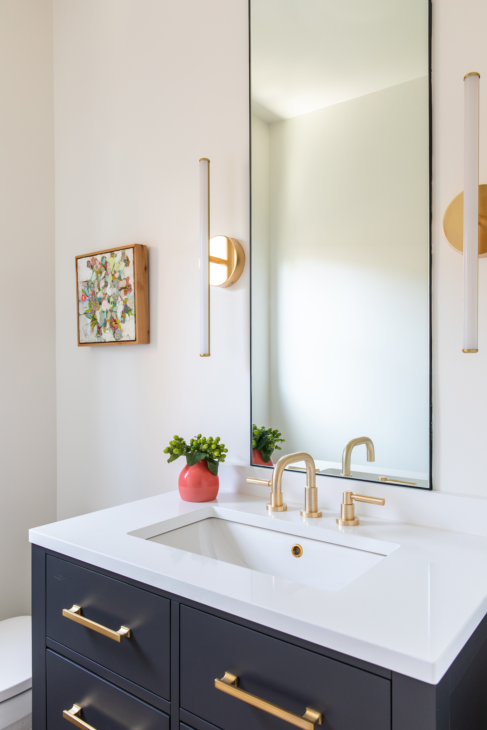
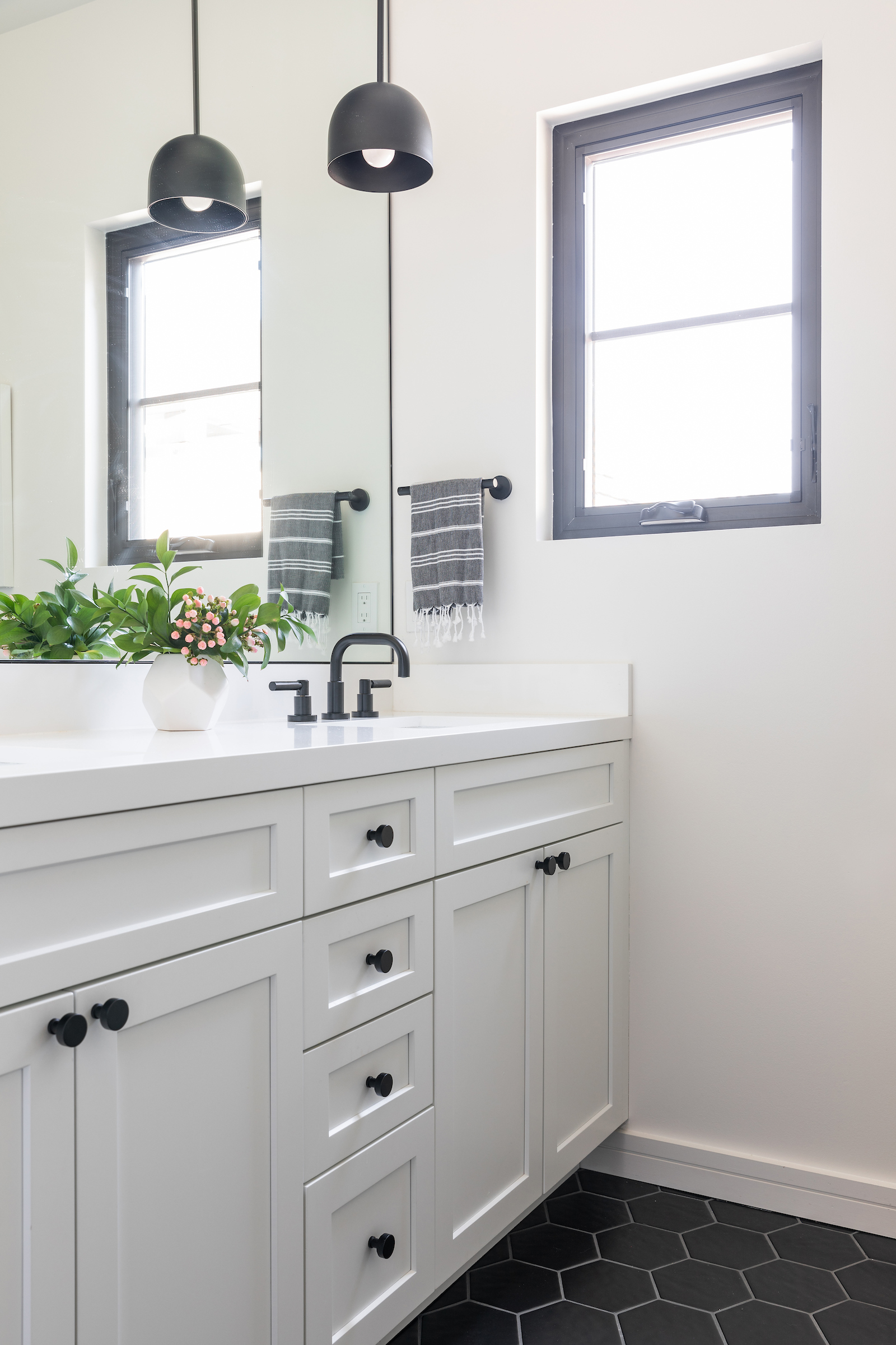
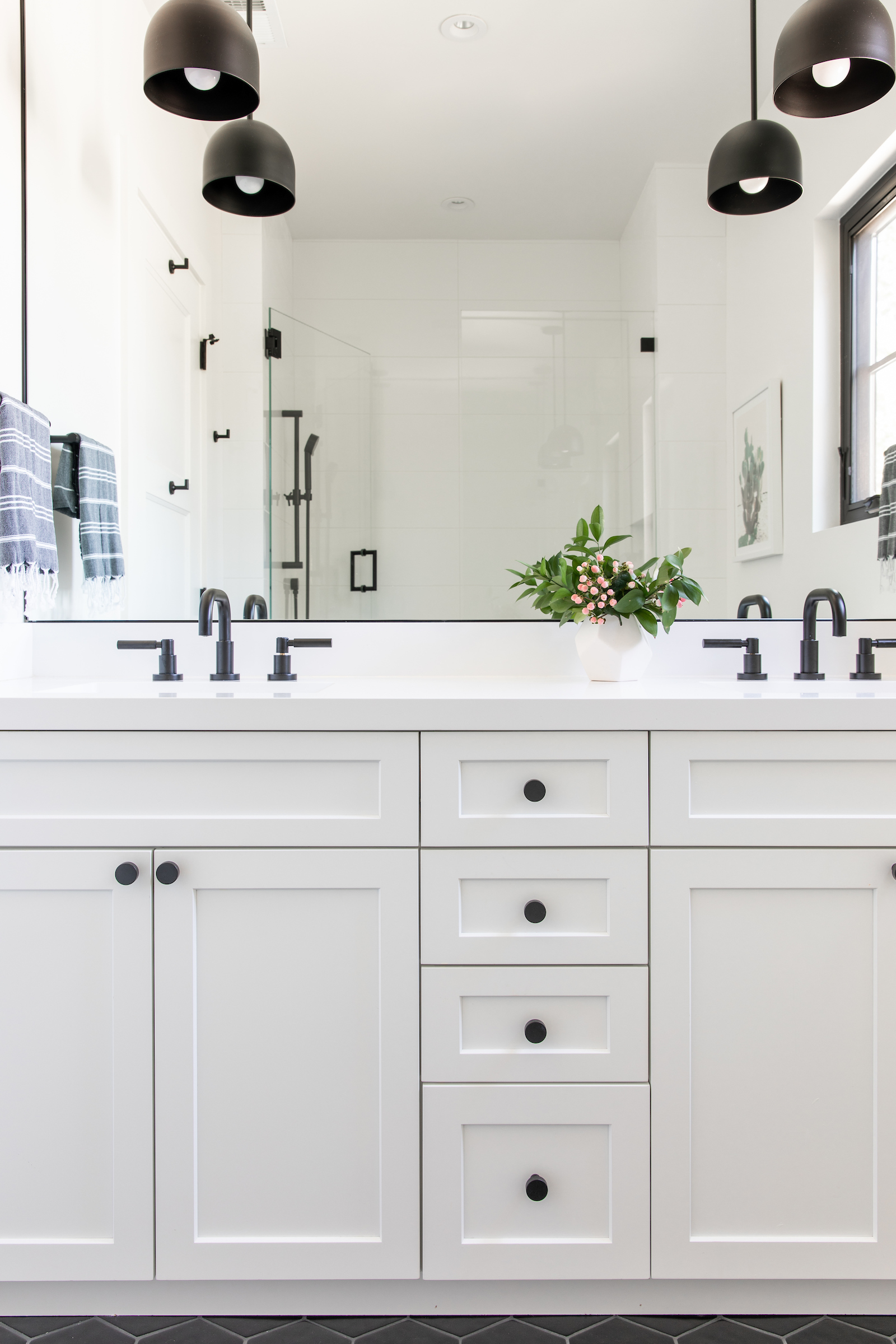
The powder room is adjacent to the dining space and kitchen so we wanted it to feel like a natural continuation visually.
In this space, we opted for a floating vanity in a rich charcoal, and took advantage of the vertical space by custom making a mirror which sits on top of the backsplash and leads the eye up towards the ceiling.
We then grounded the clean, simple room with an antique carpet, and a textured oil painting for a splash of color infusion.
Interior design / Emily Kates Design
Architecture / Hyland Design Group
Build / Terry Babb
Photography / Vivian Johnson
Sign up to the Homes & Gardens newsletter
Design expertise in your inbox – from inspiring decorating ideas and beautiful celebrity homes to practical gardening advice and shopping round-ups.

Jennifer is the Digital Editor at Homes & Gardens. Having worked in the interiors industry for several years in both the US and UK, spanning many publications, she now hones her digital prowess on the 'best interiors website' in the world. Multi-skilled, Jennifer has worked in PR and marketing and occasionally dabbles in the social media, commercial, and the e-commerce space. Over the years, she has written about every area of the home, from compiling houses designed by some of the best interior designers in the world to sourcing celebrity homes, reviewing appliances, and even writing a few news stories or two.
-
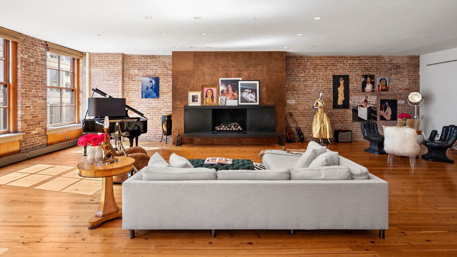 Courtney Love's historic loft combines rock star luxury with raw New York bones – it's on the market for almost $9.5 million
The singer's former SoHo home features exposed brick walls, original wooden columns, a gas fireplace, and high ceilings – take the tour
By Hannah Ziegler
-
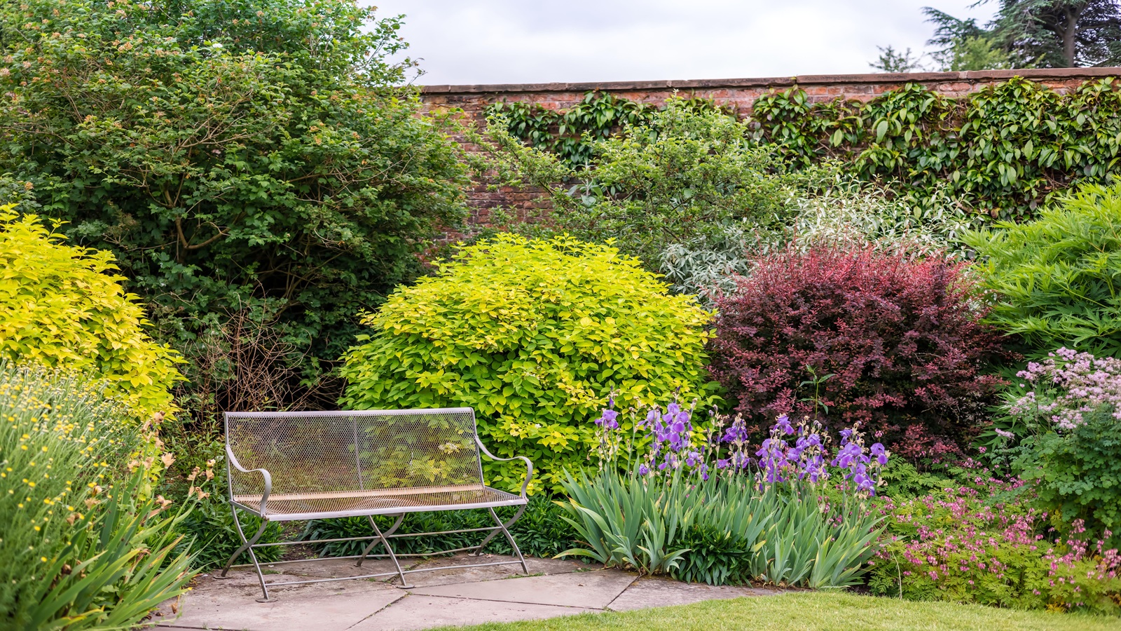 Triangular shaped garden ideas – landscape designers share 9 ingenious ways to redesign your corner plot
Expert tips for planning, planting and finessing a triangular shaped plot, so you can savour the space year round
By Jill Morgan