A light-filled San Francisco condo gets a Copenhagen-style makeover
An open-plan room with a view is the star attraction of this Scandinavian-inspired apartment in the Golden City

Famed for its hilltop perch and scenic views of San Francisco Bay and the city’s beloved skyline, the Portrero Hill neighborhood is one of the Golden City’s residential hotspots.
Shortly after settling into their condo in the district, married couple Eugene and Katherine Tsay decided it was time for a renovation to update ageing parts of the home, and make the most of views to rival the world’s best homes.
‘The biggest change they wanted to make was to open up the kitchen to the dining and living rooms,’ said interior designer Cathie Hong, who worked on the project with the couple. ‘The iconic San Francisco bay windows in the dining and living room let in beautiful natural light, but the original kitchen felt dark because it was boxed in with walls on all sides and all of the cabinets and backsplash were a dark gray color.’
The year-long project largely focused on turning these spaces into one light-filled 'Great Room'. Positioned on the second floor of a 3-story building, structural limitations made it impossible to open up the space entirely, but Roger Wong of Live Architects was still able to remove all but one structural column.
‘The new open-concept great room became a much more warm and inviting space to enjoy the city views,’ said Hong.
When it came to the aesthetic, the Tsays were keen to implement elements of Scandinavian design in the project, having visited Copenhagen at the beginning of the process and fallen in love with its style.
‘The finished result is everything we had hoped for,’ said Hong. ‘It is soft and minimal with influences from both Europe and Asia, and is such a good reflection of Eugene and Kathy, their marriage, their heritage, and their travels.’
Hong took us on a tour of the property and showed us how she opened up the apartment not just to the views, but to the world.
Kitchen
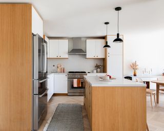
‘I love the great room. It's not a huge space by any means, but the white and oak kitchen plays together so nicely with the minimalist dining area and the muted tones of the living room,’ said Hong. As mentioned previously, the kitchen, living room and dining room are now all located in one large living space.
Inspired by the Tsay’s travels, Hong worked with Reform CPH, a Copenhagen-based cabinet company that works with Ikea’s Sektion kitchen system to create white and white oak doors and drawer fronts for the kitchen ideas.
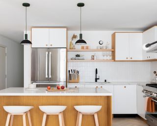
The simple, utilitarian aesthetic is continued with variegated tiles in chalk white from Heath Ceramics, which are contrasted with matte black faucets and black pendant lights from Ferm Living, and elevated by a quartz Statuario Maximus countertop by Caesarstone.
Dining Room
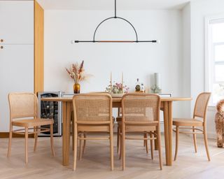
Moving through to the dining area, the whole space is brought together by white oak herringbone floors that Hong says ‘add such a beautiful architectural element that feels very European.’
‘We embraced the oak in the floors and kitchen and carried it into the dining room furniture, topping it off with a whimsical and intentionally simplistic chandelier from Katy Skelton,’ added Hong of her dining room ideas. The elegant bar light fitting is paired with a table and chairs from Design Within Reach, the rattan backing of the chairs adding a mid-century modern touch.
Living Room
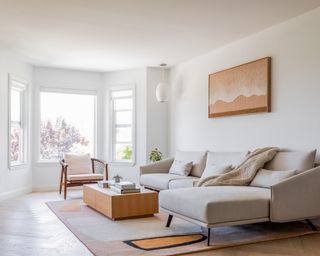
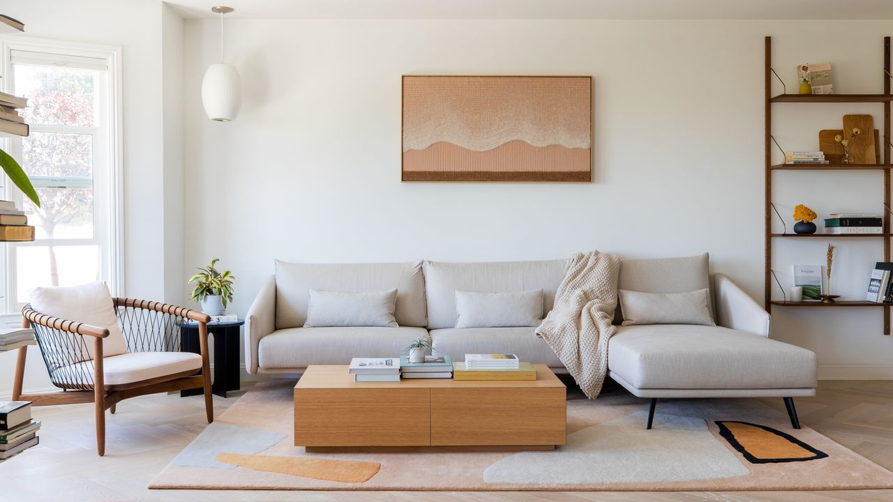
‘I was also very happy with the way the furniture came together in the living room,’ said Hong. ‘The custom size handmade rug from Cold Picnic was a high-risk purchase because we couldn't see the colors in person beforehand – but both the Tsays and I agree it was absolutely worth the risk. And the original natural fiber art over the sofa by Mimi Jung, one of my favorite Korean artists, is the icing on the cake that makes the room.’
The continuation of the neutral scheme with a taupe sectional sofa from Design Within Reach is given warmth and depth by the addition of dusty blushes, sage greens, muted corals, and creamy off-whites. ‘The walnut Herman Miller chair was custom upholstered in a light blush-colored fabric and paired perfectly with the art above the sofa,’ said Hong.
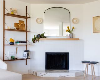
In the corner of the living room ideas, a fireplace area features a marble base, more chalk white tiles, this time from Ann Sacks’ Savoy collection in a stacked style, as well as a mantel mirror from Rejuvenation and sconces from Triple Seven Home.
Guest Bathroom
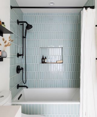
‘Moving on from the great room, the first room off the hallway is the guest bathroom,’ explained Hong. The color and material scheme from the living areas continue largely into the bathroom ideas, with partially white walls, an oak vanity and matte black hardware and matching shelves from Schoolhouse Electric.
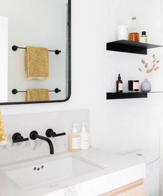
‘Unfortunately neither of the bathrooms in this house have any natural light, but we added some personality to the small box by covering the tub walls in Fireclay Salton Sea 2"x8" tiles and the floors with Fireclay Sugar Hextile tiles.’ The pale blue shower tile ideas bring the biggest splash of color yet to the project, but in a soothing and contemporary way.
Master Bedroom
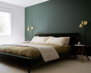
The Tsay’s home has two bedrooms, one of which has been converted into a gym and home office. The master bedroom, however, is just as much about indulgence as it is function. ‘We painted a deep moody green accent wall in the master bedroom and purchased a green upholstered bed in a similar tone to create a monochromatic haven for them to relax,’ explained Hong of the bedroom ideas. The Lulu & Georgia bed in a dark shade of moss green is paired with forest tones in the Alpine Trail wall paint by Behr. For a touch of pizzazz, the wall is decorated with brass sconces by Cedar & Moss.
Master Bathroom
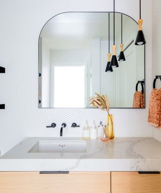
The above bedroom is part of a master suite that includes a master bathroom. ‘We wanted to tile all the walls to elevate the look of the bathroom, but to keep the project from going over budget, we opted for an off-brand white glossy penny tile,’ said Hong. ‘Instead, we splurged on our Allied Maker pendants and a custom white oak floating vanity from Ogee Millwork.’
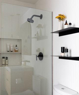
The penny tiles are extended to fill the walk-in shower area, which is fitted with hardware from Schoolhouse Electric.
Interior Design / Cathie Hong
Architecture / Roger Wong, Live Architects
Photography / Christy Q. Photography
Sign up to the Homes & Gardens newsletter
Design expertise in your inbox – from inspiring decorating ideas and beautiful celebrity homes to practical gardening advice and shopping round-ups.

Ailis started out at British GQ, where a month of work experience turned into 18 months of working on all sorts of projects, writing about everything from motorsport to interiors, and helping to put together the GQ Food & Drink Awards. She then spent three years at the London Evening Standard, covering restaurants and bars. After a period of freelancing, writing about food, drink and homes for publications including Conde Nast Traveller, Luxury London and Departures, she started at Homes & Gardens as a Digital Writer, allowing her to fully indulge her love of good interior design. She is now a fully fledged food PR but still writes for Homes & Gardens as a contributing editor.
-
 Joanna Gaines' Hillcrest Cottage is a lesson in making the most out of a small space – take a tour to see how she brings her iconic style to this tiny rental property
Combining her signature rustic style with a contemporary palette, Joanna makes this tiny cottage feel bright and airy
By Eleanor Richardson Published
-
 5 things to avoid buying at IKEA – and where to get them instead
IKEA is a wonderful resource for affordable, on-trend home decor, but there are a few things this design editor would never buy
By Pip Rich Published