This San Francisco period home has a light-filled interior awash with easy going elegance
The quietly stunning decoration of this historically significant San Francisco home allows the grand architecture to sing

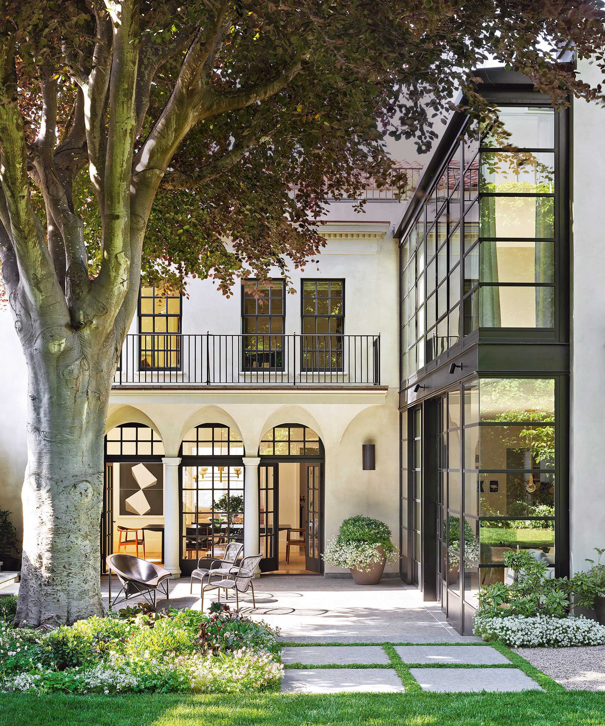
The rebuild of this impressive 1920s house in the Pacific Heights neighborhood of San Francisco was carefully steered by local architectural practice Walker Warner for its new owners, a young family.
A plethora of highly skilled experts and consultants were needed for the project, as the house required foundation stud work before being pieced back together again.
‘To approach this build successfully we had to, effectively, take the house down to the studs and reinforce the foundations with steel, bringing it in line with recent earthquake codes,’ explains Brooks Walker, co-principal at Walker Warner Architects.
A new double-height addition was built on the back of the building, which brings open-plan living to the ground floor, housing the kitchen and casual dining and living areas with views to the garden, which was designed by Scott Lewis Landscape Architecture. The result is, without doubt, one of the world's best homes.
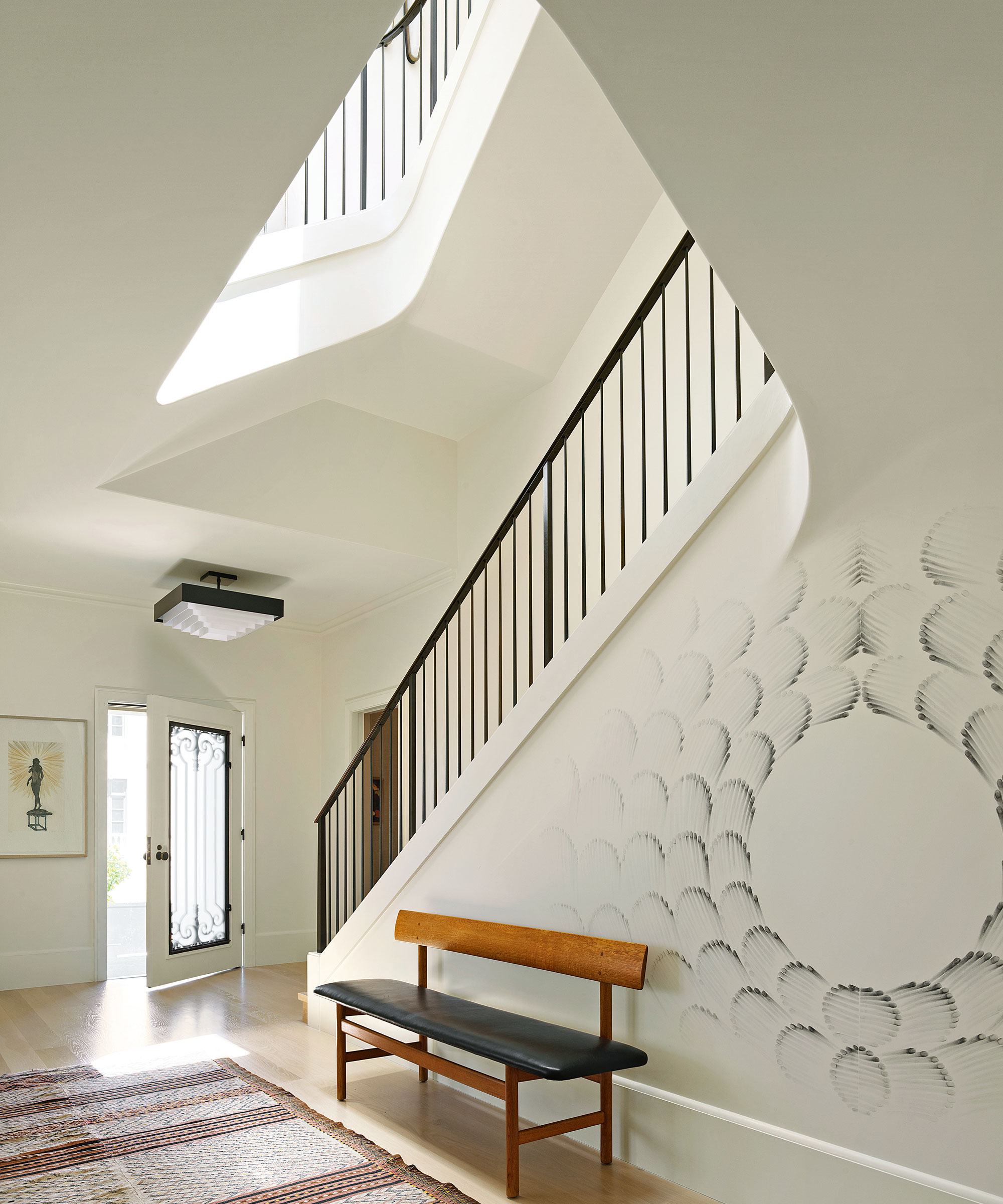
Entryway
'This district of San Francisco is full of beautiful houses,’ says interior designer Chloe Warner, founder and principal of Redmond Aldrich Design. ‘This is a particularly nice example and you can see the Italian Renaissance influence. We created atmosphere by layering textures and graphic forms rather than pattern and color,’ says Chloe.
‘The neutral color palette imbues the home with what I would refer to as easy-going elegance, and a flood of natural light creates a bright, open atmosphere that feels quintessentially Californian. White oak hardwood floors and a luxurious range of creams form the ideal backdrop, while the artwork adds pops of color.’
The clients were heavily involved in the design process. ‘They were quick to zero in on the “feeling’’ they wanted. Timeless, uncluttered and tranquil were all keywords laid out in the initial interiors brief,’ explains Chloe.
'We knew the project would have wonderful architecture and natural light so we deliberately pulled back on certain design elements. We also knew that to fulfil the brief properly, it would take a restrained decorating touch, giving the architecture, and the art, an opportunity to sing. It’s an elegant house, but it’s also family-friendly.’
Graphic forms in the hall, including the mural by artist Judith Braun, echo the lines of the evocative staircase.
Living room
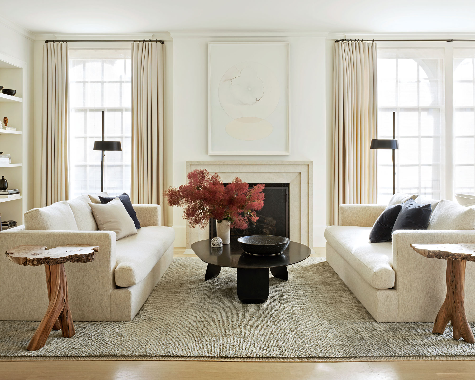
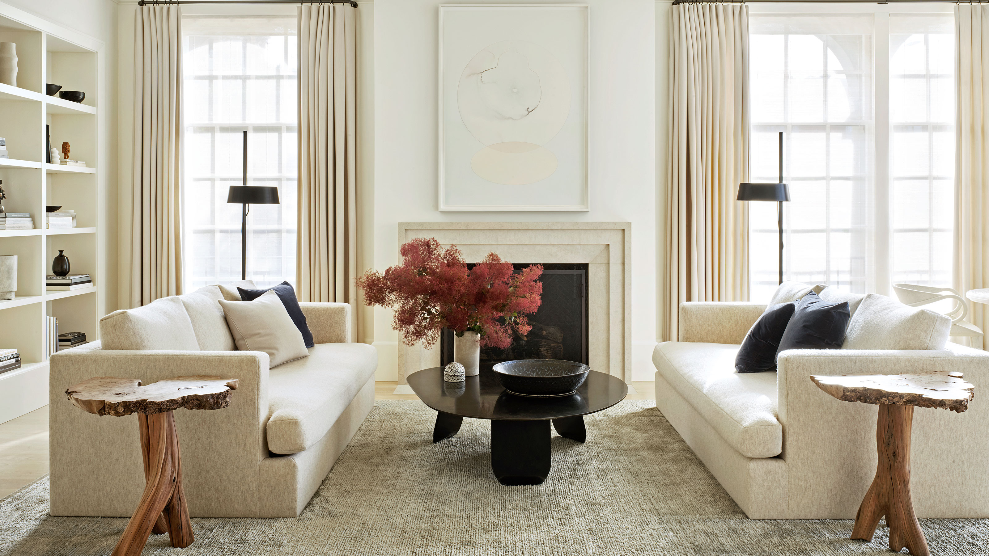
Nestled in the center of the home, the formal living room, Chloe says, ‘showcases an artful execution of sophisticated, minimalist comfort. Original casement windows and long wool curtains evoke a warm atmosphere while maintaining the room’s expansive feel.’
The look is pleasingly symmetrical in this space – and for anyone looking for living room ideas that are cool, calm and collected but suitable for a family, it's a masterclass.
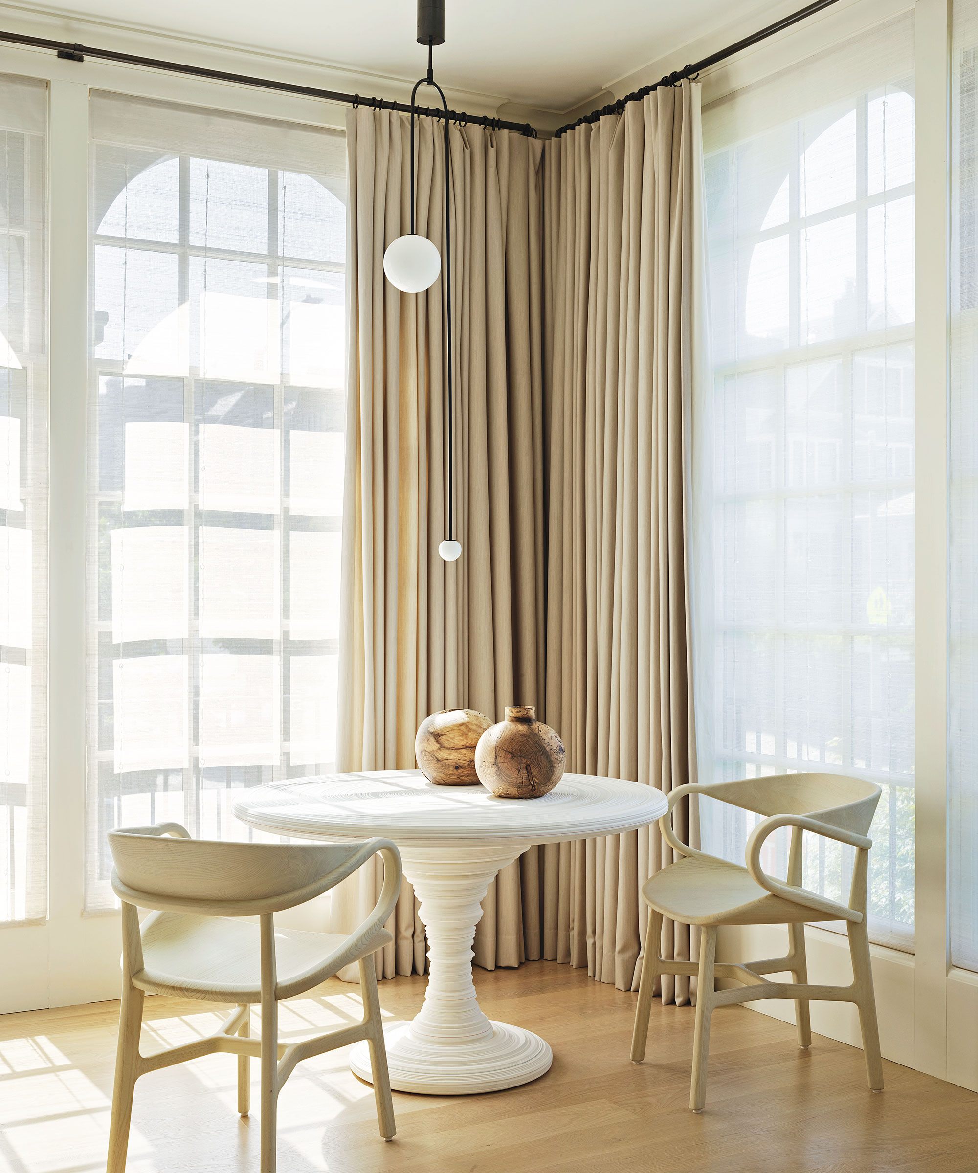
Contemporary statement pieces, such as the cast plaster sculptural round-top table from Pimlico-based interior designer Rose Uniacke in a corner of the living room, add depth among the layered neutrals. The family uses this as a games table.
Kitchen
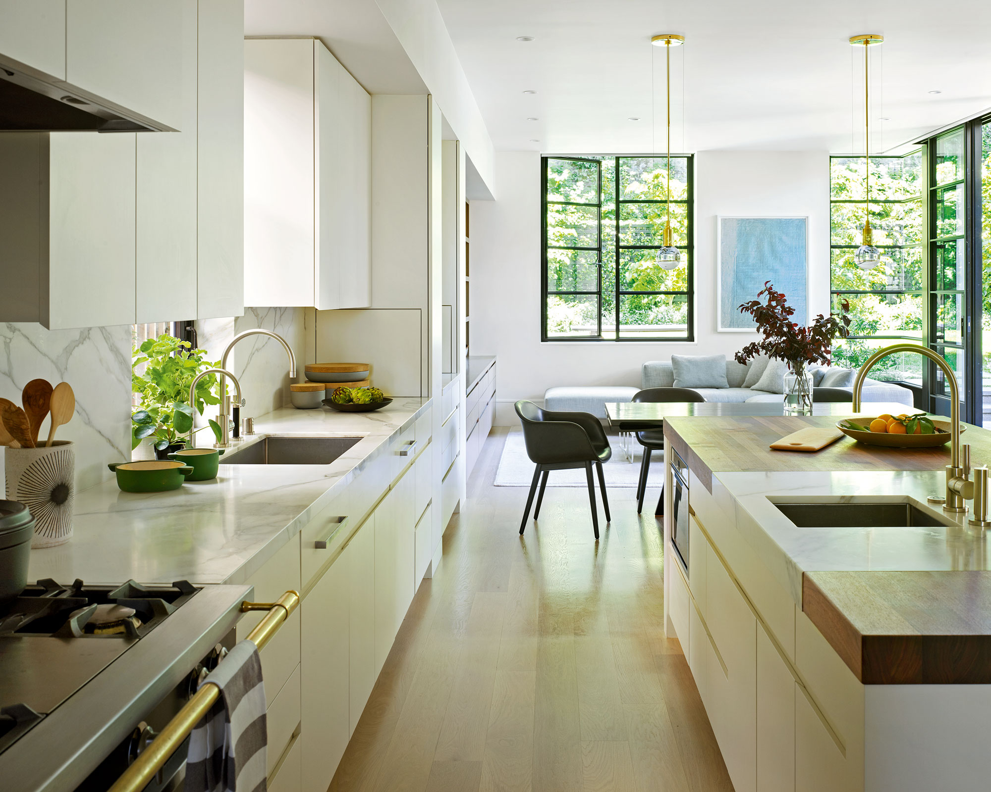
Even though this is a new part of the house, Chloe has designed the interior to be a seamless transition so it feels completely coherent.
'The large steel-box construction offers floor-to-ceiling windows and large sliding doors, continuing the feeling of limitless natural light,’ she says. ‘It has been designed to look out onto the century-old copper beech tree, an impressively large and beautiful feature of the garden.’
Forming part of the new double-height addition at the rear of the house is a contemporary open-plan cook space with informal living and dining areas. Kitchen ideas to look out for include the cabinetry, which was kept pared-back to blend into the living spaces.
Bedroom
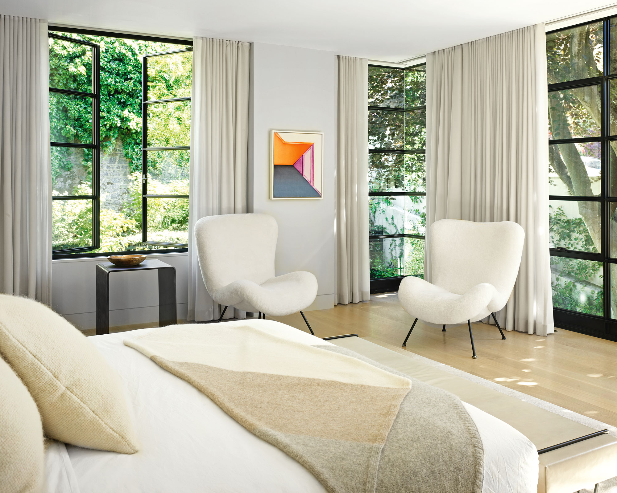
Neutral wool curtains soften the architectural black window frames and give the main bedroom space a feeling of warmth and comfort.
Dressing area
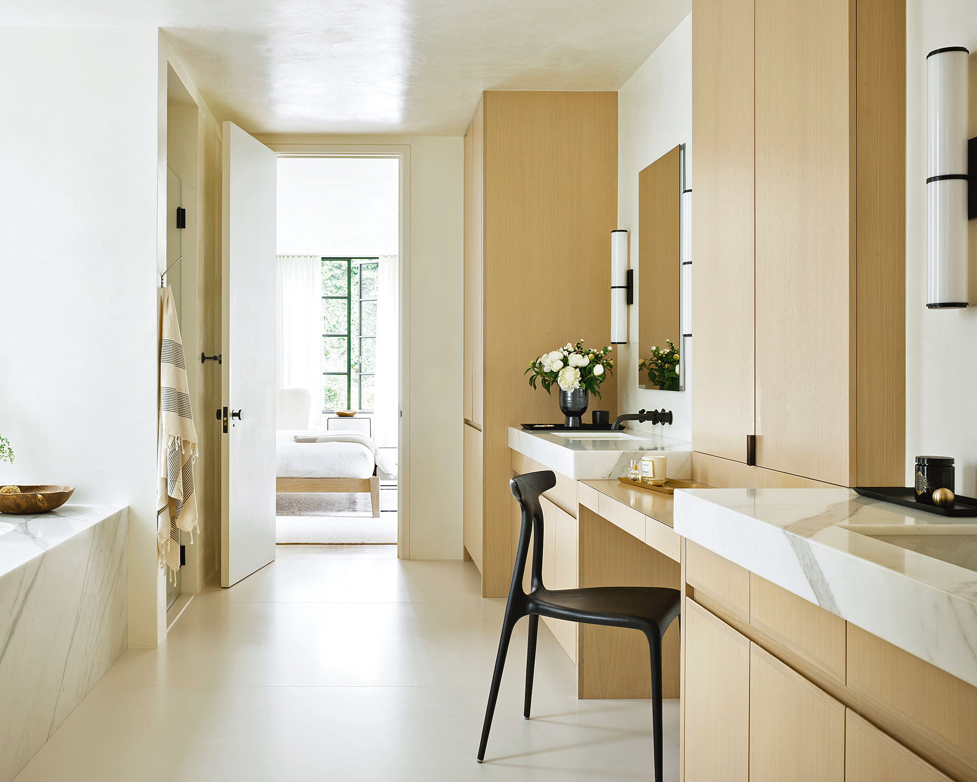
Built-in white oak cabinetry forms a beautiful dressing space in the bathroom.
Roof terrace
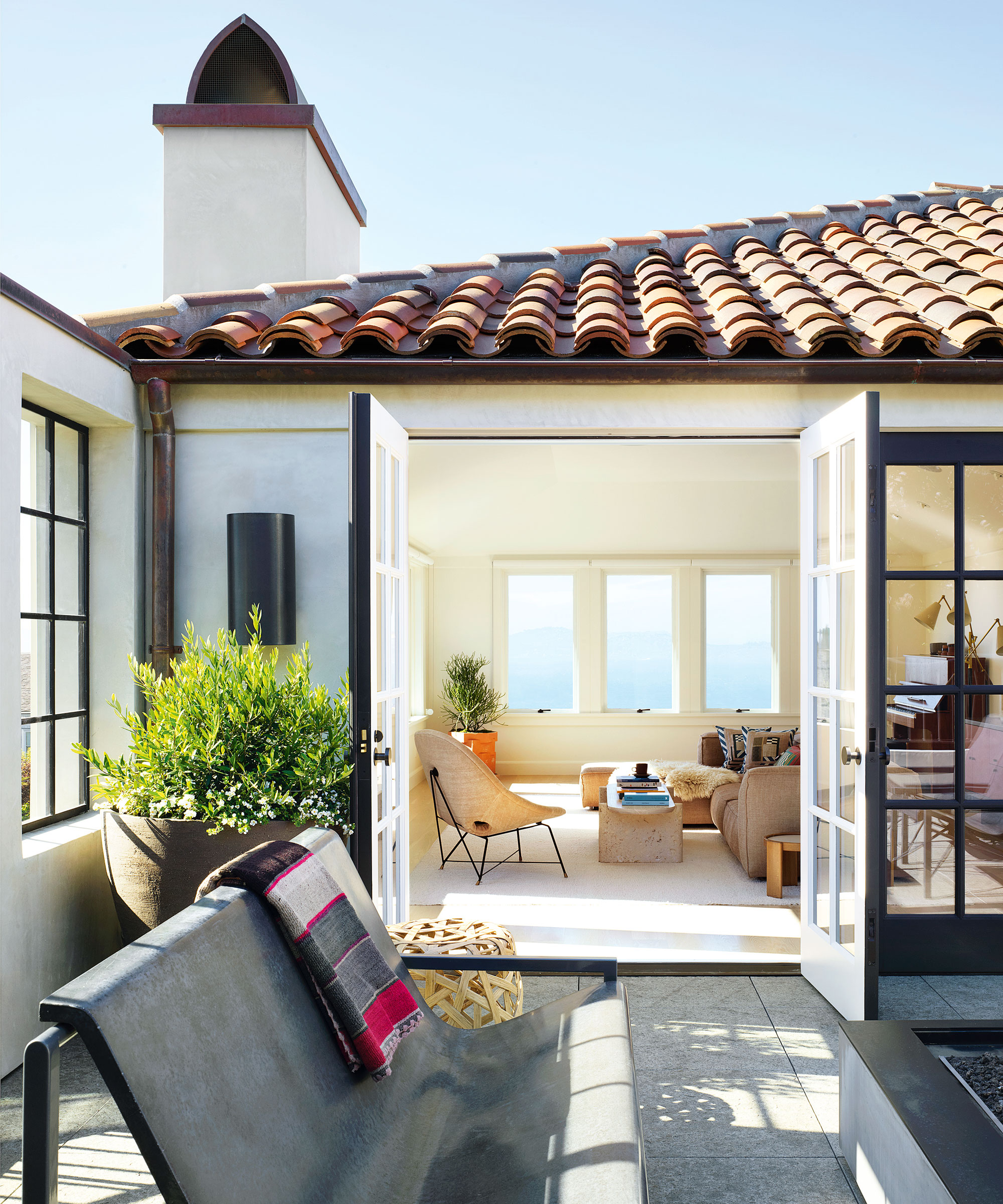
Located off the snug, the terrace is enclosed with rendered walls.
Interior designer/ Redmond Aldrich Design
Architects/ Walker Warner Architects
Photography/ Matthew Millman
Text/ Rory Robertson
Sign up to the Homes & Gardens newsletter
Design expertise in your inbox – from inspiring decorating ideas and beautiful celebrity homes to practical gardening advice and shopping round-ups.

Interiors have always been Vivienne's passion – from bold and bright to Scandi white. After studying at Leeds University, she worked at the Financial Times, before moving to Radio Times. She did an interior design course and then worked for Homes & Gardens, Country Living and House Beautiful. Vivienne’s always enjoyed reader homes and loves to spot a house she knows is perfect for a magazine (she has even knocked on the doors of houses with curb appeal!), so she became a houses editor, commissioning reader homes, writing features and styling and art directing photo shoots. She worked on Country Homes & Interiors for 15 years, before returning to Homes & Gardens as houses editor four years ago.
-
 Do cleaning products expire? Professional cleaners warn time could make them ‘less effective, and in some cases, irritating to use’
For the best results, it pays to stay on top of the timeline of your cleaning products
By Chiana Dickson Published
-
 7 of the best tomatoes for growing in pots - expert growers pick their top varieties ideal for large harvests from containers
You can enjoy bumper homegrown harvests in small spaces
By Drew Swainston Published