This West Village home owned by Ryan Murphy showcases luxurious minimalism
Ryan Murphy's beautiful West Village home, fashioned by designers Axel Vervoordt and David Cafiero, features a calm and pared-back neutral interior that's awash with texture

Looking for a New York home during the extensive renovation of their LA villa, Ryan Murphy and his husband David Miller were delighted to find a property that needed little adjustment.
Ryan, a television writer, director and producer, was working more frequently in the city and the pair decided it was the opportune time to create a base there.
The mid-19th-century four-story townhouse had formerly been renovated by architect David Bucovy but Ryan and David were eager to give it their own nuanced identity.
Having worked with them sourcing furniture for their Provincetown home, the former studio of abstract expressionist painter Hans Hofmann, interior designer David Cafiero was well placed to fill the home with carefully considered pieces.
‘The house is in the West Village, a quaint, beautiful and quintessentially New York neighbourhood,’ says David. ‘The previous owner had done the house up, so all we had to do was furnish it.'
Entrance and main living room
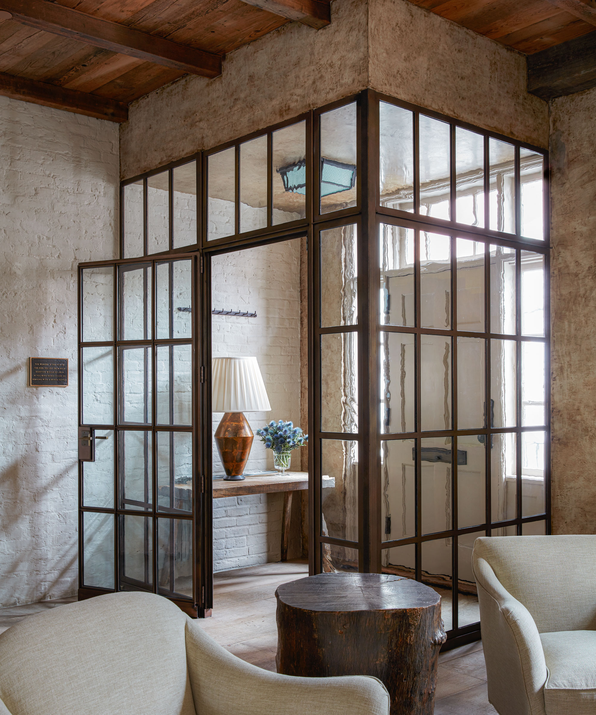
'Axel Vervoordt had worked on the renovation and opened the space up using reclaimed beams for the floating stair treads and reusing old floorboards as ceiling joists. There is cabinetry in white oak and ash and chestnut floors. One whole side of the house is exposed brick that has been limewashed,' says David.
The steel-framed panes of this vestibule introduce an industrial edge, while allowing the space to open up to guests immediately upon entry.
Living area
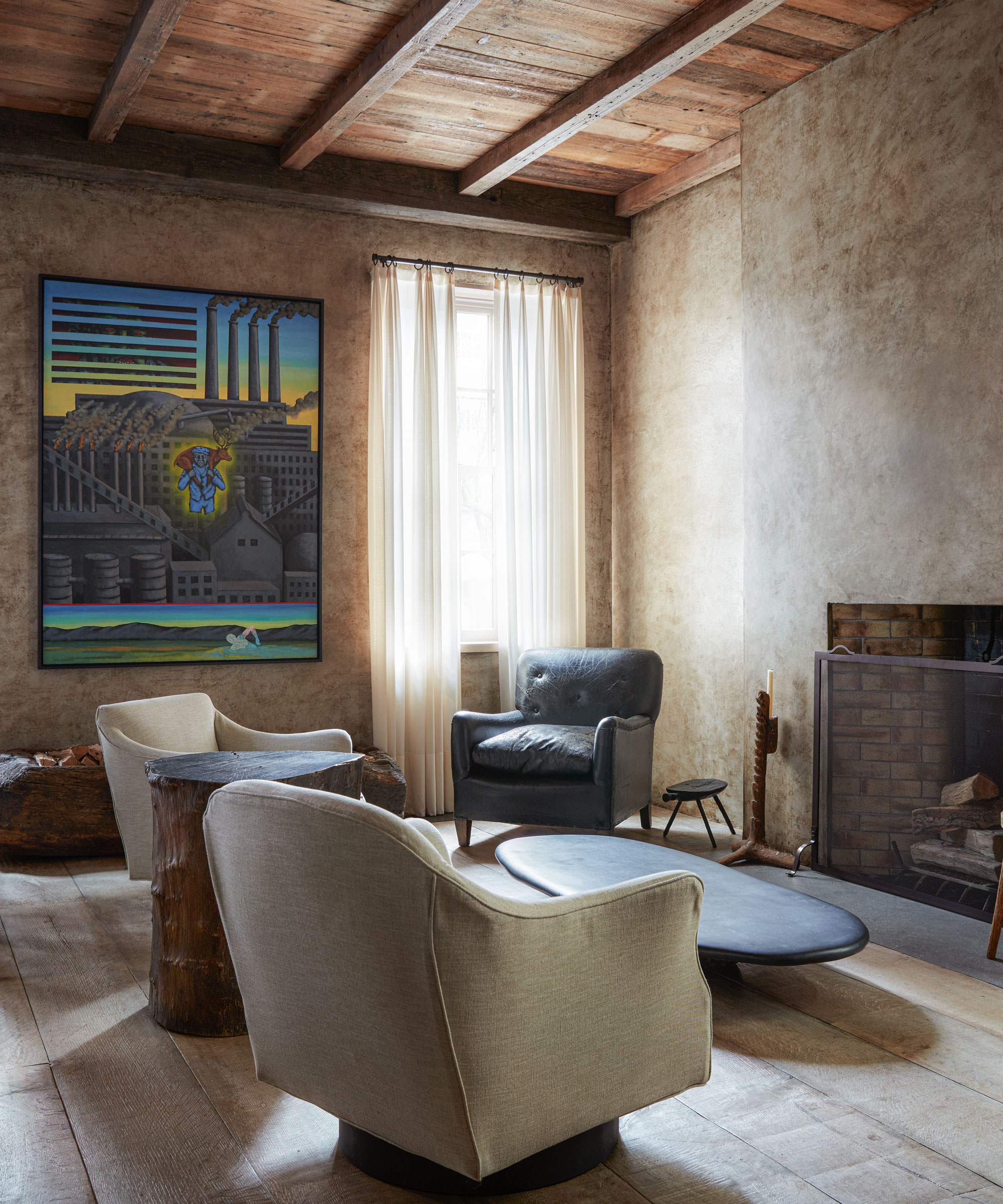
Living room ideas include the combination of wood and a distressed plaster finish on the walls, which evokes a calm and monastic ambience at odds with the fast pace of the city on its doorstep.
‘It’s a very peaceful, work-orientated house,’ says David. ‘But it’s also about comfort and accessibility.
Sheer Belgian linen curtains softly diffuse the light in the living area. Leaving the chimney breast bare highlights the beauty of the architecture.
Main living and dining area
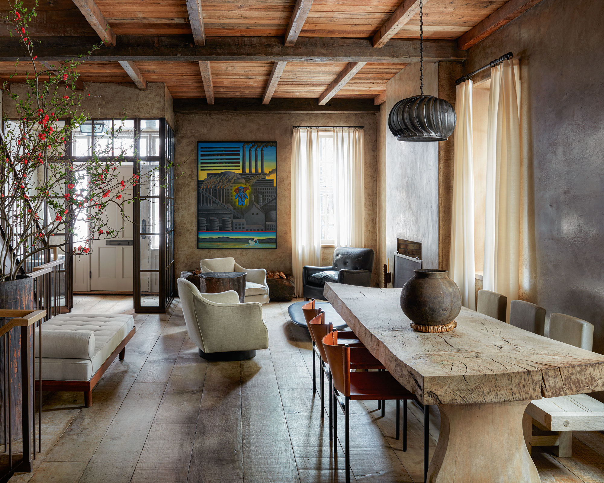
It was Ryan’s decision that the interior had very little color but was more characterized by tone on tone.
'I let the space dictate what it wanted and often the less you do, the better. It’s about restraint,’ he adds.
The personalities of Ryan and David are reflected widely in the artwork, much of which was bought with consultation from David’s friend Joe Sheftel.
‘I feel that you should always have books and art,’ says David. ‘It’s something you can always pass along. When you redo a kitchen and a bathroom you can never take it with you. But books and art can take on a new life, move with you and become something you leave for your children.’
Furniture, much of it from Galerie Half in Los Angeles, pays tribute to mid-century designers, such as Charlotte Perriand and Pierre Jeanneret. ‘There’s a lot of breathing space around each piece,’ says David.
This mood of luxurious minimalism grounds the rooms with larger features, such as the ancient-looking wooden dining table, bringing a charisma of their own.
The evocative feel this space exudes is a result of the masterful combination of rich materials.
Kitchen
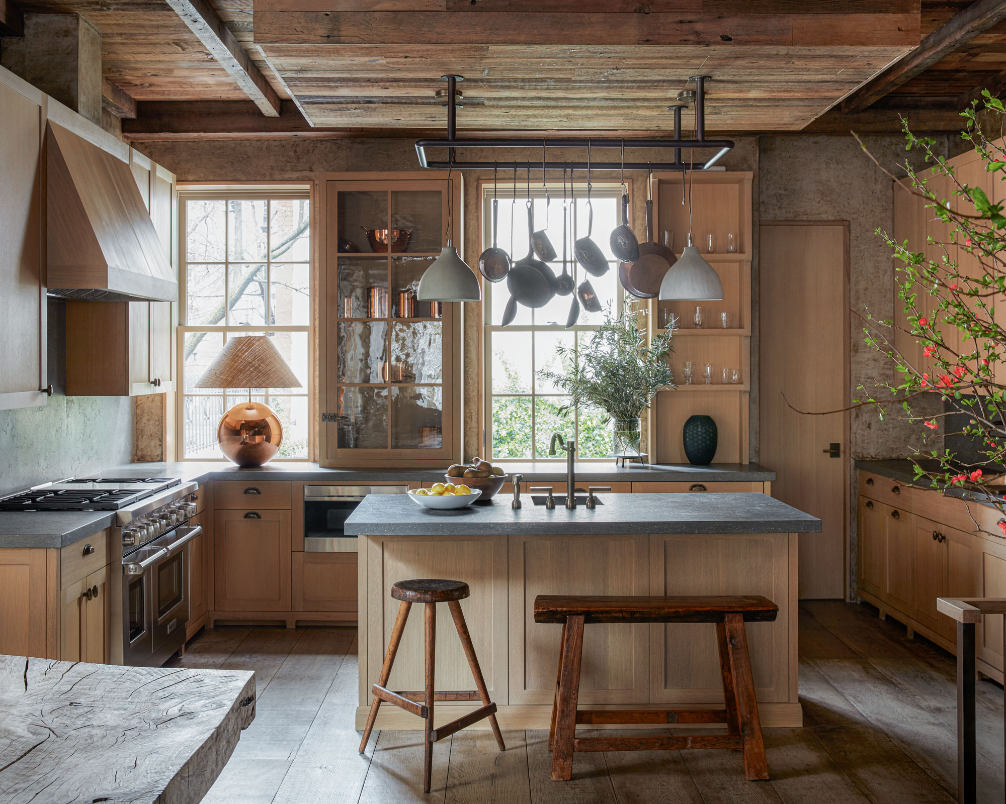
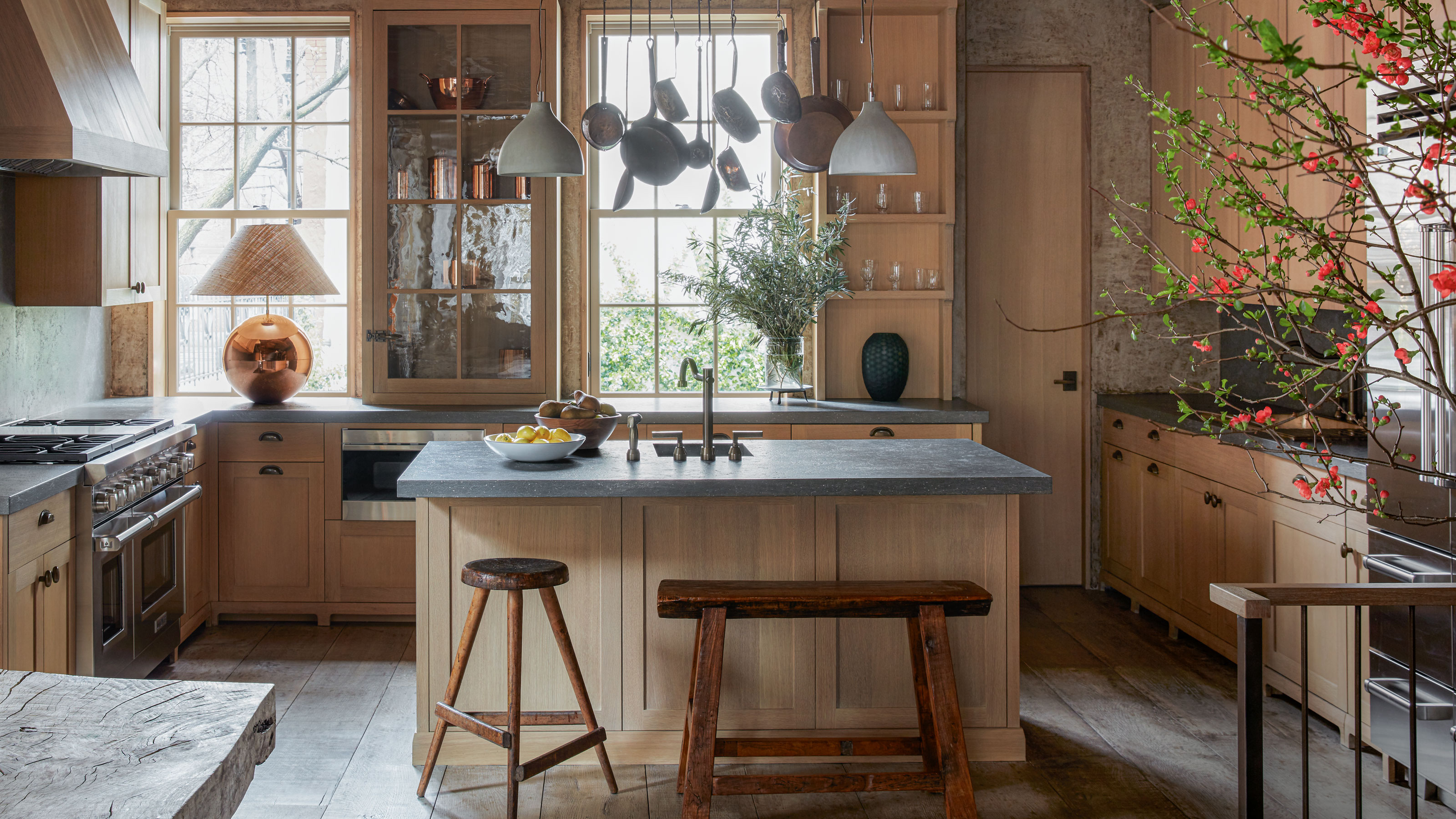
Kitchen ideas include the steel gantry above the island, which looks almost like an art installation.
Library
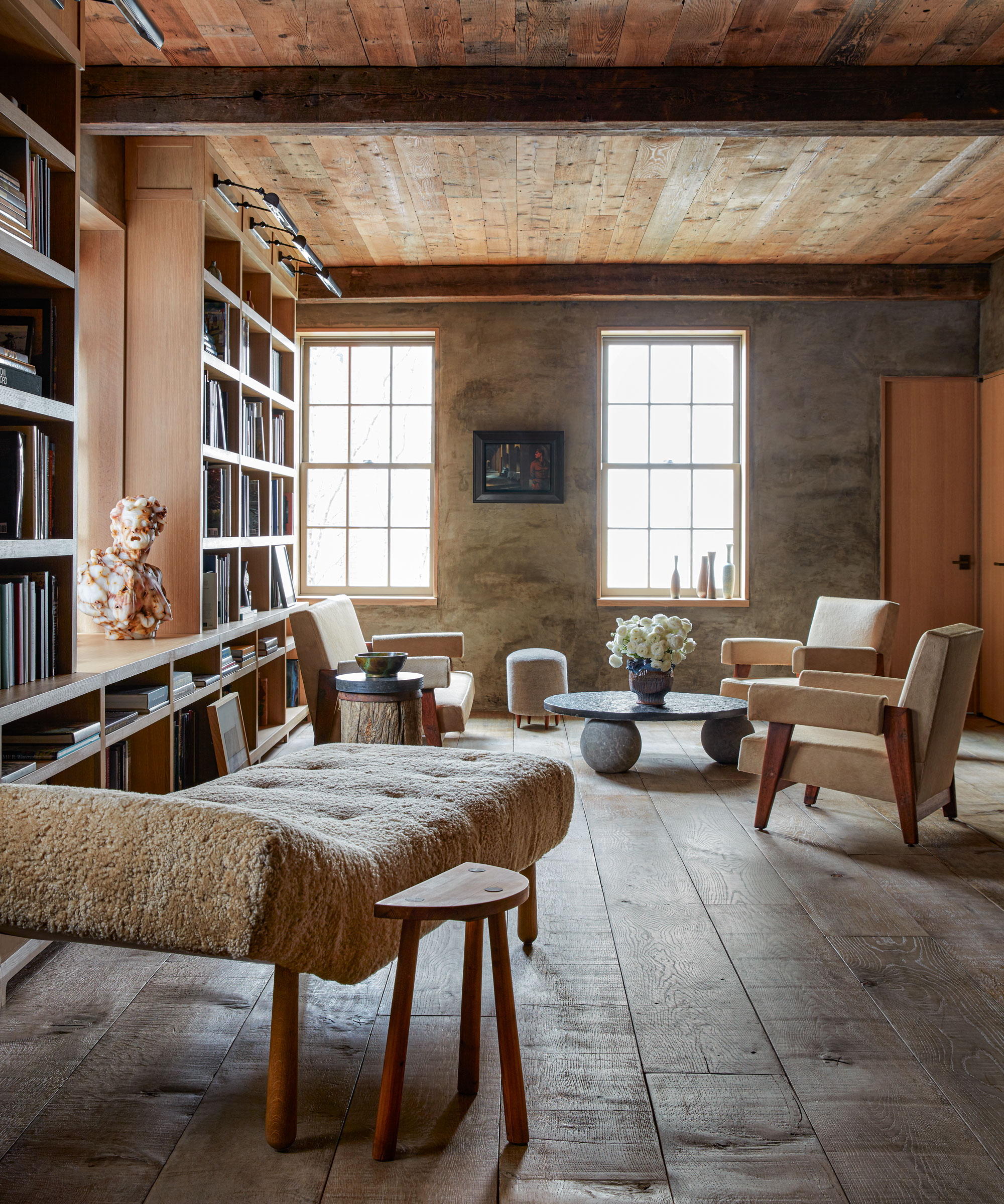
At the intellectual heart of the house is the library on the first floor. Here, books on medieval history, art and photography span the shelves.
‘The books came from the estate of a friend, a college professor who died,’ says David. ‘We bought his entire collection but it was important to honor his spirit by keeping all the books together.’
Lights above the shelves illuminate the exceptional collection of books. A relaxed seating group and fleece chaise longue strike an informal note.
Landing
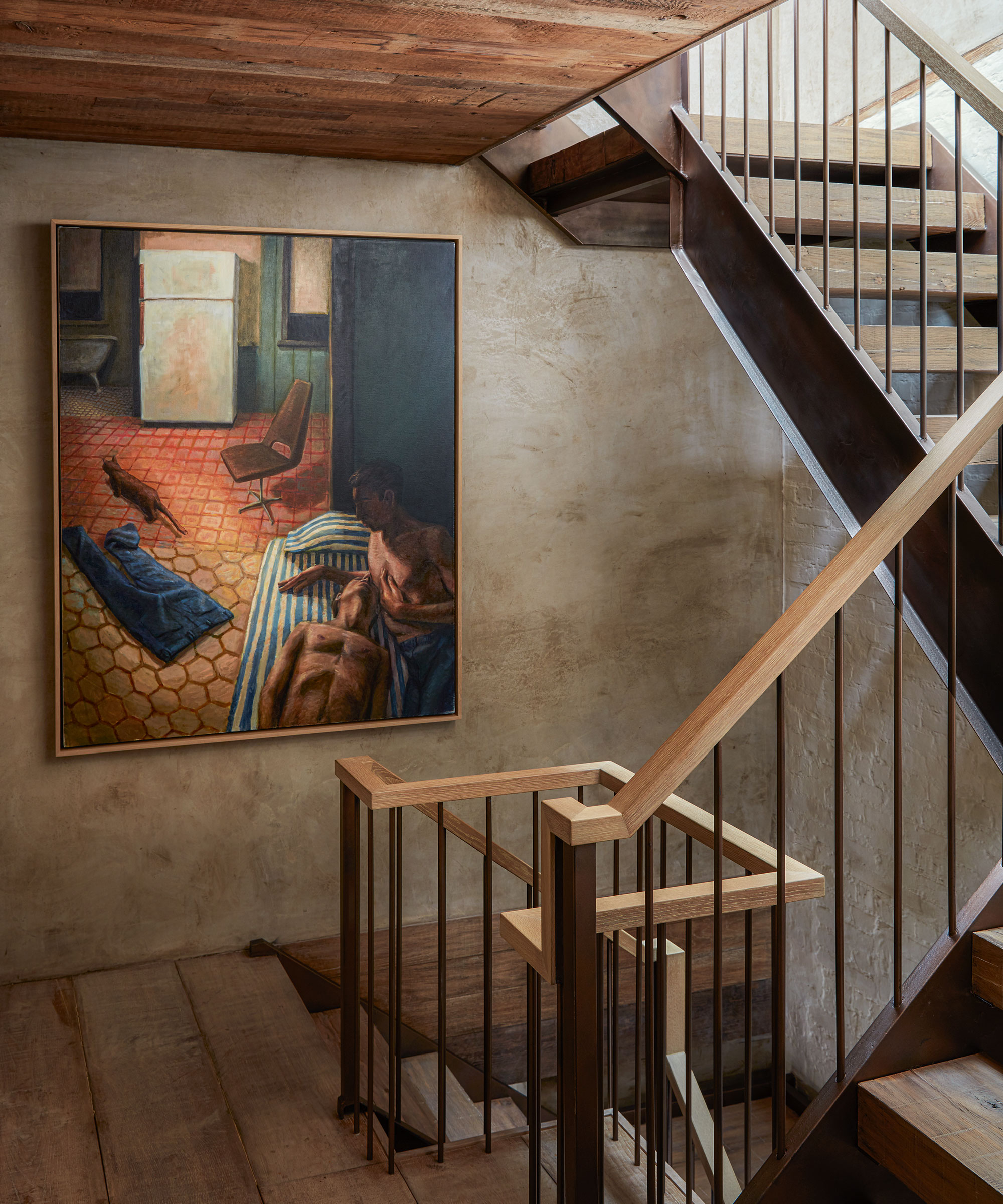
All of the paintings in the house have rich colors that tone with the interiors.
Bedroom
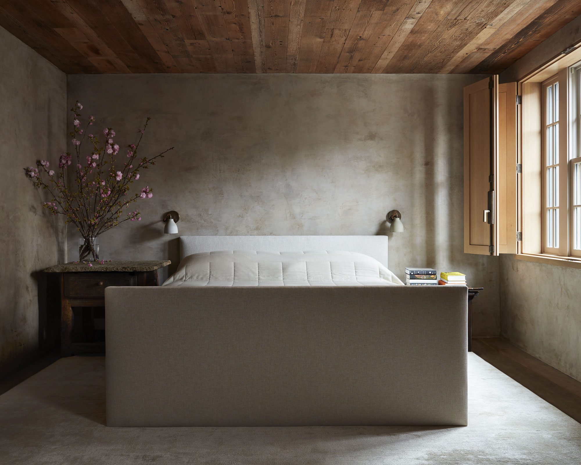
David designed this large bed to ground the space. The shutters negate the need for curtains.
Bathroom
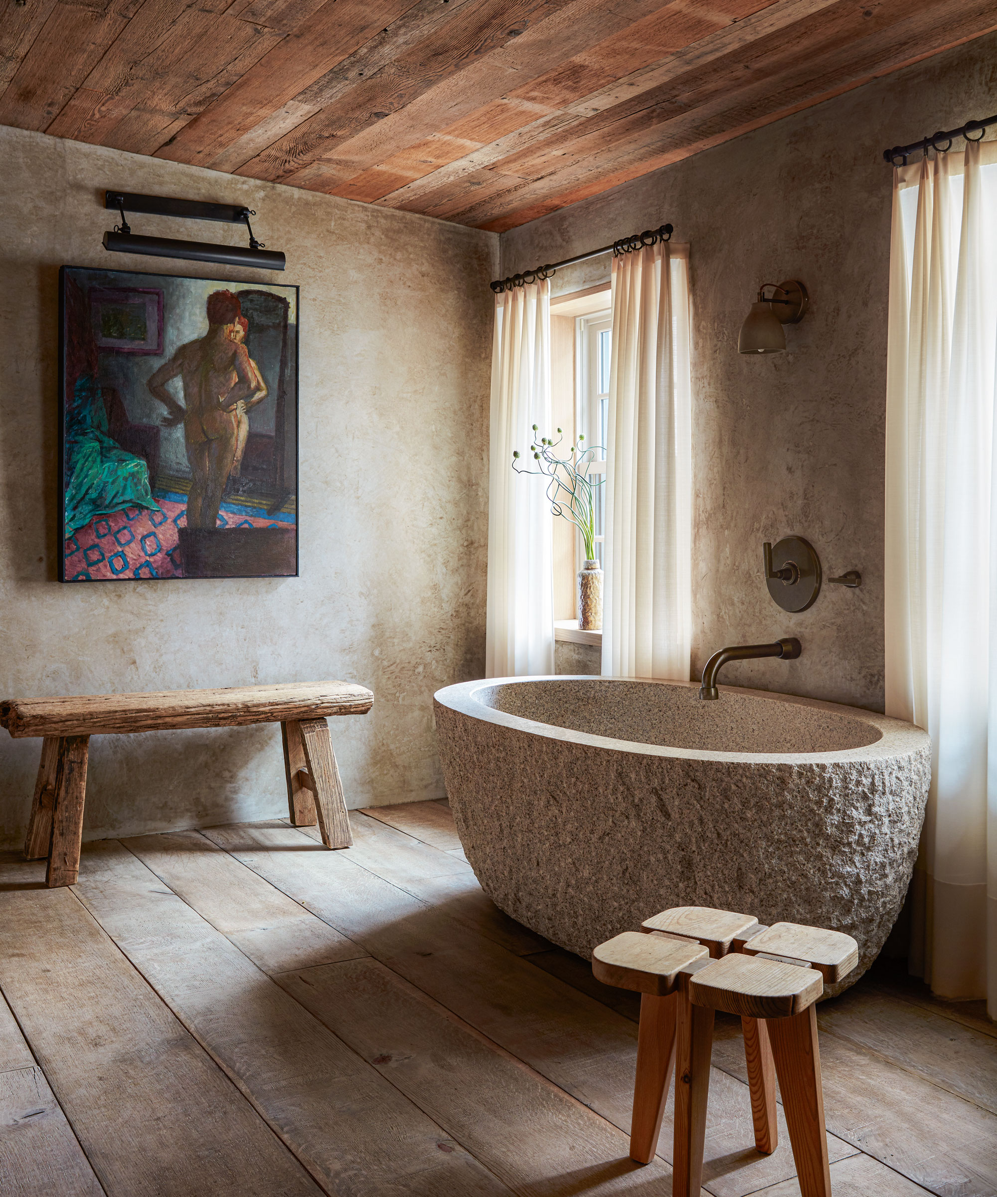
Almost monastic in its simplicity, the room is elevated by the statement bath and rich textures.
‘Every time I step into that house it seems quiet and serene,’ says David. ‘It’s so solid, like a vault. It has an amazing smell like a faint spice that comes from the wood. Despite being sparse it also manages to be inviting. And it’s as warm and cozy in winter as it is cool and refreshing in summer,’ he concludes. A blissful retreat for all seasons.
Photography/ Stephen Kent Johnson/Otto
Interior designer/ David Cafiero
Text/ Juliet Benning
Sign up to the Homes & Gardens newsletter
Design expertise in your inbox – from inspiring decorating ideas and beautiful celebrity homes to practical gardening advice and shopping round-ups.

Interiors have always been Vivienne's passion – from bold and bright to Scandi white. After studying at Leeds University, she worked at the Financial Times, before moving to Radio Times. She did an interior design course and then worked for Homes & Gardens, Country Living and House Beautiful. Vivienne’s always enjoyed reader homes and loves to spot a house she knows is perfect for a magazine (she has even knocked on the doors of houses with curb appeal!), so she became a houses editor, commissioning reader homes, writing features and styling and art directing photo shoots. She worked on Country Homes & Interiors for 15 years, before returning to Homes & Gardens as houses editor four years ago.
-
 Charred little gem with saffron dressing
This recipe with charred little gem is both easy to make and sure to impress guests. It's the perfect side for fresh spring menus
By Alice Hart
-
 Grilled asparagus with herb and pickled red onion
This grilled asparagus couldn't be easier, and it's a wonderful way to get the best flavor from our favorite spring veg. It's perfect alongside fish or lamb
By Alice Hart