A renovation refreshed this Virginia home from '90s throwback to contemporary cool
After housing them for two decades, a family's home was desperate for an update. Jamie Ivey was tasked with making it fit for the 2020s
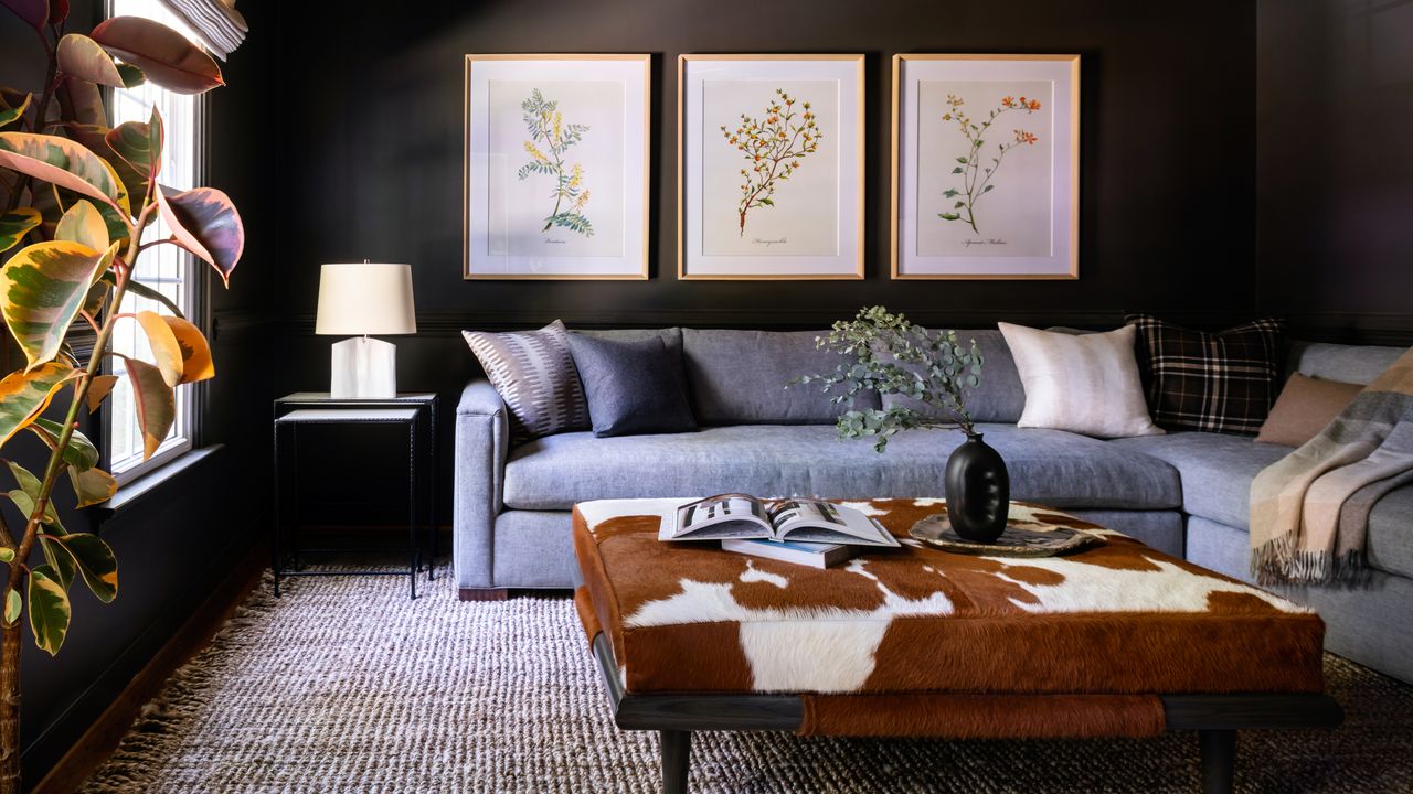

After living in their Richmond home for nearly 20 years, a Virginia family found themselves on the verge of leaving it behind. They came close to buying a whole new house, before interior designer Jamie Ivey reminded them that you don’t know what you’ve got til it’s gone.
‘That [new] home was going to need hundreds of thousands of dollars in construction and renovation costs to get it where they wanted it,’ said Ivey. ‘I convinced them that their current home had plenty of space; it just needed a refresh.’
An outdated design scheme meant that by late 2019, the owners were slowly falling out of love with the house. ‘The big must-have for all the spaces was to update the look, as it was very much stuck in the 1990’s,’ said Ivey. ‘They wanted something fresh with a modern feel, but still fitting with their colonial revival-style home. So it had to be a touch traditional, but with a modern bend. The wife didn’t want a feminine color palette or ornate details. We clicked right away, as I definitely gravitate towards a more moody masculine vibe in my designs.’
Inclusive of the pandemic-induced delay that has hindered the renovation of even some of the world’s best homes, the project was completed earlier this year. ‘The home is now more functional for their current lifestyle, and feels updated yet still classic,’ said Ivey. ‘They are a warm, friendly, modern, inviting, down-to-earth family, and the home now reflects that vibe. Now I just need to convince them to re-design their kitchen!’
Ivey took us on a tour of the home, and shared how she brought a languishing family home bang up to date.
Entrance hall
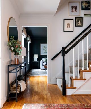
Welcoming guests into the home is an entrance hall abundant with personal touches. ‘We had a new stair runner installed, as well as created a gallery wall, where we re-framed family photos and mixed them in with new modern pieces,’ said Ivey of her hallway ideas. ‘The large round mirror at the entry, metal console table, and fabulous brass ceiling fixture at the entry provide a fresh look right when you walk into the home.’
Living room
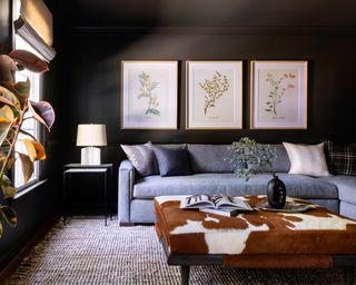
'My favorite room to design was the living room,’ said Ivey. ‘I love it when clients want to do something different, and painting everything in that room a deep warm bronze from Sherwin-Williams really created the cozy intimate space they were after.’
With brass accents and a custom cowskin Ottoman from Vanguard adding further warmth to the dark living room ideas, Ivey needed to be conscious to maintain balance in the room. ‘To keep it from being too warm, we married it with a custom sectional in a cool gray fabric from Kravet. We had pillows made in a mix of plaids, stripes and solids. The overall vibe makes you want to kick up your heels and relax.’
Dining room
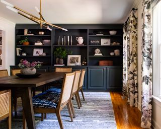
If you have a fabric that you love, let it inspire the scheme for a whole room. ‘The curtain fabric was the jumping off point for the color palette of the room, as the colors were rich and saturated,’ Ivey said of her dining room ideas. ‘We pulled one of the curtain colors and painted their existing built-in cabinetry a deep green blue.’
The Farrow & Ball painted unit extends across the length of one wall, with the deep blue tones pulled out in the newly upholstered chairs, done to ‘give the space more added texture and pattern’, said Ivey.
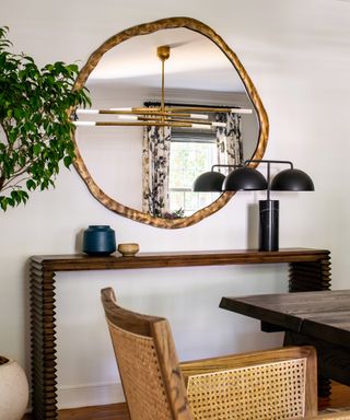
‘The showstopper chandelier is a conversation starter for sure’, she added of the light fitting from Kelly Wearstler’s Rousseau collection with Visual Comfort, visible here in the reflection of another stunning circular wall mirror. ‘This room isn’t modern, but isn’t traditional, it’s both. It’s exactly what we were trying to achieve throughout the home.’
Master bathroom
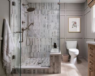
‘My favorite design element is the marble shower tile in the primary bathroom and how it aligns with the millwork,’ said Ivey of her bathroom ideas, explaining that getting the shower right was a major undertaking. ‘We removed the wall in the shower to let in some natural light, which really made the shower feel much larger.’
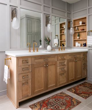
Combined with the white oak double vanity and the warm grey walls, the result is spa-like in its soothing nature. ‘The palette is tone on tone, with taupe, brass, nickel, and warm white. It really gives it a muted, serene vibe. It’s so dreamy when you walk in this room.’
Master bedroom
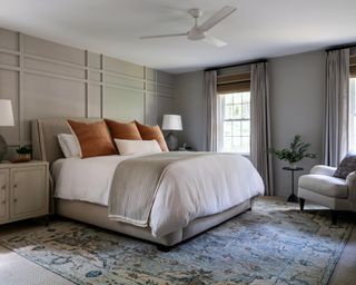
The unusually bold and pronounced millwork in the bathroom appears again in the bedroom ideas, lending modernity to the space through its assertive use of geometry. Softness is, however, present in abundance, from the upholstered bed to the soft grey chair by Robin Bruce. ‘Again, the palette is dreamy and muted, with a mix of modern touches that still fit into the overall architecture of the home,’ said Ivey. Either side of the bed are Denali lamps by Hudson Valley, atop a pair of custom Vanguard nightstands.
Upstairs hallway
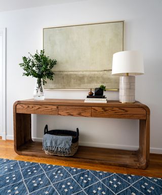
When it comes to hallway storage ideas, think about how you can make the useful beautiful.
‘We designed this custom console table, which houses extra cords, batteries, and knick knacks,’ said Ivey. ‘A fresh coat of white paint, along with new accessories and lighting made this hallway feel more up to date.’ The console table is joined by an invigorating blue runner and a Borneo table lamp, also by Hudson Valley.
Hallway bathroom
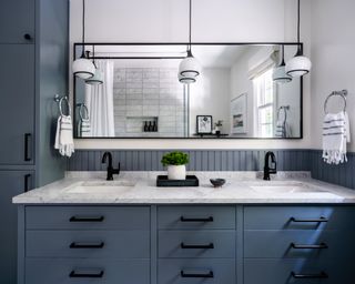
Along with the master bathroom, Ivey also refreshed the hallway bathroom. ‘We custom designed the vanity and linen closet to maximize storage, as their existing one wasn’t fitting the bill,’ said Ivey. ‘The muted blue paint color, stacked marble tile in the shower, bold pendants, and black hardware give this space a slightly more modern feel.’
Interior design / Ivey Design Group
Photography / Ansel Olson
Sign up to the Homes & Gardens newsletter
Design expertise in your inbox – from inspiring decorating ideas and beautiful celebrity homes to practical gardening advice and shopping round-ups.

Ailis started out at British GQ, where a month of work experience turned into 18 months of working on all sorts of projects, writing about everything from motorsport to interiors, and helping to put together the GQ Food & Drink Awards. She then spent three years at the London Evening Standard, covering restaurants and bars. After a period of freelancing, writing about food, drink and homes for publications including Conde Nast Traveller, Luxury London and Departures, she started at Homes & Gardens as a Digital Writer, allowing her to fully indulge her love of good interior design. She is now a fully fledged food PR but still writes for Homes & Gardens as a contributing editor.
-
 I'm running out of room for my houseplants and this plant stand with grow lights is the perfect space-saving solution – it's currently $50 off at Amazon, too
You can even use it for indoor growing and propagating
By Tenielle Jordison Published
-
 Reese Witherspoon limits her bookshelf to three colors for a cohesive, streamlined impact – it's perfect for a minimalist living room
The actress makes a case for curated book storage – it's the ultimate way to bring the bookshelf wealth trend into even the most pared-back homes
By Megan Slack Published