This timeless period home has an eclectic interior awash with color and pattern
Interior designer Heidi Caillier has used cozy colors and playful prints in her 1920s Seattle home to create a retro feel

Design expertise in your inbox – from inspiring decorating ideas and beautiful celebrity homes to practical gardening advice and shopping round-ups.
You are now subscribed
Your newsletter sign-up was successful
Want to add more newsletters?
When Heidi Caillier moved her interior design firm from San Francisco to Seattle, she brought with her a signature look very much in favour with California’s laid-back, sun-loving community.
Gradually, as a more northern approach to life took hold, her design language evolved, with her own home a clear example of where the journey led her.
‘When I was starting out, my style was very bohemian and bright with big pale sofas and blasted white walls – it was the look I was hired for,’ says Heidi.
Article continues below‘But things started to change once I’d moved to Seattle. I was taken on by an older, savvy client who asked for a very different style and that totally shifted things for me.
'With this second home, I wanted to bring in aspects of client projects that had really worked and appealed to me.’
The Tudor Revival house, built in 1925, was only 20 blocks from the family’s previous home, which Heidi and her husband, Justin, and twins Rowan and Soter, as well as rescue dog Violet, had now outgrown.
‘By the time the twins were two we knew we were going to outgrow our former bungalow, so we casually began looking for about a year,’ says Heidi.
Design expertise in your inbox – from inspiring decorating ideas and beautiful celebrity homes to practical gardening advice and shopping round-ups.
‘When we walked into this house we knew it was the right fit, so we put in an offer within 10 minutes. We loved the scale of the property, with rooms that didn’t feel too large, and there was a big basement we could renovate.’
During the eight-month renovation, the family stayed in their rental property in Tacoma, south of Seattle, which meant that work was able to progress without too much upheaval for them.
See: World's best homes – tour the globe’s most beautiful houses
‘We bought the house from an older gentleman and while it had been well cared for, it felt dated and needed a refresh,’ says Heidi. ‘The overall layout worked for us so we didn’t do a lot of structural changes but added a bathroom upstairs and moved walls in the kitchen to make it larger. We did a lot of landscaping in the garden, but everything else was cosmetic.
‘I wanted to stay true to the style and period of the house, but mix looks. While on client projects I buy most things in one fell swoop, but with my own home I wanted to take time to deliberate.’
Kitchen
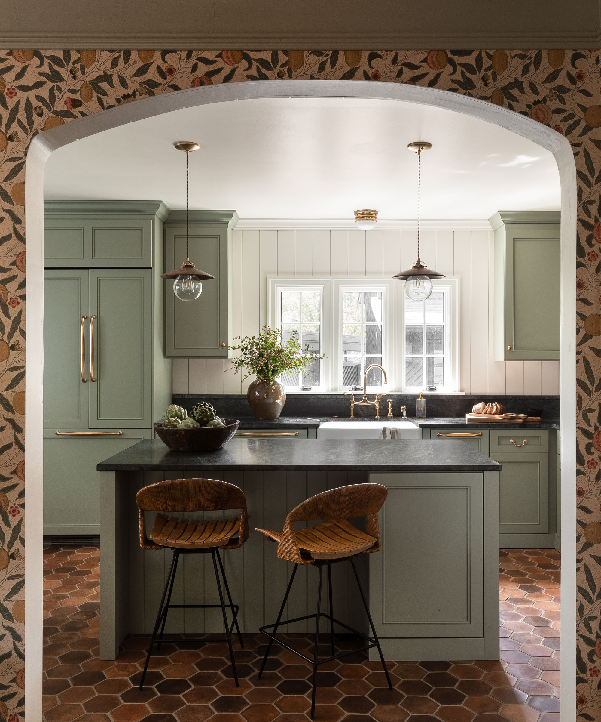
The ground floor has a circular floor plan with kitchen, dining and sitting room all connecting via large, softly rounded archways.
In the kitchen, the hexagonal shape of the flooring is a modern update of traditional terracotta tiles.
See: Kitchen ideas – decor and decorating ideas for all kitchens
Kitchen diner
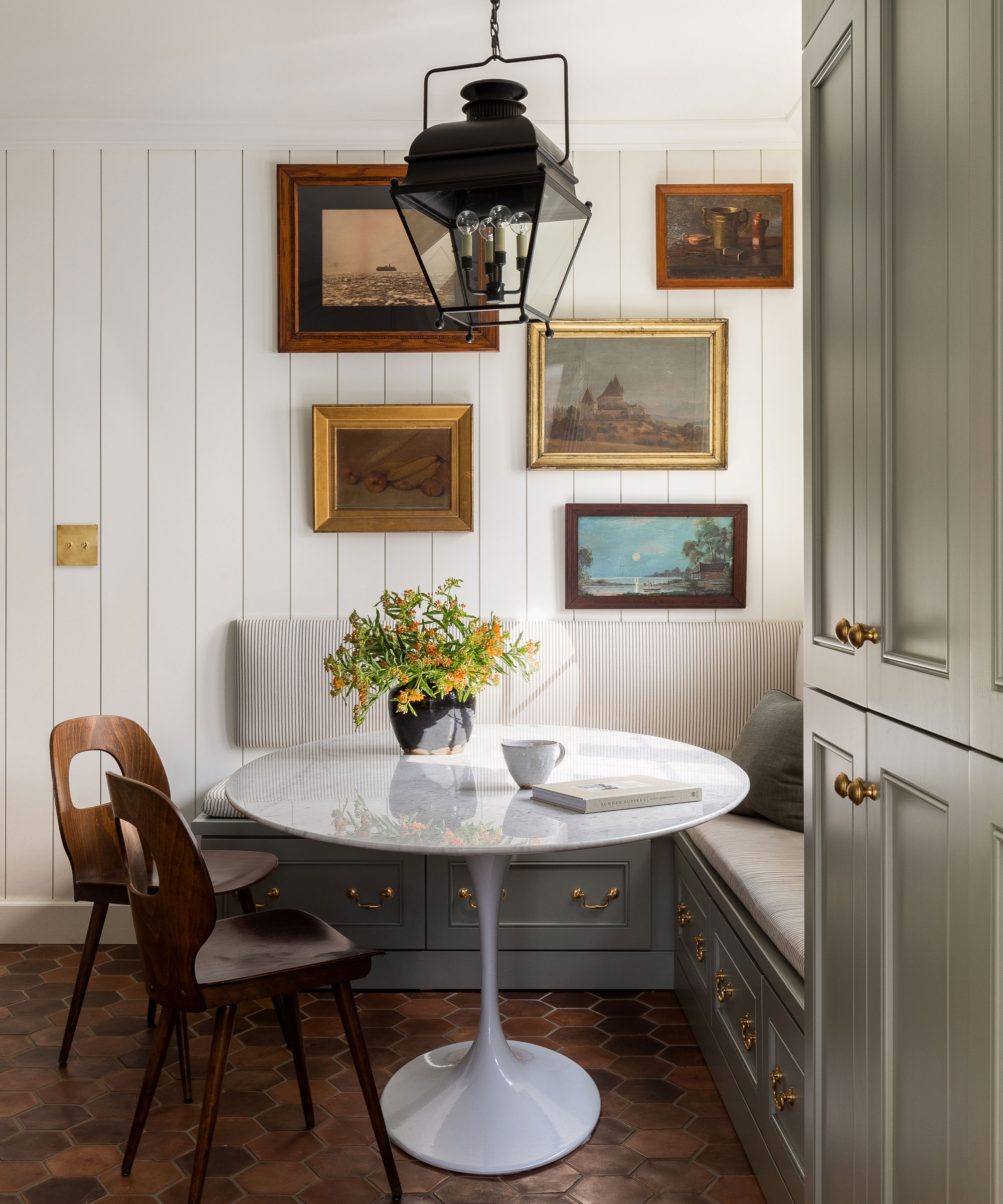
Banquette seating hides storage for art supplies and the Tulip table is the perfect foil to the more classic design choices.
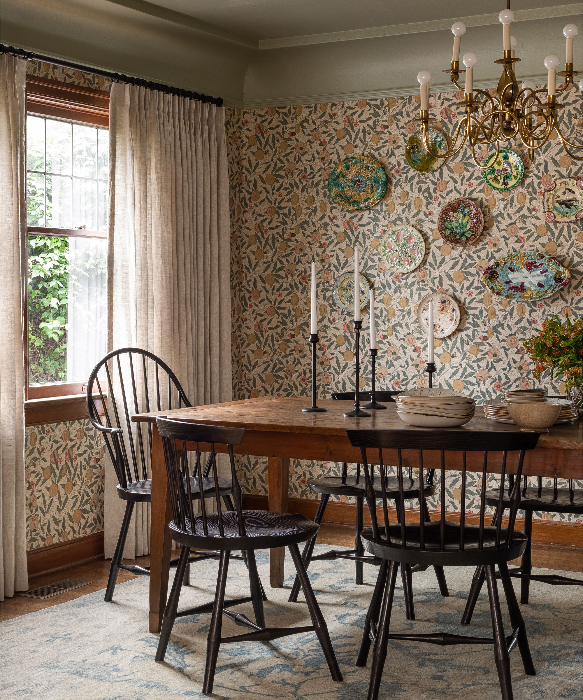
Paying tribute to the Tudor Revival origins of the architecture, in the dining room Heidi opted for an orchard print wallpaper that, in combination with the Windsor-style chairs and handmade plates, evokes the gentle mood of the Arts and Crafts era.
The sage green ceiling and cornicing adds a sense of warmth and picks up the color of the foliage in the wallpaper.
See: Dining room ideas – inspiration for decorating and furnishing your space
Sitting room
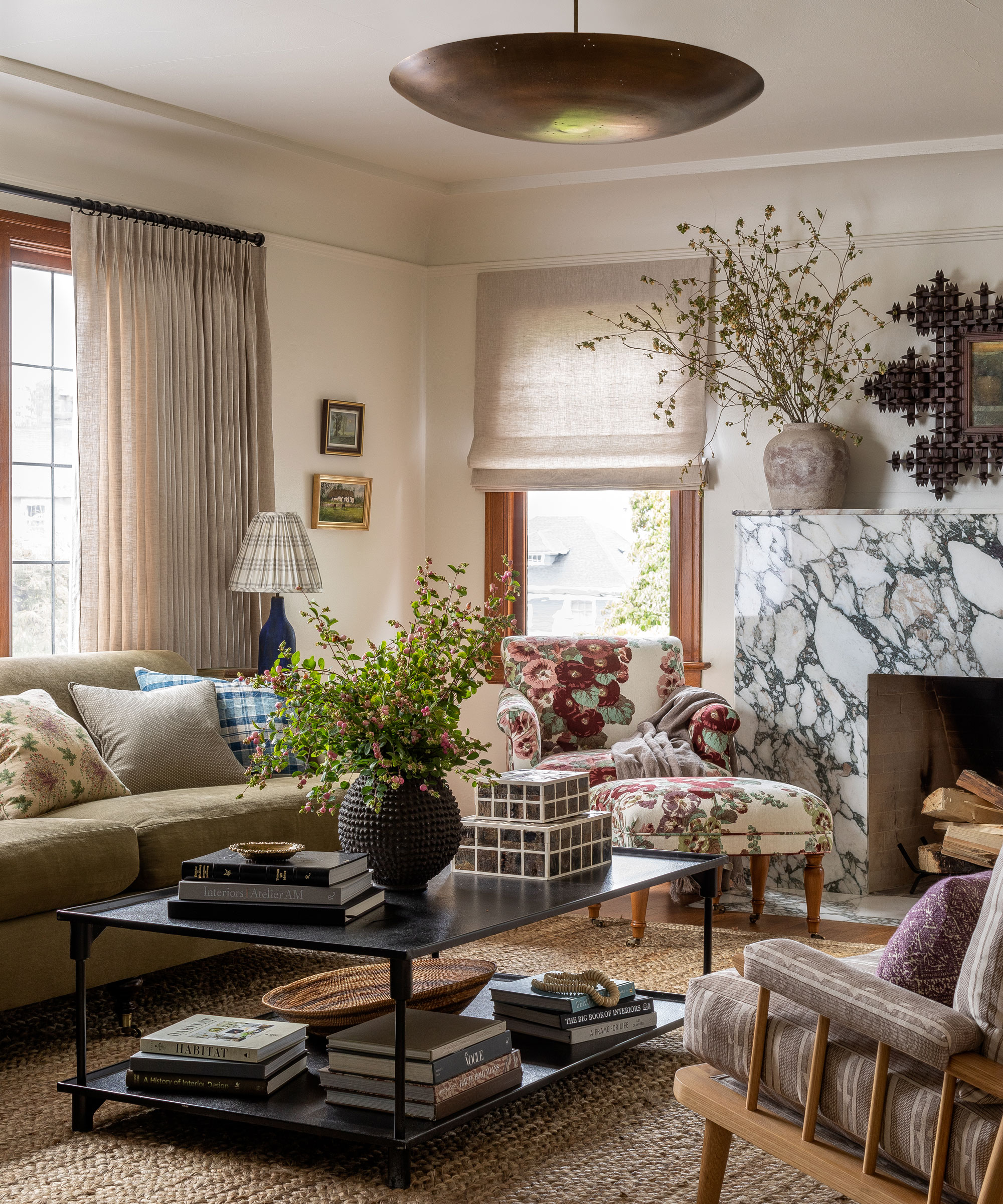
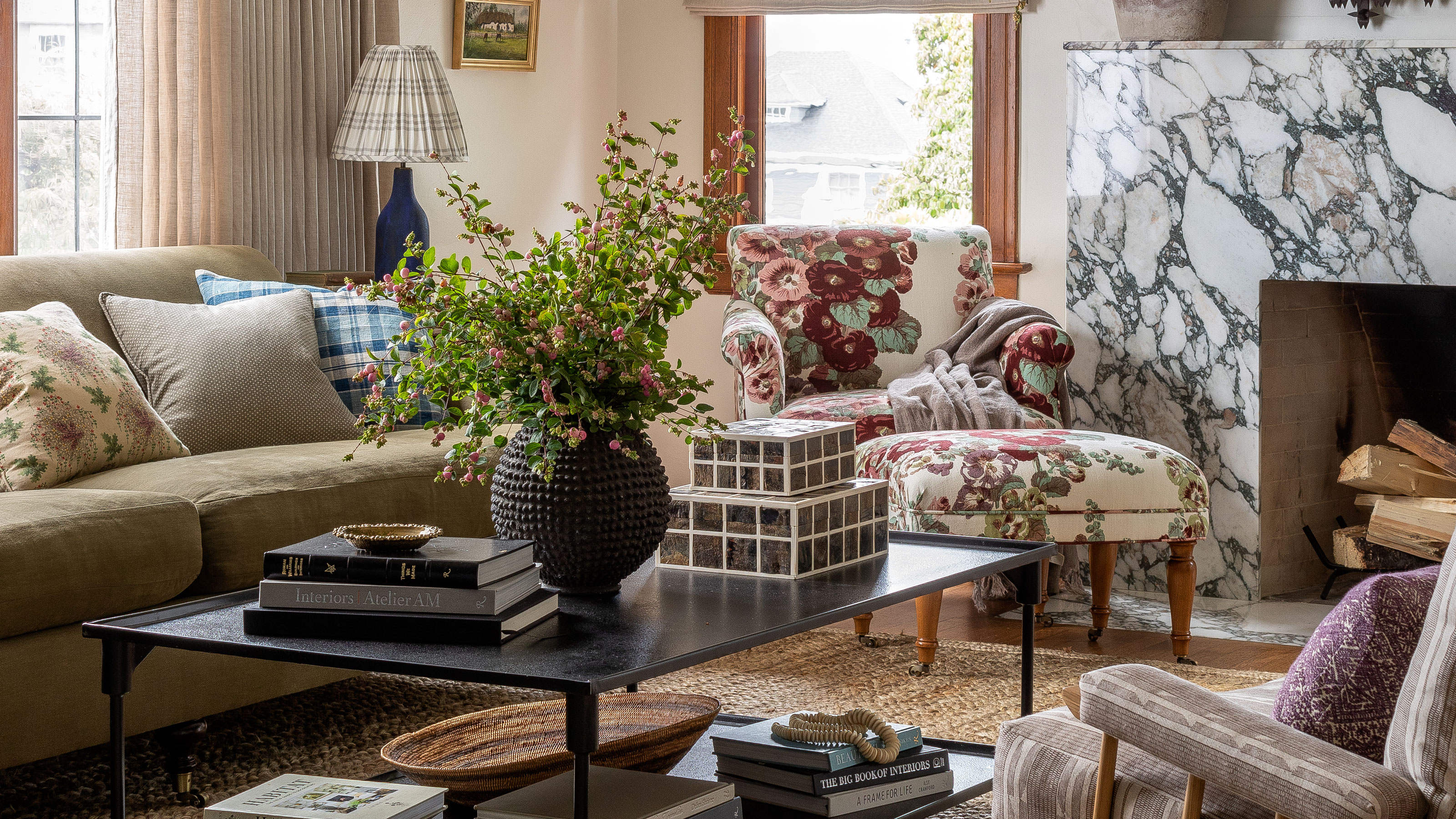
The sense of nostalgia shifts into a more timeless impression in the sitting room that could have been plucked from any decade in the last 50 years.
The diverse assortment of furniture styles here are complemented by an ever-wider array of prints and patterns in the cushions, the intimately snug and comforting surroundings finely tuned for relaxation.
The ‘mash-up’ of furnishings strikes a mood of eclectic coziness, while the jute rug and veining of the fireplace bring an organic twist.
‘I like the textiles to clash and avoid the temptation to have everything matching,’ says Heidi.
See: Living room ideas – clever ways to decorate living spaces
Hall
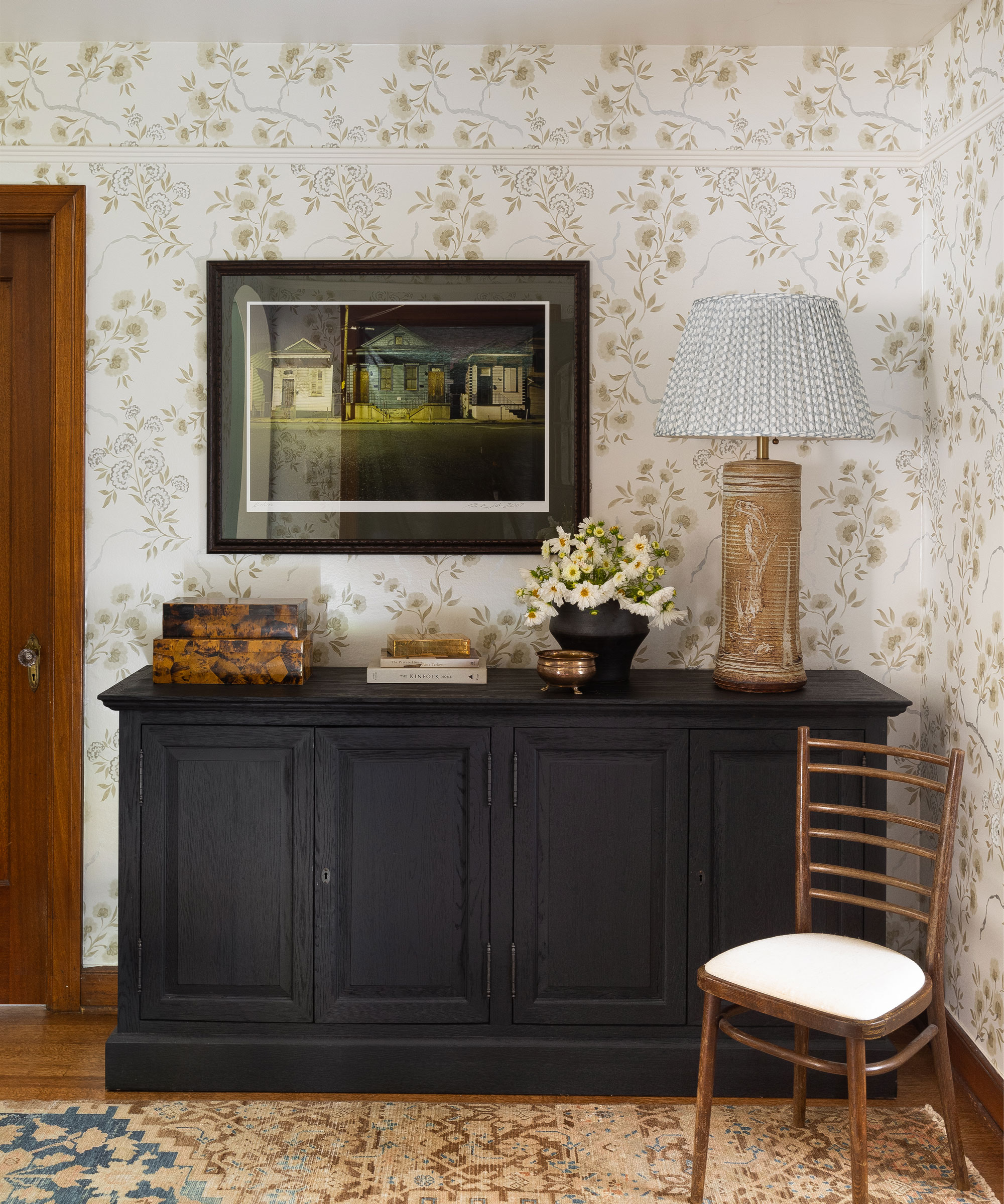
In the hall, the gentle and ethereal wallpaper, which continues upstairs to the landing, has a reflective quality that bounces light around the space.
Bedroom
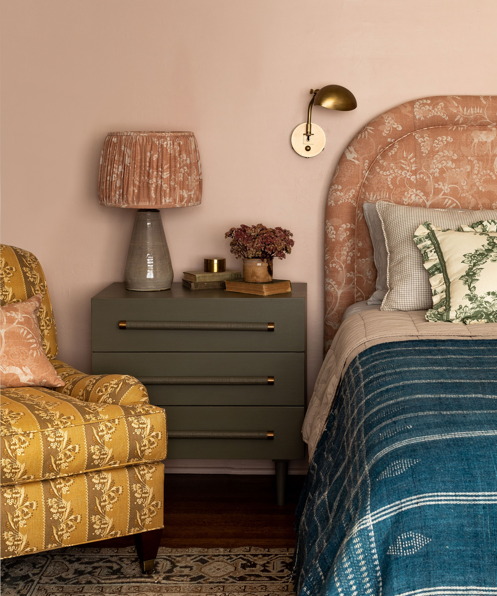
Upstairs, the bedrooms are accessorised with love-worn cushions and throws, the furniture upholstered in retro floral fabrics in a palpable demonstration of passing time.
The pink walls and fabric bring a sense of continuity to this delight of clashing fabrics.
See: Bedroom ideas – designs and inspiration for beautiful bedrooms
Children's bedroom
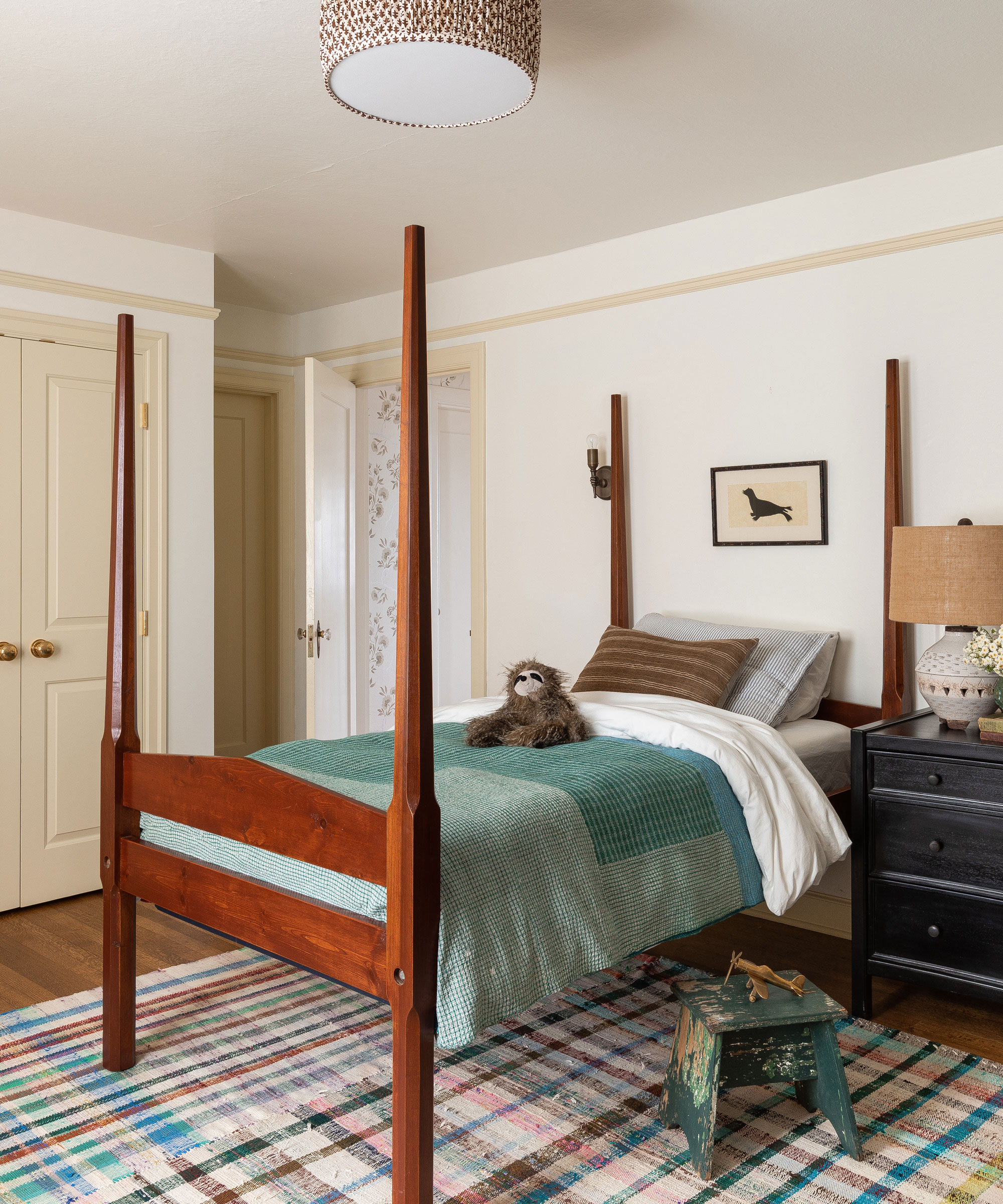
Heidi had two rag rugs stitched together to cover the floor in the children's bedroom. The cream frames, doors and rail bring definition to the white walls.
Bathroom
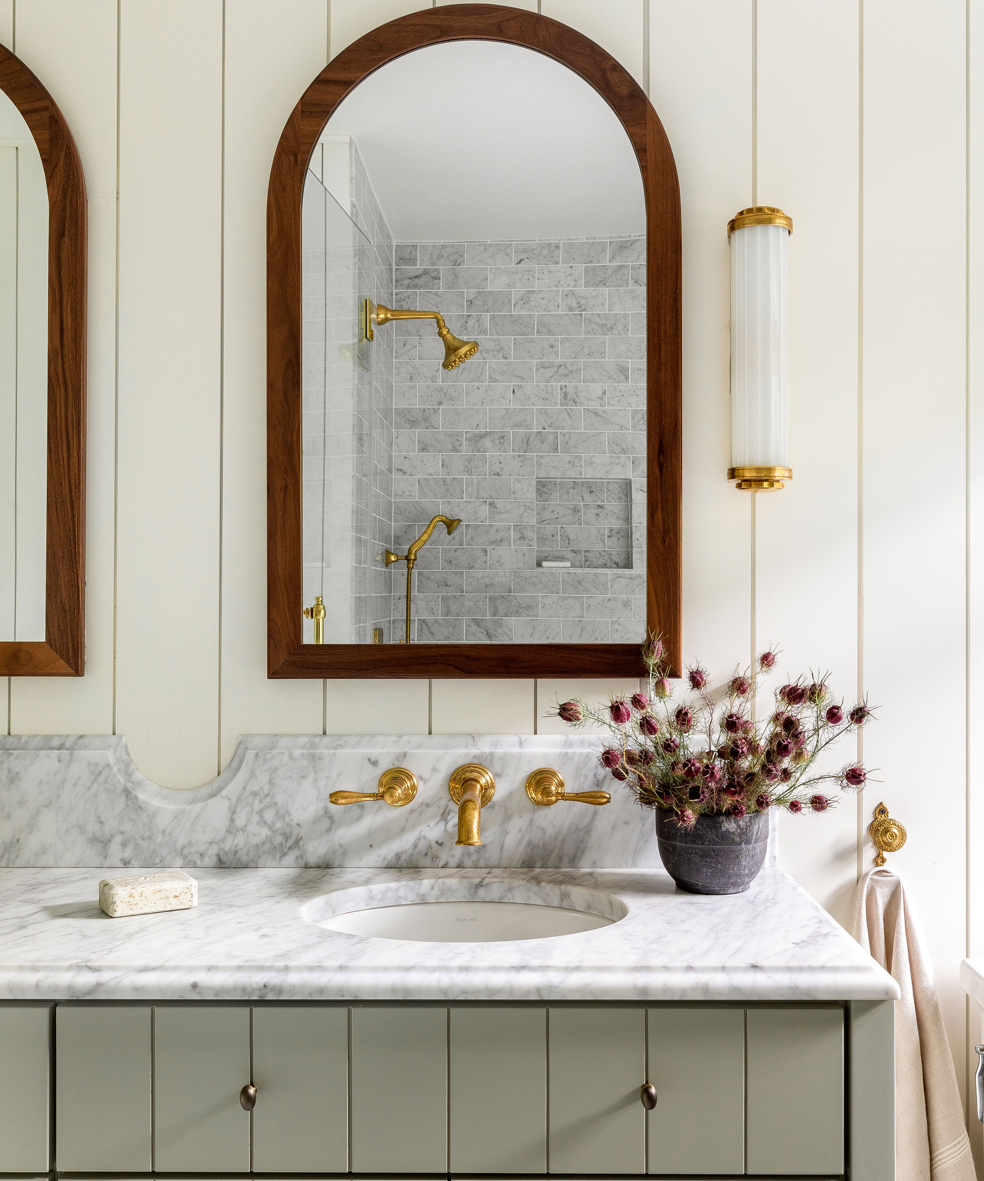
A wall-hung tap saves space on this custom built double vanity unit in the bathroom. The wood frame of the mirrored cabinet and the brass accents introduce a wonderful richness.
With its highly original interior where nothing is contrived, this home is a wholesome anchor for the family that live here.
Interior design / Heidi Caillier Design
Photographs / Haris Kenjar
Copy / Juliet Benning

Interiors have always been Vivienne's passion – from bold and bright to Scandi white. After studying at Leeds University, she worked at the Financial Times, before moving to Radio Times. She did an interior design course and then worked for Homes & Gardens, Country Living and House Beautiful. Vivienne’s always enjoyed reader homes and loves to spot a house she knows is perfect for a magazine (she has even knocked on the doors of houses with curb appeal!), so she became a houses editor, commissioning reader homes, writing features and styling and art directing photo shoots. She worked on Country Homes & Interiors for 15 years, before returning to Homes & Gardens as houses editor four years ago.