5 design tips to steal from this newly light-filled Nashville kitchen renovation
A total color overhaul and a few structural changes helped turn this kitchen from a shadow trap into a light and bright stunner
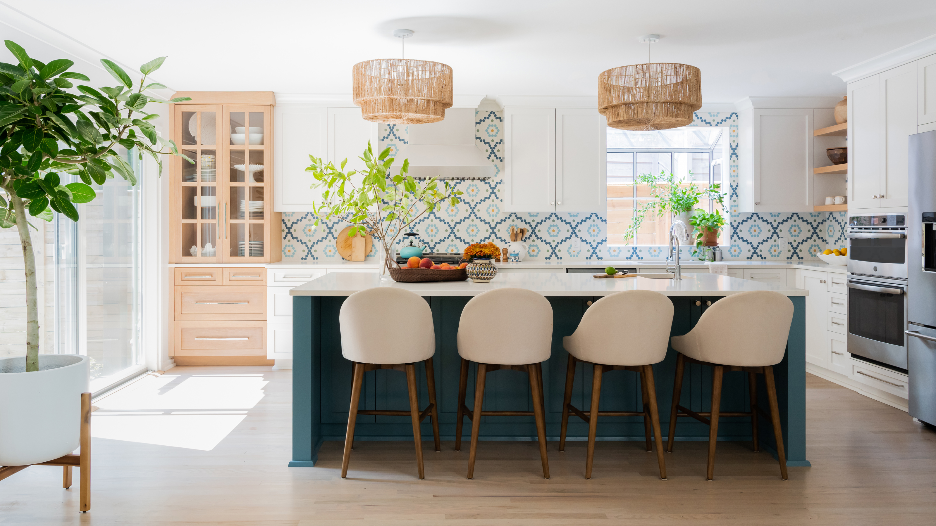

In Nashville, a total redesign has allowed a color-loving cooking enthusiast to see her kitchen in a whole new light.
‘Functionally, the client desired a semi-open concept more conducive to entertaining,’ explained Kate Chlebowski, founder of Vernacular, and the designer behind the new kitchen ideas.
Chlebowski worked to transform this Tennessee kitchen from a dark, crowded room into a light-filled, open space, with alterations ranging from new cabinets to major structural changes to this room and the living spaces beyond.
We took a tour of the kitchen with Chlebowski, who shared with us how she reinvigorated the dated space into one that will be loved for years to come.
1. Embrace a love of color with patterned tiles
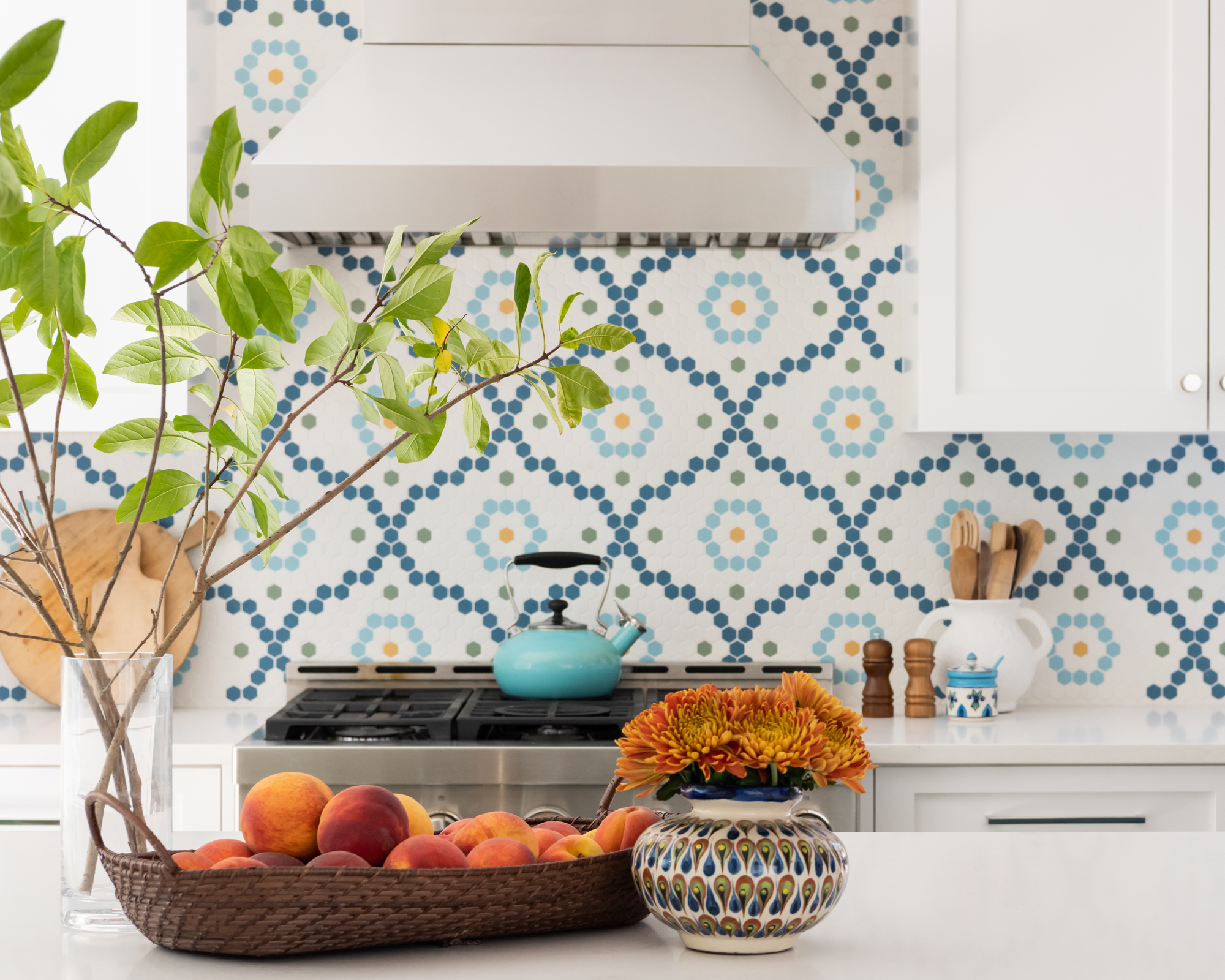
‘Aesthetically, our client absolutely loves color and having fun with pattern and textures,’ said Chlebowski. ‘She enjoys traveling, and desired a space that reflected her fun-loving lifestyle.’
Along with the island’s blue cabinetry painted in Sherwin-Williams’s Refuge, color has been injected into the space through hexagon mosaic-style kitchen tile ideas, sourced from American Restoration Tile in tones of teal and the occasional rhythmic fleck of orange.
‘We started with the backsplash, which was a custom color design, and kicked off from there. Once we had that element in place, everything else followed.’
2. Let the light in
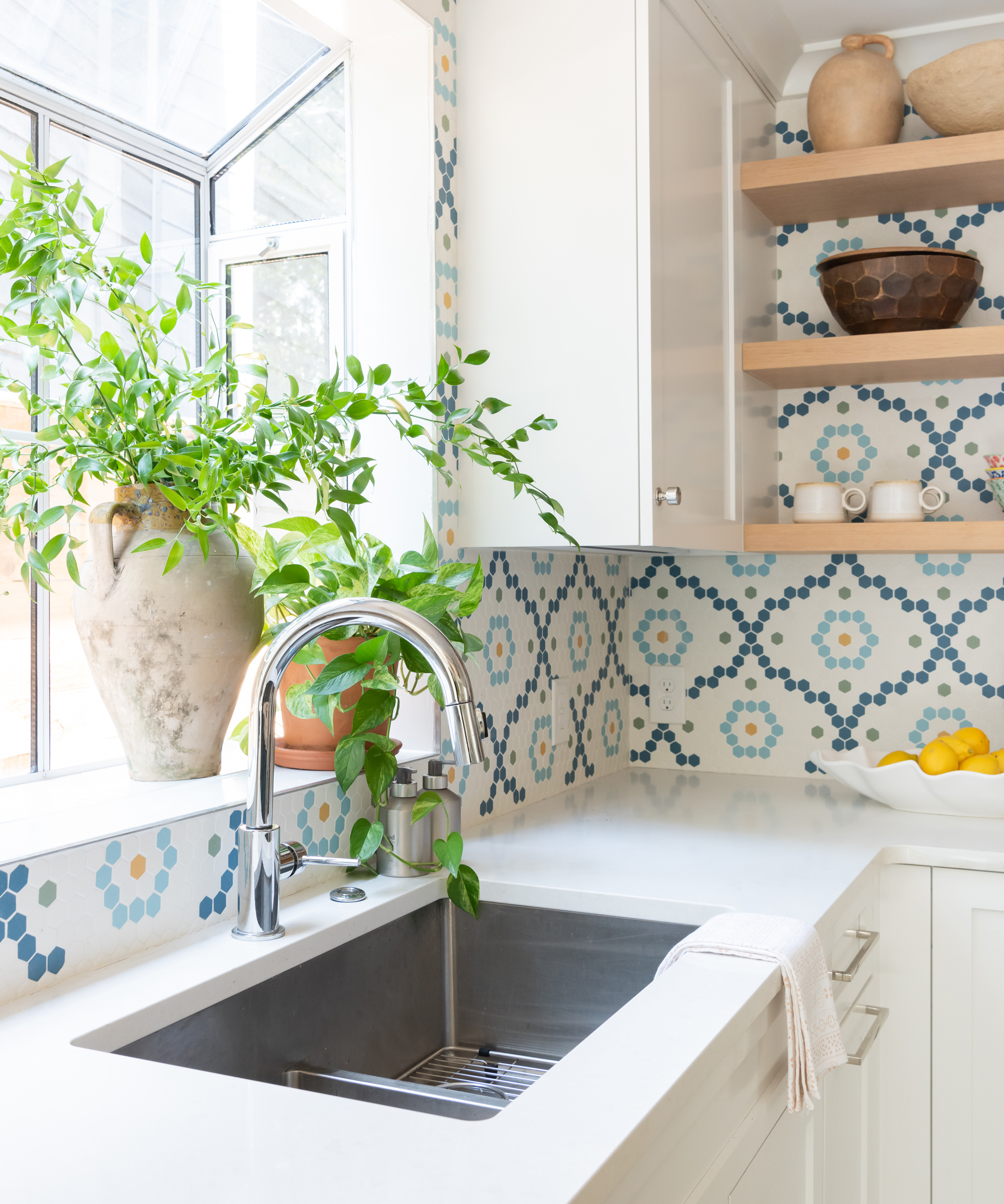
Undoubtedly the biggest changes to the space were the dramatic kitchen remodel ideas. ‘Lighting was also a huge desire,’ said Chlebowski. ‘The kitchen ceilings are only eight feet tall, but the adjacent living spaces have amazing vaulted ceilings with skylights. Those spaces received tons of natural light that could never reach the kitchen space with the existing dividing wall.’
‘After we removed the wall and basically redirected the entire kitchen, it received tons of natural light and a more functional flow.’ This change allowed the kitchen’s smaller windows to become pleasant vignettes that can host pot plants and ornaments on their sills, rather than needing to be kept clear as the sole bearer of natural light.
3. Balance a scheme with natural elements
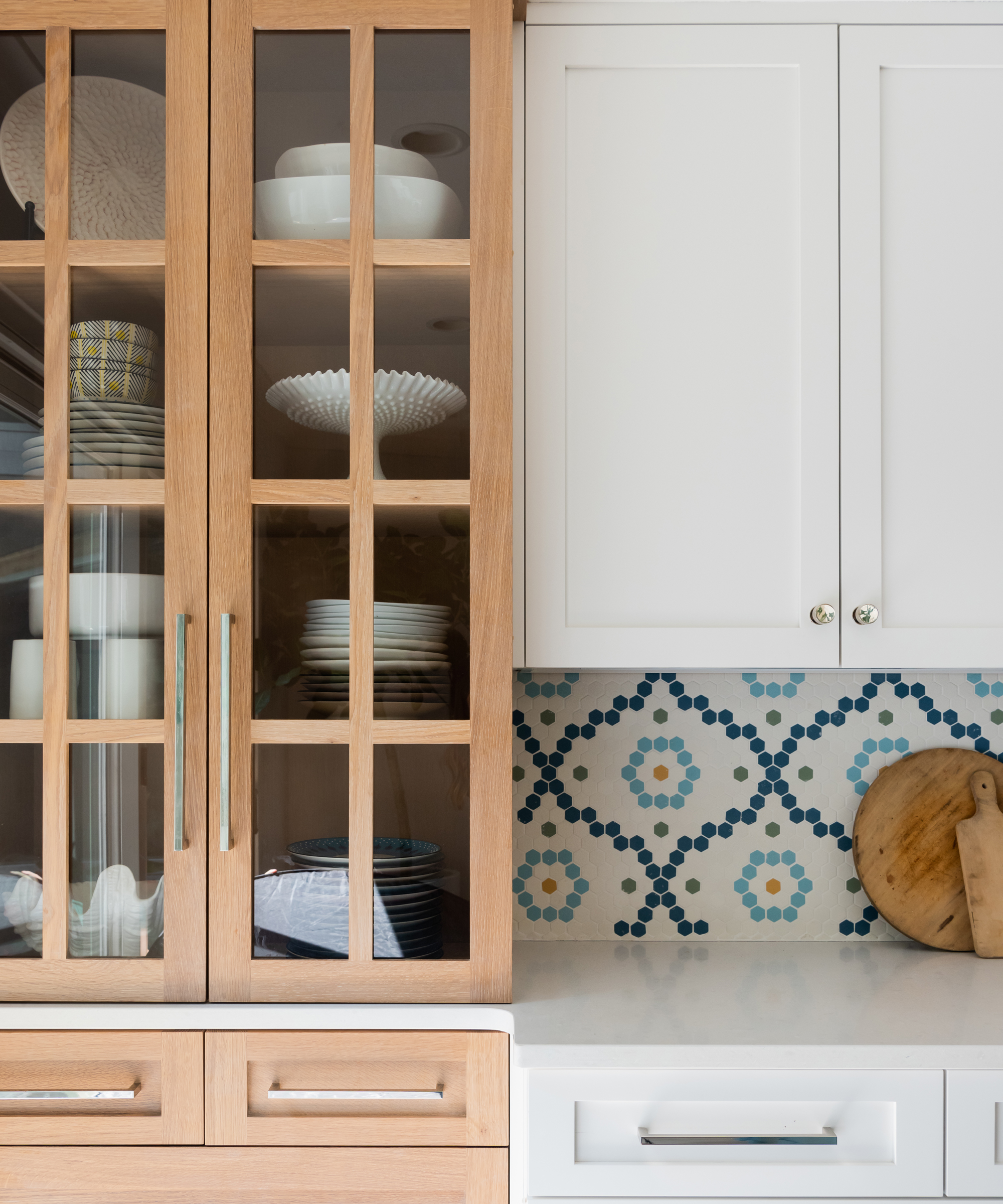
The classic combination of white and blue lends a refreshing aesthetic to the kitchen color ideas, but Chlebowski was sure to soften this with more muted tones.
‘The backsplash is the obvious star of the kitchen, but I think the natural wood elements, like the display cabinet and open shelves, really bring the kitchen into balance,’ she said. ‘I don’t think painted cabinetry is going anywhere anytime soon, but I do believe there’s a new interest in adding natural textures and finishes to add warmth and dimension to a space. I don’t think the kitchen would have hit home without those elements.’
Alongside the wooden storage fixtures, the kitchen lighting ideas feature pendant lampshades from Selamat that have been woven with jute twine, and a distressed vintage runner that helps add a rustic edge to the crisp aesthetic.
4. Indulge a love of cooking with cordon bleu appliances
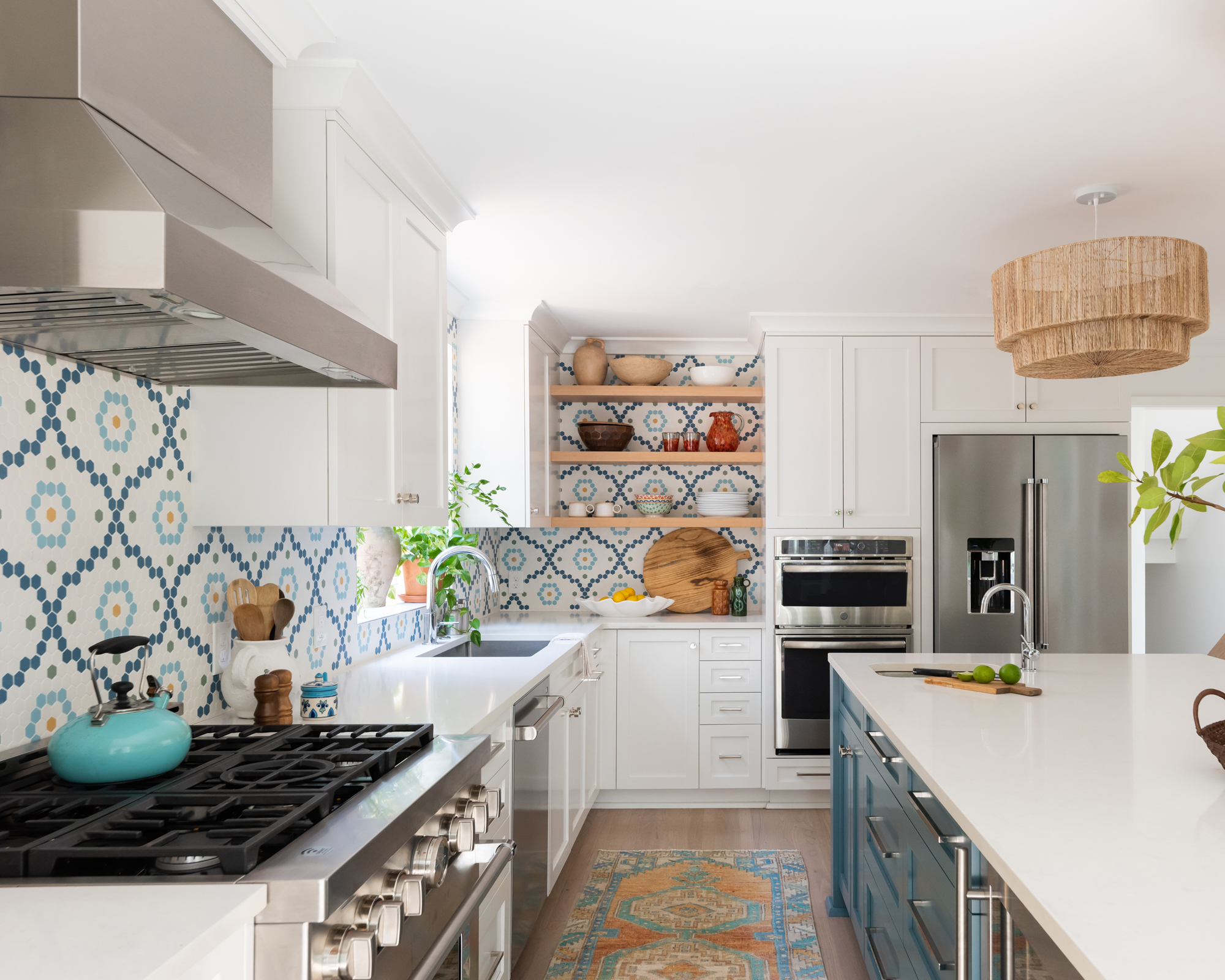
For anyone who loves being the host with the most, it is essential that a kitchen doesn’t just look good, but feels good too. ‘The client also loves to cook and entertain, so we opted for [Caesarstone] quartz countertops, two sinks, and an undercounter refrigerator in the island for guests,’ explained Chlebowski.
Packing functionality into the kitchen island ideas helps with the functionality of the space, while the importance given to high quality appliances, including a double refrigerator and full range from Kitchenaid, makes it a space that is pleasant to cook in.
5. Add personality through open shelves
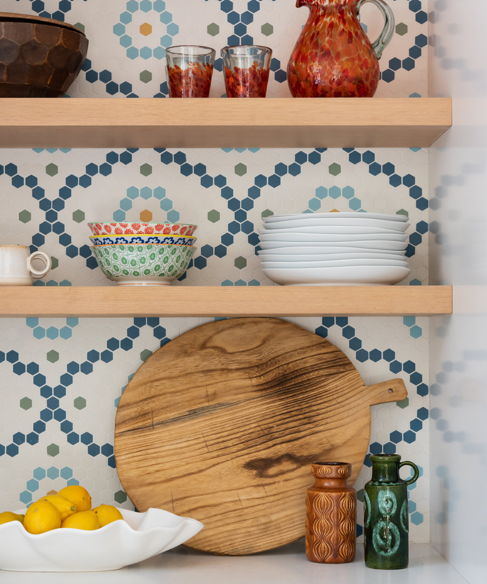
While the kitchen backsplash ideas were the first step in stamping the client’s personality onto the project, the opportunity for unique details didn’t stop there. ‘The open shelving created an opportunity to display collected items that are both interesting and functional,’ said Chlebowski.
This corner is also a space that the owner can re-personalize on a whim, using it to showcase new season tableware and decor as well as old favorites.
Interior Design / Vernacular
Photography / Ruby & Peach Photo
Sign up to the Homes & Gardens newsletter
Design expertise in your inbox – from inspiring decorating ideas and beautiful celebrity homes to practical gardening advice and shopping round-ups.

Ailis started out at British GQ, where a month of work experience turned into 18 months of working on all sorts of projects, writing about everything from motorsport to interiors, and helping to put together the GQ Food & Drink Awards. She then spent three years at the London Evening Standard, covering restaurants and bars. After a period of freelancing, writing about food, drink and homes for publications including Conde Nast Traveller, Luxury London and Departures, she started at Homes & Gardens as a Digital Writer, allowing her to fully indulge her love of good interior design. She is now a fully fledged food PR but still writes for Homes & Gardens as a contributing editor.
-
 Ina Garten's storage pantry is an insightful window into all of the best cookware used by the chef – and it's easy to recreate on your kitchen shelves from $48
The beautiful dishware in The Barefoot Contessa's Hamptons pantry showcases the tools she uses most often to cook – this is exactly how you replicate it
By Sophie Edwards Published
-
 Extend the lifespan of your appliance with 5 simple but crucial washing machine maintenance tips
From cleaning the filters to keeping the door open, experts reveal the washer tips they swear by
By Andy van Terheyden Published