5 design tips to steal from this elegant modern kitchen with a tactile touch
Work in harmony with the architecture and remember to add texture to your modern kitchen design, says this expert
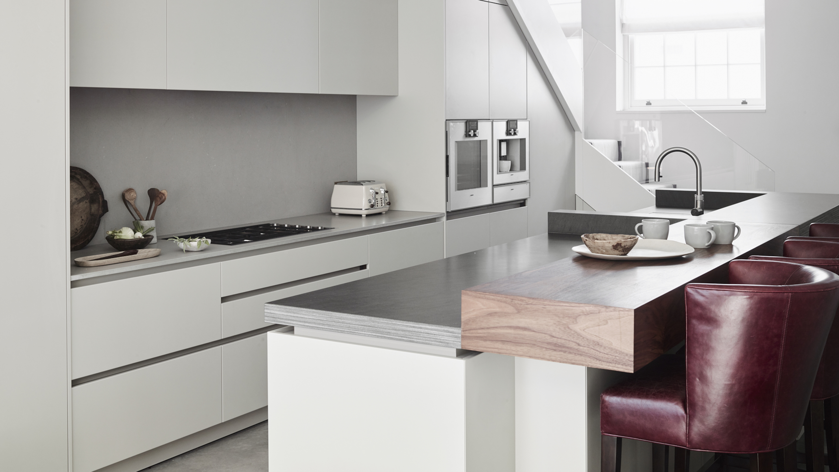

Creating a slick, geometry-ruled, monochrome kitchen is a modern design fiend’s dream – but you’ll need to be sure to strike a balance between simplicity and spirit.
While your initial kitchen ideas may be led by minimalist principles, don’t forget that it needs to feel like home. In this stunning example by kitchen design agency Roundhouse, an architecturally astute, pristine design is brought to life by deftly executed tactile details.
Roundhouse’s Senior Design Consultant Daniel Lau gave us a tour of the space, and showed us how to do modern kitchen ideas right.
1. Make your island monolithic
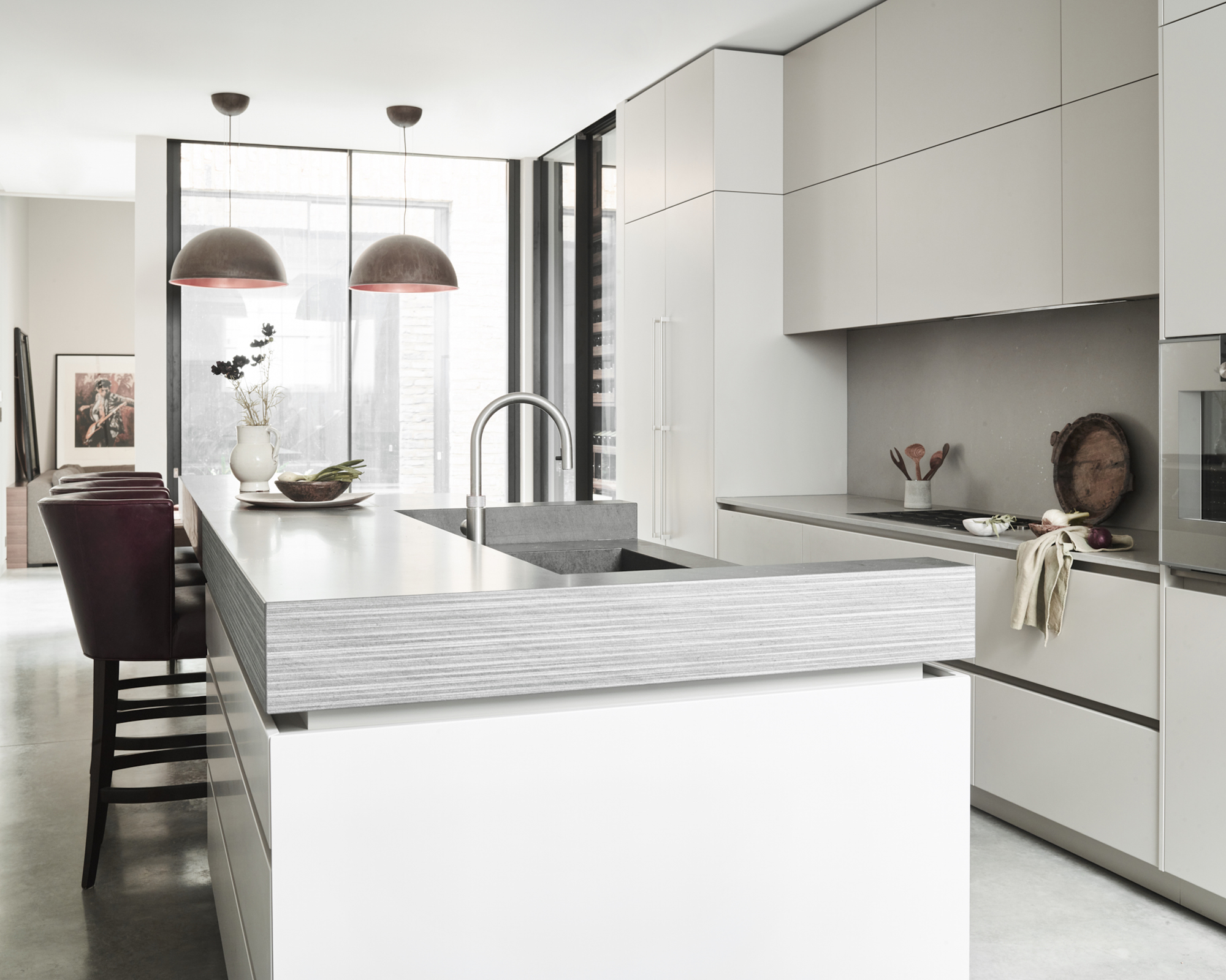
An island is not only a practical addition to your kitchen layout ideas – it can be a design piece too. ‘The client was after an almost monolithic island that would be the statement feature in their new kitchen space,’ explained Lau. As well as its dominating size ensuring a definite presence, its pristine, handle-free white cabinetry is paired with a bespoke, honed Vermont worktop with a striated edge profile.
2. Work in harmony with the architecture
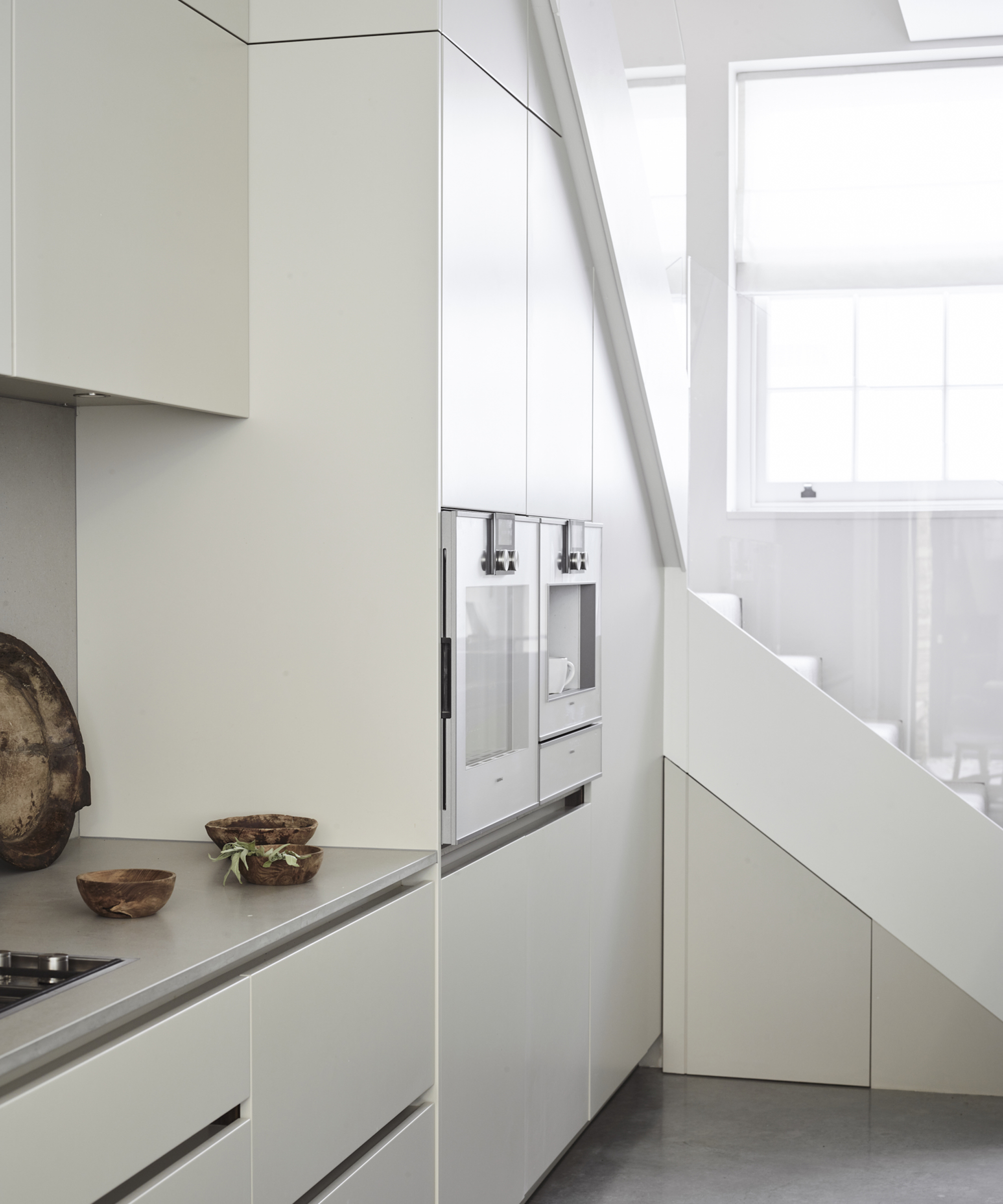
‘The rest of the cabinetry was designed to almost blend into the architecture,’ said Lau. ‘Double height, matt lacquer Urbo cabinets go all the way to the ceiling while also hiding the ducting for the extractor.’ In designing the kitchen cabinet ideas and beyond, the Roundhouse team worked closely with the home’s interior architect Debra Parkington.
‘This project was a great example of how we can collaborate with other design professionals to create completely unique designs that not only stand out, but also link with the entire aesthetic of any renovation.’
3. Soften a cool aesthetic with informal areas
With a pared back, modern aesthetic such as this, it’s important to include areas that make the room feel accessible rather than austere. ‘Creating a more informal dining area was also important, so we built up the black walnut breakfast bar to match the statement worktop on the island,’ said Lau.
The wood’s warming interjection into the monochrome scheme beckons guests to take a seat, while the pairing of burgundy leather bar seats adds a welcoming touch of old school comfort.
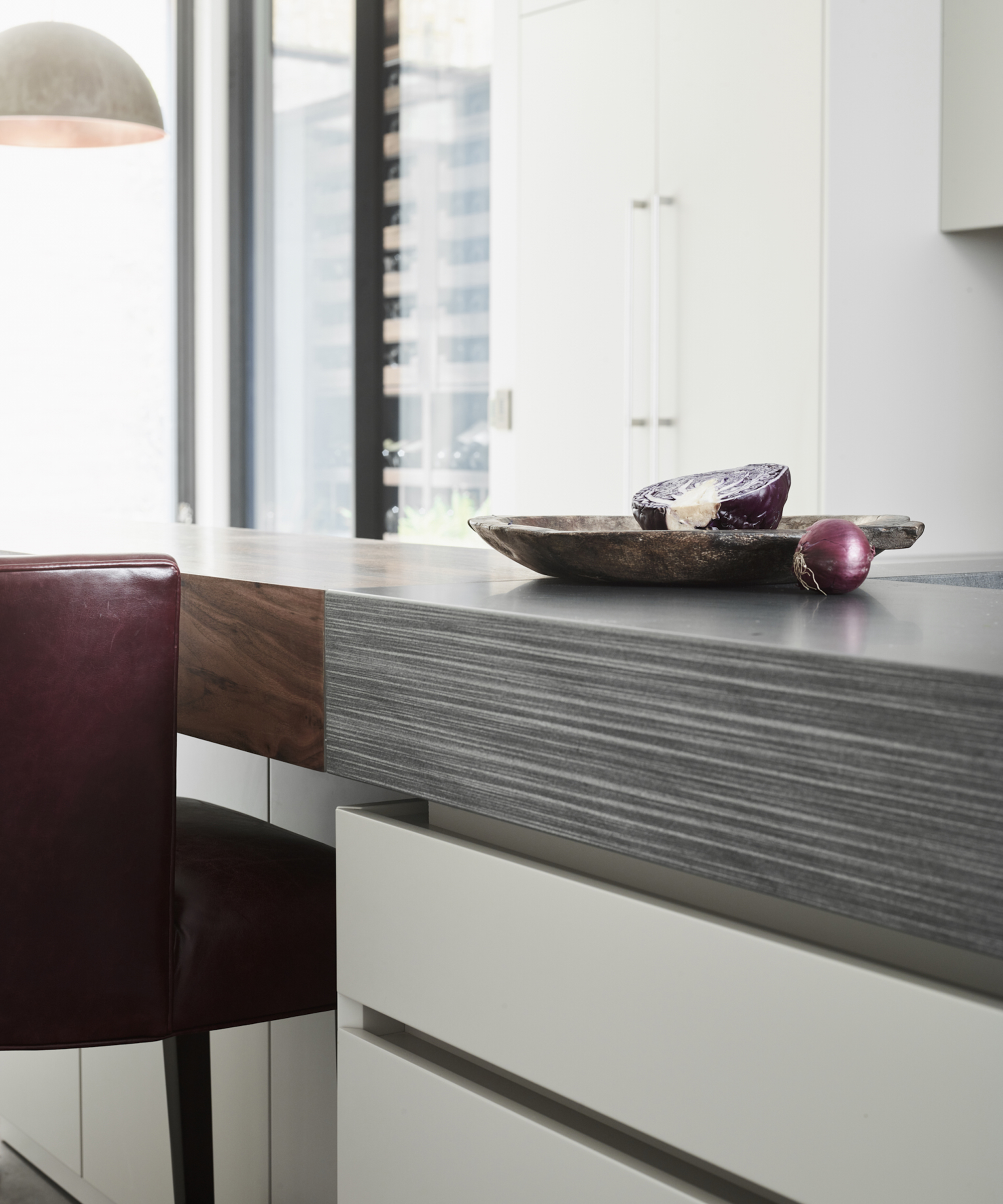
4. Ensure a modern kitchen has tactile details
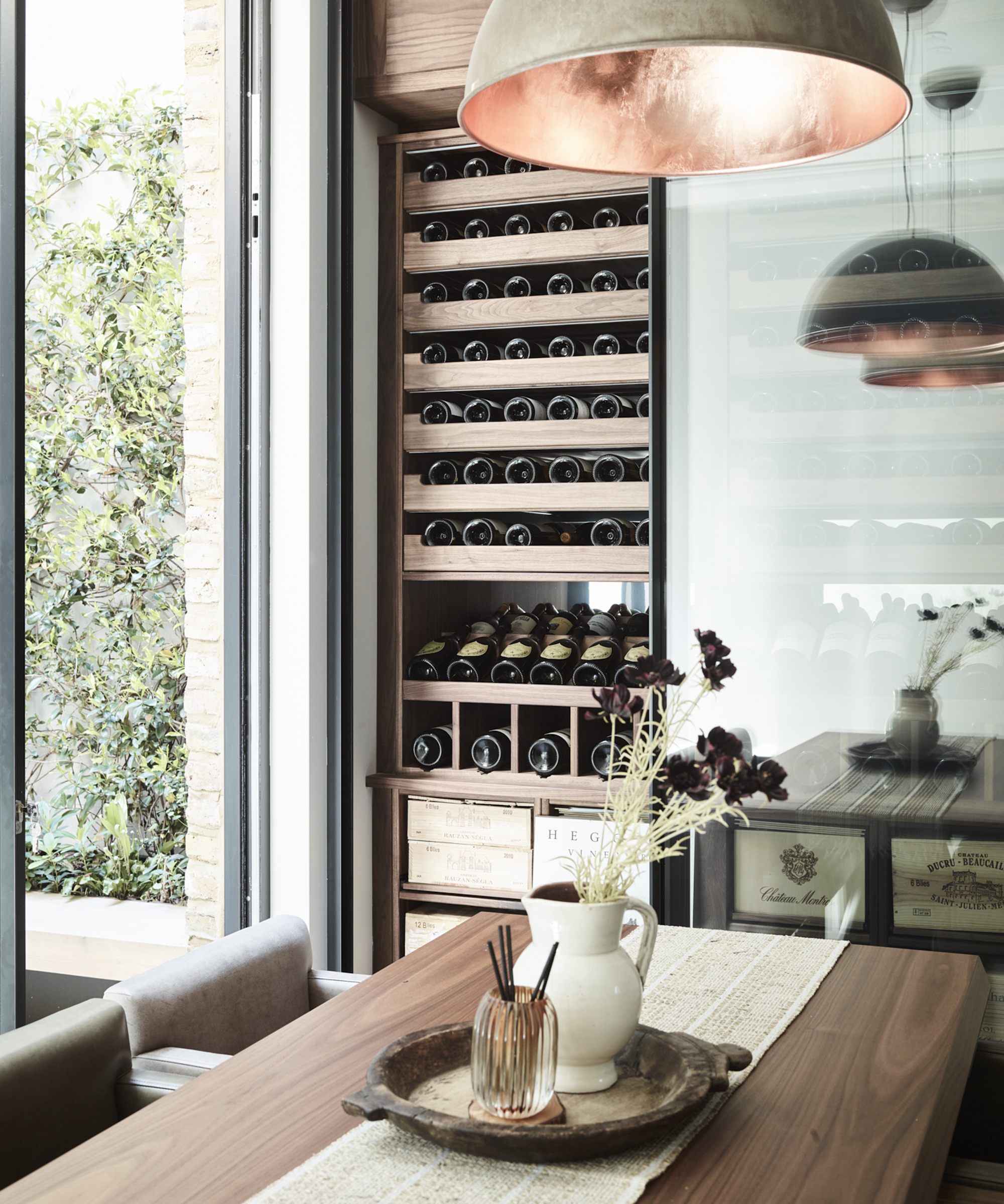
In a kitchen dominated by a sea of white, handleless cabinetry, Lau was keen to implement textural notes throughout. ‘The use of the different texture and finish to the side of the island [in the striated edging] introduces a more tactile element to the kitchen,’ he said. Next to the modern kitchen island, a richly colored wooden dining table sits next to a wine fridge with warm wooden shelves, and under a pair of lampshaded pendant lights, that pair a mottled grey exterior with glowing, brushed copper on the inside.
5. Be practical when designing your work surfaces
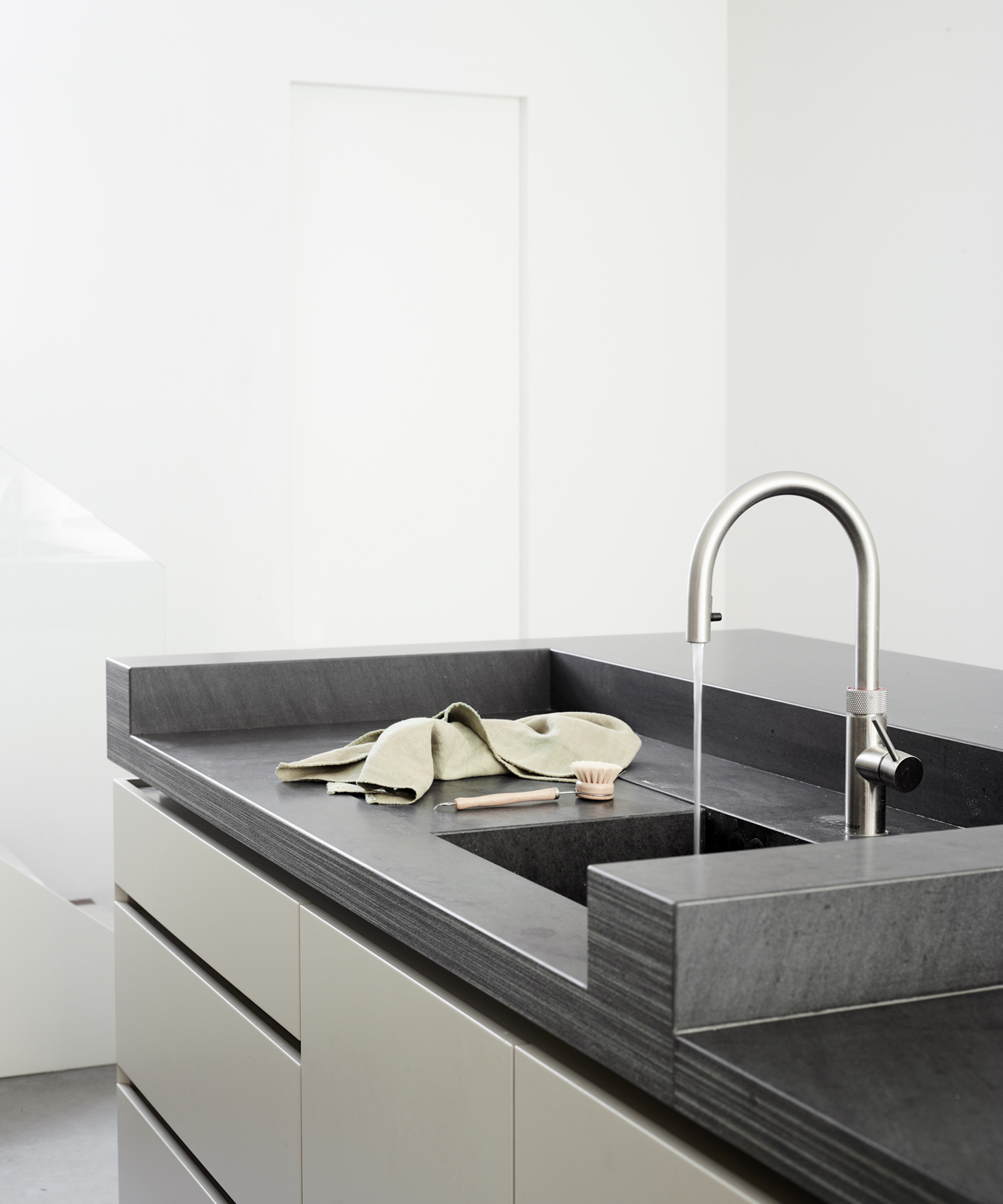
When thinking about how to design a kitchen, practicality should always be a top priority. Creating a bespoke piece allowed Lau to implement lesser-used, but highly sensible, kitchen island ideas.
‘Building up the worktops and creating a separated wet area for the sink is a really nice detail as any water does not spill to the back of the island like you can get with more conventional island designs which house sinks,’ Lau explained.
Interior Design / Roundhouse
Sign up to the Homes & Gardens newsletter
Design expertise in your inbox – from inspiring decorating ideas and beautiful celebrity homes to practical gardening advice and shopping round-ups.

Ailis started out at British GQ, where a month of work experience turned into 18 months of working on all sorts of projects, writing about everything from motorsport to interiors, and helping to put together the GQ Food & Drink Awards. She then spent three years at the London Evening Standard, covering restaurants and bars. After a period of freelancing, writing about food, drink and homes for publications including Conde Nast Traveller, Luxury London and Departures, she started at Homes & Gardens as a Digital Writer, allowing her to fully indulge her love of good interior design. She is now a fully fledged food PR but still writes for Homes & Gardens as a contributing editor.
-
 5 surprising but brilliant ways to clean with old socks – from perfectly buffing stainless steel to deterring pests naturally and more
Tackle dust in tricky corners, clean your mirrors and even banish bad odors with those rogue single socks
By Andy van Terheyden Published
-
 How to grow astilbe – expert advice on cultivating this shade-tolerant flowering perennial
Shade-tolerant and pest-resistant - astilbe are hardy and tough perennials that can thrive in many settings
By Ellen Wells Published