Design house: This classic home in Indiana has been given a modern monochrome update
The interior designer has used a cool black, white and cream combination to add a sophisticated yet laid-back look to this home


This design project was a full renovation of a classic colonial home – for a large family in Carmel, Indiana.
There are many variations of colonial style houses, all reflecting the influences of regions that the settlers coming over to the US at the time originated from. This was a style that spanned several decades, starting during the 1600s and lasting until well into the 19th century.
The homeowners had raised their five children here, and they were embarking on a new phase of life as empty nesters. The home needed to transition along with them.
- See some of the world's best homes – beautiful properties from around the globe
In their desire to create a home that they could comfortably live out the rest of their years, they decided to call in the professionals to finish the job. This is where interior designer Whittney Parkinson steps in.
Whittney began her career as co-owner of the architecture and interior design firm, MAWR Design, working with her father from 2008, until founding Whittney Parkinson Design in 2016. As a young designer in the field, Whittney designed projects varying from high-end residential to a vast array of multi-million dollar commercial projects around the Midwest.
We speak to Whittney about the design project.
'With a growing family, there was a dire need for a larger but incredibly functional kitchen, and more open floor plan for conversing,' she says.
'We programmed spaces to have different functions than they had previously, and truly embraced elements of the classic colonial architecture, all while reflecting a "high contrast with warmth" aesthetic, as requested by the owners.'
Kitchen
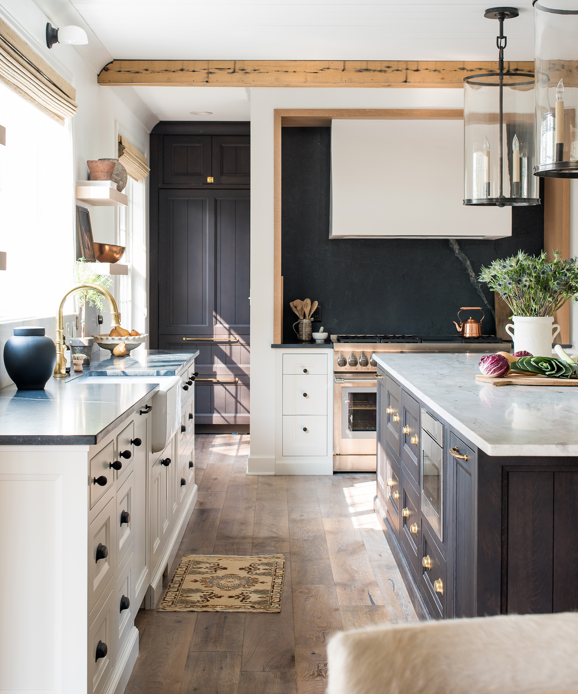
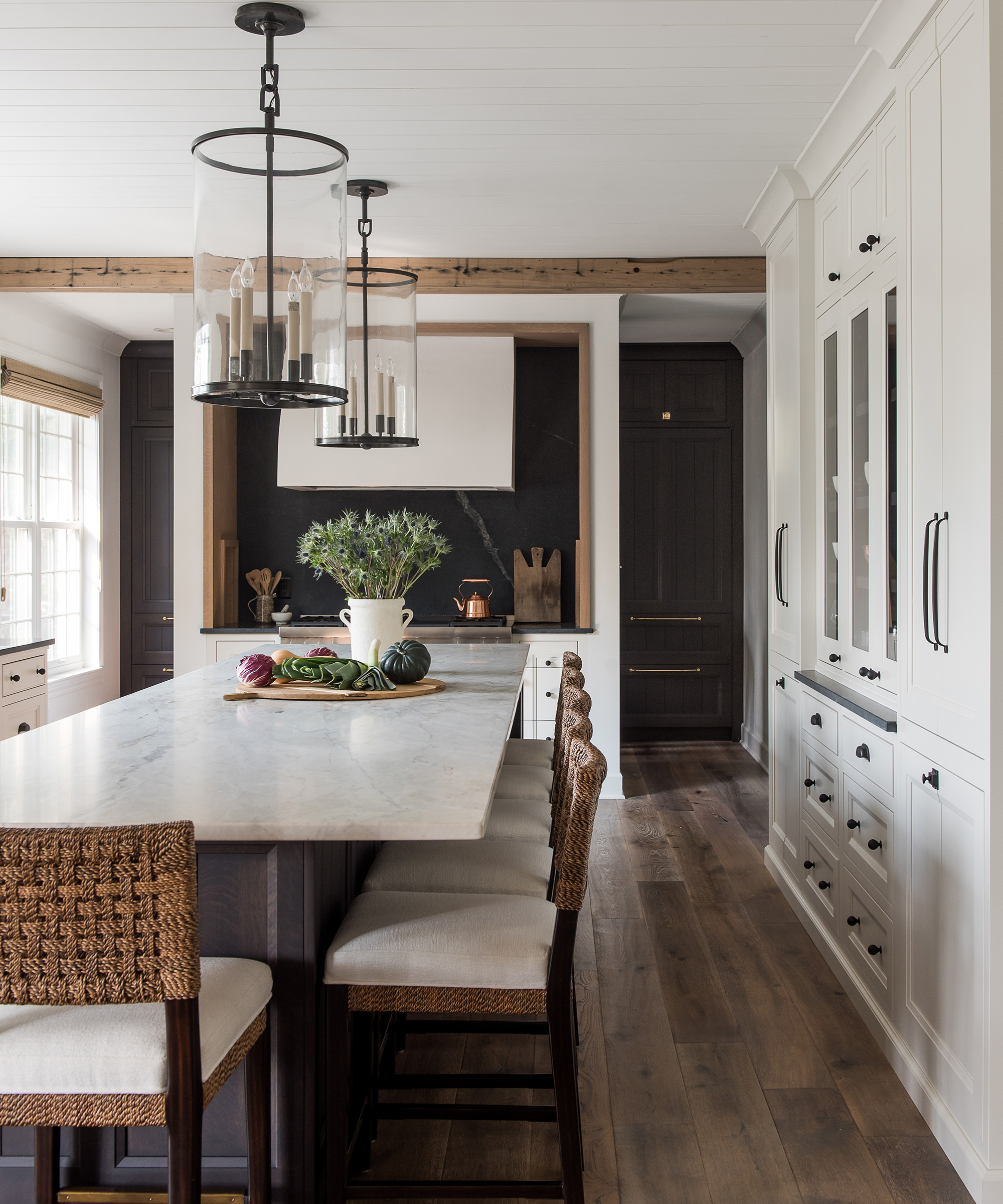
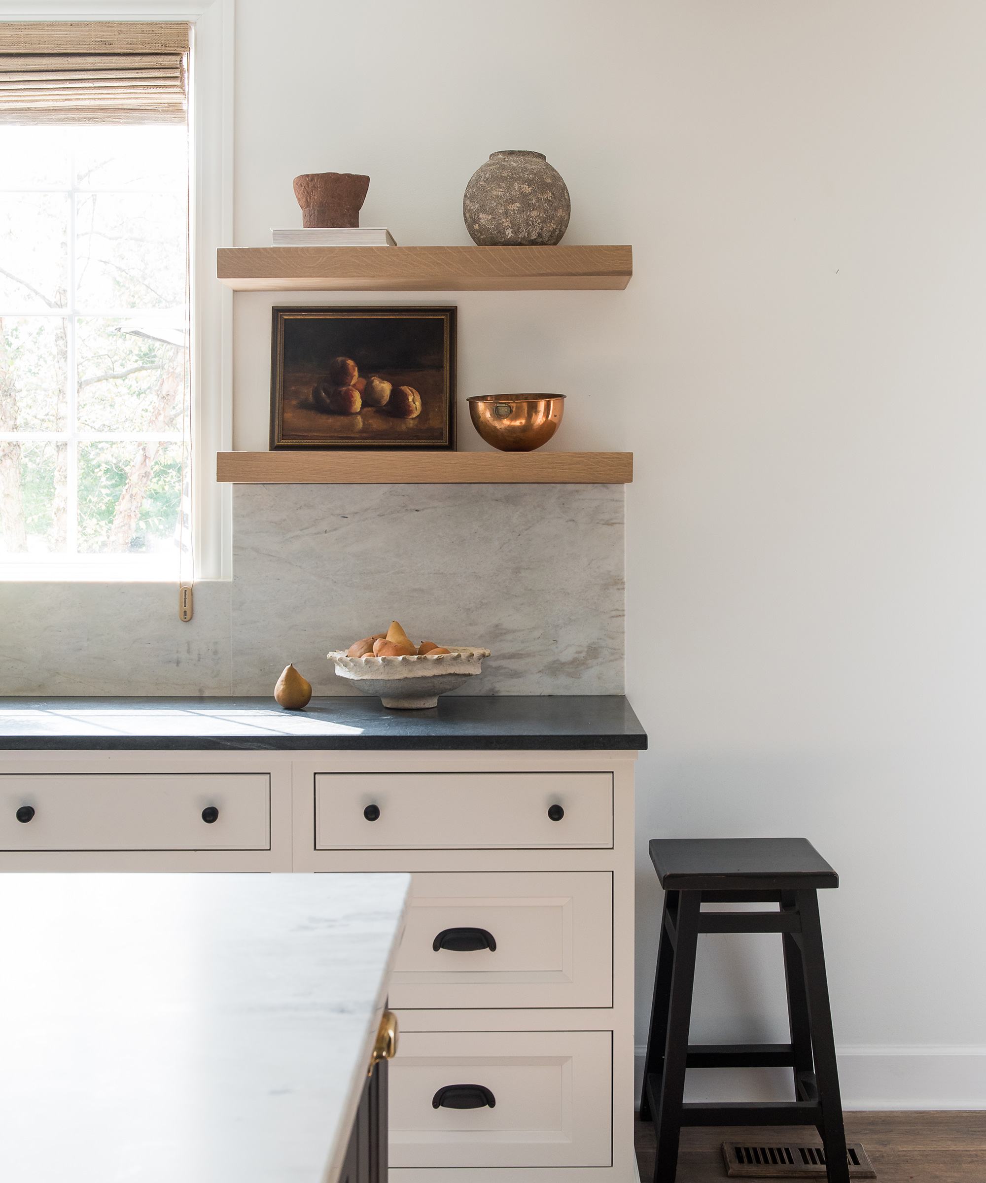
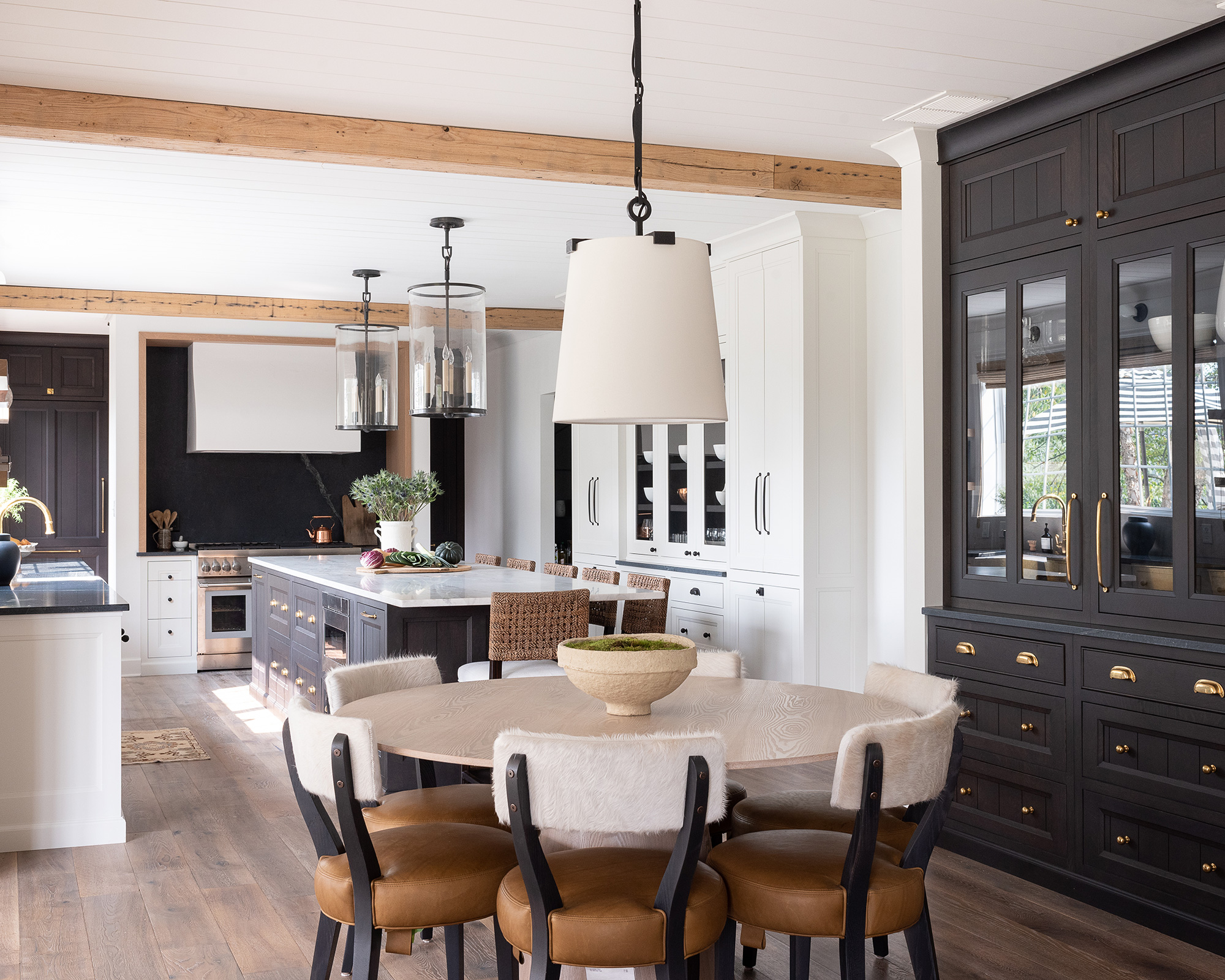
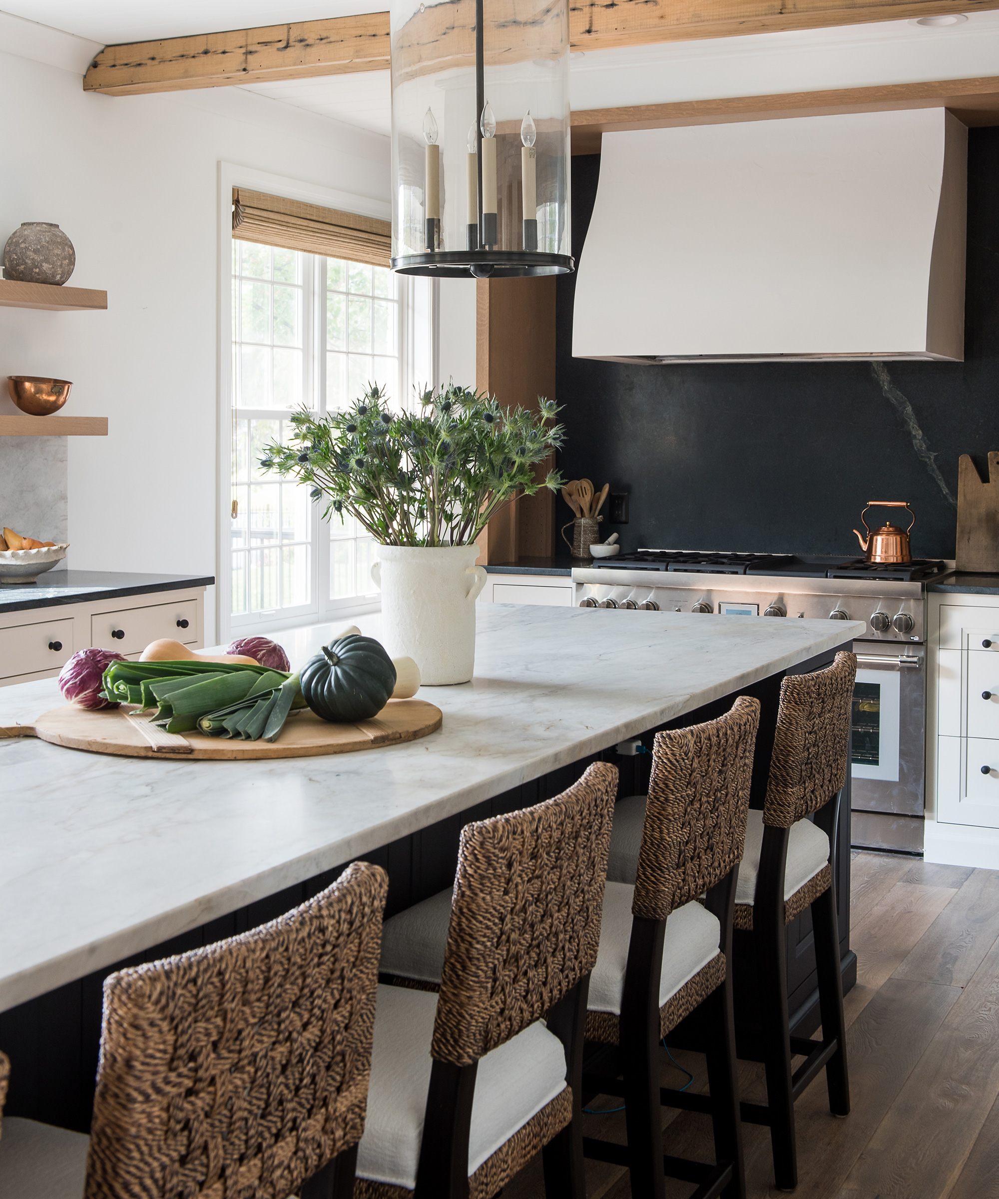
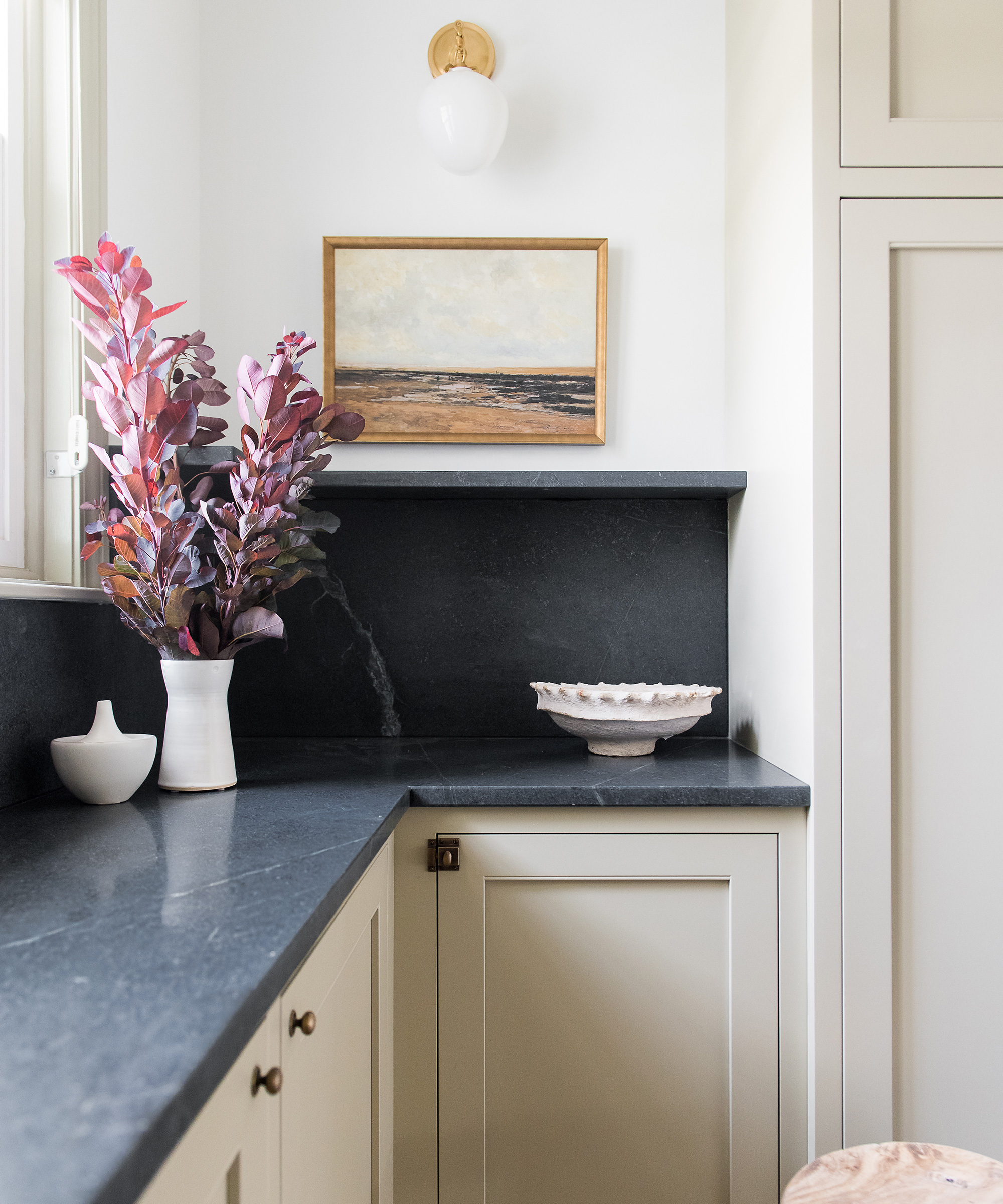
'The client had one request for this space: black, white with a little warmth.
'We achieved this by using a mix of wood finishes and paint colors. It really is a triumph of the senses.
'We wanted to increase the space in this kitchen-diner so we used several feet of the existing dining room to create length. The addition of floor to ceiling cabinetry allows for maximum storage space, and it means no more dusting above cabinets.'
- Design house: An elegant summer retreat in New York – beautifully restored to perfection
Butler's pantry
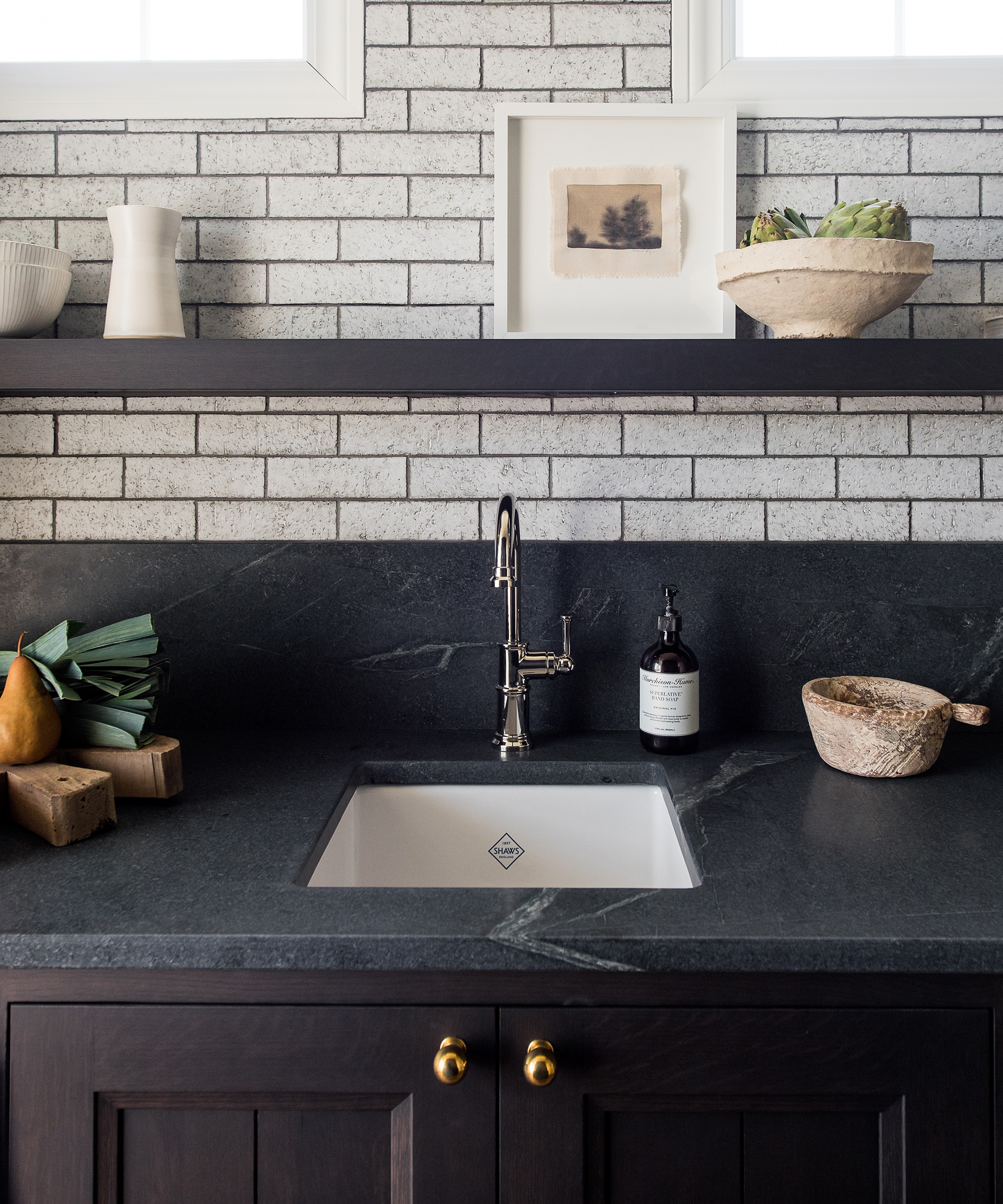
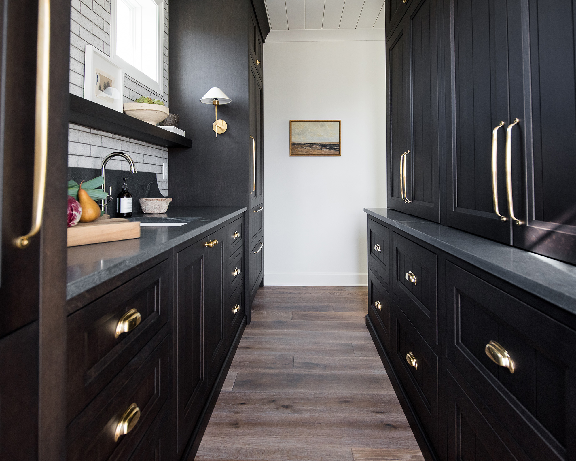
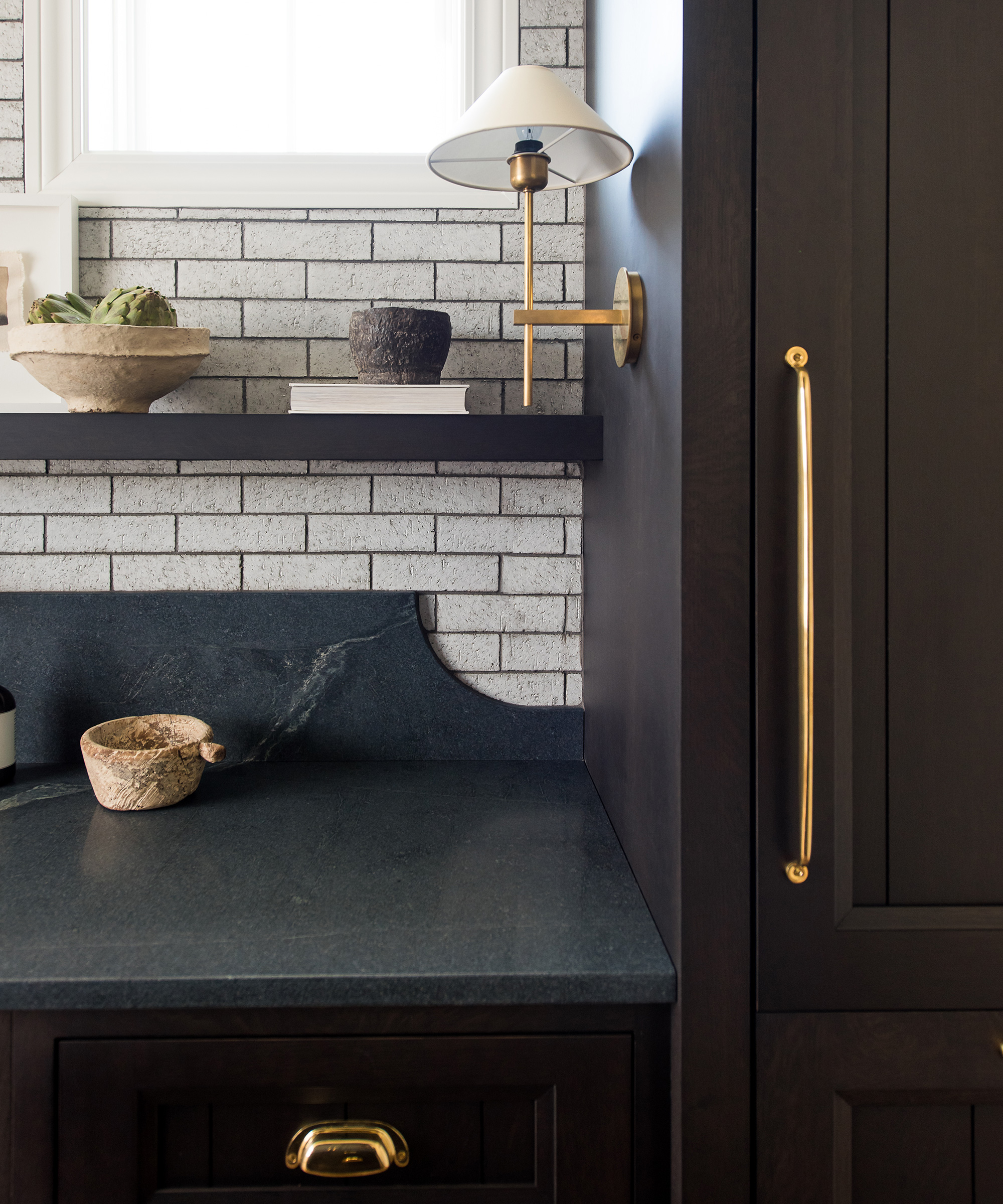
'This space was originally a formal dining room, that was only used on holidays. By making this a pass-through butler's pantry, we were able to add two full size refrigerator/freezers to accommodate large family gatherings and remove the door swings from the narrow kitchen space, as to not cause congestion.'
Sunroom
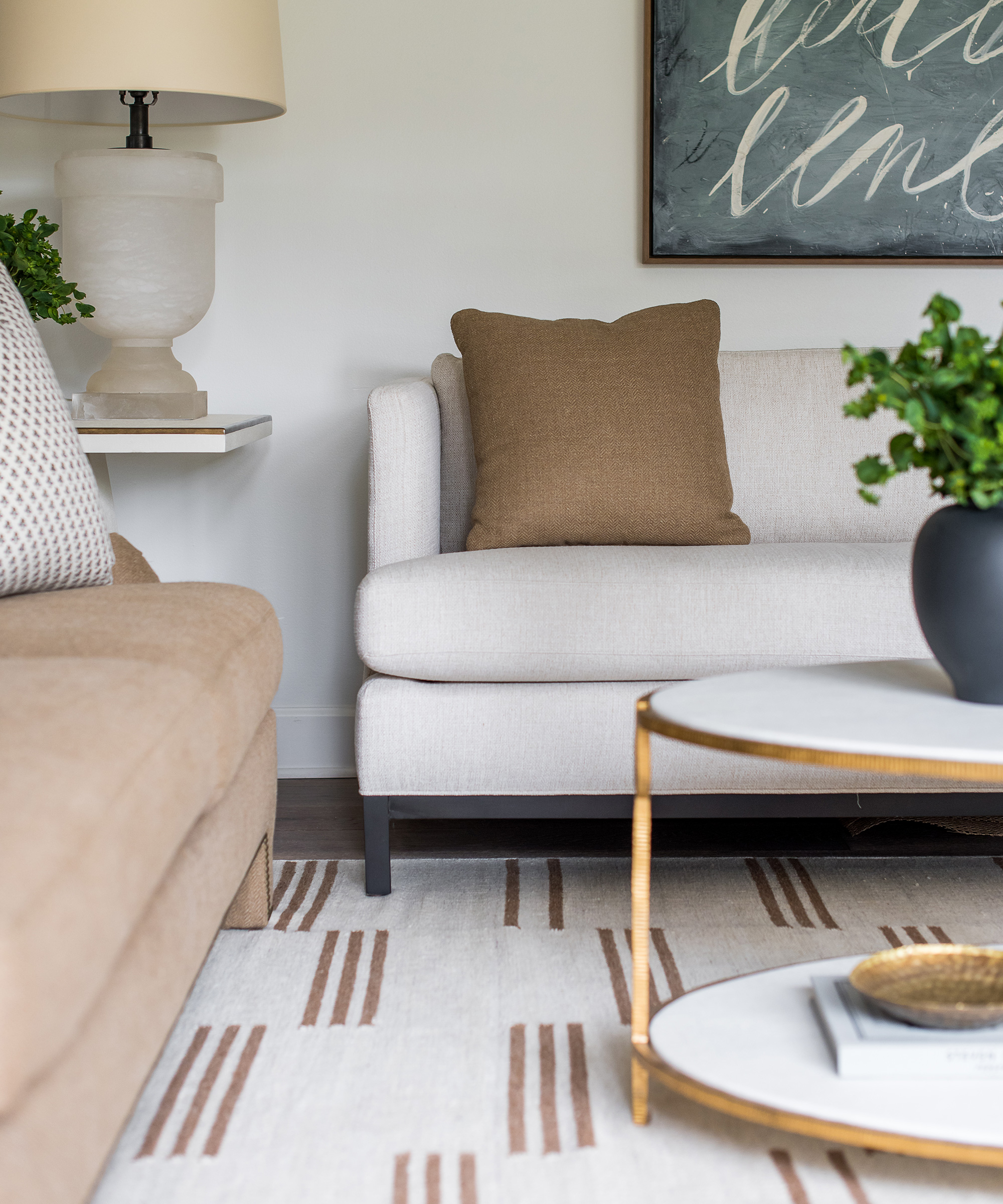
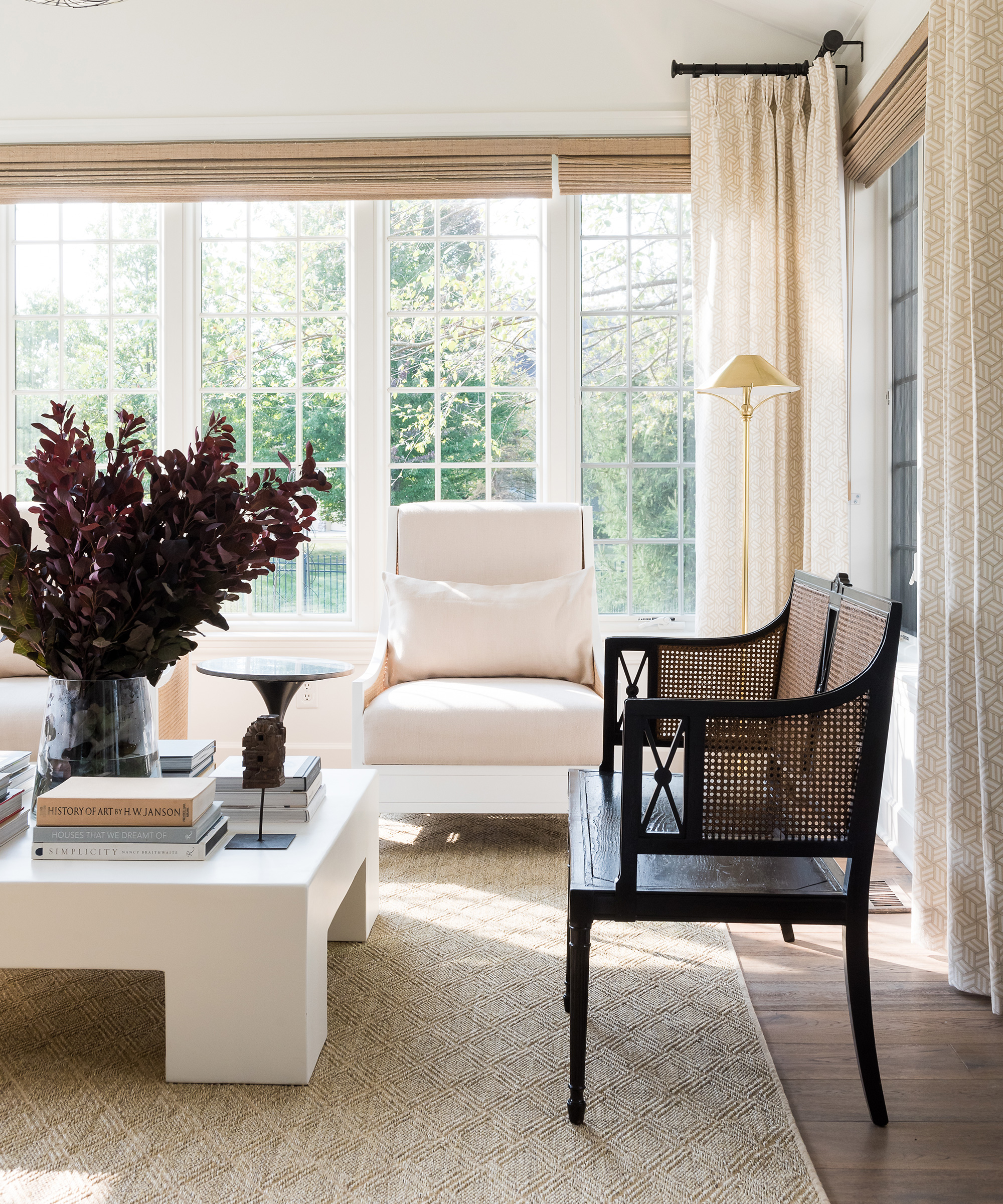
This space had one intention in the new design: relaxation.
'We designed this as a place to converse during family gatherings without the interruption of a TV. It can also be used to read the morning newspaper.
'This room already had the advantage of eastern morning sun, we just provided the neutral layers, shapes and textures for a tranquil Xanadu.'
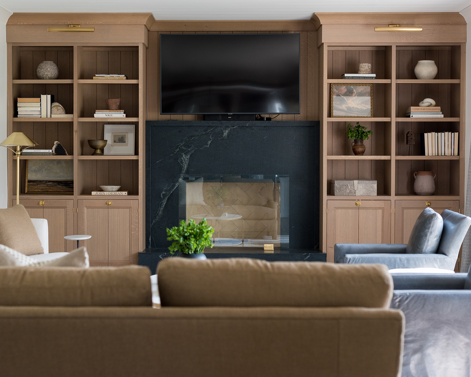
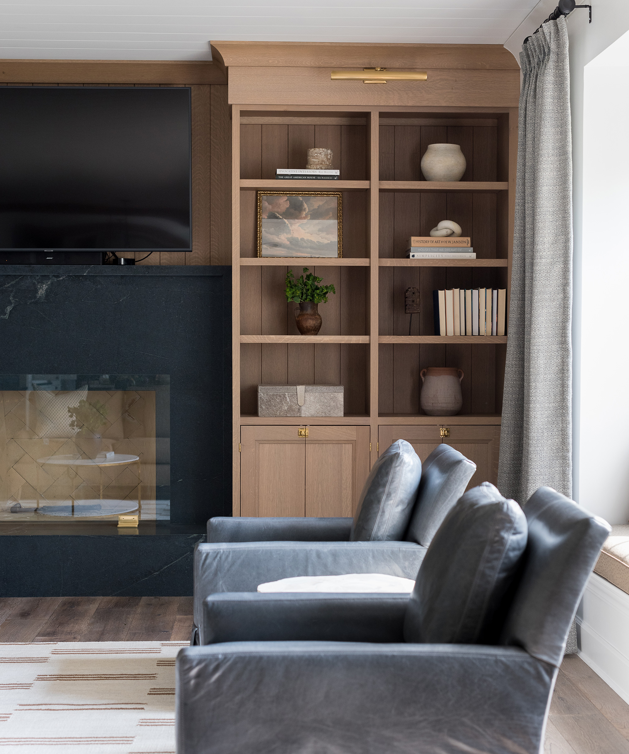
Living room

'Previously, this space was separated from the kitchen. We removed any visual barriers, and completely re-designed the fireplace wall, making it a focal point that tied into the kitchen with the soapstone slabs, and warm white oak.
'The new furniture layout has been curated with large family gatherings in mind, all while keeping with the color scheme that is evident throughout the home.'
Hall
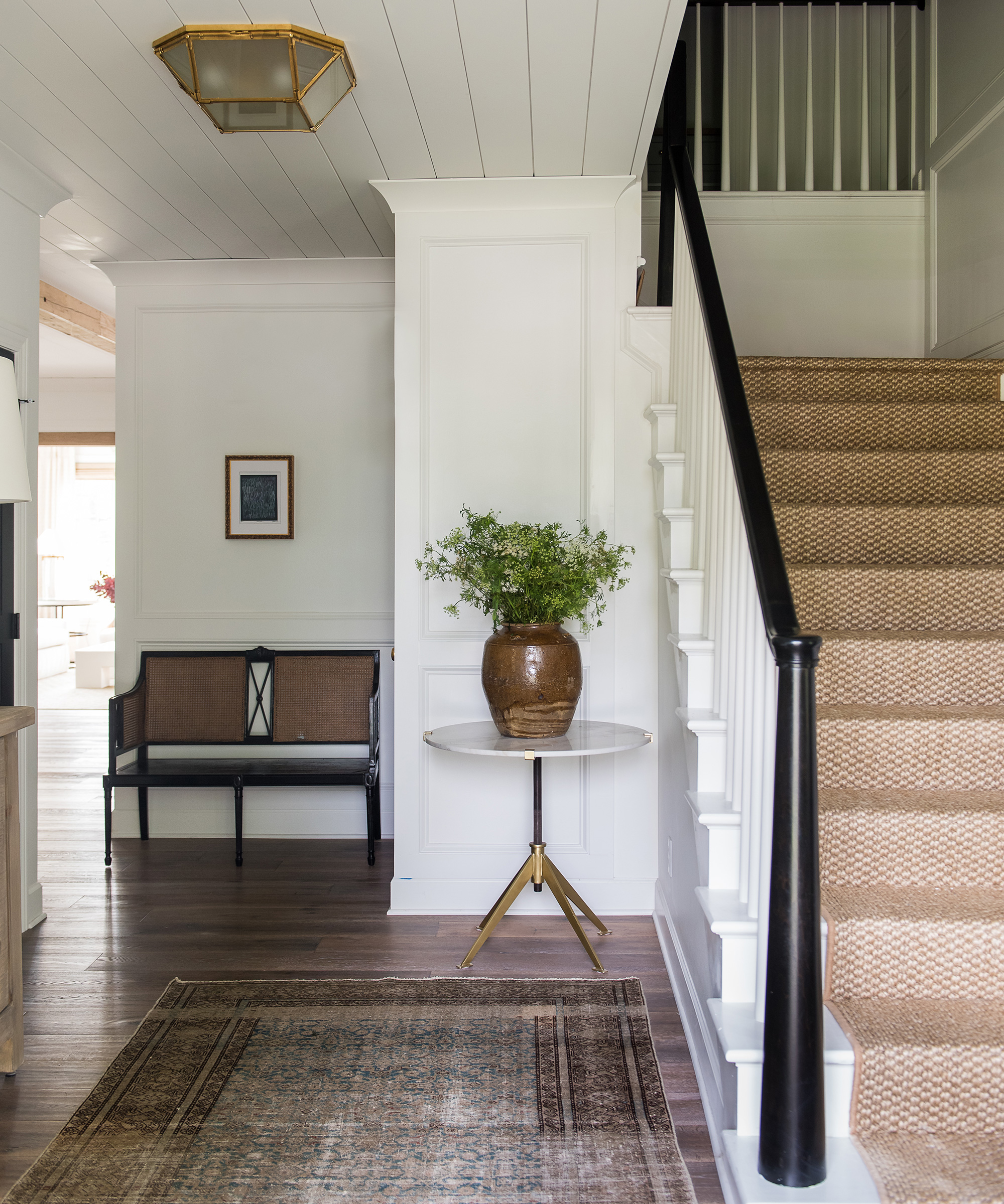
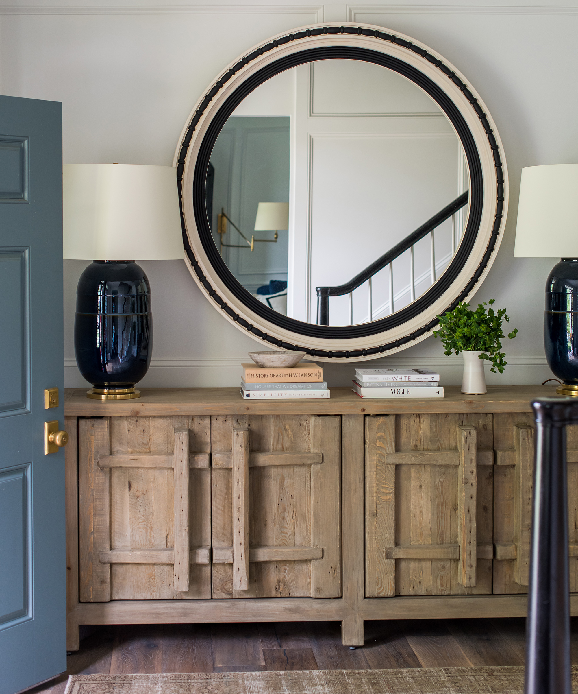
'As the first impression of the home, this entry needed a lot of work. Initially an open two-story entry, it felt cavernous.
'We lowered the ceiling to reflect an element, true to form in colonial architecture, and added trim details to the walls, new hardwood floors, stair railings and a sisal runner.'
Powder room
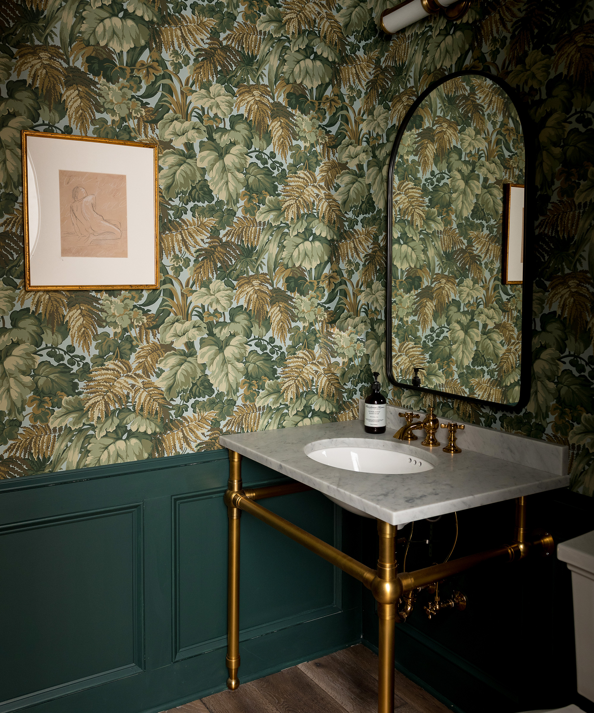
'For the powder room we wanted to throw the rule book out of the window. This space is all about fun and frivolity. The Cole & Son wallpaper is an inspired addition that we think fits this space perfectly.'
Laundry room
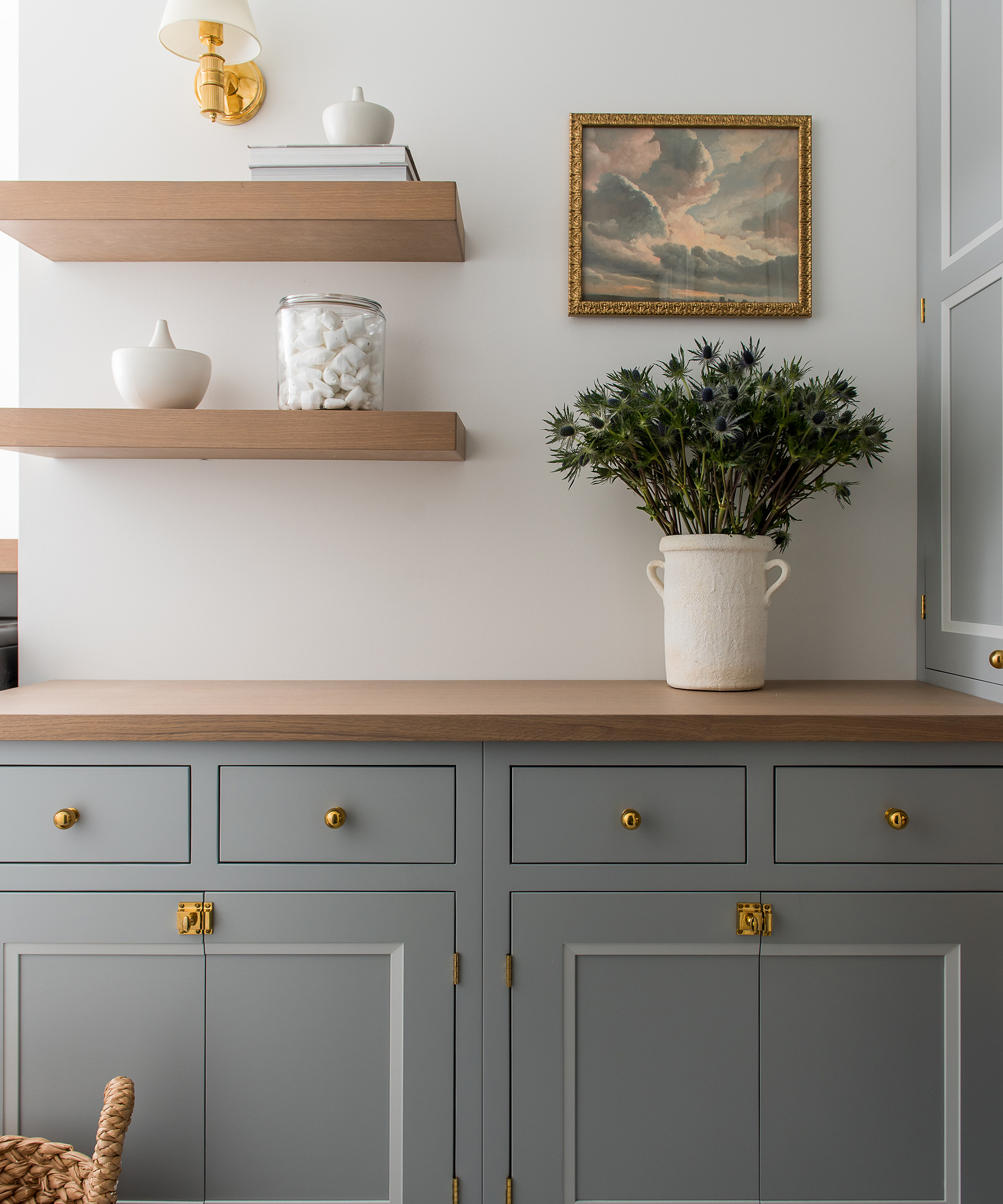
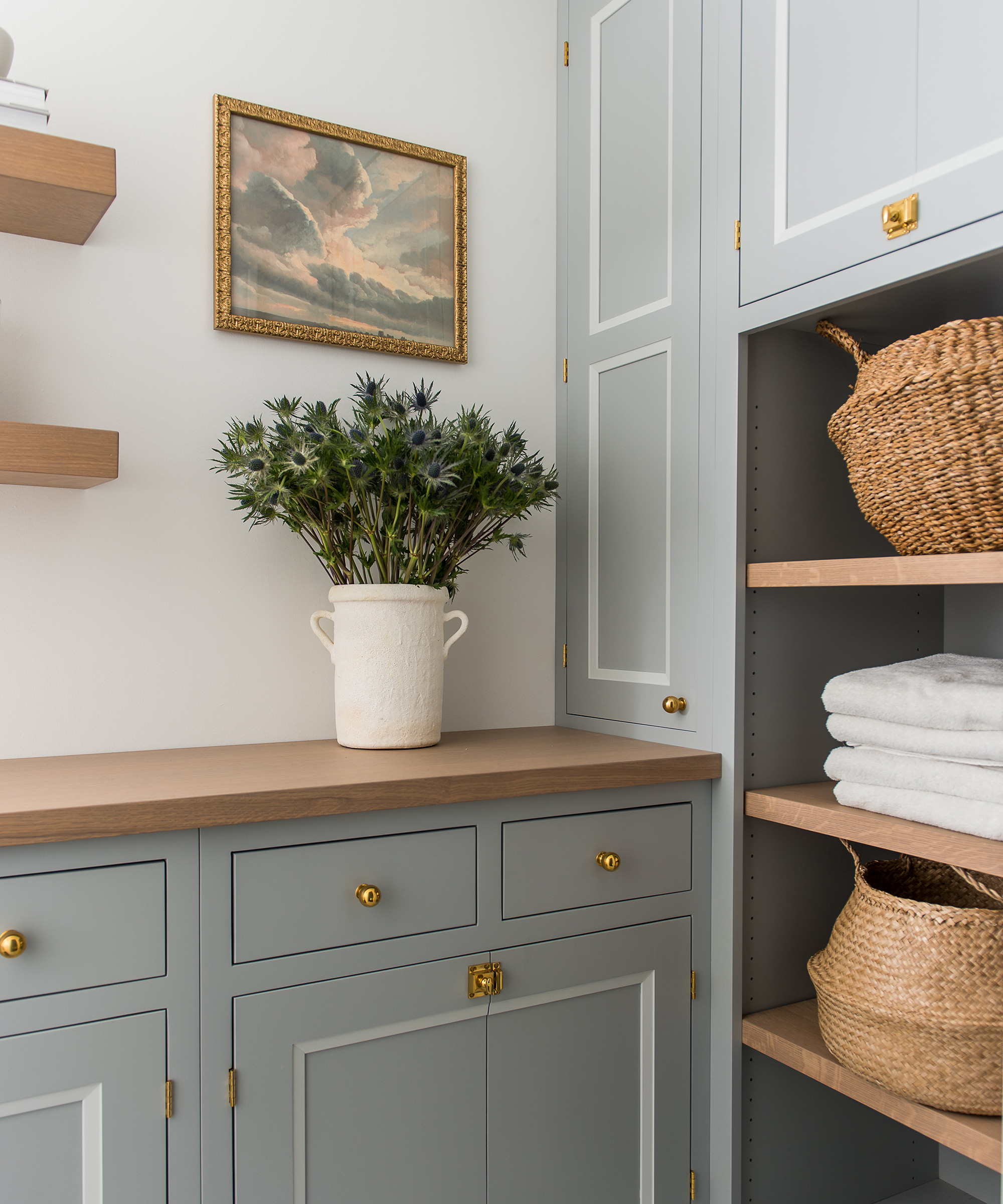
'To create the laundry room we re-worked an existing closet space on the second floor, for convenience.
'We used two-tone cabinetry is a blue-gray hue to allow depth, and paired this with a wood worktop for warmth amongst the Carrara tile.'
Pet room
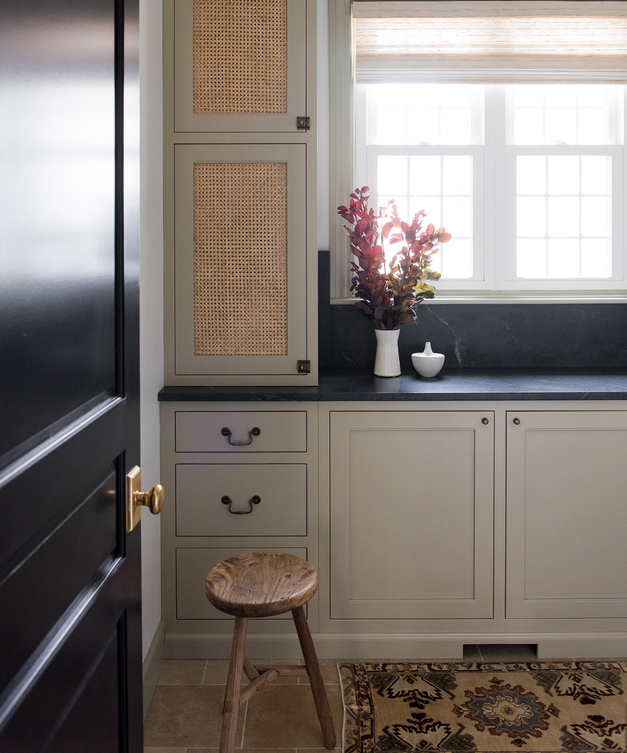
'This room was previously a laundry room, which made sense when they had a house full of children. In this new phase of life, the clients wanted their laundry room relocated to the second floor, adjacent to the master bathroom for ease of use.
'This room took on a new identity as the 'dog room'. The cabinet doors open up to reveal full-size dog beds, food and bowls. It was created as a place of refuge for the dogs for when the owners entertain.'
Photography / Sarah Shields Photography
Interior design / Whittney Parkinson Design
Sign up to the Homes & Gardens newsletter
Design expertise in your inbox – from inspiring decorating ideas and beautiful celebrity homes to practical gardening advice and shopping round-ups.

Jennifer is the Digital Editor at Homes & Gardens. Having worked in the interiors industry for several years in both the US and UK, spanning many publications, she now hones her digital prowess on the 'best interiors website' in the world. Multi-skilled, Jennifer has worked in PR and marketing and occasionally dabbles in the social media, commercial, and the e-commerce space. Over the years, she has written about every area of the home, from compiling houses designed by some of the best interior designers in the world to sourcing celebrity homes, reviewing appliances, and even writing a few news stories or two.
-
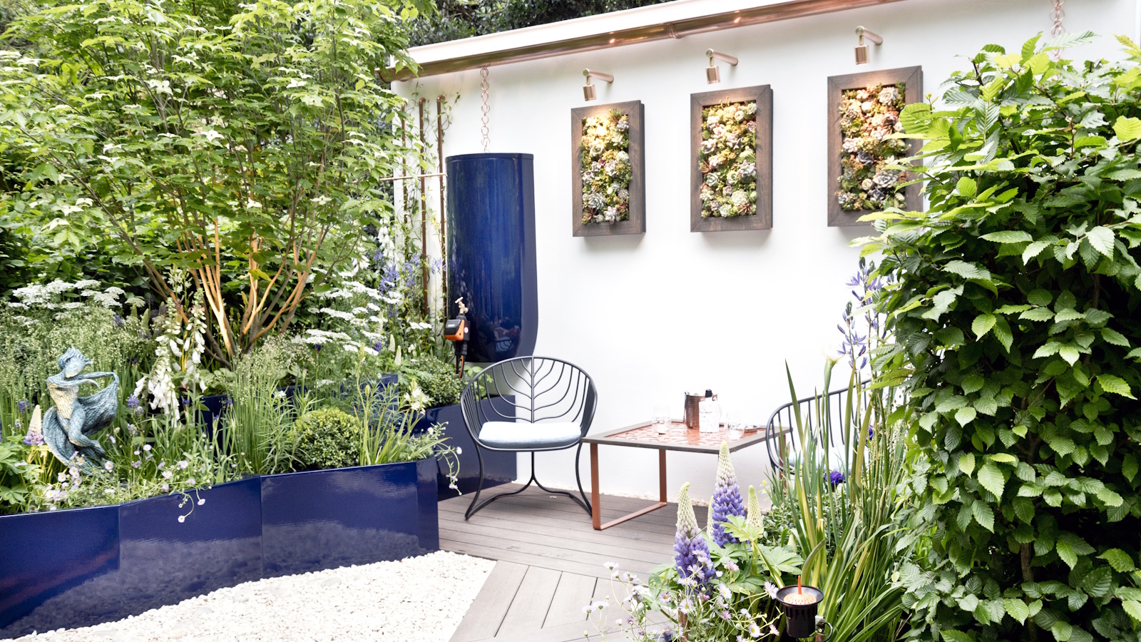 Urban gardening ideas – 7 creative ways to grow in small spaces, balconies, containers, indoors, and more
Make the most of your space with these innovative ways to garden
By Tenielle Jordison
-
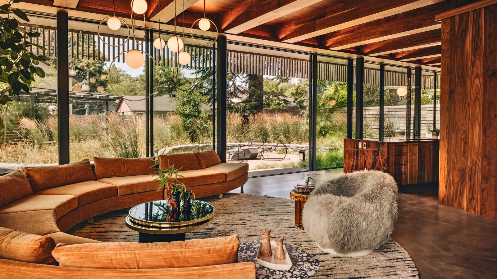 'Sexy disco-era Italy meets Japanese farmhouse in the Brazilian jungle' was the description the interior designer gave this glass-walled modernist home
Offering a warm welcome that defies its stark, modernist lines, this archictectural gem is full of surprises
By Karen Darlow