Design house: Statement color and Art Deco elements give this Utah home a modern touch
A neutral backdrop provides the perfect canvas for a sophisticated splash of color in this cleverly-designed home

With seemingly endless mountain views, ski slopes and sights from Wasatch-Cache National Forest to Thousand Oaks Trailhead, it is easy to see why the owners chose to settle down in Halladay, Utah.
Creating a space that the family could lay down roots meant hiring an interior designer that they could rely on to turn this house into a dream home.
They hired interior designer Jessica Bennett of Alice Lane Interior Design, who would go on to completely transform the property – from top to bottom – which meant that the house is now unrecognisable to what it was before.
- See some of the world's best homes – beautiful properties from around the globe
The property
'The project was a remodel of a home the owners built 10-15 years ago – it was in dire need of an refresh,' says Jessica.
'The finishes, trim, and cabinetry needed an update to give them new life, so we redesigned the main level spaces and reused as many existing cabinets and finishes as possible. The owner requested a space that was light and bright – and, most importantly, was comfortable for their children and grandchildren to relax in.'
We speak to Jessica Bennett of Alice Lane Interior Design about the design project.
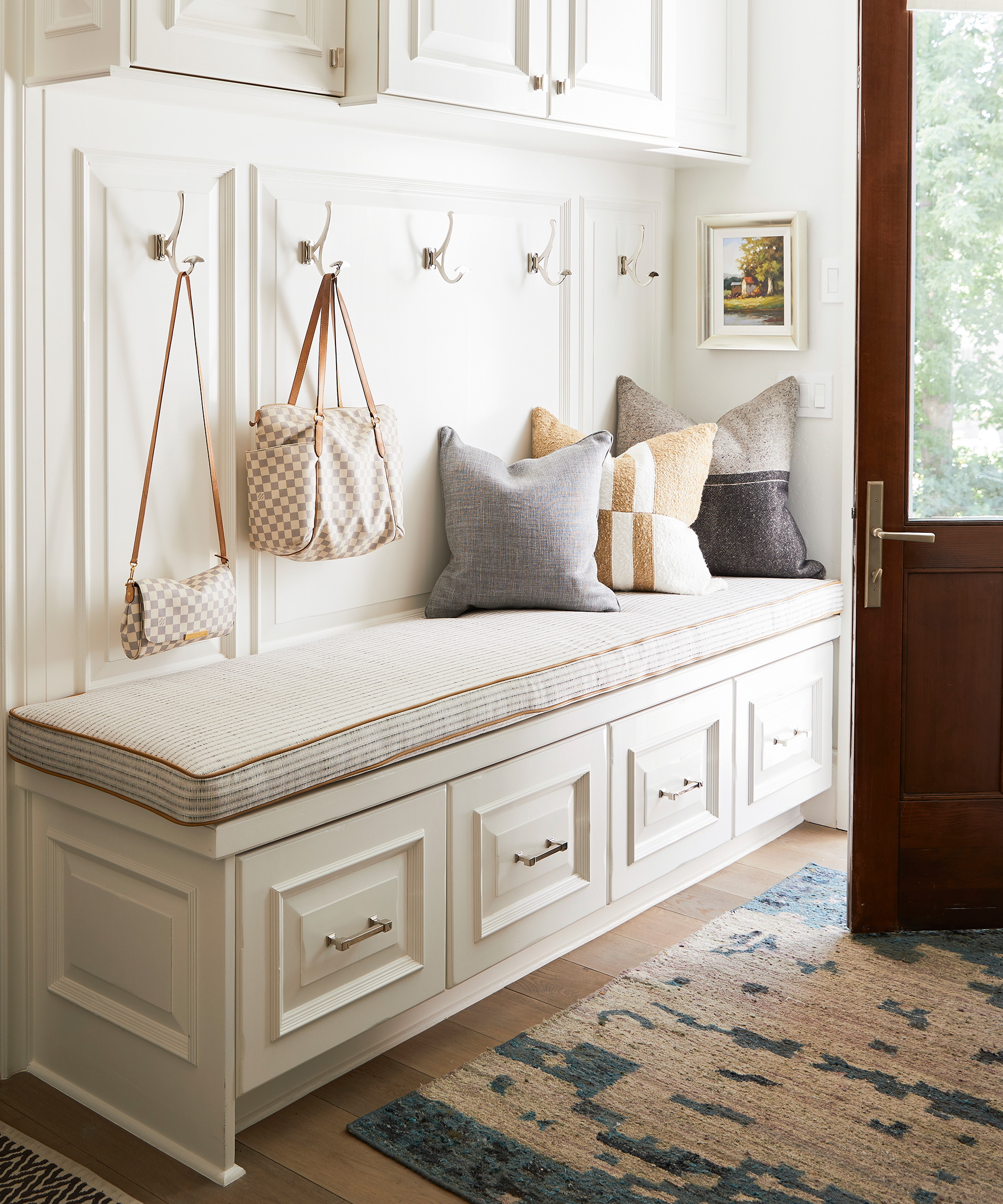
Hall
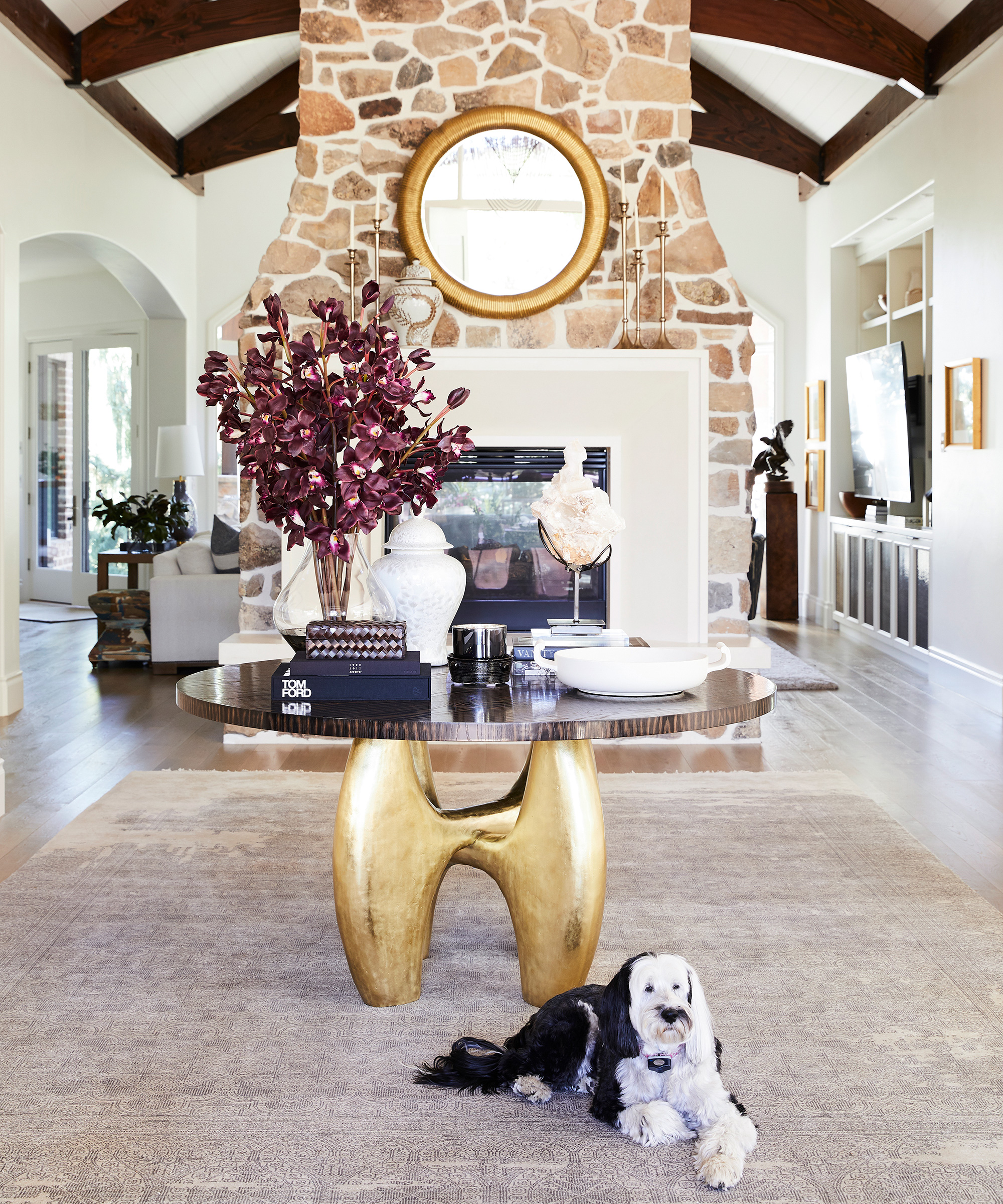
We dressed the walls with a soft grass cloth and filled in the grout on the stone with lighter brighter tone.
The original fireplace mantle was replaced with a clean-lined cast stone surround, while the ornate stair balusters were replaced with a custom baluster designed with tidy lines.
New art, lighting, and furniture made this space stylish and welcoming.
- Reese Witherspoon's house: 5 decorating tricks we’ve learnt from the actress
Home office
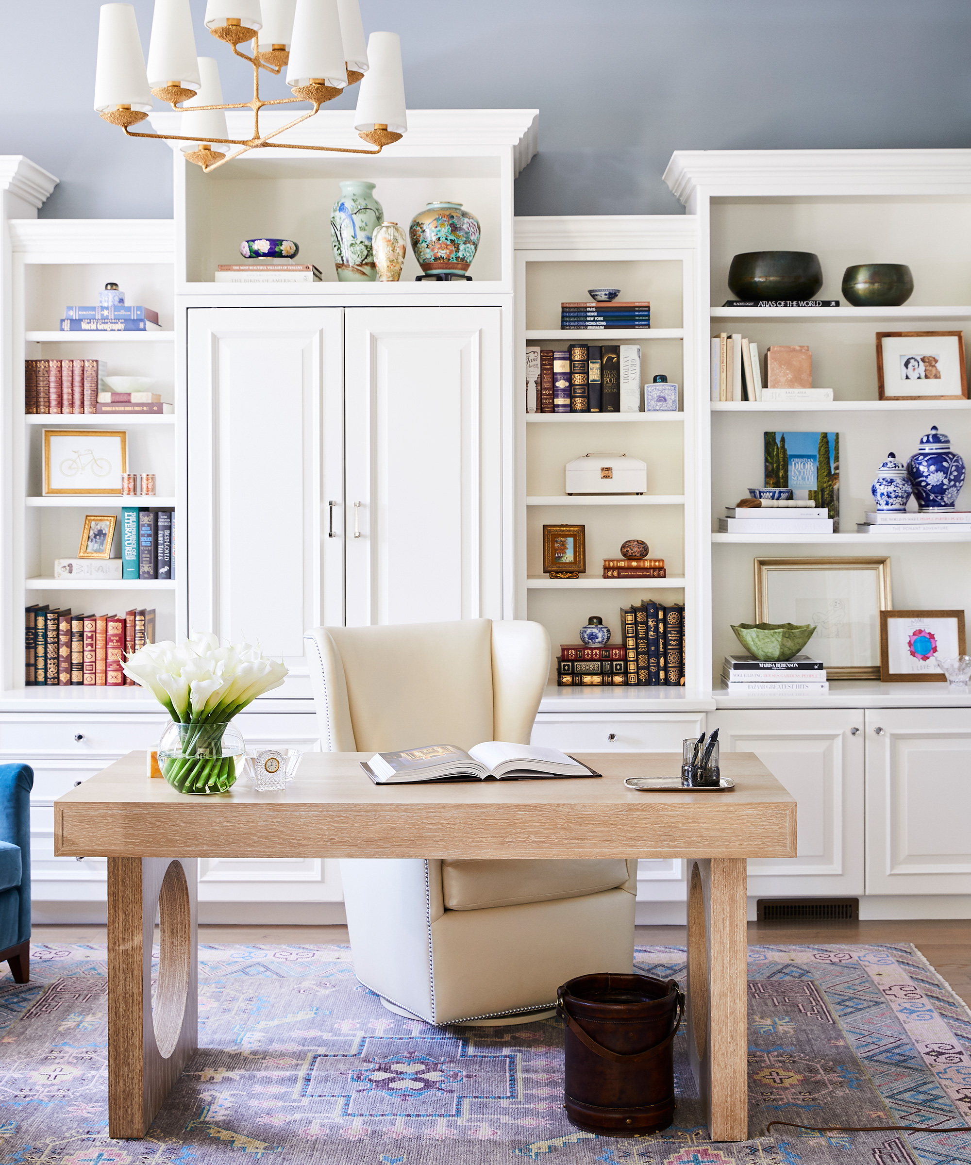
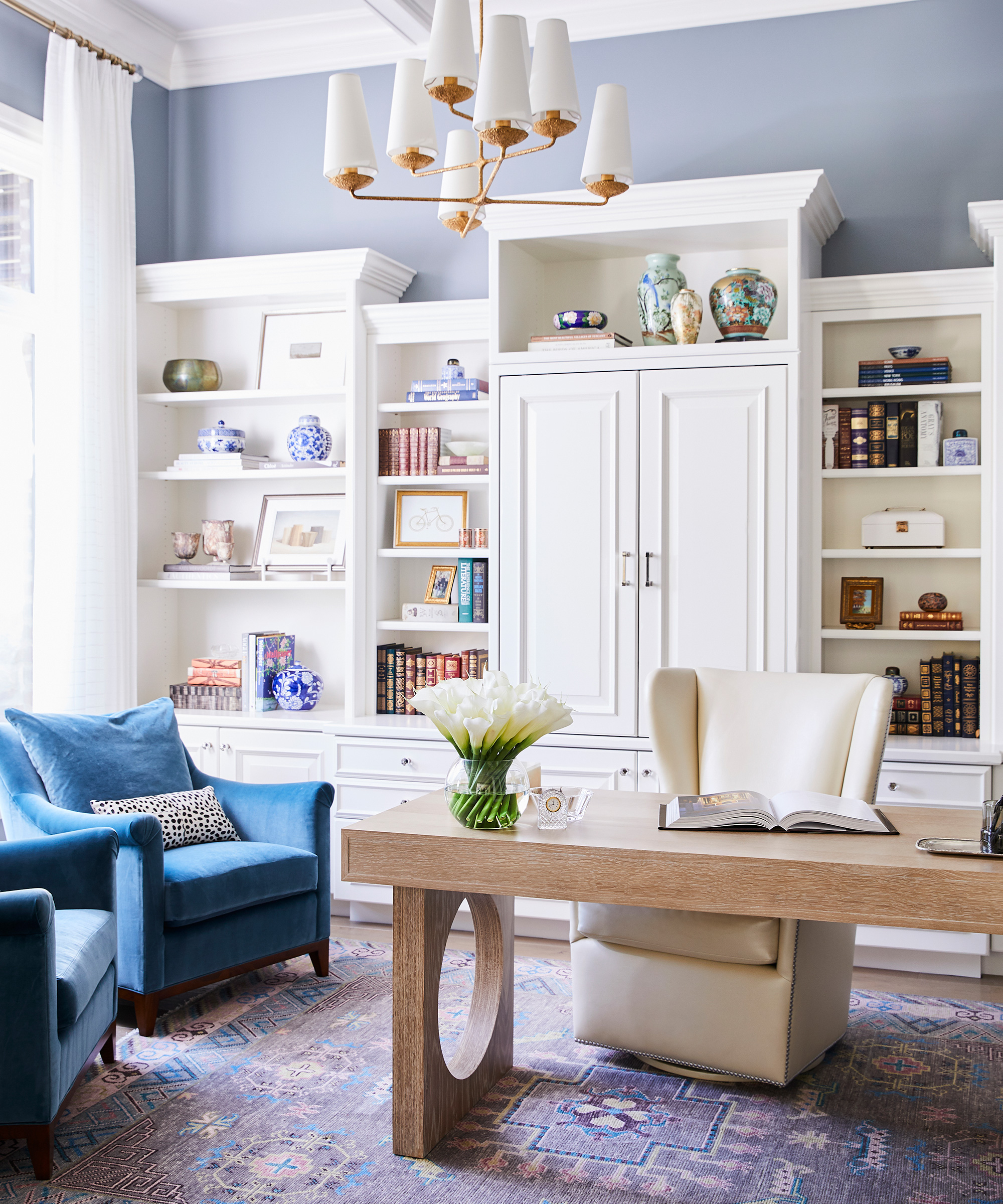
This space got a facelift with new paint. The built-ins were once a dark wood tone, now a soft shade of white.
The homeowner’s favorite color is blue and requested this space to be colorful. We layered in blue upholstery and rug with pretty pastel tones.
Finally, the new light is the jewelry of the space.
Living room
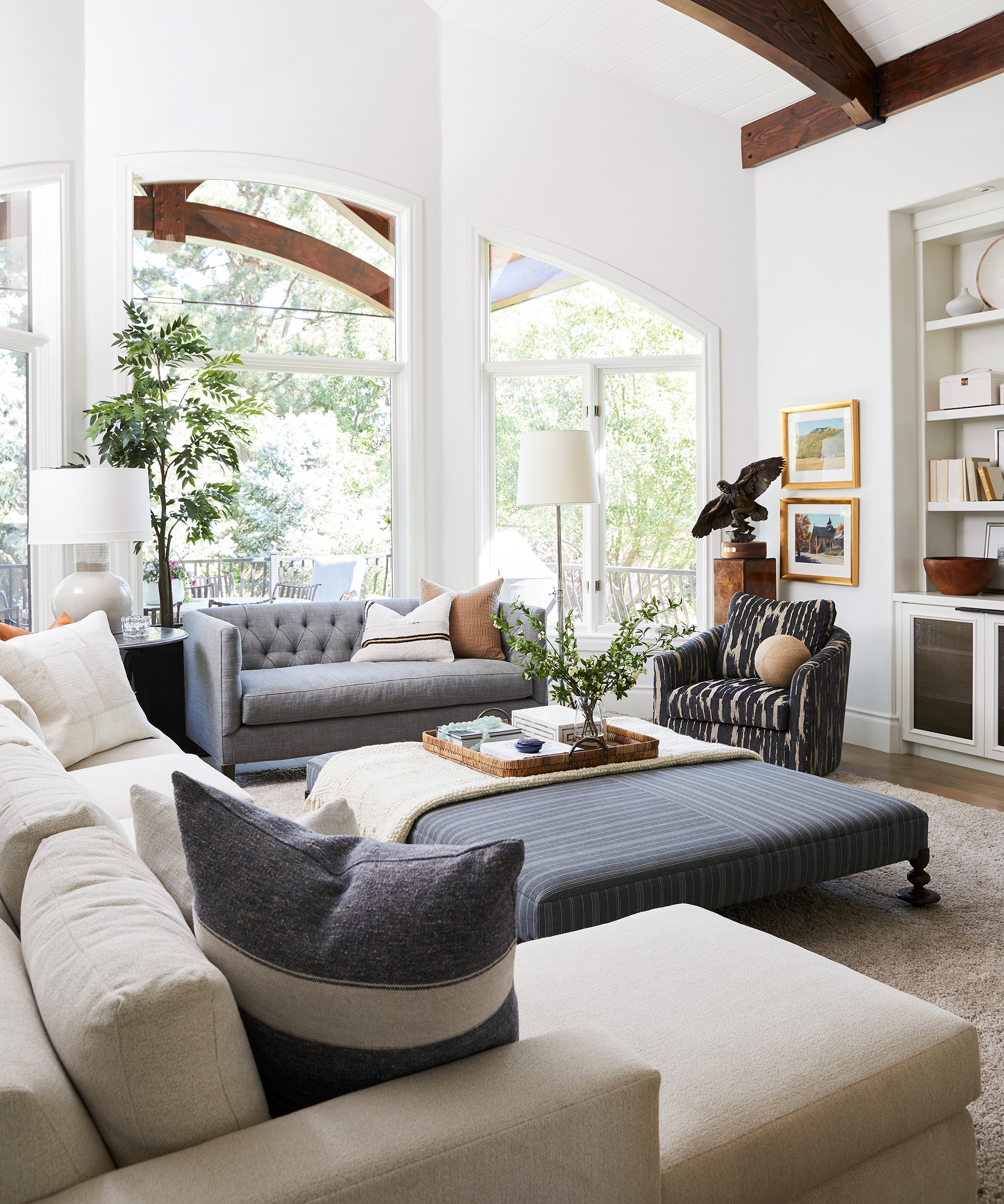
The original media cabinet was dark and heavy and didn’t allow for a large television. We designed an off white cabinet that layered the television over the built-ins and allowed for flexibility to switch out the electronics easily in the future.
To achieve a textured look, we blended warm and cool tones with cozy textures in this room to create an inviting space for the family to entertain and hangout. This space can easily seat a large group comfortably for all the parties they host.
Kitchen

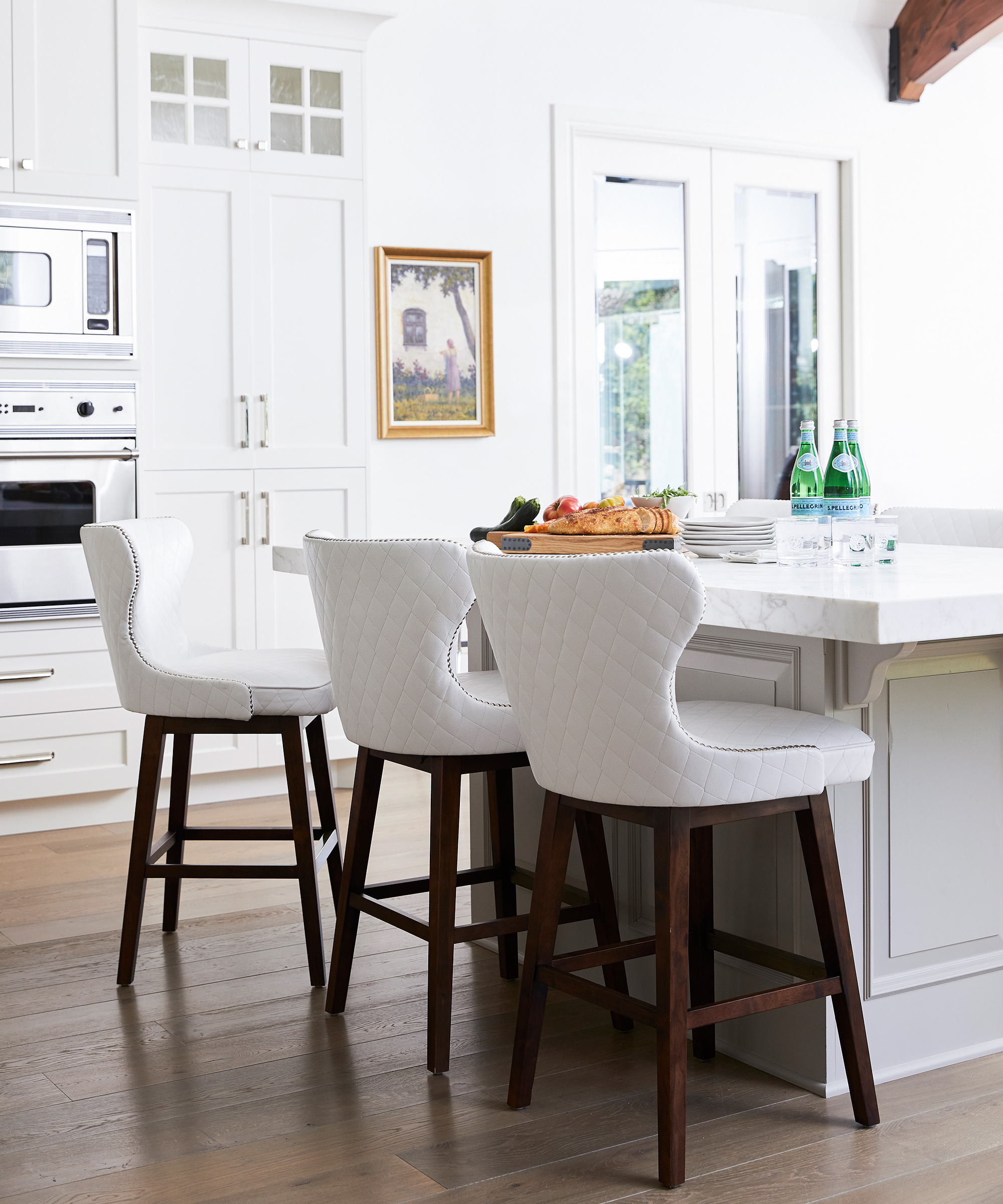
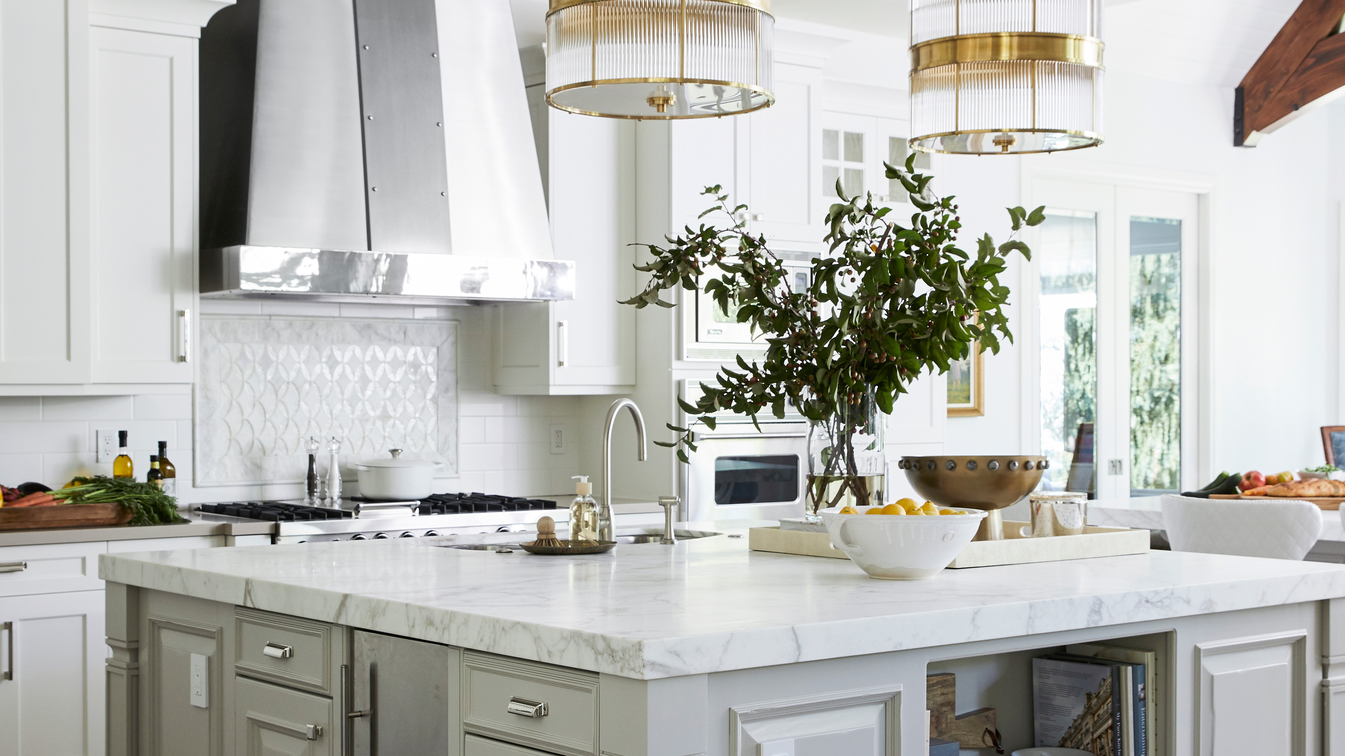
The original wood cabinets received a fresh coat of white paint and the dark painted island was lightened to a soft greige – thus breathing life into the kitchen.
These brand-new Ralph Lauren pendants add the warmth that this space needed.
Main bedroom
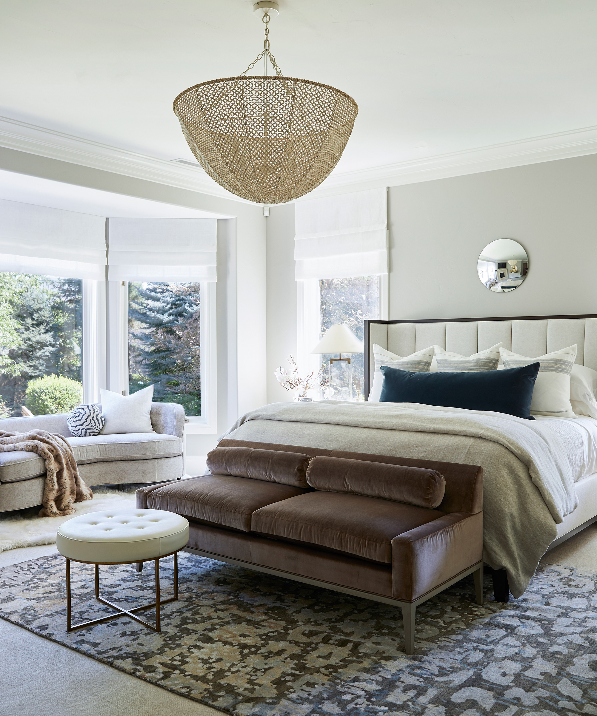
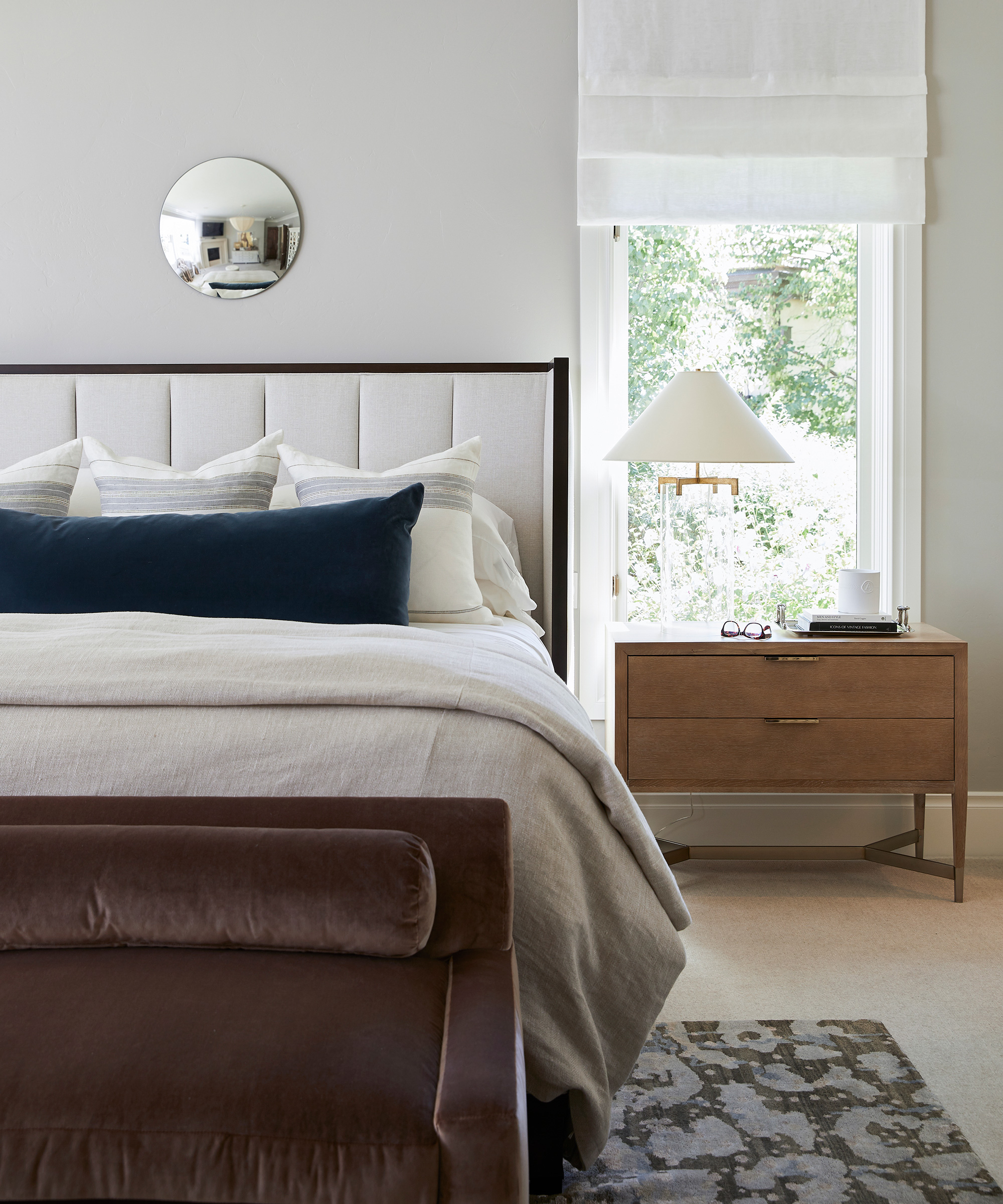
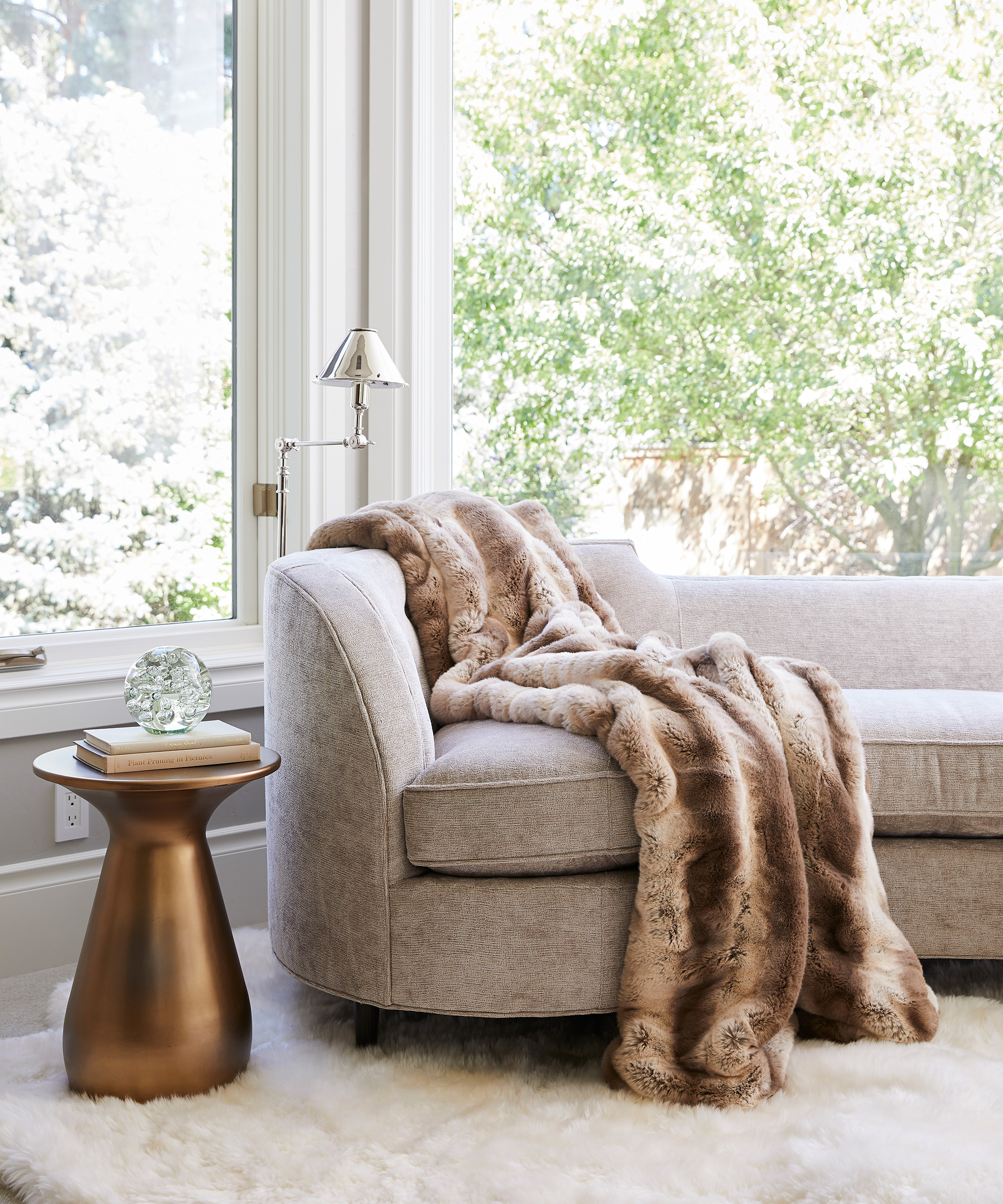
We designed a new fireplace surround and brightened the finishes in this space.
The once dated furniture was exchanged for transitional furniture – with clean lines and sophisticated colors a must.
Main bathroom
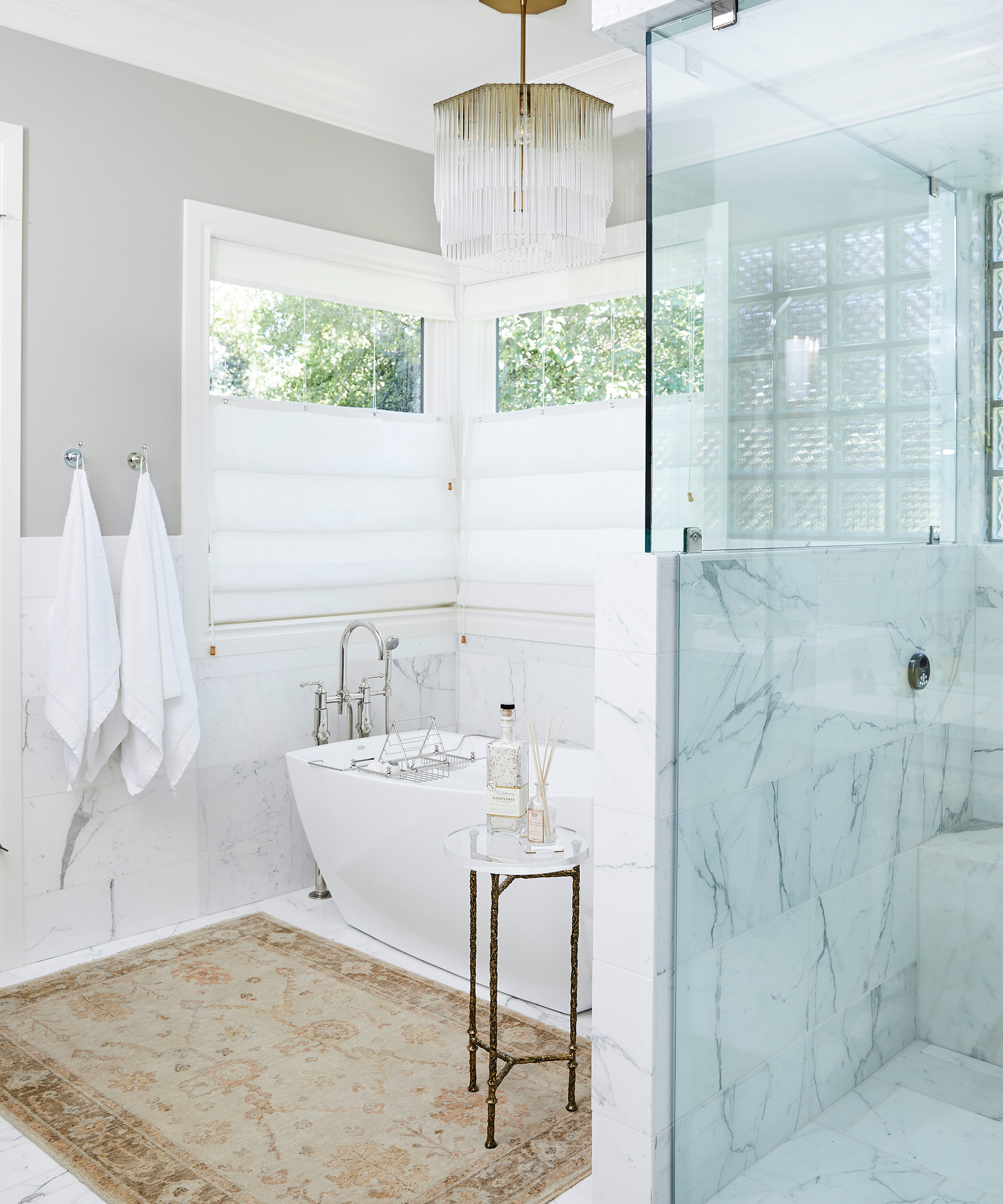
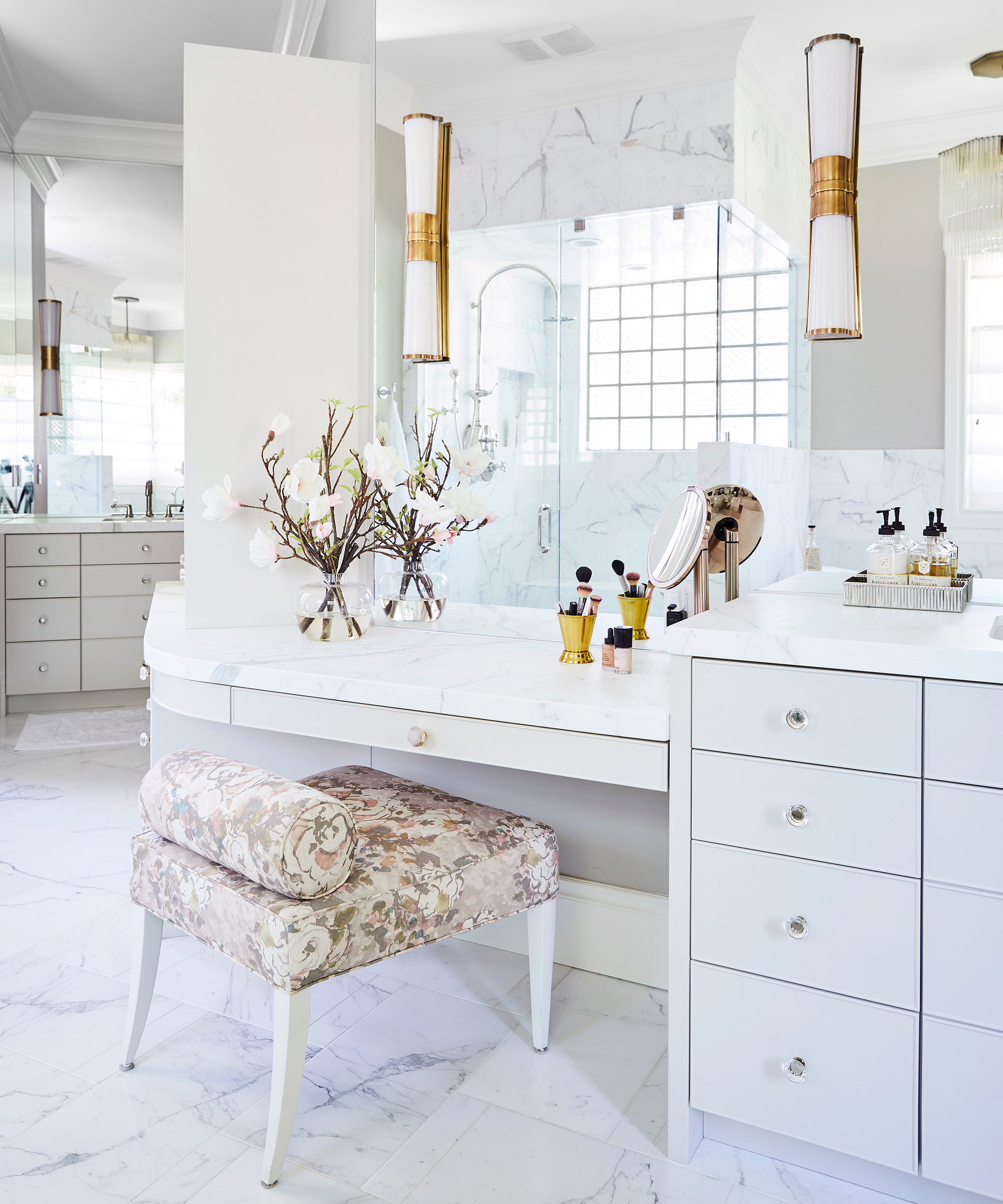
We freshened up the bathroom with a beautiful white marble, a freestanding tub, and a new off white vanity.
This room desperately needed an element of sparkle and intrigue, so we added in mirrors and statement lighting.
Powder room
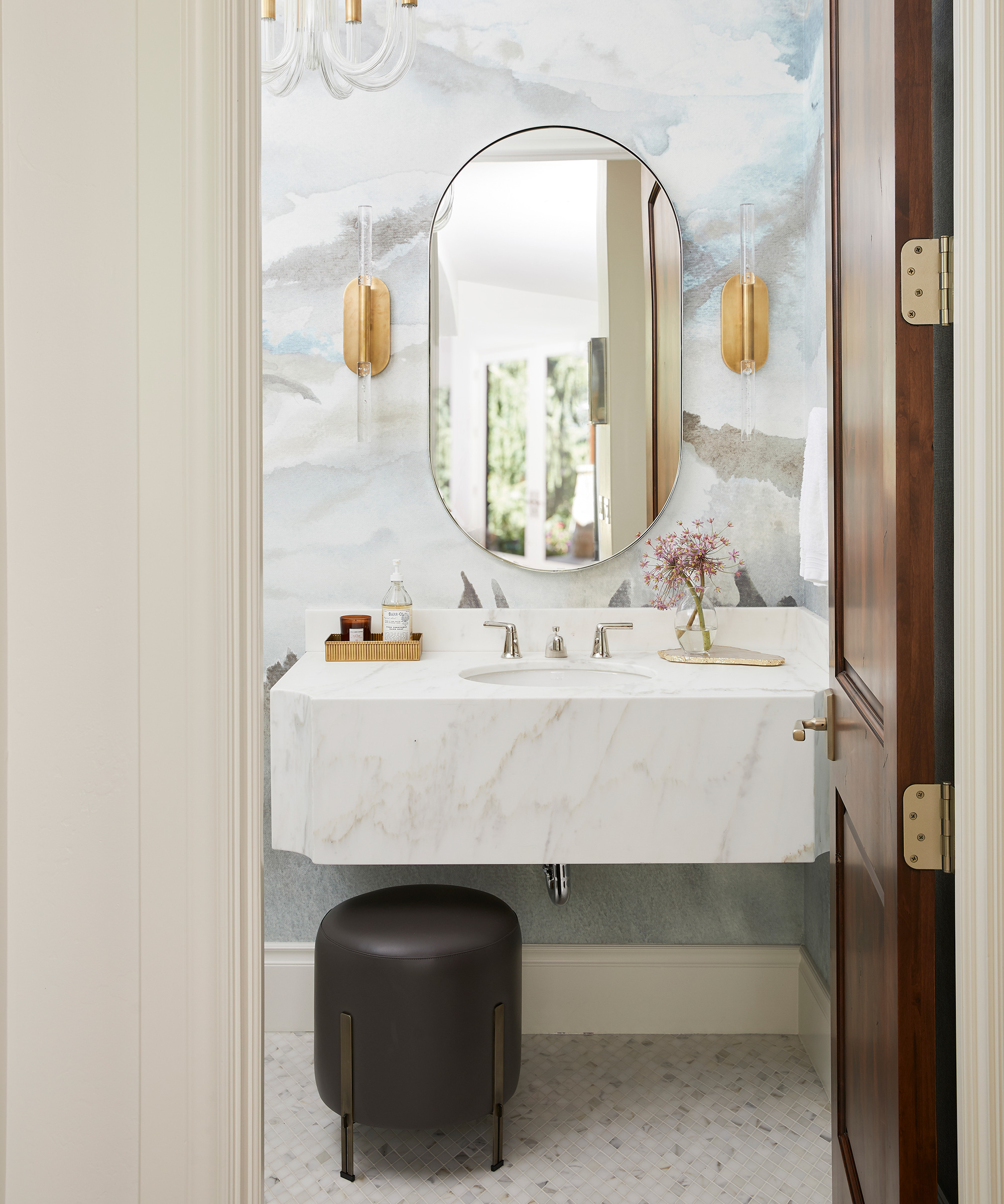
This was the room that started the whole remodel. The husband didn’t like the wallpaper and thought the whole scheme look dated.
Taking this in to consideration, we updated the wallpaper, vanity, lighting, and tiles – in keeping with the contemporary finishes we used elsewhere.
Mud room / laundry room
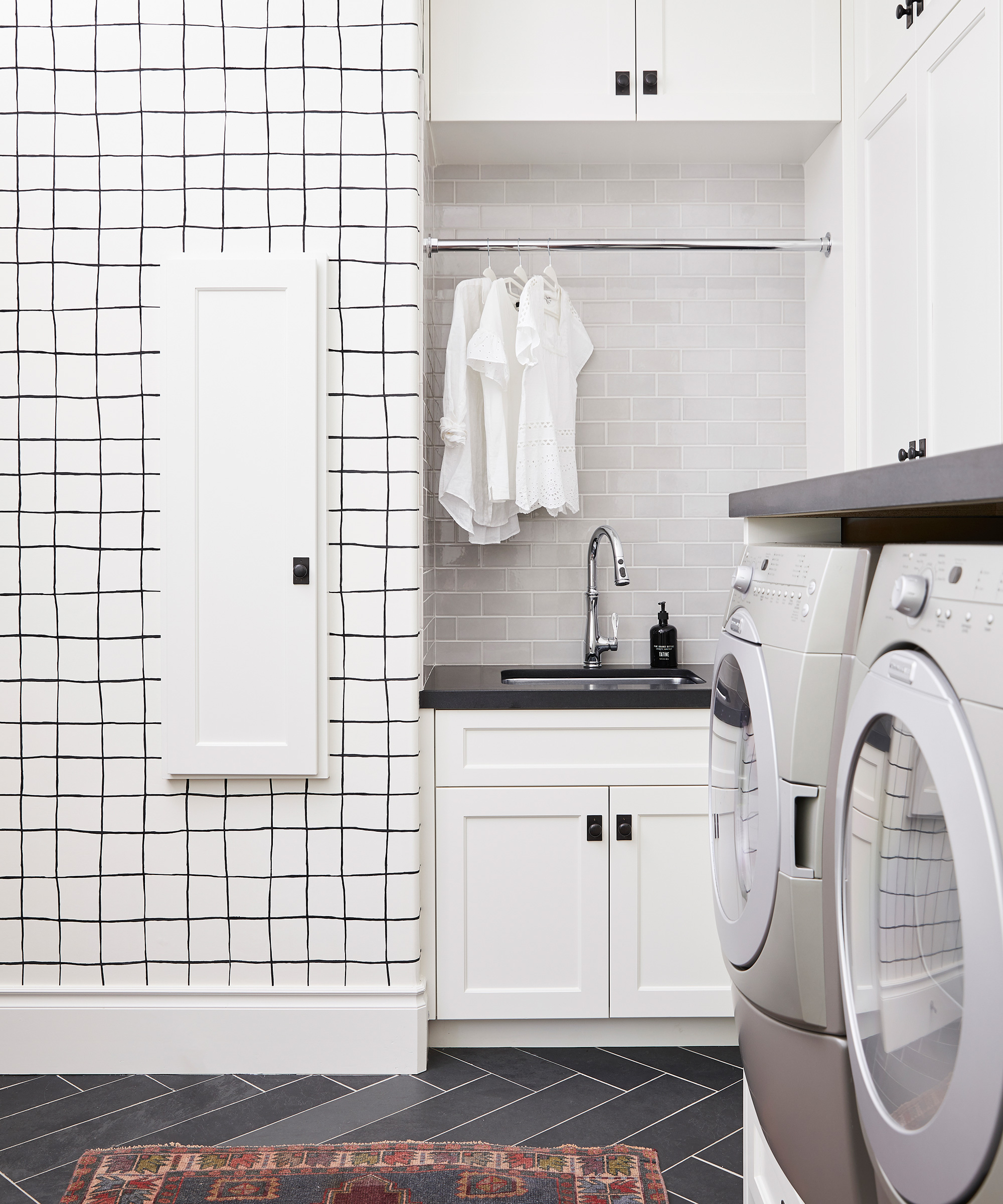
Functionality was the driving force behind this redesign, so with this in mind, we updated all the cabinetry to ensure if was not only stylish, but practical, too.
Our favorite detail is the mesh drying racks for sweaters and delicates.
Playroom
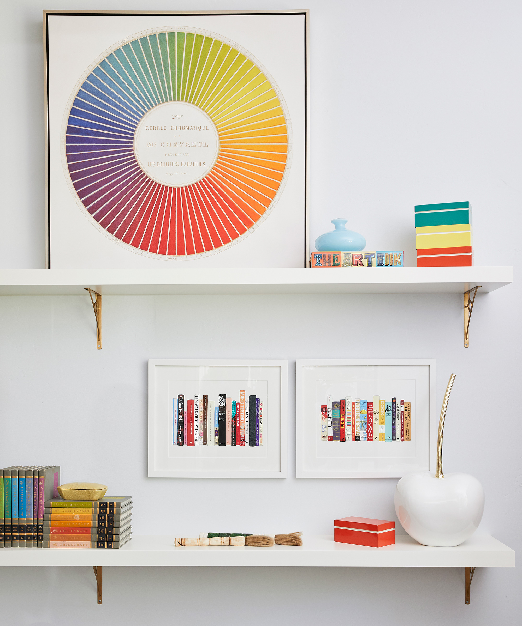
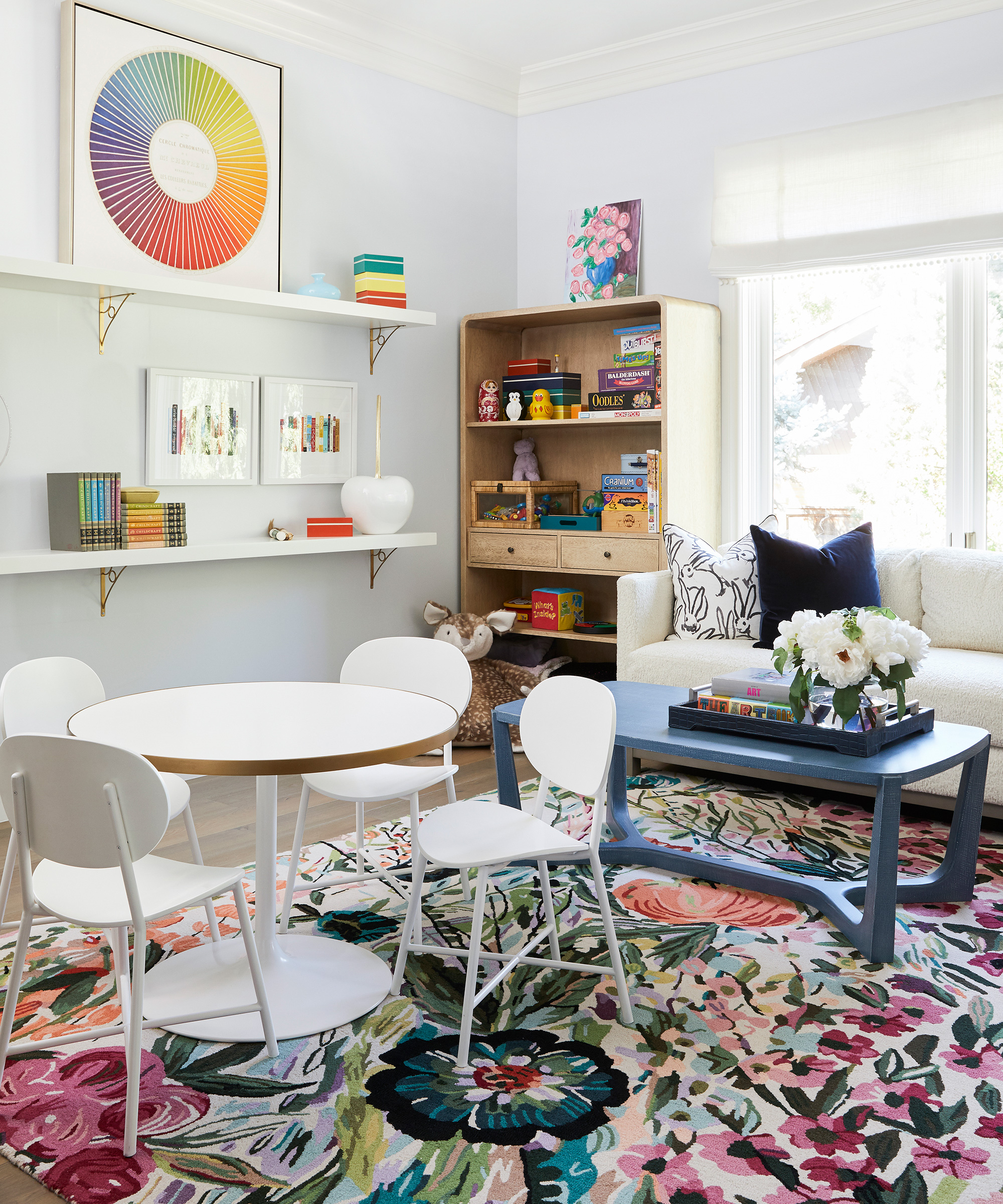
We knocked down the wall between the dining nook and the former guest bedroom, to create a playroom for the children to hang out in.
It’s perfect because of the quick access to the kitchen – so the adults can keep an eye on the children while dinner cooks.
A color is a defining factor in this space, as well as storage, and we think we've nailed both.
Photography / Nicole Hill Gerulat
Interior designer / Jessica Bennett of Alice Lane Interior Design
Sign up to the Homes & Gardens newsletter
Design expertise in your inbox – from inspiring decorating ideas and beautiful celebrity homes to practical gardening advice and shopping round-ups.

Jennifer is the Digital Editor at Homes & Gardens. Having worked in the interiors industry for several years in both the US and UK, spanning many publications, she now hones her digital prowess on the 'best interiors website' in the world. Multi-skilled, Jennifer has worked in PR and marketing and occasionally dabbles in the social media, commercial, and the e-commerce space. Over the years, she has written about every area of the home, from compiling houses designed by some of the best interior designers in the world to sourcing celebrity homes, reviewing appliances, and even writing a few news stories or two.
-
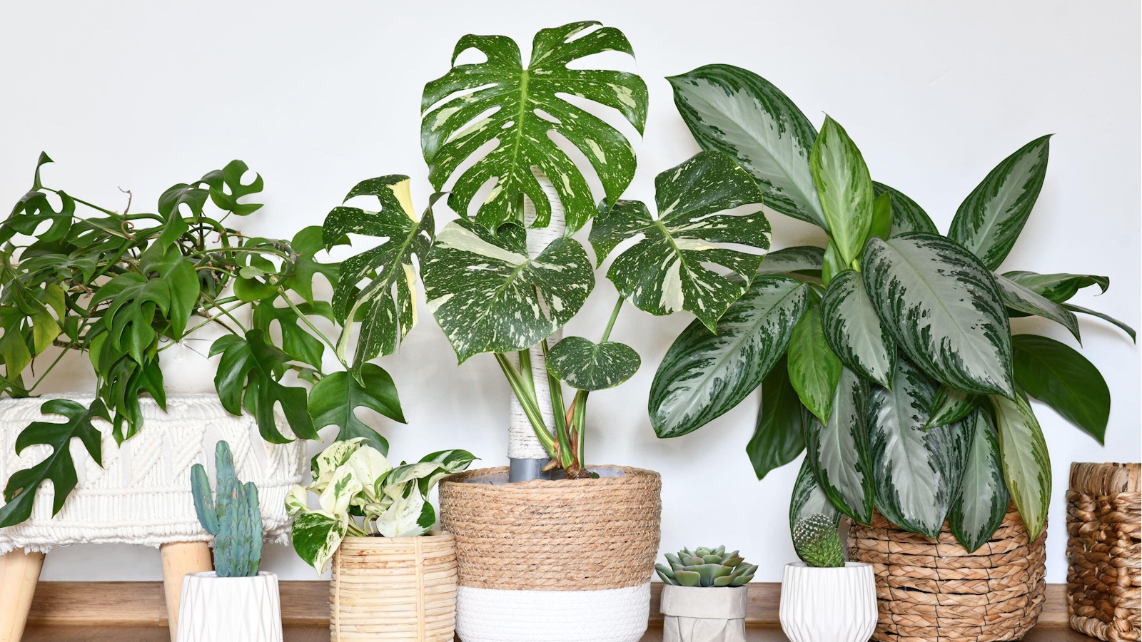 9 longest-living houseplants – expert recommendations and tips for species that can live over 10 years
Invest in these houseplants now for years of luscious foliage in your home
By Tenielle Jordison Published
-
 Kris Jenner's 'organic modern' living room champions the most talked-about trend of 2025 – it's the new way to do luxe-minimalism
Simple silhouettes, organic textures, and industrial nuances infuse functional pieces with elegance to create an effortlessly chic and easy-to-live-with living space
By Jennifer Ebert Published