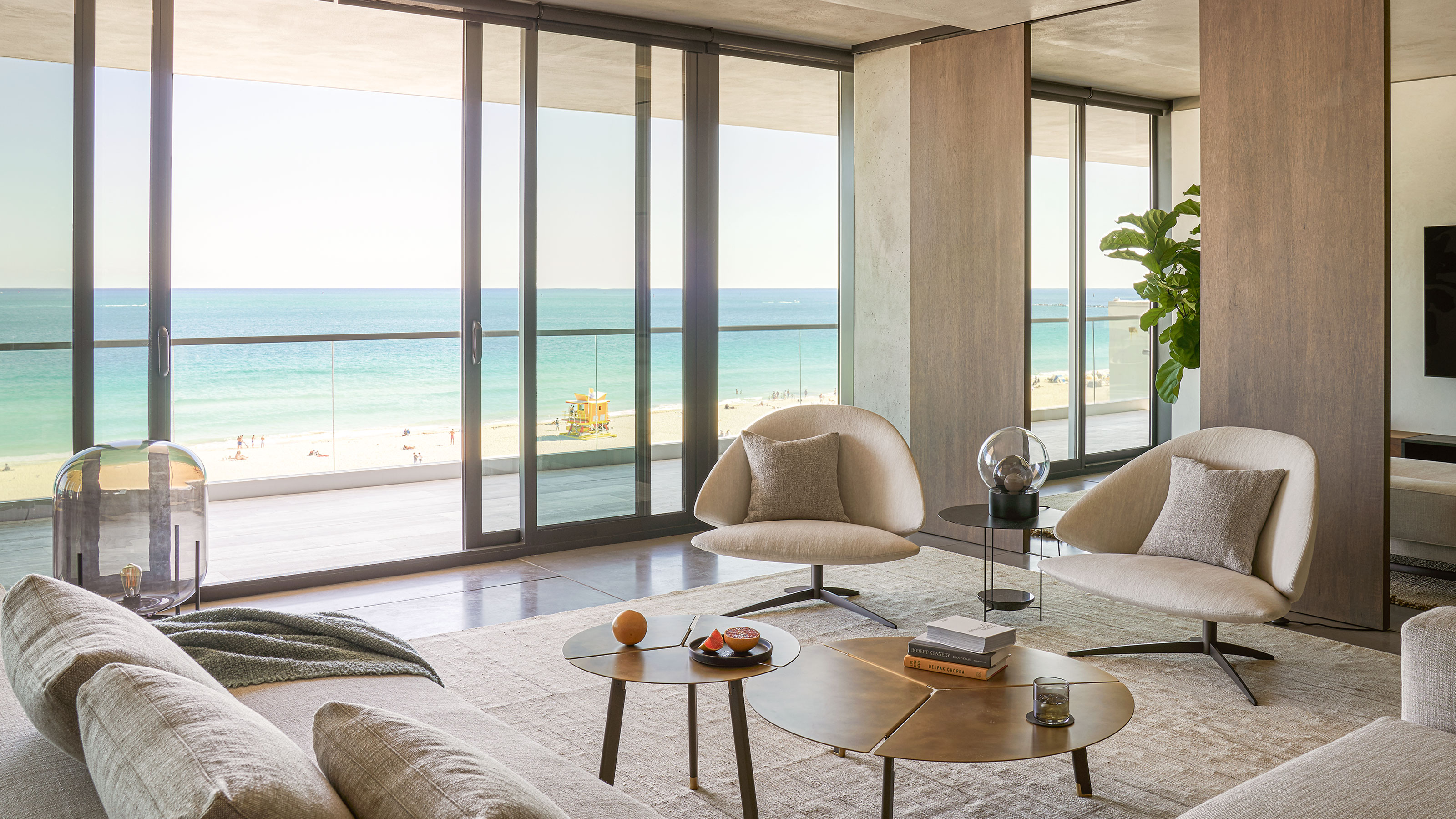
This Miami beachside apartment's calm and atmospheric interior is only eclipsed by the view
A redesigned apartment in Miami has a serene aesthetic that showcases the stunning light of its coastal location

Design expertise in your inbox – from inspiring decorating ideas and beautiful celebrity homes to practical gardening advice and shopping round-ups.
You are now subscribed
Your newsletter sign-up was successful
Want to add more newsletters?
With layers of dark timber, hand-trowelled plaster and riven stone, this family home feels reassuringly grounded.
This is all the more surprising when you discover it is located six storys above the buzzy, hedonistic setting of Miami’s South Beach – but that was precisely the aim of its designers at mwworks.
This apartment was designed for a family with strong Miami roots, returning to Florida from Seattle.
Article continues below‘The idea was to create a quiet, atmospheric environment that is rich in tones and materials,’ explains Eric Walter, co-founder of mwworks. ‘In this way, the space allows the family to focus on being together in a setting that suggests permanence, a quality not often associated with South Beach.’
The five-bedroom home was previously two separate apartments, which Eric and his team have seamlessly joined together.
They began by stripping back the spaces to their raw elements and the original hefty cement pillars that they revealed at this point have not been concealed or treated in any way. Instead, they take their place alongside grainy wood, concrete and sweeps of plaster in a scheme that celebrates strong textures.
Kitchen
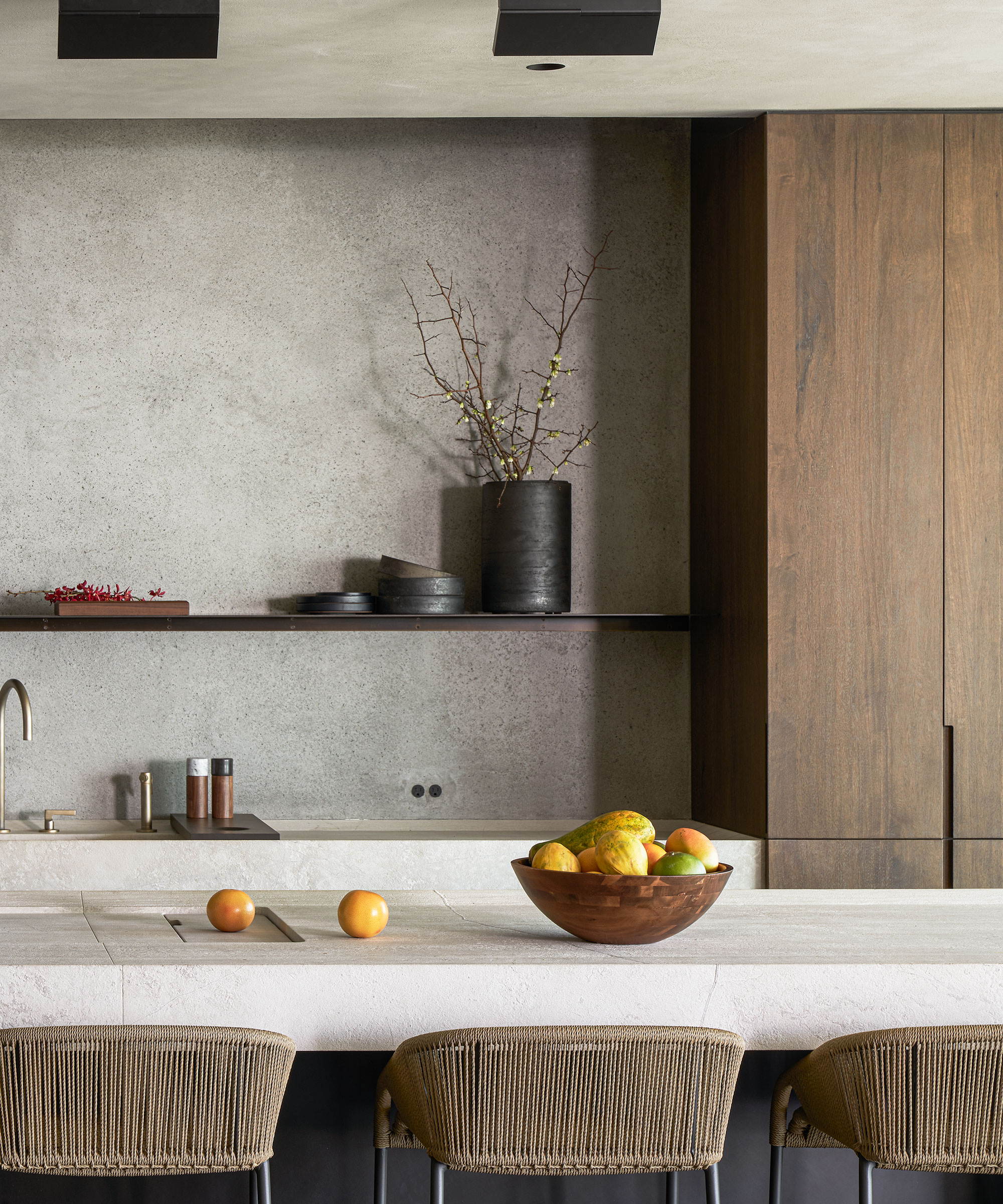
The kitchen is a masterclass in modern kitchen ideas. The kitchen countertops are hand-chiselled with raised lips reminiscent of the natural drift of sand.
Design expertise in your inbox – from inspiring decorating ideas and beautiful celebrity homes to practical gardening advice and shopping round-ups.
Artworks are kept to a minimum and hit just the right note. Dreamy fantastical graphite drawings by Ethan Murrow in the kitchen and the main dining area feel suitably airy.
Dining room
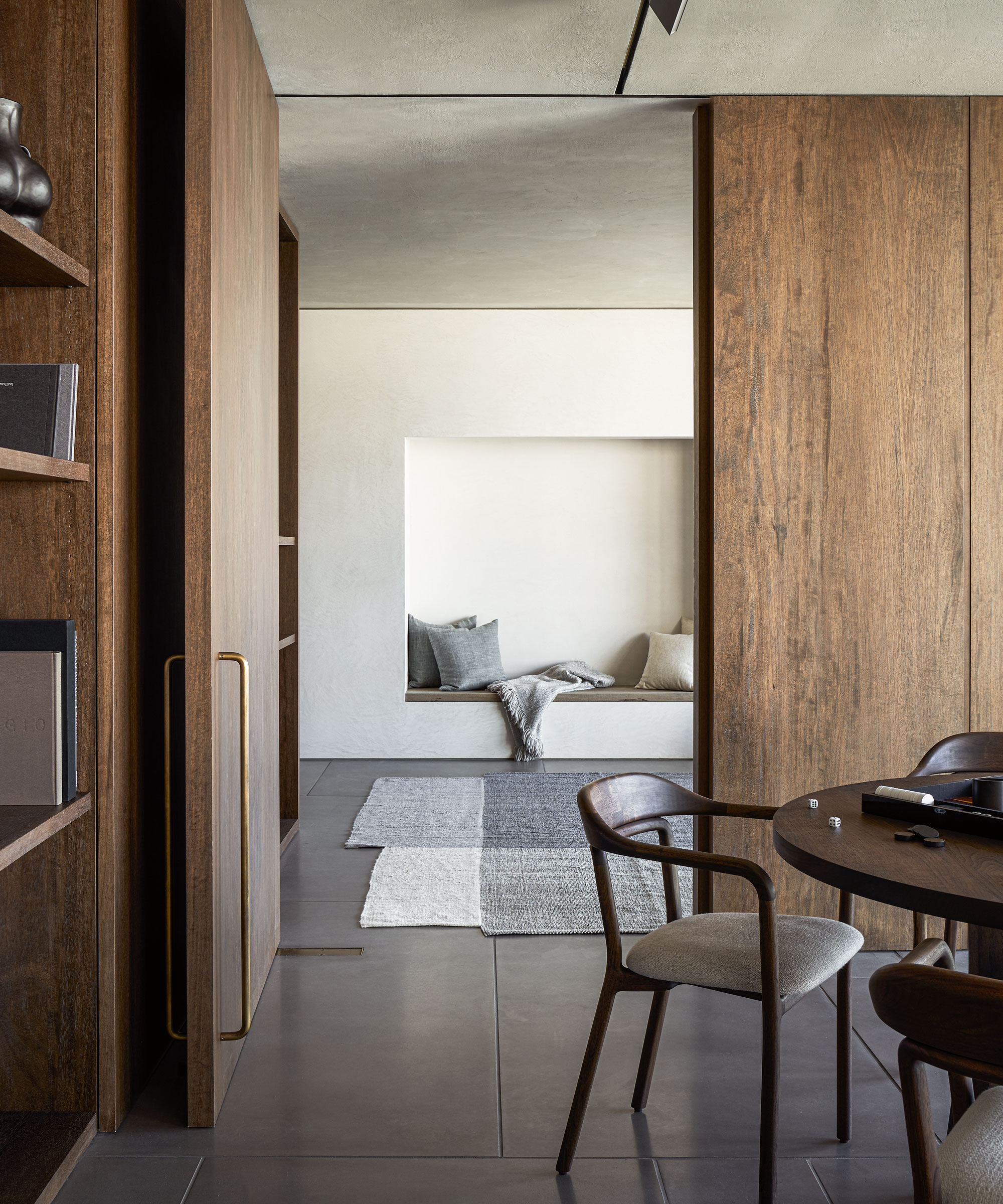
Modern dining room ideas abound. Key materials include black limba, a West African hardwood used not only on the floors but for bespoke cabinetry and the sliding doors that divide, or unite, the sociable spaces, such as between the dining room and family room.
Throughout the apartment, there is an interplay of light and shadow. The plaster for the walls in the family room beyond the dining room was picked ‘as the irregular surface highlights the changing quality of light throughout the day and lends a particular softness to private spaces,’ says Eric.
Living room
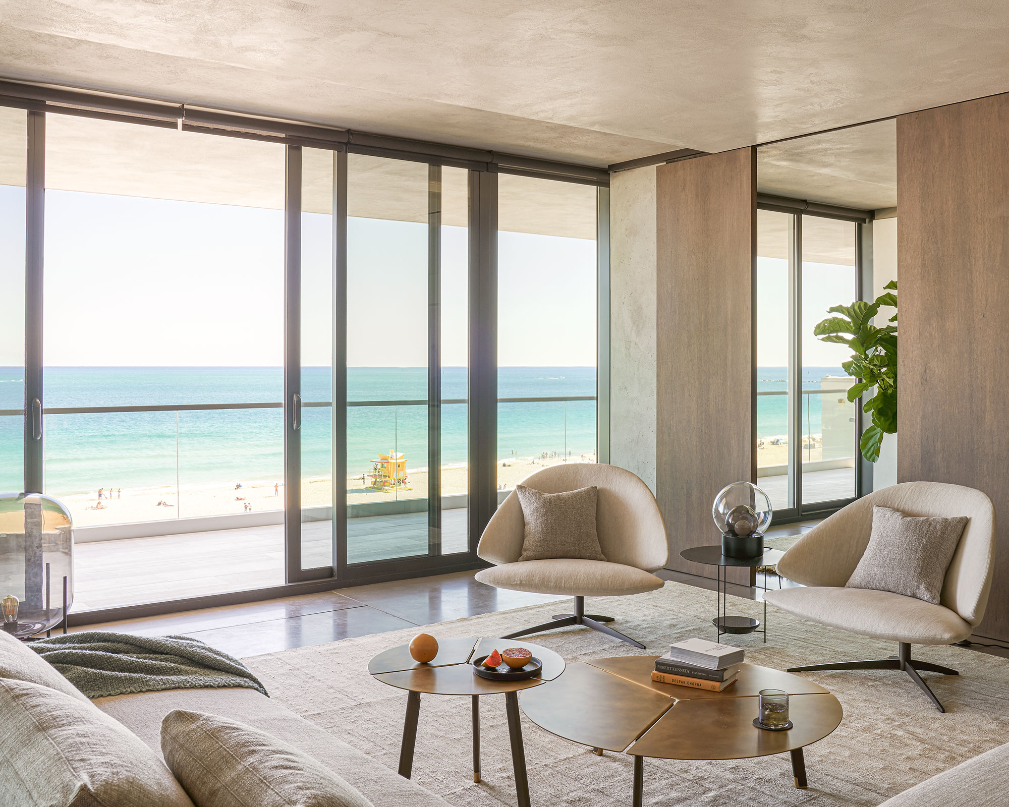
Living room ideas include sculptural shapes that bring a sense of ease to the main seating area, which has beautiful ocean views.
The intensity of the light was a key consideration for Eric and his clients. ‘Our first conversations focused on the ever-changing views from the apartment and the quality of light,’ he explains. ‘Our design grew out of a desire to amplify these effects and let the interior architecture act as both a canvas and a frame.’
Bedroom
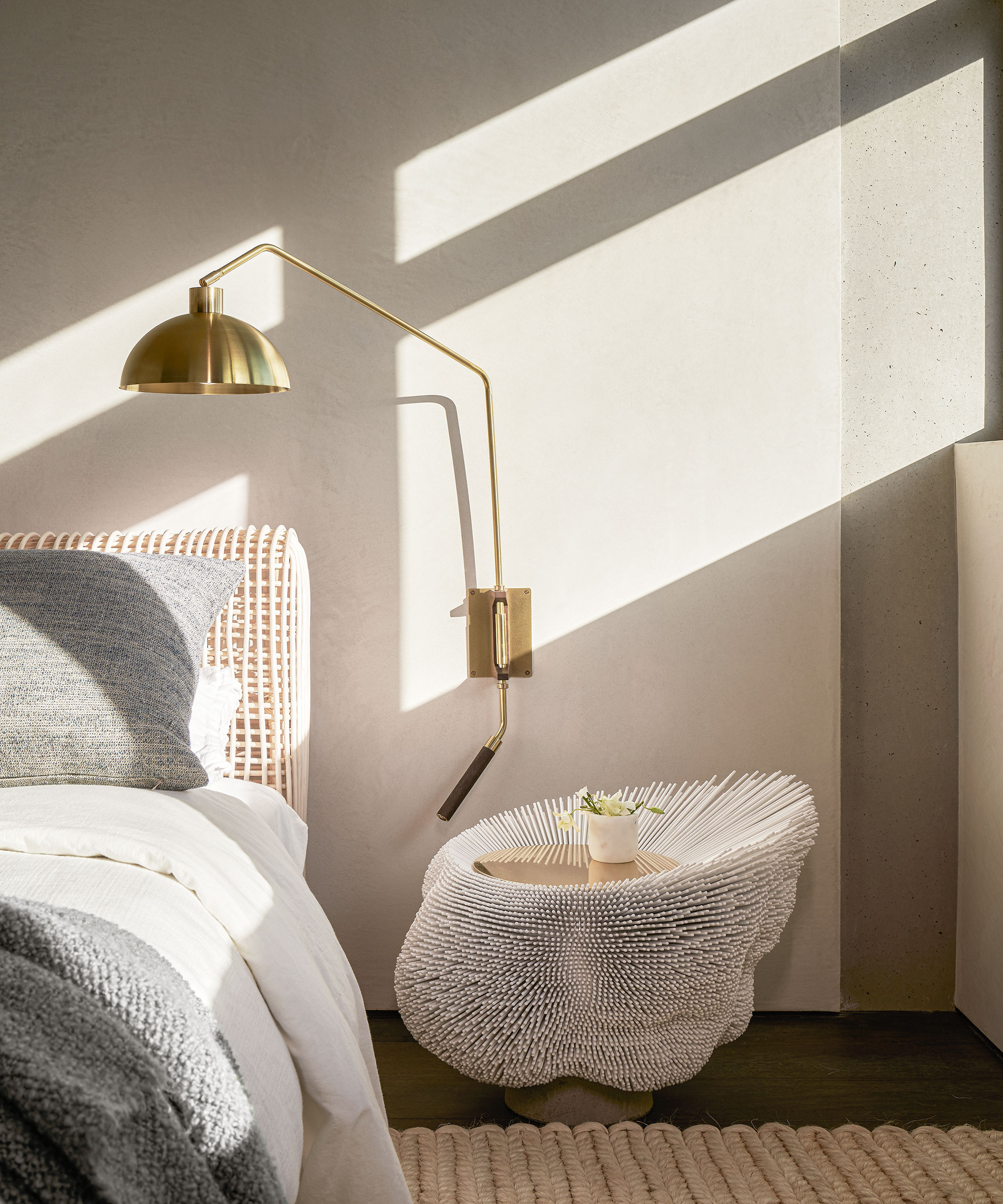
In every scheme, the designers used texture to add pattern – here, a rattan bed and a handcrafted side table that echoes the shape of a sea anemone.
The emphasis on textures also embraces the simpler decorative finishing touches, such as woven chair backs, baskets, sheer curtains and rugs, which come loosely threaded with silk or as tightly woven sisal bouclé. It all adds up to spaces so rich in materials that they feel complete, cohesive and, most importantly, self-contained. To the point where the ocean views from the windows are simply an added extra.
Main bathroom
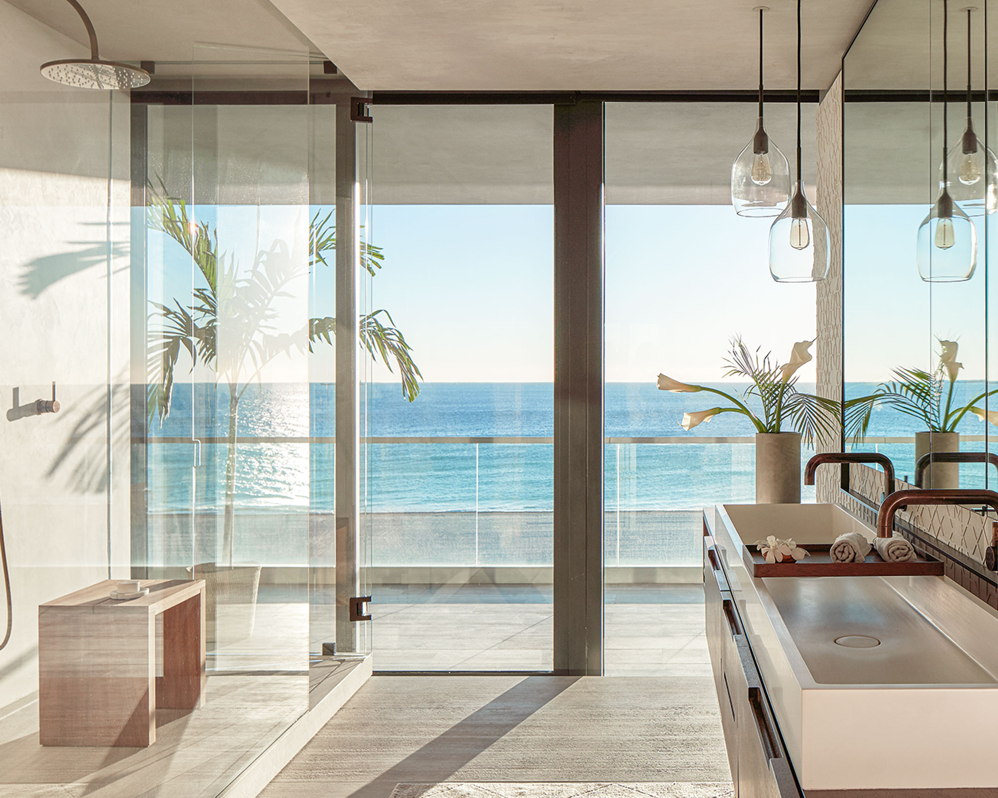
Beach bathroom ideas are incredibly underplayed. The shower tray in the main bathroom is made from carved stone, a texture that feels natural underfoot.
The entrance to the apartment has a large-scale photograph of a figure floating in the ocean by Richard Misrach, a reminder of how the serenity of the sea also carries a hint of danger. A giant folded paper sculpture by Gonzalo Lebrija hangs in a corridor, reflecting a fascination with textures, folds and shadows that is repeated in a section of angular 3D tiles in the bathroom.
In this way, themes and shapes are echoed so that the closed off private spaces (the bedrooms, a family room and the entrance area) feel as integrated into the whole as the open-plan kitchen, dining area and living room.
Interior designer mwworks
Photography/ Kevin Scott
Text/ Jo Leevers

Interiors have always been Vivienne's passion – from bold and bright to Scandi white. After studying at Leeds University, she worked at the Financial Times, before moving to Radio Times. She did an interior design course and then worked for Homes & Gardens, Country Living and House Beautiful. Vivienne’s always enjoyed reader homes and loves to spot a house she knows is perfect for a magazine (she has even knocked on the doors of houses with curb appeal!), so she became a houses editor, commissioning reader homes, writing features and styling and art directing photo shoots. She worked on Country Homes & Interiors for 15 years, before returning to Homes & Gardens as houses editor four years ago.