A storage-smart refit turned this Manhattan apartment into a family home
Making a city apartment comfortable for a family of five is no mean feat, but the result here is both stylish and functional
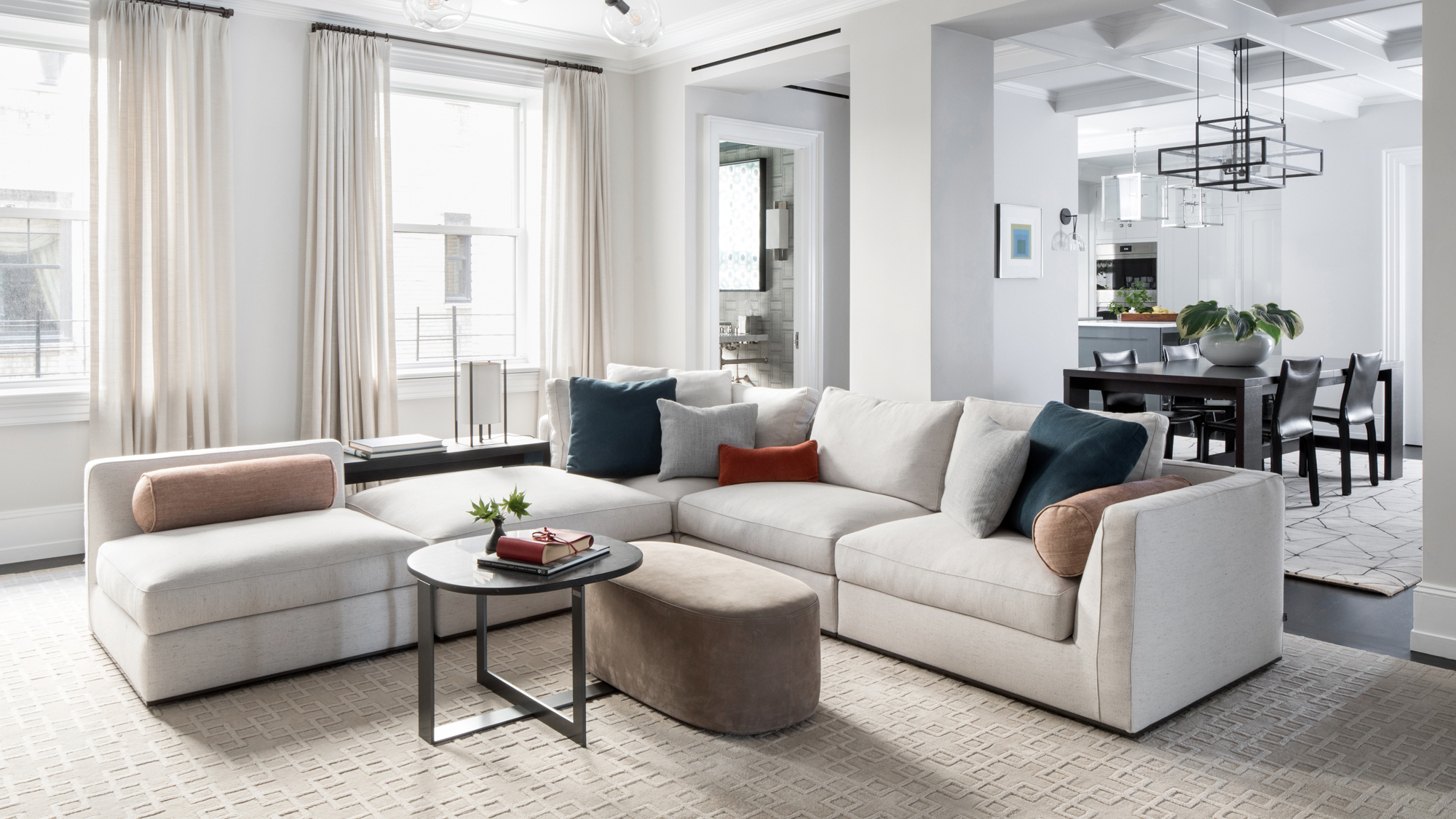

When a family embarked on a total gut restoration of an Upper East Side apartment in Manhattan, they called on Alexis Hughes & Co once again. The family’s Tuxedo Park home had been one of the interior design firm’s first ever projects, and Hughes was more than happy to help with round two.
‘They know how much I love to get to the bottom of how they hope to use the space, in effort to figure out how to best configure rooms and furnishings’, said Hughes. ‘We worked on the home through the construction, detailing every aspect of the build and subsequent decoration.’
This meant that Hughes and the family were involved in reshaping the pre-war apartment at an architectural level, updating it for modern life and the discrete housing of smart home equipment, air conditioning compressors and all the kit that comes with three young children.
‘Despite being so large for a city home, it is still a city home for five, so we really worked hard to engineer every nook and cranny to be an efficient use of space’, said Hughes.
‘Inspired by the family’s home in Tuxedo Park – whose 1910 walls are 24” thick in many places – we created a deep, cased opening from the formal entrance to the apartment, into the dining room.’ Inside, walnut-lined cabinets
Storage was key in this design to help it become a family home that was not only functional but had licence to stay stylish.
‘The project was really a joy to work on with clients who are very interested in all the details and very trusting with the design’, recalled Hughes. ‘We had so much fun picking out so many high gloss paint colors for use throughout the home. We were thrilled to be able to have custom embroidered living room curtains and to be able to specify so many bespoke details for this family home.’
- See: World's best homes – tour the globe’s most beautiful house
Kitchen
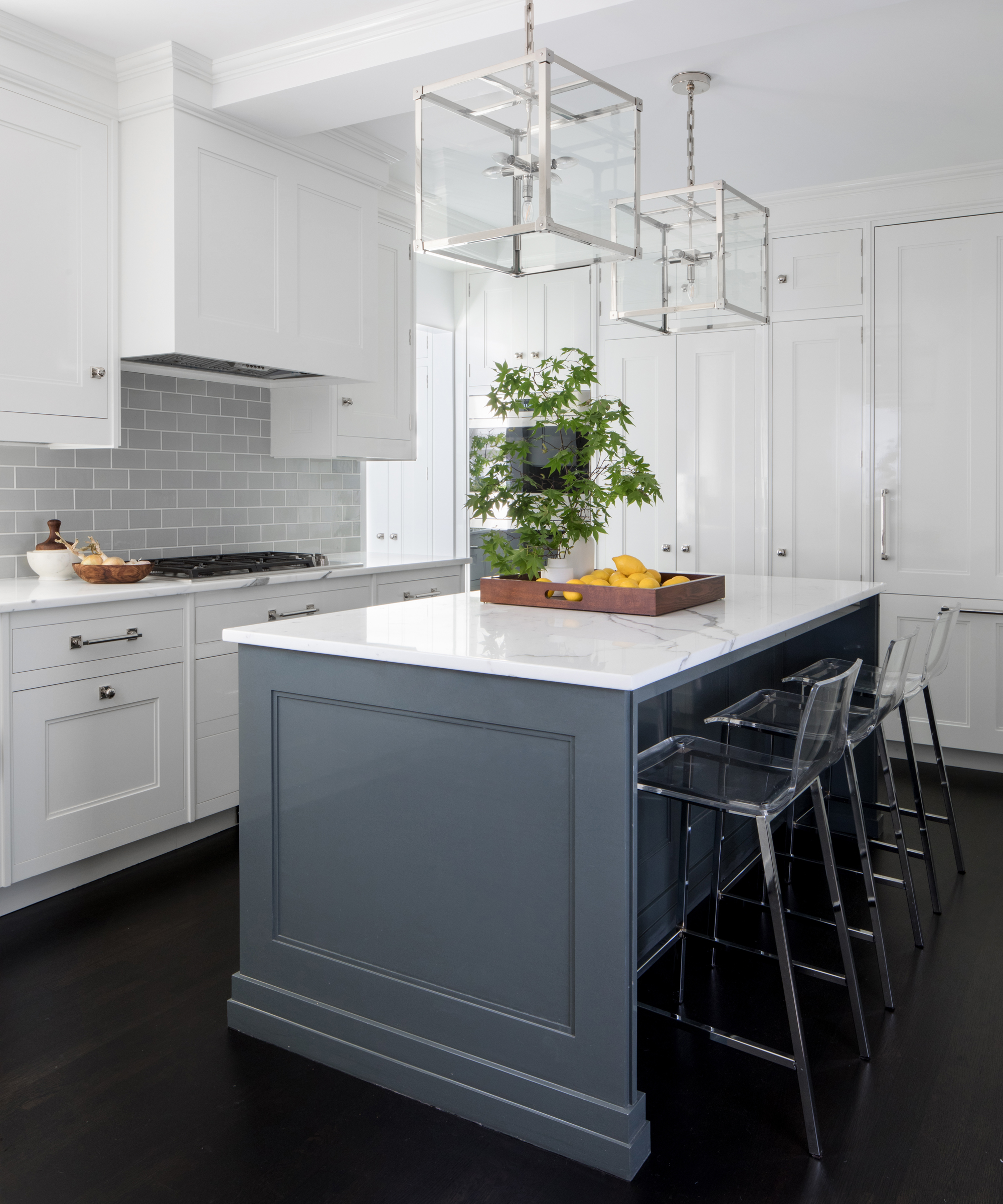
Glossy white Chris Peacock cabinetry bounces light around this small but bright kitchen, while light grey subway tiles, and a marble-topped blue grey island kick off the cool neutral color scheme that runs throughout the house.
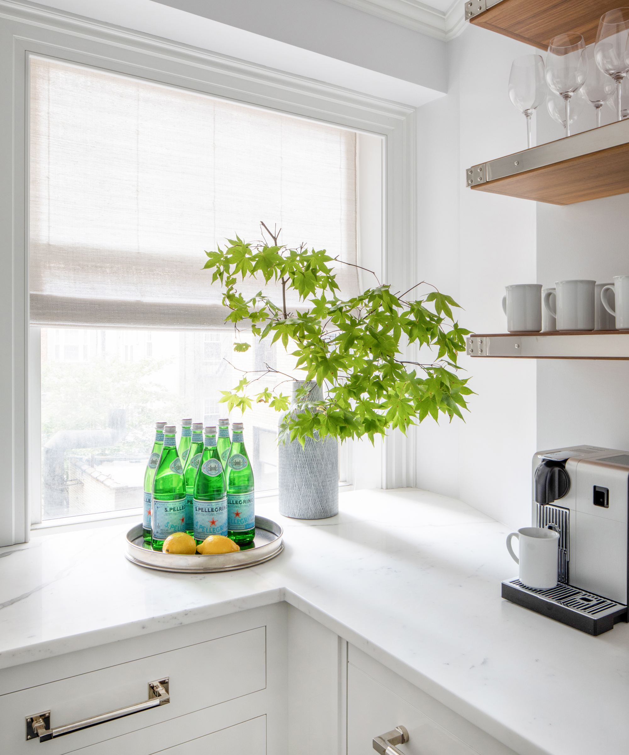
‘This space was particularly tricky as it had a very strangely shaped bump off of the kitchen that was especially sunny and seemed like a sin to ignore,’ said Hughes. Not big enough to be used as a breakfast room, the team took a practical approach and turned it into a ‘butler’s pantry’.
‘It’s become the perfect place to enjoy a cup of coffee and the view’, added Hughes.
- See: Kitchen ideas – decor and decorating ideas for all kitchens
Dining Room
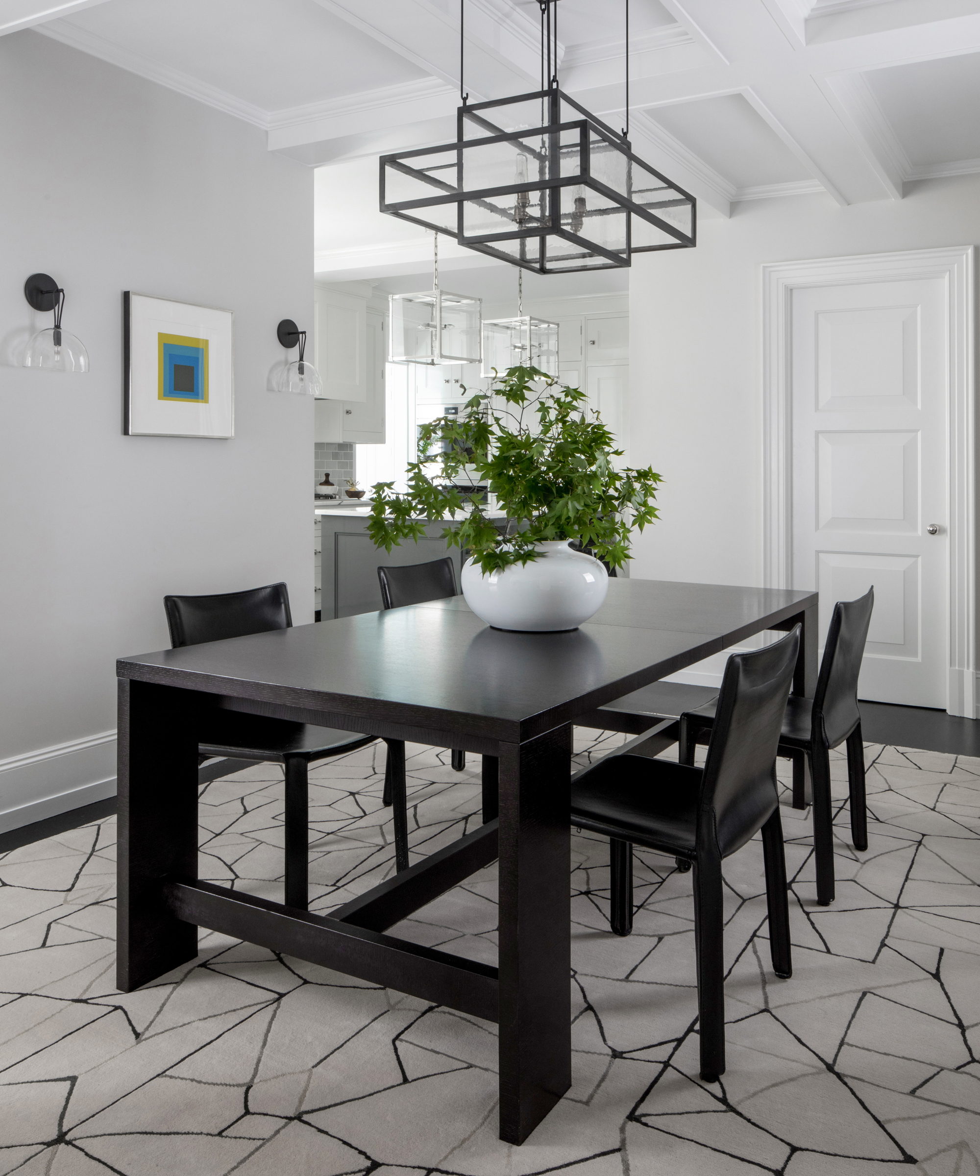
The kitchen leads through into a dining room, which is also partially opened up to the nearby family room. ‘We opted for a more open plan for the dining area than was originally imagined’, said Hughes. ‘This has meant much more family time as you can cook a meal, do homework or eat in the dining room and enjoy the family room without being isolated. It is a huge space but feels so well connected now.’
A lantern-like, geometric light fitting hangs over the dining table by B&B Italia, while Josef Albers artwork is flanked by Alison Berger sconces.
Family Room
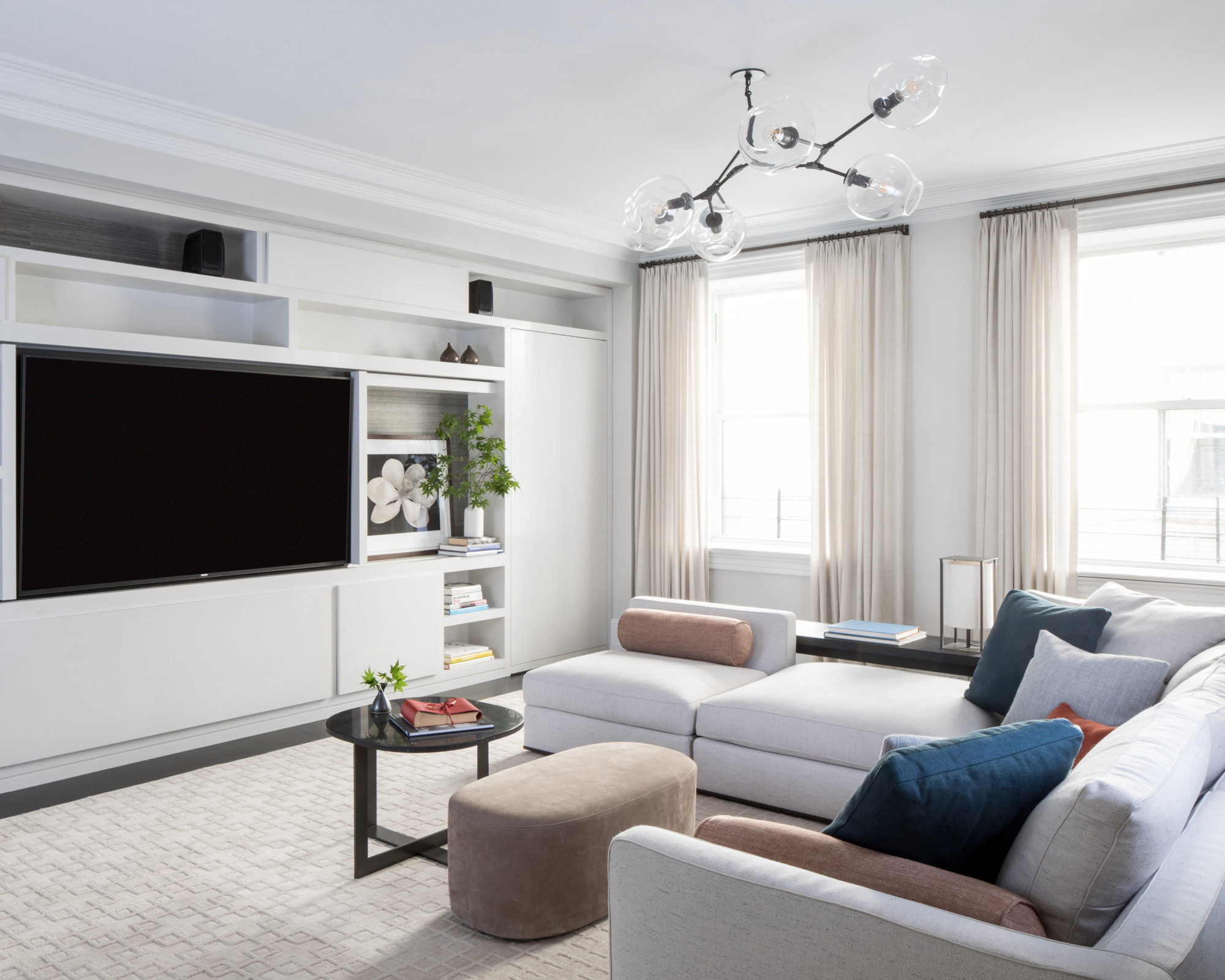
The large, light-filled family room seems to be designed with comfort at its heart, a long, low corner sofa beckoning clambering kids and much needed rest — but Hughes’s key concerns for the room were more practical.
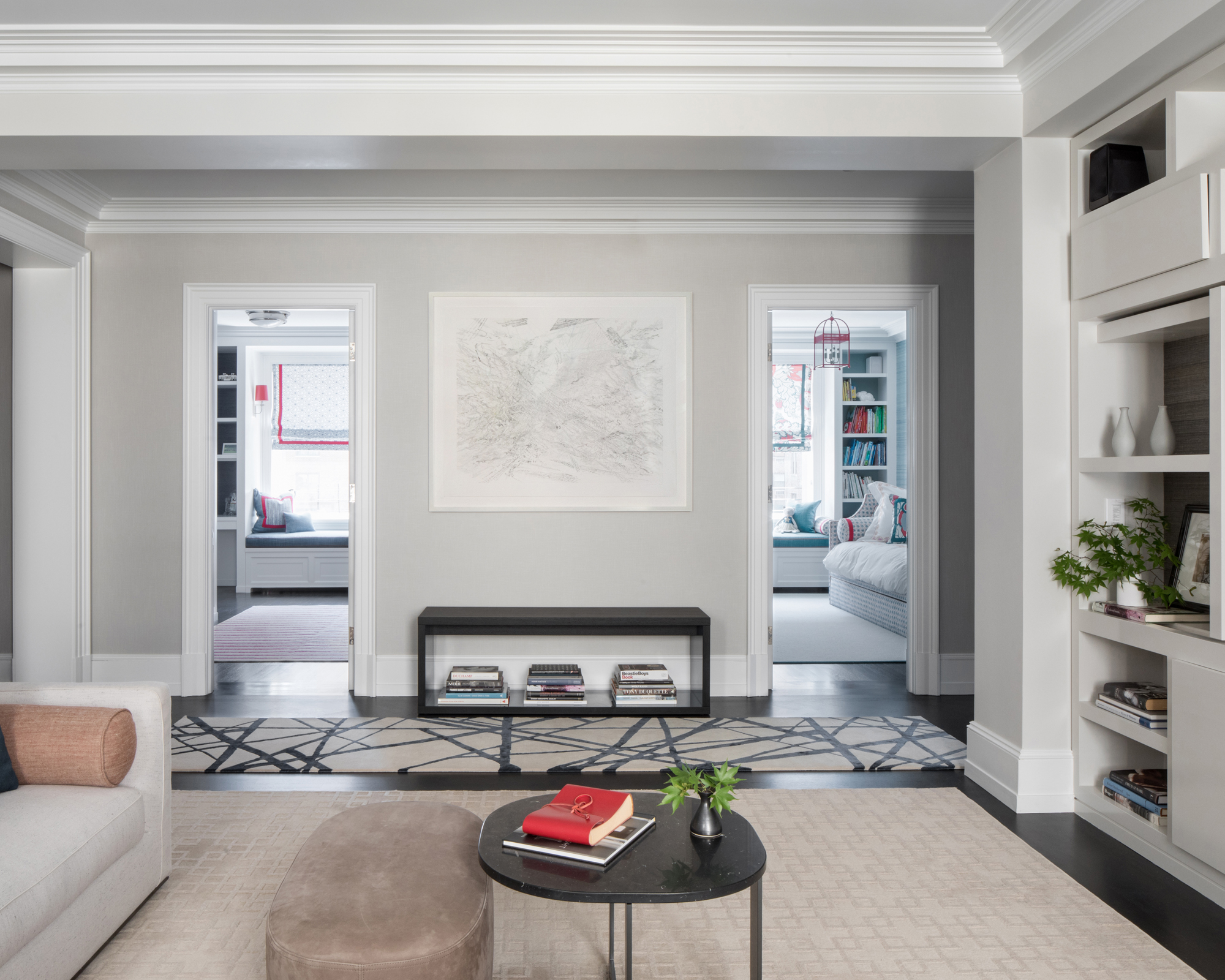
‘Accommodating a modern and accessible wall of cabinetry with asymmetrically placed closed and open shelving was the primary focus of the design work for the family room’, said Hughes. ‘Beyond that, the furnishings were the fun additions to the room.’
- See: Living room ideas – clever ways to decorate living spaces
Living Room
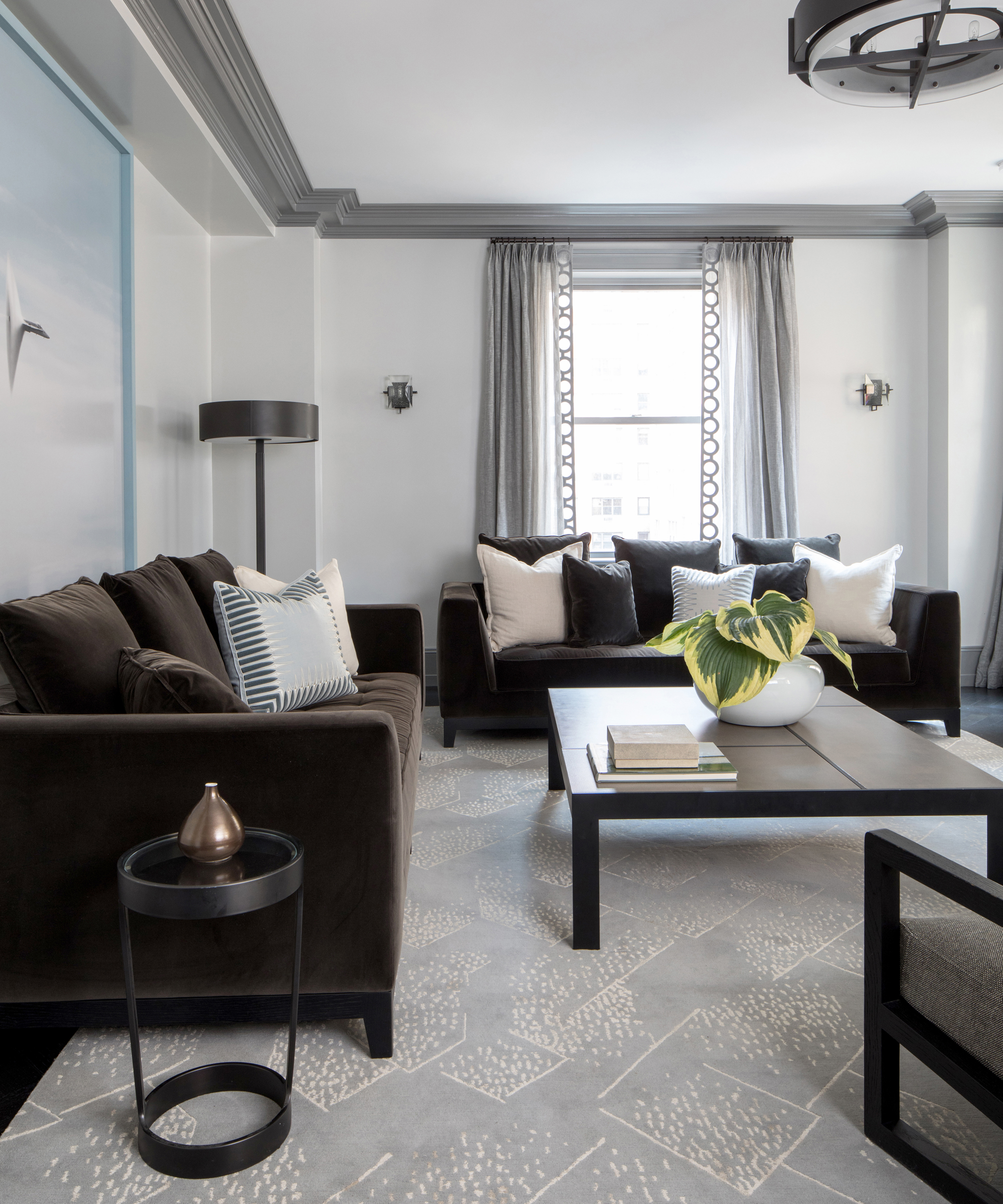
‘The focus of this room was as an additional area for the family to relax, watch golf on television, read and play the piano,’ said Hughes. The living room’s darker furniture and textiles gives it a cosier feel than the family room, while more individual seating gives the impression of a place for curling up quietly.
One wall is dominated by a huge photograph of a jet plane breaking the sound barrier, owned by the family before acquiring the apartment. ‘With dad, who enjoys flying, this photo is of particular importance to the family’, explained Hughes.
Powder Room
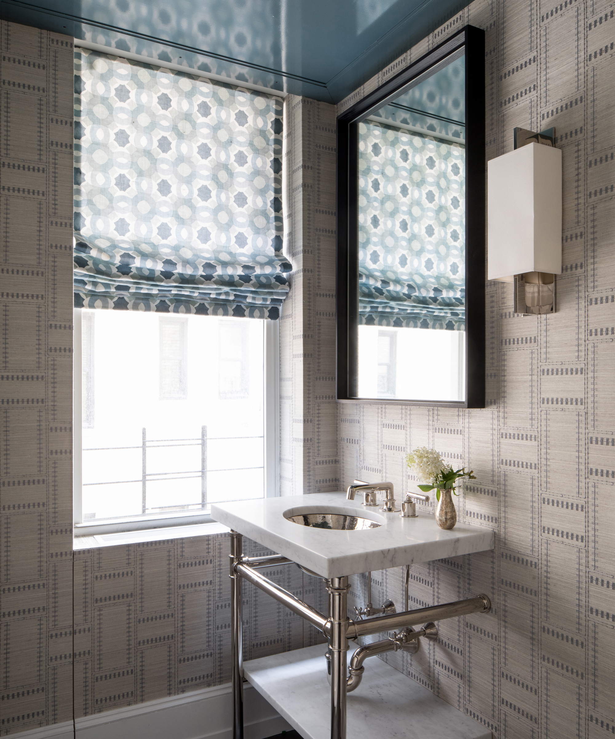
‘Hiding the air conditioning compressor is always a significant issue in an apartment,' said Hughes, who managed to not only do so in the powder room, but turned its concealment into a design feature.
A ceiling panel was installed to cover the compressor, painted in high gloss De Nimes paint by Farrow & Ball. The gray tones in this muted blue are picked out in this powder room idea’s stunning hand-stitched wallpaper by Crezana Design.
Boys Bedroom
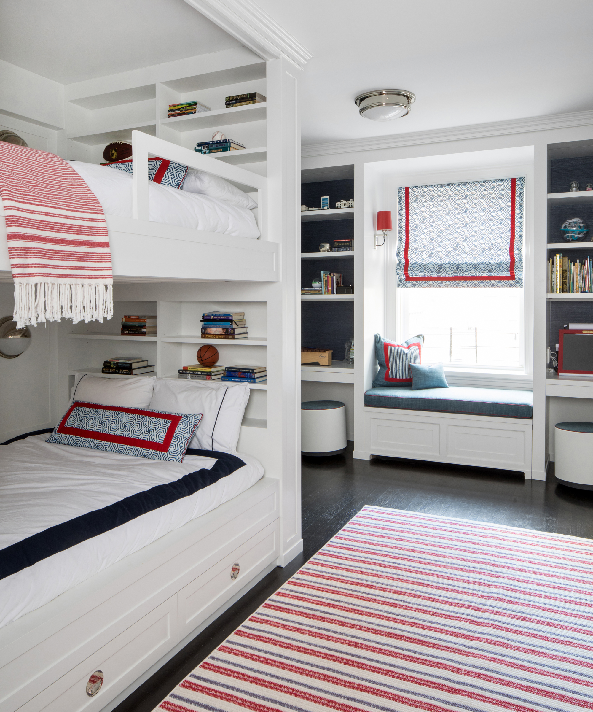
‘With two boys sharing a room next door to their younger sister, we wanted to be careful to design moments for each of them to have their own dedicated space and privacy,’ said Hughes. In this room, each boy has his own desk and shelving unit, while to maximise the floor space in the room for play, Hughes designed a built-in bunk bed. They also each have their own storage units neatly concealed within its staircase.
- See: Bedroom ideas for boys – imagination is the key to creating a daring den
Girls Bedroom
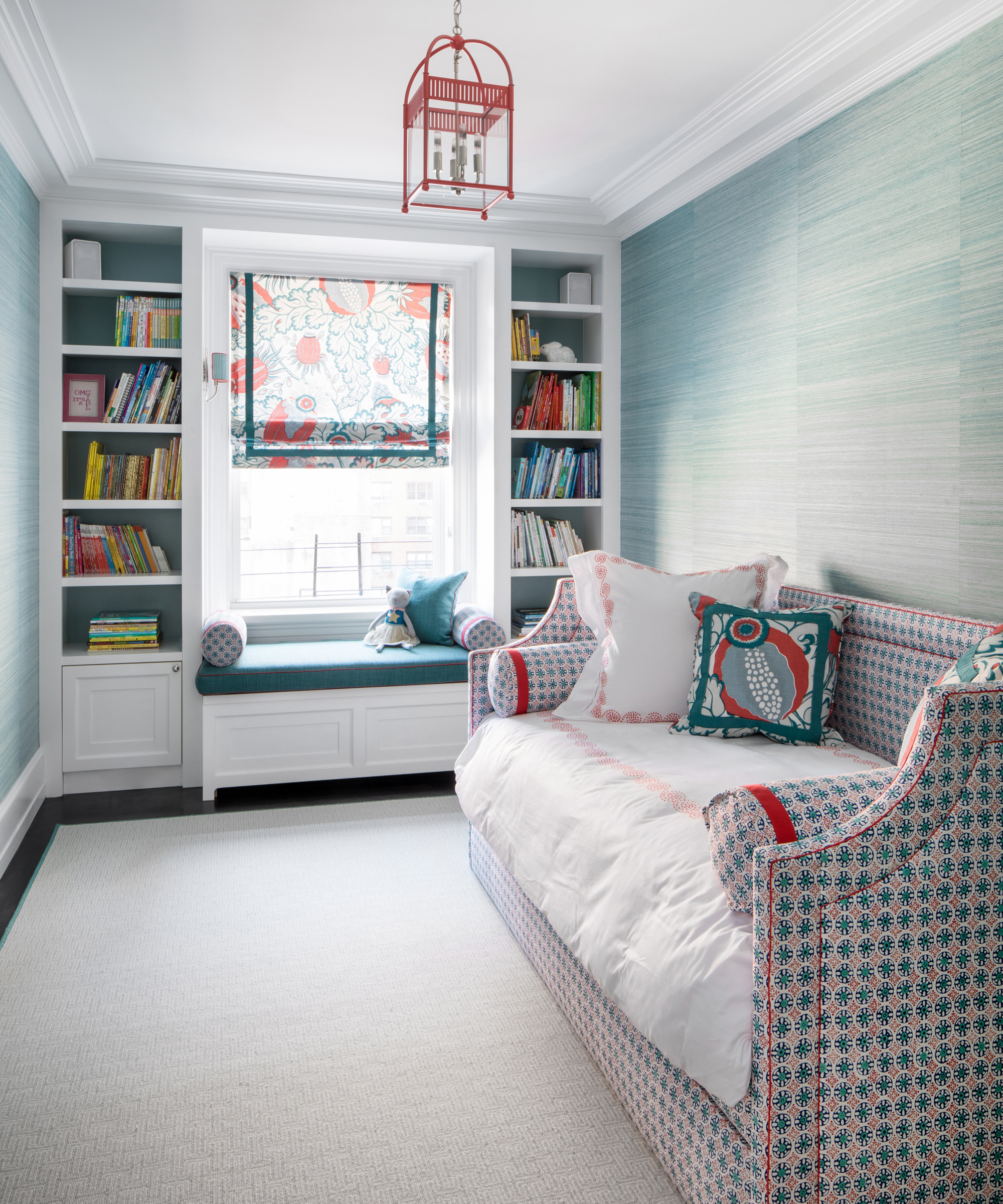
Shunning a traditionally ‘girly’ pink-peppered palette, Hughes has maintained the home’s blue-leaning color scheme, but injected some youthful fun with naturally inspired patterns and teamed a fresher blue with red.
‘In the daughter’s room, we opted for a window seat for reading with mom or dad and designed the bed as a daybed, lengthwise against the wall to give her more room’, said Hughes.
- See: Bedroom ideas for girls – rethink pink and create a room that will grow with her
Kids bathroom
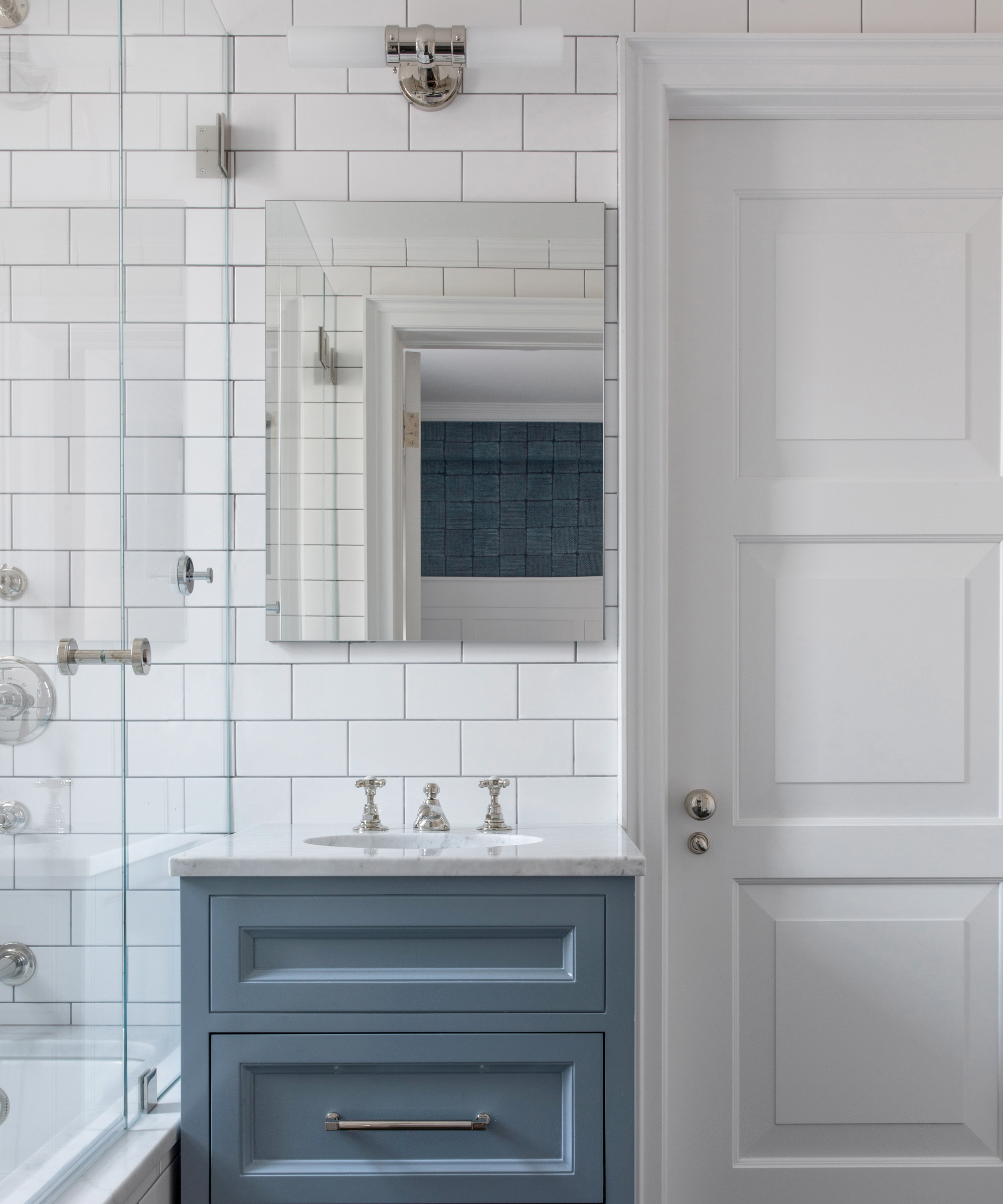
The children get their own bathroom too, complete with a custom vanity unit, painted again in a faded indigo, with walnut drawers and a marble-style sink. White subway tiles clad the walls while deep grey basalt lines the floor.
Master Bedroom
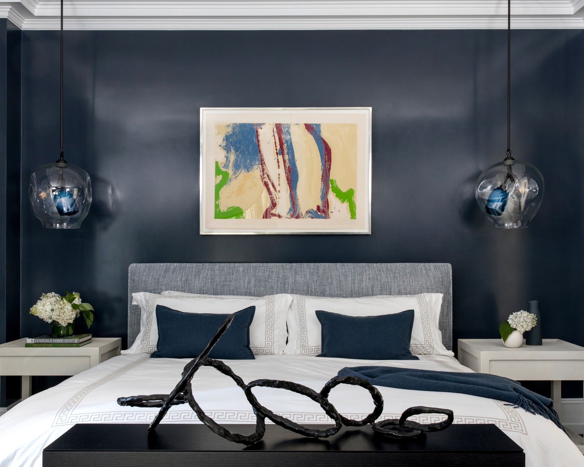
The master bedroom is where the subtle hints of blue give way to an indulgent wave of navy gloss paint, and artwork — including a piece by Willem de Kooning — sets a sophisticated tone. This room also received some careful layout consideration from Hughes.
‘In the master suite, the original plan was to enter directly into the bedroom from the living room’, she said. ‘Moving the entrance slightly to the right meant that we could place the piano near that entrance, saving room for an additional sofa in the living room. It also meant that we could add a vestibule to the master suite which serves as the perfect buffer moving from the public space to the privacy you would want in your bedroom.’
Master bathroom
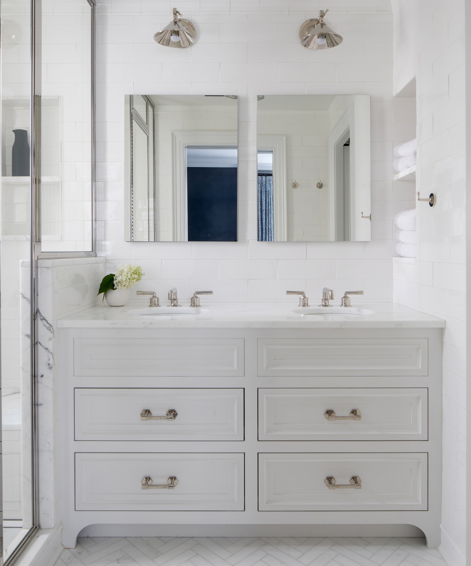
At the heart of the master bathroom is a decadent double vanity, with corresponding twin mirrors. The white scheme of the room is punctuated with marble-effect statuary elements including a herringbone tiled floor, and a slab in the shower, all lightly veined with grey.
- See: Bedroom ideas – designs and inspiration for beautiful bedrooms
Study
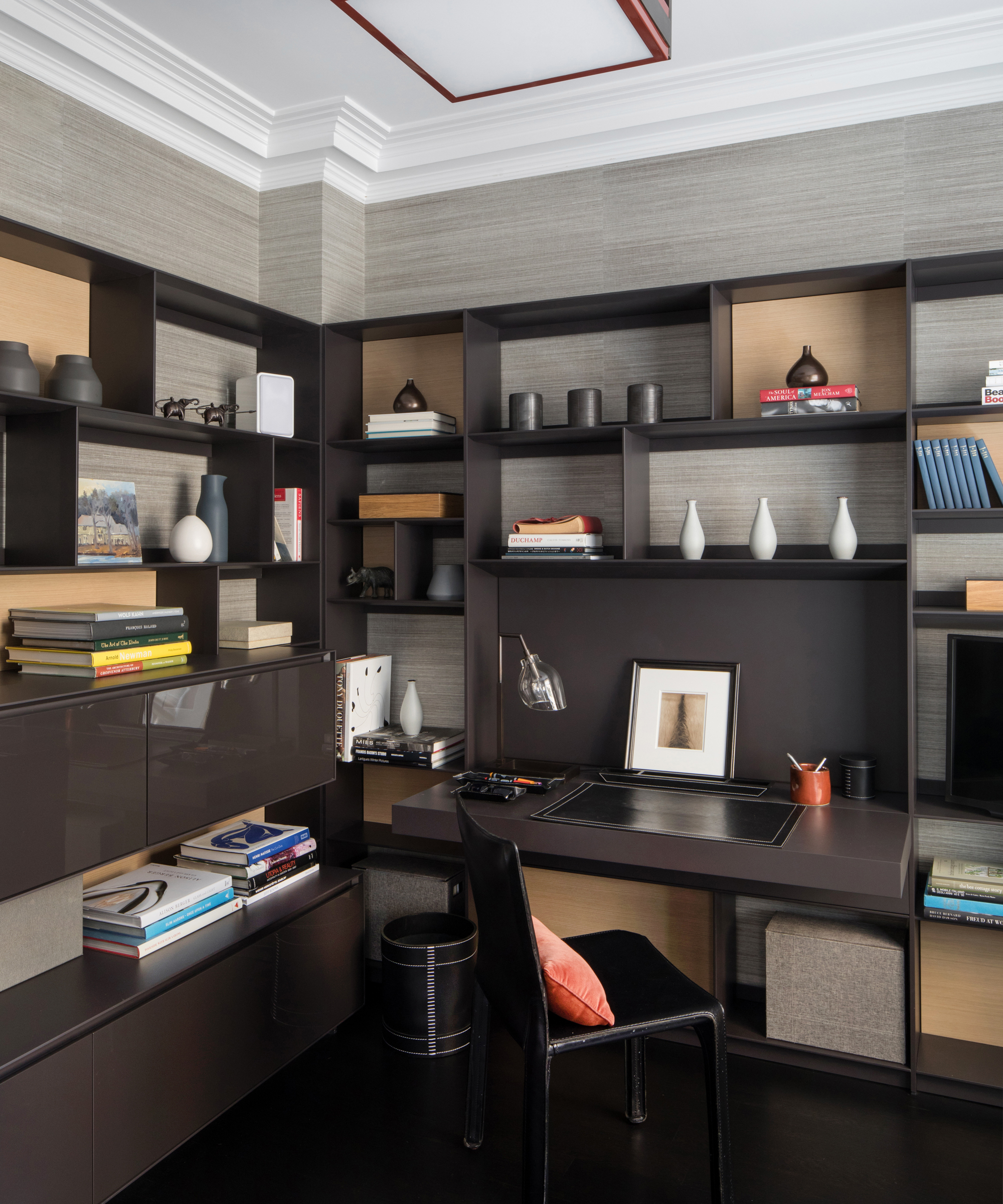
Housed behind a concealed door in the family room, the study is a private nook used by the client to work from home even before the pandemic. Inside, careful cabinetry and shelving is used again to maximise storage space, this time in a darker, more sophisticated tonal brown palette.
Interior Design / Alexis Hughes & Co
Photography / Raquel Langworthy
Sign up to the Homes & Gardens newsletter
Design expertise in your inbox – from inspiring decorating ideas and beautiful celebrity homes to practical gardening advice and shopping round-ups.

Ailis started out at British GQ, where a month of work experience turned into 18 months of working on all sorts of projects, writing about everything from motorsport to interiors, and helping to put together the GQ Food & Drink Awards. She then spent three years at the London Evening Standard, covering restaurants and bars. After a period of freelancing, writing about food, drink and homes for publications including Conde Nast Traveller, Luxury London and Departures, she started at Homes & Gardens as a Digital Writer, allowing her to fully indulge her love of good interior design. She is now a fully fledged food PR but still writes for Homes & Gardens as a contributing editor.
-
 Grilled asparagus with herb and pickled red onion
This grilled asparagus couldn't be easier, and it's a wonderful way to get the best flavor from our favorite spring veg. It's perfect alongside fish or lamb
By Alice Hart
-
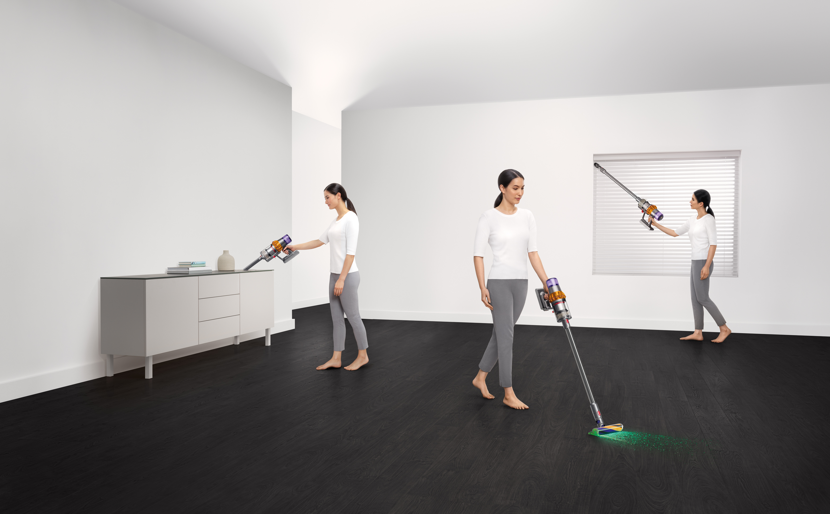 Dyson V15 Detect vs Dyson V12 Detect Slim – which is right for your home?
I've spent more than 200 hours testing vacuum cleaners and these two cordless Dysons are my personal favorites
By Dan Fauzi