A sprawling Bel-Air mansion gets a colorful, culinary-focused update
Nestled in the luxurious Los Angeles neighborhood, this stunning home is designed to entertain
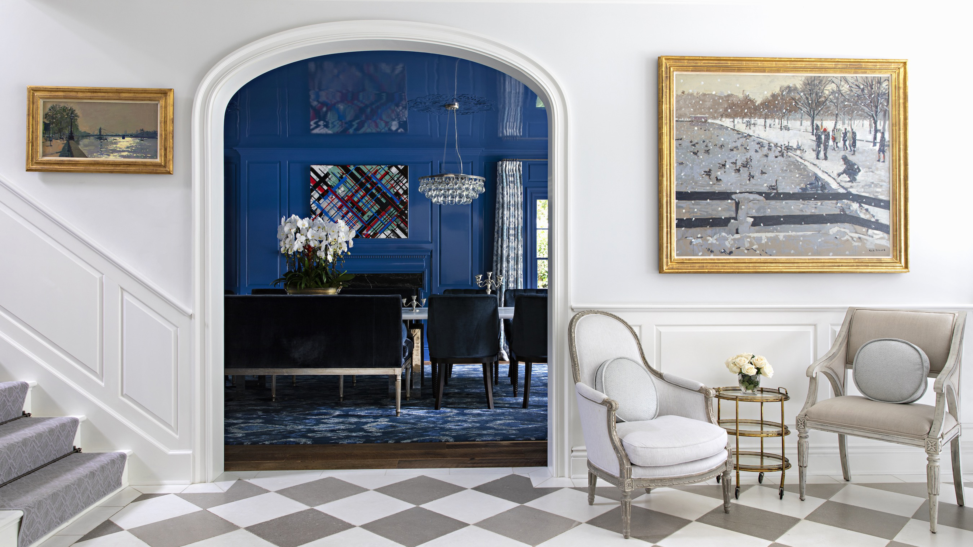

Thanks to a seminal 90s TV show or two, the Bel Air area of Los Angeles has become synonymous with dazzling residences, pristine pools and a taste for luxury – fast forward thirty years, and this home shows nothing has changed.
Renowned as a neighbourhood crammed with some of the world's best homes, you could say this one is a house fit for a prince (fresh or otherwise) – but more accurately, it’s home to a financier, their young family, and a pretty impressive wine collection.
Recently renovated by Evens Architects and redesigned by interiors guru Windsor Smith, the house has been shaped around the passions and hobbies of its owners, with spaces for eating, drinking and entertaining of paramount importance, and styled with nostalgic flair.
From a statement dining area to a whole room dedicated to drinking wine, Smith took us on a tour of this sprawling LA home.
Entrance Hall
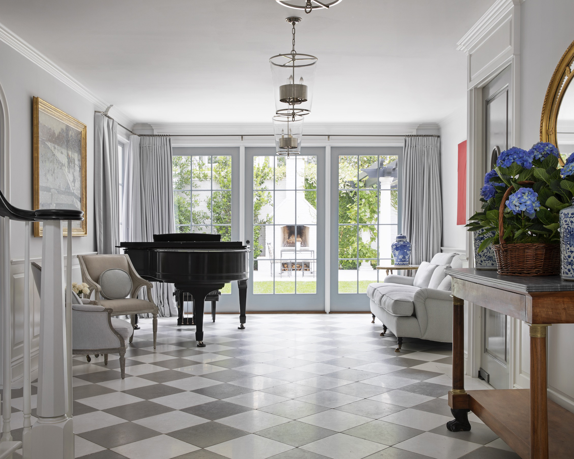
A bit of spacial rejigging allowed Smith’s hallway ideas to go the distance. Moving the dining area from the hall into the seldom used living room ‘opened up the sightline and allowed for a wonderful wide center hall with direct views out to the yard,’ said Smith.
‘I’ve always loved walking into a center hall as a true living space. The piano resides here amongst clusters of eclectic seating and feels like a quaint boutique hotel lobby – perfect for pre-dinner cocktails or after dinner scotch! The colors are a Baltic gray and white and the perfect backdrop for their art collection which is also eclectic and fun.’
Dining Room
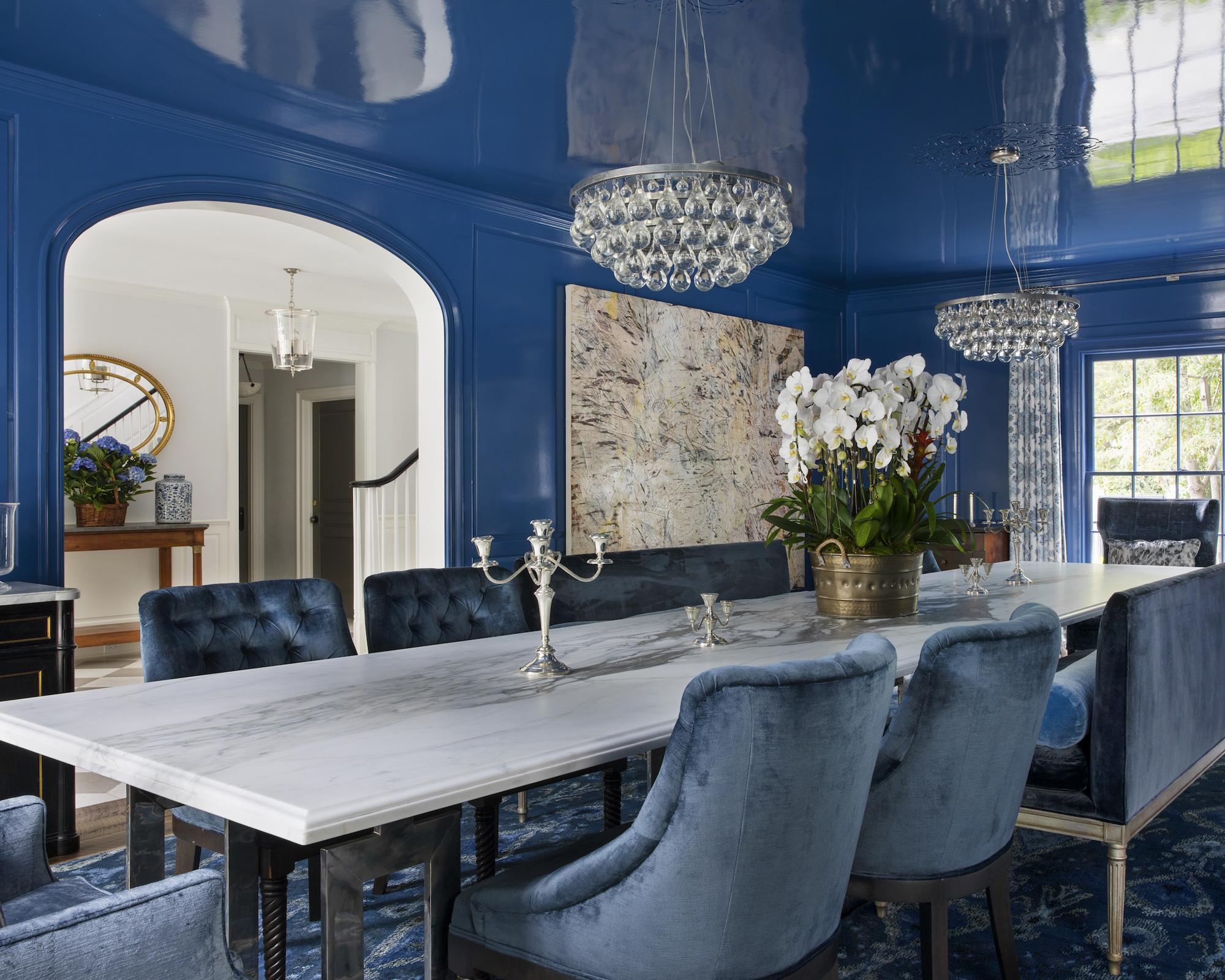
The dining room didn’t only get a new location, but an eye-catching new color scheme.
‘The lapiz blue dining room presents a lovely custom-made table of industrial Parisian bases, and a beautiful book-matched pale arabescato marble top that we were taken by – when put together, it looks like a Michelangelo pencil drawing of an arm extended. [One of the client’s] eyes are the bluest eyes I’ve ever seen, and I knew this was the perfect place for her to reign over many dinner parties.’
Among the blue contributions to Smith’s dining room ideas are Schumacher silk velvet benches, and a Jamal’s Rugs carpet, not to mention the paintwork.
‘The lacquered ceilings gave the space height, as it reflected the windows as if they were stacked. It gives you a sense you are underwater, looking up at the world above – it’s a pretty dreamy experience to be in that space.
Kitchen & Family Room
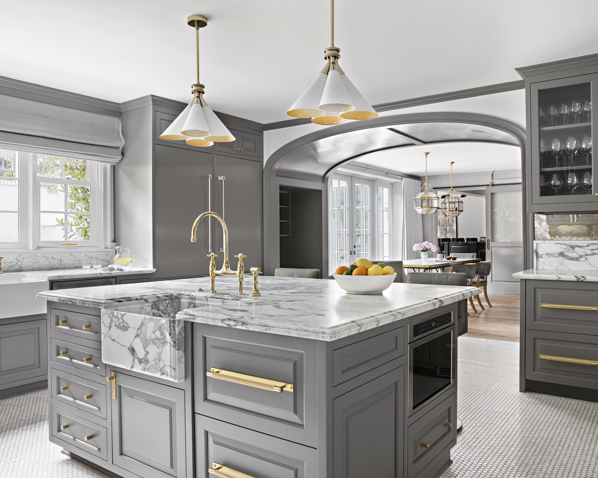
A grey and white scheme makes an impact once again in the kitchen, where statuarietto marble is used across the work surfaces and even for one of the sinks, paired with cabinetry painted in Baltic Gray by Fine Paints of Europe, custom bar stools and unlacquered brass faucets by Michael Smith.
‘The back splashes are an aged mirror that bounces the light in a beautiful way, and the small white mosaic floor feels nostalgic like Pastis in New York in the early years,’ says Windsor Smith.
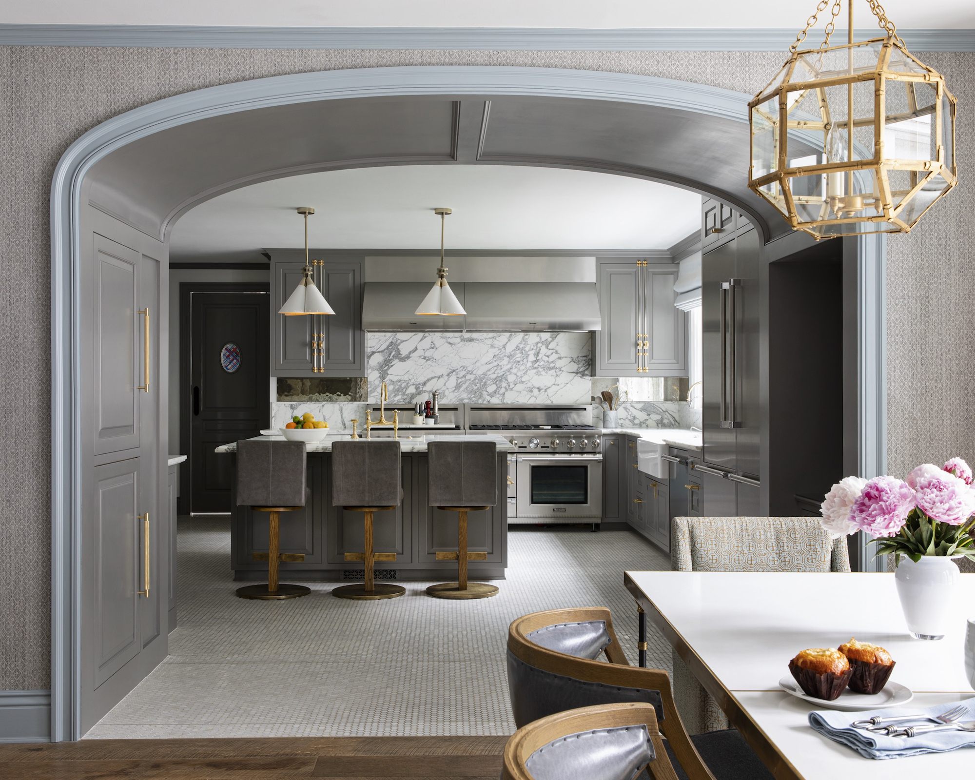
The creative kitchen ideas don’t stop there – the space extends into a family room, connected by a deep arch that hides a practical secret.
‘This double thick walkway houses a desk area, so mom duties are easy to manage while still in the center of the action.’
‘The blue family room is more relaxed… the mood is casual but refined. I prefer a mixture of chairs rather than a set for a more collected feeling.’ The chair selection is paired with a campaign-style table from Opus by Windsor Smith, and light fixtures by Suzanne Kasler for Visual Comfort.
Powder Room
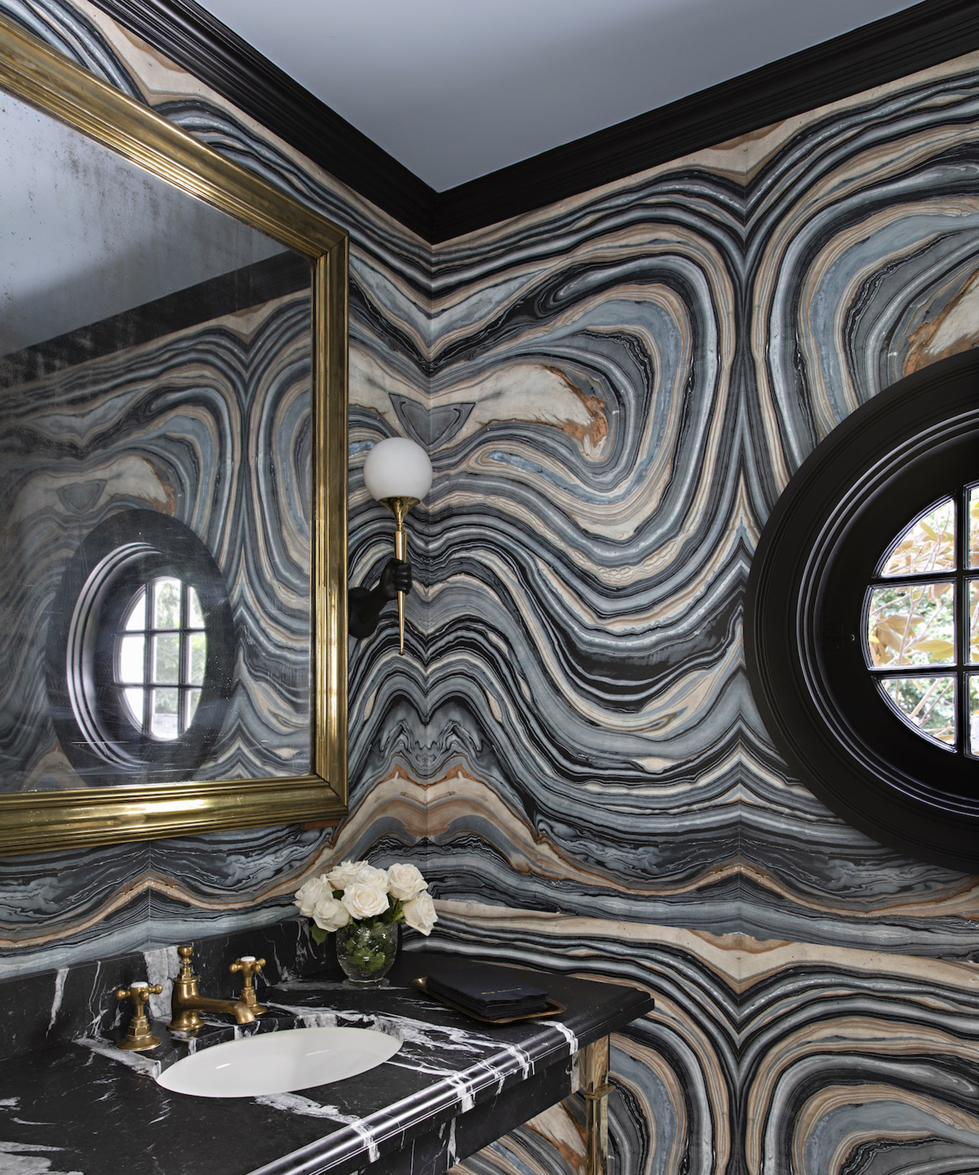
The powder room is where Smith’s use of marble really comes into its own. In this small but decadent space, panels of layered marble cover the walls. Stripes of black, grey and brown are arranged symmetrically on both the horizontal and vertical planes, giving the effect of walking into a hall of mirrors. The natural wonder is given an extra touch of luxury with brass faucets and a gold framed mirror.
Library
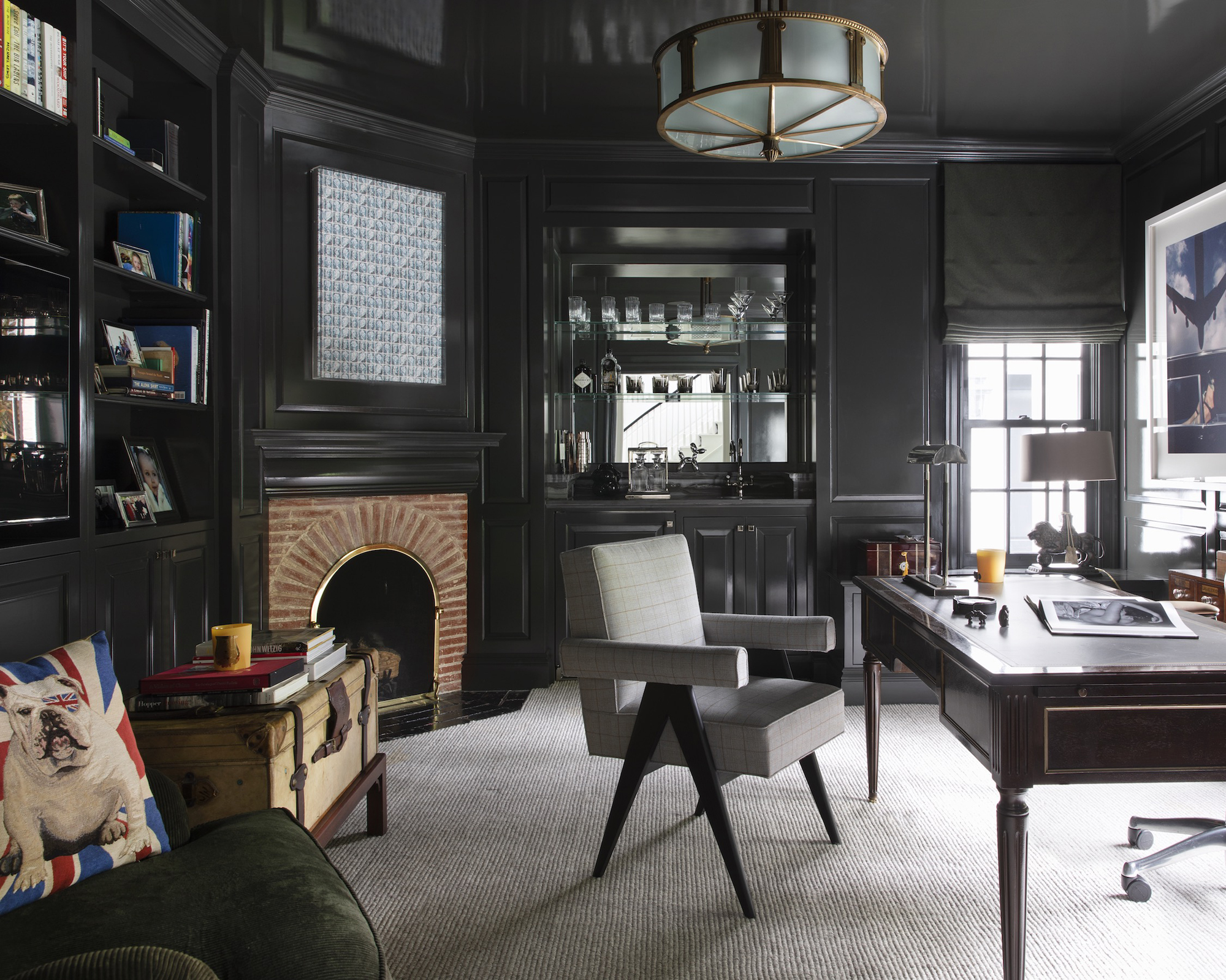
‘I love this petite library,’ said Smith. ‘It’s proportions remind you that you are in the nostalgic part of Bel-Air with the Hotel Bel Air a stone’s throw away. The deep hunter green with a touch of gray was the perfect backdrop for [the client] who is both nostalgic and sentimental.’
Combining a study with a recreational library area and mini bar makes it a perfect room for both work and play. ‘The bar and original brick fireplace feel old Hollywood and [with the client] being a financier, it seemed appropriate. The reclaimed bronze chandelier from a turn-of-the-century bank was befitting!’
Swimming pool & pavilion
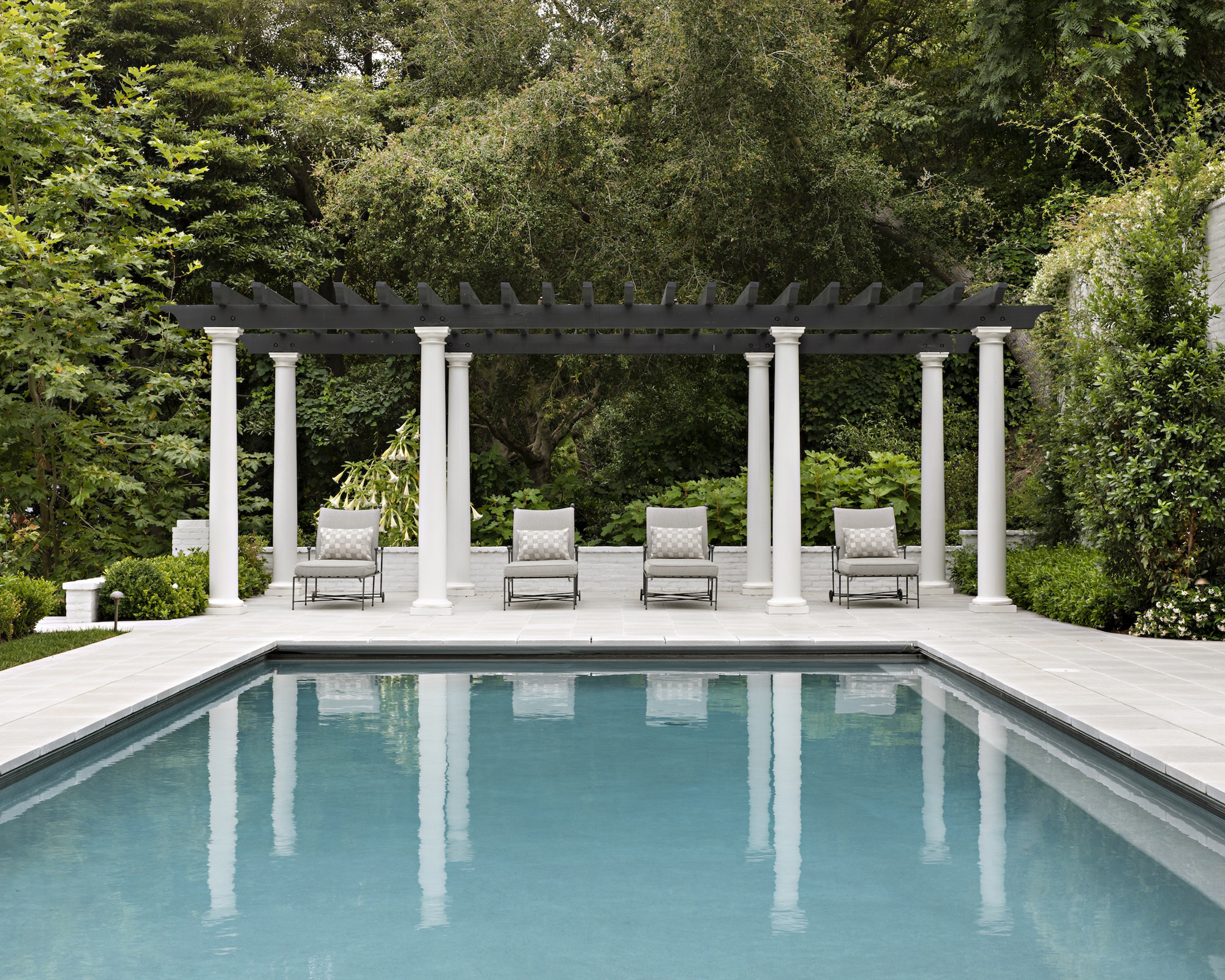
The home’s pool area is among its most enviable assets, and swimmers can enjoy the view from a set of pale grey upholstered sun loungers, sheltered by a monochrome pergola, held up by grand, classical-style columns.
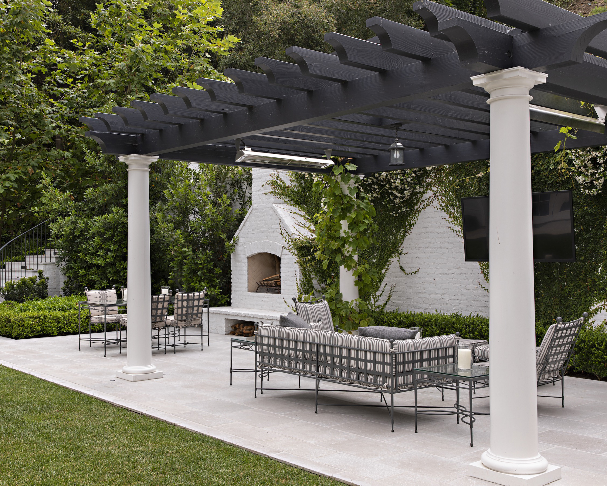
Head a little closer to the house, and you’ll find the main pavilion with more seating, an outdoor fireplace and a BBQ area, all flanked by stairs.
‘The composition is truly inspired, and Janus et Cie furniture covered in Perennials was the perfect choice in its delicate nature for the beauty of these gardens,’ said Smith. ‘It has a more sophisticated feeling in contrast to the pool area, which is sportier.’ ‘I wanted to bring the brick of the exterior inside and give this room a more loft feel,’ said Smith. ‘The bronze table was made with multiple varied height plateaus for books and collectibles. The black and white story was the perfect backdrop to the family’s photo collection. I chose the Urban Archeology sconces in repetition to illuminate the gallery wall.’
The seating area is flanked by the wine cellar on one side, and a bar at the other. ‘With libations at each end of the room, why ever leave?’ said Smith.
Games room
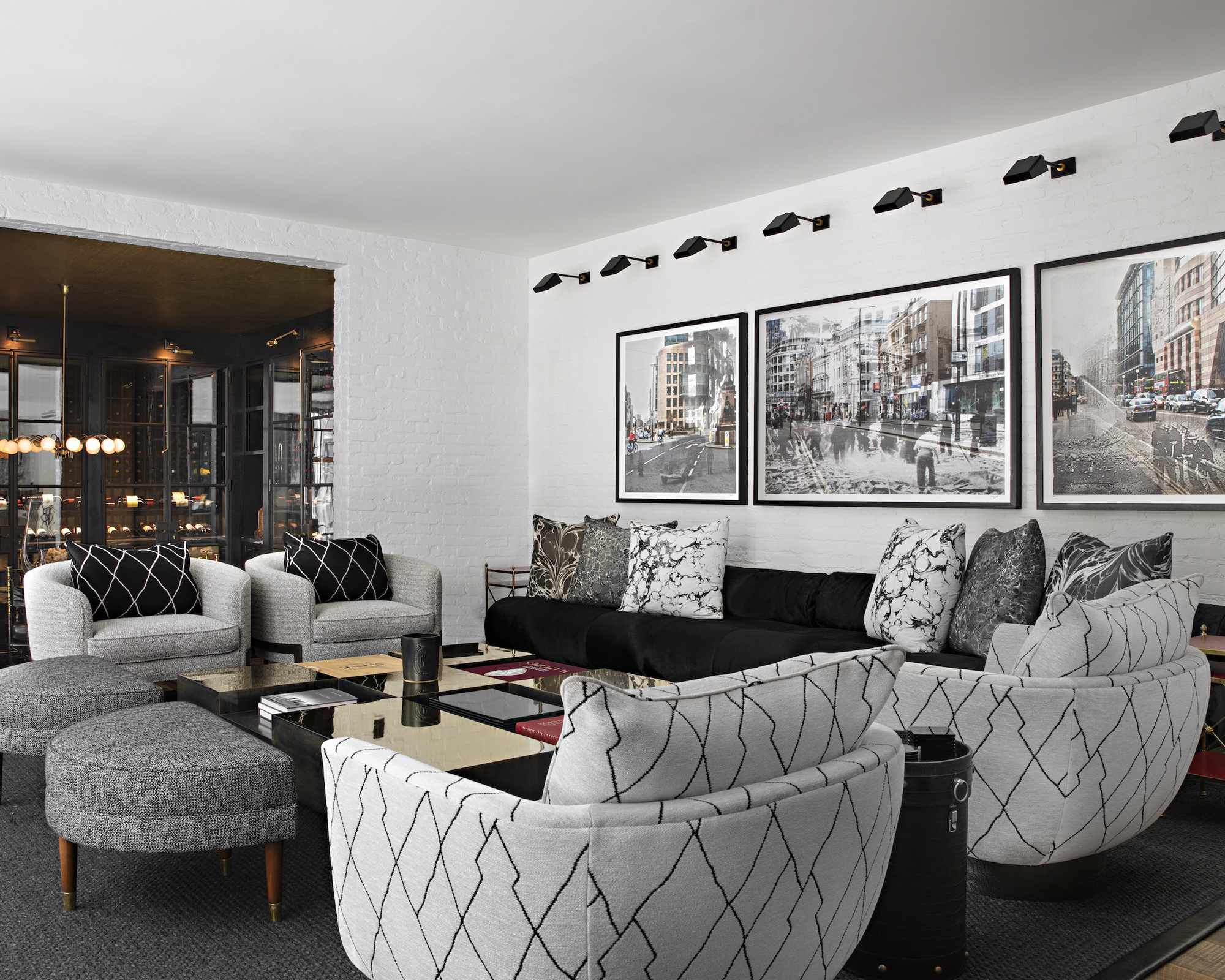
‘I wanted to bring the brick of the exterior inside and give this room a more loft feel,’ said Smith. ‘The bronze table was made with multiple varied height plateaus for books and collectibles. The black and white story was the perfect backdrop to the family’s photo collection. I chose the Urban Archeology sconces in repetition to illuminate the gallery wall.’
The seating area is flanked by the wine cellar on one side, and a bar at the other. ‘With libations at each end of the room, why ever leave?’ said Smith.
Bar
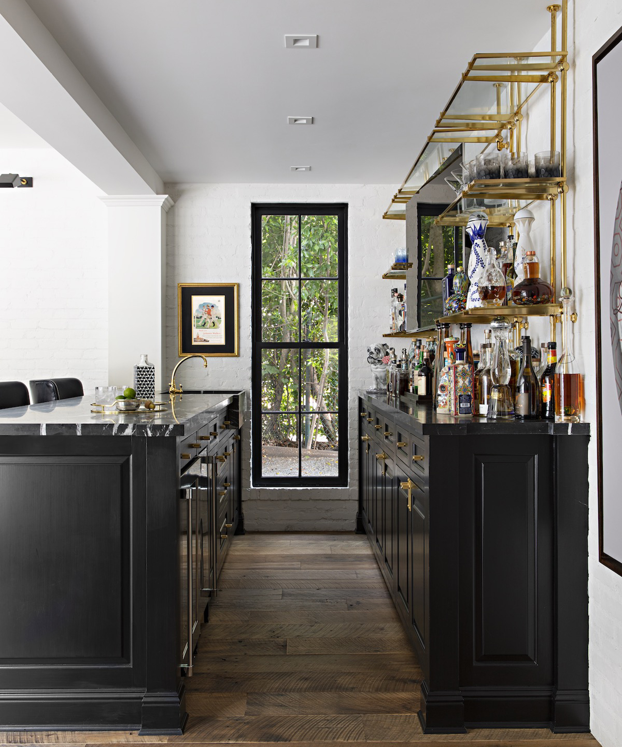
This impressively sized home bar wouldn’t look out of place in, well, a real bar. Surrounded by reclaimed oak flooring, a long counter is made up of gloss black cabinetry, and houses drinks fridges, brass fittings and bar stools. Against the wall, a back bar supports an impressive bottle selection, displayed on brass shelving from Opus by Windsor Smith.
Wine cellar
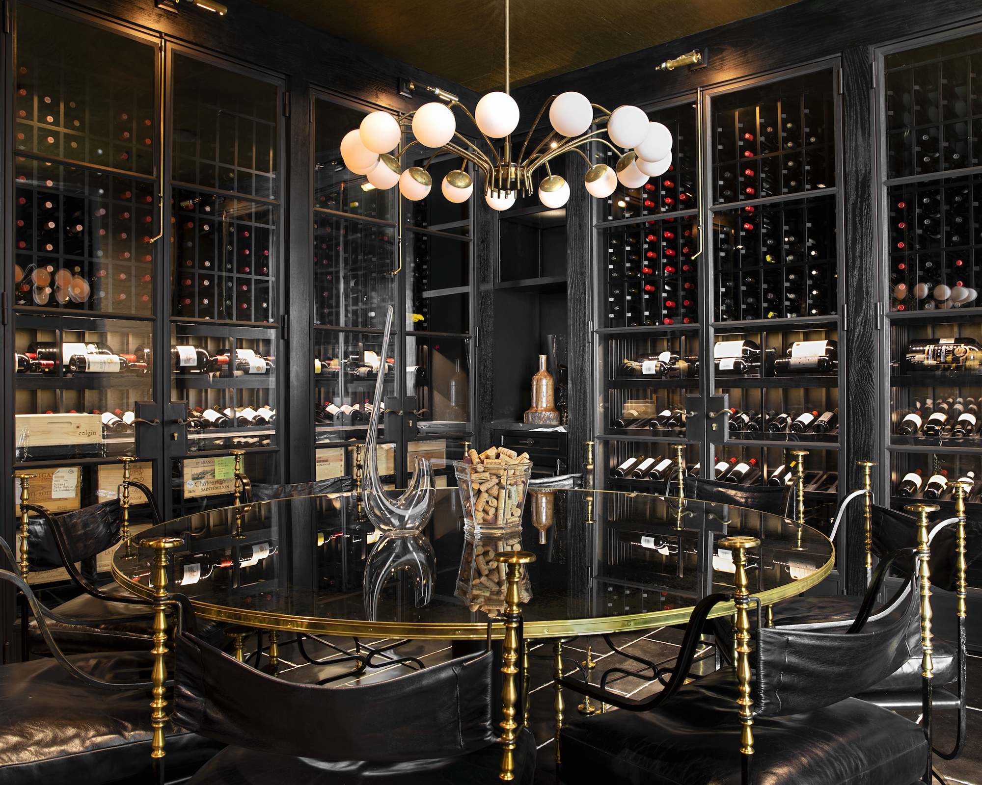
‘The wine cellar was built into the hillside at the end of a family room addition to the house,’ explained Smith. ‘[With the client] being a lover and collector of wine, it made it a shame to tuck in out of view – so just a few steps down we created a wine room.
‘I had the doors made to temperature control the wine, and planted a custom brass and glass table, made to hold the room as a true dining space.’
The floor is made from a tumbled Belgian blue stone with white mortar, while the cabinets are closed with integral brass cremones.
‘The chandelier was found [by the client] in her travels and has the most amazing ambient glow,’ added Smith.
Living room
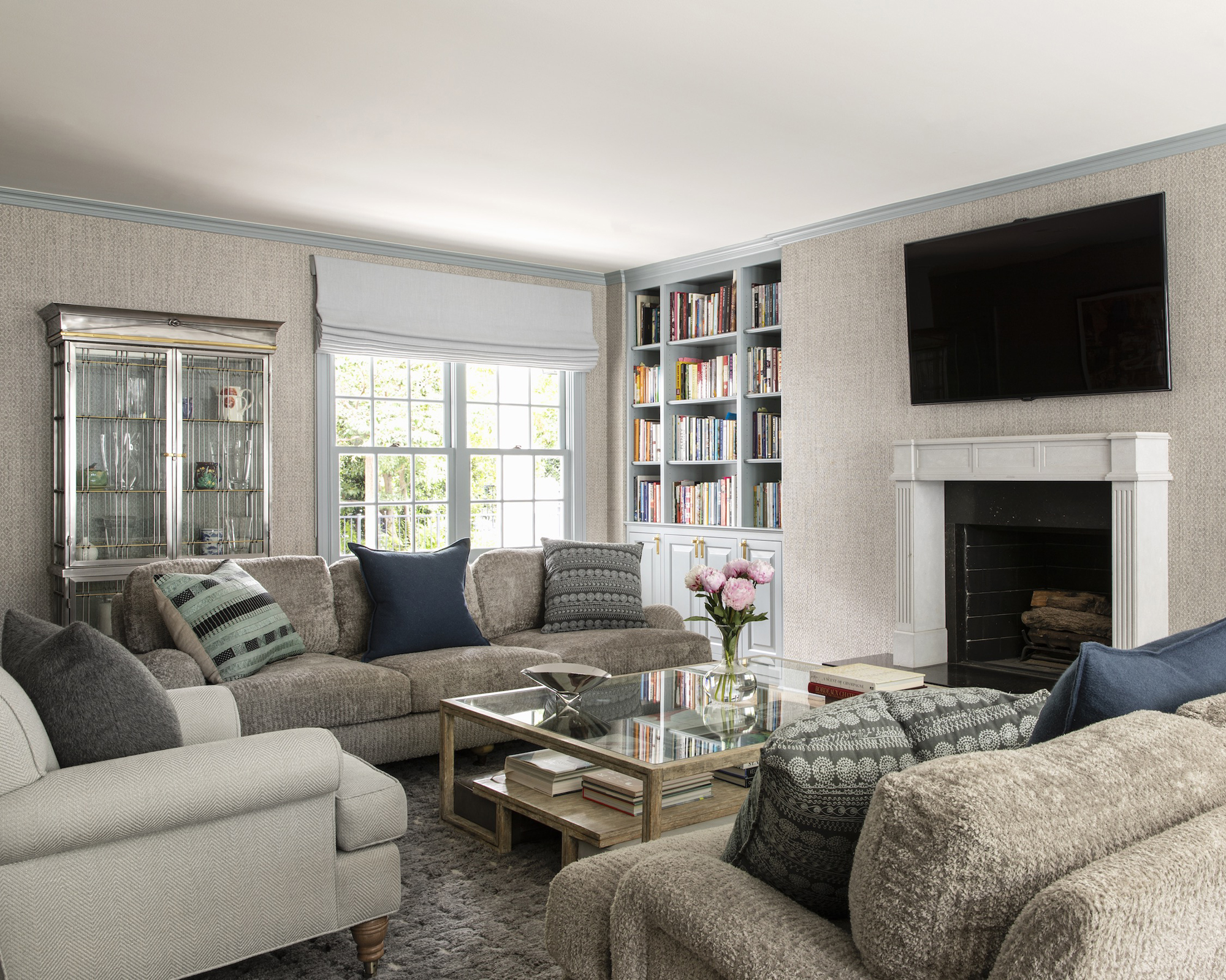
In contrast to dramatic color schemes elsewhere in the home, Smith keeps it neutral and cozy with her living room ideas. The walls sport a woven, nature-inspired covering, with duck egg blue used on the ceiling coving to bring a spot of color into the largely neutral scheme. A Directoire metal cabinet from France brings a flash of luxury, while squashy textured sofas signify a room meant for relaxation.
Bedroom
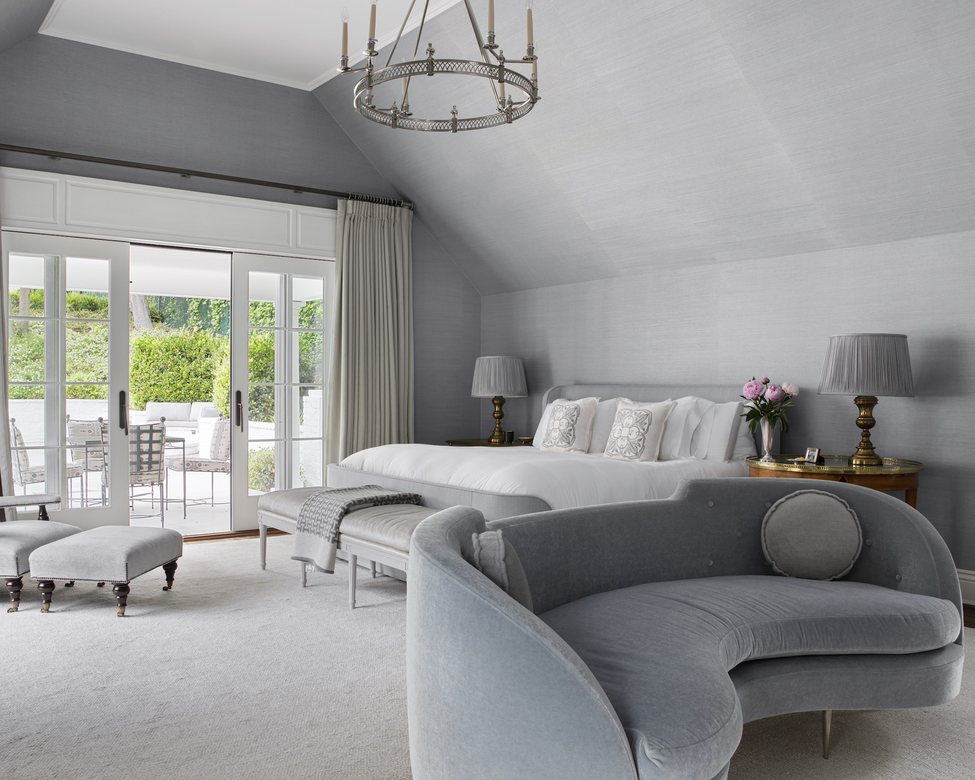
With double height ceilings, this bedroom was always going to be a majestic sleep space, but Smith’s scheme helps it become intimate and serene too. The Opus collection appears again among her bedroom ideas, this time supplying the contemporary pale blue sofa and the similarly curvaceous bed, which is draped with a Kravet mohair throw and flanked by Regency side tables.
The Gabardine Brunswick wool curtains open out onto a similarly calming view. ‘The outside terrace is a beautiful lifestyle element – where better to have your morning’s first coffee?’ said Smith.
Bathroom
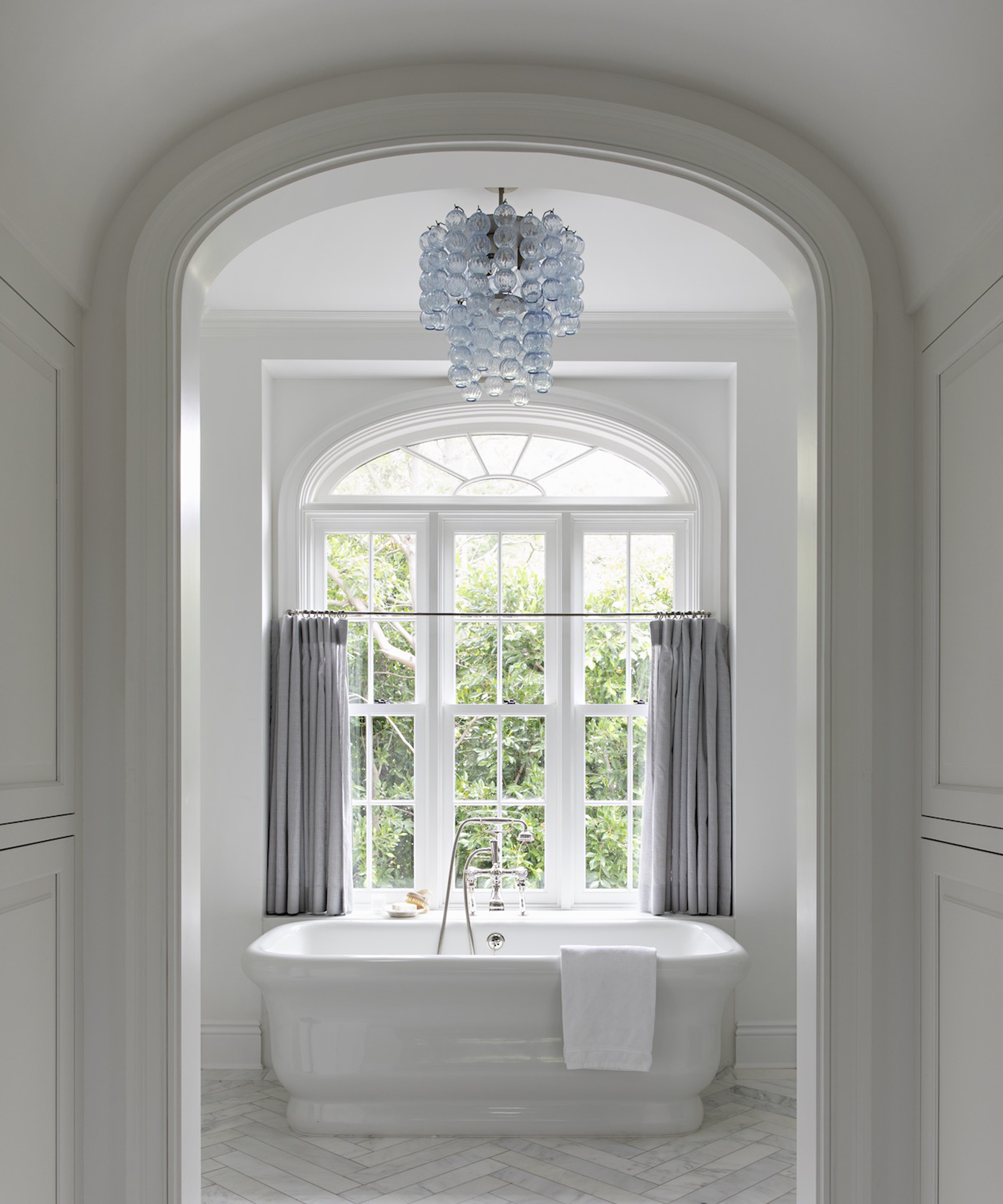
Simplicity is the name of the game with Smith’s bathroom ideas here. A white freestanding tub is framed by the arched entrance and set below the window, while a white herringbone tiled floor in marble effect lends some gentle texture below. A grey half curtain on the window allows the bather a little extra privacy if needed, while a splash of color is lent by the blue contemporary chandelier.
Architecture / Evens Architects
Interiors / Windsor Smith
Photography / Karyn Millet
Sign up to the Homes & Gardens newsletter
Design expertise in your inbox – from inspiring decorating ideas and beautiful celebrity homes to practical gardening advice and shopping round-ups.

Ailis started out at British GQ, where a month of work experience turned into 18 months of working on all sorts of projects, writing about everything from motorsport to interiors, and helping to put together the GQ Food & Drink Awards. She then spent three years at the London Evening Standard, covering restaurants and bars. After a period of freelancing, writing about food, drink and homes for publications including Conde Nast Traveller, Luxury London and Departures, she started at Homes & Gardens as a Digital Writer, allowing her to fully indulge her love of good interior design. She is now a fully fledged food PR but still writes for Homes & Gardens as a contributing editor.
-
 Andrew Walker's wooden cabinets have made me rethink the concept of a classic neutral kitchen – they're simple without feeling overly minimal
Raw, pared-back cabinetry has never felt so sophisticated – designers say they're a 'smart, long-term investment with lasting style'
By Megan Slack
-
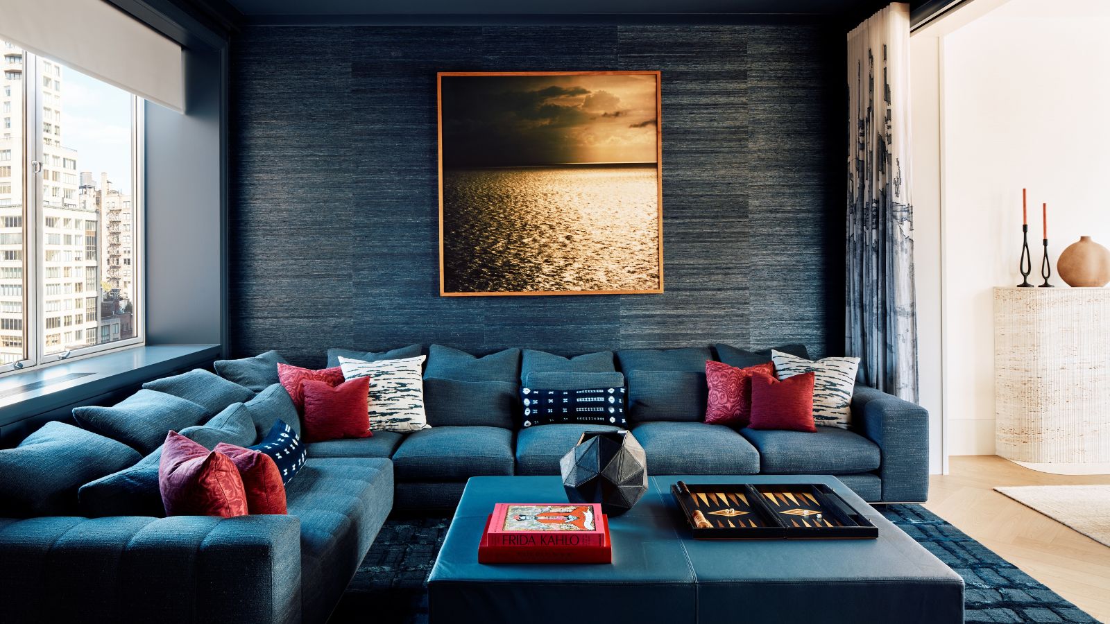 Blending two contrasting styles in a small city apartment was no easy task – but this home brings together California casual and classic Upper East Side charm with ease
'The finished interior blends quiet luxury with laid-back elegance to mix New York and California’s best qualities'
By Karen Darlow