8 interior design tricks to steal from this light-filled Lake Michigan home
A recent renovation saw this 1913 home filled with more natural light than ever — now the interiors live up to its new look
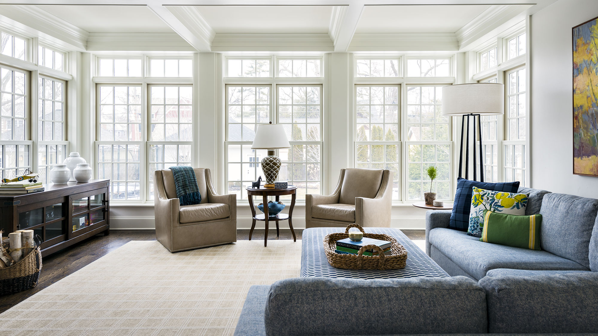

Built in 1913, this home in Wilmette, Illinois, sits just two blocks west of a beach on the shores of Lake Michigan. The task for interior designer Mark Lavender was to make the inside of this home just as remarkable as its location.
Following a major extension project four years ago, the home now counts five bedrooms, four bathrooms and one half-bath among its rooms, as well as 4,300 sq ft of floorspace, excluding an additional attic and basement.
‘The architecture of the original house is a traditional foursquare home, and the architect complimented the original design very nicely with the new design’, says Lavender. ‘We wanted to create a warm, welcoming vibe that complimented the client’s desire for light airy spaces.’
The result of Lavender’s work is a home that is both grand and inviting, personable but also highly personal. From styling spectacular windows to creating a hallway inspired by the Serengeti, these are the interior design tips you can take from this stunning lakeside home.
1. Make sure connected rooms feel harmonious, but still distinct
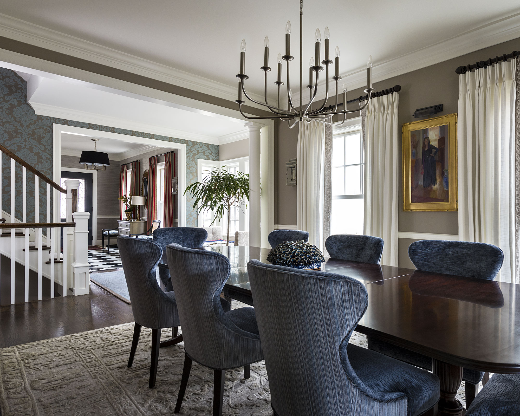
The loggia-style layout of the house’s first floor — encompassing the foyer, stair gallery, dining room and what was formerly the breakfast room — opened up both tremendous possibilities and design difficulties for Lavender.
‘In effect, all of these rooms flowed into each other and one could view all four spaces from the front door’, explained Lavender. ‘We had to create a strong sense of flow with the fabrics and colors, so that one space flowed seamlessly into the next.’
‘This was made more difficult, in that the foyer and dining room wanted to be more formal than the breakfast room and the stair gallery. We tied these rooms together by the use of consistent colors, and created textures in the various rooms with wallpaper and fabrics.’
Tones of teal blue run throughout the rooms, but are displayed differently in each — lighter with more relaxed patterns in the former breakfast room, but darker and more tightly woven in the dining room.
2. Warm up white walls with texture
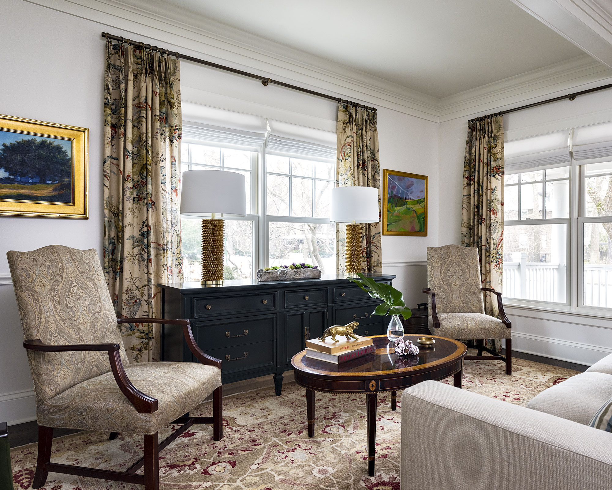
‘The finishes originally selected were all white including the walls, trim and ceilings’, explained Lavender. ‘Our client tasked us with creating warm and calming spaces with the use of some color, texture and new lighting.’
Presented with what was effectively a blank canvas, Lavender focused on using furnishings to bring texture and personality into the rooms. Richly patterned fabrics grace the armchairs, curtains and rug in the living room, with fabrics throughout the home sourced from the likes of Ralph Lauren, F. Schumacher and Jim Thompson. They are accompanied here by dark woods and a warming splash of gold running through the coffee table, studded lamps and picture frames, which themselves encompass bright artwork.
3. Make the most of natural light
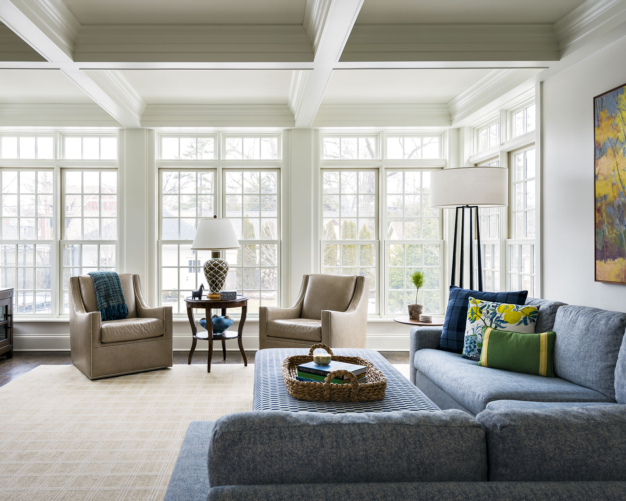
‘Our client enlarged the home considerably in 2017. They reconfigured the layout of the home and created a large addition on both the west side and rear of the home,’ said Lavender. ‘There was attention given to large windows within the new addition to allow light to stream into the spaces.’
Light was hugely important for the clients during the build, so Lavender worked to make sure that was continued throughout the interior decor. In the stunningly light and bright living room, wrap-around floor-to-ceiling windows are embraced as the central design feature, shunning curtains altogether with the rest of the decor kept low, carrying on the theme of teal blue which also reflects the sky.
4. If a room doesn’t work for you, change its purpose
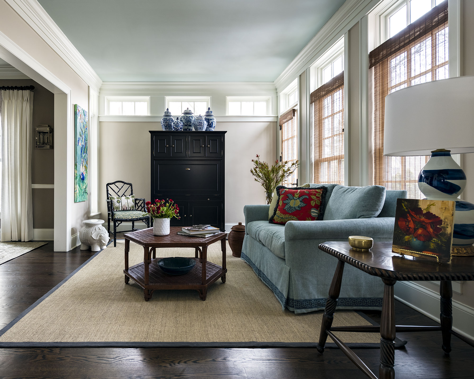
The loggia layout meant that the dining room flowed into the breakfast room — with two connected rooms both set up with tables and chairs, Lavender remarked that the area ‘began to look like a restaurant.’ Looking to resolve the issue, Lavender did some deep diving into what the client really needed from the breakfast room space.
‘Our client had created an office for the husband who sometimes worked from home — but the wife had a laptop she used in various rooms in the house and a printer located in the back of the kitchen.’
‘We also discovered through our conversations that the client never ate in the breakfast room — so we reimagined this space as a sitting room and work area for her. We added a small sofa and a large secretary that she could use for her office space and fold up the desktop when guests arrived.’
5. Take inspiration from your travels
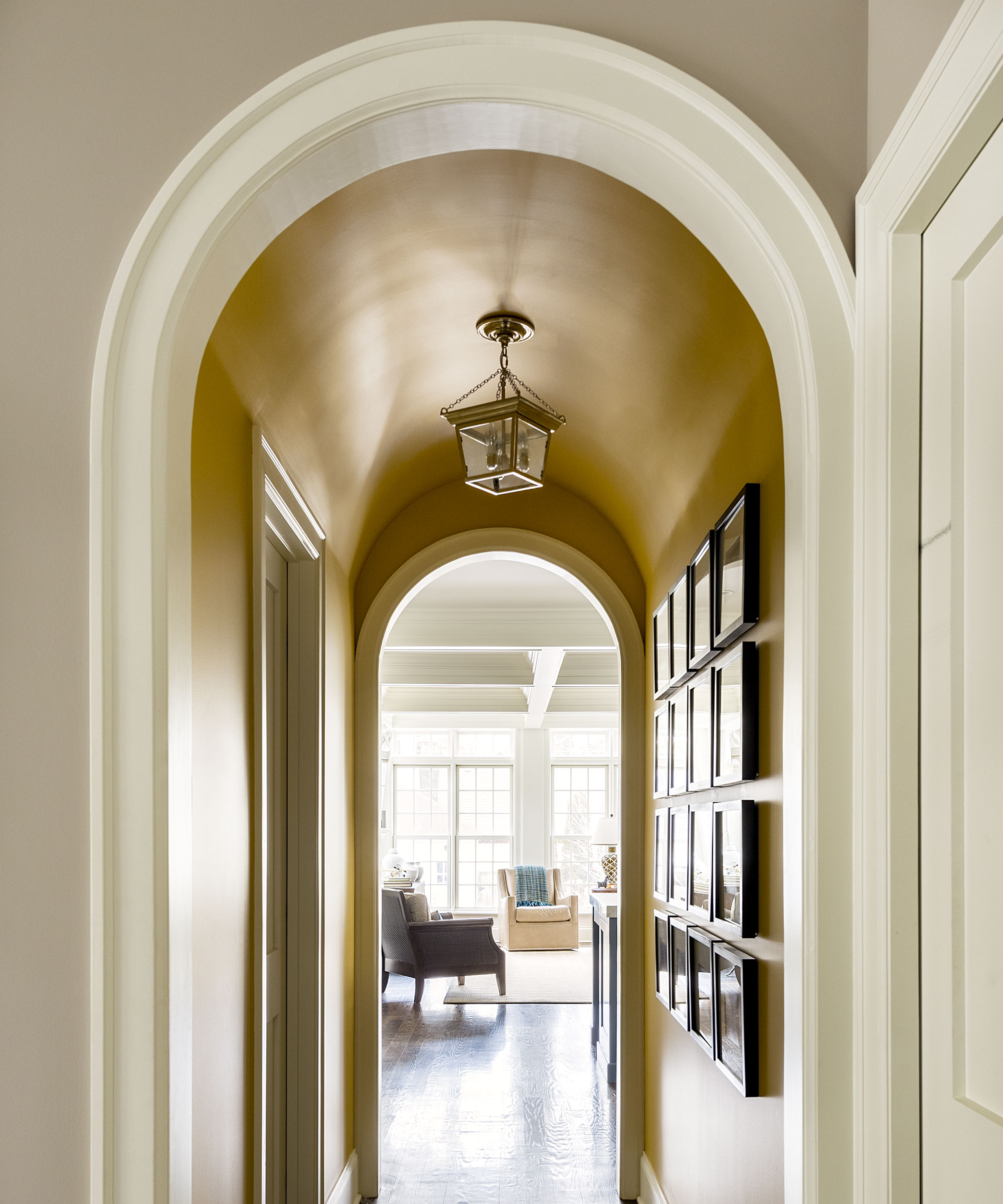
Homes are places to be filled with happy memories — even ones that happened far beyond their walls. ‘Our client had travelled to Africa on safari during the summer we started our design, and wanted to feature some photos they had shot during their trip,’ said Lavender.
Wanting to display photographs from travels is nothing new, but consider taking it a step further and use them to inspire aspects of the surrounding room’s design. ‘We curated a gallery wall within a hallway that featured a barrel vault, and separated the kitchen and the living room with photos. We painted the walls and vaulted ceiling Farrow & Ball Sudbury Yellow to emulate the grasses of the Serengeti.’
6. Checkered floors never go out of style
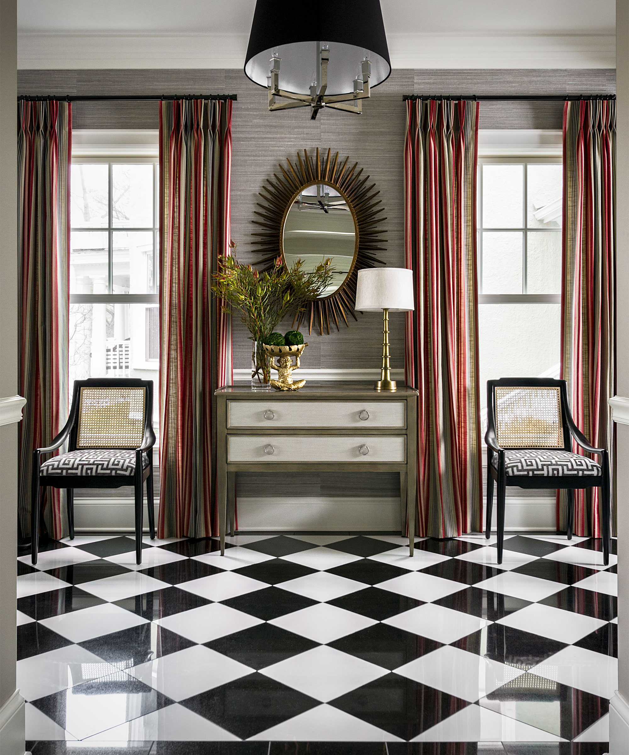
A striking contrast to the more nuanced, winding use of color on white throughout the rest of the home is the checkered floor in the foyer. Its inclusion instantly imbues the space with a timeless sense of stylish grandeur — while the patterned has thousands of years of history, Lavender pinpoints this incarnation back to the early 20th century and the house’s early years, with an Art Deco-style sunburst mirror and sleek, sloped-arm chairs.
7. Turn a forgotten corner into a cosy nook
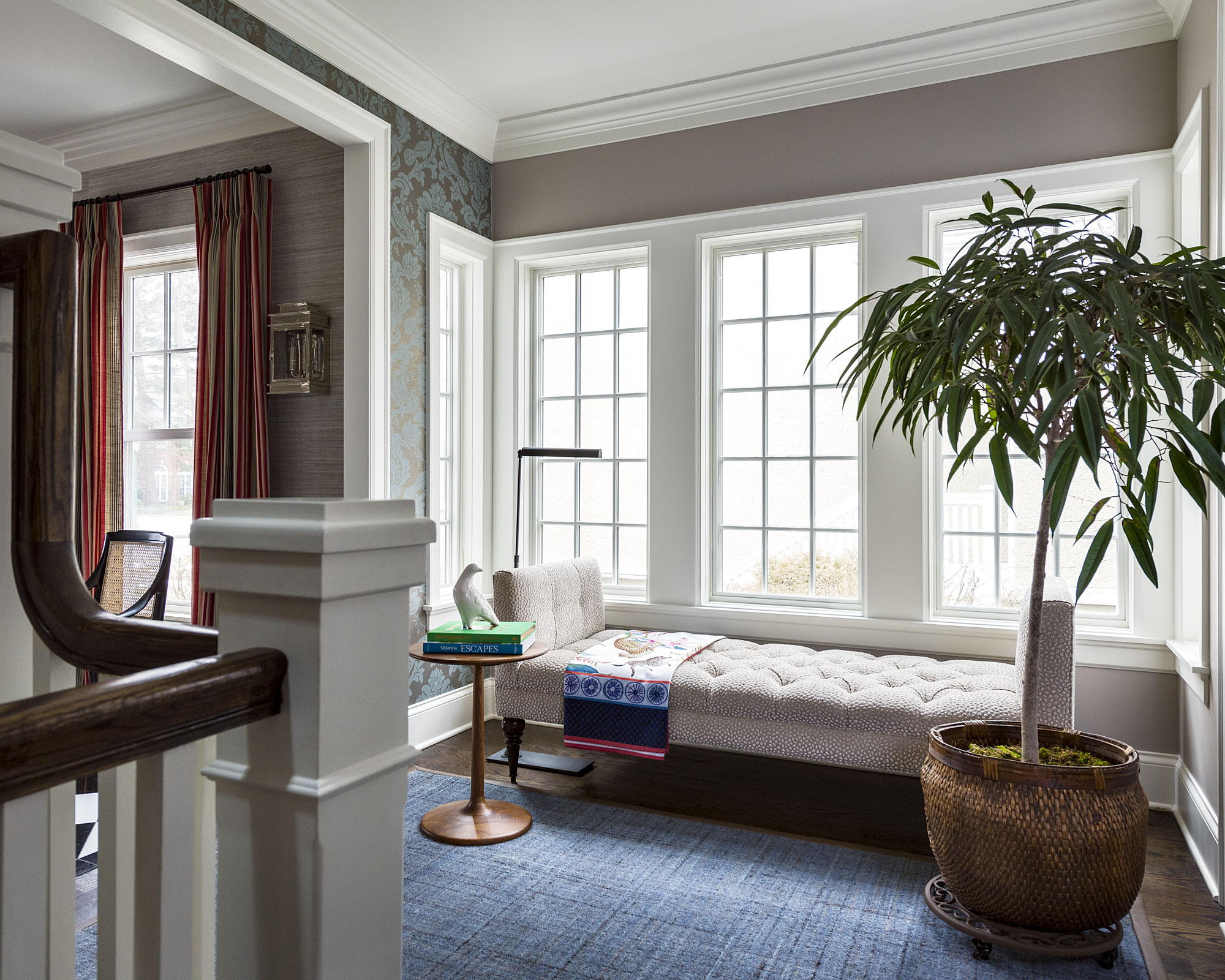
In what could easily have been a forgotten walkway, Lavender has turned the stair gallery into a quiet reading nook, that follows the grandeur of the foyer with a cosiness that puts visitors at ease.
A daybed makes the most of another set of tall, wrap-around windows, equipped with a reading light and table for some lazy afternoon relaxation. Eclecticism in texture is important here too, with the space combining a baroque wallpaper with contemporary spotted upholstery and a woven rug.
While look and feel is important, Lavender was also careful to think about the practicalities of all the fabrics he chose. ‘Our client has two children and two dogs, so we wanted to utilize fabrics and surfaces that were stain and scratch resistant that would hold up to heavy use.’
8. Make sure your most cherished items stand out
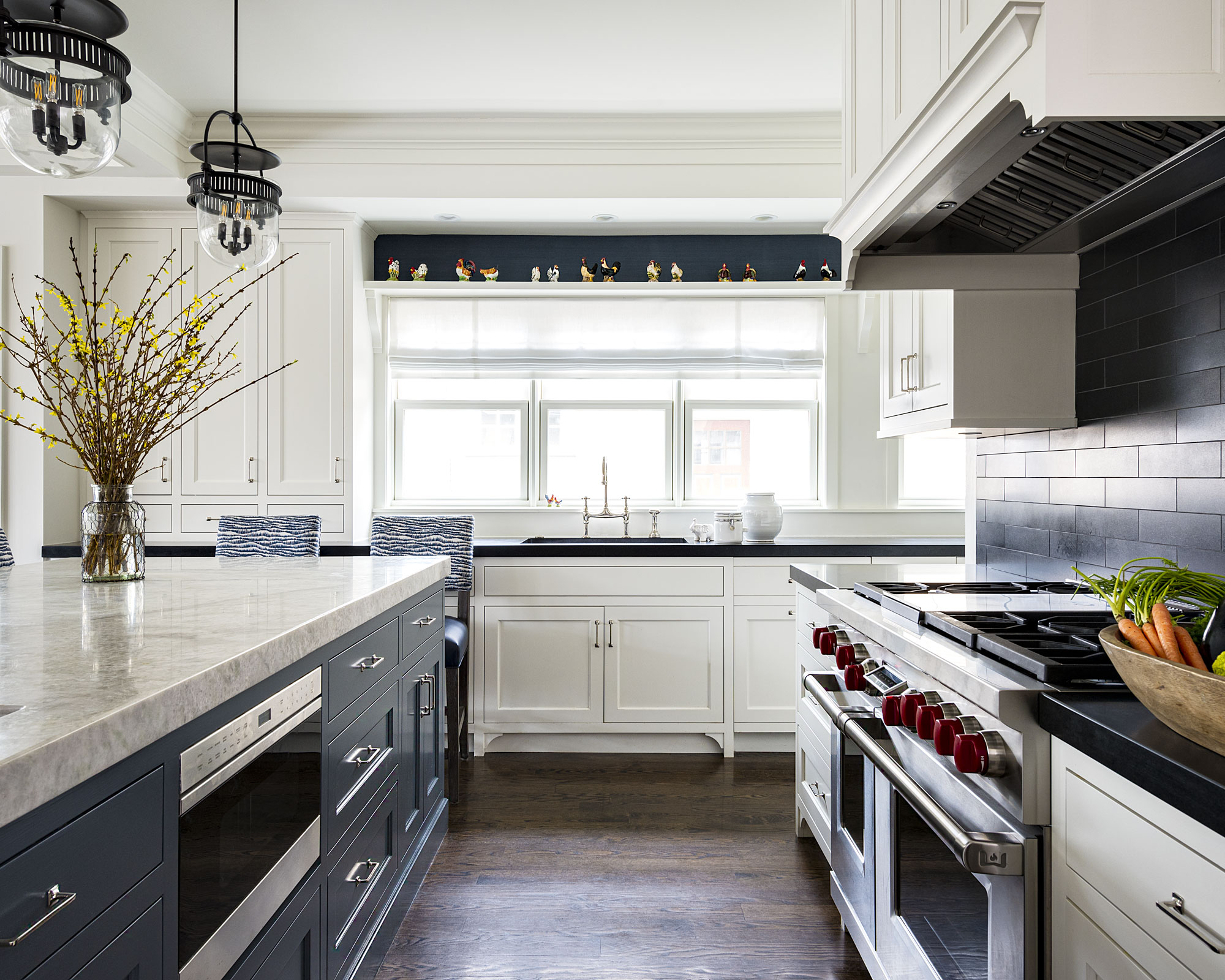
When the clients moved into the home from Alexandria, Virginia, they brought with them some key pieces of antique furniture, namely a large wooden breakfront and dining table, both of which take pride of place in the dining room. They also had some smaller items that required considered display.
‘Our Client had a large collection of chicken salt and pepper shakers that they wanted to display in their kitchen’, said Lavender. ‘They had built a long shelf above the sink — however, with the white cabinets and white walls that were originally installed, the collection was lost.’
‘We took leftover wallpaper from the foyer walls and installed it on the back wall. We then painted the wallpaper dark blue which was the same color we had used to paint the island, tying these two elements together and creating a dramatic backdrop for the collection.’
Interior Design / M. Lavender Interiors
Photography / Chris Bradley Photography
Sign up to the Homes & Gardens newsletter
Design expertise in your inbox – from inspiring decorating ideas and beautiful celebrity homes to practical gardening advice and shopping round-ups.

Ailis started out at British GQ, where a month of work experience turned into 18 months of working on all sorts of projects, writing about everything from motorsport to interiors, and helping to put together the GQ Food & Drink Awards. She then spent three years at the London Evening Standard, covering restaurants and bars. After a period of freelancing, writing about food, drink and homes for publications including Conde Nast Traveller, Luxury London and Departures, she started at Homes & Gardens as a Digital Writer, allowing her to fully indulge her love of good interior design. She is now a fully fledged food PR but still writes for Homes & Gardens as a contributing editor.
-
 5 fast-growing tiny flowers – expert recommendations to fill your pots and borders with color in record time
These fast-growing tiny flowers prove that miniature can also be marvelous
By Thomas Rutter
-
 Midimalist kitchens are the trending way to create a characterful yet clutter-free space – and these 8 spaces prove how chic this best of both worlds style can be
It's the go-to kitchen style for a balance of busy and simplistic design
By Molly Malsom