6 interior design tropes to steal from this colorful Texas home
How do you design a comfortable family home for an ex-punk rocker? This is how one Texas design team played it just right
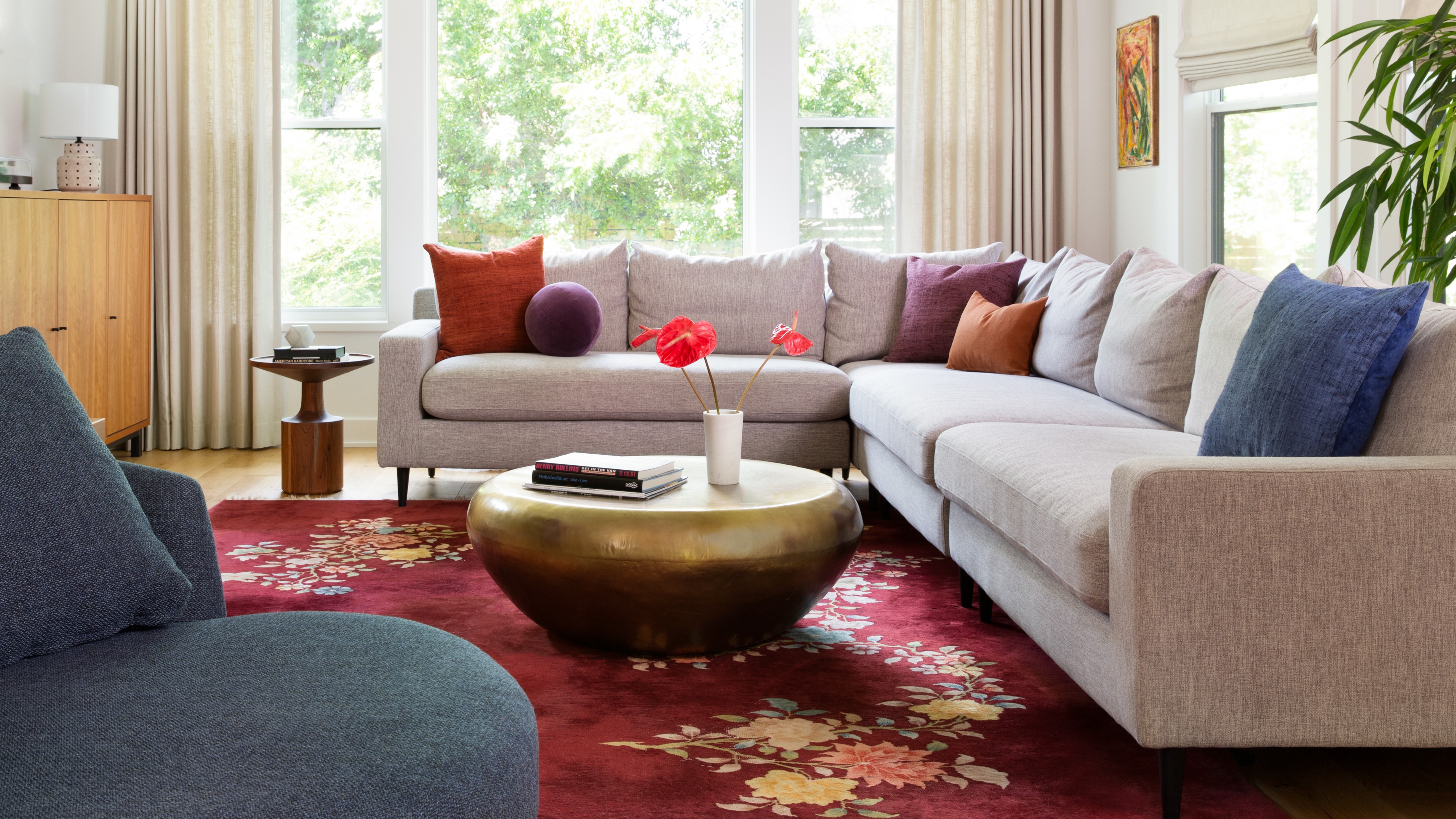

When a globetrotting ex-punk musician and their marketing manager partner decided to settle down in Austin, Texas, Sarah Stacey Interior Design was on hand to help turn their new house into a comfortable but characterful abode.
Having lived in England and Paris prior to their US return – and with both five-year-old twins and a dog in tow – the team were not short on life experiences to cram into the Crestview property.
Over the year-long project, the designers aimed to channel ‘the traditional influences of a farmhouse design, juxtaposed with modern, edgier furnishings’. The result is a home that celebrates the owners’ artistic tendencies, but underpins these personal touches with a respect for key design principles.
From color-blocking to period medleys, here’s how the team created a home with just the right amount of rock ’n’ roll; it's the perfect space to pick up interior design tips.
1. Mix vintage pieces with the daringly new
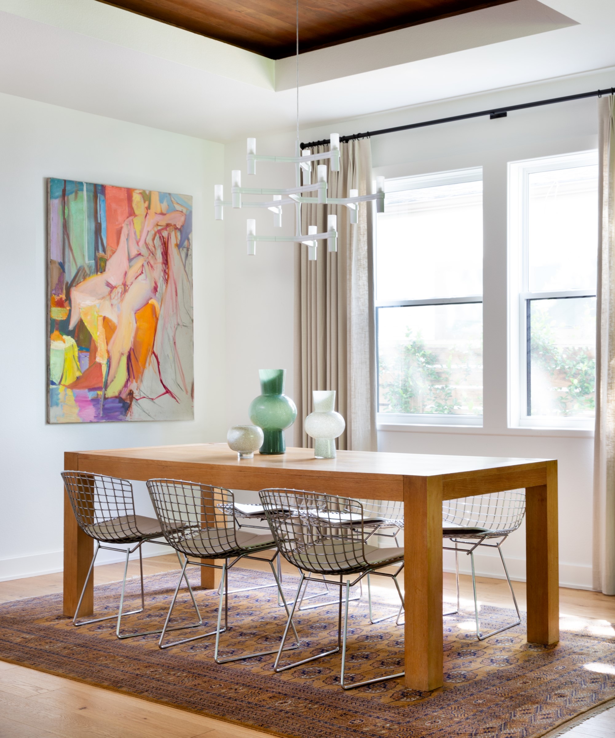
Can’t decide between ultra-modern aesthetic and doing the time warp? Have it both ways, says the Sarah Stacey team.
‘We love the way everything in the dining room came together. The mix of new and vintage looks great and gives a one of a kind feel... We also incorporated vintage art that we stumbled upon in Round Top, TX – that truly makes this design unique.’
In the dining room and elsewhere, Persian-style rugs are juxtaposed with contemporary furniture and dazzlingly modern light fittings.
2. Make comfort king
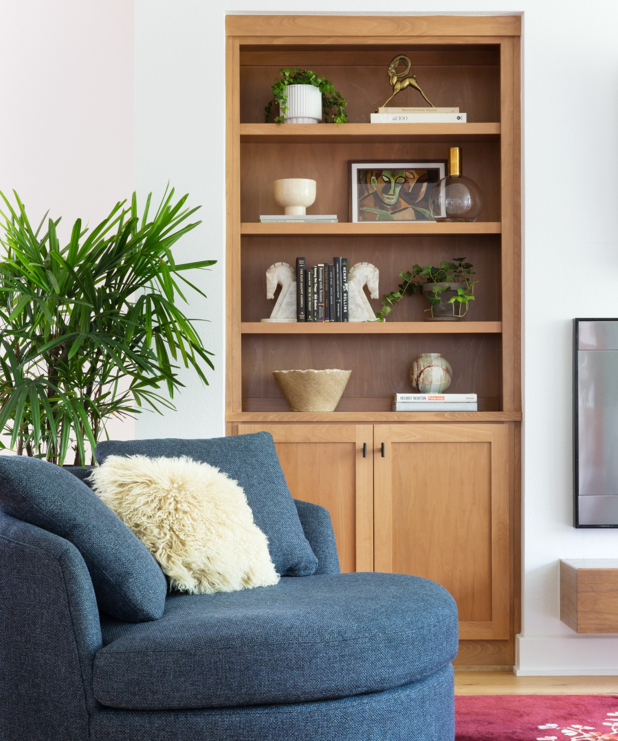
After years of taking to the stage, it was time for this retired rocker to hit the couch. Catering for a new pace of life, the home is filled with soft furnishings designed with relaxation in mind.
‘We maximized functionality for the family by selecting a sectional sofa that they could lounge on, and hang out comfortably while watching TV and listening to records,’ said the Sarah Stacey Interior Design team.
In the living room, the sprawling corner sofa is matched with an equally voluminous armchair, both pieces bedecked with squashy cushions.
3. Liven up a neutral base with color blocking

Picking a neutral scheme for your walls and key furniture pieces doesn’t mean you need to shun color altogether. An underlying base of white and its variants can be a great platform to showcase your chromatic taste.
‘We utilized color blocking with pillows, rugs, and florals on top of the tonal palette’, said the team. Across the house, brightly colored artwork, statement floor coverings, and patterned textiles introduce warm hues to an otherwise cool backdrop.
4. Going for gold doesn’t have to be gaudy
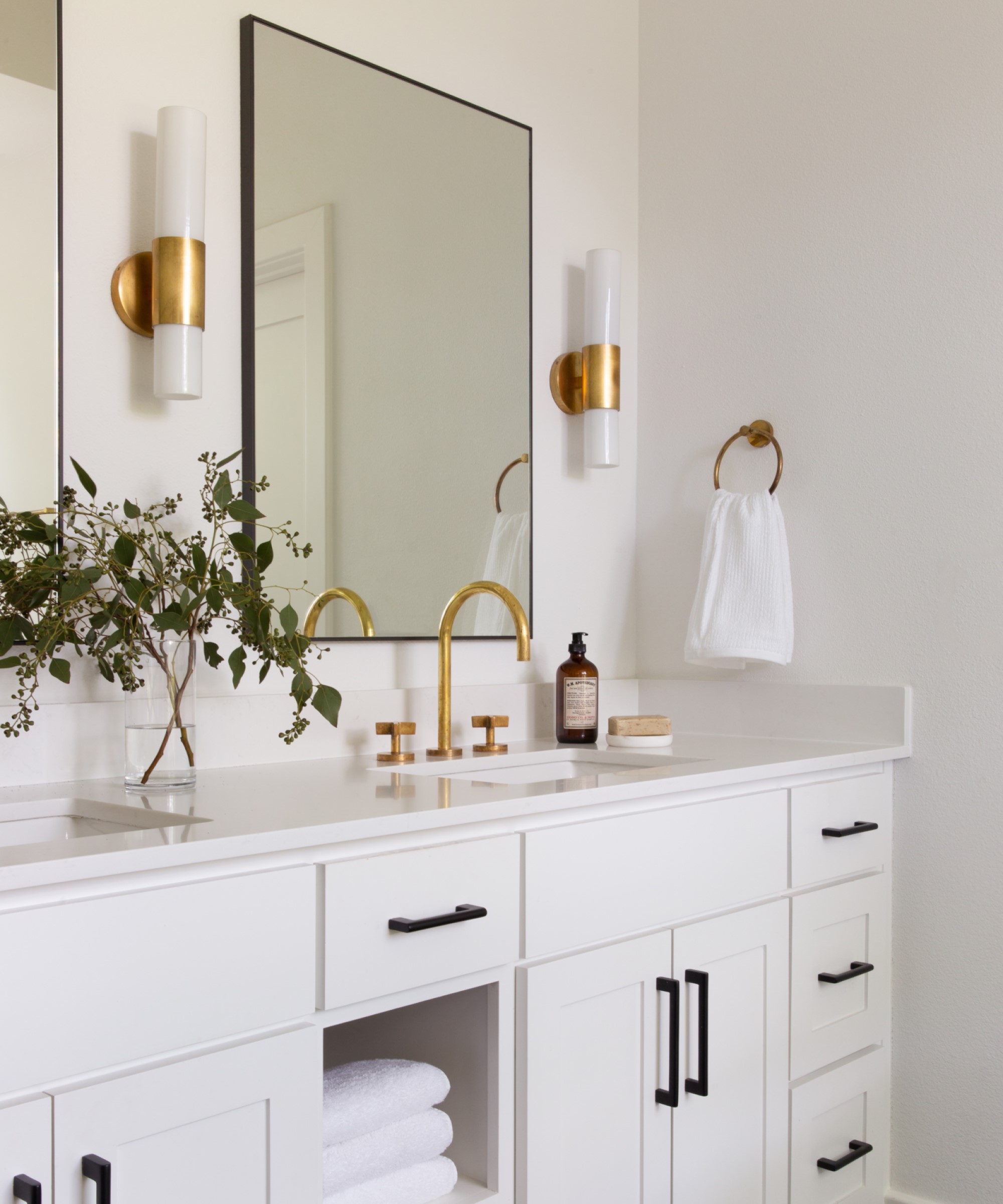
A smattering of gold always lends a little bit of luxury – but push it too far and you’ll tend towards the tacky. For this rockstar couple, brass fittings and golden hues are used sparingly, and always with a matte finish. From fashionable faucets to rustic vintage frames and a bold coffee table from Arteriors, this house has nailed the midas touch.
5. Take texture to the next level
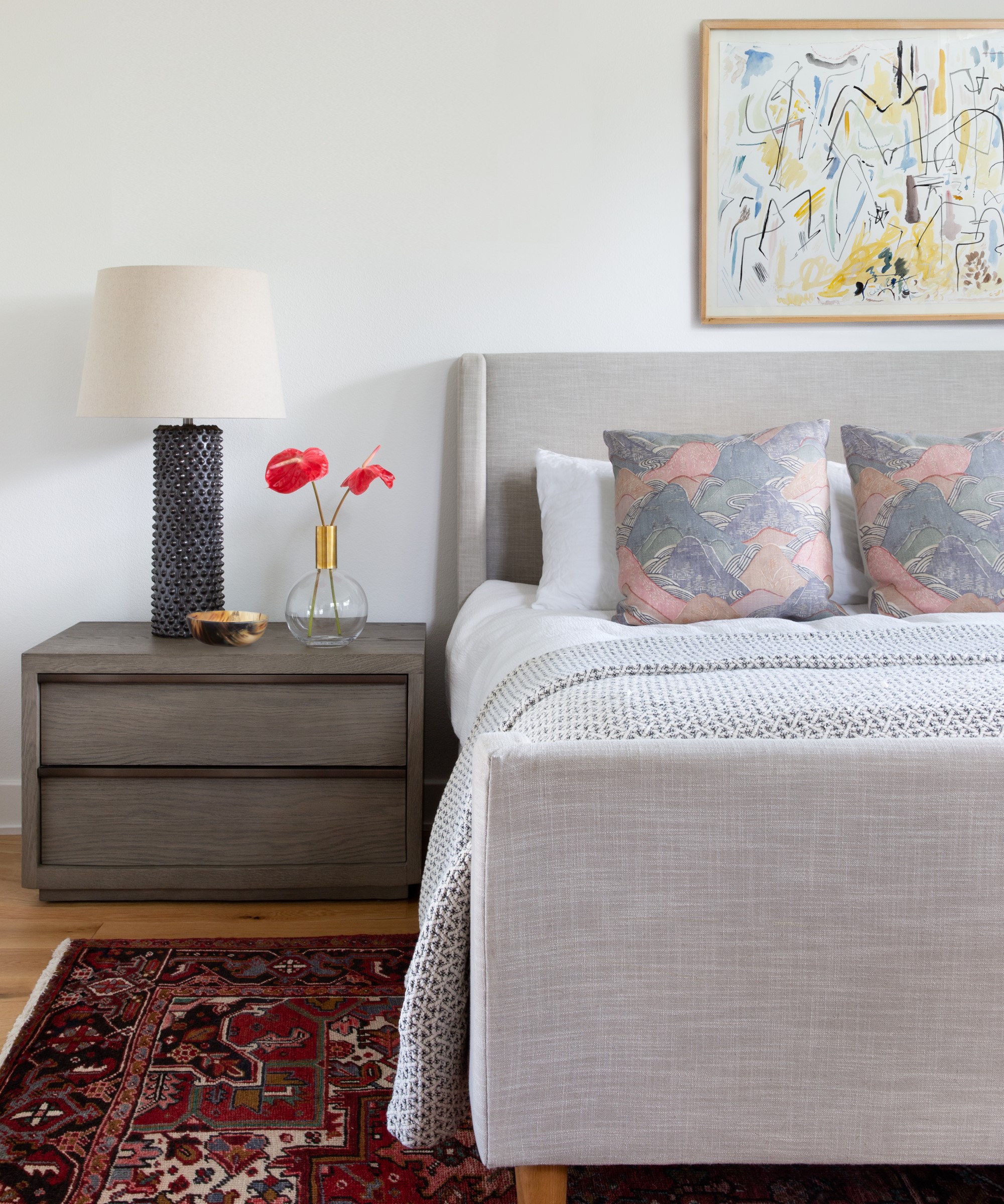
‘We started by selecting finishes that are high-end, yet feel casual and textural,’ said the team. The tactility of the home was a key focus for Sarah Stacey Interior Design throughout the project.
The design’s layered approach to texture is particularly evident in the bedroom. Textiles range from a rustic woven rug, to bed upholstered in crosshatch fabric, and a bouncy knitted throw. Meanwhile, a beautifully grained wooden bedside table is topped with a studded lamp.
6. Buck trends and make it personal
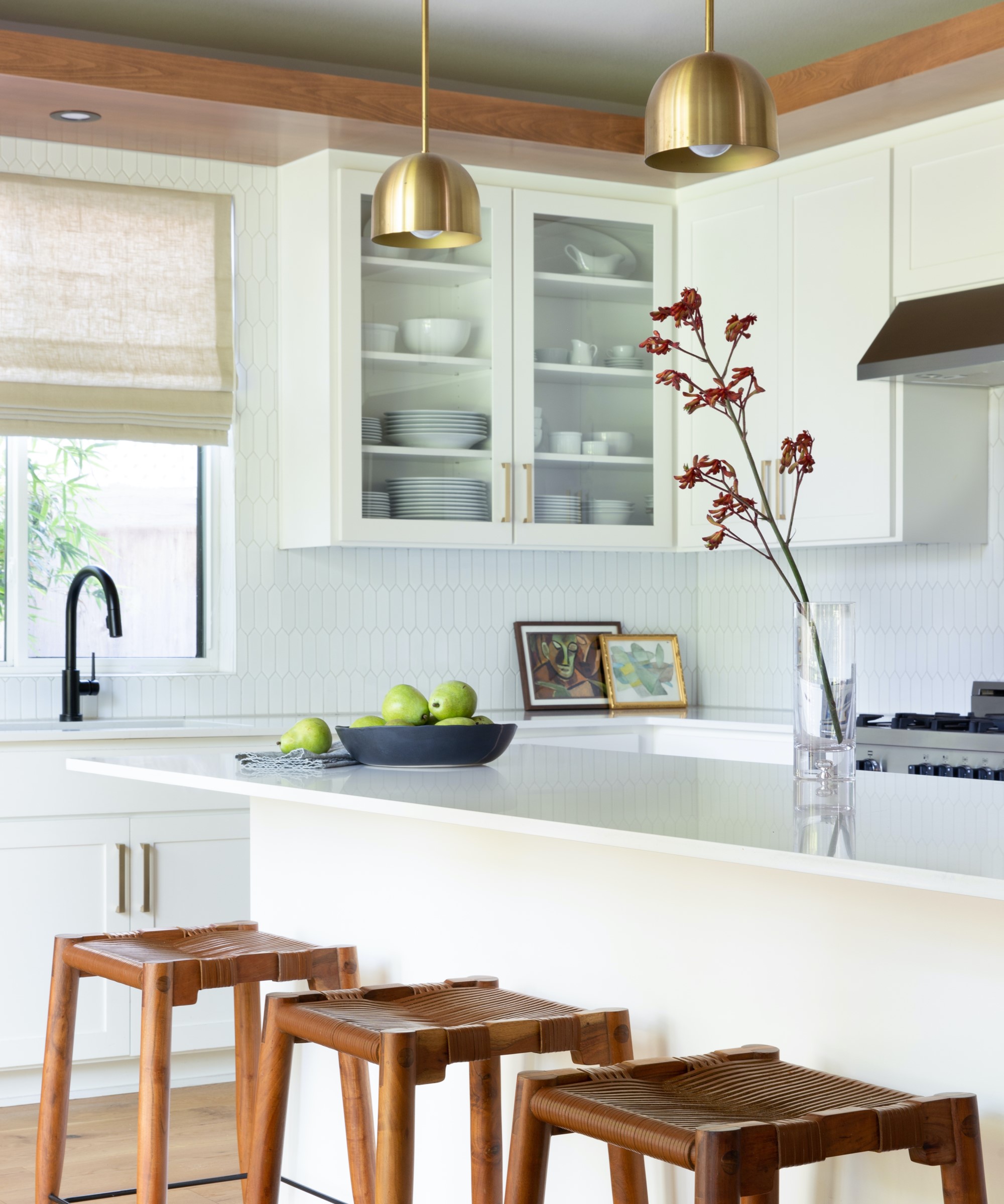
By their very definition, punk rockers don’t follow the rules – and this house is no exception. ‘Focus on things that you like over trends’, advised the design team. Elements like brass fittings may be all the rage, but this house is filled with personal touches from unique thrift store-sourced artwork to bold statement furnishings.
‘The client is happy with their new home and that's what matters most.’
Interiors / Sarah Stacey Interior Design
Photography / Molly Culver
Construction / Dawson-Lupul Builders
Sign up to the Homes & Gardens newsletter
Design expertise in your inbox – from inspiring decorating ideas and beautiful celebrity homes to practical gardening advice and shopping round-ups.

Ailis started out at British GQ, where a month of work experience turned into 18 months of working on all sorts of projects, writing about everything from motorsport to interiors, and helping to put together the GQ Food & Drink Awards. She then spent three years at the London Evening Standard, covering restaurants and bars. After a period of freelancing, writing about food, drink and homes for publications including Conde Nast Traveller, Luxury London and Departures, she started at Homes & Gardens as a Digital Writer, allowing her to fully indulge her love of good interior design. She is now a fully fledged food PR but still writes for Homes & Gardens as a contributing editor.
-
 Urban gardening ideas – 7 creative ways to grow in small spaces, balconies, containers, indoors, and more
Make the most of your space with these innovative ways to garden
By Tenielle Jordison
-
 'Sexy disco-era Italy meets Japanese farmhouse in the Brazilian jungle' was the description the interior designer gave this glass-walled modernist home
Offering a warm welcome that defies its stark, modernist lines, this archictectural gem is full of surprises
By Karen Darlow