6 design tricks for neutral interiors we're borrowing from this Californian designer
Textile design guru Lauren Meichtry shares her tips on giving your home a seasonal, kid-friendly refresh
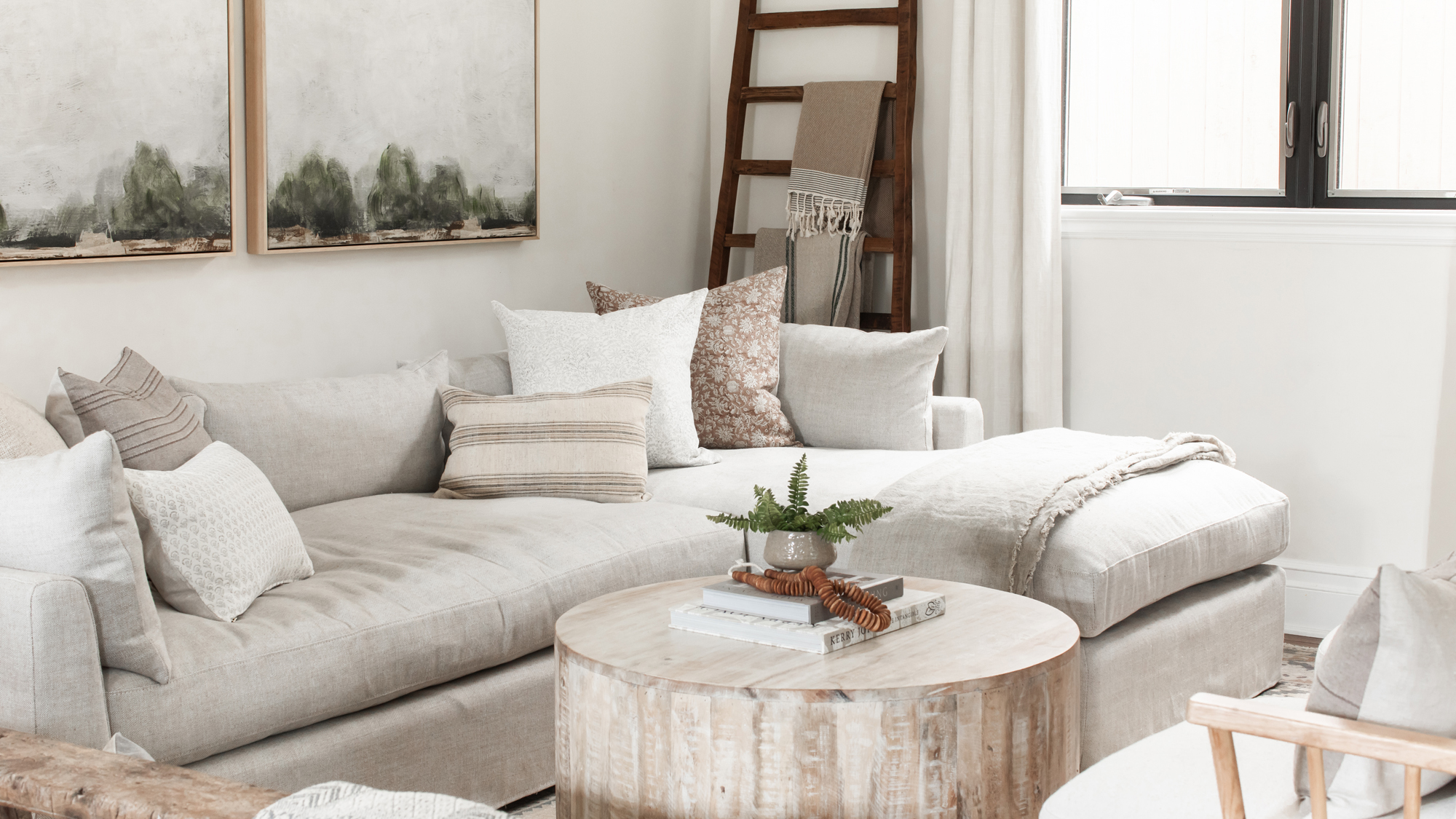

After a challenging year, pillow designer Lauren Meichtry saw this spring as the perfect time to celebrate new beginnings – and she chose to do this with a refresh of the California home that had served her and her family so well during the pandemic.
‘I spend so much time working on beautifying other people's homes and sometimes neglect my own,’ she said. ‘After spending more time together at home than ever, I wanted to freshen up my home with functionality in mind, while still maintaining a distinctive style that felt comfortable to my kids, but didn't skimp on design details.’
See: World's best homes – tour the globe’s most beautiful houses
The Elsie Home founder and Manhattan Beach resident has shared her tips and tricks for reinvigorating a home. From seasonal textiles to ways of keeping messy kids at bay, these are the small design choices that will make a big impact.
1. Lighten up your palette for spring
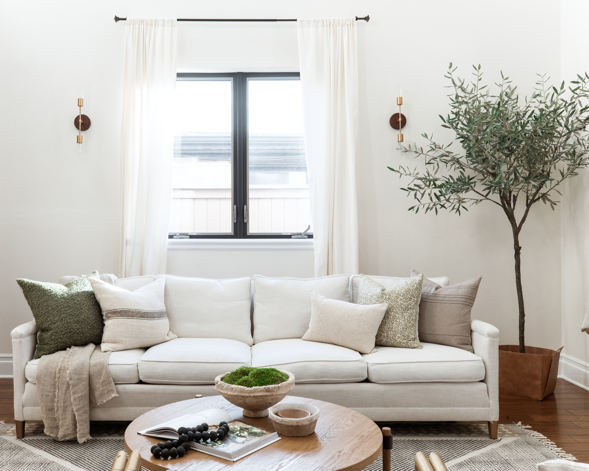
‘Spring signifies new life and especially this year, perhaps the invitation of guests back into our homes’, said Meichtry, who embraced a lighter palette to mark the start of brighter days. ‘Coming off of winter, I used heavier textures and darker tones. I wanted to lighten things up using mostly textiles as a quick and easy refresh’.
Meichtry went largely for muted tones across the scheme to get a ‘relaxed feeling’ in the home, while the addition of corals and soft blues helped give the home a ‘fresh spring look’.
‘Of course, I changed out all of my pillows but, to be fair, I design pillows. I have loads at my fingertips and I enjoy seeing how a slight change in color and texture can instantly elevate a room.’
‘The denim blue color really compliments the wood tones in the bed frame and makes for an effortlessly chic look.’
See: Living room ideas – inspiring ways to decorate and furnish your space
2. Move artwork around for an instant refresh
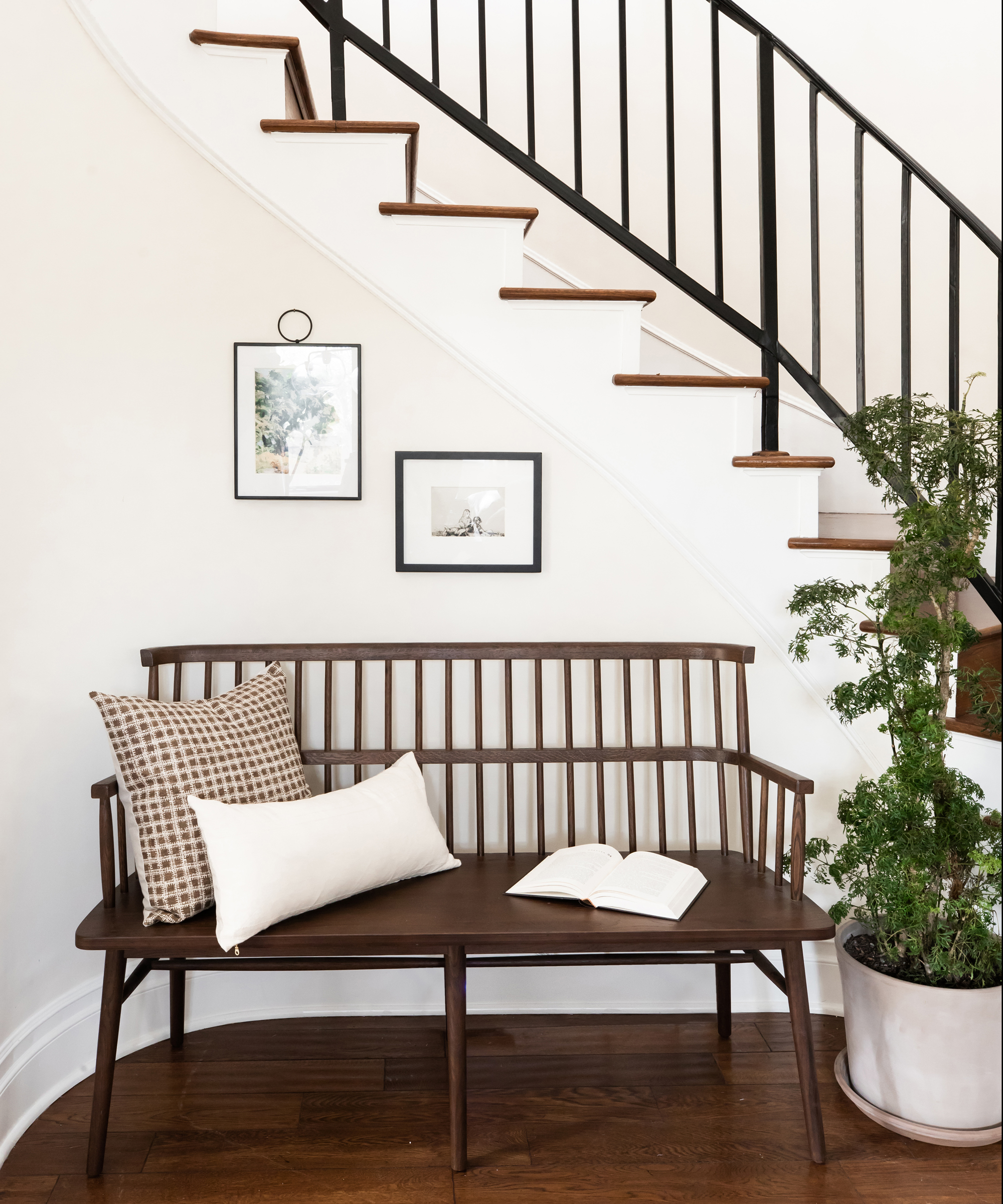
If your budget doesn’t have room for a full seasonal redesign, it is possible to get a new feel around your home without spending a cent.
At the beginning of the season, Meichtry switched the position of key pieces of artwork around the house. ‘I absolutely love shuffling around existing pieces to see how different they can look in another area of my home,’ she said.
For the smaller artworks on her kitchen shelves this is a more regular occurrence. Believe it or not, I switch the art and decor out every couple of weeks!
3. When it comes to pillows, less is more
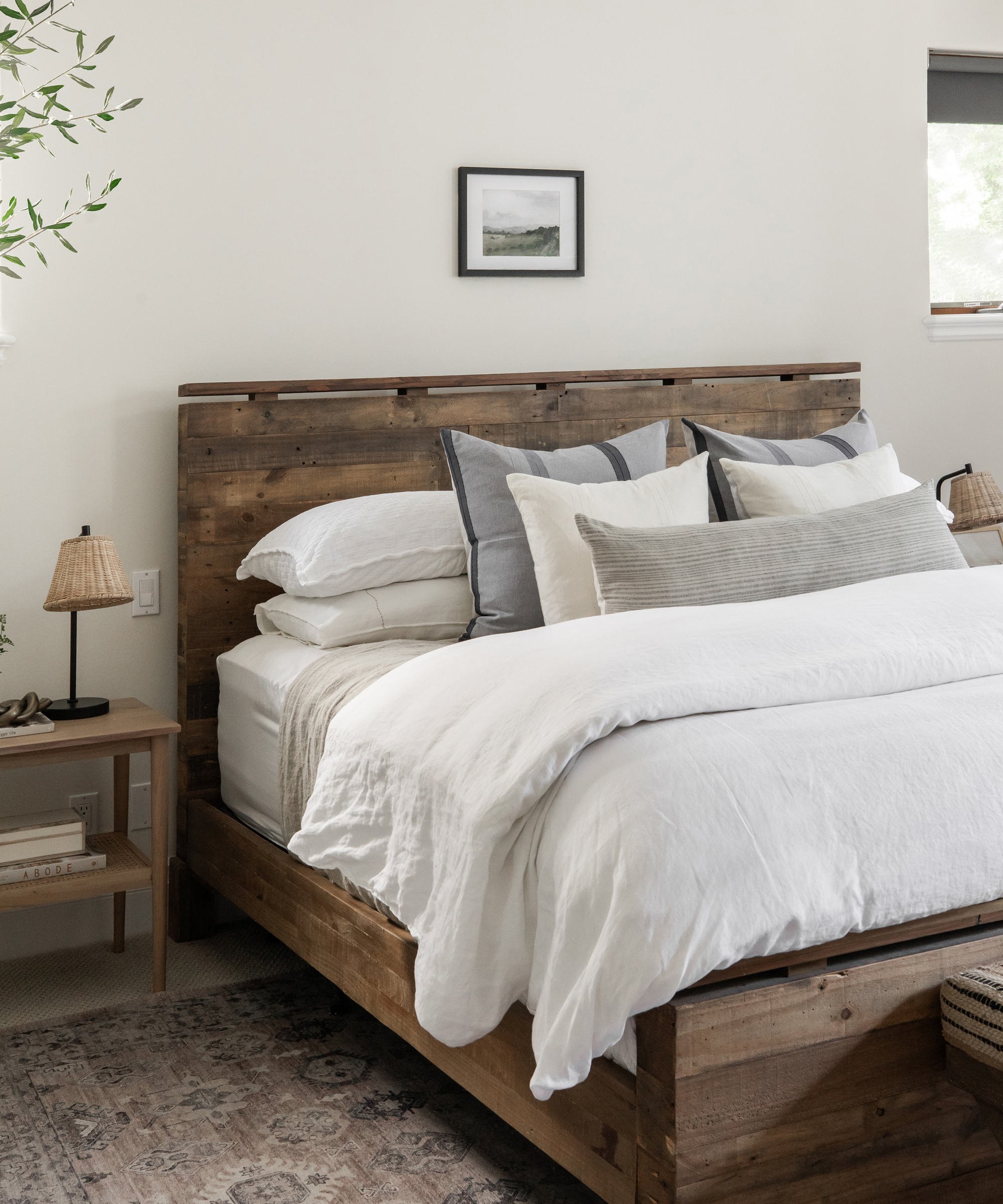
Considering her occupation, Meichtry has a surprisingly restrained approach to soft furnishings, especially in the bedroom. ‘I do believe less is more when it comes to pillows on our bed. You might think five isn't considered ‘less’, but I'll argue that it is.’
For Meichtry, pillows shouldn’t be the ‘focal point’ in a bedroom, but are rather there to ‘create a feeling of serenity’.
‘I chose two 24x24 pillows to serve as my foundation. I also love using extra-large lumbars on beds because they can stand alone and still create an impact. If you don't feel like putting all of your pillows on one morning, your bed can still look made with just a long lumbar.’
See: Bedroom ideas – designs and inspiration to decorate and furnish your space stylishly
4. Let your shelves do the talking
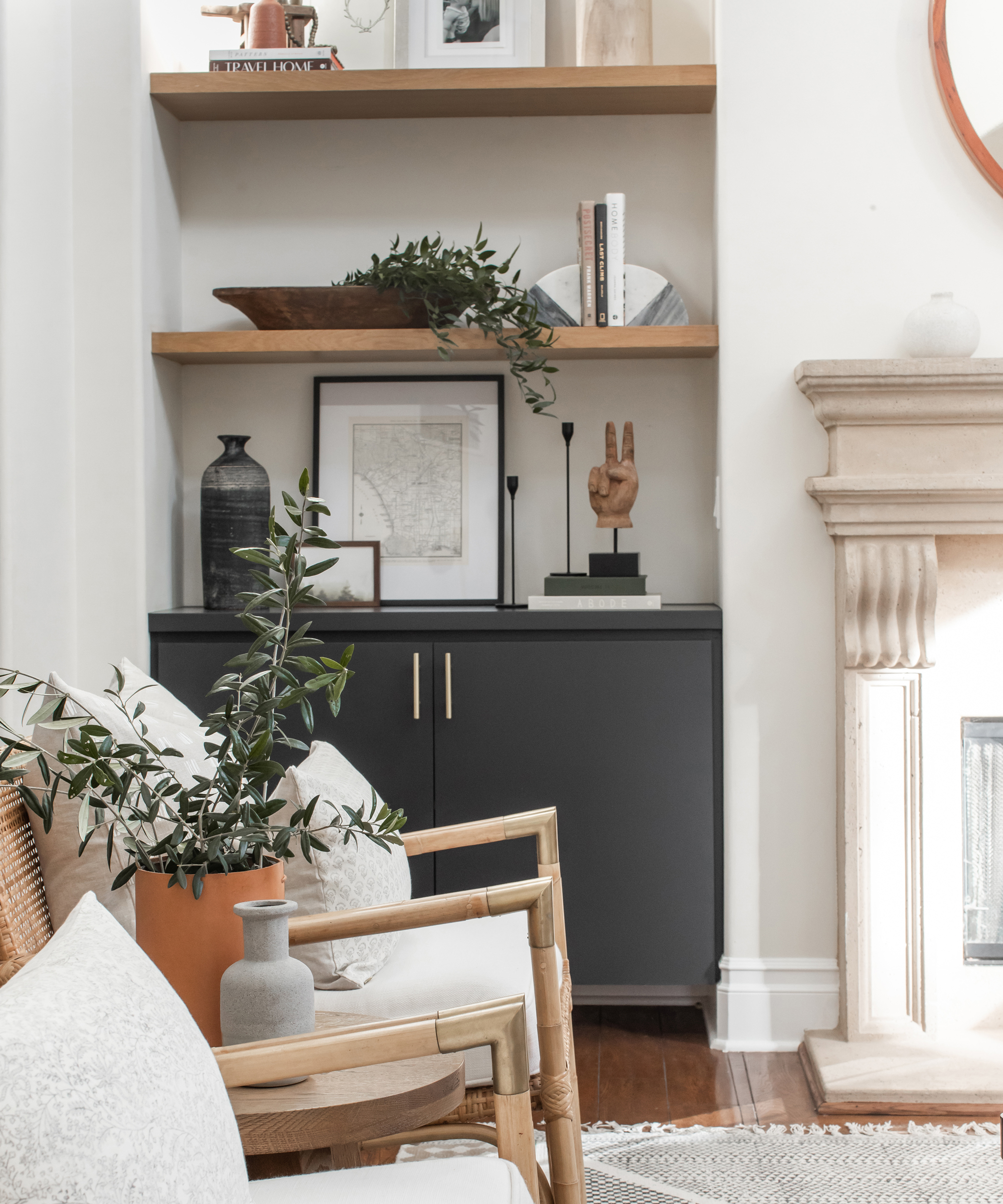
‘Open shelves can be tricky because you want them well styled but they should also tell a story,’ said Meichtry. For the designer, shelves are for so much more than storage. In her home, they are used as a vehicle for channeling what’s important to her and her brood.
‘I included a vintage map of Los Angeles – where we live – some of our favorite books, and a wood peace sign, which speaks to who we are as a family’, she said, with regards to the recessed shelves next to her fireplace. ‘Styling is a delicate balance between creating beautiful spaces and also making sure they look like someone lives there.’
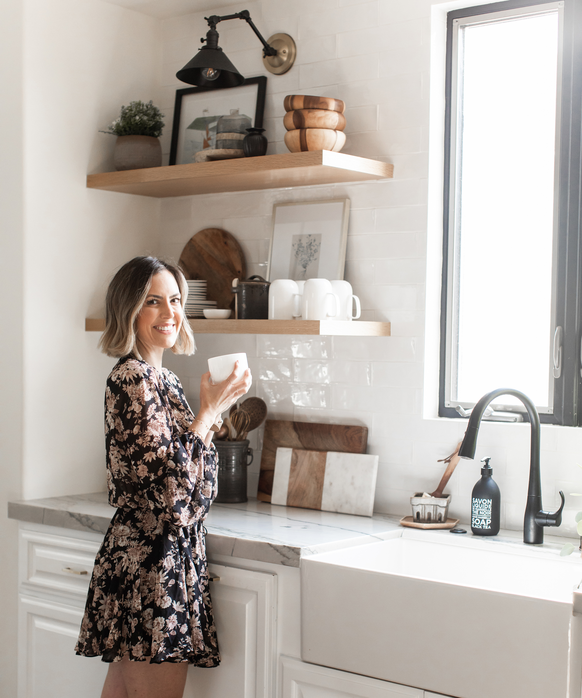
Meichtry is such a fan of open shelving as a design feature, she added more to the kitchen shortly after moving in. ‘There was so much heavy cabinetry and it made our relatively small kitchen feel even smaller. I had these shelves custom made to fit our space and made sure to have enough space to display art and serving pieces.’
See: Kitchen ideas – decor and decorating ideas for all kitchens
5. Choose artwork that fits in your space
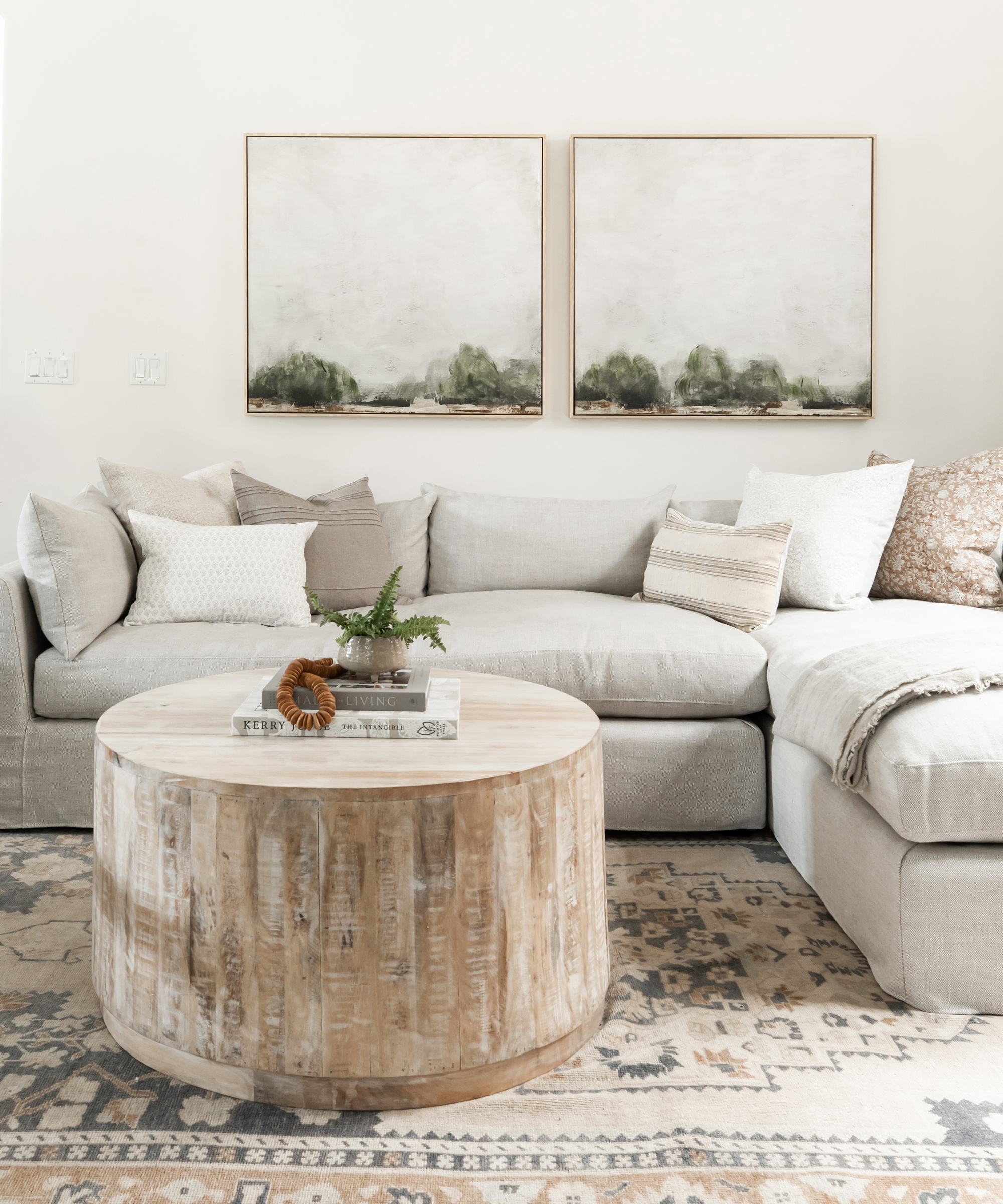
‘We love the outdoors – even though my work is interior focused – so you'll notice a lot of landscape paintings in my home’, said Meichtry.
But the content of the wall art wasn’t her only concern. ‘We have really high ceilings in our home, and finding art that fills the space has been challenging. When we added art to our offering, it was important to me that the artwork could be customized to fit any space.’
‘I had these two pieces – Forest Landscape 1 and Forest Landscape 2 from Elsie Home – custom made to fit our family room perfectly and think it added just the right amount of color.’
6. Kids art stations will save your decor
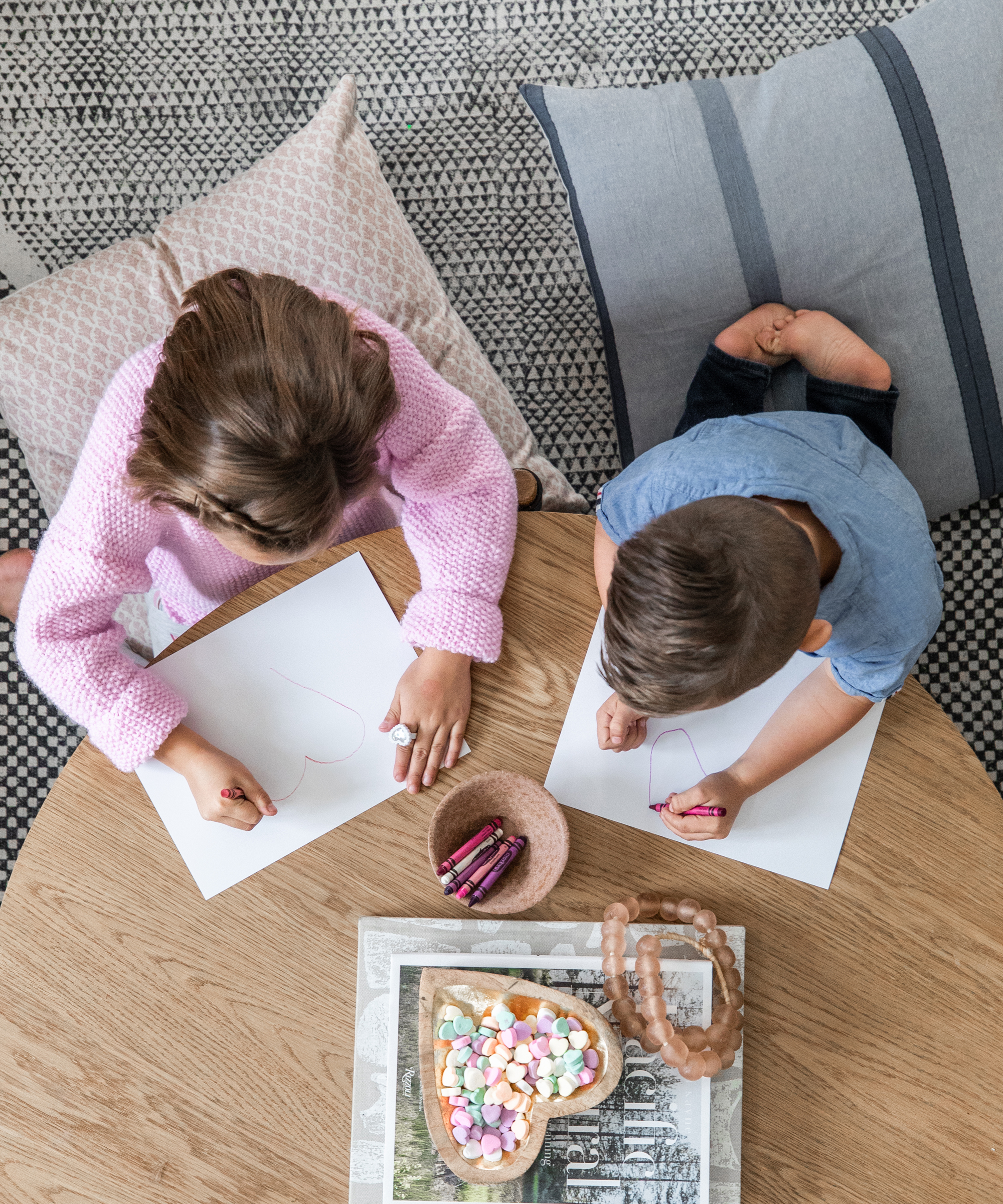
‘I think there's a misconception about having a well designed home with kids,’ said Meichtry. ‘Many people think you can't have kids and nice things. I think you can have both.’
For Meichtry, having designated areas for her children to ‘play and really be kids’ was a must-have – not only to keep them happy, but also to save the decor from ruin.
‘My kids know what is important to me and which items they can thrash. I have little art stations all around the house and the kids know they can color and create in those spaces only – that way I don't end up with crayon or marker on my sofas or walls.’
Interiors / Lauren Meichtry, founder of Elsie Home
Photography / Public 311 Design
Sign up to the Homes & Gardens newsletter
Design expertise in your inbox – from inspiring decorating ideas and beautiful celebrity homes to practical gardening advice and shopping round-ups.

Ailis started out at British GQ, where a month of work experience turned into 18 months of working on all sorts of projects, writing about everything from motorsport to interiors, and helping to put together the GQ Food & Drink Awards. She then spent three years at the London Evening Standard, covering restaurants and bars. After a period of freelancing, writing about food, drink and homes for publications including Conde Nast Traveller, Luxury London and Departures, she started at Homes & Gardens as a Digital Writer, allowing her to fully indulge her love of good interior design. She is now a fully fledged food PR but still writes for Homes & Gardens as a contributing editor.
-
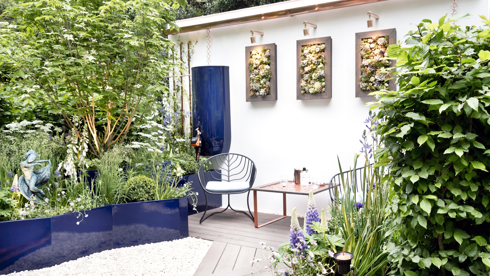 Urban gardening ideas – 7 creative ways to grow in small spaces, balconies, containers, indoors, and more
Make the most of your space with these innovative ways to garden
By Tenielle Jordison
-
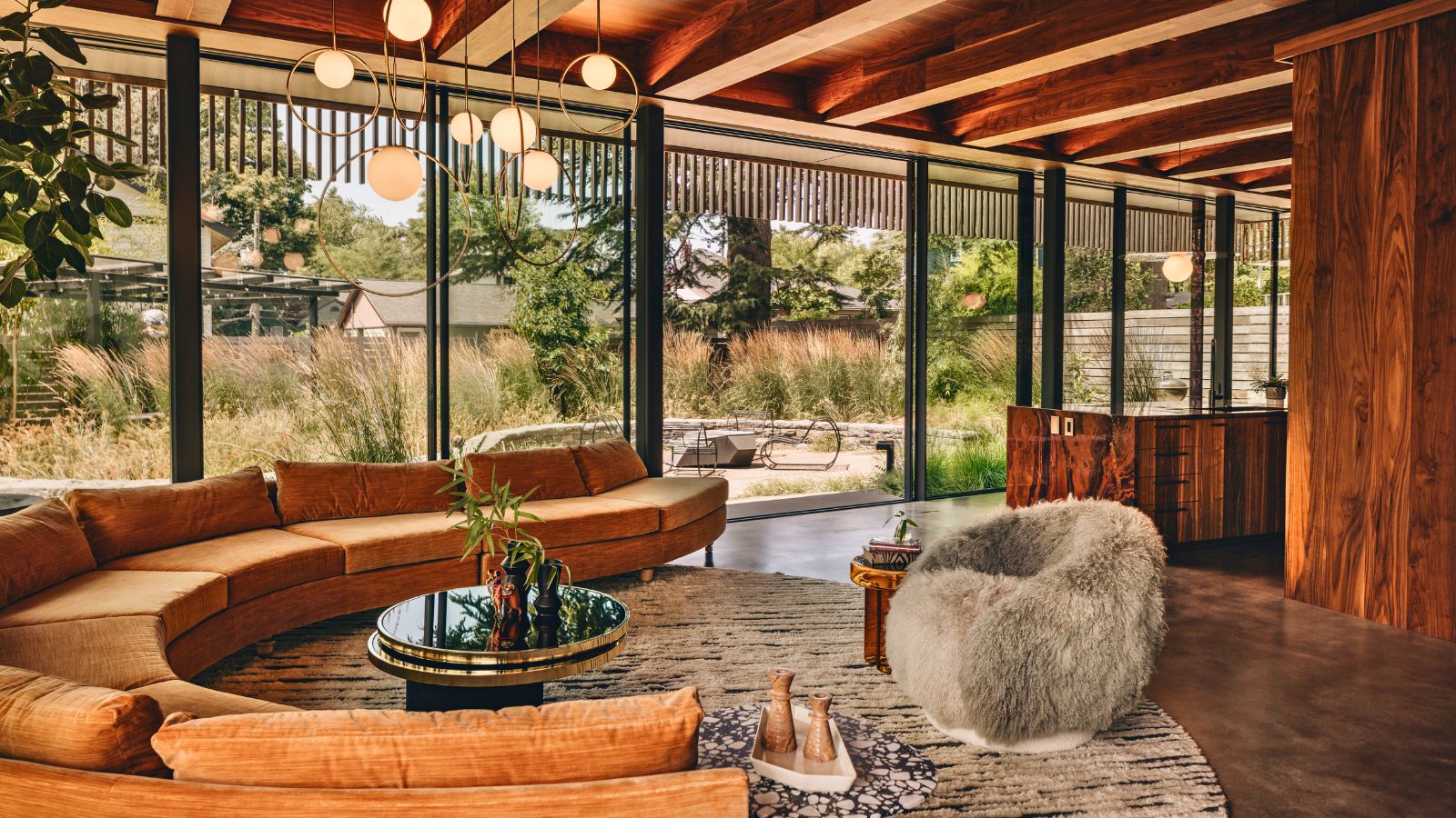 'Sexy disco-era Italy meets Japanese farmhouse in the Brazilian jungle' was the description the interior designer gave this glass-walled modernist home
Offering a warm welcome that defies its stark, modernist lines, this archictectural gem is full of surprises
By Karen Darlow