7 design secrets to steal from this European-inspired Seattle home
A brightening refresh of this Queen Anne home has given its art-loving owners a European-style masterpiece
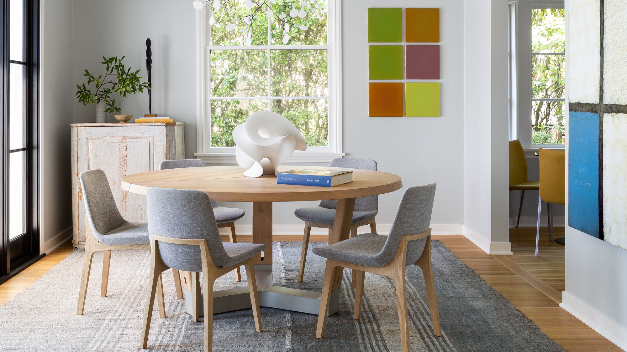

Lisa Staton Interior Design knows this house in Seattle very well indeed. Twelve years after the company first decorated the 1936-built brick property in the city’s Queen Anne neighborhood, the owners invited the team back to refresh their much-loved home.
The result is a bright, clean and slick reimagining that injects personality by embracing the owners’ love of art, and taking more than a few cues from across the pond. From the sprawling marble villas of Italy to the pared back elegance of Scandi design, this home has made Europe its muse.
‘We wanted to infuse modern into it with a casual elegance,’ said the team. ‘Modern furniture, carefully curated antiques and sculptural forms were paired together to keep things fresh and simple, but warm’.
For art-lovers looking for interior design tips to make their masterpieces pop, or Europhiles looking to transport their aesthetic across the Atlantic, here’s how to get this effortlessly cool look.
1. For a modern classic, do it like an Italian
For the Lisa Staton Interior Design team, it was the unusual floor-plan of the home that first got them thinking about Europe. ‘While it is traditional in form, it also has a very elegant and simple layout – almost like a classic Palladian villa,’ the team said.
Working with a 1930s house that had echoes of the Renaissance, the team found themselves inspired by ‘the way Italian and French villas merge modern with classic.’
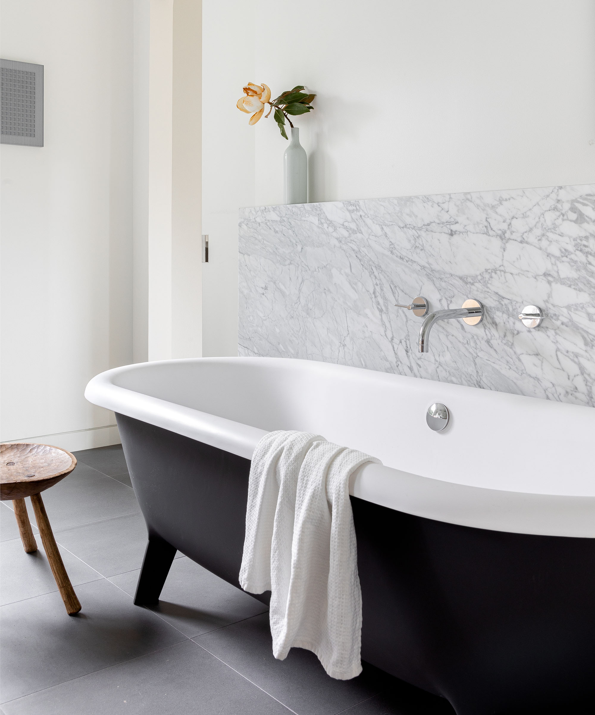
‘While the cabinets are modern and streamlined, the blue French La Canche range and generous marble counters and backsplash nod to tradition. The master bath has an Italian Agape tub, which is a modern take on a classic claw-foot tub.’
2. Ditch the upper cabinets for an airier kitchen
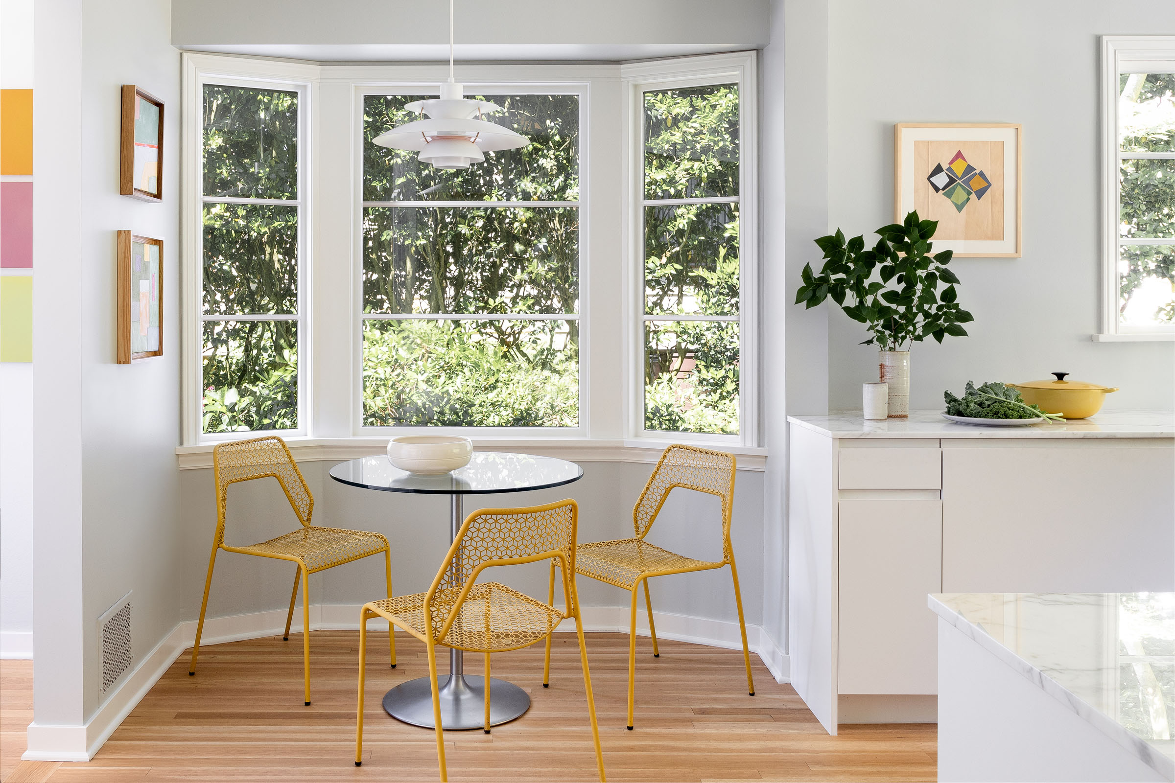
A ‘game changer’ – that’s how the Lisa Staton team described the decision to remove all upper cabinets from their kitchen design. The result is an ‘open and airy’ room, which maximizes the sense of space by keeping all bulk below the eyeline.
The use of two under-counter fridge drawers and a separate pantry keep storage on the down-low, while a clean aesthetic was achieved through the use of ‘European-style cabinets’, which integrate the drawer-pulls into the doors, eliminating the need for visible handles.
3. Head north for a Scandi palette
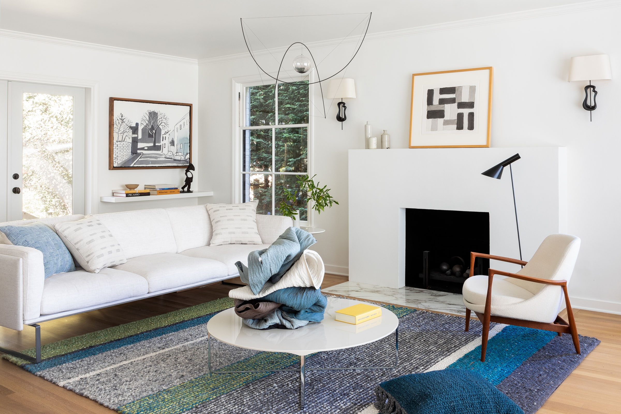
It’s not just Mediterranean Europe that has made waves in this home, but its Scandinavian neighbours too. ‘We found inspiration in a Nordic palette,’ said the team, using it deftly throughout the home, which has a gray-painted brick exterior.
Inside, walls are painted white or powder gray, and matched with pale woods – in antique Swedish furniture and beyond – darker grays, and the occasional inflection of icy cool blues.
4. Let your art do the coloring
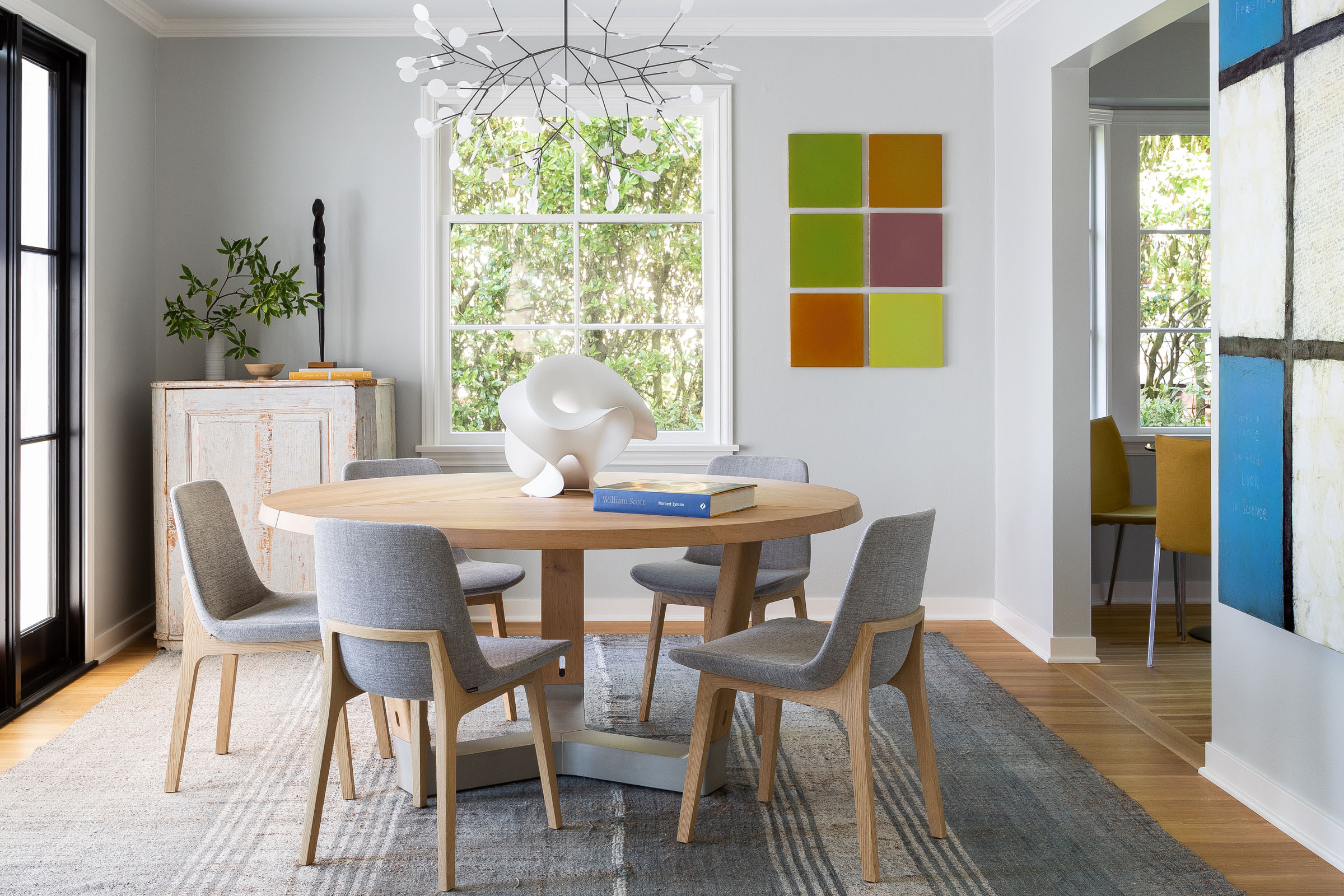
Sticking to a Scandi palette does not, however, mean this home is a bastion of neutrality. ‘Our goal was to allow the rooms to harmoniously flow onto each other and allow a clean and crisp backdrop for art’, said the team, who have peppered almost every wall of the house with the owners’ extensive collection of artwork, from technicolor canvases that dominate entire surfaces to small white oak-framed prints. ‘There was a purposeful decision for the color to come from the art.’
5. To keep your marble modern, go monochrome
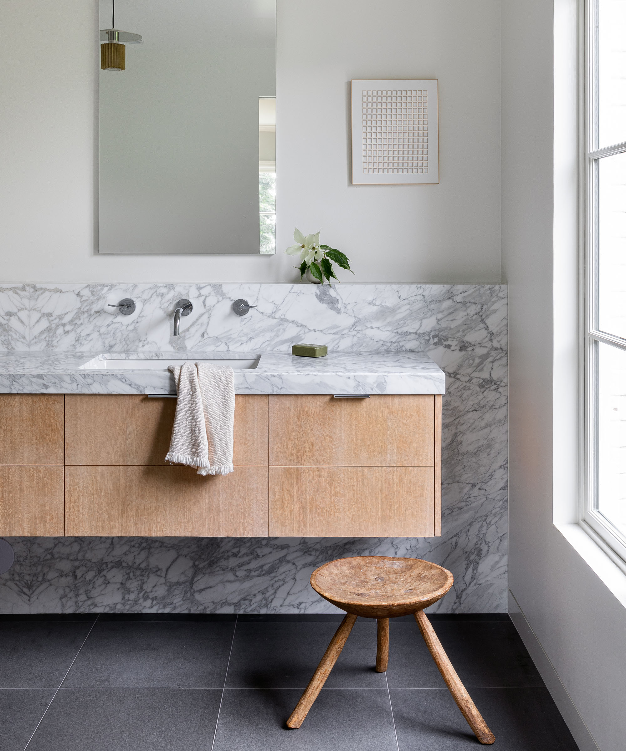
It’s no secret that marble is a contemporary design darling – but use it wrong, and you’ll end up swerving into the kitsch. To keep it modern, Lisa Staton Interior Design has gone monochrome, using a pale white and gray Italian marble from Carrara across the house, only switching it up for vintage marble bedside table in black.
If you’re worried about coming off a little cold, use color elsewhere in the room to heat things up. ‘White oak cabinets add warmth against the long and generous custom marble backsplash,’ the team said of its use in the bathroom.
6. Treat your wood right
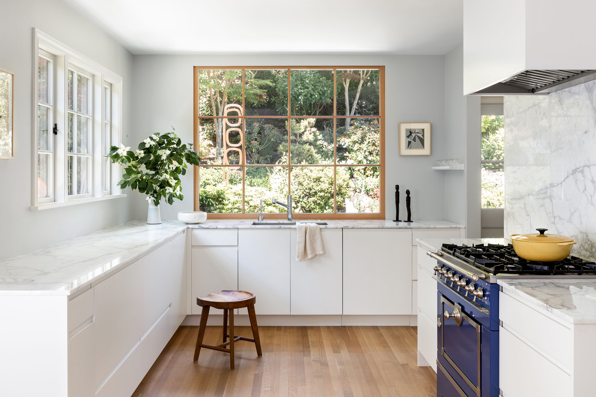
With kitchen wall space left empty of upper cabinets, a large picture window was installed to let the outside in – but the view wasn’t the only touch of nature in the design. ‘After it was installed, we decided not to paint it and leave it as blond oak wood.’
A healthy respect for natural woods can be seen throughout the property, especially on the floors, which were all sanded and treated with Swedish blond wax, and sealed with Rubio Monocoat oil. ‘Not polyurethane – a very European approach,’ said the team.
7. Search high and low for your textiles
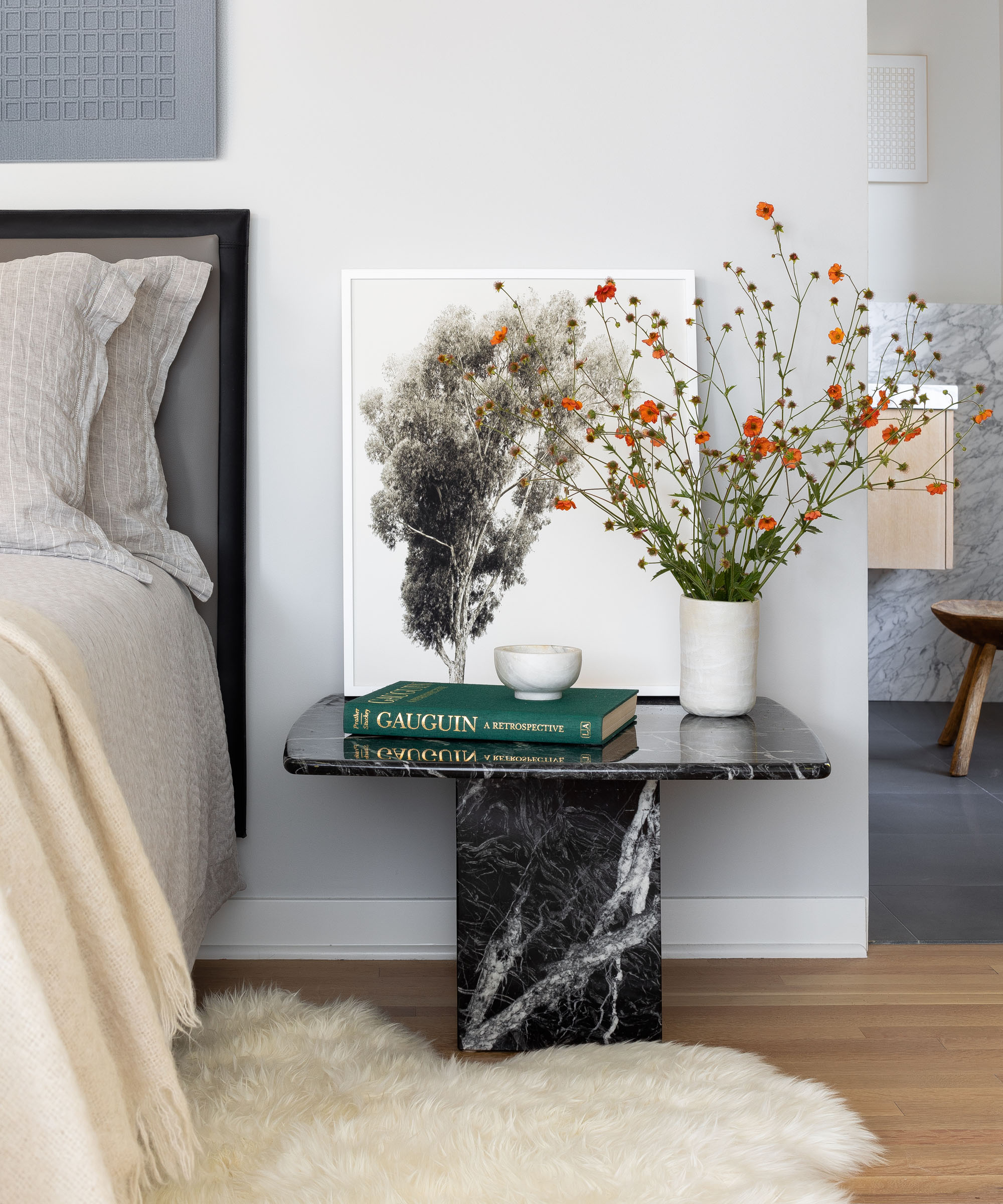
Layered textiles add a decadent feel to almost any design scheme – but that doesn’t mean you need to break the bank on every single piece. In the bedroom, the sheepskin rug at the base of the marble bedside table fits the bill as a luxurious way to take your first morning steps – it is, however, from CostCo.
In contrast, higher-end fabrics include the felted wool rug by Paulig that sprawls across the living room floor, having been handwoven in Morocco. In the dining room, a Turkish wool flat weave rug from Hedgerow – a vintage store based in Edison, just north of Seattle – brings texture to the room’s slick geometry.
Interiors / Lisa Staton Interior Design
Photography / Haris Kenjar
Sign up to the Homes & Gardens newsletter
Design expertise in your inbox – from inspiring decorating ideas and beautiful celebrity homes to practical gardening advice and shopping round-ups.

Ailis started out at British GQ, where a month of work experience turned into 18 months of working on all sorts of projects, writing about everything from motorsport to interiors, and helping to put together the GQ Food & Drink Awards. She then spent three years at the London Evening Standard, covering restaurants and bars. After a period of freelancing, writing about food, drink and homes for publications including Conde Nast Traveller, Luxury London and Departures, she started at Homes & Gardens as a Digital Writer, allowing her to fully indulge her love of good interior design. She is now a fully fledged food PR but still writes for Homes & Gardens as a contributing editor.
-
 Charred little gem with saffron dressing
This recipe with charred little gem is both easy to make and sure to impress guests. It's the perfect side for fresh spring menus
By Alice Hart
-
 Grilled asparagus with herb and pickled red onion
This grilled asparagus couldn't be easier, and it's a wonderful way to get the best flavor from our favorite spring veg. It's perfect alongside fish or lamb
By Alice Hart