This 100-year-old Hudson Valley barn conversion has been given a truly modern makeover
After standing on this spectacular spot for more than a century, a once-dilapidated barn has been given a homely makeover
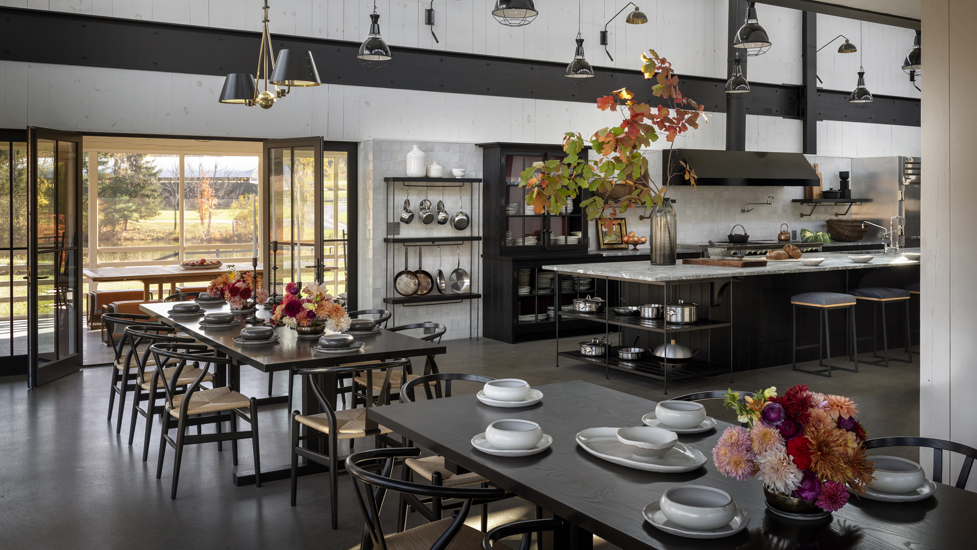

‘It was semi-derelict and seemingly untouched for years,’ said Richard Felix-Ashman, recalling the initial state of this 1920-built barn, prior to its renovation and transformation into a stunning home.
‘Our clients saw beyond the dilapidation. They had a strong vision for its future, wanting to upcycle the structure into a space for themselves, for guests and for family.’
Situated in the Hudson Valley, the barn was already blessed with a stunning countryside location.
‘The true genius of the original barn is its site’, said Felix-Ashman. ‘The barn sits on a gently rising slope, and the new French doors open to a view of the pond below and the forest beyond. It is an incredibly peaceful place.’
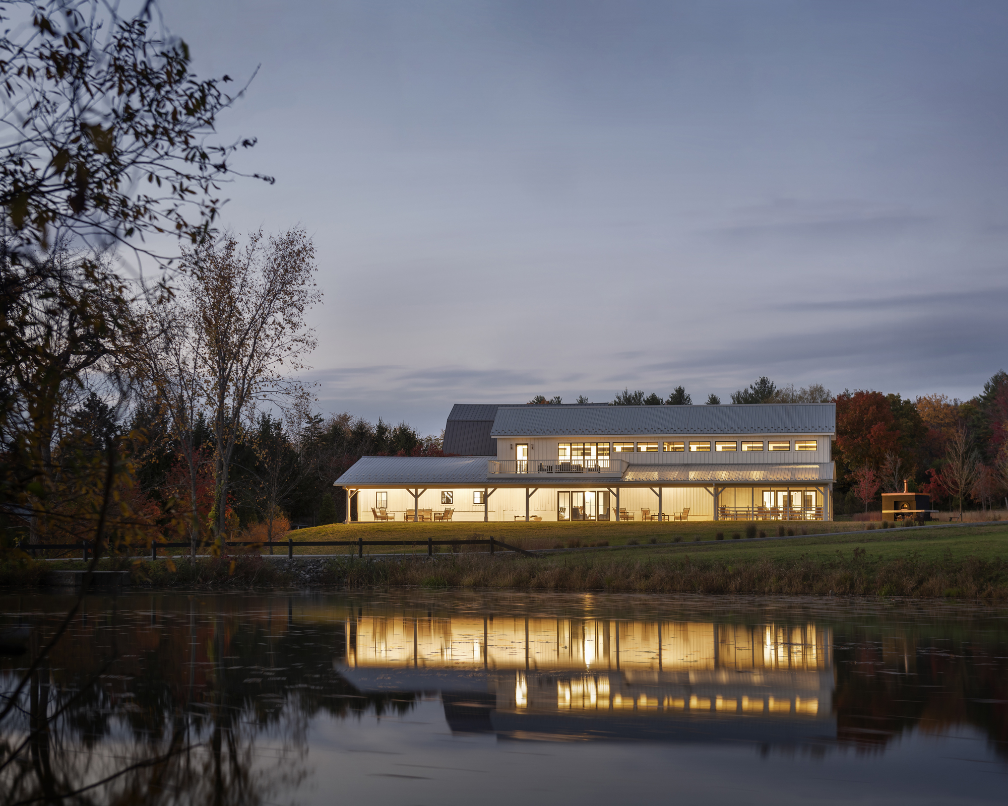
While the team were keen to retain much of the original layout and multiple features from the historic building, the French doors are among the clever restructurings and design touches used to turn it into both a spectacular visual feast and welcoming space for entertaining.
‘We tried to find a balance between rusticity and refinement,’ said Felix-Ashman. Our client did not want anything to feel overly designed, which is perfect for us as a design firm. At the end of a project, we always hope that our mark or signature is invisible and that we leave a space for our clients to make their own.’
- See: World's best homes – tour the globe’s most beautiful houses
Kitchen
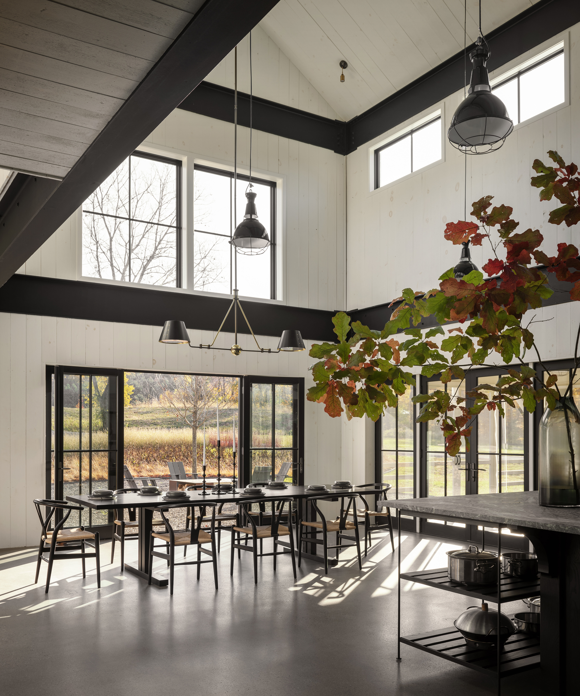
Situated under the nave of the building, Felix-Ashman calls the kitchen the ‘centrepiece’ of the house.
‘The roof in the nave was raised creating a new, higher clerestory, which doubled the interior daylight, and improved the barn’s proportions.’
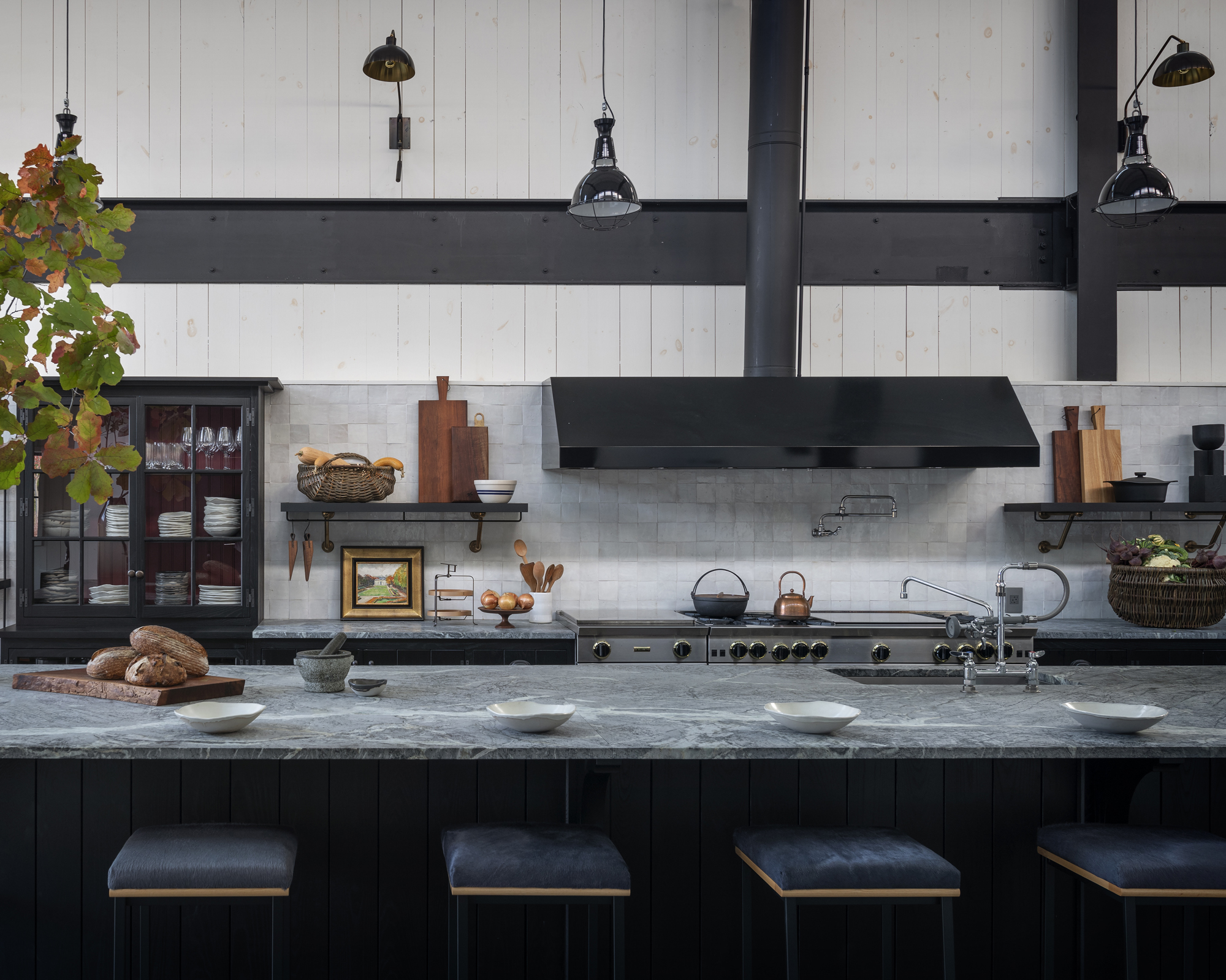
'We arranged the cooking and prep around a mammoth island,’ he said. ‘I feel it symbolizes our client’s generosity. The whole experience is about giving and feeling comfortable.’
Under the impressive double height ceiling, the soapstone island is paired with shimmering zellige tiles by Clé, as well as locally sourced blackened ash cabinets that contrast with the white-painted shiplap that runs throughout.
- See: Kitchen ideas – decor and decorating ideas for all kitchens
Dining Area
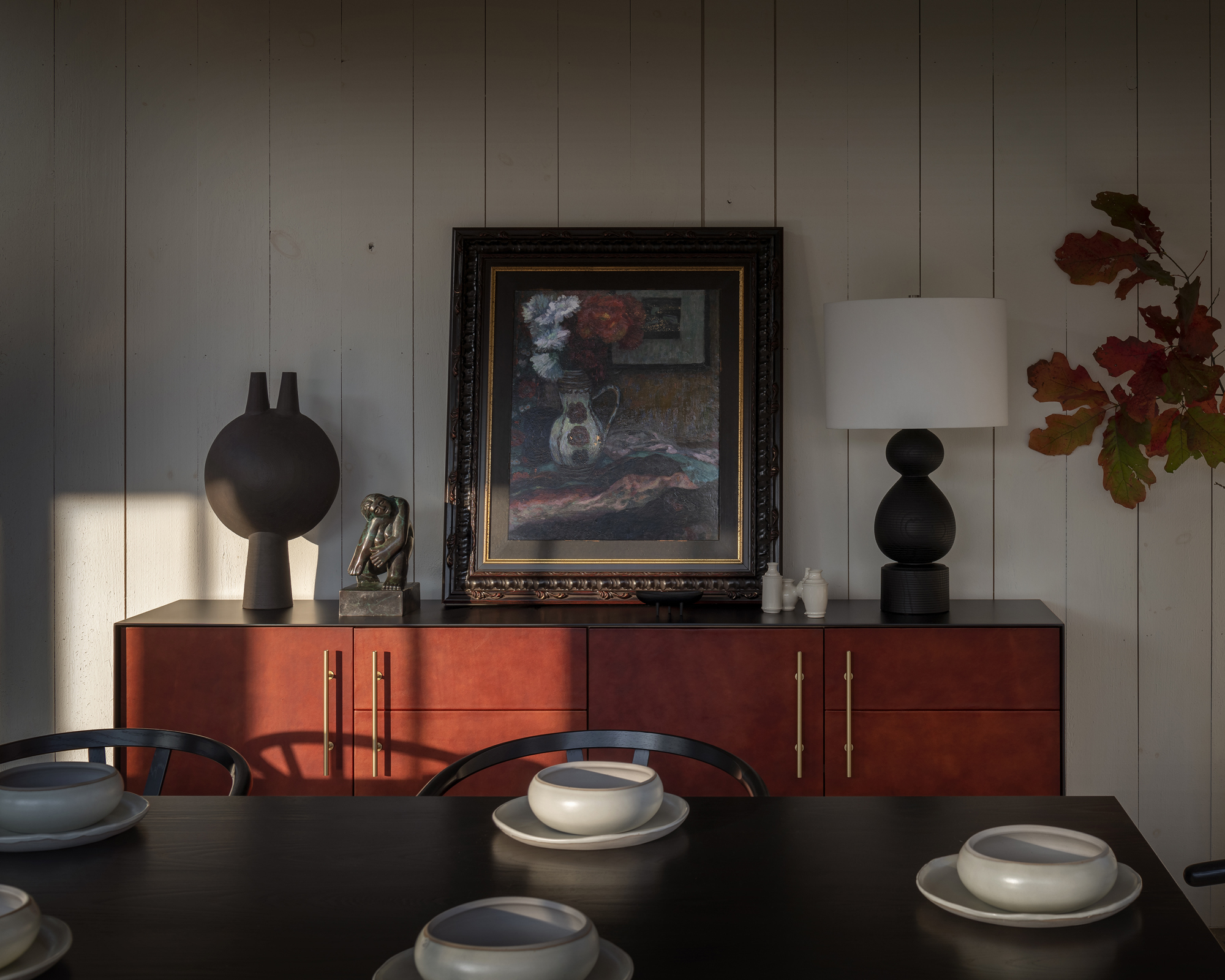
The kitchen area merges into a large, partially open-plan dining space, with plentiful room to accommodate numerous hungry guests. The two tables are custom in blackened ash, and flanked with wishbone chairs by Carl Hansen.The second table leads into a more intimate space, complete with a slick red ochre and black sideboard by Croft House.
Bar
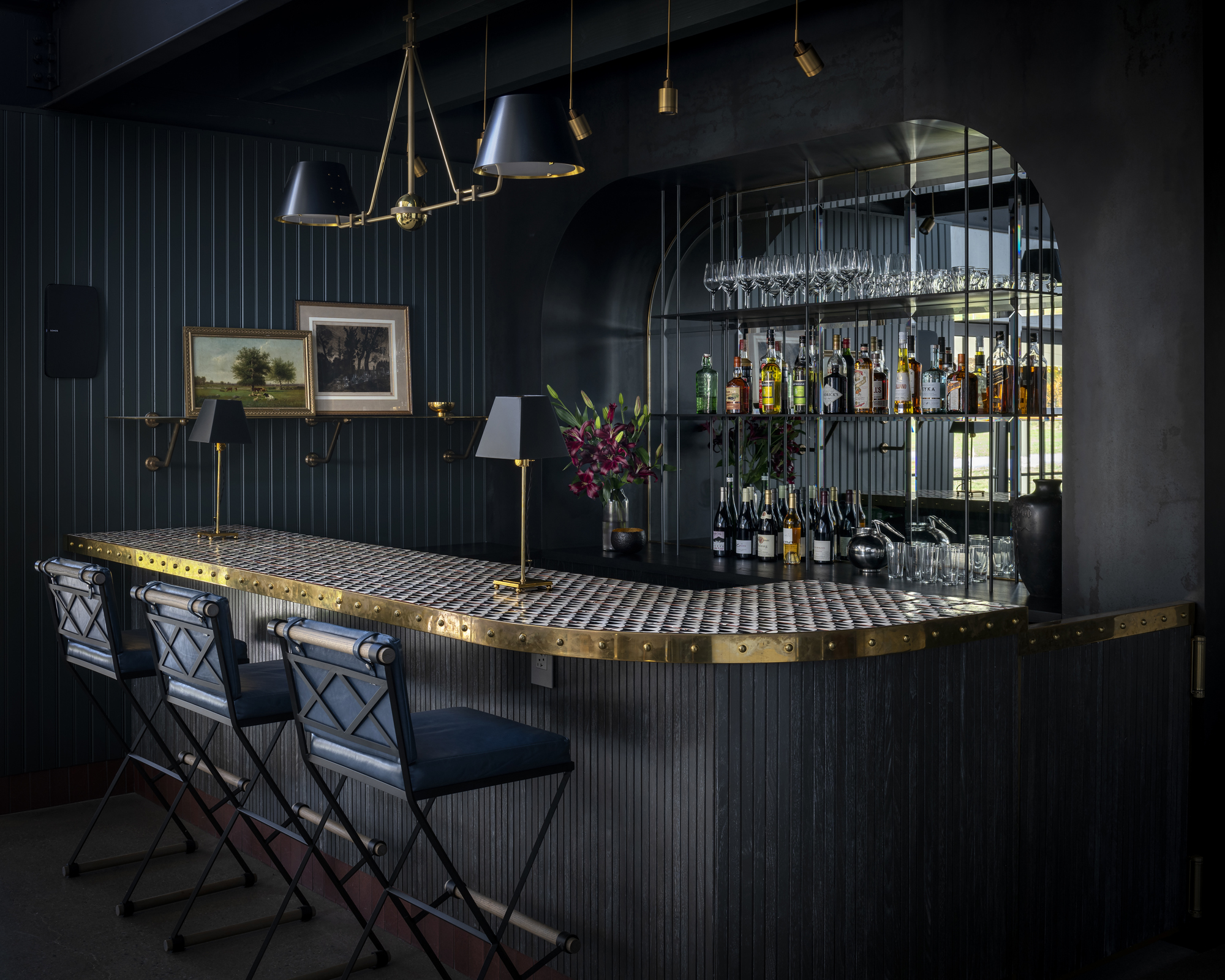
Under the mezzanine, the team equipped the house with its very own bar. A moodier corner ready for late night tipples, the bar itself is clad in cerused walnut, while the shiplap walls are painted a dark blue-green. ‘It’s an unexpected touch,’ said Felix-Ashman. ‘It creates a darker, more intimate counterpoint to the larger, bright, white space of the nave.’
Glistening details include bar top tiles by Tabarca surrounded by a brass trim, as well as a Starphire mirror behind the back bar.
Living room
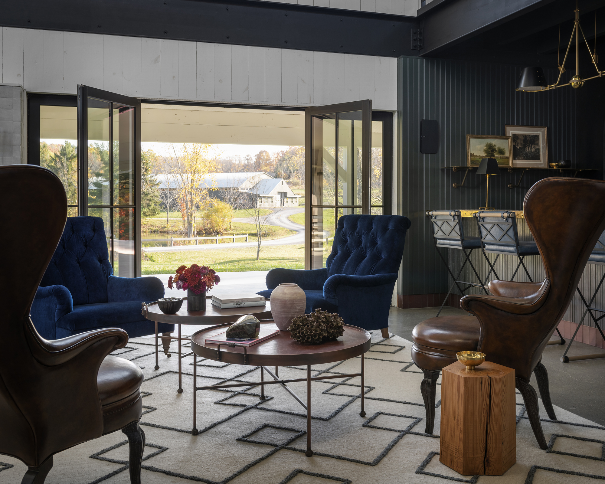
Turn around from the bar, and you’ll find yourself in the lounge area, which Felix-Ashman said he added ‘for softness’. The small nook is positioned at the meeting point between the bar, the bedrooms and a large set of French doors which open out onto the forest.
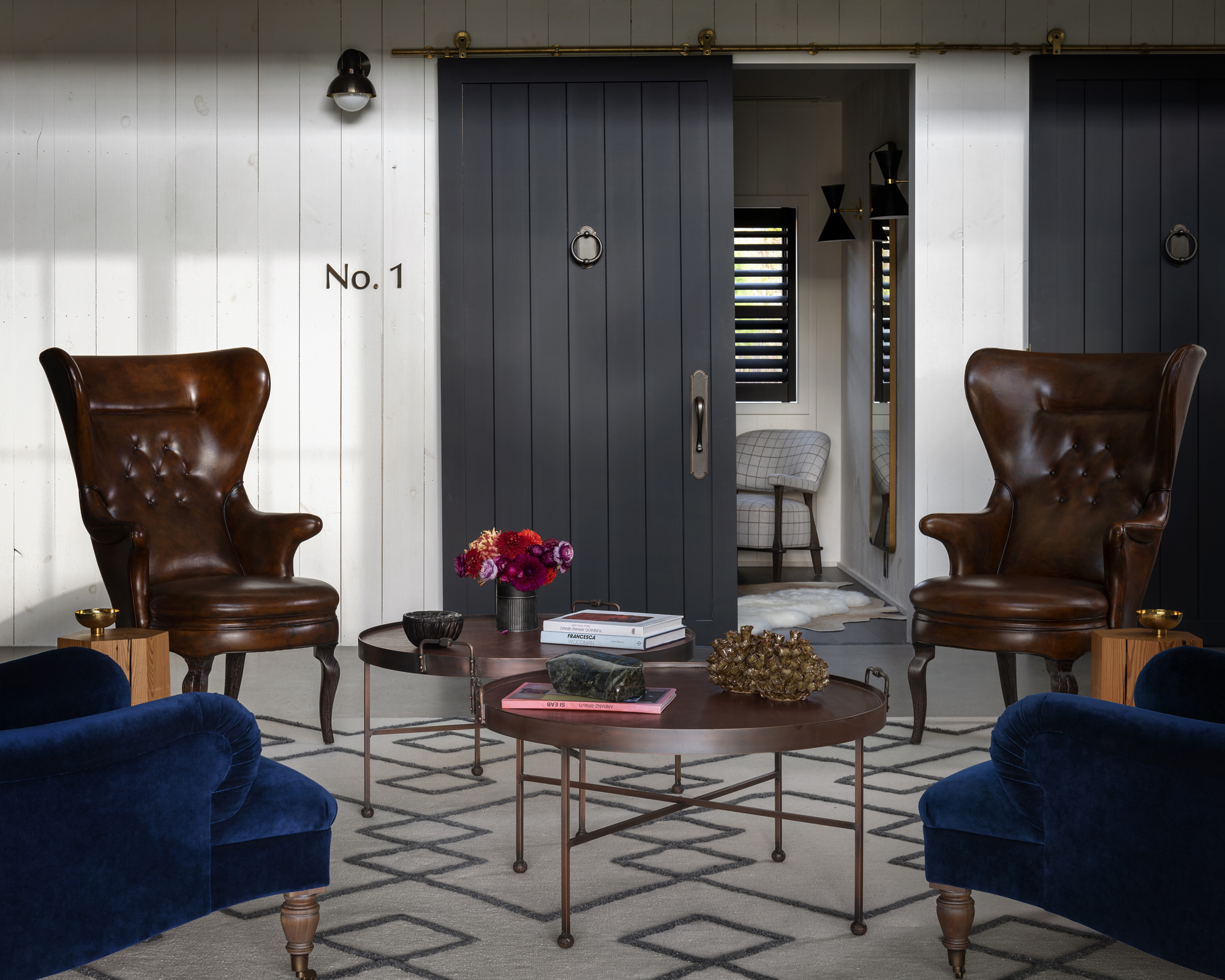
The area ties in aspects of each neighbour, with natural wood tables from Casamidy and Uhuru, distinguished Henningsen-style high back chairs from Jean de Merry. and luxurious Dmitriy & Co. armchairs upholstered in deep blue Holland & Sherry velvet.
- See: Living room ideas – clever ways to decorate living spaces
First bedroom
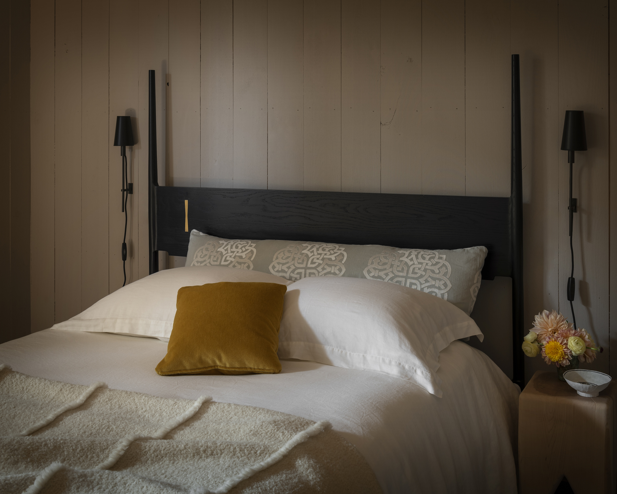
‘We maintained the original barn configuration of horse stalls and converted those into bedrooms, located behind sliding barn doors,’ said Felix-Ashman. ‘We added bedroom numbers for a touch of whimsy.’
In this room, a dramatic walnut bed from Fern is flanked by sconces from Urban Electric Co., a blanket by Rosemary Hallgarten, and a pillow in Holly Hunt mohair.
- See: Bedroom ideas – designs and inspiration for beautiful bedrooms
Second bedroom
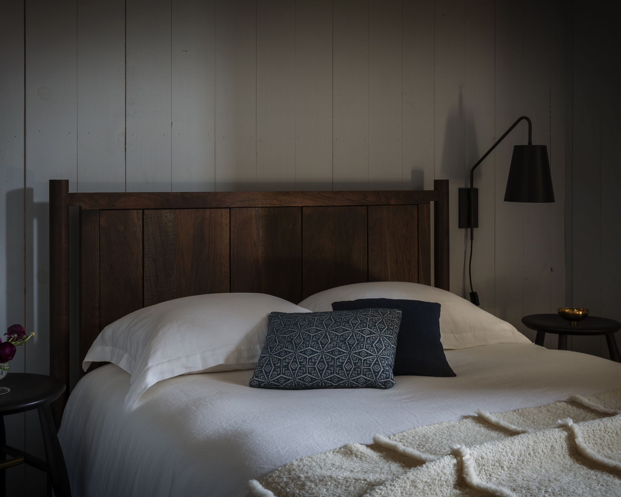
In the second bedroom, a robust Chris Earl bed is made with ebonized oak and brass and topped with pillows from Holland & Sherry and Soane Britain.
Bunk room
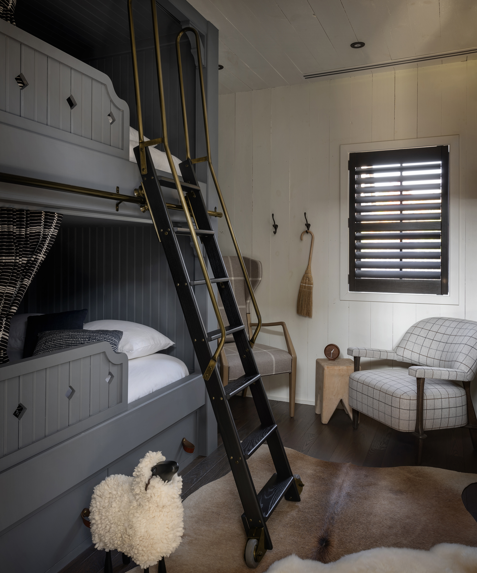
Alongside the two double bedrooms is one bunk bedroom. A grey painted bunk bed climbs one side of the former horse stall space, accessible via a black step system with a feature brass handle, and fitted with drapery from Zac & Fox. The rest of the room features cosy armchairs upholstered with Rogers & Goffigan fabric.
Bathroom
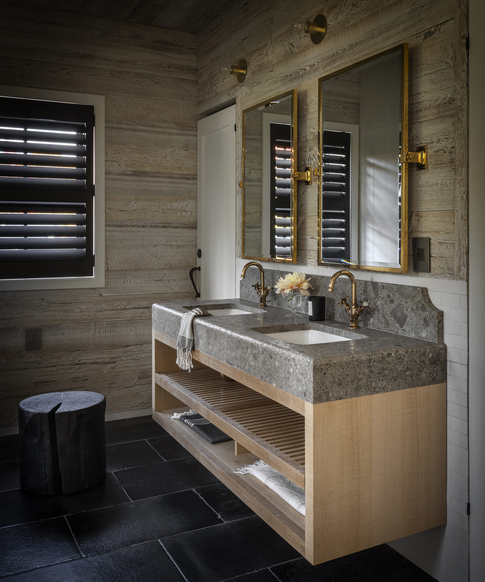
Things get a little closer to nature in the bathroom, where shiplap and beadboard are swapped with natural wood panelling by Resawn Timber Co.. This is paired with a wooden vanity counter, topped with Ceppo Di Gre marble, as well as brass fittings from Rocky Mountain for a touch of warmth.
Interiors / Richard Felix-Ashman Design
Photography / Aaron Leitz
Stylist / Yedda Morrison
Sign up to the Homes & Gardens newsletter
Design expertise in your inbox – from inspiring decorating ideas and beautiful celebrity homes to practical gardening advice and shopping round-ups.

Ailis started out at British GQ, where a month of work experience turned into 18 months of working on all sorts of projects, writing about everything from motorsport to interiors, and helping to put together the GQ Food & Drink Awards. She then spent three years at the London Evening Standard, covering restaurants and bars. After a period of freelancing, writing about food, drink and homes for publications including Conde Nast Traveller, Luxury London and Departures, she started at Homes & Gardens as a Digital Writer, allowing her to fully indulge her love of good interior design. She is now a fully fledged food PR but still writes for Homes & Gardens as a contributing editor.
-
 Drew Barrymore's striped sofa is her most elegant design to date – it oozes East Hampton elegance in time for summer 2025 (and is under $384)
This subtly striped linen sofa anchors any living room while feeling light and casual – it looks so much more expensive than its price tag
By Megan Slack
-
 Bryce Dallas Howard's bedroom is the most creative, social space in her entire home – she uses 'conversational seating' to create a multifunctional 'salon'
The actress's bedroom doubles as a home office thanks to its clever layout and furnishings, proving that this area is much more than a sleep space
By Hannah Ziegler