9 furniture and layout choices to steal from this beautiful kitchen extension
Designers Harvey Jones have added thoughtful seating areas and eye-catching pieces to give existing furniture a modern edge
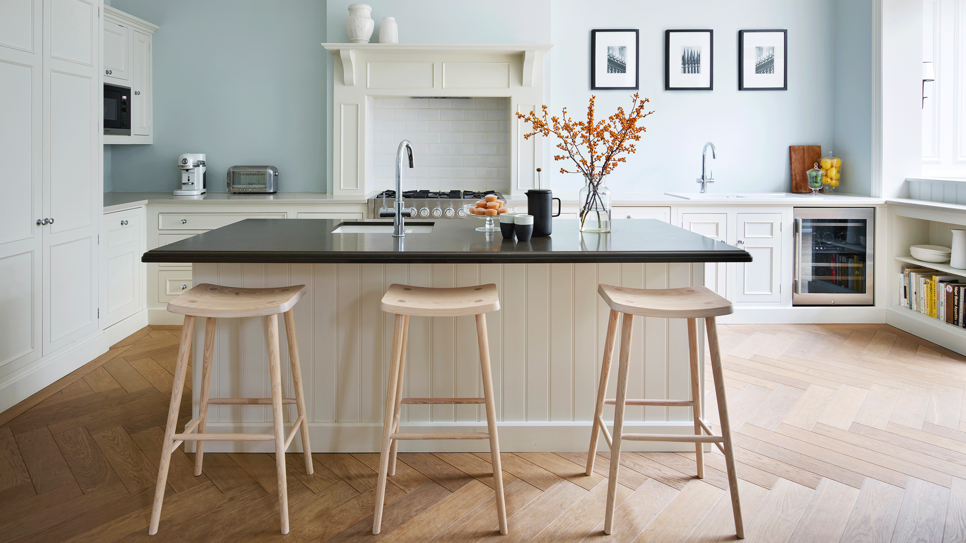

A kitchen extension ranks high on many home owners’ renovation wishlist. Jennifer and David Livingstone, who live in a five-bedroom Victorian terraced house in Surrey with their three young children, were no different.
While it had a generous footprint, the couple wanted to replace the existing conservatory with an extension to create an open-plan kitchen and dining room that was more family-friendly. This left them on the lookout for kitchen ideas that would incorporate the existing furniture with new features.
‘The kitchen was the reason we bought the house. It has a very high ceiling and a wonderful feeling of space,’ says Jennifer. ‘Like many families, we live in the kitchen, so it made sense to us to put this room top of our list of priorities,’ she explains.
They enlisted the help of Rachel Scott, designer from Harvey Jones to realise their vision and here are the 9 design secrets that gave the space a new lease of life.
1. Keep the extension in keeping with the style of the house
The one thing we kept in the house renovation was the kitchen, because it was so beautifully solid and well made, and we loved its traditional style,’ explains Jennifer. ‘It was just too good to throw away.’
To create a family-size dining area, adjacent to the kitchen, they demolished a lean-to conservatory and came up with an orangery-style kitchen extension idea with a large roof lantern, which they constructed on the same footprint.
‘The conservatory was too cold in winter and too hot in summer. This extension is much more comfortable and usable, and its style is more in keeping with the age of the house,’ she says.
2. Add banquette seating to link the dining and kitchen areas
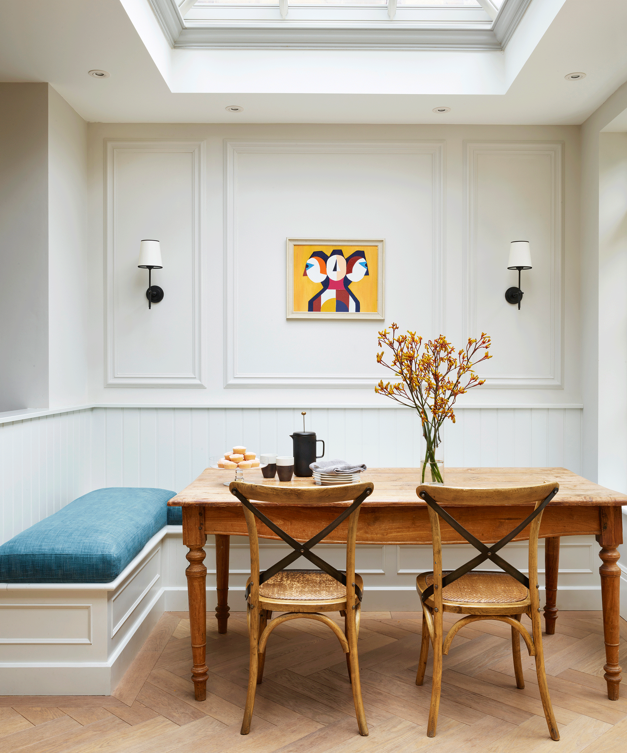
Keen to include some banquette seating in the new dining area, Jennifer made a phone call to designer Rachel Scott of Harvey Jones, who had created the kitchen ten years previously.
‘When I was a child, we rented a holiday house that had banquette seating around the dining table and I still remember thinking it was fun,’ says Jennifer. ‘We can accommodate quite a few people around our table, including extra little bottoms, so it is a flexible solution.’
Rachel came up with the perfect banquette seating idea, in keeping with that vision, linking it to the kitchen.
3. Use what's there already
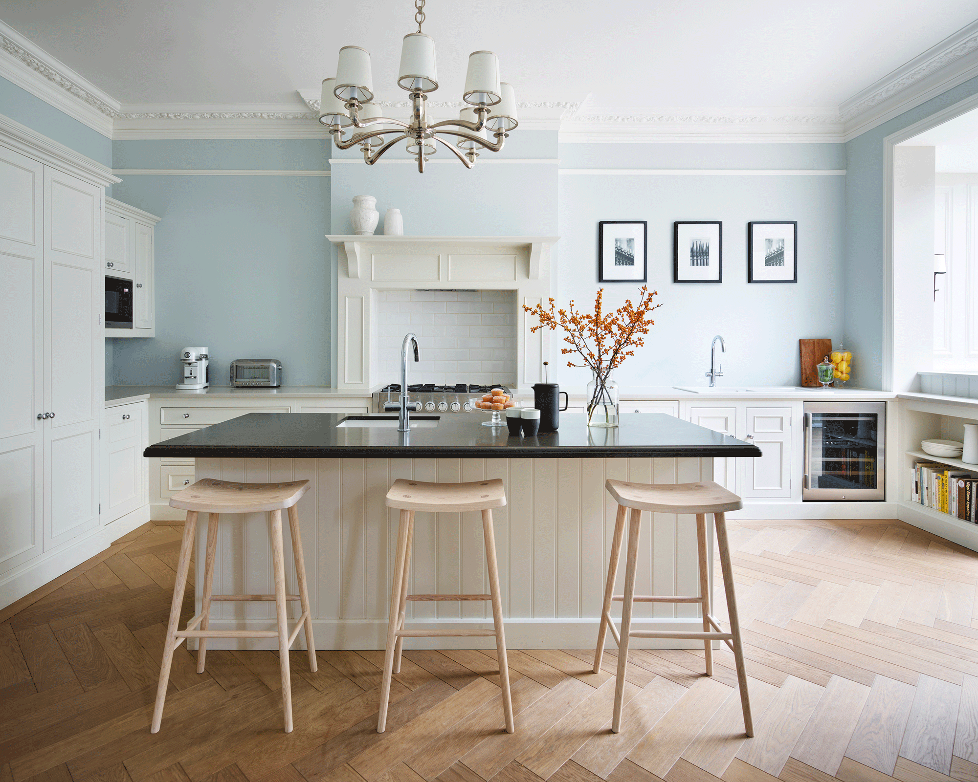
To complete the new look room, the previously cream-colored cabinets were repainted in Farrow & Ball’s Strong White, to provide fresh contrast against the pale blue walls, glass handles replaced with smart polished chrome knobs, and two shades of grey used for quartz surfaces to replace the well-worn wooden worktops.
‘I’m glad that we have been able to recycle the kitchen cabinetry and hopefully give it at least another ten years of life,’ says Jennifer. ‘It is a space that works brilliantly for our family.’
4. Create a work-from-home office nook
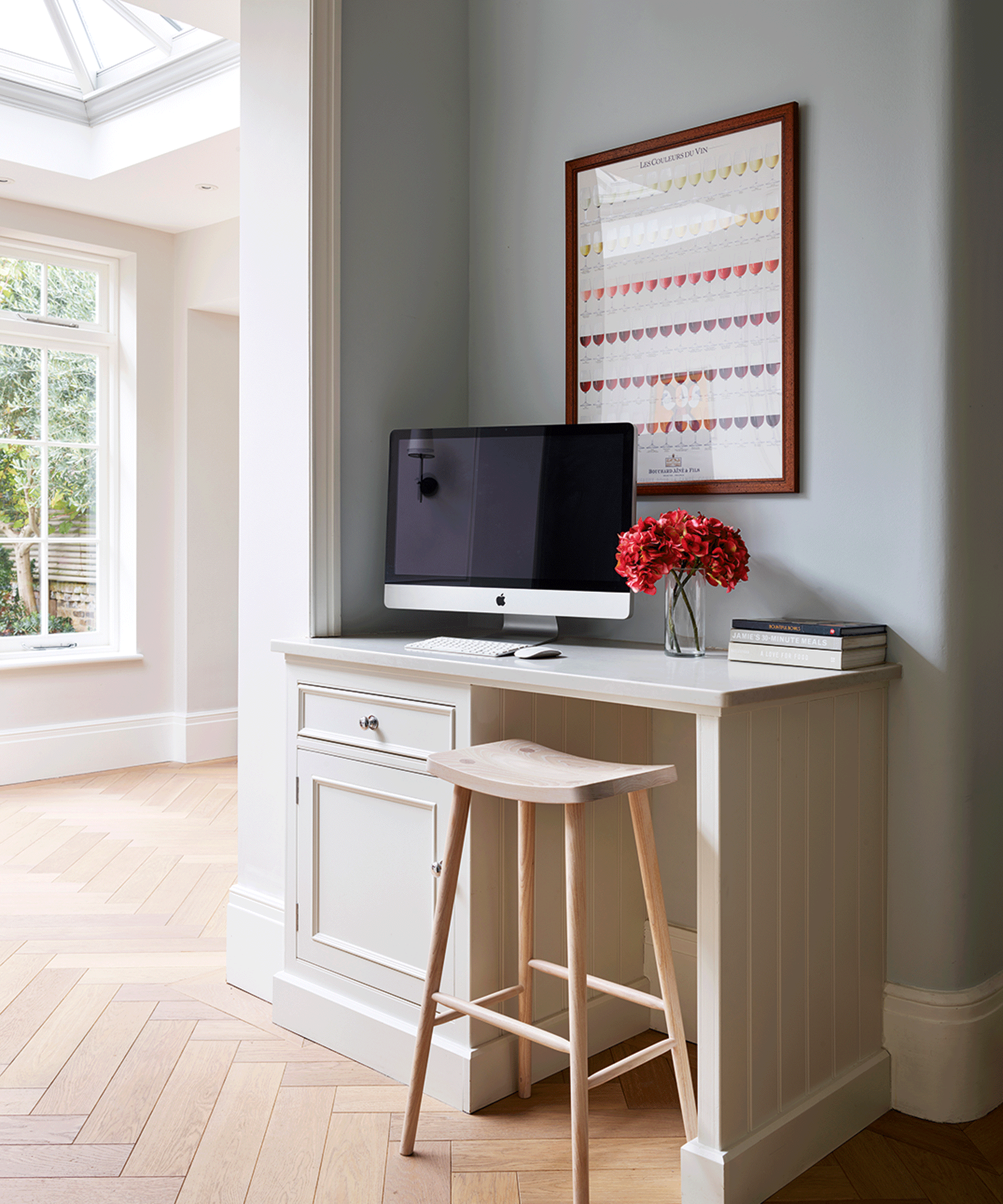
A neat desk makes a home admin centre in the kitchen, out of the way of the main cooking area, with a playroom around the corner so that Jennifer and David can keep an eye on the children whilst at the computer.
The top drawer of the cabinet contains built-in sockets for charging phones and tablets, while the cupboard below includes pull-out trays for the printer and paper refills.
The countertop is made in the same quartz as the kitchen work surface – a clever way to incorporate a home office idea and make it feel like part of the kitchen.
5. Have a striking focal point
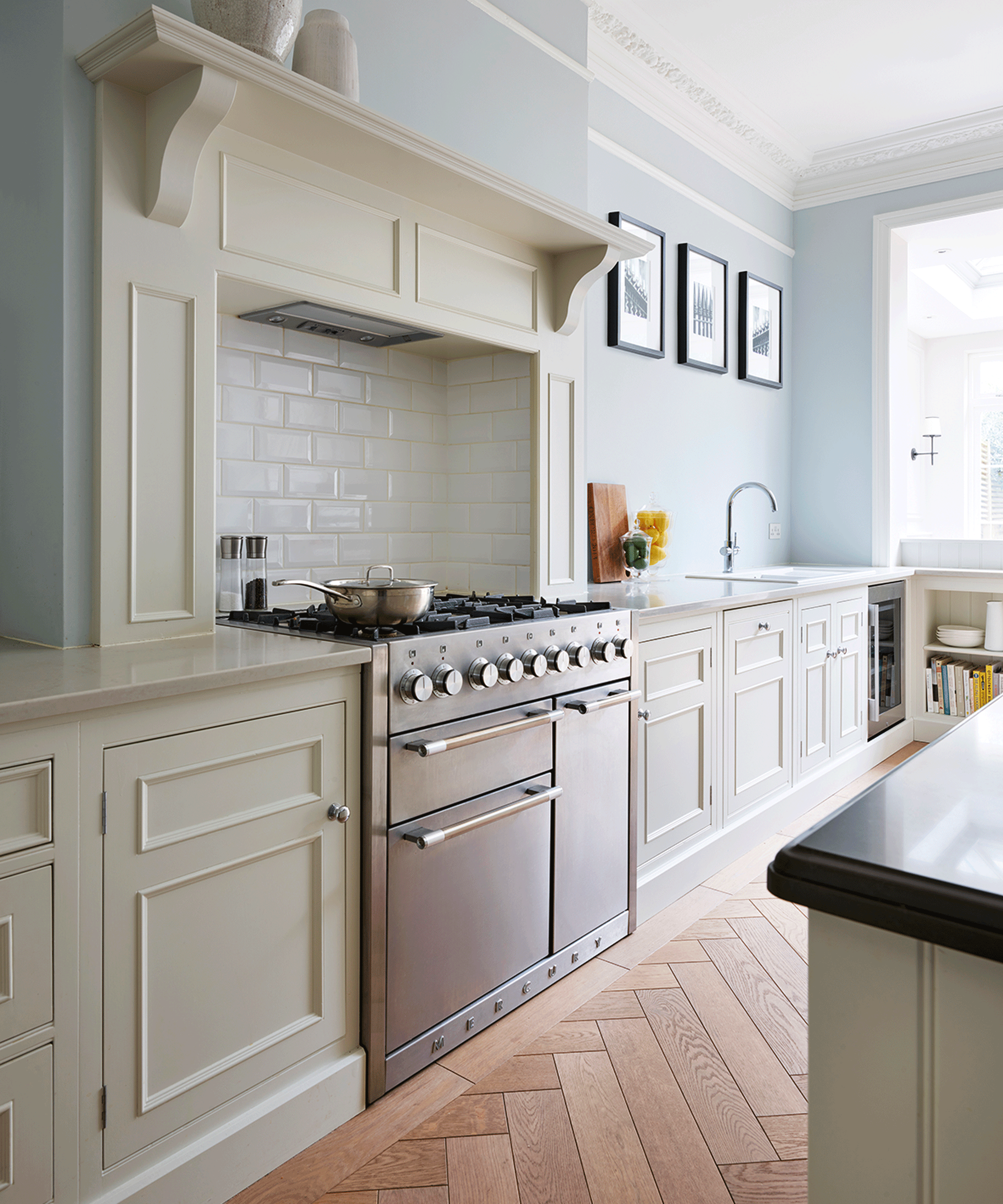
The Mercury range cooker has a five-burner gas hob built into the chimney breast, forming the focal point of the design.
A central island offers prep, storage and socializing space, bridging tall cabinetry with dried and chilled food storage on one side and the dining area in the new extension on the other.
6. Install two wash stations for ease
For maximum flexibility in a busy family kitchen, a prep sink on the island is fitted with a tap dispensing filtered, chilled and sparkling water, as well as ‘regular’ hot and cold. ‘One of us can be making drinks or cleaning vegetables here, the other doing the washing up at the main sink,’ says Jennifer.
The larger main sink has a ‘regular’ kitchen tap that also dispenses kettle-hot water, making it easy to quickly fill a pan with boiling water close to the range cooker. There is a dishwasher positioned close to each sink.
7. Match the seating with the kitchen cabinetry
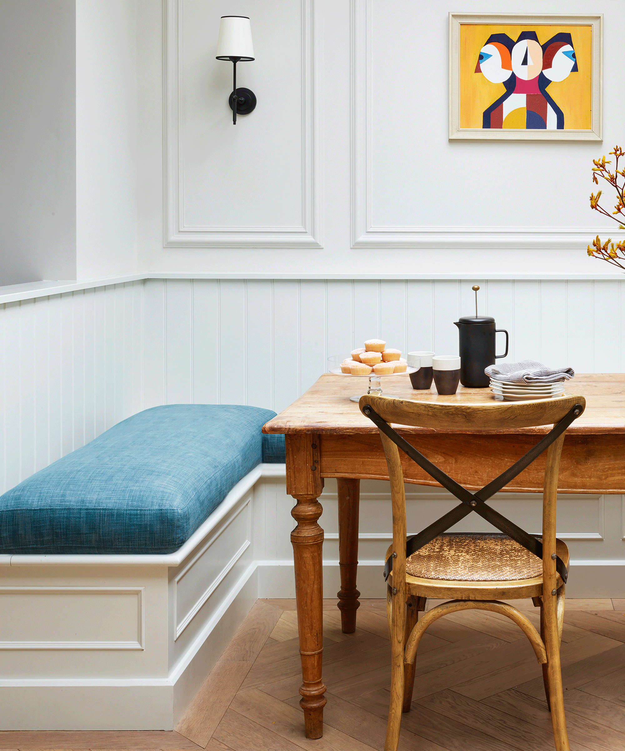
The bench seating is designed with similar beaded panels to match the kitchen cabinetry, with cushions made by a local upholsterer to add comfort. Wall panels above were designed by Jennifer to add depth to the room and complete the look.
8. Add storage in unexpected areas
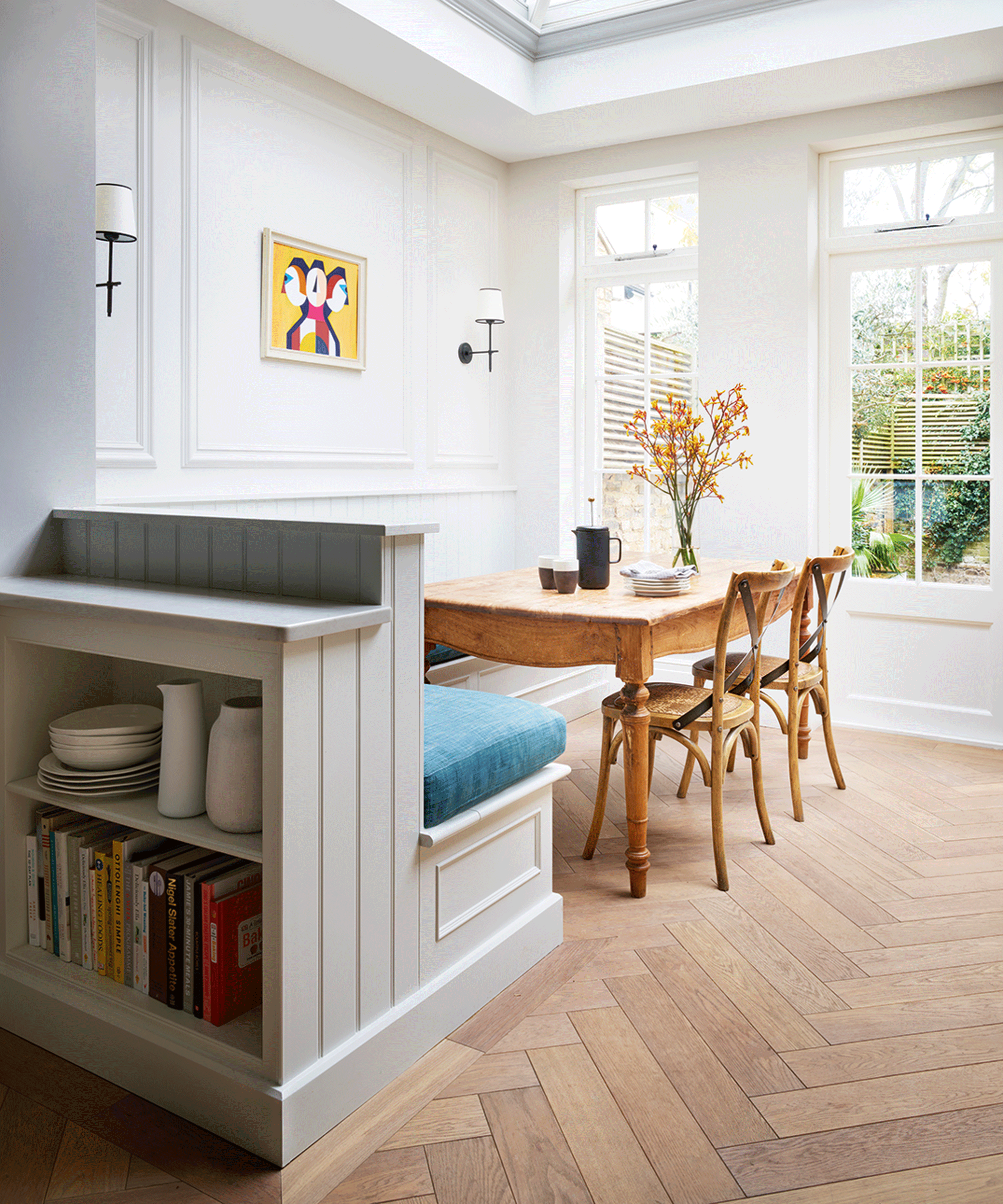
As well as being a stylish spot for dining, the banquette also doubles up as a crucial kitchen storage idea.
A shelving unit – designed to complement the existing cabinetry – has been built on the back, with a countertop for serving, so it acts as a perfect spot to store extra crockery and cookery books.
9. Use different worktops to zone the space
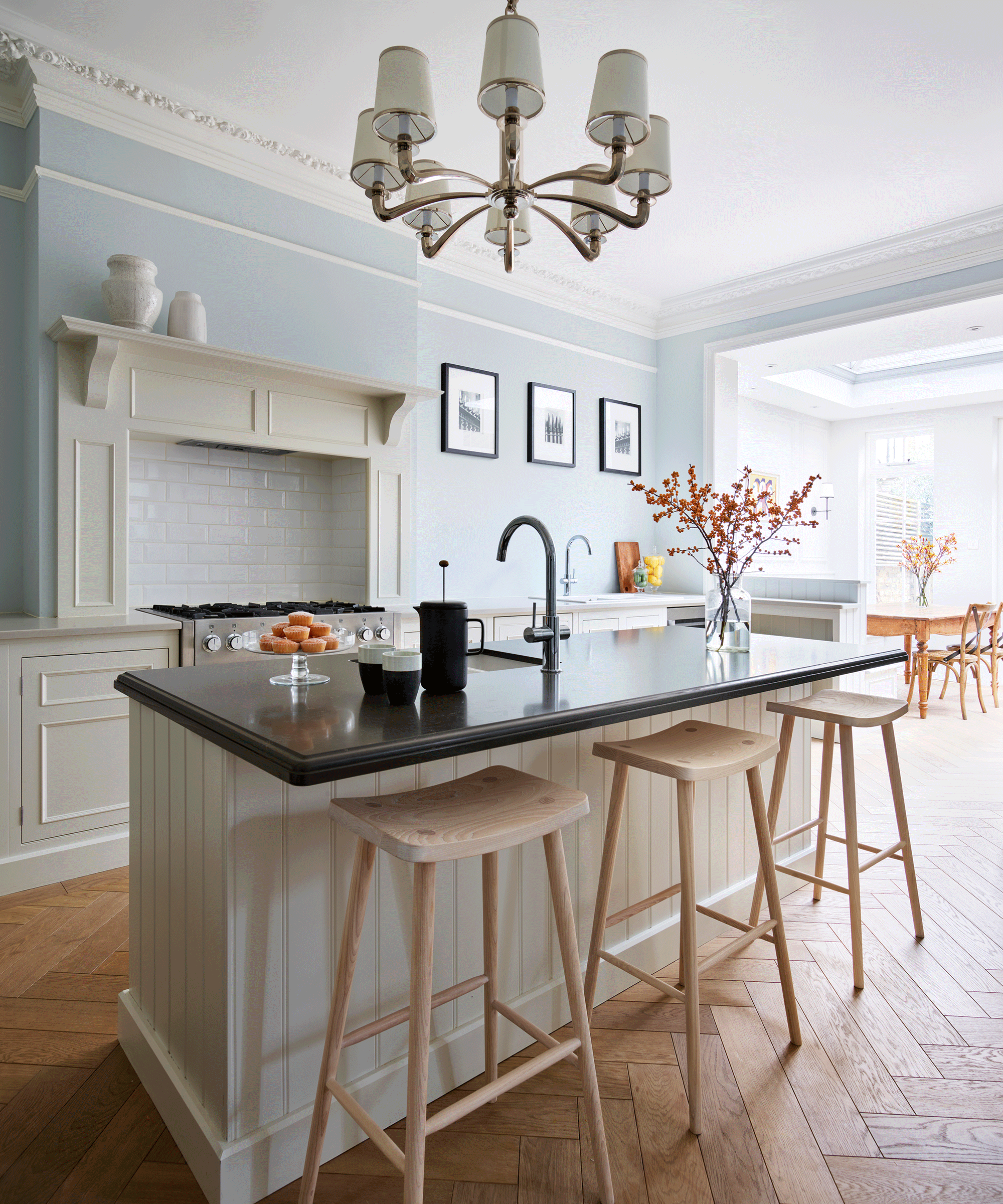
Choosing a different color for your island worktop helps zone the different functions in the kitchen. Here, a dark grey quartz island worktop from Caesarstone highlights the washing area and is an interesting contrast against the light grey in the prep areas.
It also adds definition to the gentle blue and off-white scheme, while natural warmth comes from the oak floor and bar stools
Sign up to the Homes & Gardens newsletter
Design expertise in your inbox – from inspiring decorating ideas and beautiful celebrity homes to practical gardening advice and shopping round-ups.

Amelia Thorpe is a specialist interiors and design journalist, covering every topic to do with homes from fabrics, furniture and lighting to surfaces, kitchens and bathrooms.
As the daughter of an antique dealer and a lifelong collector of old cookery books and vintage graphics herself, she also has a particular expertise in antiques, mid-century and decorative arts of all kinds.
Drawn to homes because of their importance in the happiness of our lives and the enjoyment they can bring, Amelia has been writing about the topic for more than fifteen years. She has interviewed some of the most influential designers of our time, from Piero Lissoni, Antonio Citterio, Jaime Hayon and Arik Levy to Nina Campbell and Robert Kime.
-
 April is the ideal time to prune beautyberry shrubs – for a stunning display of vibrant berries this fall
Whether you choose to trim gently or hard prune, cutting back in spring promotes healthy and productive growth
By Drew Swainston
-
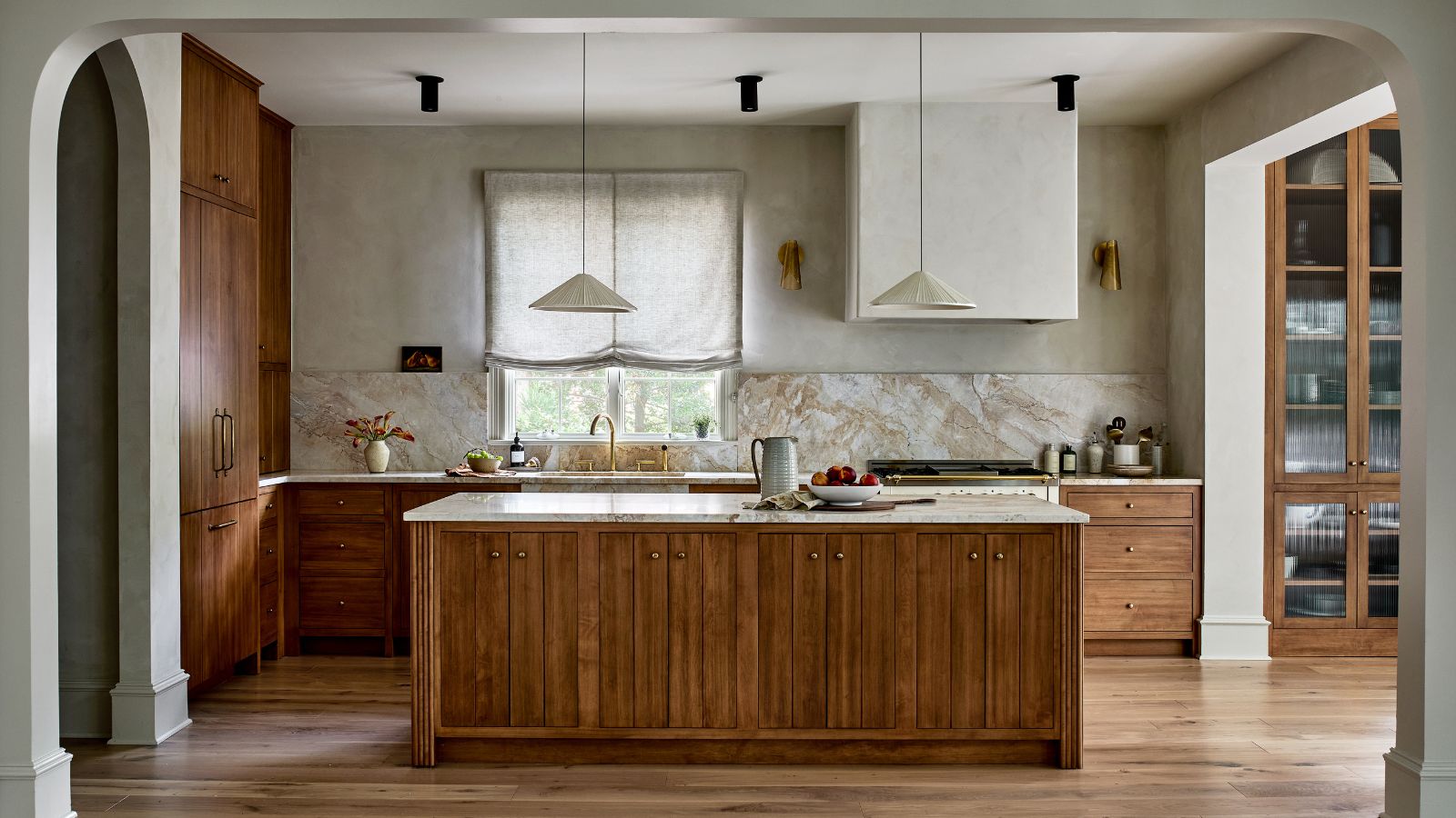 This kitchen has been transformed from cramped and outdated to warm and welcoming – and it's all thanks to a few thoughtful Japandi-style features
Warm wood tones, textural designs, and considered contrast are key to this beautiful transformation
By Molly Malsom