6 design tips to steal from this beachside bolthole in the Hamptons
From oversized windows to keeping it minimalist, find out how to design a house around a breathtaking view
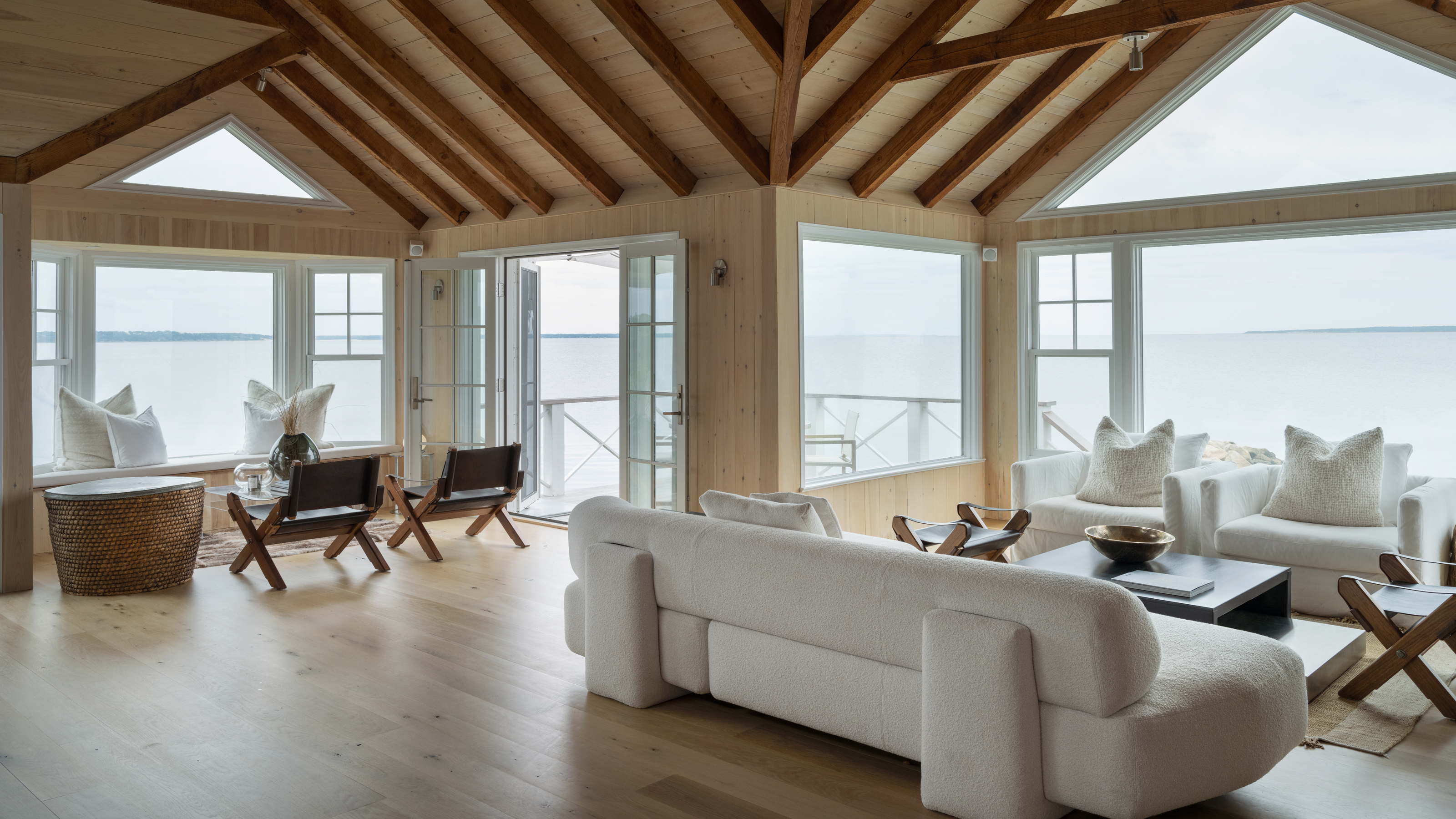

A former fisherman’s home with stunning views of crashing waves, sweeping sandy beaches and undulating grassy dunes – surely there is nowhere better for a back-to-nature escape?
With a breathtaking location that would be the envy of the world's best homes, this house in Amagansett Bay, East Hampton, recently came into the hands of New York-based designer and real estate developer Amalia Graziani of Noor Property Group – and she was determined to make the most of it.
‘I chose to take on this project because I saw incredible potential,’ said Graziani. ‘The structural and aesthetic issues in this house were numerous, but the location and the way the house is situated on the lot are really special.’
The pandemic meant the project lasted 18 months rather than the planned 12, but the impact of being locked down wasn’t entirely negative.
‘It slowed down the process, which is always painful when you've already started construction, but it allowed me to reflect and introduce new elements into the design based on my experience being at home,’ said Graziani. ‘After looking at a lot of clutter in my own workspace, I created more hidden cabinetry and simplified furniture choices.’
The renovated house is now designed to honor its surroundings first and foremost. Graziani gave us a tour, and explained how she built a home around a spectacular view.
1. Warm up a space with wood paneling
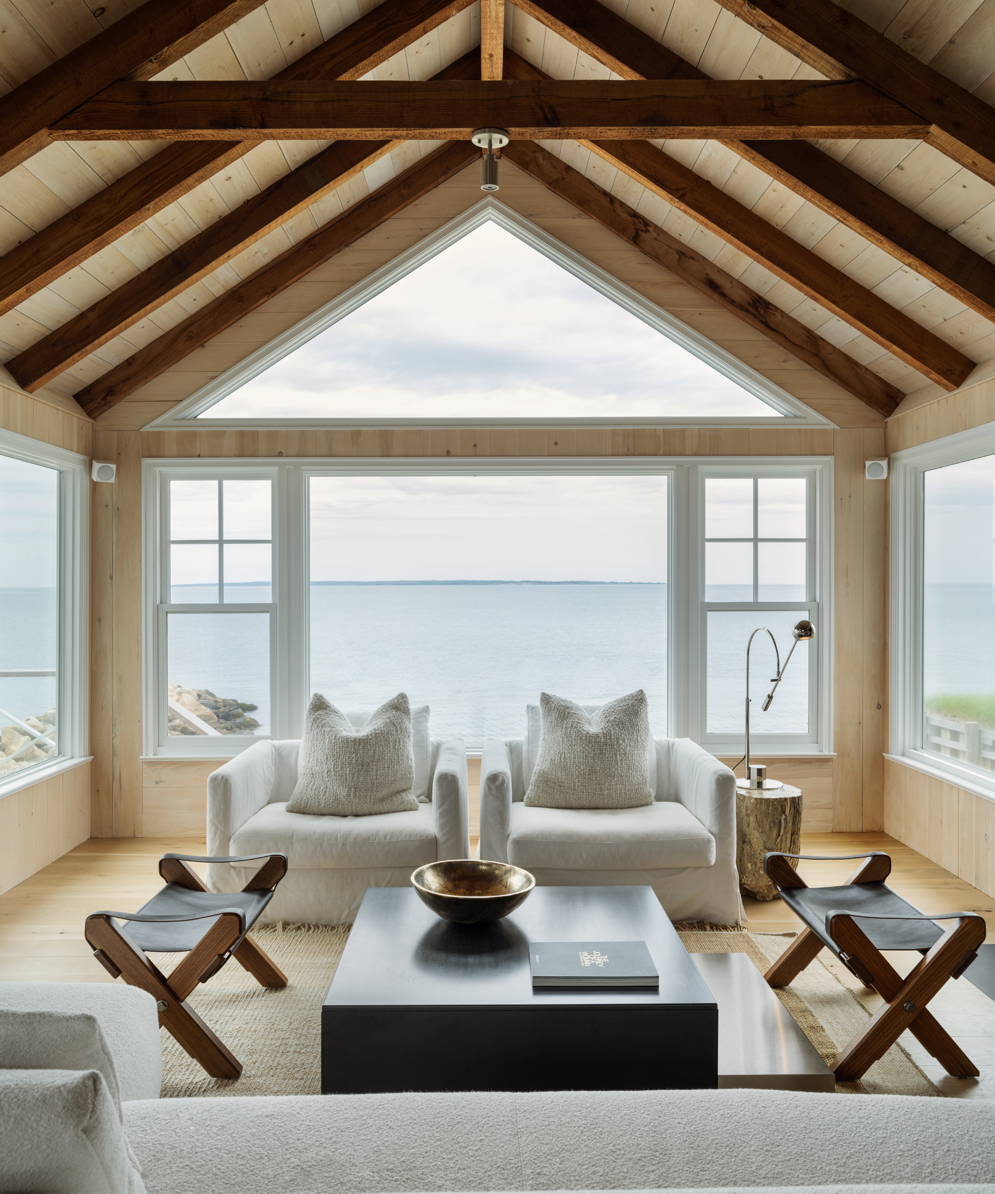
Head up the external steps of the house, and you’ll enter through the Great Room – and yes, it lives up to its name. ‘The room is oversized with windows on three walls and dramatic vaulted ceilings,’ says Graziani. The challenge with the living room ideas was not making an impact, but keeping the room feeling cozy.
‘The space is great for gathering, but felt cold prior to renovating,’ explained Graziani. ‘To offset this, I introduced unfinished oak wood paneling on the walls. It warms up the space and keeps a calm, uniform palette throughout. I created several seating nooks here, which foster intimate discussion and keeps the room from feeling cavernous.’
2. Keep it minimalist in the kitchen
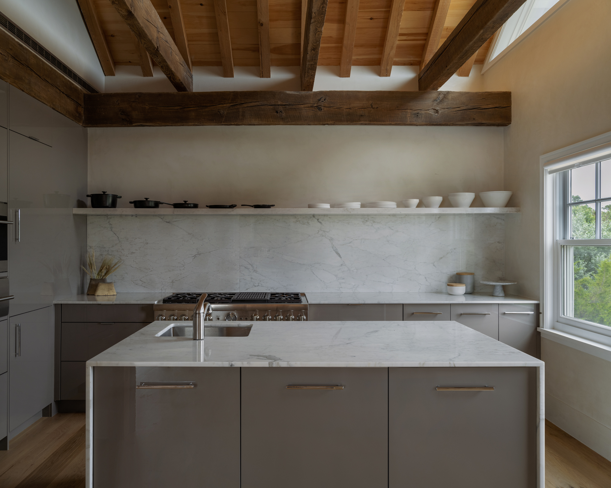
‘The kitchen is my favorite room in the house,’ said Graziani. ‘I wanted to create a room that hid all kitchen supplies. The refrigerator and cabinetry is tucked away into floor-to-ceiling grey paneling from Hans Krug.’
Minimalism largely reigns over Graziani’s kitchen ideas, with the exception of its luxurious marble countertops and backsplash. To ensure these stood out, Graziani worked hard to keep the back wall as simple as possible.
‘To keep a clean wall above the range, I bypassed a traditional hood,’ she explained. ‘There is a ventilation system hiding behind the large horizontal beam that bisects the wall. I didn't find many resources online about how to do this, so it was a fun challenge to create this solution with my team.’
3. Set the scene with oversized windows
‘Every design decision in this home is oriented around the view and the light coming into the space,’ said Graziani. With such a unique panorama on the doorstep, Graziani knew she needed to make the most of it. ‘The house is very close to the water, so the view is very dramatic and you can feel like you're on a boat. To draw the eye outward, I added oversized windows and kept the interior palette very neutral.’
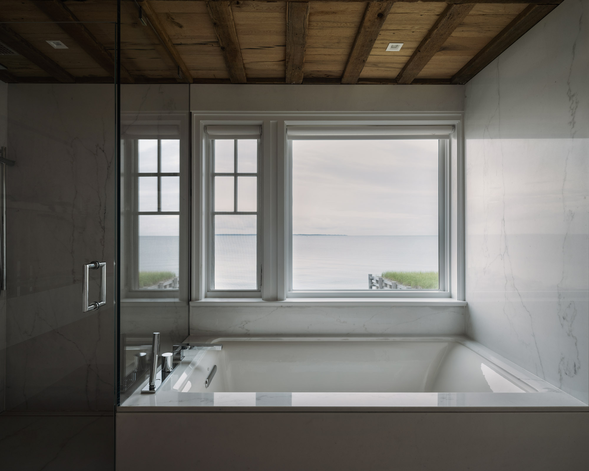
As well as the large windows that follow the vaulted ceilings upwards in the main room, Graziani used a similarly wall-filling window arrangement in her bathroom ideas, allowing a bathing incumbent to relax alongside uninterrupted views of the skies and seas.
4. Forgo art and let the view be the masterpiece
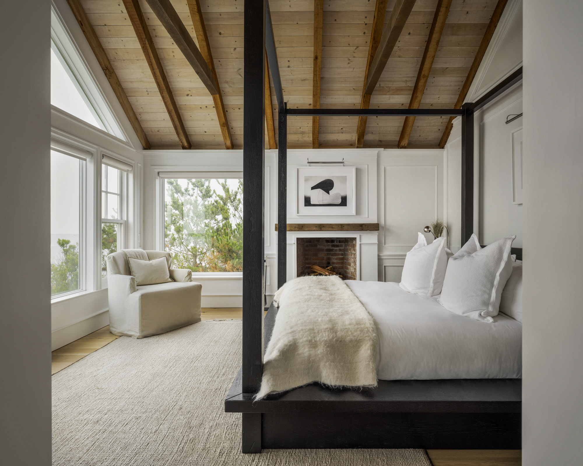
Paring back the interiors to clean neutrals was also part of Graziani’s strategy to ensure the view remained the star throughout the house, including among the bedroom ideas.
‘In the upstairs bedrooms I brought bright white paneling into the mix,’ explained Graziani. ‘I have so much fun designing custom millwork and this project was no exception. The bedrooms have very dramatic windows, so using paneling on the walls instead of wall art keeps the views of nature in focus.’
5. Mix rustic and slick textures
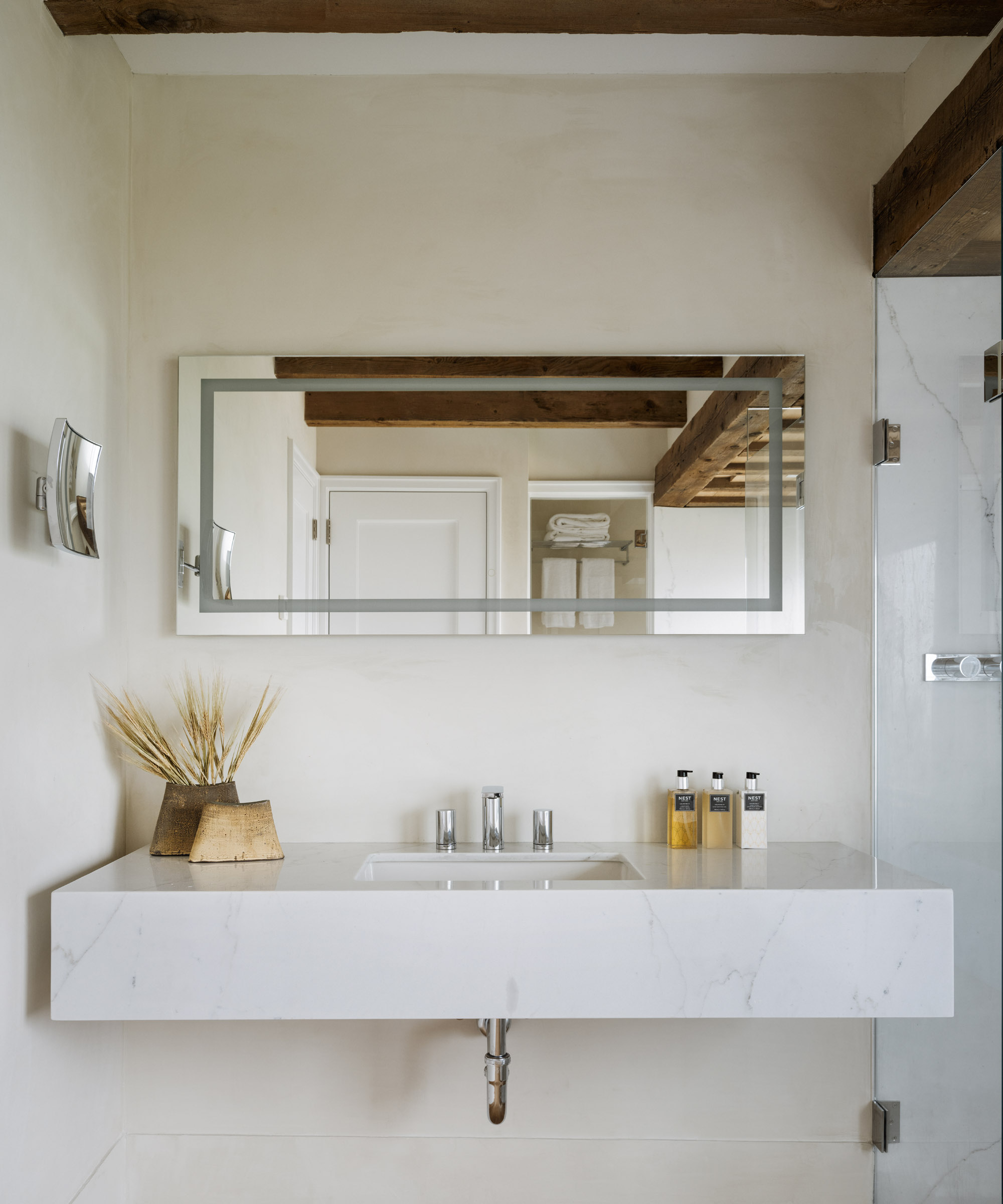
To keep this simple scheme feeling interesting, Graziani took careful consideration with her use of textures, choosing materials that not only reflected the natural world beyond the windows, but created intriguing contrasts.
‘The passageways and bathrooms were treated with a Venetian plaster that has a bit more shine than you’d expect,’ said Graziani. ‘It reflects light and offsets the very rough antique beams we chose for the ceilings.’ In this bathroom, the crisp geometry of the sink and walk-in shower is emphasized by polished white marble, its straight lines contrasting with the undulating beams.
6. Use black accents to add drama to a neutral scheme
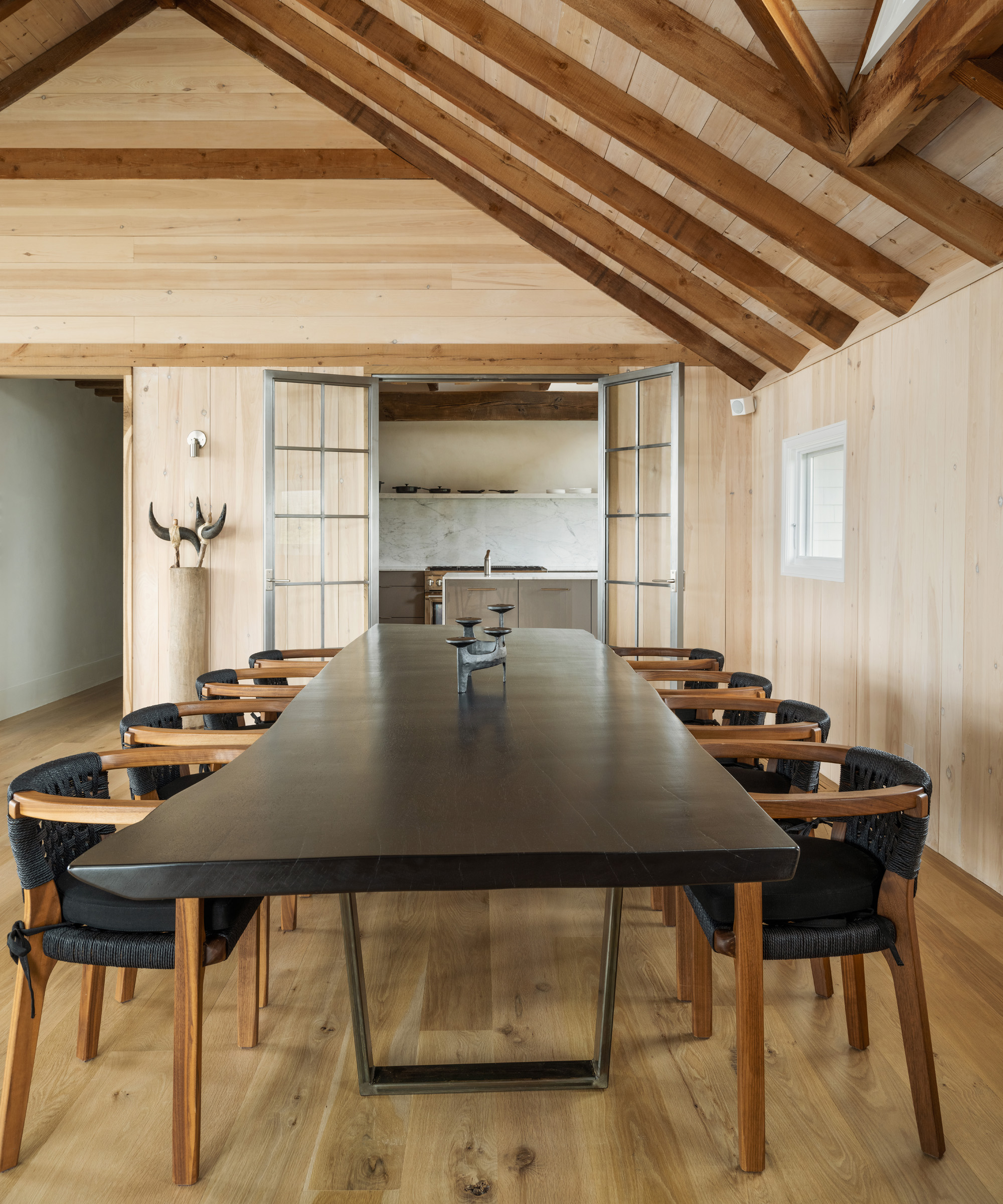
While visual interest is more taken care of by the stunning vista, the neutral scheme still needed a little drama to match up to it. To reflect the architectural awe of the beamed ceilings, structure is given to the lower half of many of the rooms with accents of black.
In the bedroom, this comes in the form of a black four poster bed by RH; the living areas feature black side tables and a coffee table by Zeus, while shelves are decorated with simple black ornaments from Love Adorned. The dining room ideas are dominated by a long, irregularly shaped table in dark wood, and black leather chairs by Roman and Williams Guild.
Interior Design / Amalia Graziani of Noor Property Group
Photography / Alice Gao
Sign up to the Homes & Gardens newsletter
Design expertise in your inbox – from inspiring decorating ideas and beautiful celebrity homes to practical gardening advice and shopping round-ups.

Ailis started out at British GQ, where a month of work experience turned into 18 months of working on all sorts of projects, writing about everything from motorsport to interiors, and helping to put together the GQ Food & Drink Awards. She then spent three years at the London Evening Standard, covering restaurants and bars. After a period of freelancing, writing about food, drink and homes for publications including Conde Nast Traveller, Luxury London and Departures, she started at Homes & Gardens as a Digital Writer, allowing her to fully indulge her love of good interior design. She is now a fully fledged food PR but still writes for Homes & Gardens as a contributing editor.
-
 How to clean a patio – 6 different methods, and when you must use a chemical cleaning agent
From manual scrubbing, natural solutions or calling in the pros, industry experts reveal the benefits and considerations of each method
By Andy van Terheyden Published
-
 Kris Jenner's favorite air fryer, the Ninja Crispi, is the perfect small kitchen solution – it deserves a place on the most compact of countertops
Kris approves of this compact yet powerful air fryer, and so do our own kitchen appliance experts, praising it for its multifunctionality
By Hannah Ziegler Published