9 ideas for creating eye-catching focal points in a New York newbuild apartment
Interior designer Eric Winnick has injected personality and pizazz into this newbuild, resulting in a chic and sumptuous loft-like home

Design expertise in your inbox – from inspiring decorating ideas and beautiful celebrity homes to practical gardening advice and shopping round-ups.
You are now subscribed
Your newsletter sign-up was successful
Want to add more newsletters?
The clients of New York based designer Eric Winnick of E Lawrence Design struggled to find the perfect home. They had raised their children on Long Island but when they became empty nesters they decided to move back to Manhattan, location of many of the world's best homes.
Having searched for a property for almost two years, they found this beautiful newbuild apartment but almost walked away from it because of the structural wall between the living and dining rooms.
Fortunately, Eric came up with a creative solution that changed their minds about buying the apartment, and he then set about fulfilling their brief of creating a modern, loft-like home that was warm and chic. The result is an elegant neutral interior awash with sumptuous touches.
Article continues below1. Create a dramatic feature wall
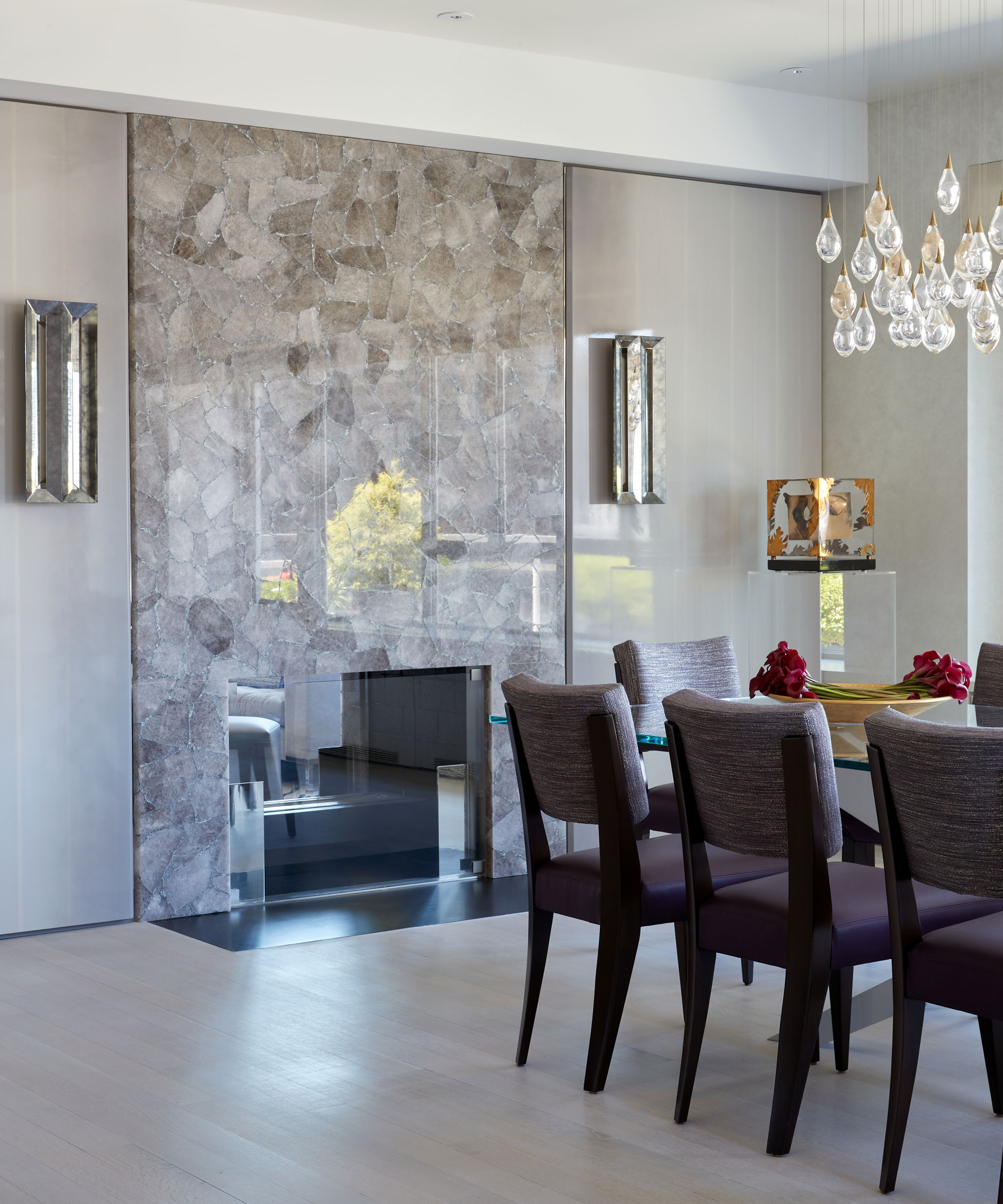
Eric's clients almost didn't buy the apartment because of the wall between the dining and living room, which you see as soon as you enter the apartment.
One of Eric's dining room ideas was to make the wall a focal point of the home by cladding it in a smoky quartz with custom ombre wood panels and polished nickel, and installing a pass through fireplace, which is a great feature for entertaining. 'The wall separating the living room and dining room is my absolute favorite,' he says. 'It is elegant, sleek and comprised of subtle details that make it special.'
2. Hang statement lighting
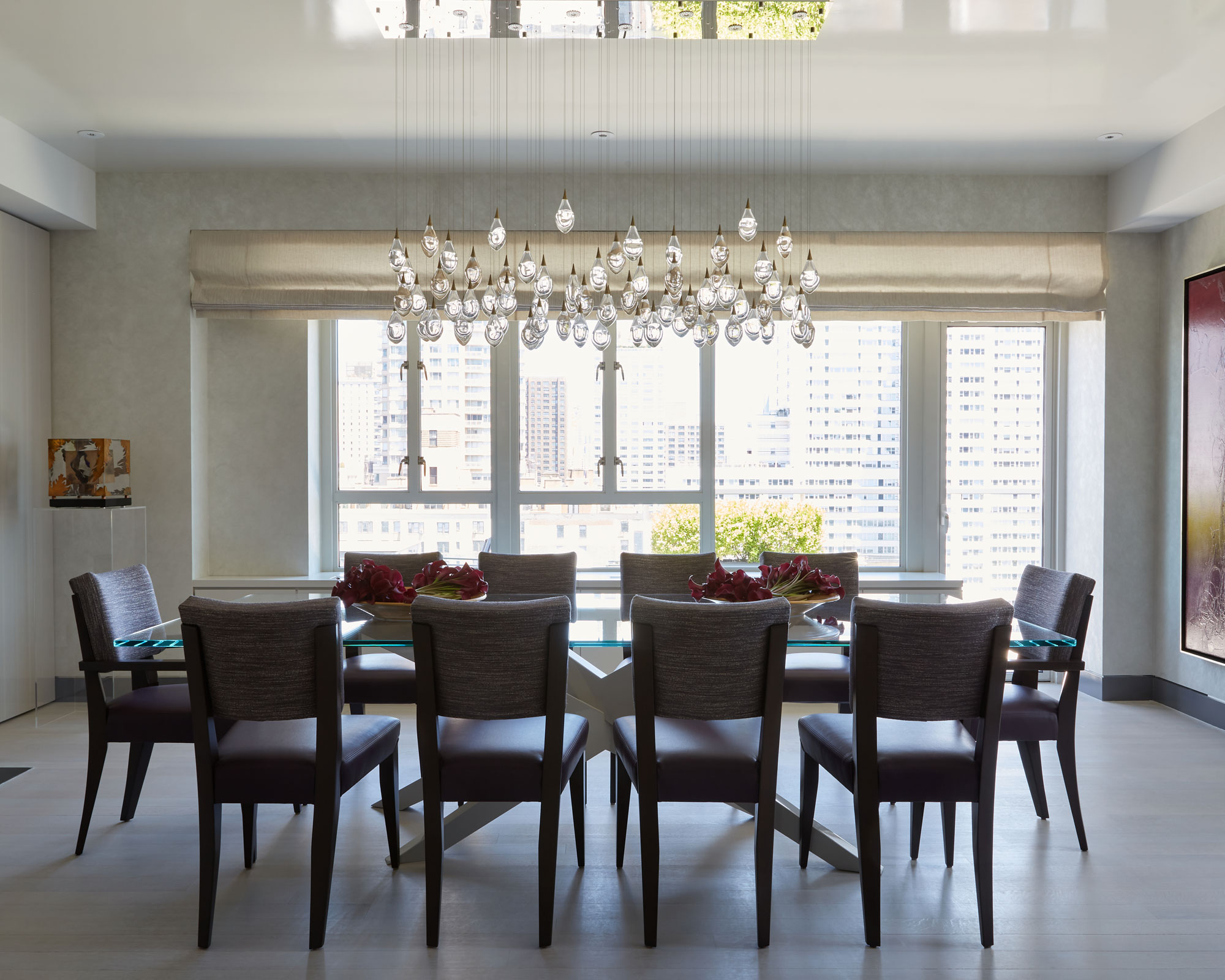
Eric wanted to draw the eye into the space and has used a dramatic chandelier by Studio Bel Vetro consisting of glass drops that appear to float in mid air, as well as capturing the light from above. Eric has enhanced the light and ethereal feel with a glass dining table that seats 10 on a regular day but can accommodate more as needed.
3. Bring in striking artwork
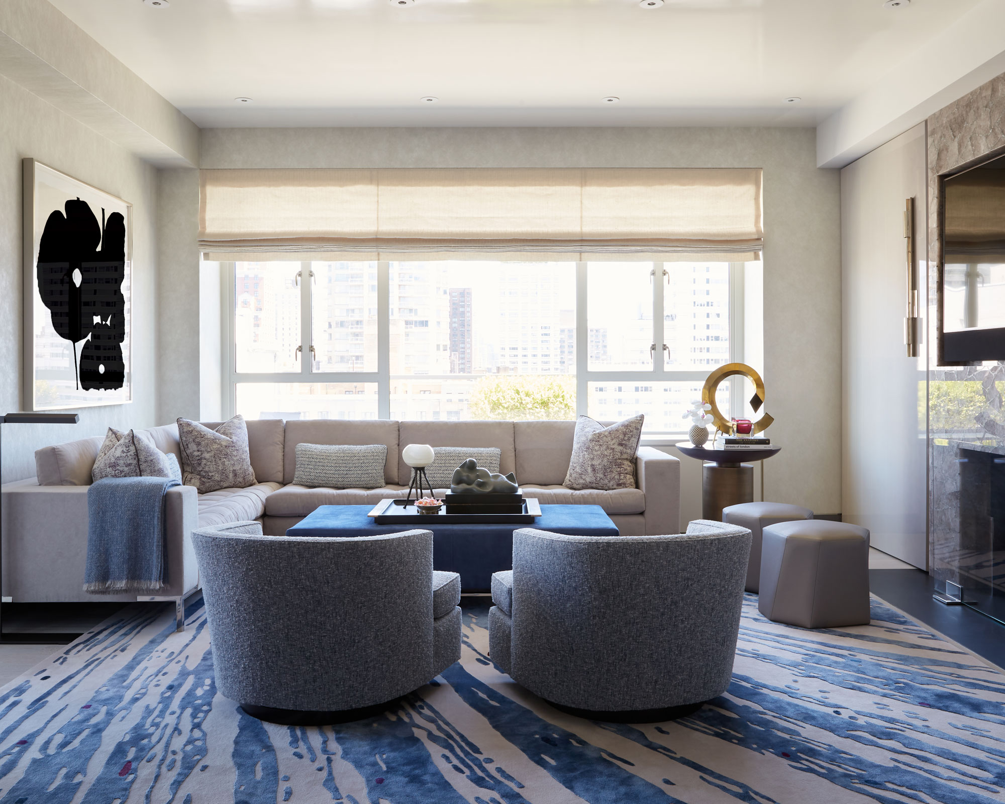
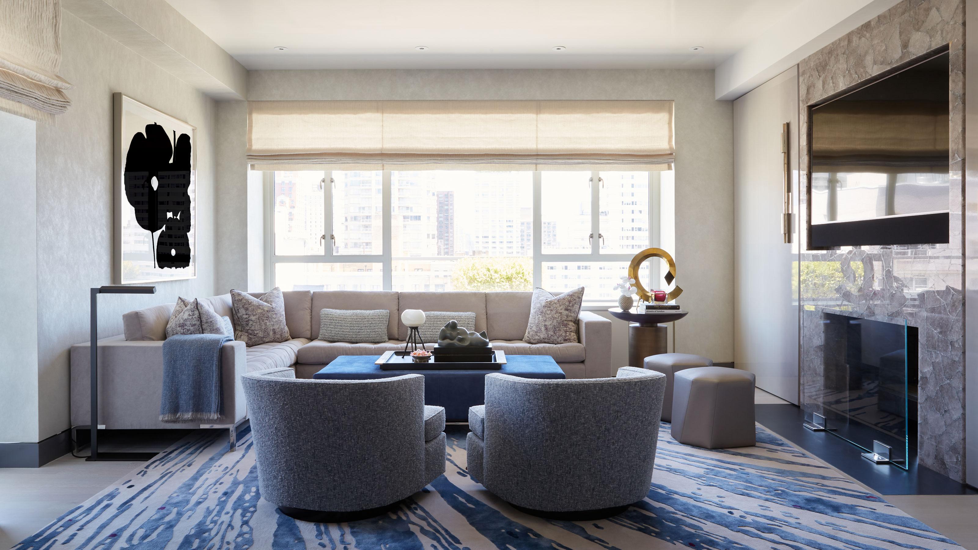
Living room ideas include breaking up a plain wall with an eyecatching artwork. Artwork is great for helping a scheme feel more cozy and lived in. The dark tones of the monochrome poppy print here balance those of the TV on the opposite wall.
Design expertise in your inbox – from inspiring decorating ideas and beautiful celebrity homes to practical gardening advice and shopping round-ups.
4. Incorporate a colorful floating desk
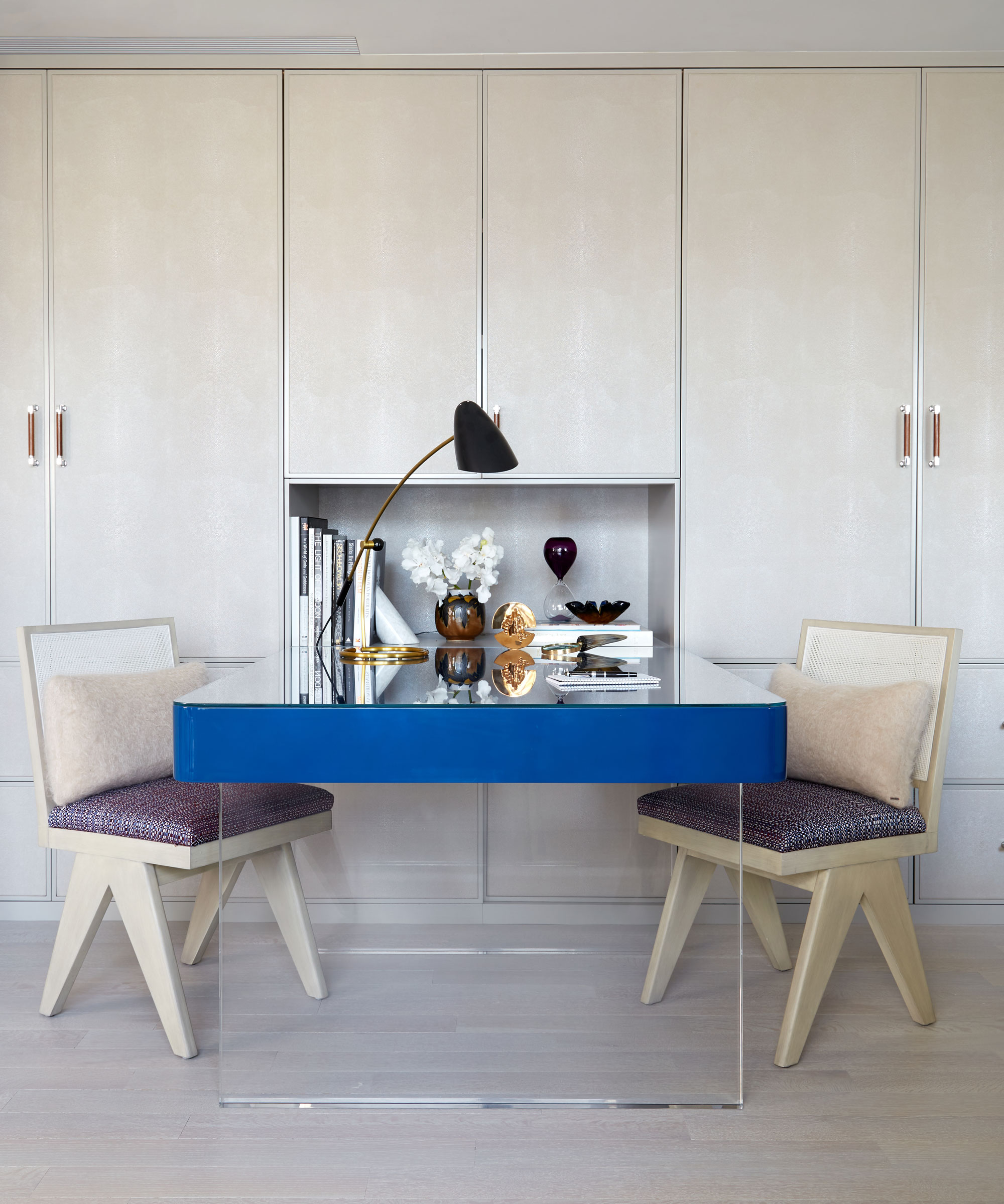
In the home office, Eric introduced bespoke lacquer cabinets with shagreen door fronts. Among his clever home office ideas was a floating desk in a blue high gloss lacquer to add a pop of color.
The walls of this area were removed so that it is open to the living room and it's a great space for both husband and wife to work together when necessary, but also retreat to individually. With music being a family passion, the piano lives here too, allowing for a natural transition into a musical space.
5. Install a stylish glass door
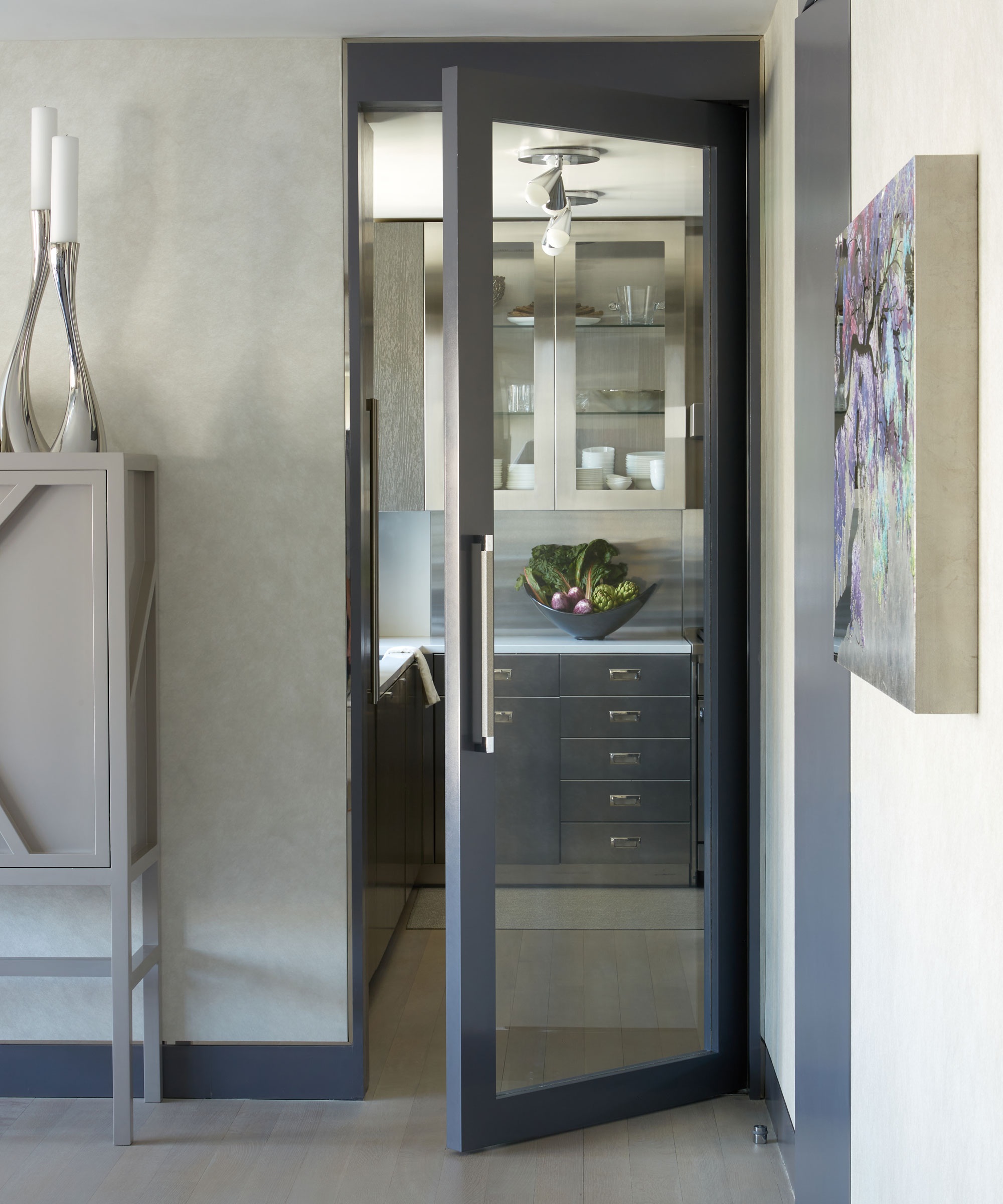
The kitchen was brand new, but Eric made some modifications. Among the kitchen ideas was replacing the kitchen entry door with a glass one, creating light flow and visibility and helping the apartment to retain an open plan feel.
6. Introduce a sumptuous headboard
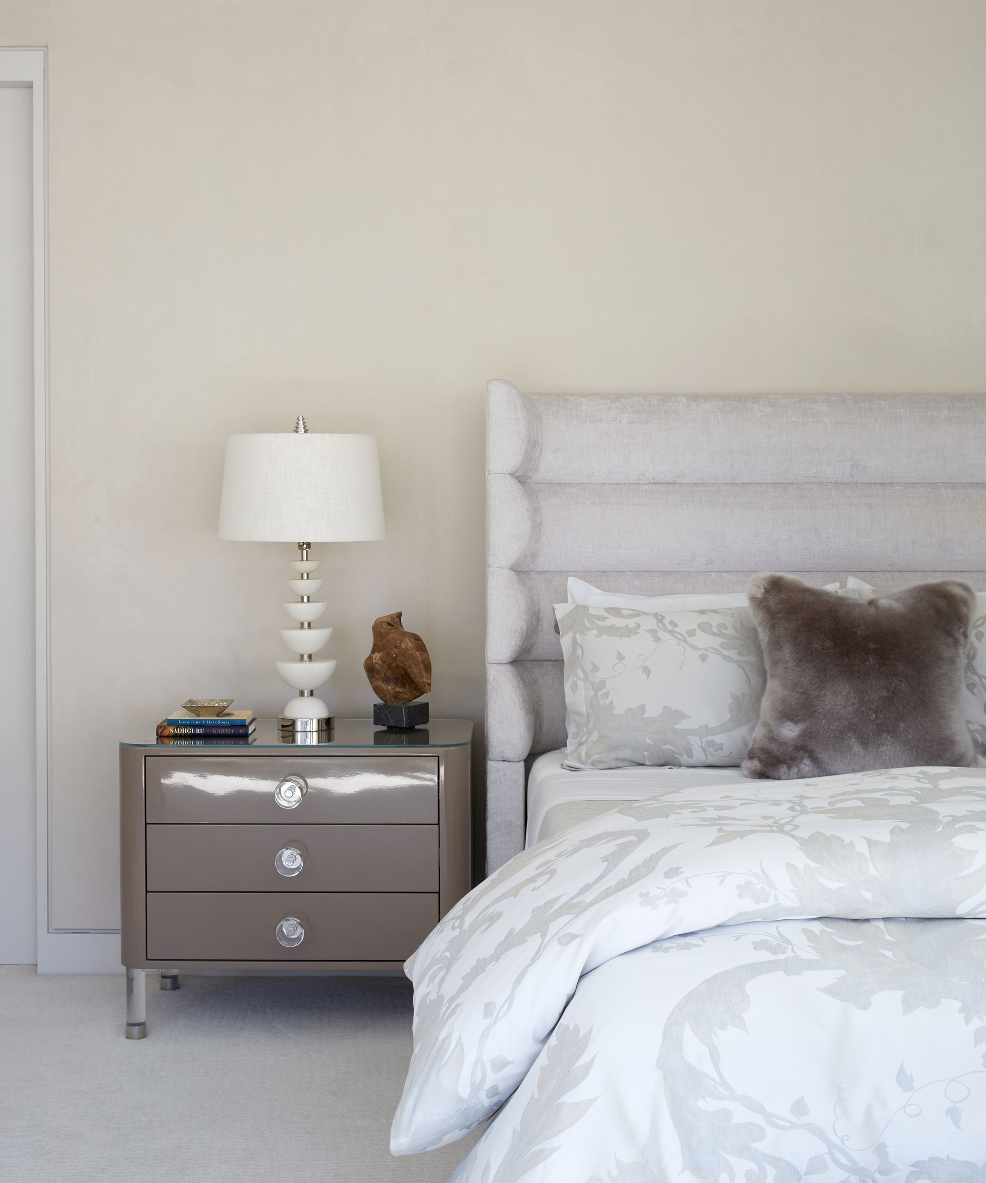
Eric's brief was to create a serene and luxurious space in the main bedroom. One of his bedroom ideas was to draw the eye to the bed by incorporating a headboard with a soft wing detail, upholstered in a warm and inviting fabric. 'I wanted something that was interesting in detail and cozy in texture,' says Eric.
7. Inject elegance with vintage furniture
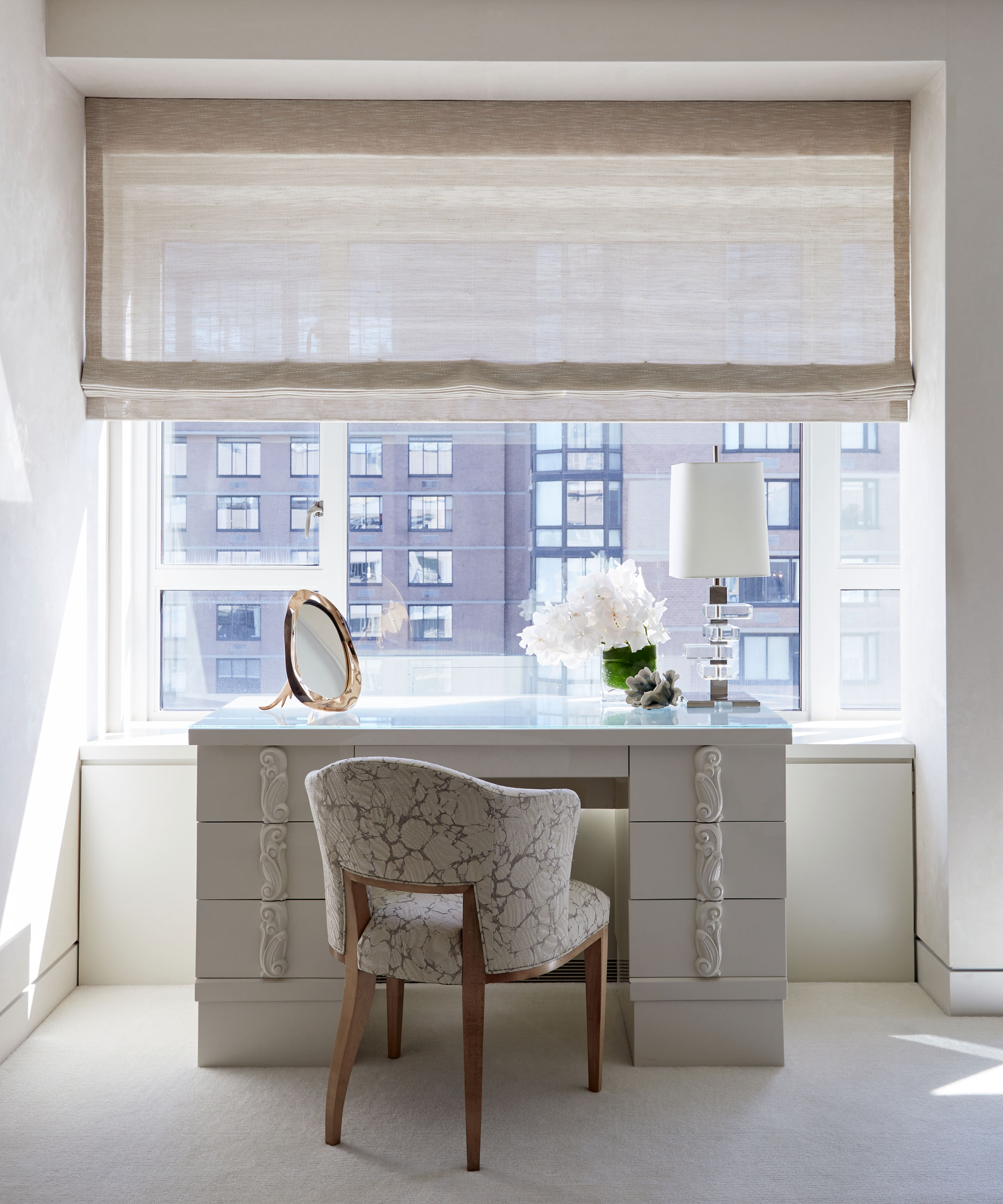
Eric made the most of the window space by sourcing a vintage lacquer dressing table with scrollwork detailiing to provide the perfect area for the wife to get ready while watching the city below. A voile blind allows light to filter through but provides privacy.
8. Create a sumptuous reading nook
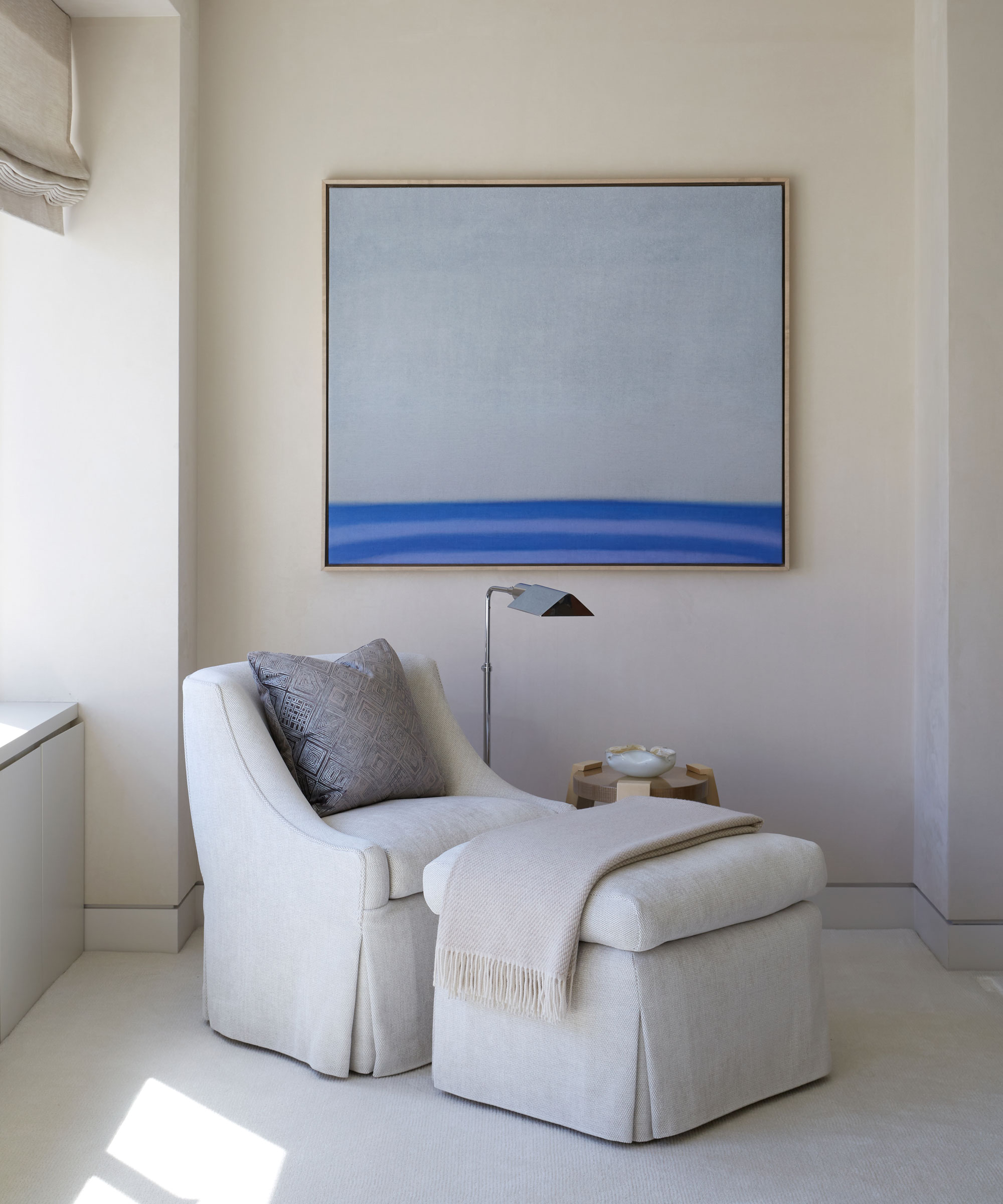
In a cozy corner of the main bedroom, Eric has introduced a boucle upholstered chair and ottoman to pave the way for the perfect reading nook. An angled floor lamp provides task lighting. As a finishing touch, Eric has hung statement artwork to define the space and inject color.
9. Evoke atmosphere with a backlit quartz worktop
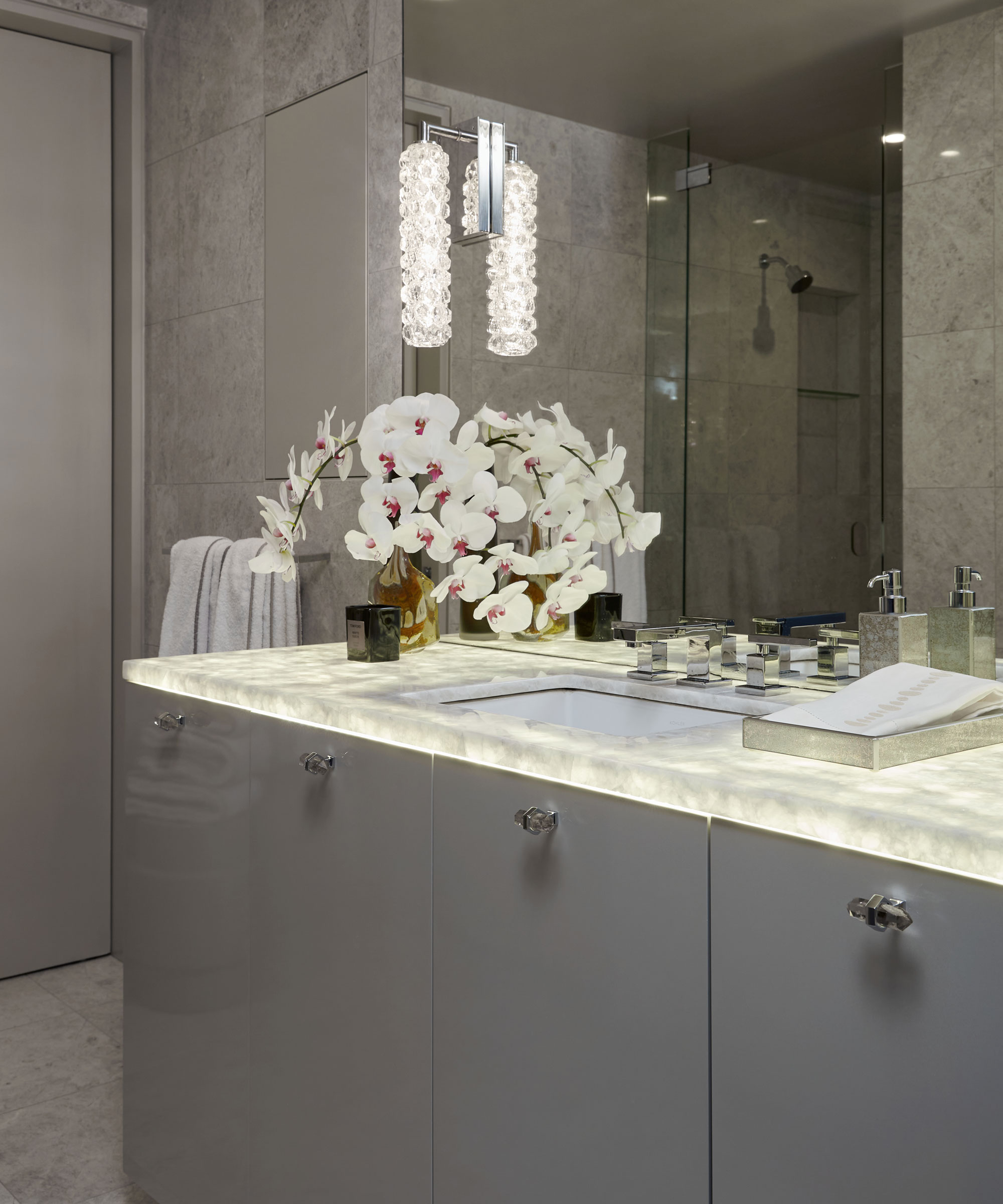
Eric wanted to elicit a sophisticated and chic jewel box feel in the powder room. Among his bathroom ideas was introducing a backlit quartz countertop to create the wow factor. Eric has further enhanced the jewel box feel with crystal sconces.
Interior design E Lawrence Design
Photography Reid Rolls

Interiors have always been Vivienne's passion – from bold and bright to Scandi white. After studying at Leeds University, she worked at the Financial Times, before moving to Radio Times. She did an interior design course and then worked for Homes & Gardens, Country Living and House Beautiful. Vivienne’s always enjoyed reader homes and loves to spot a house she knows is perfect for a magazine (she has even knocked on the doors of houses with curb appeal!), so she became a houses editor, commissioning reader homes, writing features and styling and art directing photo shoots. She worked on Country Homes & Interiors for 15 years, before returning to Homes & Gardens as houses editor four years ago.