6 design tips to steal from this refreshed century-old home in Philadelphia
Blending comfort and style was key in Melinda Kelson O'Connor Design's update of this Colonial Revival home
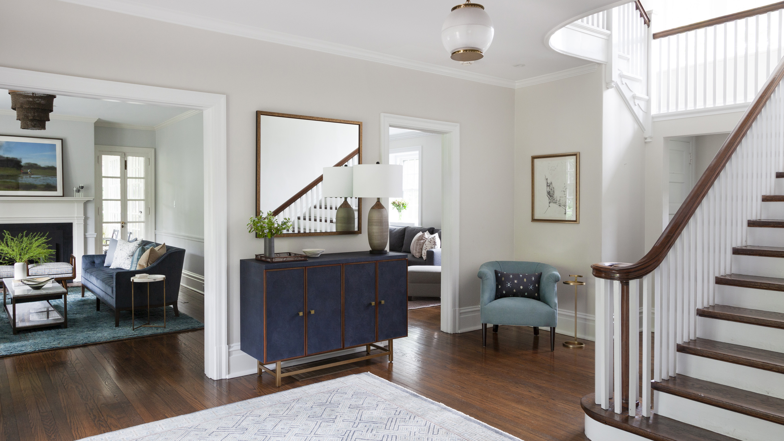

When Shana Teitelbaum and James Manchester relocated their family from New York City to Chestnut Hill, otherwise known as Philadelphia’s Garden District, it wasn’t just the location that marked a big change.
The family upgraded from a city apartment to this much larger Colonial Revival style house, and called upon Melinda Kelson O’Connor Design to help make it feel like home.
‘The clients wanted to create a modern yet warm and welcoming aesthetic while respecting the character of their 1911 stone home,’ said Founder Mindy O’Connor.
‘They have a large family, host most holidays, and entertain friends, so must-haves were ample seating with beautiful but enduring and durable materials that can handle kids and real life,’ said O’Connor. ‘While the decor is crisp and thoughtful throughout, nothing is too precious or unapproachable.’
O’Connor’s design amalgamates the client’s need for comfort and function with style worthy of hosting a serious party – necessities for all of the world’s best homes – as well as bringing the past up to date with contemporary touches.
‘The end result strove to blend a simple, modern yet timeless feel with pieces that still suit the historic nature of the home,’ she said. O’Connor took us on a tour of this deftly refreshed property, and shared her tips for making a historic house a very modern home.
1. Choose bold colors, but ensure they don’t overwhelm
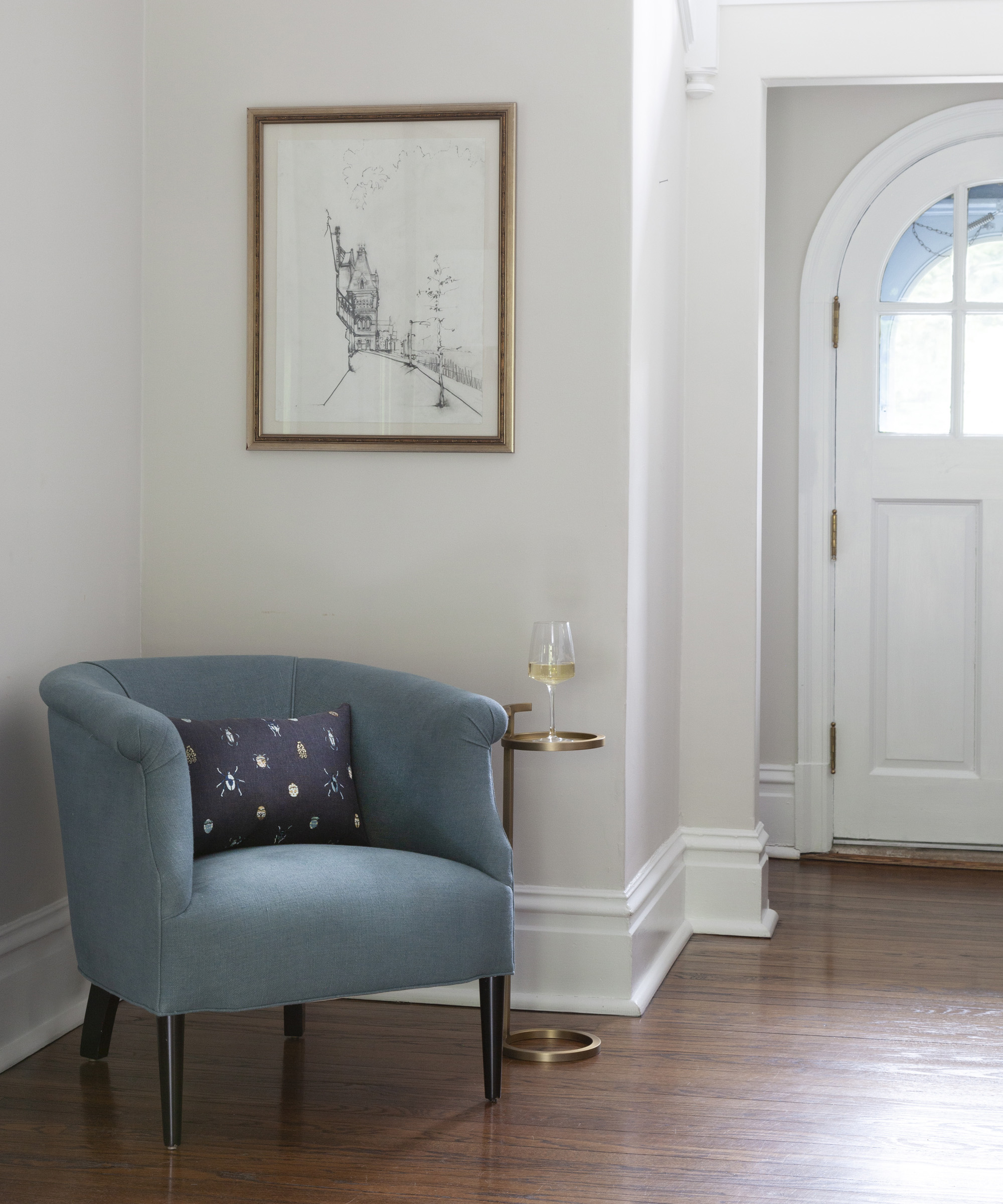
From the foyer to the living room, the ground floor of the largely neutral home is peppered with enlivening accents of blocked color, mainly in invigorating blues.
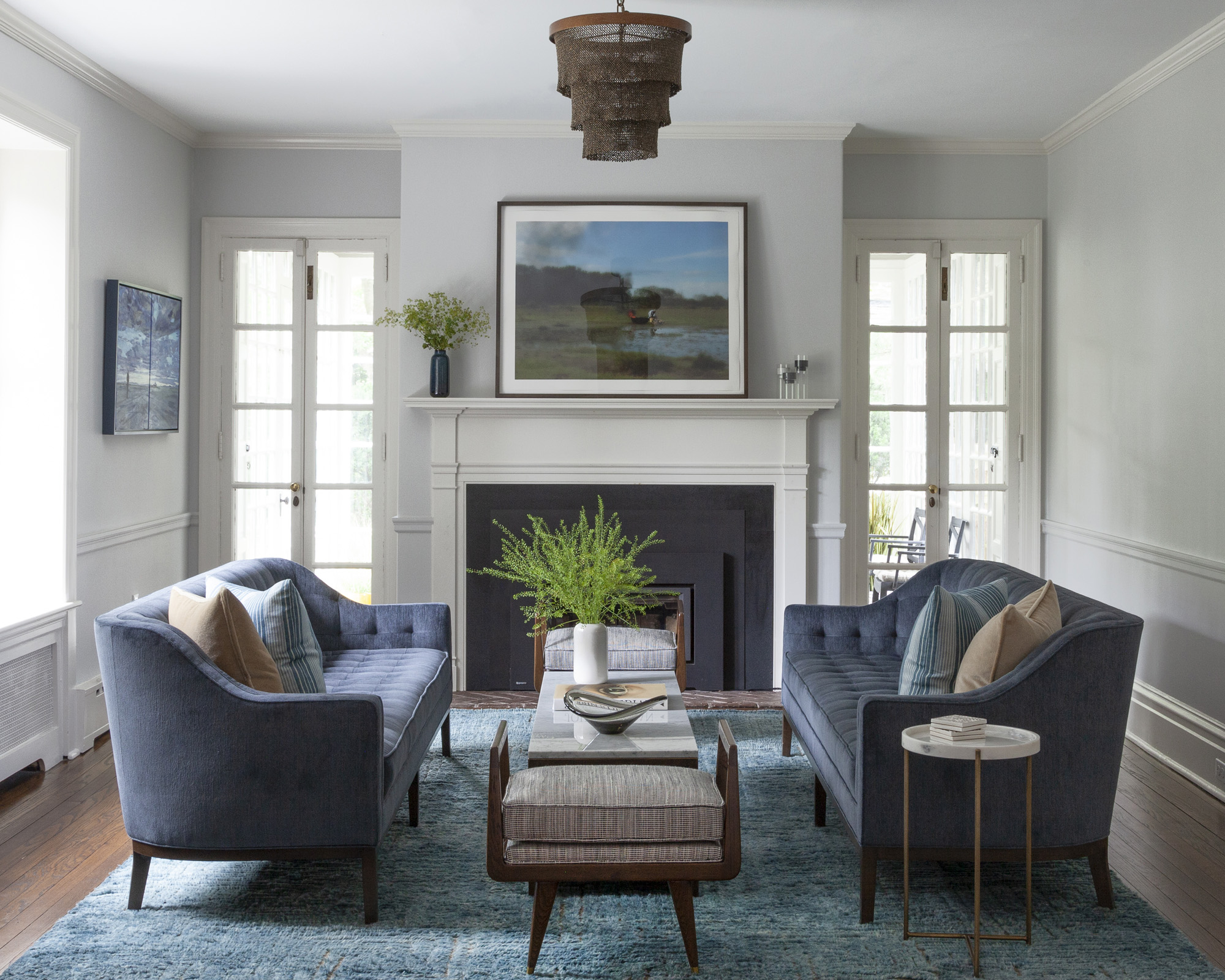
‘The clients desired strong colors to make the spaces feel vibrant, but not overwhelm the design,’ explained O’Connor. ‘I love the living room for its juxtaposition of serenity and boldness, with symmetrical custom tufted curving blue couches.’
Texture is the key to reigning in these strong color choices. In the foyer, this corner armchair in a tone of cyan creates a relatively dramatic accent among O’Connor’s hallway ideas, but its impact is softened by the textured weave of the linen upholstery.
2. Highlight period features with crisp white
At more than a century old, this house is filled with absorbing period features. In order to both celebrate and modernize them, O’Connor chose to pick out characterful parts of the woodwork with paint.
‘The curving banister and historic details are highlighted by crisp white trim, introducing this classic home,’ she explained, which saw her contrast the white with dark, polished wood accents.
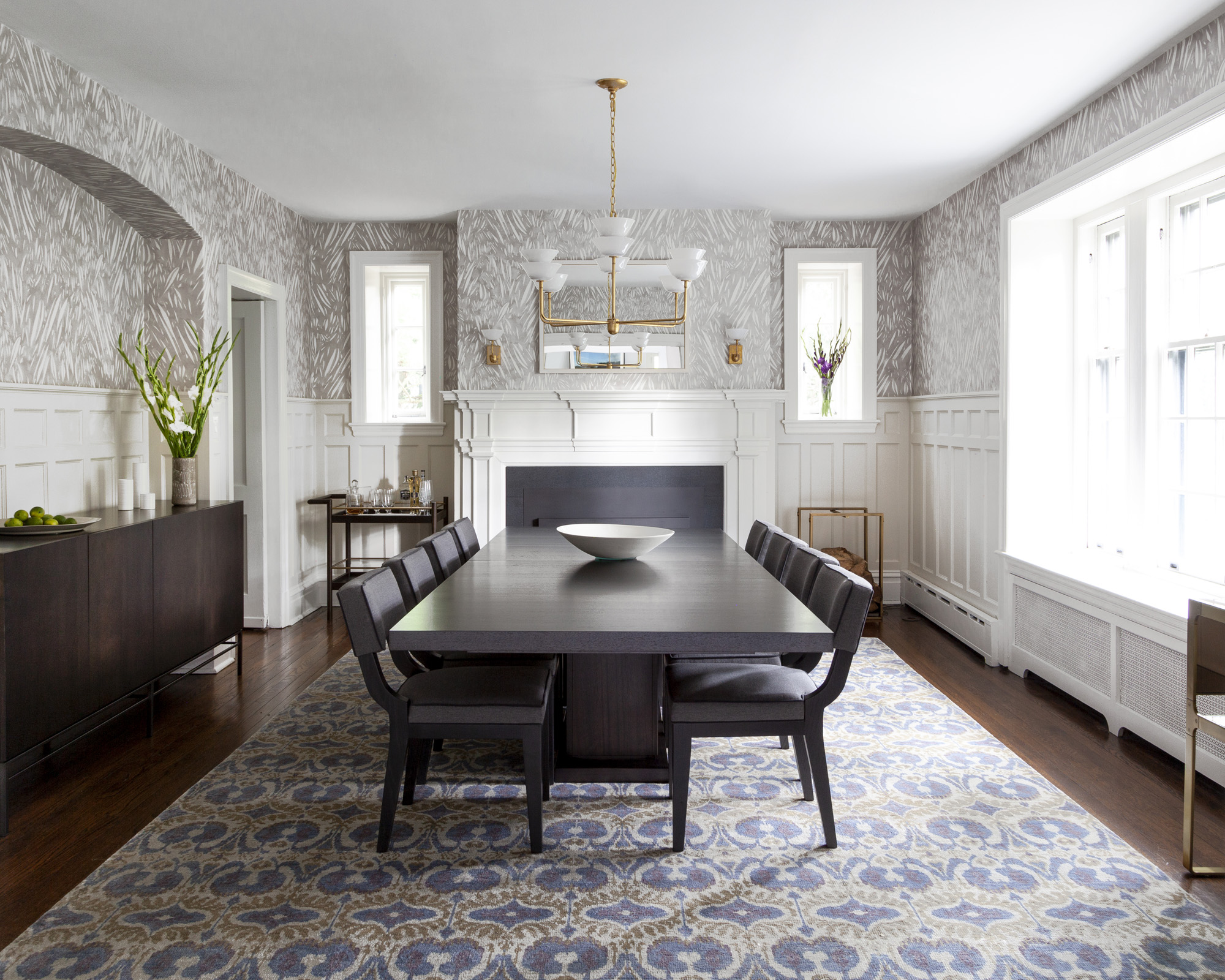
This clean approach to spotlighting period features continues into O’Connor’s dining room ideas, where the fireplace and paneling are also picked out in white. ‘The historic millwork and paneling in the dining room sets up a classic and neutral base for the lively wallpaper above,’ said O’Connor.
3. Use textiles to make formal layouts welcoming
Throughout the ground floor, fabrics are used to soften not only the color scheme, but also the sense of formality that the Colonial Revival layout conveys. ‘The patterned wool rug in blues and light grays – with a hint of pink – is subtle and welcoming on entry,’ said O’Connor.
Textiles are also crucial in allowing O’Connor’s living room ideas to fulfil multiple functions. ‘This room is a lovely mix of cozy and elegant. It is comfortable for relaxing by the fire and yet dressed up for entertaining,’ she said. ‘The soft hand knotted rug grounds the space with its deep color and offsets the formality of the symmetrical couches, benches and marble cocktail table.’
4. Pair blues with earthy tones and textures
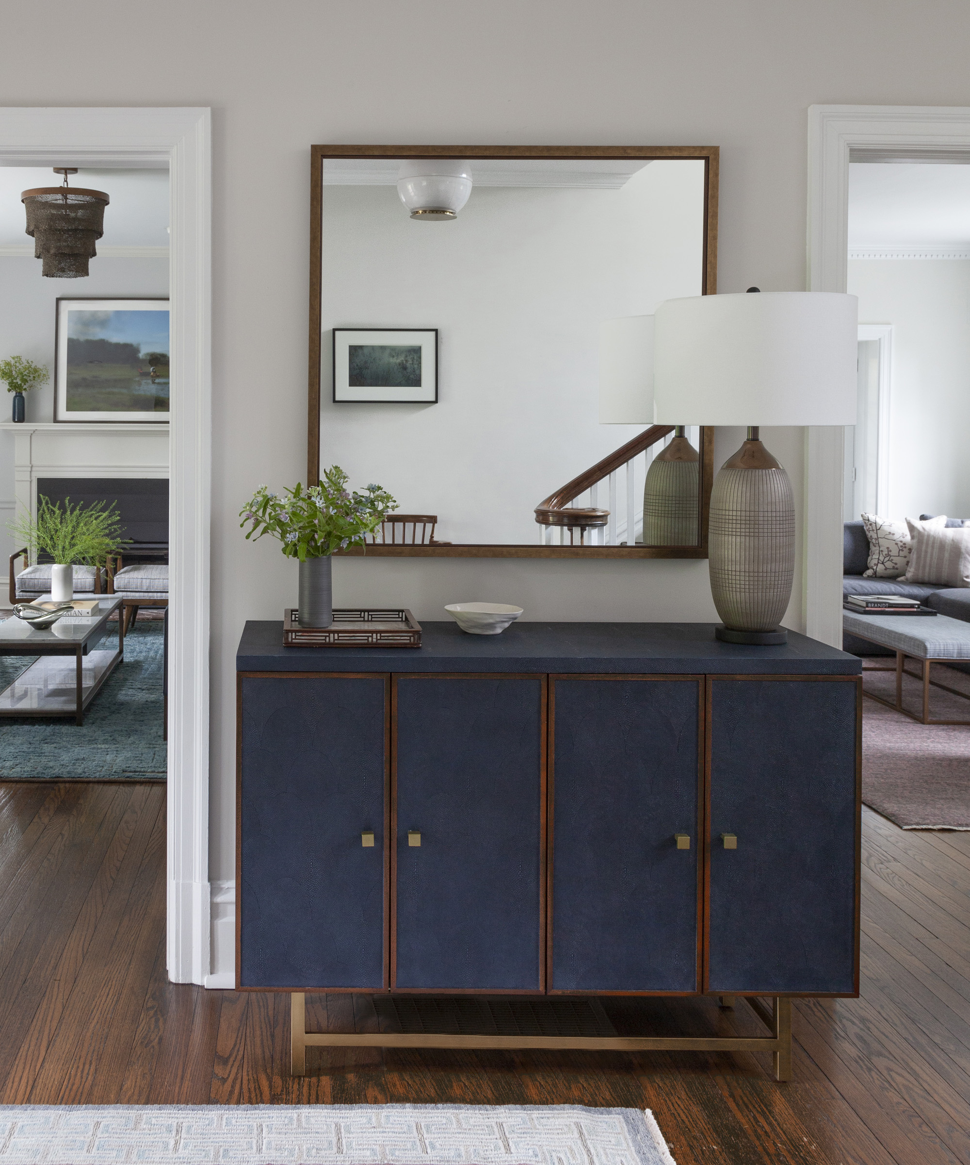
From entering the foyer, it is clear that blue reigns supreme is this scheme. ‘The navy console, wood accents and linen chair set up the color story that will reappear in other spaces,’ explained O’Connor.
This pairing of richly hued blues with brown wood is key in keeping the scheme warm and inviting. ‘The bronze earth tones of the chandelier add a warm contrast to all of the powerful blues,’ said O’Connor of the living room. Elsewhere, hints of pale pink and gleaming brass accents in the side tables and further light fittings add layers to this warmth.
5. Artwork adds elegance to relaxed rooms
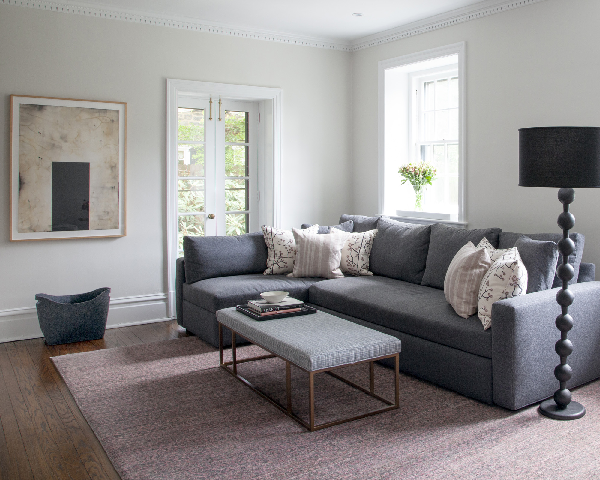
For when the clients want to fully kick back, O’Connor created the den – but even this most informal room is still stylishly considered. ‘The large workhorse of a sectional is brightened and accented by pinks and black from the pillows and rug. We worked to achieve a livable, fun and still sophisticated room,’ said O’Connor.
A key tool for adding sophistication to this relaxed space was the choice of artwork. ‘A painting by local artist Edward McHugh, adds drama and interest to the space, while the lamp – by local Philadelphia company Lostine – adds whimsy.’
6. Introduce modernity with lighting
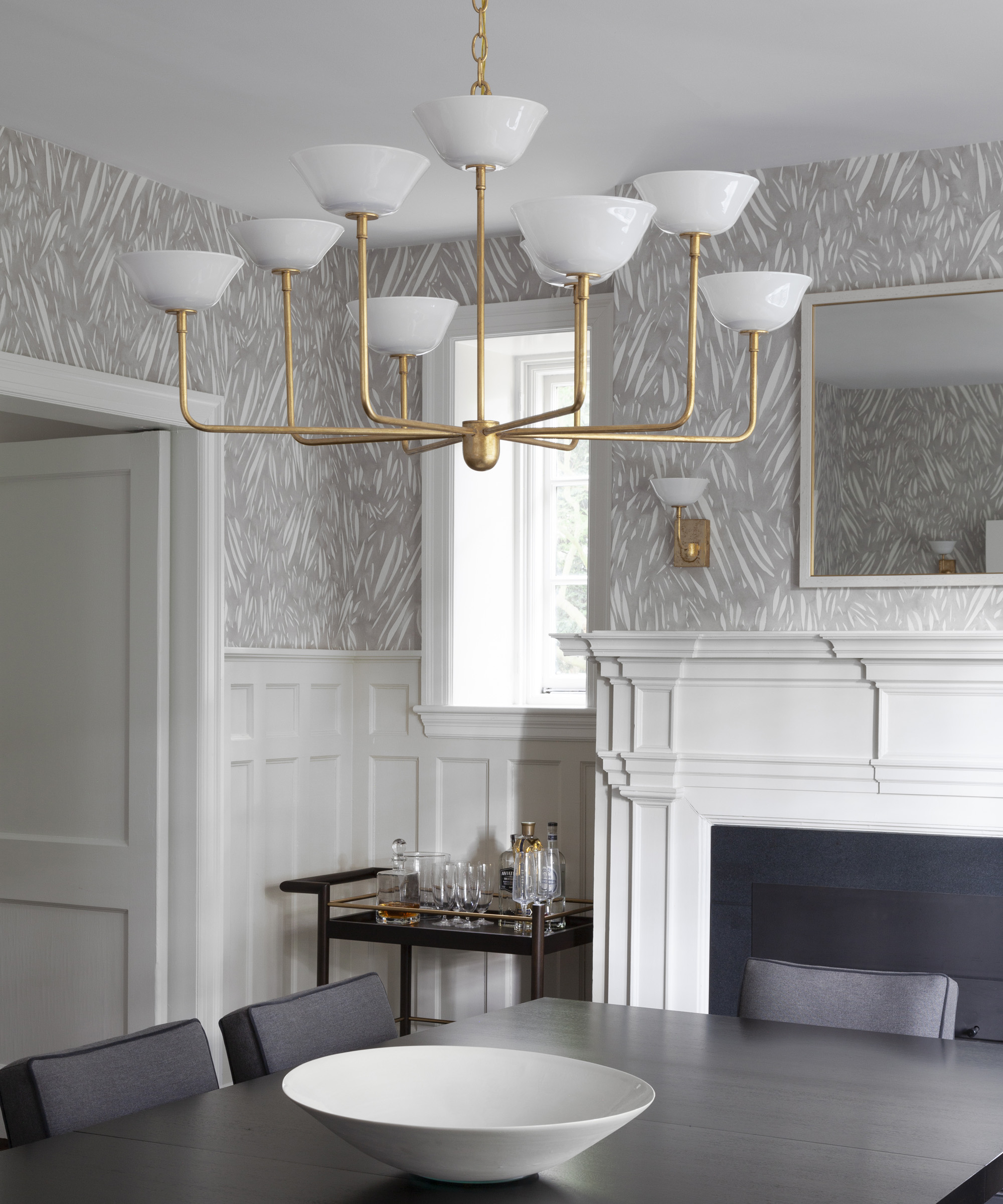
Beyond the obvious introduction of contemporary furniture, another way O’Connor subtly wove modernity into the fabric of the century-old home was through lighting.
‘The prismatic glass globe pendant introduces the classic but modern tone that will follow throughout the house,’ explained O’Connor of her choice for the foyer lighting. ‘The lighting fixtures are each distinctive but relate, and create a connected aesthetic from one room to the next.’
This theory culminates in the dining room’s statement chandelier, where a contemporary-style structure in glowing brass holds up handmade glass coupes.
Interior Design / Melinda Kelson O’Connor Design
Photography / Wendy Concannon Photography
Sign up to the Homes & Gardens newsletter
Design expertise in your inbox – from inspiring decorating ideas and beautiful celebrity homes to practical gardening advice and shopping round-ups.

Ailis started out at British GQ, where a month of work experience turned into 18 months of working on all sorts of projects, writing about everything from motorsport to interiors, and helping to put together the GQ Food & Drink Awards. She then spent three years at the London Evening Standard, covering restaurants and bars. After a period of freelancing, writing about food, drink and homes for publications including Conde Nast Traveller, Luxury London and Departures, she started at Homes & Gardens as a Digital Writer, allowing her to fully indulge her love of good interior design. She is now a fully fledged food PR but still writes for Homes & Gardens as a contributing editor.
-
 Ina Garten's storage pantry is an insightful window into all of the best cookware used by the chef – and it's easy to recreate on your kitchen shelves from $48
The beautiful dishware in The Barefoot Contessa's Hamptons pantry showcases the tools she uses most often to cook – this is exactly how you replicate it
By Sophie Edwards Published
-
 Extend the lifespan of your appliance with 5 simple but crucial washing machine maintenance tips
From cleaning the filters to keeping the door open, experts reveal the washer tips they swear by
By Andy van Terheyden Published