7 design tips to steal from this artwork-filled townhouse in London's Pimlico
Yellow London's design for this family home combines serene neutrals with pops of color aplenty
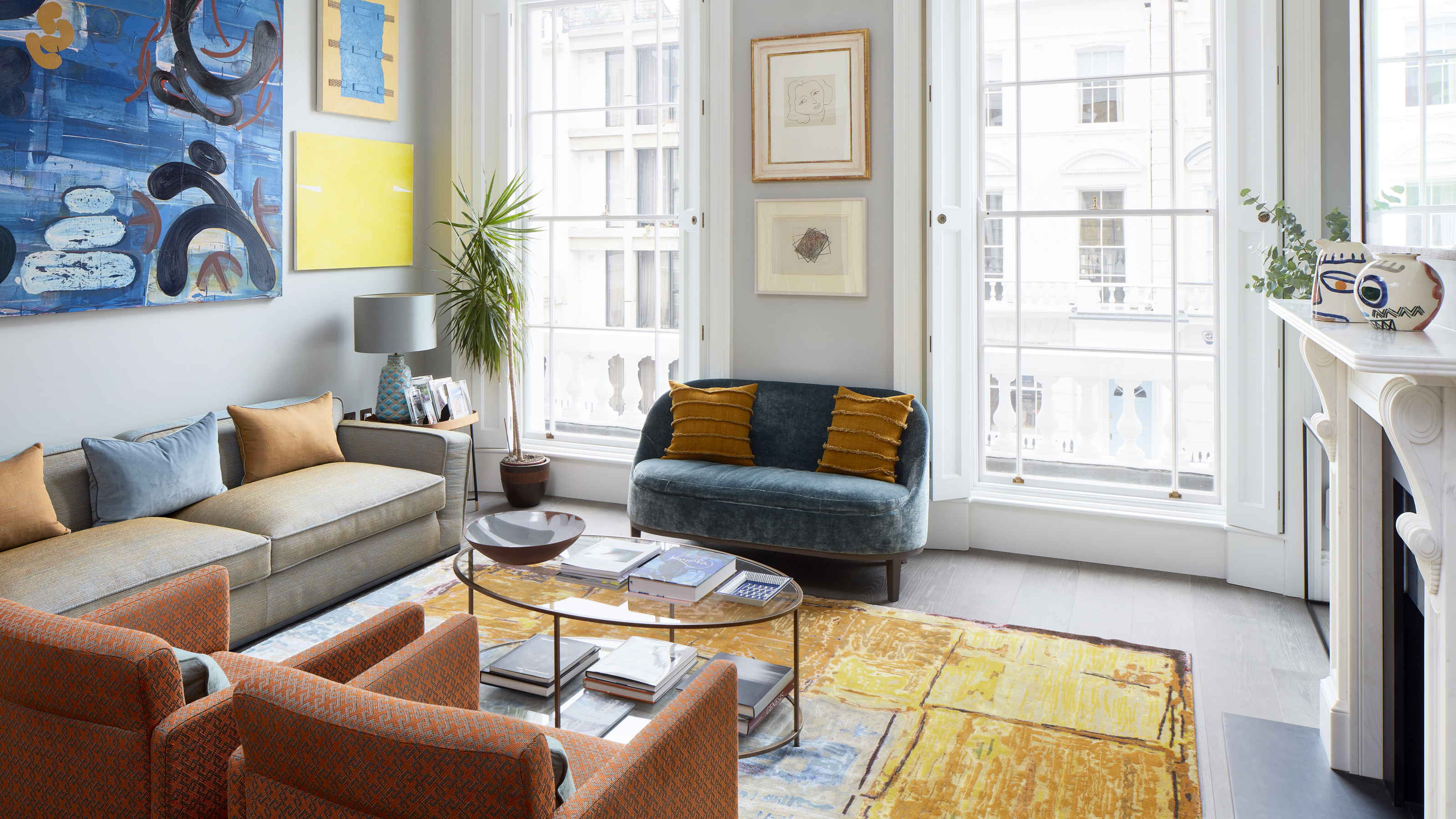

In the heart of London’s upmarket Pimlico neighborhood, interior design company Yellow London were called in to give a townhouse an update that could accommodate both an art collection to rival those of the world’s best homes, and the needs of its younger residents.
‘The client wanted to modernize the space that they had, retaining the original features, while making it more functional for their three young children,’ said Yellow London Co-Founder Liv Wallers.
‘They wanted a classic contemporary feel, making the most of the existing architectural details using color and texture in the furniture, which would work well with the client’s art,’ added fellow Co-Founder Cath Beckett.
Across its five floors, the team created a family home that blends cool neutrals with pops of color aplenty. Beckett and Wallers took us on a tour of the artistically inclined end result.
1. Use a single paint color to create consistency
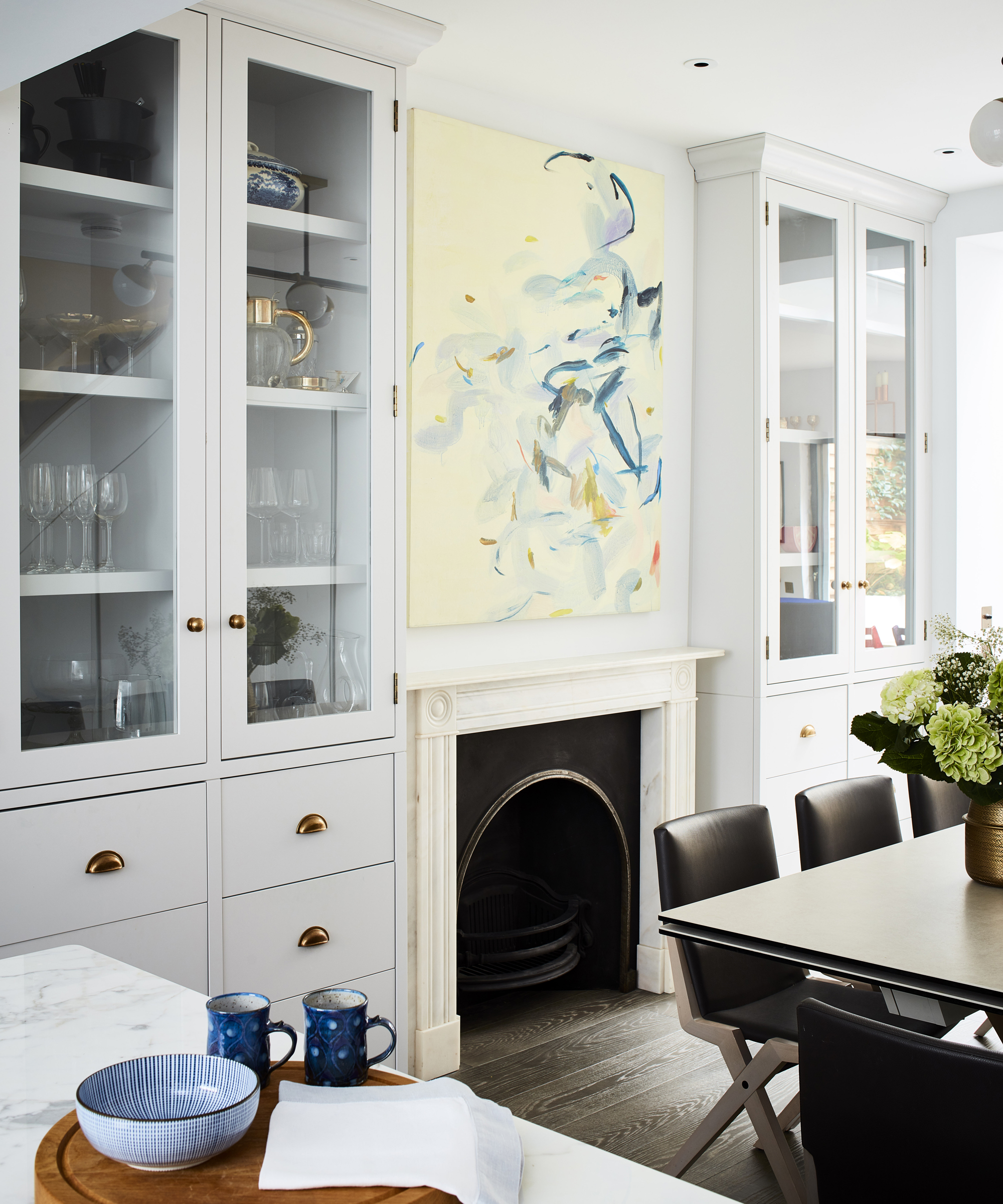
While the whole scheme is given character with bold injections of color, a feeling of consistency is created by the repeated use of a single neutral.
‘There is one color on the walls throughout the house – Ammonite by Farrow & Ball – which sets the tone,’ said Wallers. This pale gray which borders on white dominates the wall scheme in some rooms – such as among the largely monochrome kitchen ideas and in the light and bright anteroom – but is used as accents elsewhere too, picking out woodwork and ceilings in the drawing room and beyond to tie the whole house together.
2. Ensure artwork takes center stage
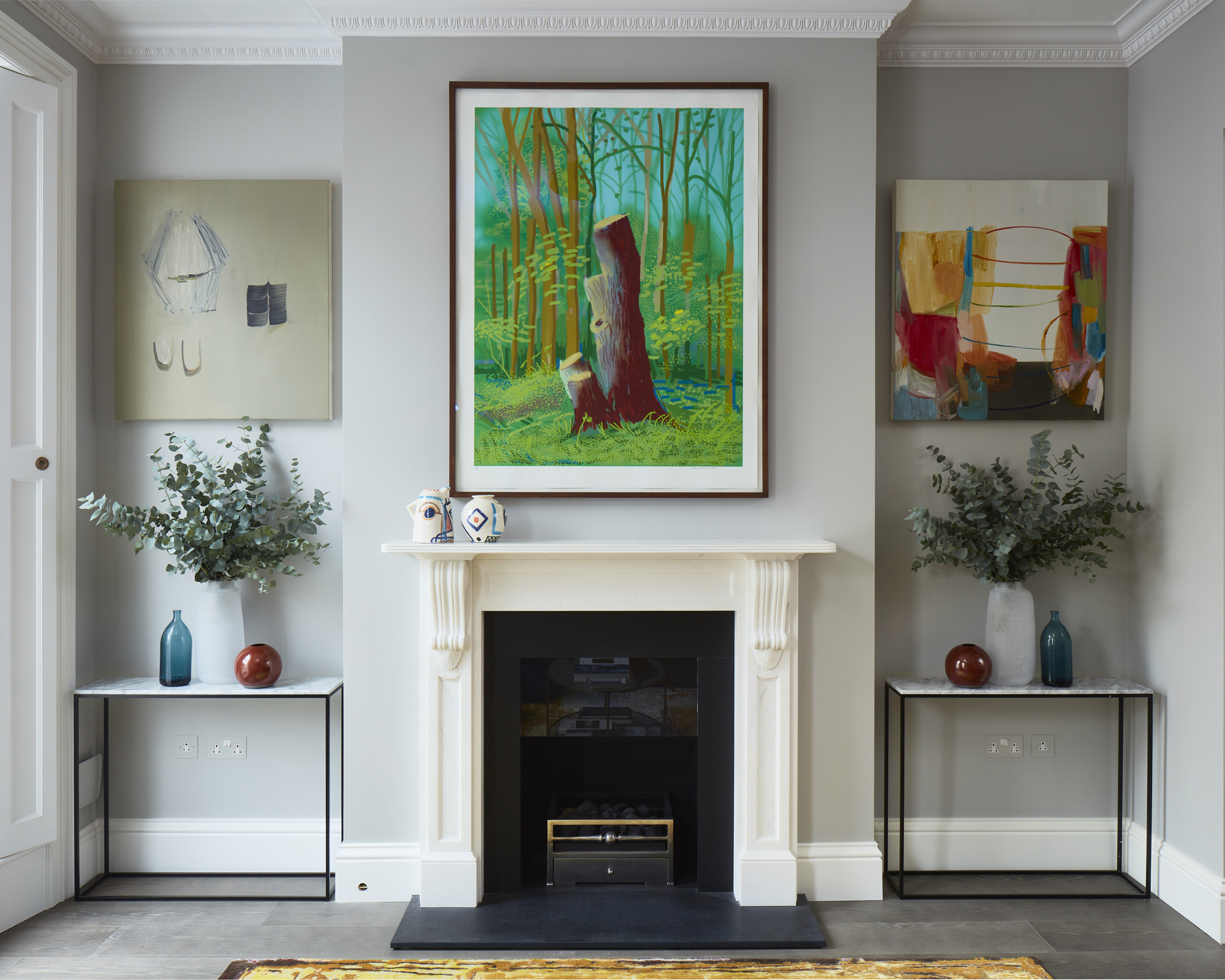
‘The clients wanted fairly neutral walls as a backdrop for their extensive art collection,’ said Beckett. The inclusion of an eclectic selection of artwork was a huge consideration for Yellow London in the creation of the design scheme, and pieces can be found in every room.
‘The scheme in the drawing room uses bold colours to complement the art, keeping pattern to a minimum,’ added Beckett. While a neutral gray is used for the wall color, bolder chromatic choices characterise the furniture and decor, including orange Aram armchairs upholstered in Dedar Milano fabric. This combination allows the artwork to stand out while preventing the room from feeling too much like a gallery space.
3. Let your favorite fabrics lead a design scheme
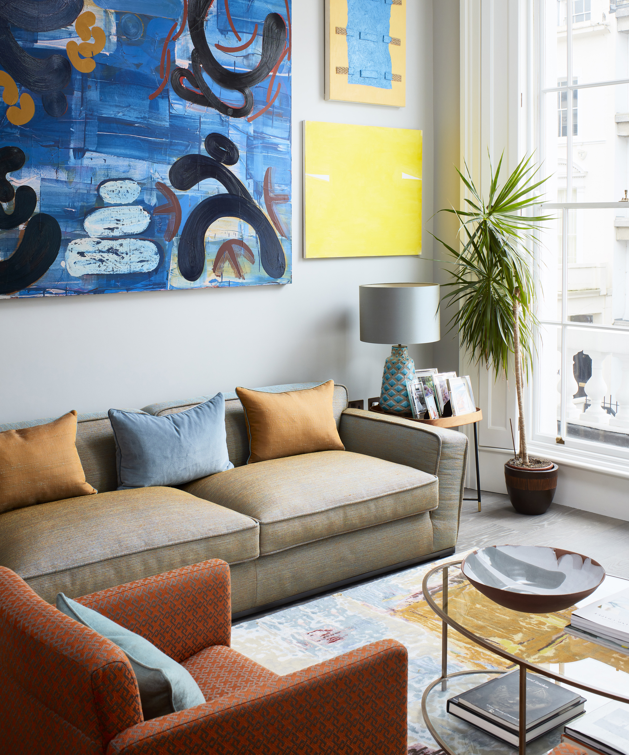
It’s not just artwork that can provide chromatic inspiration – if you’ve fallen in love with a specific fabric, let it take the lead in the room.
‘In the drawing room, the fabric of the large sofa works really well in the room and the scheme. As you can see it changes colors, as it is made up of various colors and is actually created from blue and orange silk threads, so it changes with the angles,’ said Wallers of the B&B Italia sofa upholstered with Jim Thompson material. ‘This fabric was the initial fabric for the scheme, which the client was very keen to use and it worked well with the art too.’
‘The rug was also a key piece which pulls the room together and the colors work perfectly with the rest of the scheme,’ added Beckett, describing The Fulcrum by Marcus Hodge rug from Amy Kent. ‘You would think that these are bespoke colors in the rug but it is one of Amy Kent’s colorways.’
4. Balance formal living rooms with relaxed spaces
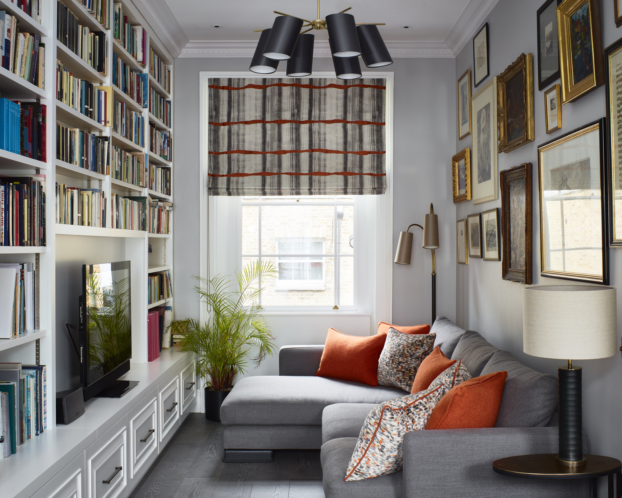
While the drawing room acts as a more formal living room, it’s L-shaped layout means it comes with a secret. ‘There is a snug area off the main room with joinery to create a library feel and a cozy area to watch TV,’ said Beckett of their multifunctional living room ideas.
The compact nature of this nook has been embraced, filling the space with books and an eclectic gallery wall to emphasise an intimate, sheltered atmosphere, while a large corner sofa ensures the snug majors in comfort.
5. Use blues in the bedroom for a calming aesthetic
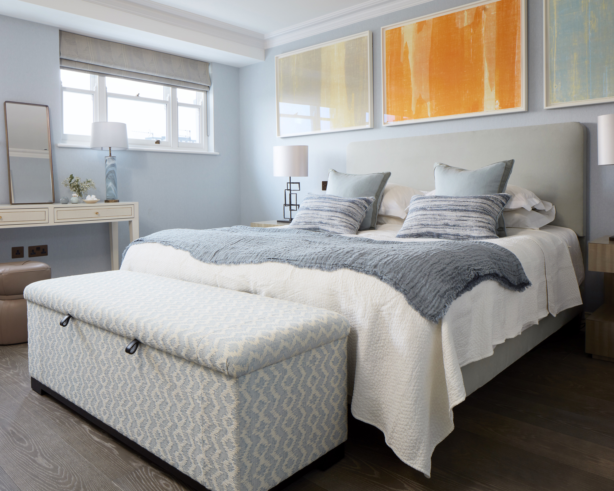
Heading up to the townhouse’s third floor, the master bedroom is an exercise in creating a sleep space that is serene, but never dull. ‘We used a cotton thread fabric walling in this room, with a blue velvet fabric on the bed,’ said Wallers. ‘The scheme comprises calming blue tones and textures.’
Blue bedrooms are proven to have a restful impact on the brain, and a pale duck egg blue is used in the wall coverings here to retain freshness among the calm. Pairing the blues with soft neutrals puts relaxation front and center, while bright orange artwork gives the room a scintillating touch of get-up-and-go.
6. Contrast traditional architecture with contemporary flourishes
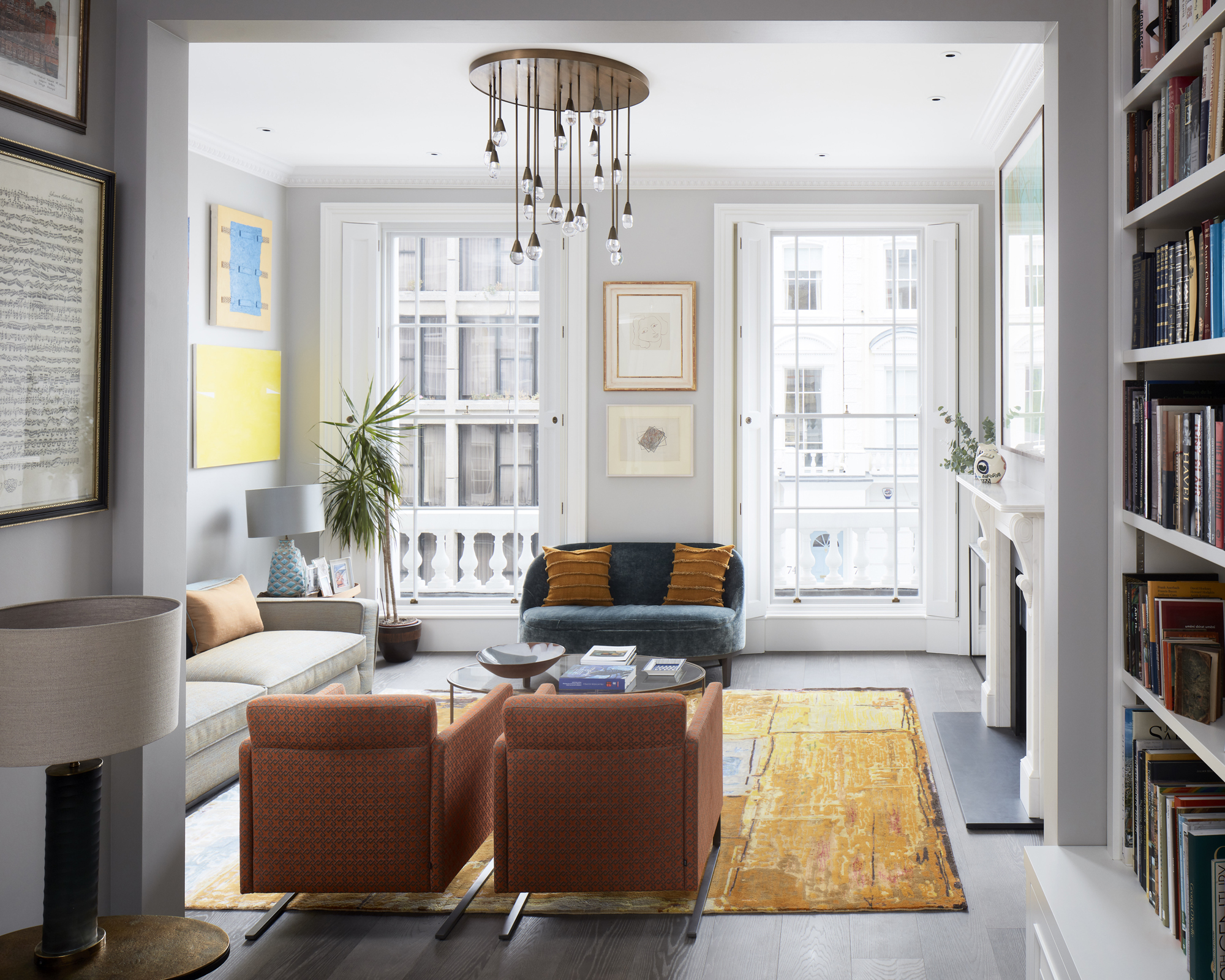
Throughout the entire scheme, the old is constantly meeting the new. ‘The drawing room on the first floor has floor-to-ceiling windows and beautiful original shutters,’ explained Beckett. ‘We replaced the fireplace and the floors are all new too. The furniture is all fairly contemporary to contrast with the traditional architecture.’
While the fireplace is new, its design lends heavily from traditional styles. This intermingling of past and present can also be seen in the drawing room’s feature light fitting, which blends the grandeur of a traditional candle chandeliers with contemporary styling.
‘We love the chandelier, which was a bespoke piece,’ said Wallers. ‘Each drop has its own internal LED light, and the glass drops were handmade by a glassblower in Cornwall.’
7. Add storage to make a home fit for a family
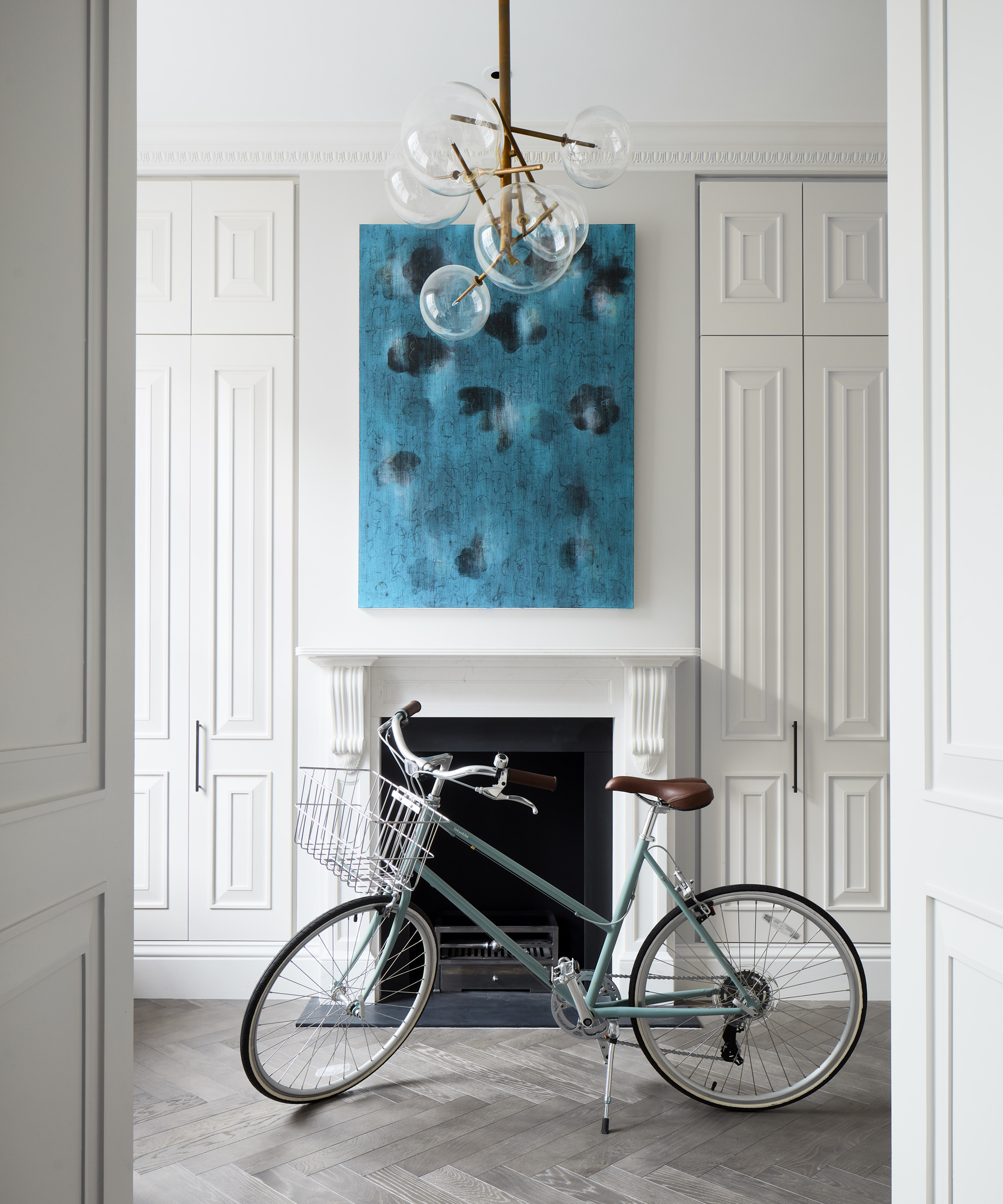
While high brow considerations of art display were a priority in the design, Yellow London always kept in mind that this was a family home first and foremost. In a house accommodating three children, you can never have enough storage.
‘The anteroom, or entrance hall, is very minimal and clean with plenty of storage for family possessions, with a large space for the grand piano in the second part of the room,’ said Beckett, citing the floor-to-ceiling cabinets.
As well as packing practicality into their hallway ideas, the kitchen is also amply equipped with storage and easy access to a dedicated space for the kids. ‘The lower ground floor of the property is the kitchen and dining room with a children’s playroom at the other end. This is all open plan and very family orientated.’
Interior Design / Yellow London
Photography / Matt Clayton
Sign up to the Homes & Gardens newsletter
Design expertise in your inbox – from inspiring decorating ideas and beautiful celebrity homes to practical gardening advice and shopping round-ups.

Ailis started out at British GQ, where a month of work experience turned into 18 months of working on all sorts of projects, writing about everything from motorsport to interiors, and helping to put together the GQ Food & Drink Awards. She then spent three years at the London Evening Standard, covering restaurants and bars. After a period of freelancing, writing about food, drink and homes for publications including Conde Nast Traveller, Luxury London and Departures, she started at Homes & Gardens as a Digital Writer, allowing her to fully indulge her love of good interior design. She is now a fully fledged food PR but still writes for Homes & Gardens as a contributing editor.
-
 The 5 worst things you can do to your fridge – these will drive up energy costs and result in pricey and regrettable repairs
It's crucial to swerve these blunders, appliance experts warn
By Ottilie Blackhall Published
-
 Orange and green is the bold color pairing quietly transforming homes in 2025 – here's 4 reasons why
Interior designers are making the orange and green combination work wonders – this is how you can too
By Sophia Pouget de St Victor Published