An apartment overlooking London's Covent Garden piazza gets a history-astute update
With 400 years of culture-packed history at its feet, the renovation of this London home draws on it all
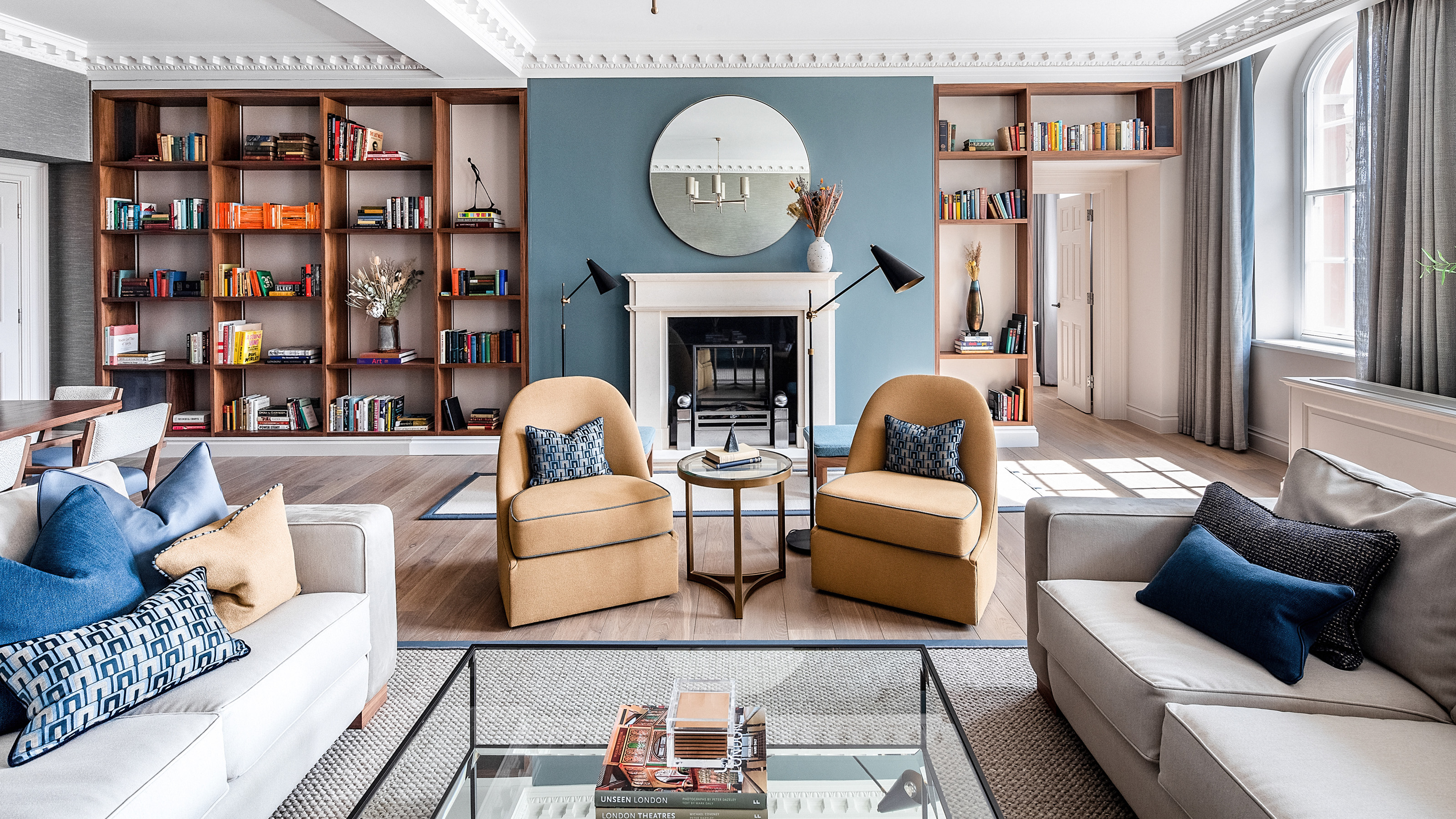

In the heart of London’s culture-packed West End, interior designers Ward & Co. were charged with reinvigorating a two-bedroom apartment – one with a particularly special view, and a whole lot of history.
The King Street home directly overlooks Covent Garden’s famed piazza, the first modern square in the English capital – a view that would be the envy of some of the world's best homes. Dating back to 1630, the piazza is nowadays home to street performers, luxury shopping destinations, high-end restaurants and the Royal Opera House.
‘Our brief was to create a space that reflected the listed status of the building, the cultural heritage of the location and yet in-keeping with the archetypal Covent Garden resident,’ said Co-Founder and Creative Director Rosie Ward.
‘Every element of the design, from the choice of materials and furnishings to textures and colors, have been selected to reflect and celebrate these elements whilst considering the fabulous aspect and views over the historic piazza. We worked together with local artisans to capture the elegance and essence of the location with a vibrant twist and contemporary touches.’
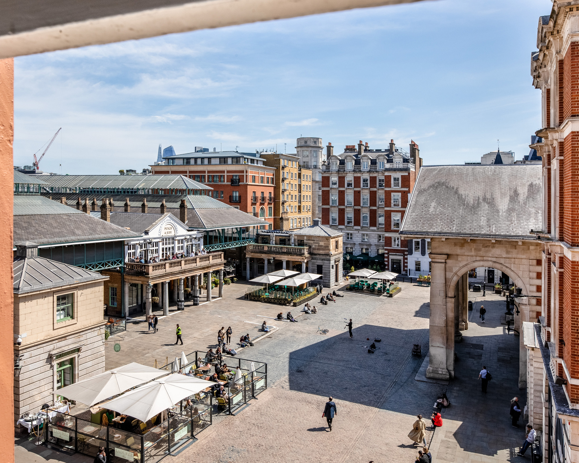
The result of the team’s work is a design scheme that deftly blends the contemporary with the area’s 400 year history. Ward gave us a tour of the apartment, now more than fit for Covent Garden’s modern day bon vivants.
Living and dining room
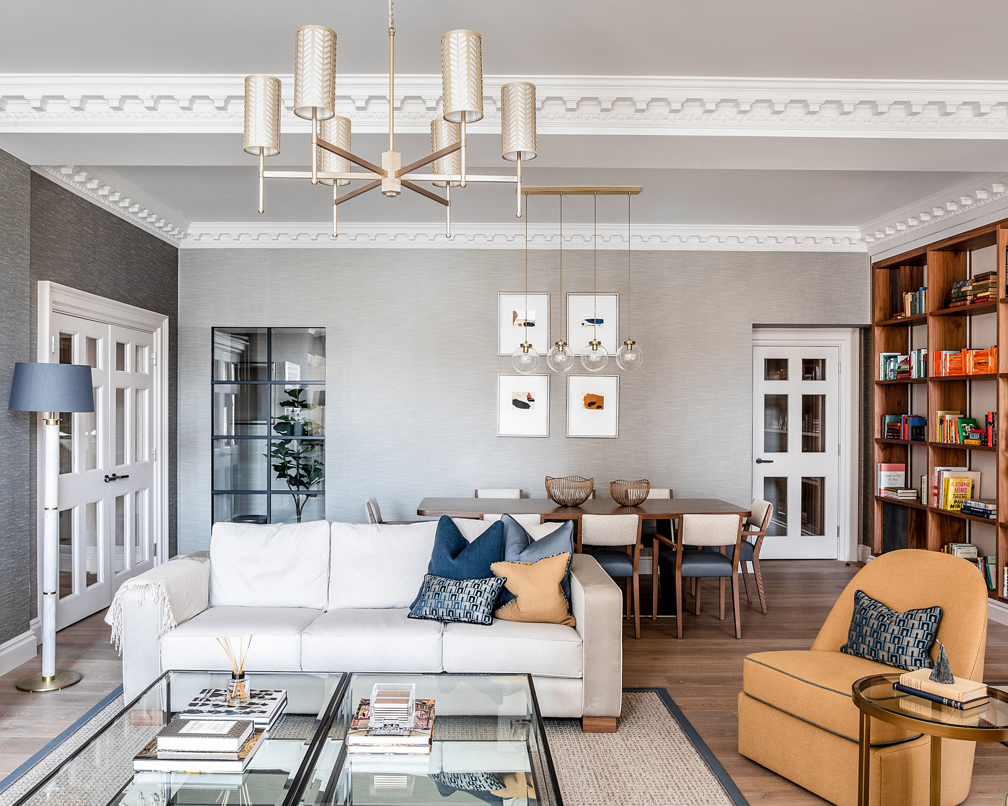
The centrepiece of the home is a light, open-plan yet cosy dining and living space, filled with colors that mirror those in the architecture of the piazza below. ‘We chose warm, traditional colors in keeping with the context of the location,’ said Ward of her living room ideas. ‘The blend of the blues and muted gold tones we felt to be very British which – combined with the walnut panelling and multi-coloured books in the living room – gave a welcoming, contemporary feel to the space.’
‘The high ceilings and stunning original features can take the stronger tones, which is why we also added the blue feature wall [in Farrow and Ball Hague Blue No.30] behind the fireplace.’
Design expertise in your inbox – from inspiring decorating ideas and beautiful celebrity homes to practical gardening advice and shopping round-ups.
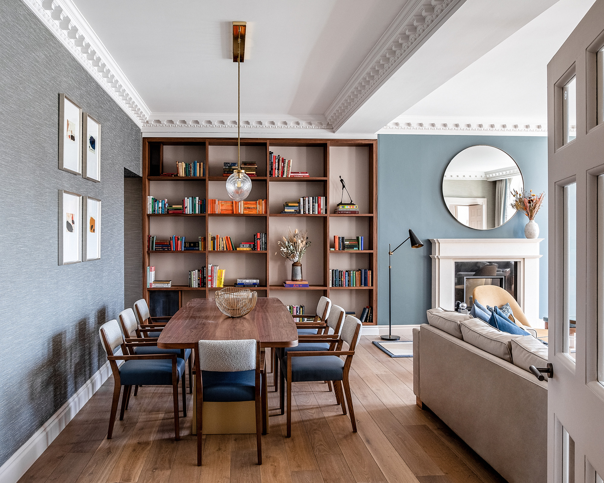
The bespoke built-in bookshelves were used to link the dining room ideas in with the living space, but also as an opportunity to sprinkle a little bit of culture. ‘This gave us the opportunity to house 400 books, each one chosen to honour a year in Covent Garden’s history.’
‘The fireplace adds to the library atmosphere and that traditional feel too; it creates a focal point in the room that is not the television.’
Hallway
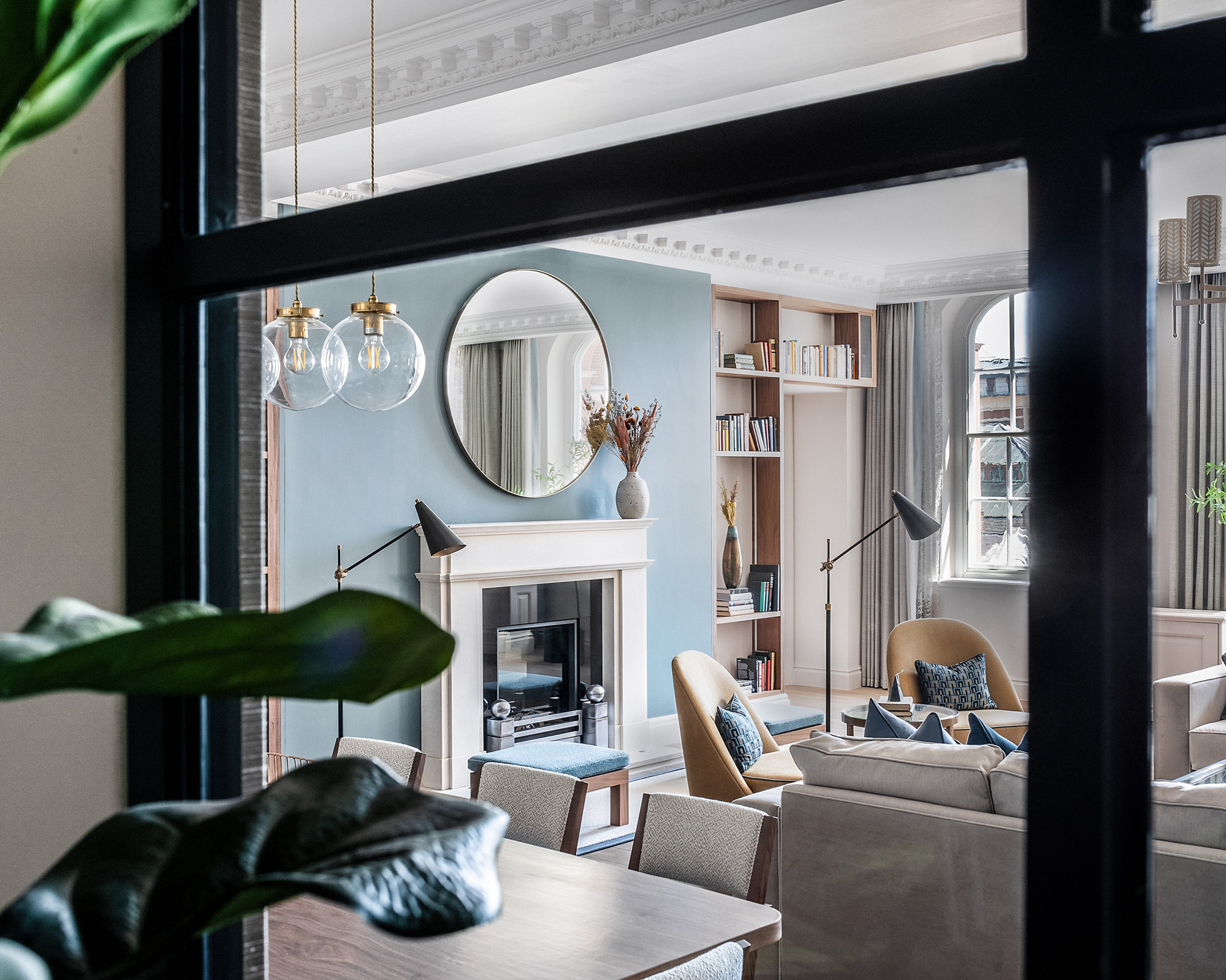
‘One of my favourite elements is the internal crittal window,’ said Ward. ‘We added this later on in the process to enhance the entrance of the property. You gain not only light but can see the colour in the living room which adds to the flow of the property.’
Ward had hoped to remove more walls and replace them with glass for a greater flow of light, but was restricted by the building’s listed status – the Crittall window is a happy compromise. ‘It allows lots of natural light to spill into the hallway which was formerly quite dark.’
Kitchen
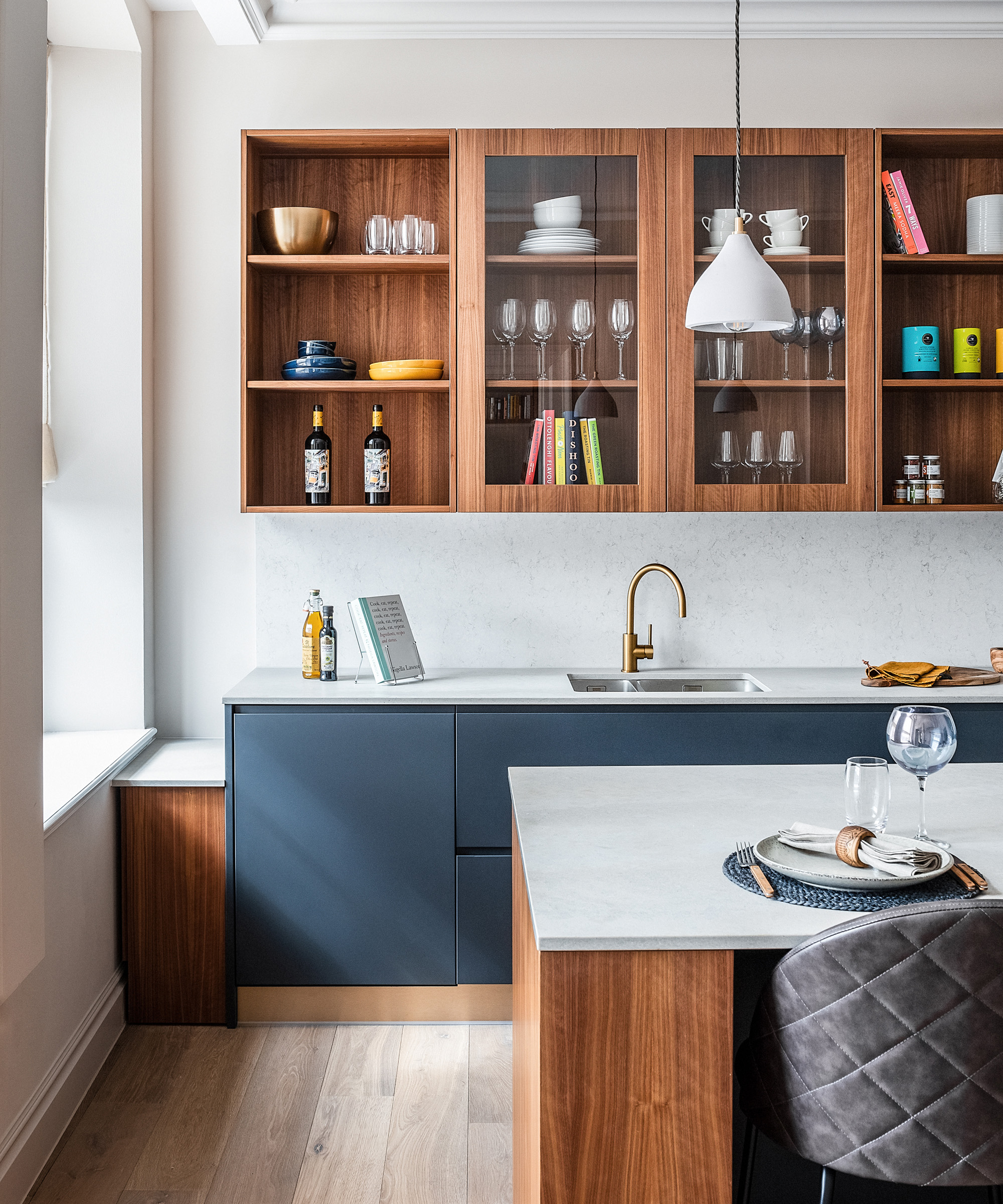
Ward's kitchen ideas take after the living room’s warm woods, cool blues and textured silvers continue, with a relatively small space kept feeling open with handleless cabinetry and an island, doubling as a space for informal meals.
‘We complemented the stone-topped cabinetry with satin gold taps, distinctly warm tones and added padded faux-leather bar stools for a contemporary yet practical look,’ said Ward.
Snug and study
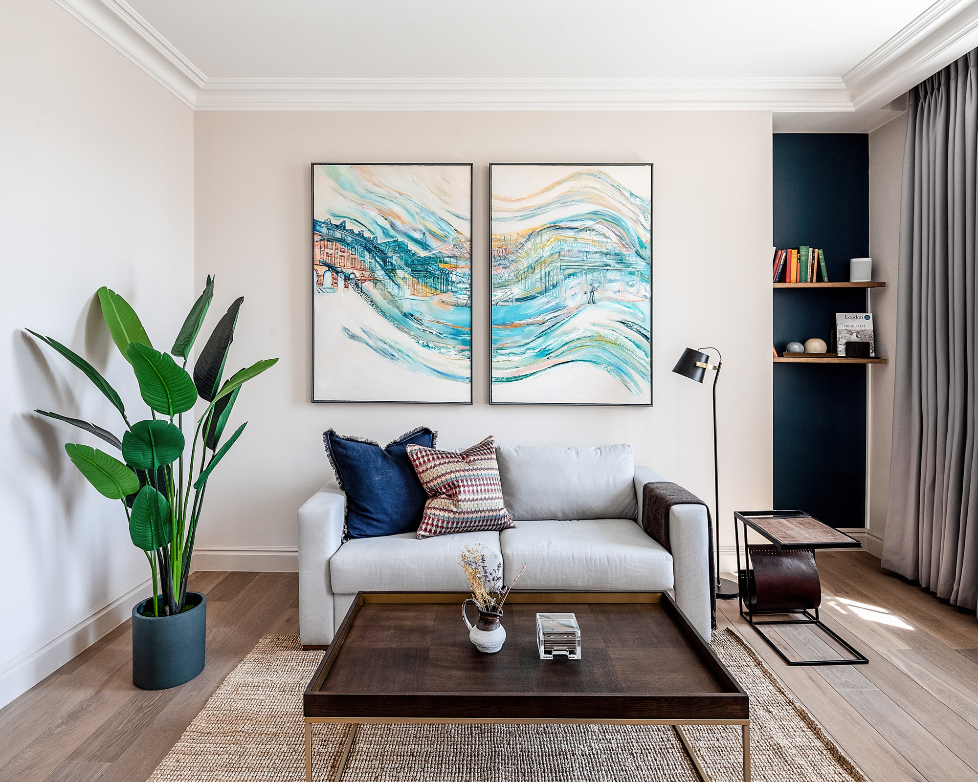
Color largely falls away in favour of a light, white space for the snug and study area. ‘We incorporated a range of bespoke and repurposed furniture pieces and specially commissioned artwork, including a pair of striking oil paintings by talented young artist Lillie Meikle, reflecting the views of the adjacent piazza and nearby hustle and bustle of the former market square,’ said Ward.
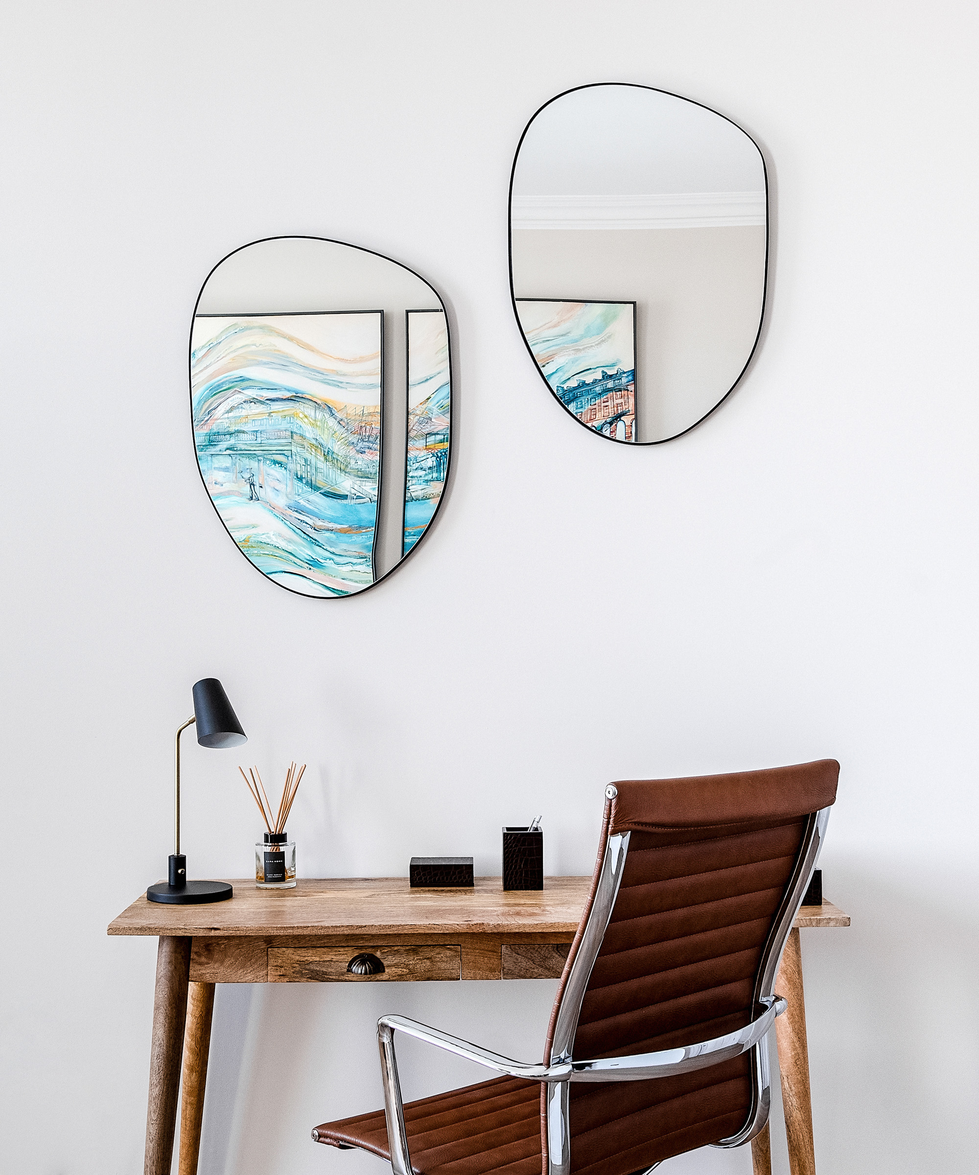
The Prussian blue in the artwork is pulled through into the sofa cushions and a painted alcove area, while the pieces themselves are reflected by a pair of mirrors on the opposite wall, hung over a small but stylish desk area – a great way to beautify simple home office ideas.
Master bedroom
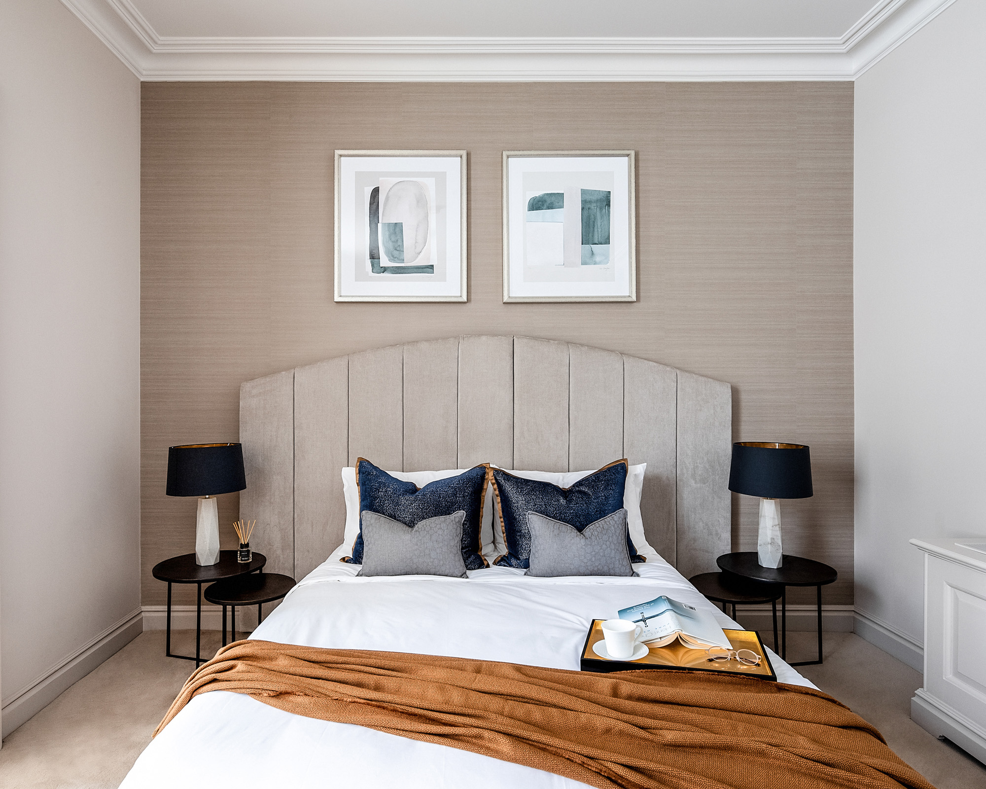
Not all parts of the apartment were quite so lucky with lighting, and more clever thinking was needed to make them feel bigger.
‘The challenge here was that it was a very dark room,’ said Ward of the master bedroom. ‘We used a one sided curtain to maximize the light from the window, and a bespoke headboard that wasn’t too high so art could be placed above, to make the ceilings feel even higher.’
Master bathroom
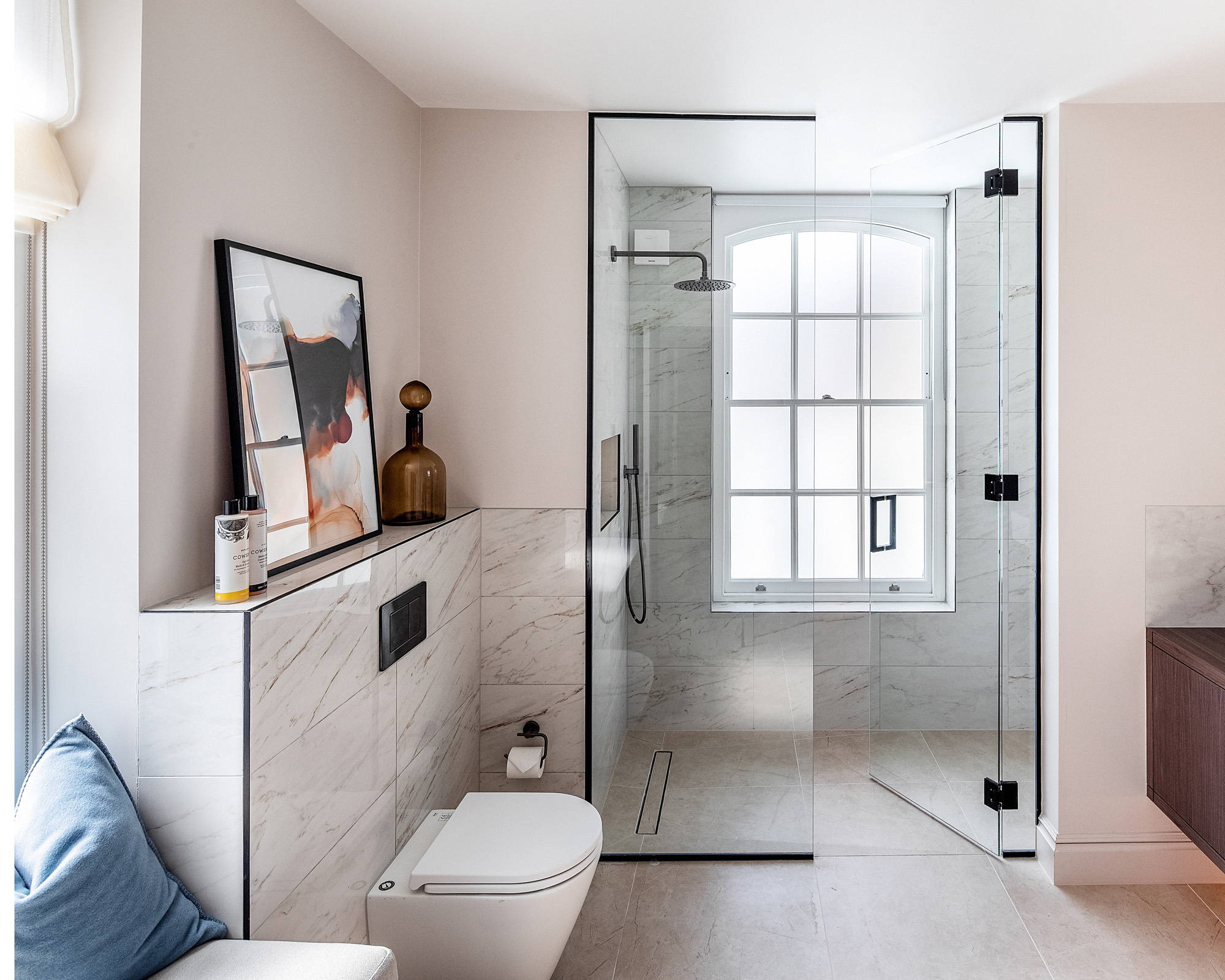
‘We re-configured this space to make it feel luxurious and fitting for a master en-suite,’ says Ward of her bathroom ideas. ‘The large bespoke vanity unit is a feature, as is the window seat.’ The seat and wooden vanity unit flank a large walk-in shower
Ward was also keen to consider the master bathroom as an extension of the adjacent bedroom, and realised they could help balance one another. ‘The light and bright tiles help to make the bedroom brighter and create an inviting calm space.’
Guest bedroom
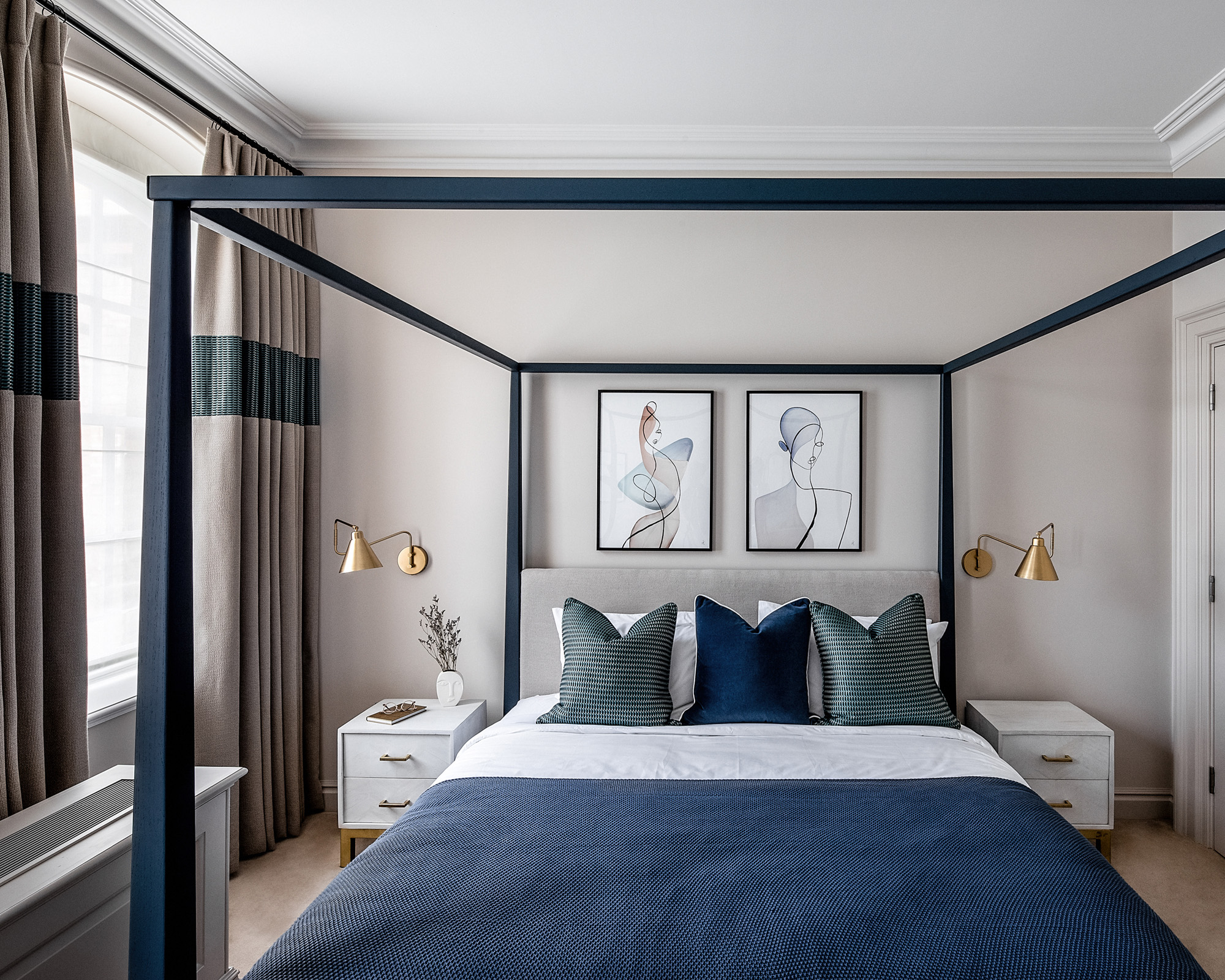
‘The tones in here are more playful than in the master bedroom,’ said Ward of the mix of cool blues with warm greys and metallics used among the bedroom ideas. ‘The cut in fabric in the curtains really catches the eye when you walk into the room.’
Along with the proportion-friendly curtain design, Ward makes this room feel balanced in both height and depth, restraint and grandeur with the use of a four-poster bed. ‘We re-purposed the existing bed, added the back headboard panel and changed the colour to navy,’ she explained.
Guest bathroom
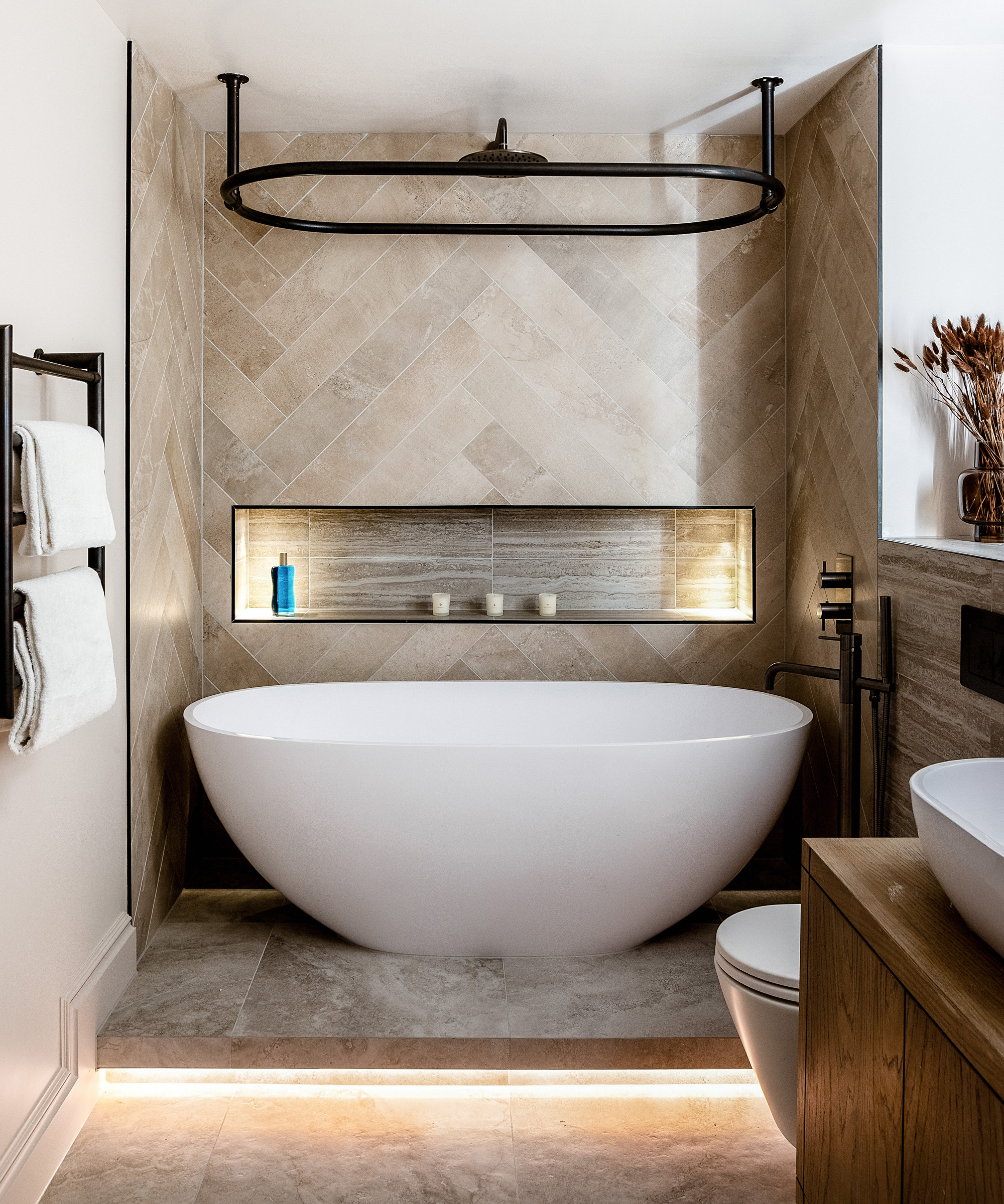
Guests are very well catered for indeed, with a luxurious full bathroom created in their honour. ‘The bathroom, which has been clad in a natural tone, provides the perfect backdrop for the unique Picasso resin freestanding bath,’ said Ward. ‘Elegantly illuminated by discrete uplights and offset by gunmetal brassware, it’s the perfect spot to unwind away from the lively cobbled streets below. We also incorporated herringbone tiling on the back wall for that extra bit of luxury.’
Interior design / Ward & Co.
Photography / Taran Wilkhu

Ailis started out at British GQ, where a month of work experience turned into 18 months of working on all sorts of projects, writing about everything from motorsport to interiors, and helping to put together the GQ Food & Drink Awards. She then spent three years at the London Evening Standard, covering restaurants and bars. After a period of freelancing, writing about food, drink and homes for publications including Conde Nast Traveller, Luxury London and Departures, she started at Homes & Gardens as a Digital Writer, allowing her to fully indulge her love of good interior design. She is now a fully fledged food PR but still writes for Homes & Gardens as a contributing editor.