5 ways this country kitchen makeover by Martin Moore has made for a more social space
Clever design and an inviting colour scheme has transformed a series of small rooms to a large, family-friendly space
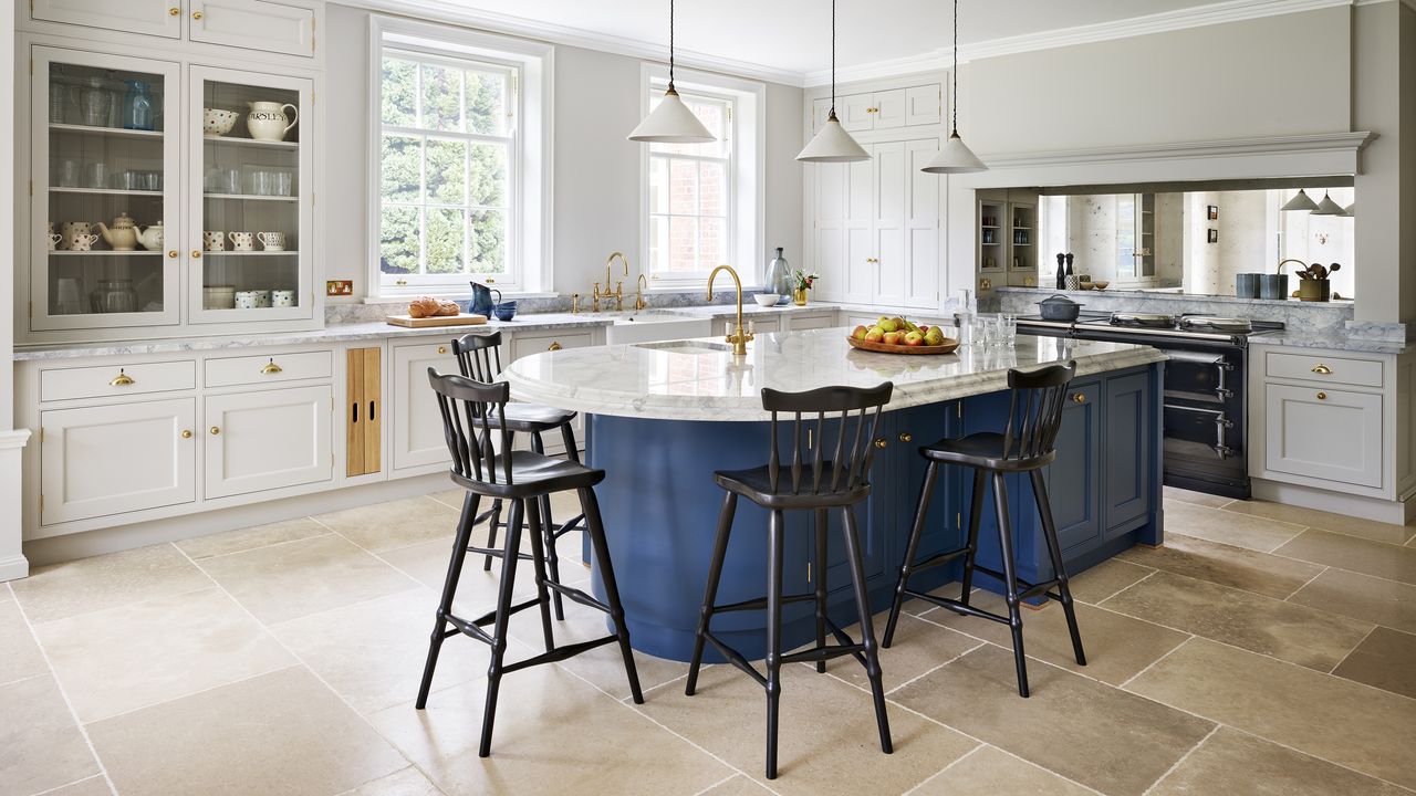

While her husband’s house hunting focus lay firmly on the proximity of his favourite golf courses, this owner was seeking something that can’t be found on any map.
‘I was heavily pregnant with our twins when we first viewed the house, and I got that ‘feeling’ the moment I walked in,’ she recalls. ‘I could really see us living there, it felt like the house was already ours.’
Known in estate agency circles as ‘buying with the heart rather than the head’, Trudi’s instincts certainly weren’t based on the condition of the property, which hadn’t been fully modernised since it was built in 1919.
‘The kitchen was a muddle of small rooms, all with different roles, and would have only been used by the servants. There was even an outdoor boiler house with an ancient cast iron coal boiler,’ recalls Trudi.
Regardless, she fell in love with the classical beauty and grandeur of the house and knew it could be the perfect rural setting to raise their growing family.
- See: Kitchen ideas – more elegant options in our inspirational gallery
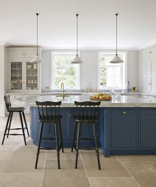
The owner had kitchen design ideas in mind. She wanted her new kitchen to have a cosy, family-friendly feel with English country comforts. Nothing too ostentatious or imposing.
‘We wanted to create a new heart of our home – one that could entertain a lot of people but was also practical for a family with a messy dog and three young children,’ she adds, ‘and we chose Martin Moore because they actually make 100% bespoke furniture – not just claim they do!’
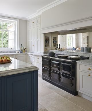
Before meeting with Martin Moore’s designer, Andrew Wartnaby, the owner made a list of her priorities. ‘It really helped to think about and clarify the essentials that I really wanted, and also the "nice to haves", before I got there so that Andrew could really get to grips with designing something specific to us,’ she explains.
Her main priorities were a large AGA range cooker and an equally generous fridge-freezer. ‘Andrew worked his magic around them and has delivered a kitchen that’s unique to us, with lots of lovely bespoke details that really makes us feel at home.'
Here are the clever design tricks which helped her achieve her dream kitchen.
1. Extending the space
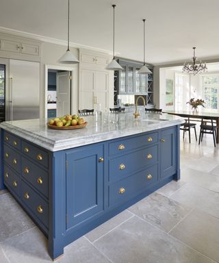
Completing the purchase in the same week the twins were born proved pretty crazy, but the couple barely took a breath before knocking through the many small kitchen rooms and extending.
‘Our aim was to create one seriously spacious kitchen-diner with TV area and large bi-folding doors overlooking the garden,’ says Trudi.
‘We also wanted a separate boot room/laundry space. We may be close enough to London to catch the occasional show, but we’re also deep enough in the country to need a proper pair of wellies.’
2. A curved island
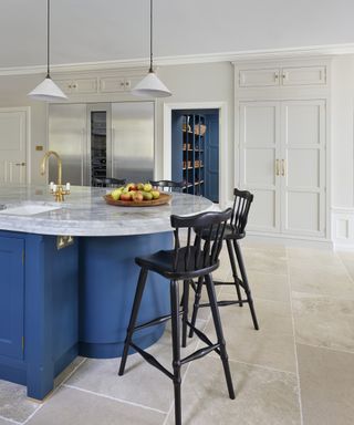
There were various discussions about the shape of the island, eventually hitting on this winning rectangular design incorporating a curved breakfast bar idea.
‘The room is very rectangular, so the curve of the island adds an appealing contrast that helps prevent the room feeling too blocky – it’s also the best shape for chatting over a coffee,’ says the owner.
Note the deep worktop overhang, which provides plenty of knee-space when sat at the bespoke bar stools. This also helps prevent scuff marks, particularly from children’s shoes, on the paintwork.
Opting for extra thick worktops with an elegant Ogee edge detail accentuates the island’s curves, adding a touch of grandeur to this statement piece.
3. Personalized storage
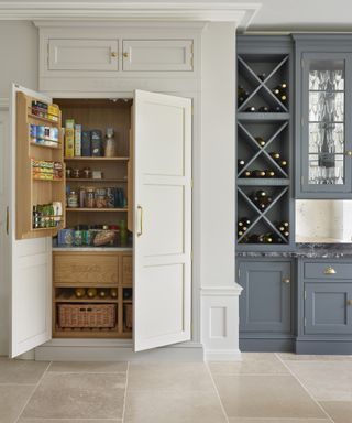
Recognising that it is the personal touches that truly make a house a home, the owner asked Martin Moore to carve lettering into her cabinets as part of a stunning pantry idea.
‘I came across someone who had created a "bread" and "naughty drawer" combination and thought it was fun, so I copied it,’ she says. ‘Now it’s my favourite part of the larder design.’
She also had the words ‘Cold Store’ etched above the fridge and ‘Dry Store’ above the larder, as a nod to the craftsmanship of the 1920s period in which the original house was built. Other popular ways to personalise your kitchen include a family or property name above the mantlepiece and named drawers for each family member.
4. A built-in bar area
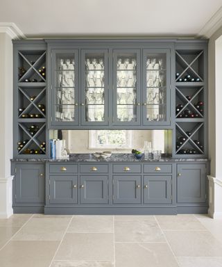
A beautiful glass dresser sits at the head of the dining table and comes into its own as a glamorous bar during parties. Day-to-day it provides ample storage for wine and glassware.
‘The antique mirror is a nod to an original design feature that we sadly had to remove and helps to ping more light around the room,’ adds the owner.
Although this unit is fully-fitted and shares the same door design as the kitchen cabinetry, the grey-blue paint colour – Martin Moore’s Iron– inspired by a painting in the extension, lends a more traditional ‘unfitted’ look.
If you love this look, our grey kitchen ideas might spark your next redesign.
5. A flexible layout
- Take another tour: This London kitchen is the epitome of serene elegance
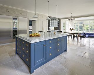
The heart of the kitchen is formed in a U-shape layout with central island. On one side of the island the main sink sits between new sash windows, with two dishwashers either side.
A classic glass dresser accommodates general crockery. On the other side the generous fridge-freezer and larder unit flank access to the boot room/laundry. At the head of the island is a showpiece AGA with prep space for resting pans.
The space then moves to the dining area, before stepping down to soft seating, with bi-folding doors to the patio and gardens beyond.
Sign up to the Homes & Gardens newsletter
Design expertise in your inbox – from inspiring decorating ideas and beautiful celebrity homes to practical gardening advice and shopping round-ups.
Linda graduated from university with a First in Journalism, Film and Broadcasting. Her career began on a trade title for the kitchen and bathroom industry, and she has worked for Homes & Gardens, and sister-brands Livingetc, Country Homes & Interiors and Ideal Home, since 2006, covering interiors topics, though kitchens and bathrooms are her specialism.
-
 Designer Drew Michael Scott creates an 'elevated vintage' console with this unexpected cheap material that you can pick up from the hardware store
DIY guru, Drew Michael Scott uses some $15 fence posts to create an entryway console table that feels antique and one-of-a-kind
By Eleanor Richardson Published
-
 Martha Stewart says the 'spring cleaning bug' has bitten her 'hard' – her seasonal organizing essentials are available on Amazon from $35
Martha's cleaning staples include storage bins, laundry hampers, dinnerware organizers, and multi-size jars – some of which are discounted now
By Hannah Ziegler Published
