A contemporary farmhouse gets a monochrome flourish in Long Island
Interior designer Marlaina Teich gives farmhouse style a modern shake-up with her keen eye for pattern
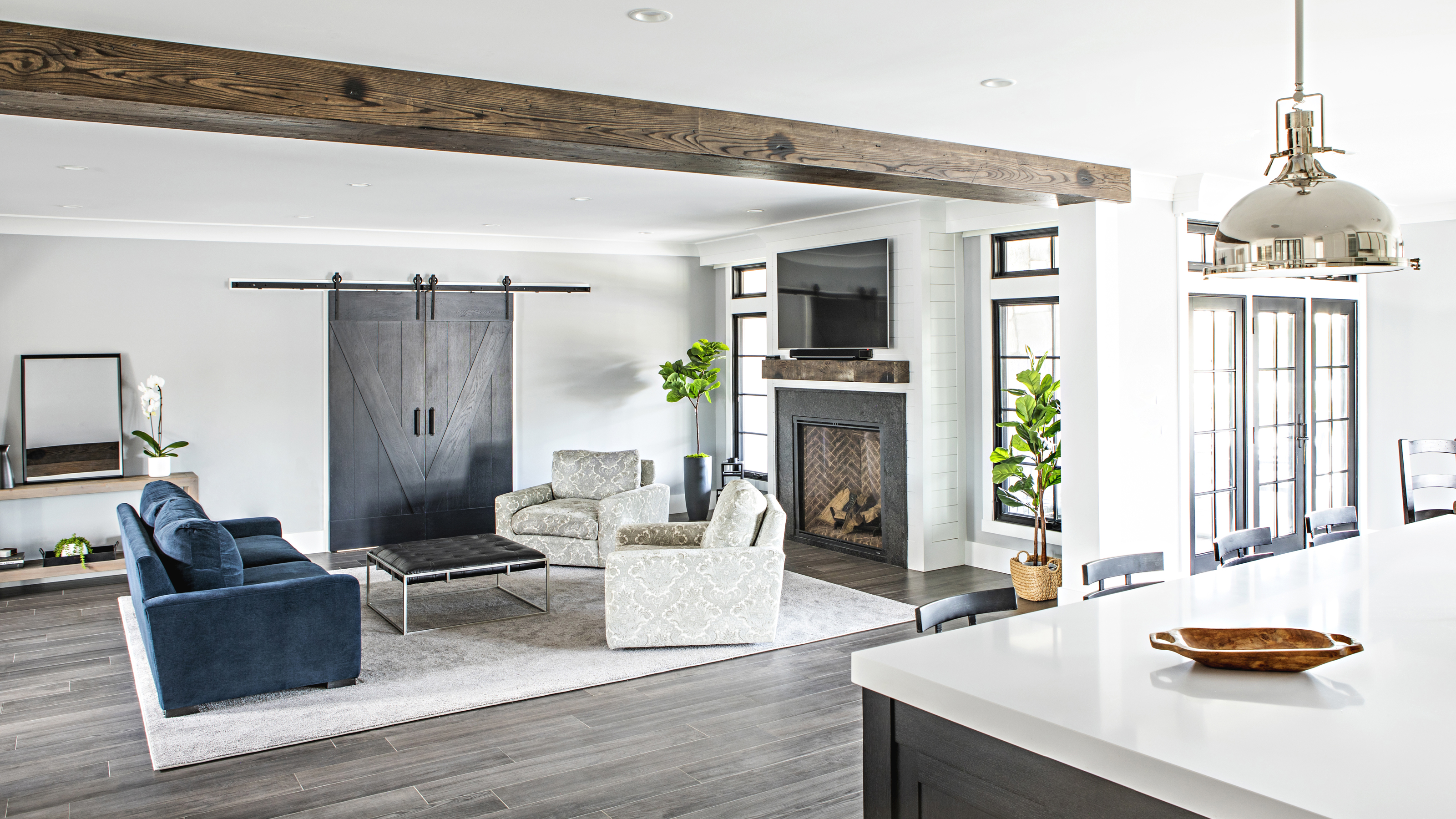

Marlaina Teich was on hand from the very start of this family home’s new beginnings.
The interior designer’s company began work on this farmhouse-style new-build while it was still made of bare framing, studs and gravel. Now, the Long Island property is a stunning, light-filled home equipped to deal with family life effortlessly.
‘We wanted to create a home for the homeowners that is completely one-of-a-kind,’ said Teich. ‘A space that they can live in comfortably with their daughter and two dogs that still had a mix of glam and rustic charm.’
A largely monochrome color scheme modernises a traditional farmhouse layout beloved in many of the world’s best homes – but where color is lacking, character is packed in.
‘The magic in this contemporary farmhouse is found within the details,’ Teich added. ‘Reclaimed wooden beams, delicate archways and finishes layered in texture and pattern were implemented with a careful eye, creating a space for the homeowners that evokes the feeling of warmth and comfort in an elegantly liveable fashion.’
From bold barn doors and beautiful beams to creative contemporary tiling, Teich took us round the spectacular family home she designed ‘from the ground up’.
Foyer
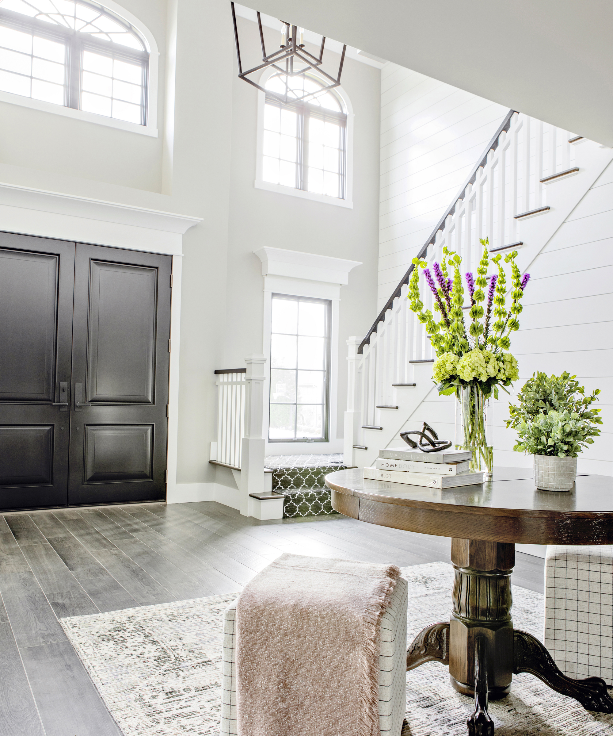
‘The two storey ceiling height creates a grand entrance’, she explained. The daunting height of the foyer has, however, been made to feel homely by Teich in the use of what she calls ‘soft elements’.
White shiplap, neutral wall paint, a faded rug and a warm wooden table make the space feel inviting after you enter through the ‘bold but classic’ custom-designed doors, while a large black lantern of Circa Lighting moderates the sense of height in the room.
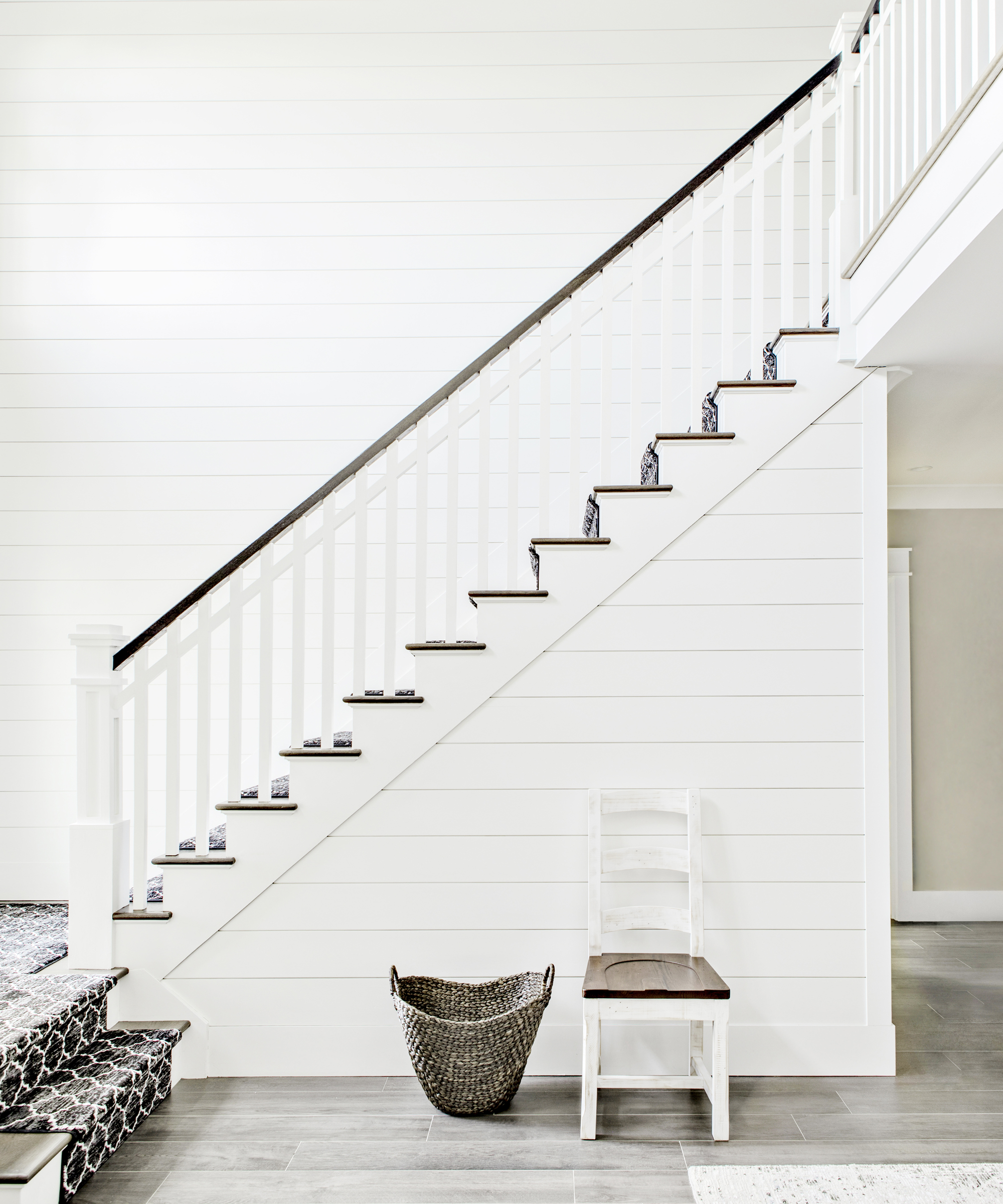
‘We designed the staircase to center the balcony newel posts to frame the oversized lantern chandelier,’ said Teich. This corner is where the monochrome tone is set for the rest of the house.
‘The black and white patterned staircase runner plays with the geometry of the 8 inch shiplap boards running up the entire landing wall.’ Peykar Carpet’s Moroccan-style offering sets a bold standard for exuberant pattern that is continued throughout the home.
Dining room
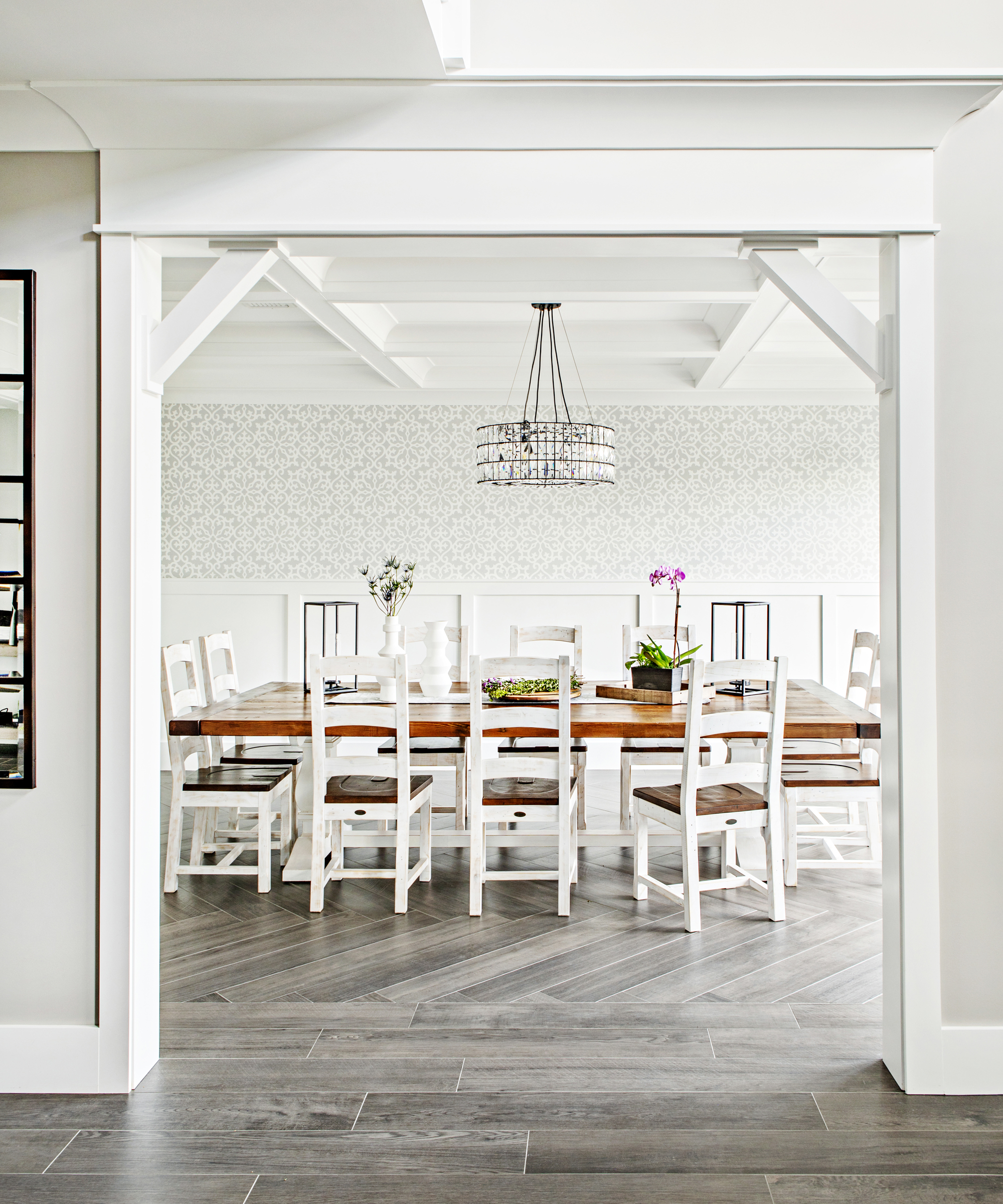
To the right, the foyer opens up to a light and airy dining room accessible through a wide beamed entrance.
‘It has a charming elegance to it,’ said Teich. The walls combine a wainscoted lower panel with a grey and white patterned Thibaut wallpaper, while a rustic wooden table and chairs are contrasted with a dazzling crystal drum chandelier.
‘A subtle detail is the herringbone wood flooring bordered all around the room,’ said Teich, highlighting one of her favorite dining room ideas. ‘The linear placement of the planks create an area rug detail without an actual rug.’
Living room

An ‘open flow for entertaining’ was a key must-have for the clients, and this is reflected in a living room that is connected entirely to the kitchen and its dining nook. Despite its size, Teich has still managed to keep the space feeling cozy.
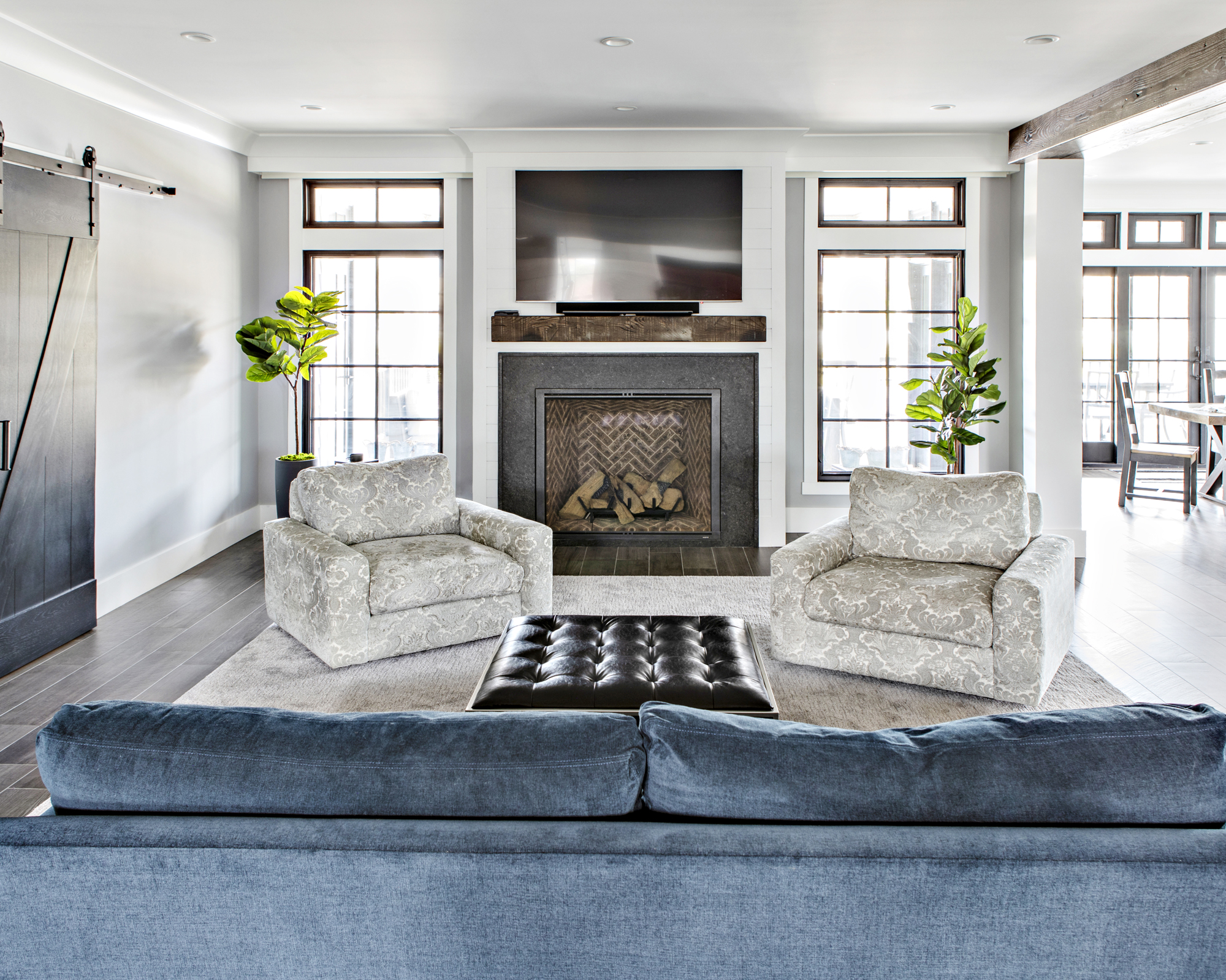
‘We mixed in a stunning blue sofa, lounge chairs with a monochromatic pattern and a leather ottoman to layer color and texture, creating a ‘sink right in’ feeling,’ she said. The eight-foot custom barn doors are a highlight for Teich among her living room ideas, as is the fireplace’s chevron brick layout. ‘The black marble surround of the fireplace is another detail I love that is subtle but perfect.’
A farmhouse feel is reinforced by the large beam that runs the boundary between the living room and kitchen, which covers a ceiling support. ‘The workroom hand hammered the dents and actually burned areas of the wood to give it a reclaimed look,’ explained Teich.
Kitchen
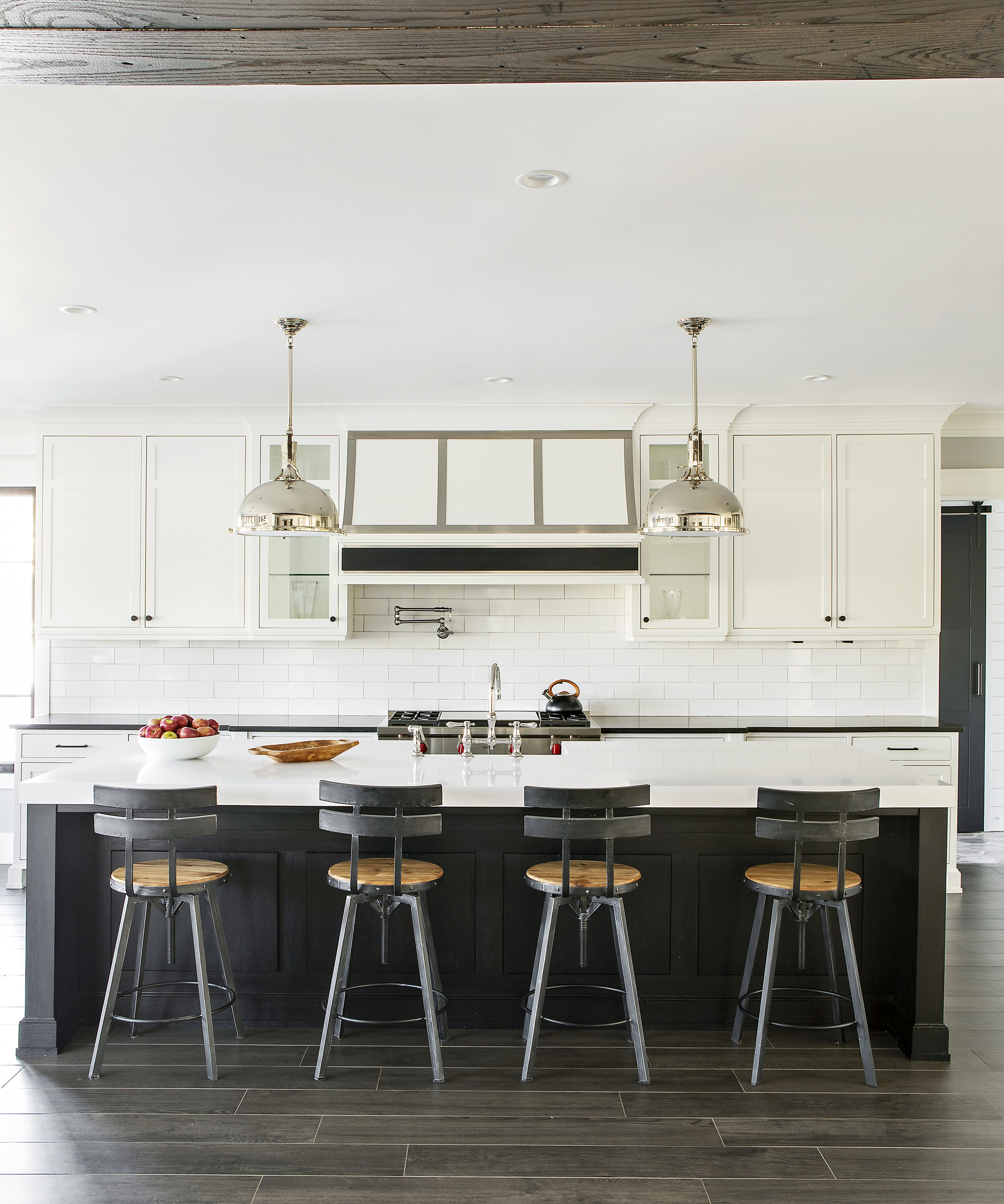
‘Mixed materials create a dynamic space for your eyes to lay on while sitting in the living room or simply passing by,’ said Teich of her kitchen design. ‘Modern contours are paired with soft wood, white subway tile and industrial elements to generate that modern farmhouse feeling.’
At the center is a large black island flanked by wooden bar stools, which grounds the light and bright kitchen ideas used elsewhere in the room.
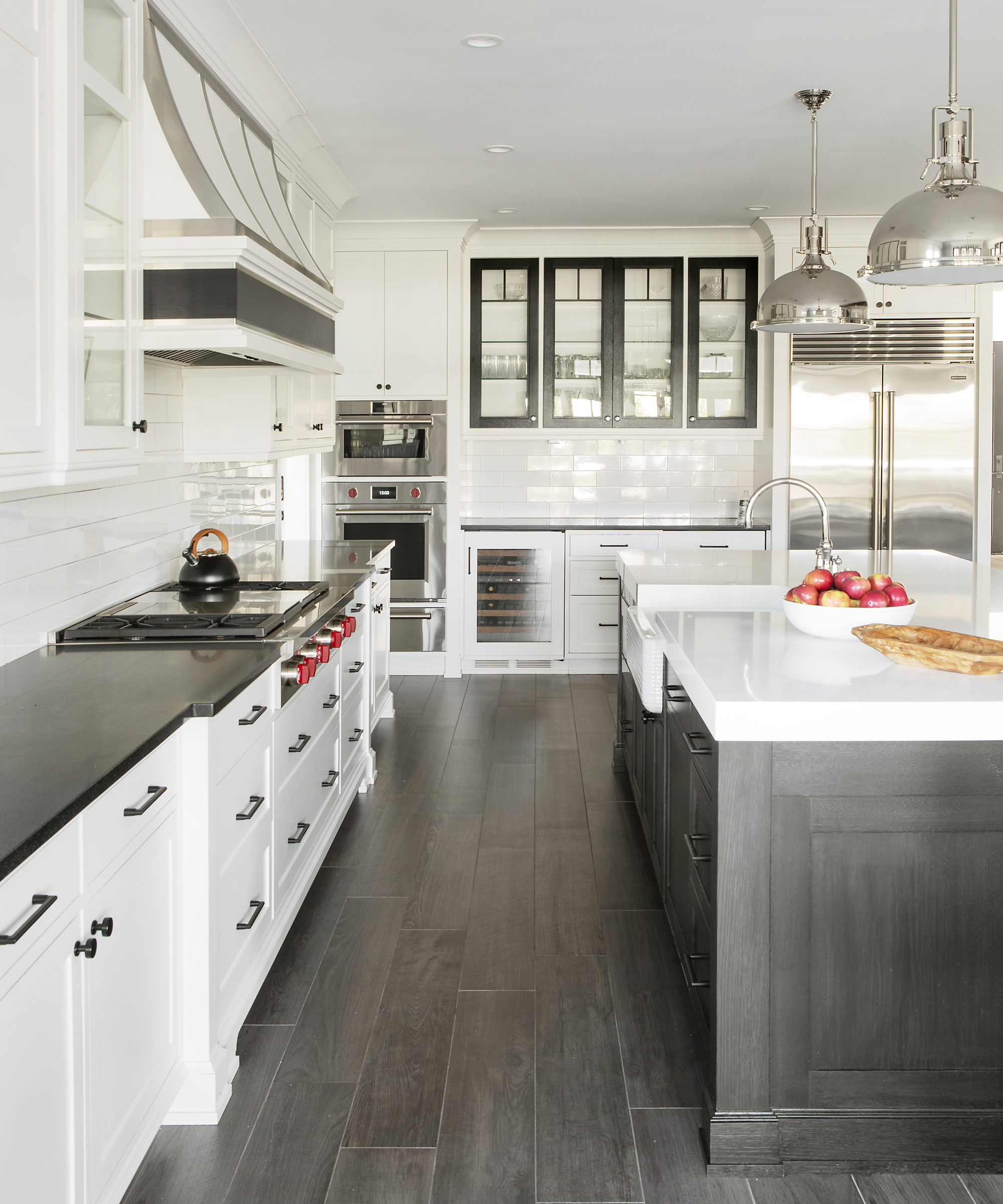
‘The classic black and white makes a stunning pairing with the stainless finishes of the appliances and pendants,’ Teich explained. ‘In the beverage area, we flipped the scheme by framing the glass cabinets in black, rather than the same white as the rest of the upper cabinetry.’
Mudroom
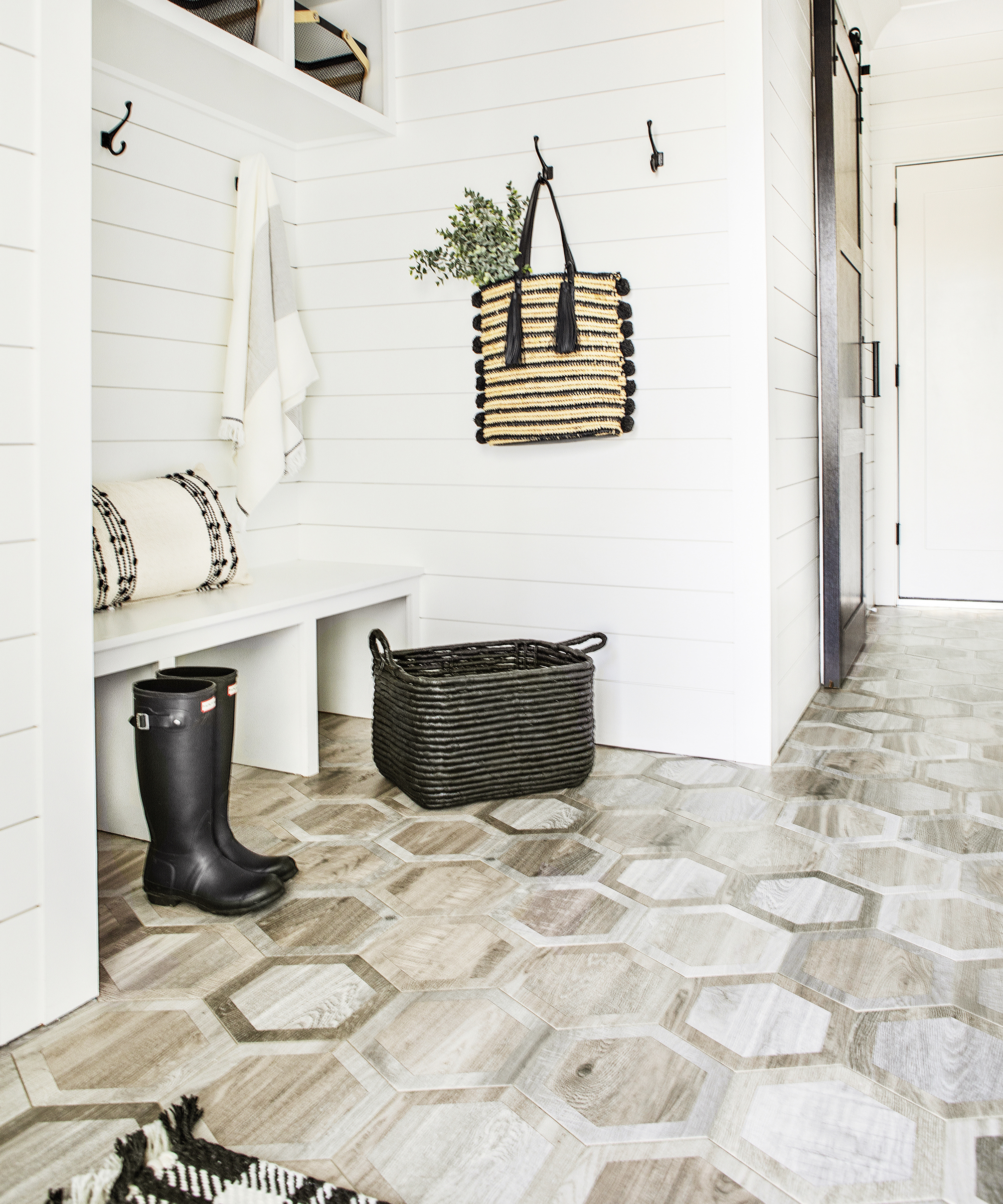
‘The mudroom is a small space with a lot of character,’ said Teich, whose careful use of pattern is even evident here, in a room set to house muddy boots and even muddier dogs.
‘I absolutely am enamored of the floor,’ she said. Wood-look porcelain in a number of tones and shades is arranged into a striking octagonal motif, presenting a modern take on farmhouse flooring.
Pool bathroom
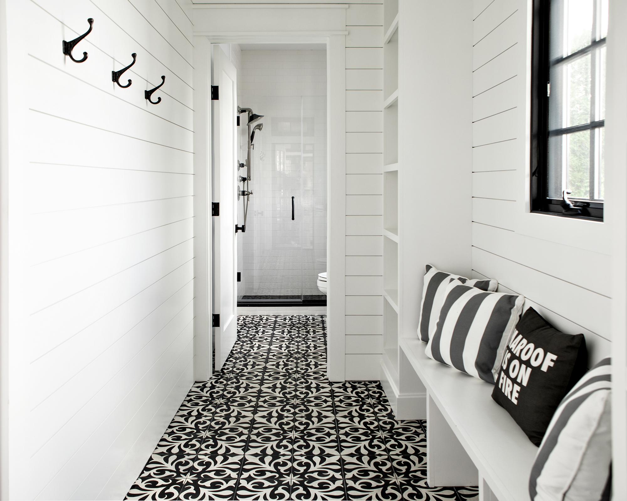
Monochrome really is king in the pool bathroom. The ‘hidden-away gem’ is accessible through either the living room den or the outdoor patio, via an entrance flanked with more white horizontal shiplap which here takes on a beachy vibe.
‘The ornate black and white floor tile creates visual interest through its large contrast against the surrounding white interior,’ said Teich.
Master bathroom
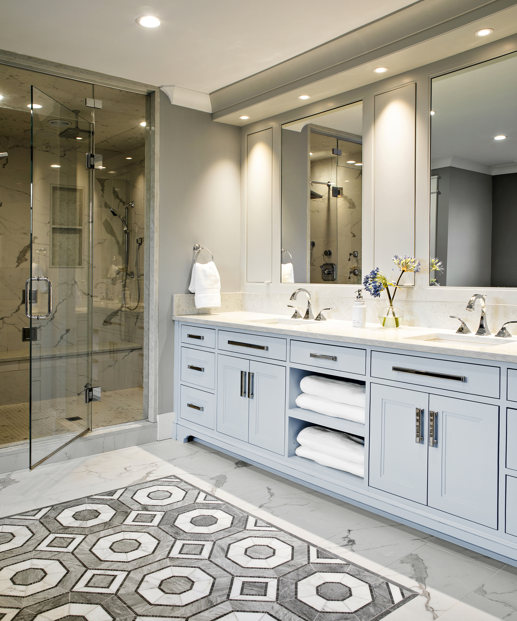
‘The monochromatic color scheme in this bathroom creates a blank canvas for pattern and accent color to shine,’ explained Teich of her bathroom ideas.
While gray paint colors the majority of the room, a soft powder blue vanity brightens the scheme, and a spectacular gray octagonal pattern is inlaid into the white marble floor for a flourish of drama.
‘A freestanding tub creates a spa-like feeling making this the perfect space for a relaxing getaway,’ Teich added.
Upstairs bathroom
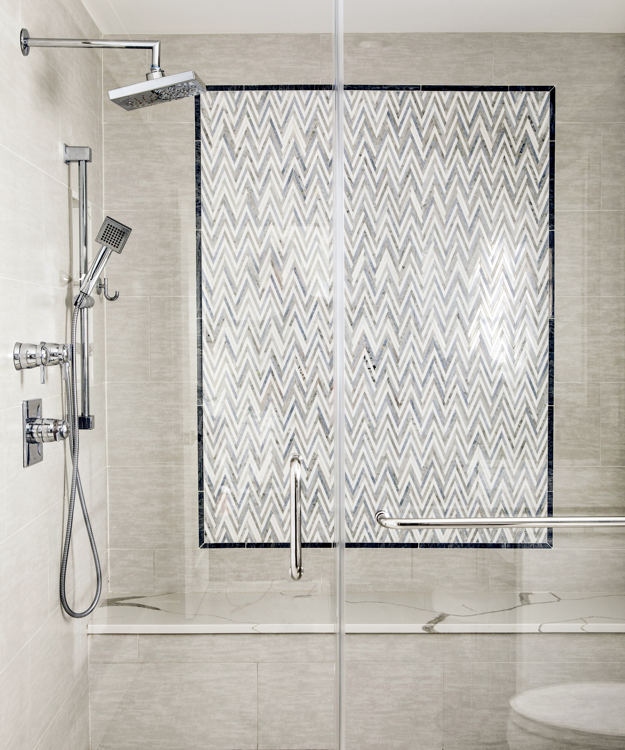
'One of the best parts about this bathroom is the shower,’ said Teich. 'It is the first thing your eyes see when you enter into the room. Framed out in black tile is a dynamic chevron tile, creating an architectural piece of artwork. About five different tiles were used to complete the shower, all blending together into a gorgeous harmony of layered pattern.’
Interior Design / Marlaina Teich Designs
Photography / Patrick Cline
Contractor / Custom Village Homes
Sign up to the Homes & Gardens newsletter
Design expertise in your inbox – from inspiring decorating ideas and beautiful celebrity homes to practical gardening advice and shopping round-ups.

Ailis started out at British GQ, where a month of work experience turned into 18 months of working on all sorts of projects, writing about everything from motorsport to interiors, and helping to put together the GQ Food & Drink Awards. She then spent three years at the London Evening Standard, covering restaurants and bars. After a period of freelancing, writing about food, drink and homes for publications including Conde Nast Traveller, Luxury London and Departures, she started at Homes & Gardens as a Digital Writer, allowing her to fully indulge her love of good interior design. She is now a fully fledged food PR but still writes for Homes & Gardens as a contributing editor.
-
 I tried the 50% decluttering rule, and it gave me the ruthless push to clear the clutter in my cramped kitchen cabinets
I can now find my dinnerware much more easily
By Rebecca Shepherd
-
 Andrew Walker's wooden cabinets have made me rethink the concept of a classic neutral kitchen – they're simple without feeling overly minimal
Raw, pared-back cabinetry has never felt so sophisticated – designers say they're a 'smart, long-term investment with lasting style'
By Megan Slack